Aspire Capital Logo Design

Isaac Blake Tile



Aspire Capital - Brand Identity
Client: Aspire Capital
Industry: Finance / Renewable Energy
Scope: Logo design, color palette, typography, brand guidelines, stationery
Context: New company, first identity
Overview
Aspire Capital is a private equity and asset management firm focused on renewable energy investing. They came in as a brand-new company with no existing visual identity, needing everything from the logo up: mark, color system, typography, brand guidelines, and stationery.
The challenge was building an identity that could sit credibly in two worlds: the conservative trust signals of private equity and the forward-looking optimism of clean energy.
The Challenge
Finance brands default to navy blue, serif type, and shield icons. Renewable energy brands default to green gradients and leaf motifs. Both are overcrowded visual territories, and Aspire Capital needed to signal membership in both spaces without looking like a generic version of either.
The identity also needed to work at scale. A PE firm's brand shows up on pitch decks, fund documents, investor communications, and event materials. It has to feel authoritative at small sizes on a business card and commanding on a presentation title slide.
Logo Concept
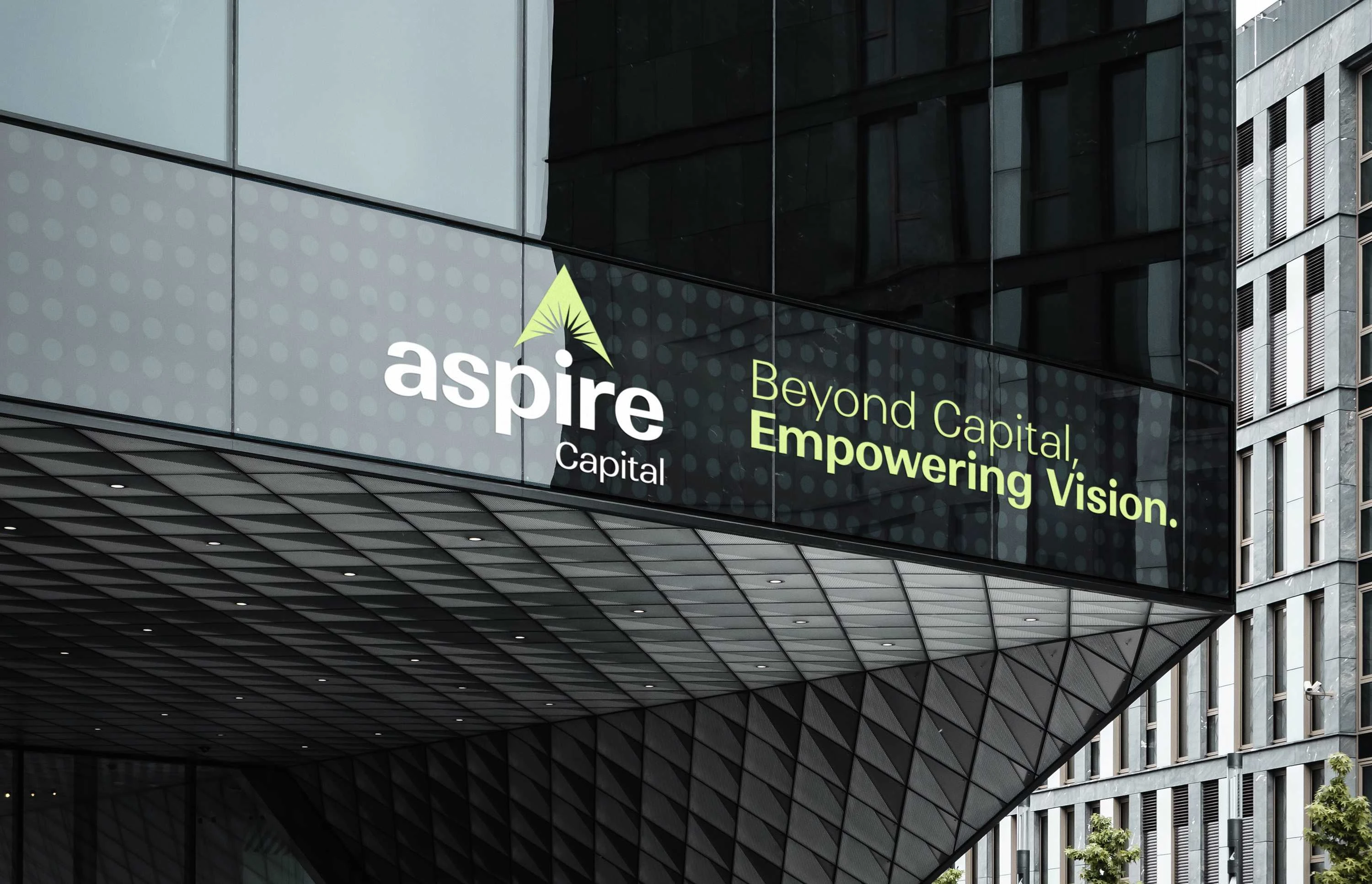
The logomark is built around the letter "A" constructed from geometric forms that serve triple duty:
Upward arrow: Growth, ambition, and the trajectory Aspire Capital promises its investors
Hidden sun element: A nod to renewable energy, specifically solar, embedded in the geometry rather than bolted on as a literal illustration
Structural stability: The triangular base of the "A" form communicates the solidity expected from an asset management firm
The result is a mark that reads as finance-first but reveals its energy focus on closer inspection.
Design System
Color Palette: Drawn from what the brief called "nature's tech symphony." The palette bridges natural tones (greens, earth tones associated with sustainability) with the cooler, more precise tones expected in financial services. The combination avoids both the sterile corporate look and the overly casual "green startup" feel.
Typography: Selected for clarity and authority. The type system balances modern geometric forms with enough weight and structure to hold up in formal financial documents.
Brand Guidelines: A comprehensive guide covering logo usage rules, clear space, minimum sizes, color specifications, typography hierarchy, and application examples. Built to ensure consistency as the brand scales across materials and contexts.
Stationery: Business cards, letterhead, and supporting collateral designed to make a strong first impression in investor-facing settings.
Result
A complete brand identity for a new private equity firm that communicates both financial credibility and renewable energy focus without leaning on cliches from either space. The system was built to scale from day one, giving Aspire Capital a cohesive visual foundation for investor relations, marketing, and all public-facing materials.



Like this project
Posted Sep 20, 2024
Complete brand identity for a new private equity and asset management firm focused on renewable energy investing. Logo, color palette, typography, brand guidelines, and stationery, all designed to bridge financial credibility with clean energy optimism.