F.A.R Code Conference Brand Identity Project

Isaac Blake Tile


The F.A.R Code Conference
Brand Identity, Event Branding & Merchandise Design - Case Study
Client: The F.A.R.Code | Allen Foundation
Project: Brand identity + full event design system for The F.A.R Code Conference
Location: Ontario, Canada
Role: Brand & Digital Designer; logo/identity, website design, event branding, merchandise, stationery, print & social design
Scope:
Logo & Brand Identity
Website / Digital Experience Design
Event Branding
Swag/Merchandise Design
Stationery
Print & Social Media Design.
1. Overview
F.A.R Code; Faith, Attitude, Relationships - began as a book by founder Olalekan Oluwayomi before growing into a live platform: a one-day conference in Toronto built for students, immigrants, professionals, and entrepreneurs who are, in the brand's own words, ready to move "from potential to real productivity." My job was to take that idea and give it a visual language strong enough to carry a book cover, a stage backdrop, a founder's cap, and an Instagram countdown post, and have every single one of them still read, unmistakably, as F.A.R Code.
This case study walks through how a single logo system, a three-colour palette, and one repeating pattern were engineered to scale across an entire brand ecosystem: identity, event collateral, merchandise, and stationery, with every decision tied back to the same core idea, "the code to unlocking your next level."
2. The Brief
The ask was deceptively simple and genuinely difficult: build a brand that could do two jobs at once.
Anchor a book - F.A.R.: Faith, Attitude, Relationships - The code to becoming who you were born to be, with the gravity and polish of a real published title.
Launch a conference - a full-day, multi-speaker event with a founder, a featured speaker, a lineup of expert speakers, two event hosts, sponsors, volunteers, and partners, all needing consistent, professional collateral in a very short production window (the "days to go" countdown alone required daily assets).
The brand also had to travel outside the digital space entirely: onto a stage, a red-carpet backdrop, a tote bag at an outdoor event, a bucket hat, a spiral notepad. That range is what shaped every choice below, nothing could be decorative for its own sake. Every element had to be modular enough to be rebuilt in five minutes by whoever was producing that day's asset, and recognizable enough to survive being reduced to a single icon on a hat.
3. Brand Identity System
3.1 The Logo — Built for Motion
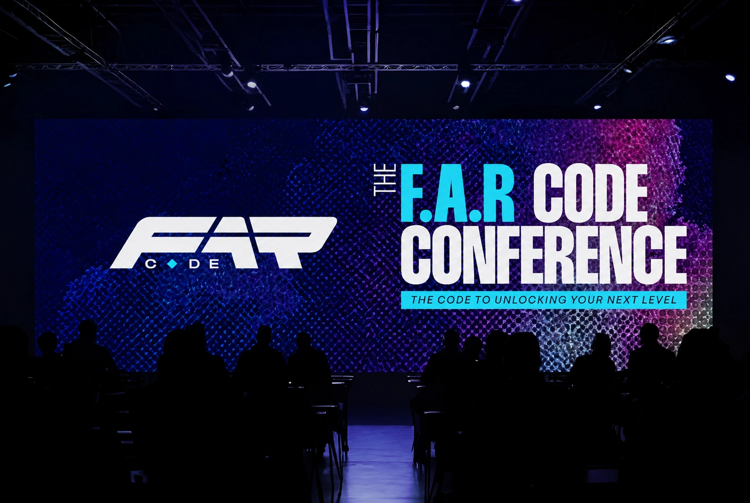
The FAR wordmark is the whole strategy in one mark. The three letters are fused into a single angular, forward-leaning form; sheared parallelogram cuts that give the type a sense of velocity, like the letters are mid-stride. That was intentional: this is a brand about movement "stop waiting, start becoming", so the logo itself had to look like it was already going somewhere, not sitting still on the page.
Underneath the mark sits the word CODE, set small and disciplined, with a diamond glyph standing in for the "O" between "C" and "DE." That diamond isn't decoration, it's the first appearance of a shape that recurs throughout the entire system (see the brand pattern, below), quietly planting the identity's DNA inside the logo itself.
Stacked beside the lockup, the full acronym unpacks the name; FAITH / ATTITUDE / RELATIONSHIPS, set in a clean, disciplined all-caps sans so the wordmark stays the hero and the explainer stays legible but secondary.
3.2 A Logo That Survives Any Background
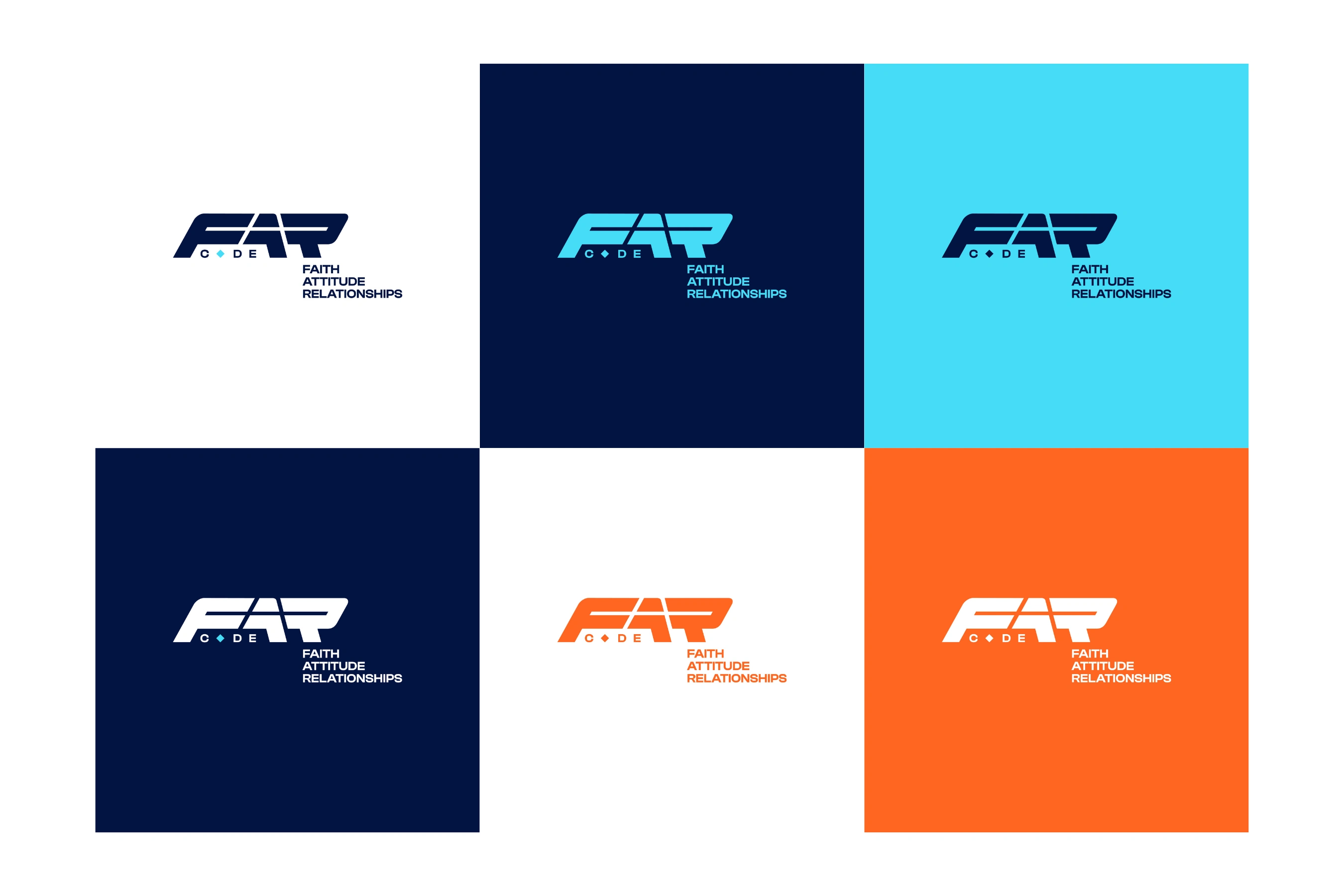
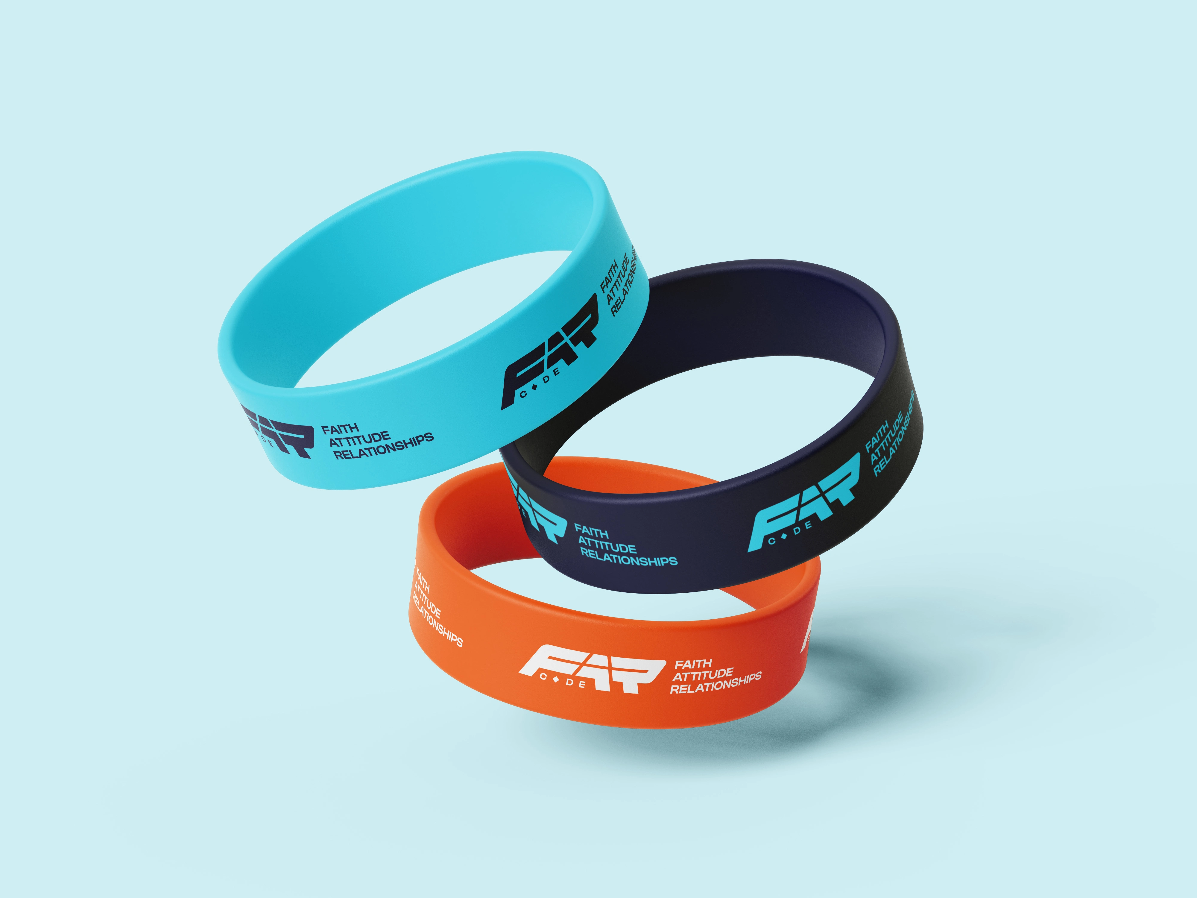
Because the brand needed to live everywhere; merch, stage screens, a white flyer, a navy Instagram tile, the mark was built as a full reversible system from day one: navy-on-white, cyan-on-navy, navy-on-cyan, white-on-navy, orange-on-white, and white-on-orange. Every combination was tested against the brand's actual four base colours so that no matter what background a given deliverable landed on, there was already an approved, contrast-safe version of the logo ready to drop in, no last-minute recolouring, no inconsistency.
3.3 The Circular Badge - The "Seal of Approval" Mark
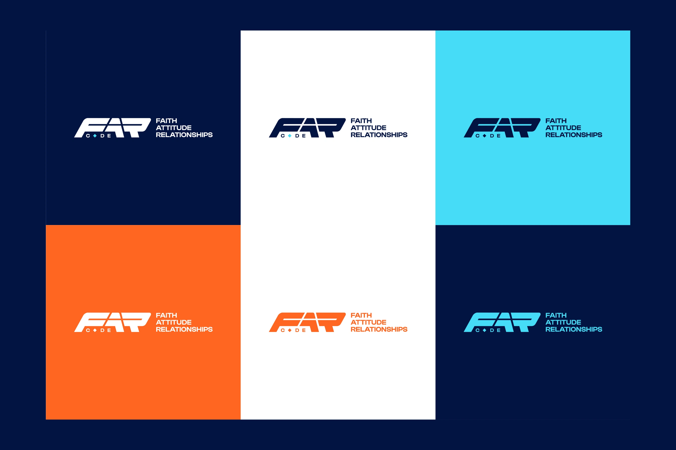
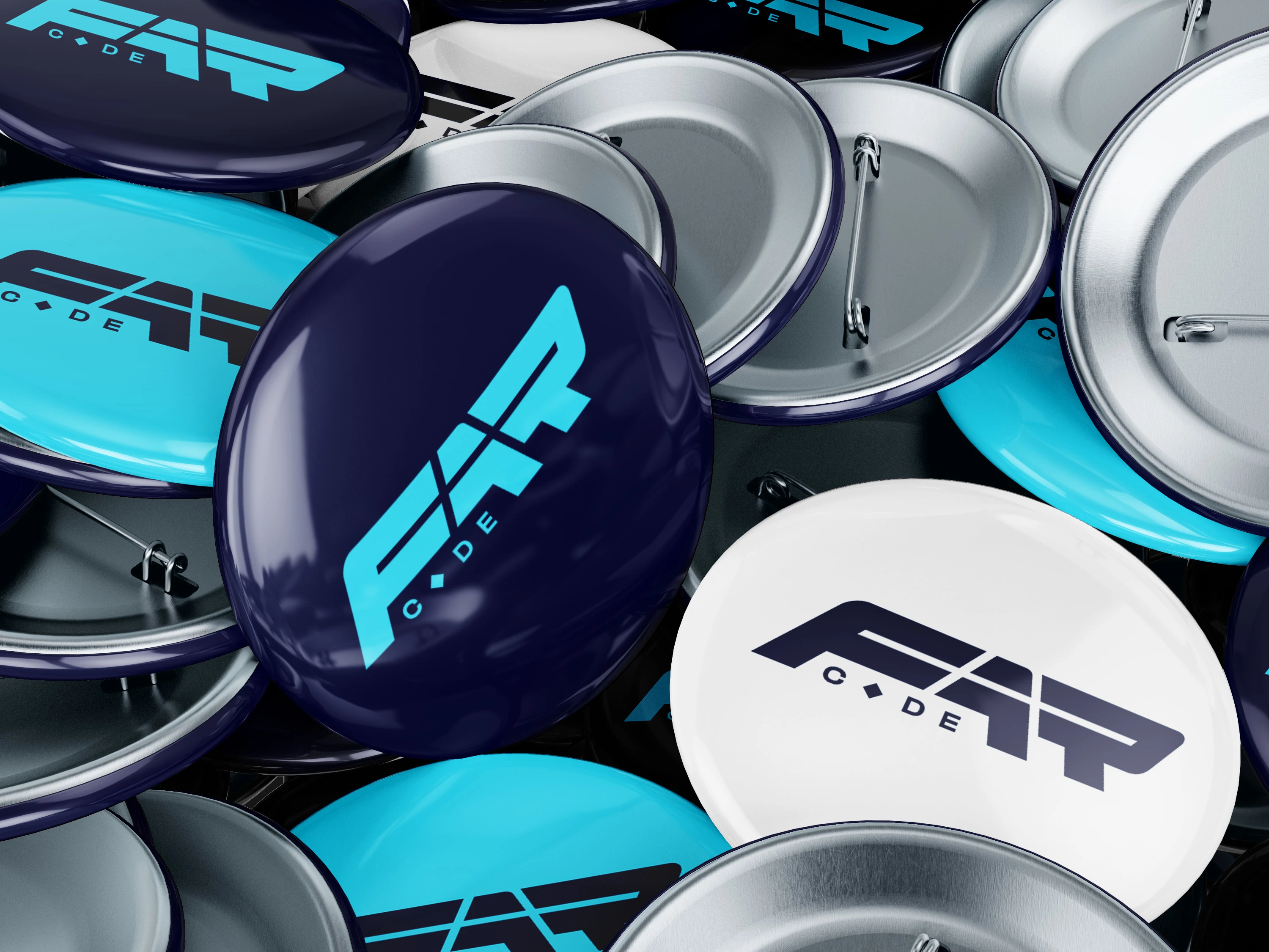
Alongside the primary lockup, I built a secondary circular badge: the FAR mark centred inside a ring of repeating type reading "FAITH • ATTITUDE • RELATIONSHIPS," separated by the same diamond glyph from the wordmark. This version functions like a seal, it reads as credibility and permanence, which is exactly what a first-year conference and a first-time author need. It's the version built for stamps, pins, and anywhere the brand needs to feel established rather than just energetic.
3.4 Colour Palette - Deliberately Restrained
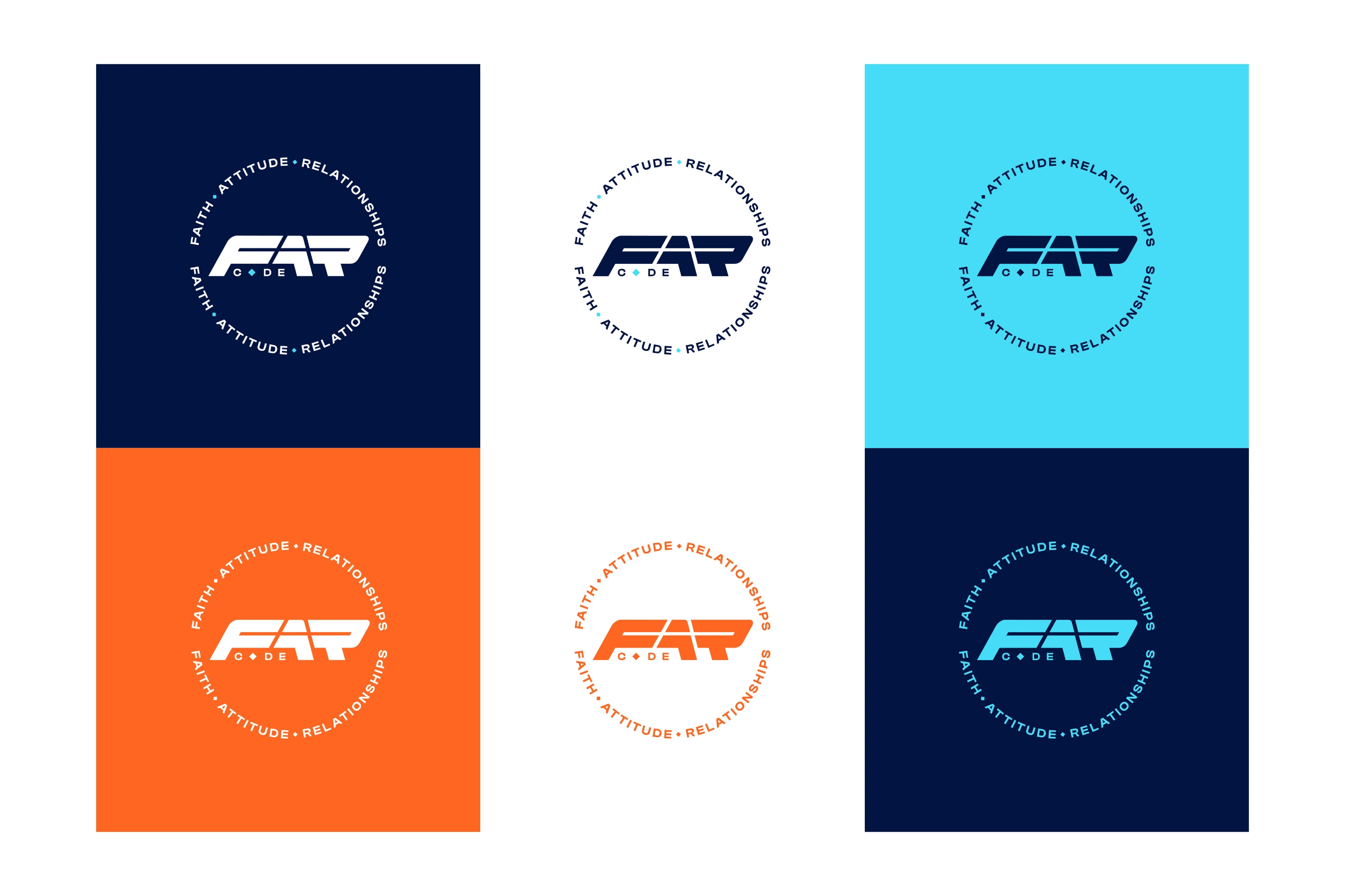
The palette is intentionally tight: Deep Navy, Sky Cyan, a single Signal Orange, and White, with soft grey gradients reserved only for numerals.
Navy is the foundation; it carries the weight of "Faith," gives the brand credibility on a stage screen or a book spine, and functions as the dominant background across almost every piece of collateral.
Cyan is the energy colour; it's the "Code" in F.A.R Code, standing in for clarity, technology, and forward motion. It's used for every headline word that needs to pop: "DAYS," "F.A.R CODE," "PARTNERSHIP," "VOLUNTEERS."
Orange is used sparingly and specifically; as a full alternate identity state (see the fifth logo variant) and inside the book cover illustration (the lone figure's jacket). It's the human, warm counterpoint to the navy/cyan tech pairing - the colour of the person the brand is actually for.
White does the heavy lifting for legibility and gives the palette room to breathe against three fairly saturated colours.
Keeping the palette this disciplined is what let three colours stretch across a book jacket, a stage LED wall, and a bucket hat without ever feeling like three different projects.
3.5 Typography - Poster Energy Meets Editorial Discipline
Two typefaces do all the work. Headlines run in a bold, heavily condensed display sans; the kind of typeface built for maximum impact in minimum width, which is exactly what a countdown numeral or a poster headline like "CONFERENCE" needs when it has to dominate a phone screen at a glance. Supporting copy, bios, dates, instructions, runs in a clean geometric sans, chosen purely for legibility at small sizes across dozens of speaker bios and footer credit lines.
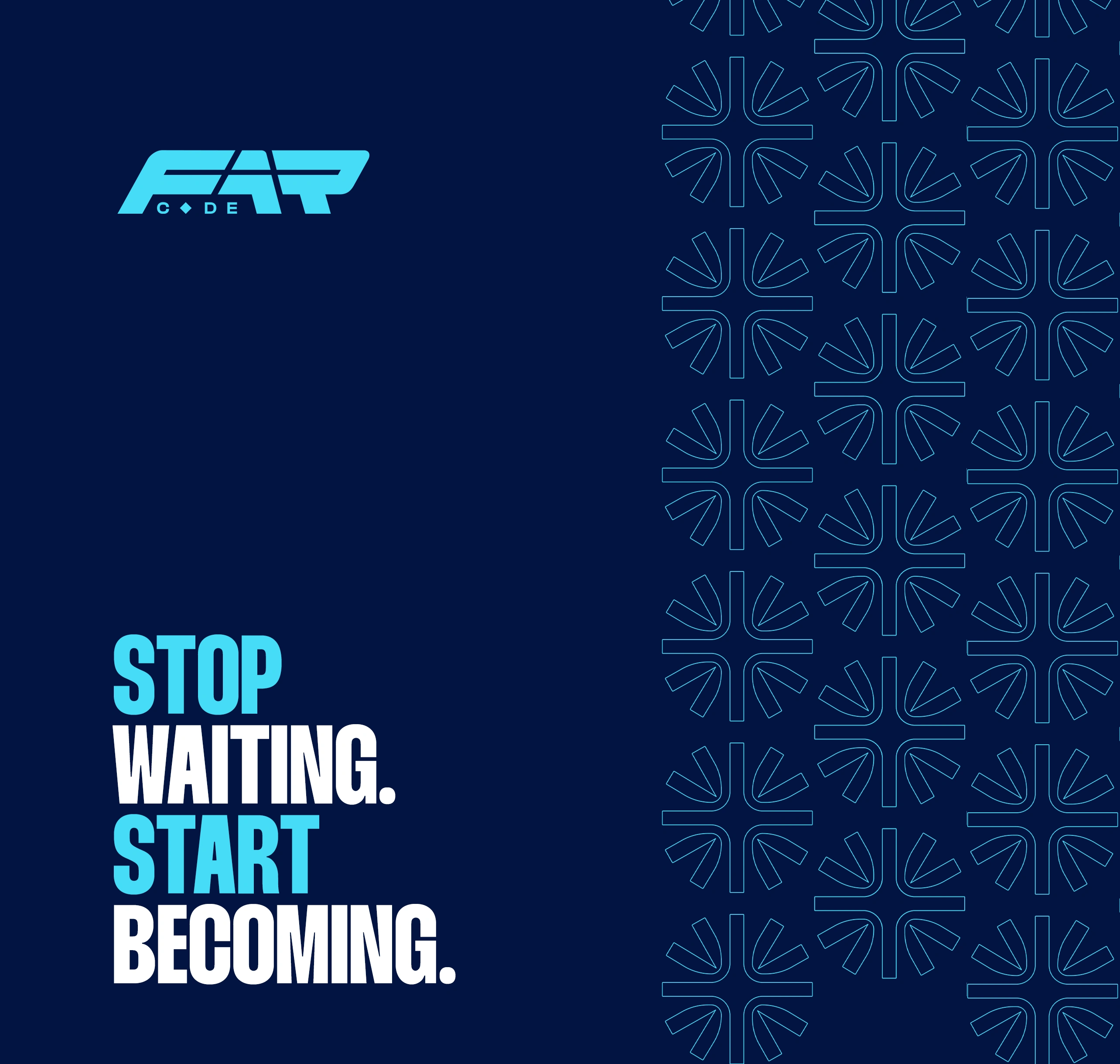
3.6 The Brand Pattern - The Starburst/Code Motif
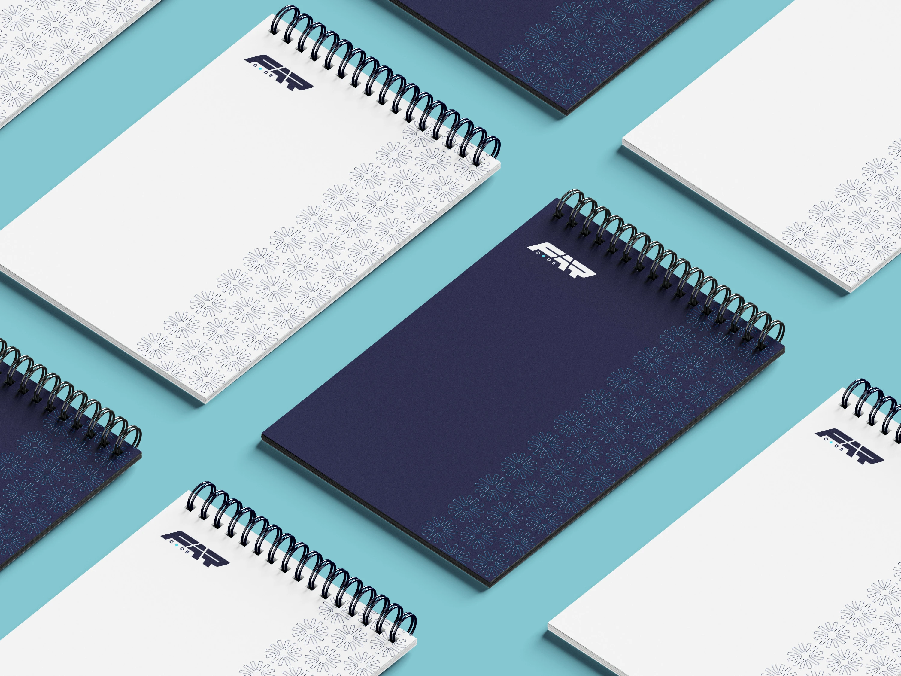
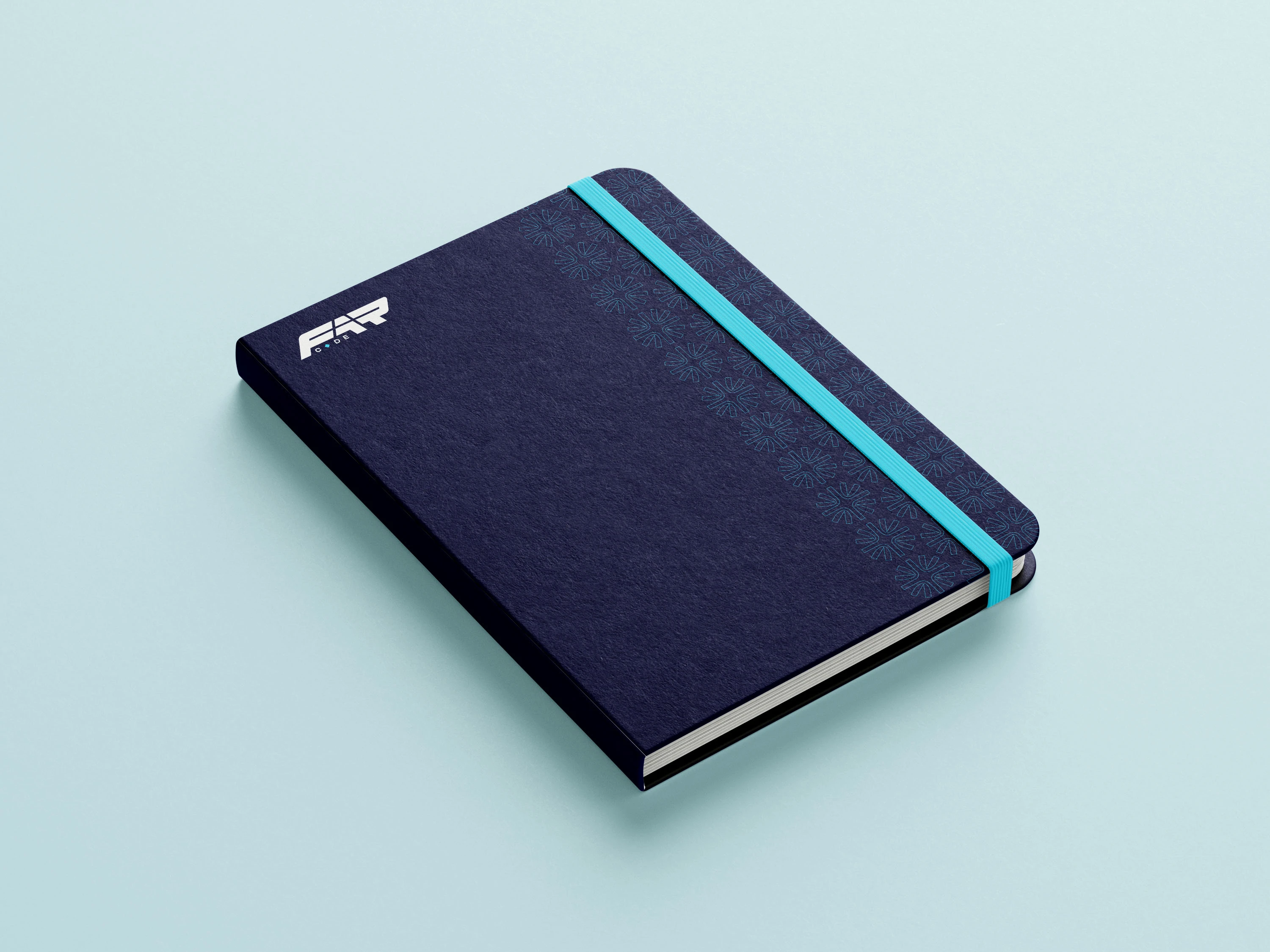
The most quietly important asset in the whole system is the repeating eight-point starburst pattern first hinted at in the logo's diamond glyph. Scaled up, it becomes a full textile-like pattern applied to tote bags, gift bags, notepads, and the event backdrop. It's abstract enough to read as pure texture, but structured enough to feel technical — a nod to "Code" without ever needing to draw a literal computer or circuit board. Its real value: it lets merchandise carry the brand identity even in the pieces where the full logo lockup would be too much — a single panel of the pattern next to a small logo mark is enough to be unmistakably F.A.R Code.
4. Event Branding
4.1 The Key Visual - Two Layouts, One System
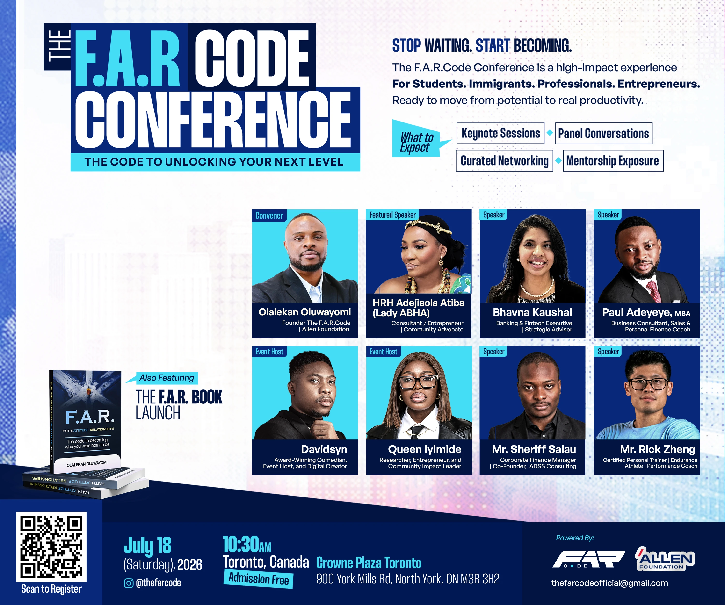
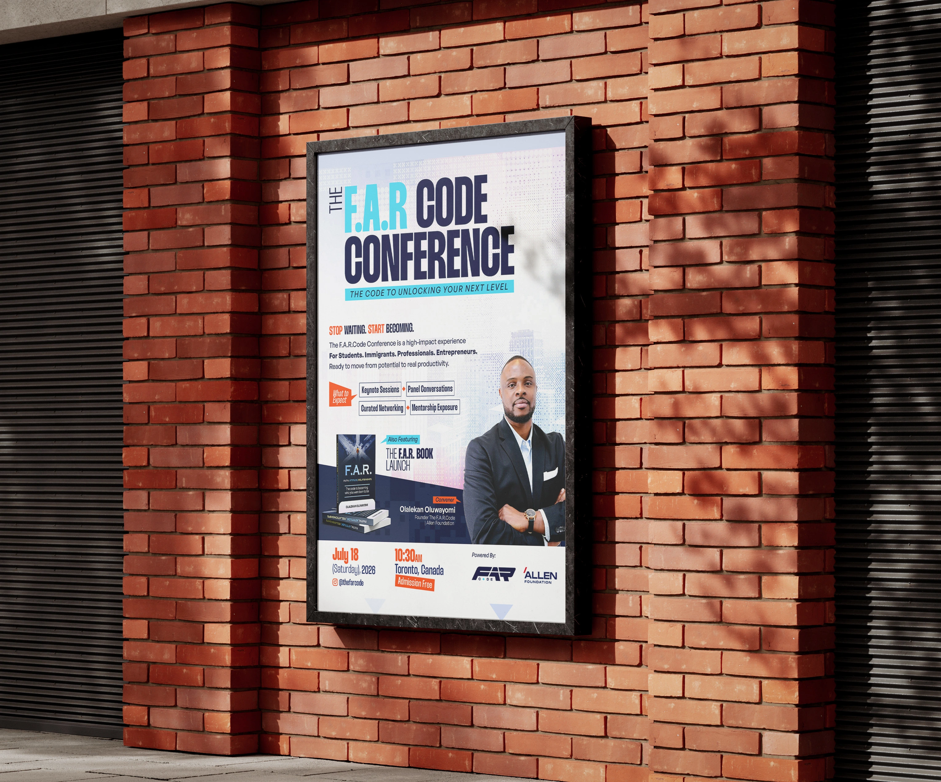
The core conference poster, "THE F.A.R CODE CONFERENCE; The Code to Unlocking Your Next Level," was built in two configurations off a single set of assets:
A landscape lineup poster presenting the full roster; Convener, Featured Speaker, three Speakers, two Event Hosts, in a clean eight-panel photo grid, each labelled by role, alongside the "What to Expect" pillars (Keynote Sessions, Panel Conversations, Curated Networking, Mentorship Exposure) and the book launch call-out.
A portrait hero layout spotlighting founder Olalekan Oluwayomi alone, for founder-forward promotion and story-format placements.
Building both from the same type system, colour blocking, and footer bar meant the team could deploy whichever format suited the platform, web banner, printed flyer, Instagram feed, or Story without ever looking like a different campaign.

4.2 The Countdown Series - Localising the Hype
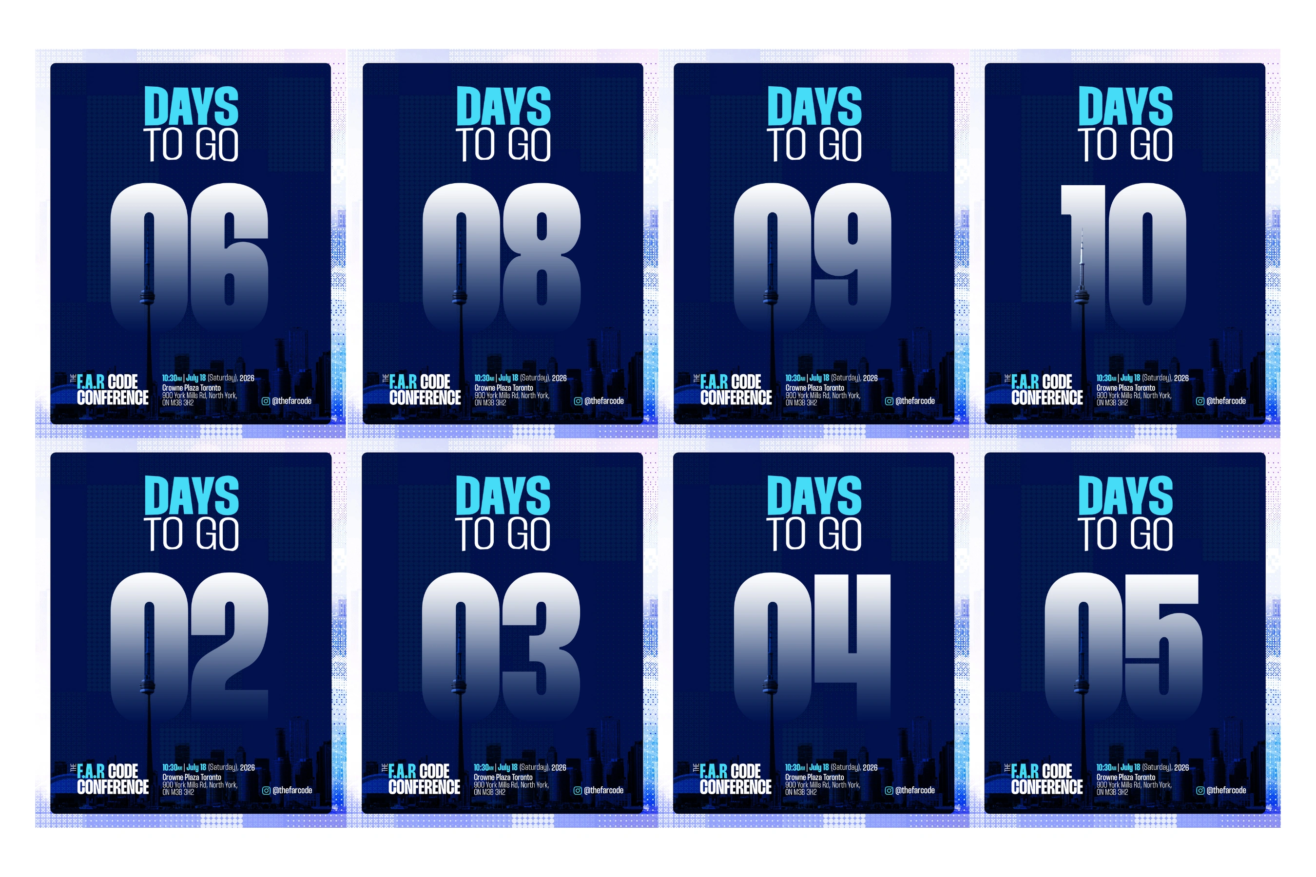
The "Days to Go" series is a small, deceptively strategic piece of design: a bold gradient numeral, "DAYS TO GO" set in the two-tier headline treatment, and critically, a silhouette of the Toronto skyline with the CN Tower rising directly through the numeral itself. That single move grounds a purely digital countdown campaign physically in the host city, turning a generic "days left" post into a piece of local anticipation-building. Built as a template, it let the team push out a new, on-brand post every single day of the run-up with nothing but the number needing to change.
4.3 Speaker Announcement System - A Built-In Hierarchy
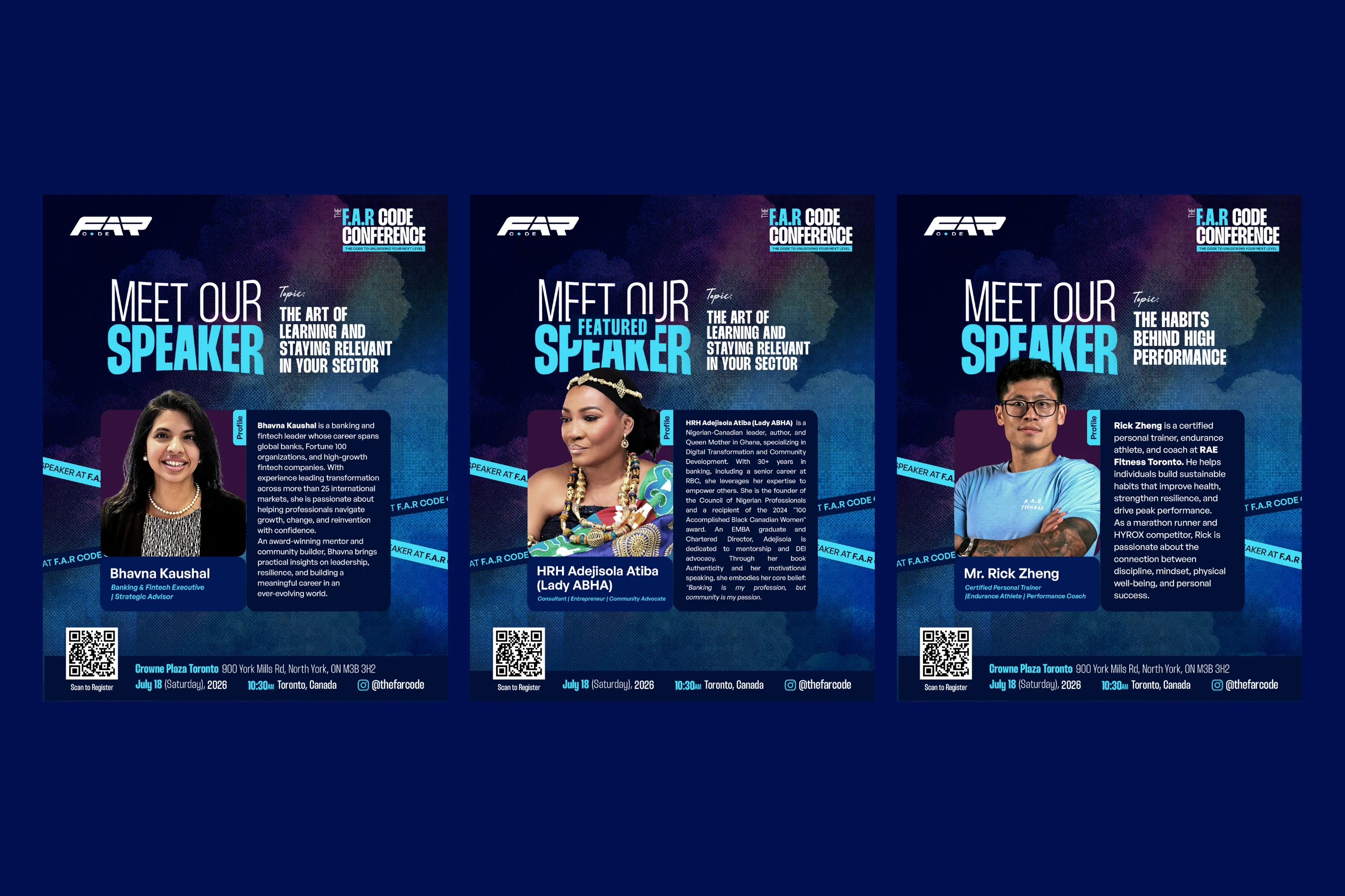
With a Convener, a Featured Speaker, standard Speakers, and Event Hosts all needing individual spotlight posts, I built a tiered "Meet Our Speaker" template rather than one flat design. The Featured Speaker treatment upgrades the headline (adding "FEATURED" in cyan above "SPEAKER") and gives the portrait a richer duotone backdrop; standard Speaker posts keep the same bones; photo, profile card, name, title, topic, QR code, venue footer, but at a calmer visual weight. This isn't just decoration; it's an information system that lets an audience instantly read status without any of the cards ever breaking the family resemblance.
4.4 Recruitment & Partnership Collateral
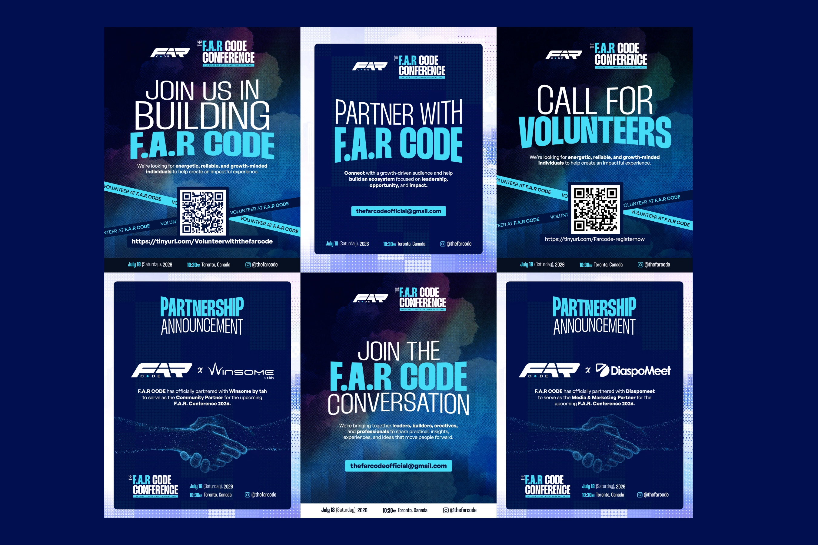
Volunteer and partner outreach ("Join Us in Building F.A.R Code," "Partner with F.A.R Code," "Call for Volunteers") share a consistent formula: bold two-line headline, a QR code as the literal call to action, and a diagonal repeating ribbon reading "VOLUNTEER AT F.A.R CODE" cutting across the layout, a device that turns a static flyer into something that visually feels like a call-to-arms banner. Partnership Announcement templates (used for the Winsome by tah community partnership and the DiaspoMeet media & marketing partnership) use a shared dotted-particle handshake illustration, keeping every new partner reveal visually consistent no matter who the logo pairing is.
4.5 Physical Presence - Stage & Step-and-Repeat
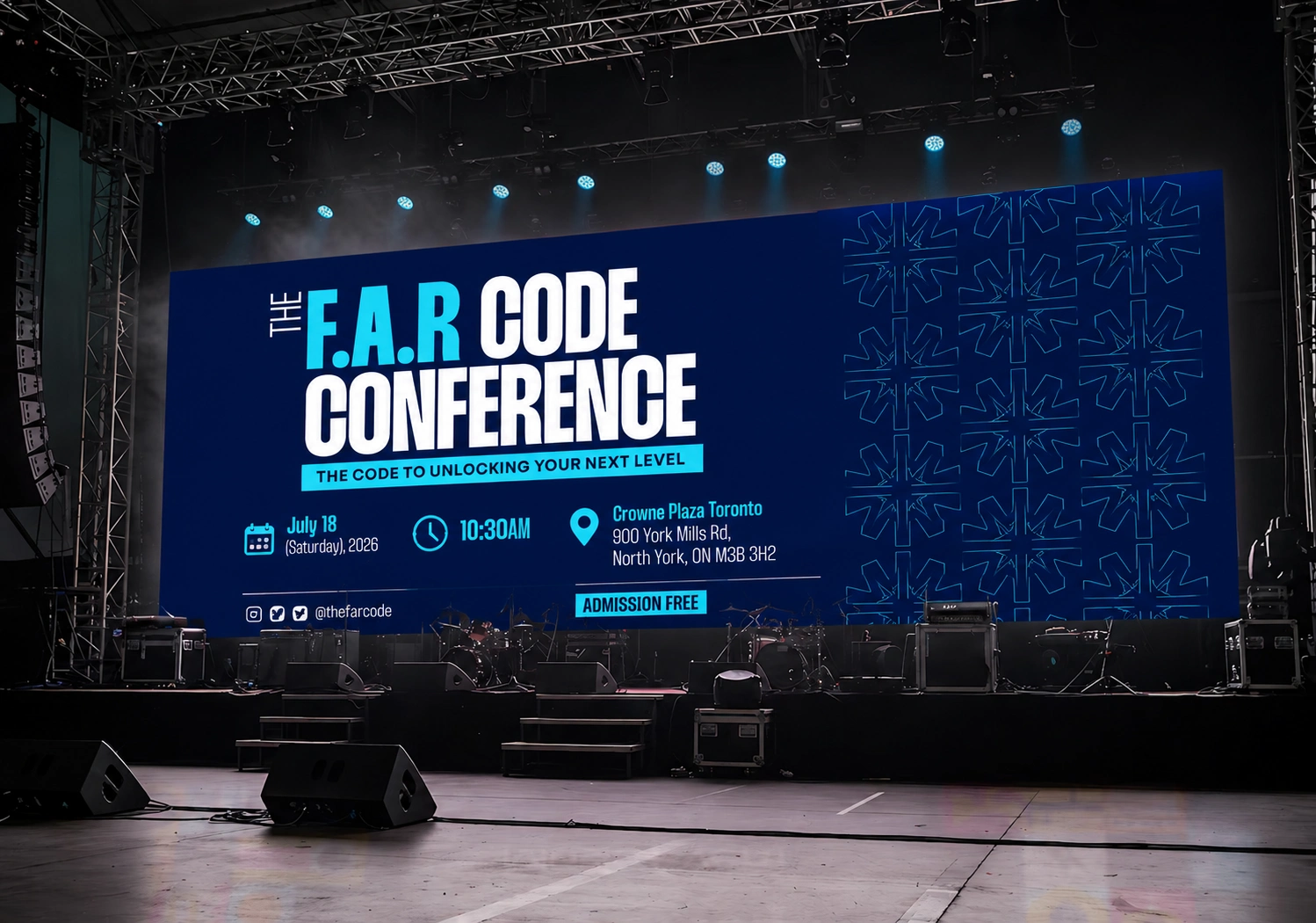
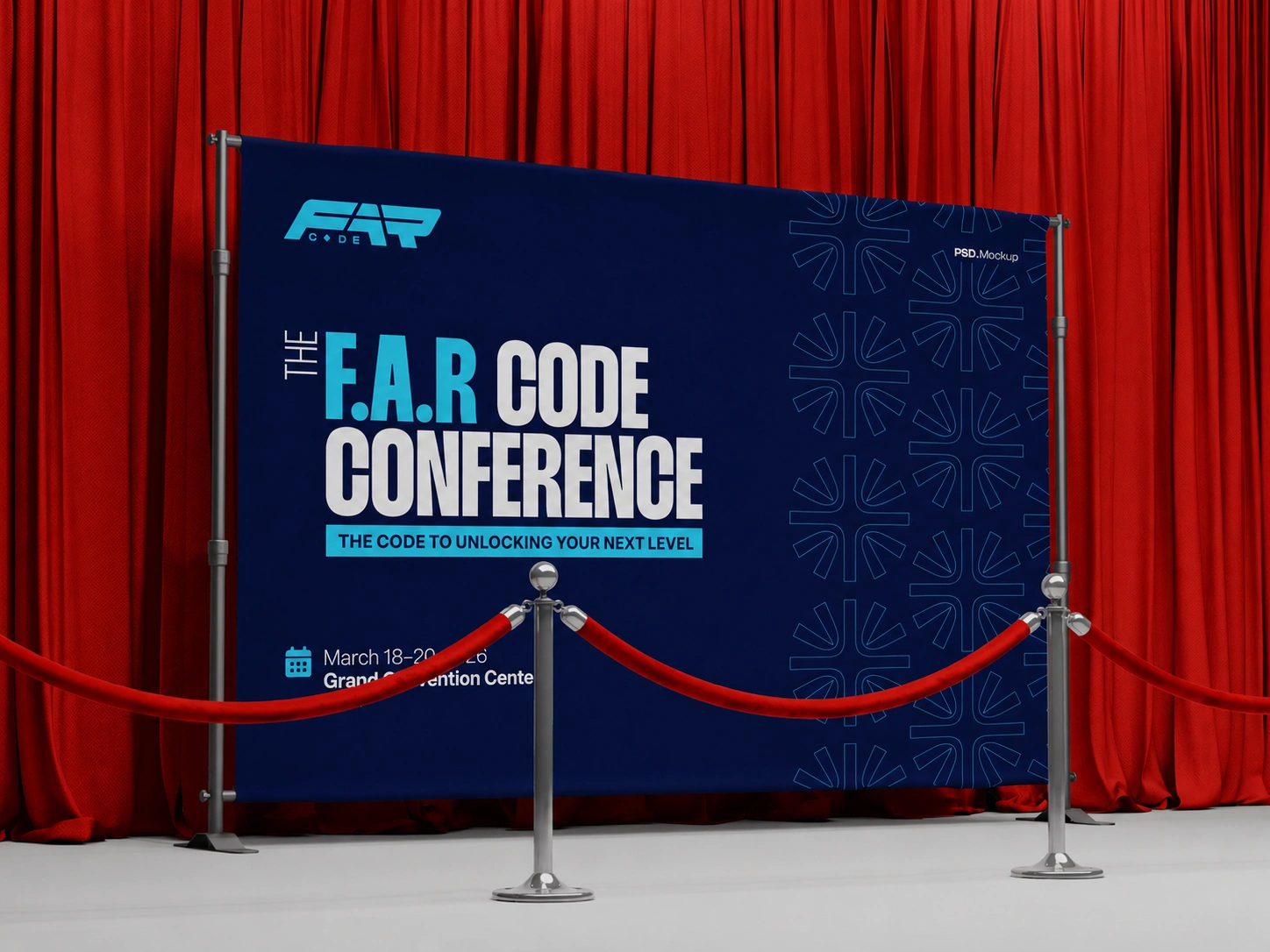
The identity was also built to leave the screen entirely: an LED stage backdrop carrying the full event title treatment and the starburst pattern at scale, and a step-and-repeat/red-carpet banner using the same layout logic, proof the system was designed with the physical event day in mind from the start, not bolted on afterward.
5. The F.A.R. Book
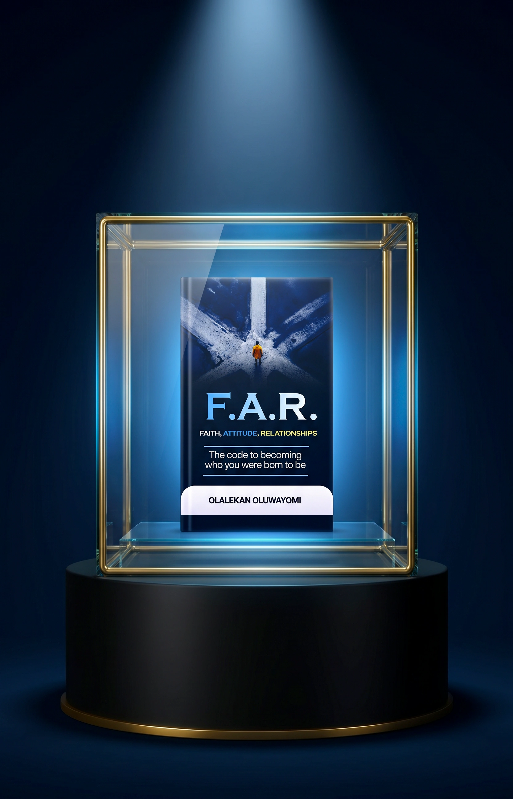
Because the conference exists as an extension of Olalekan Oluwayomi's book, the book cover needed to hold its own as a standalone editorial object while still feeling like it belongs to the same family. The cover uses a cinematic illustration; a lone figure in a burnt-orange jacket standing at the intersection of converging light beams, visually dramatizing the idea of choice and direction that "F.A.R." is built on. The subtitle treatment colour-codes each word of the acronym (Faith / Attitude / Relationships) to subtly reinforce the brand's core pillars even on the spine. The 3D book mockup then became a recurring asset inside the conference materials themselves ("Also Featuring: THE F.A.R. BOOK LAUNCH"), tying the publishing arm and the live event into one visible ecosystem.
6. The Website - A Modern, Interactive Digital Home for F.A.R Code
Print and merchandise gave the brand its physical presence; the website is where F.A.R Code had to prove itself as a living, working product. Designed and built in Framer, this wasn't a static one-pager; it's a fully designed, multi-section conference platform built to register attendees, sell the agenda, introduce a full speaker roster, and carry the same brand energy from the hero section all the way down to the footer, on any screen it's opened on.
6.1 A Cinematic, Data-Driven Hero
The site opens on a full-bleed hero: a dim, blue-lit auditorium photograph, a floating "FIRST EDITION" pill badge, and the FAR CONFERENCE wordmark scaled to fill the viewport. Sitting quietly at the edges are 3D-rendered versions of the brand's starburst pattern; the same diamond motif from the logo, now modelled as glowing dimensional icons rather than flat print marks, signalling immediately that this is a more premium, tactile execution of the identity than any print piece could be.
Below the fold line, the date and location ("18th July 2026 - Toronto, Canada") sit on a thin rule with a circular scroll-down affordance, and beneath that, a live, running countdown timer - Days / Hours / Minutes / Seconds, in the brand's cyan replaces the static "Days to Go" flyer series with a real-time, always-current component. It's the same idea as the printed countdown posts, rebuilt as functioning code instead of a new graphic every day.
6.2 Interaction Is the Design, Not a Layer on Top
Every major section of the page does something rather than just displaying something:
"Who Should Definitely Attend" is built as a live selector; four audience segments (Entrepreneurs, Immigrants, Professionals, Students) sit as icon tiles, with the active tile lit up in a glowing cyan ring while the others recede into the dark background. Selecting a tile swaps the description beneath it, letting a single section speak directly to four very different visitors without ever feeling like four separate paragraphs of text.
A scrolling marquee strip ("Mindset Transformation + Career & Business Insight…") runs the width of the page between sections; a small, constantly-moving detail that keeps the page feeling alive even when the visitor isn't actively scrolling.
"What to Expect" is laid out along an animated, hand-drawn S-curve path connecting four stops — Keynote Sessions, Panel Conversations, Curated Networking, Mentorship Exposure — each marked with its own icon and revealed as the visitor scrolls down the curve. It turns a plain four-item list into a guided journey, which mirrors the conference's own promise of taking attendees from one point to the next.
The speaker section presents black-and-white portrait cards under dramatic spotlight-beam lighting, each with hover-ready social icons (Instagram, LinkedIn) docked in the corner of the photo — styled as a horizontal, swipeable carousel with a live speaker count and a "See All" link, rather than a fixed grid.
The agenda is the most complex interactive system on the page: colour-coded session pills (Kickoff, Main Session, Break) anchor a full minute-by-minute schedule, and every single agenda item — from "Arrivals, Registration, Sit Downs" to the closing remarks — carries its own speaker thumbnail, name, and role, so the schedule doubles as a second, contextual introduction to the people on stage.
The FAQ is a clean accordion — dark pill rows that expand on click to answer registration, dress code, remote access, sponsorship, and networking questions — keeping a page that's already dense with content from ever feeling cluttered.
Registration closes the page with a stylised, glowing 3D ticket graphic paired with a glassmorphic pricing card ("General Admission" / Early Bird — Free), ending the entire experience on the one action the whole site was built to drive.

6.3 Art Direction: Cinematic Dark Mode with One Deliberate Break
The site runs almost entirely in the brand's dark navy-to-black register, lit with glowing cyan gradients, soft blue lighting effects, and depth-of-field photography treatment that makes the brand feel closer to a premium tech product launch than a community conference flyer, while staying completely inside the established palette. The one intentional exception is the book launch section, which flips to a bright white background, a deliberate tonal break that gives the F.A.R. book its own editorial moment and stops eight-plus sections of dark UI from becoming visually monotonous, before the site drops back into navy for partners, FAQ, and the team.
The page closes on an oversized, glowing FAR CODE wordmark bleeding off the bottom of the screen, the same logo the entire case study started with, now scaled up as a full-width brand moment, closing the loop between the smallest merch application and the largest digital one.
6.4 Built Responsive, Built to Scale
Every component on the site; the countdown, the audience selector, the S-curve path, the speaker carousel, the agenda cards, the accordion, the ticket module - was designed and built natively in Framer as a flexible, responsive system rather than a fixed layout, so the experience holds together edge-to-edge across desktop, tablet, and mobile without losing hierarchy, spacing, or legibility at any breakpoint. Full mobile and desktop walkthroughs will accompany this case study on publish to show the responsive behaviour in motion.
7. Swag & Merchandise
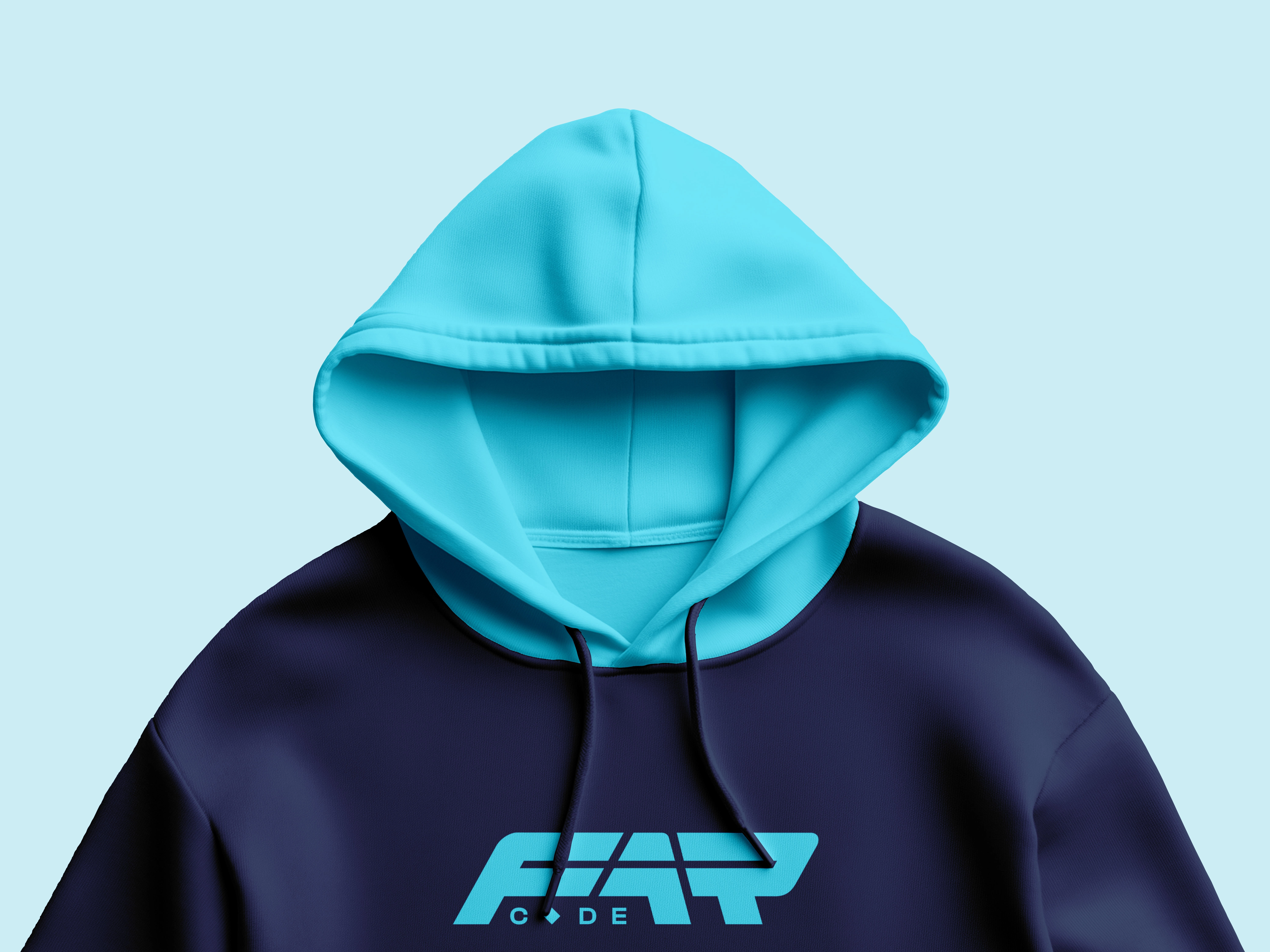
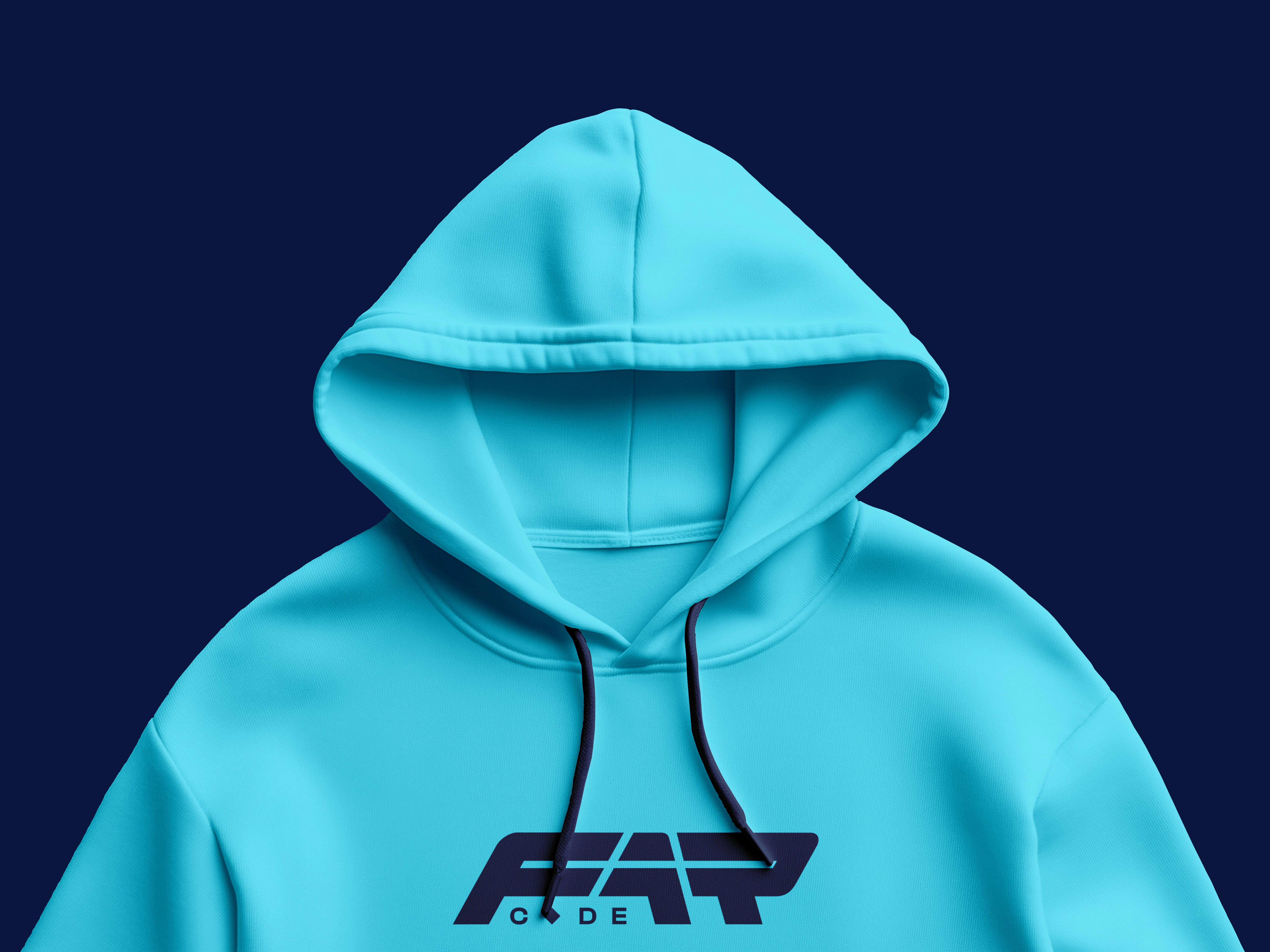
Merchandise was where the "restrained palette + one strong pattern" strategy paid off most directly. Across totes, bags, hats, bottles, and notepads, no single item needed the full lockup, the tagline, and the pattern to still read as F.A.R Code:
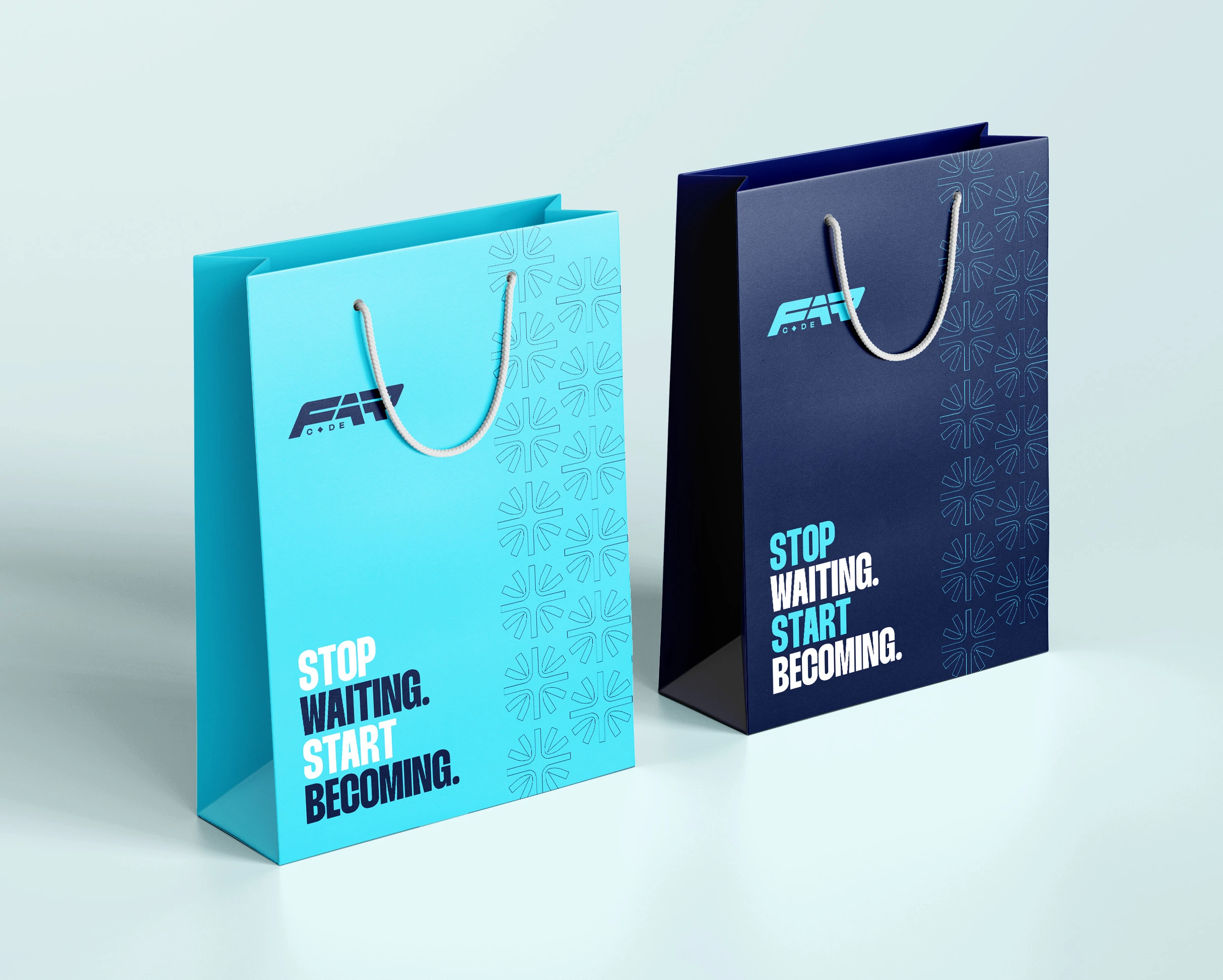
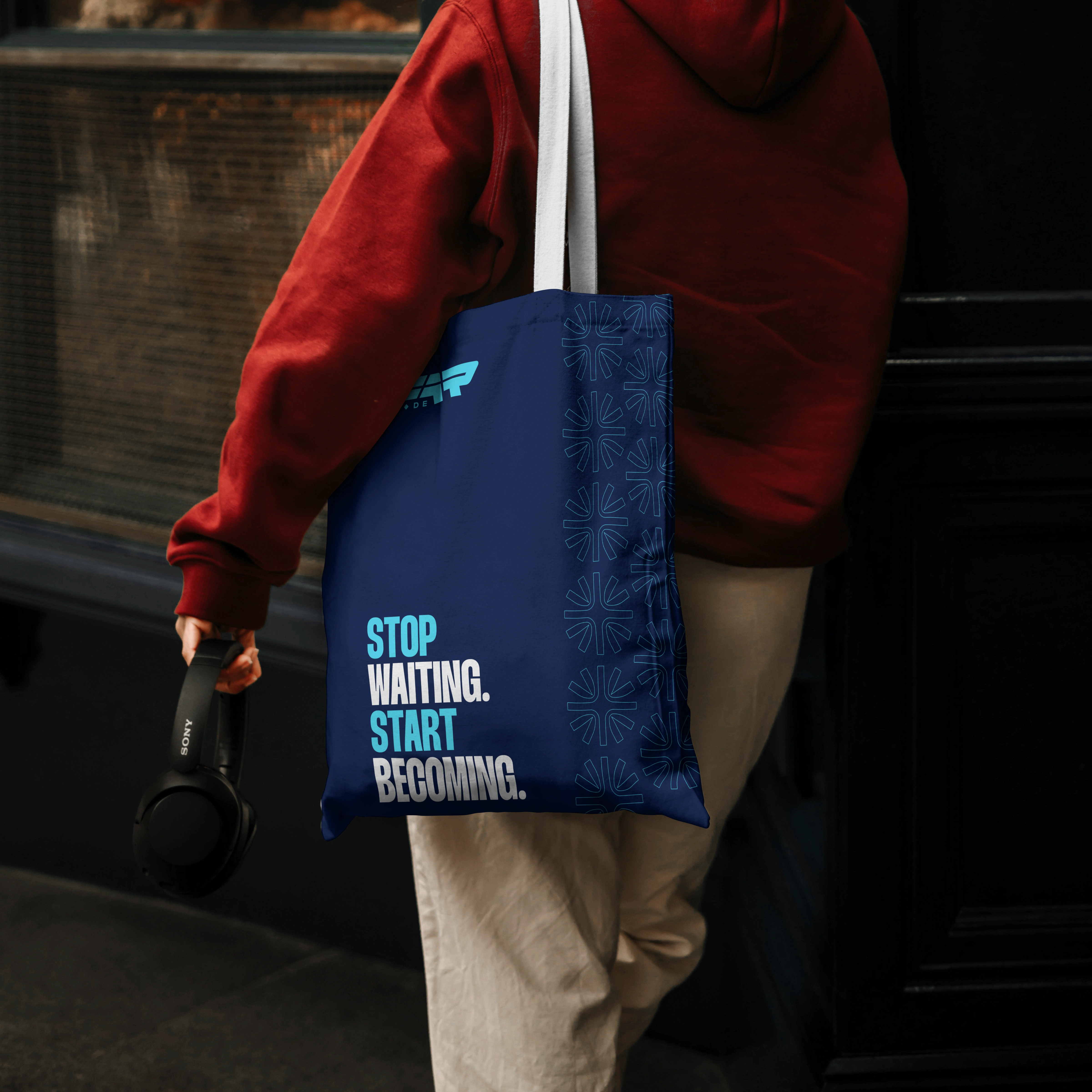
Tote & gift bags carry the logo top-left, the starburst pattern running down one edge, and the campaign line "STOP WAITING. START BECOMING." doing the emotional work produced in both cyan and navy colourways off the same layout.
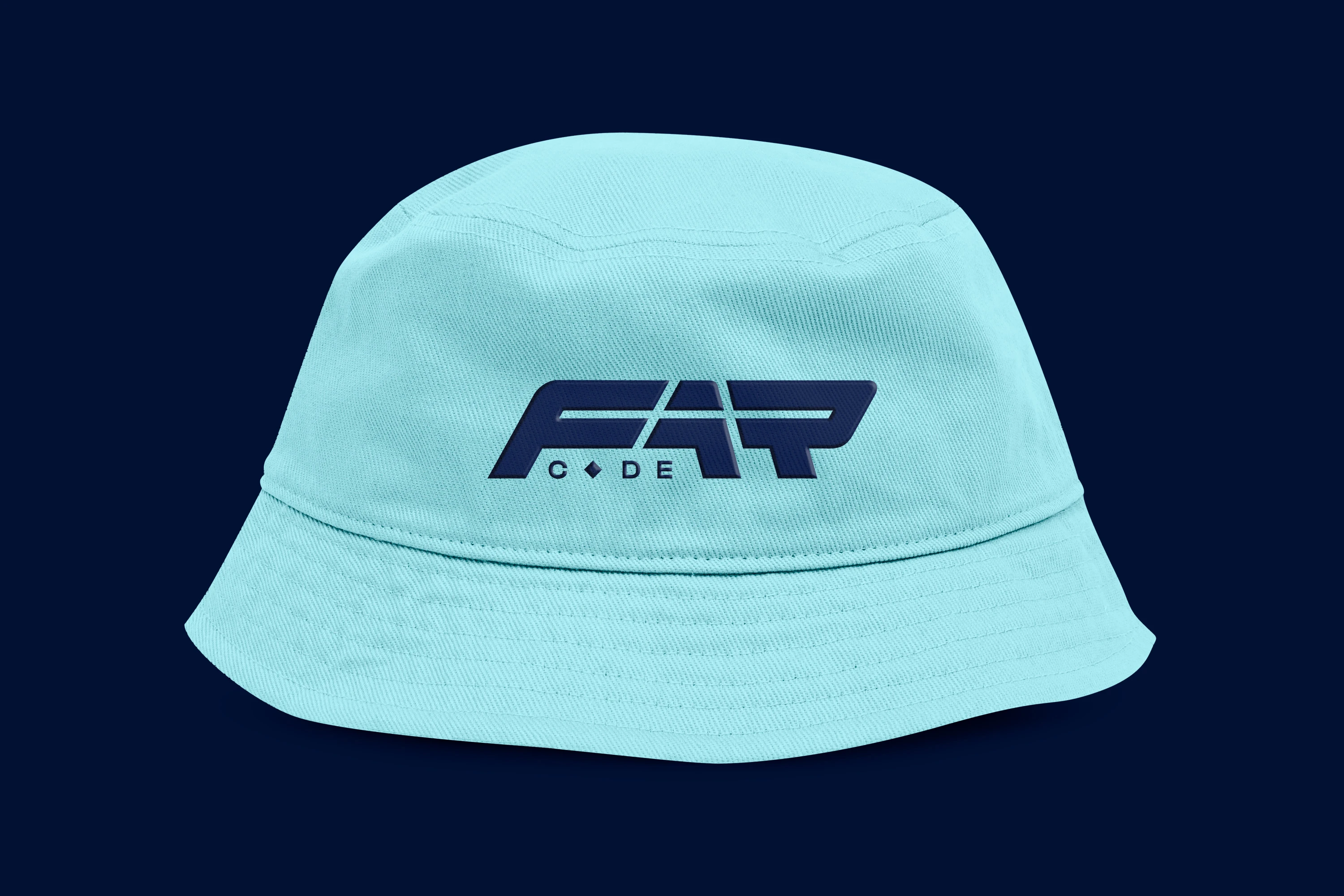
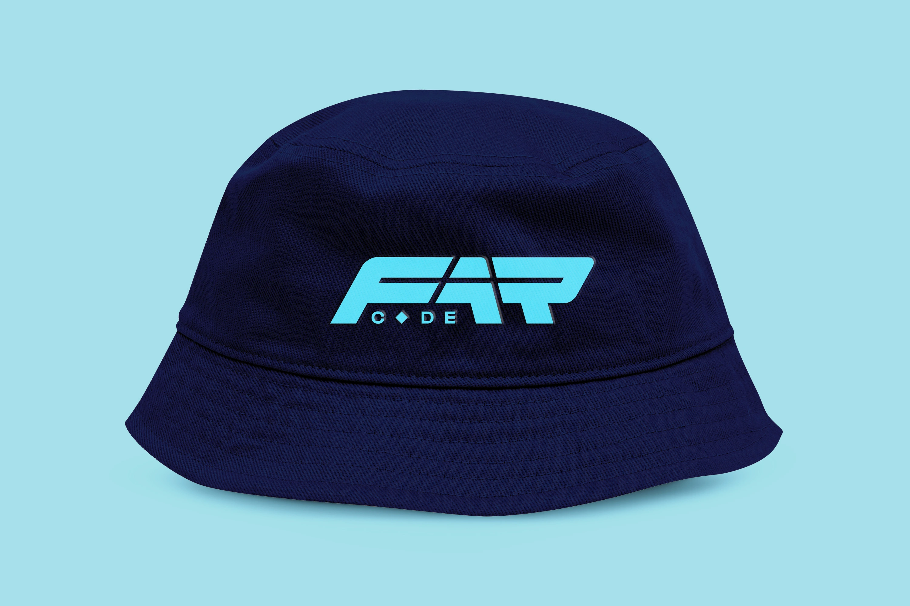
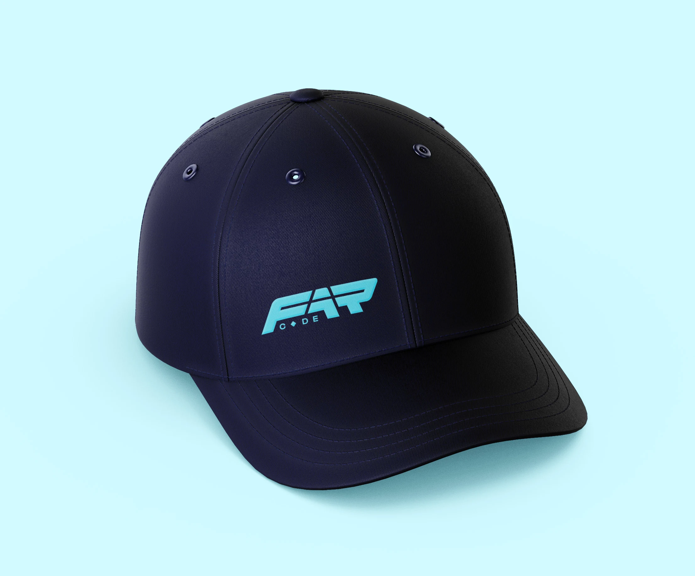
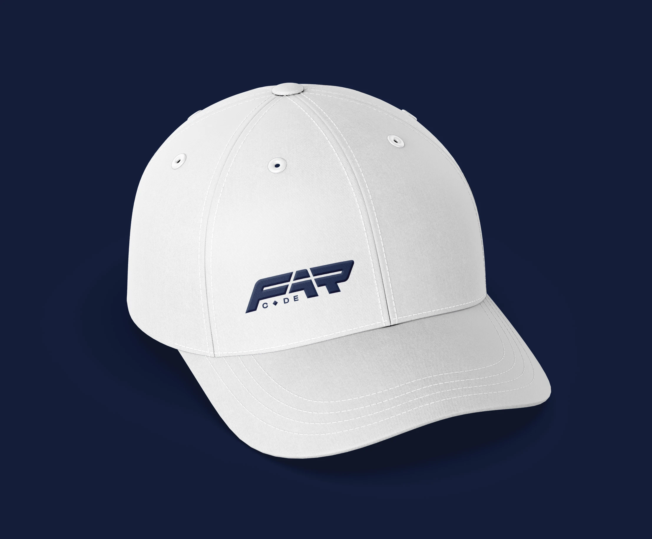
Bucket hat & baseball cap strip everything back to a single embroidered lockup - a stress test for how far the mark could be reduced and still hold its shape, which the sheared FAR letterforms were built to survive.
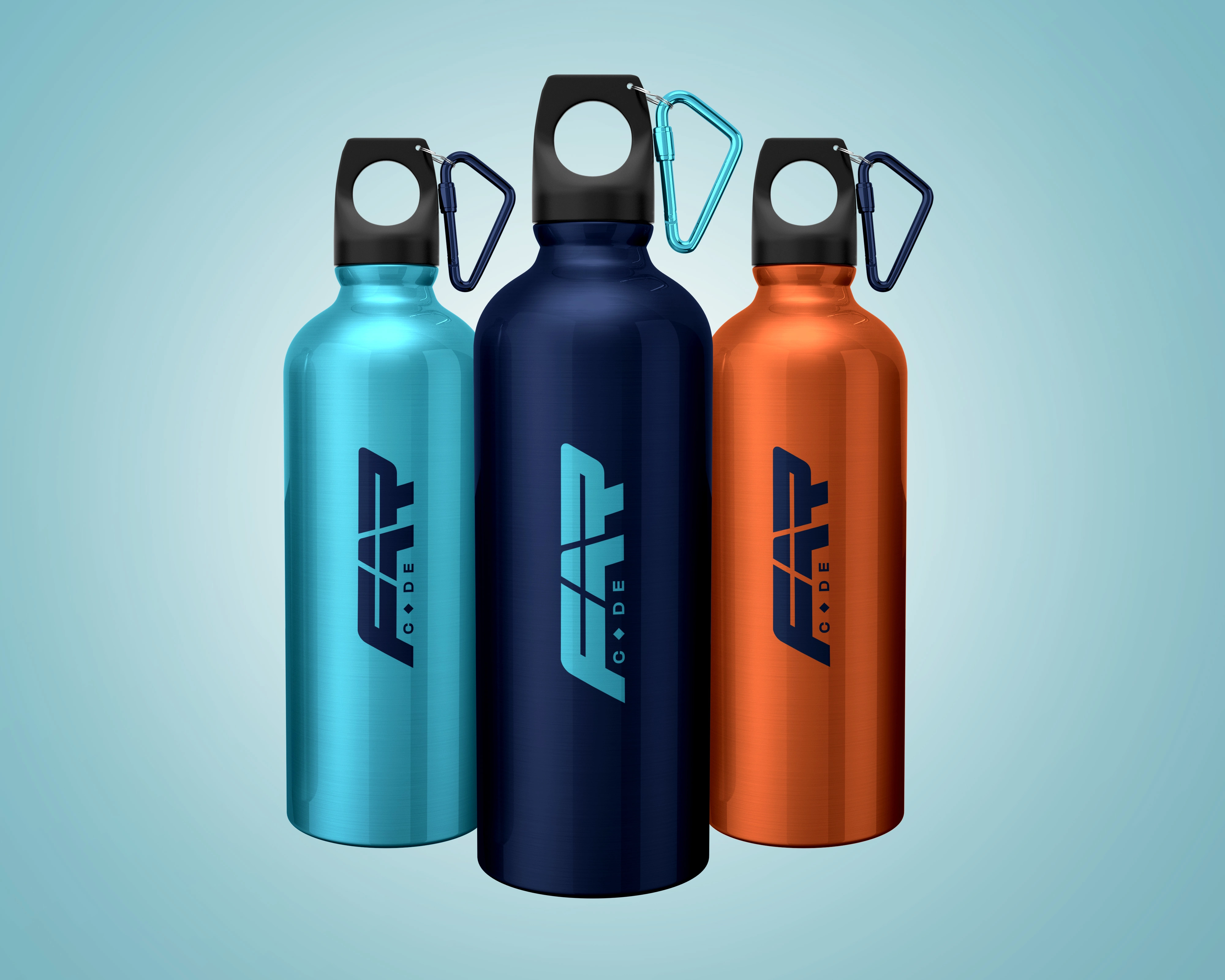
Water bottles apply the same wordmark across three brand colourways (cyan, navy, orange), turning the palette itself into the merchandise line.
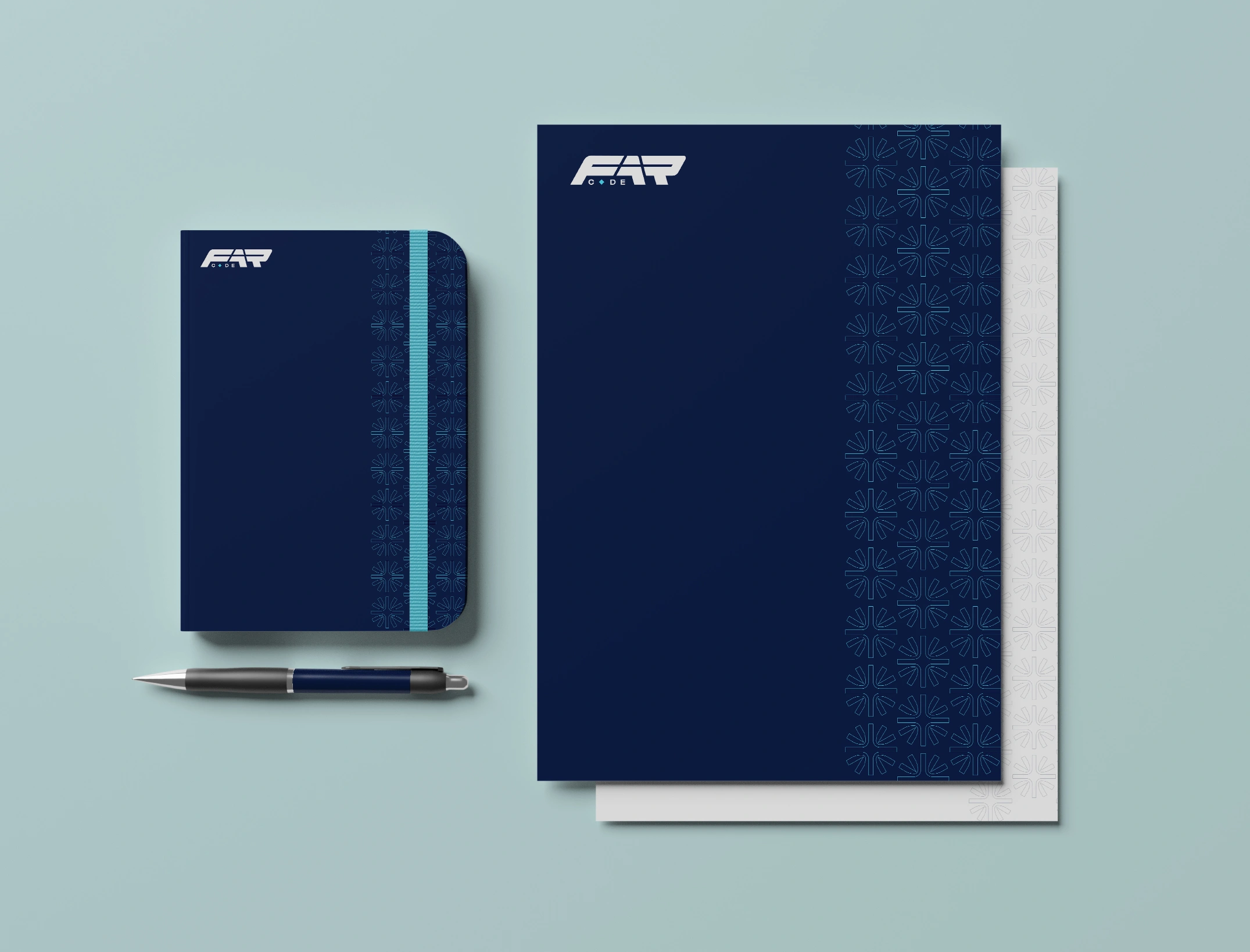
Spiral notepads extend the pattern to a stationery context in both white and navy covers, giving the brand a physical, everyday presence beyond event day.
Every item ties back to the same three ingredients; wordmark, palette, pattern - recombined at different weights depending on the format. That's what makes it read as one brand across a music-festival tote and a boardroom notepad.

8. Connecting the Dots
What holds the whole system together isn't any single asset; it's the discipline of never introducing a new colour, a new typeface, or a new decorative device without a reason that traces back to the name itself:
The diamond in "C♦DE" becomes the starburst pattern on every piece of merch - and again as the glowing 3D icons in the website hero.
The forward-leaning wordmark becomes the visual proof of "Stop Waiting. Start Becoming," repeated at full scale in the website's closing footer moment.
Cyan is reserved for "Code" energy everywhere it appears; countdown numerals, headline accents, CTA highlights, and every live/interactive element on the website, from the timer to the accordion icons.
The same footer bar (date, time, venue, Instagram handle) appears on every single piece of print and social collateral, so that whether someone sees a speaker card, a countdown post, or a partnership announcement, they land on the same essential information in the same place and the website's own sticky navigation and footer keep that same information one click away at all times.
The book, the conference, and the Allen Foundation are visually presented as one connected story rather than three separate initiatives, with the website acting as the single hub that ties the printed collateral, the merchandise, and the book launch together in one place.
That consistency is the actual deliverable of this project. Individually, each piece; the logo, the countdown post, the bucket hat, the book cover is a small design decision. Together, they're a brand system built to hold up under real production pressure: dozens of assets, multiple stakeholders, one live event date, and every single output still unmistakably F.A.R Code.
9. Deliverables Summary
Logo & Brand IdentityPrimary wordmark (5 colour states), circular badge lockup, colour palette, typography system, starburst brand pattern
Website / Digital ExperienceFull responsive conference website, designed & built in Framer; animated hero with live countdown, interactive audience selector, scroll-driven "What to Expect" path, speaker carousel, detailed multi-session agenda builder, FAQ accordion, partner grid, hosting team section, ticket/registration module
Event BrandingKey visual (2 layouts), countdown series (10-day run), speaker announcement templates (Convener/Featured/Speaker/Host tiers), stage backdrop, step-and-repeat banner
Print & SocialVolunteer & partnership recruitment flyers, partnership announcement templates, book launch tie-in graphics
Swag/MerchandiseTote bags, gift/shopping bags, bucket hat, baseball cap, water bottles
StationerySpiral notepads (2 colourways)
PublishingF.A.R. book cover design.
GOT AN EVENT COMING UP? LET'S TALK!
Like this project
Posted Aug 4, 2026
Full brand identity and design system for a first-edition Toronto conference: logo, colour palette, event collateral, speaker templates, countdown series, swag line, book cover, and a fully interactive Framer-built website.
Likes
1
Views
14