360° Brand Transformation for Project Scope 360
Isaac Blake Tile
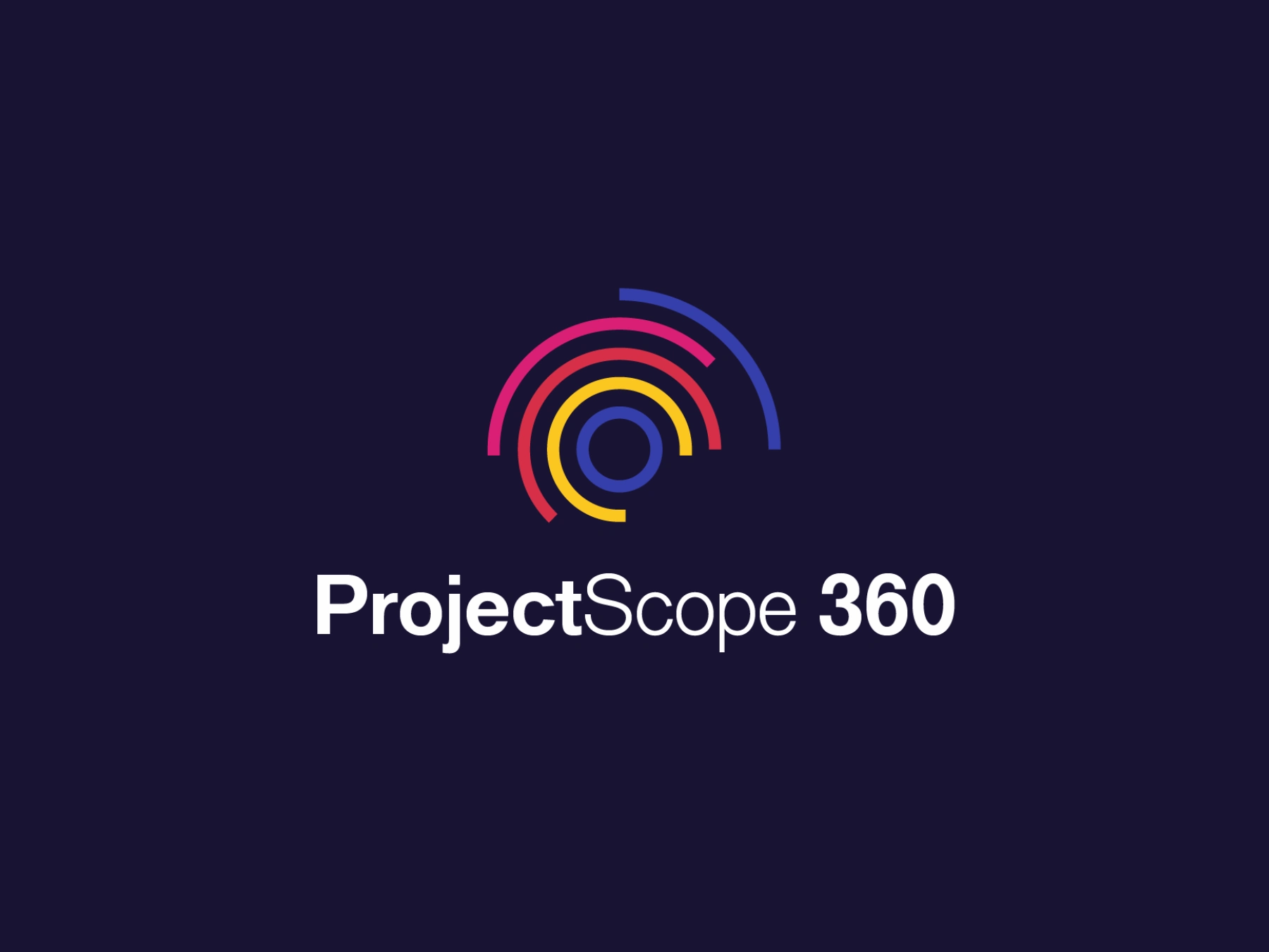
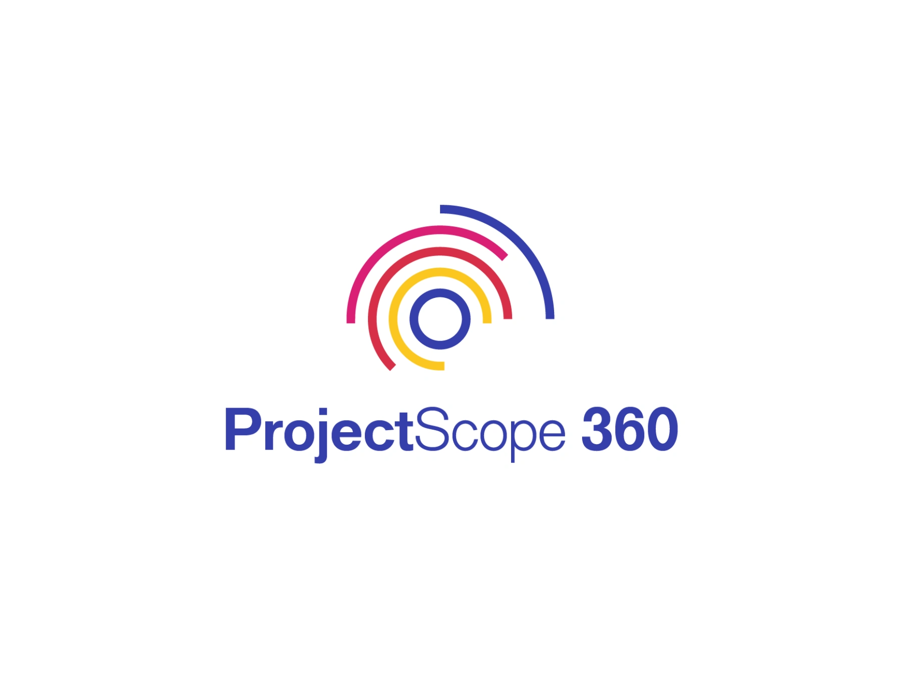
PROJECT SCOPE 360
Brand Identity Design, Brand Guidelines & Website Development
Project Type: Brand Strategy, Identity Design, Web Design
Timeline: 5 Weeks
Location: Ontario, Canada
PROJECT OVERVIEW
Project Scope 360 is a project management training and consulting firm that needed a complete brand transformation to compete in the competitive PMP certification market. This project unified brand strategy, visual identity design, comprehensive guidelines, and conversion-optimized web development into a cohesive system that positions the brand as both a credible educator and a lifelong professional partner.
BRAND STRATEGY
The Challenge
The project management certification space is dominated by institutional players with cold, corporate visual languages. Project Scope 360's core differentiator—their 360° support model from initial interest through certification to career advancement—needed to be embedded into every brand touchpoint.
Strategic Positioning
Brand Concept: "Full Circle Project Solutions"
The positioning centers on comprehensive, human-centered support that transcends traditional training boundaries. Unlike competitors who end at course completion, Project Scope 360 partners with clients throughout their entire professional journey.
Positioning Triad:
Expertise – Professional credibility through PMI certification and proven methodologies
Partnership – Human connection and ongoing support beyond the classroom
Results – 100% success rate backed by structured accountability
Market Position
Premium-accessible: High-quality training without institutional rigidity. The brand needed to communicate professional authority while remaining warm and approachable—a sophisticated balance that informed every design decision.
Brand Personality Dimensions:
Formal yet approachable (70/30 lean)
Progressive over traditional (85/15 lean)
Balanced accessible-serious (55/45)
Simple over complex (60/40 lean)
This dimensional positioning prevents the brand from feeling one-dimensional while maintaining consistency across applications.
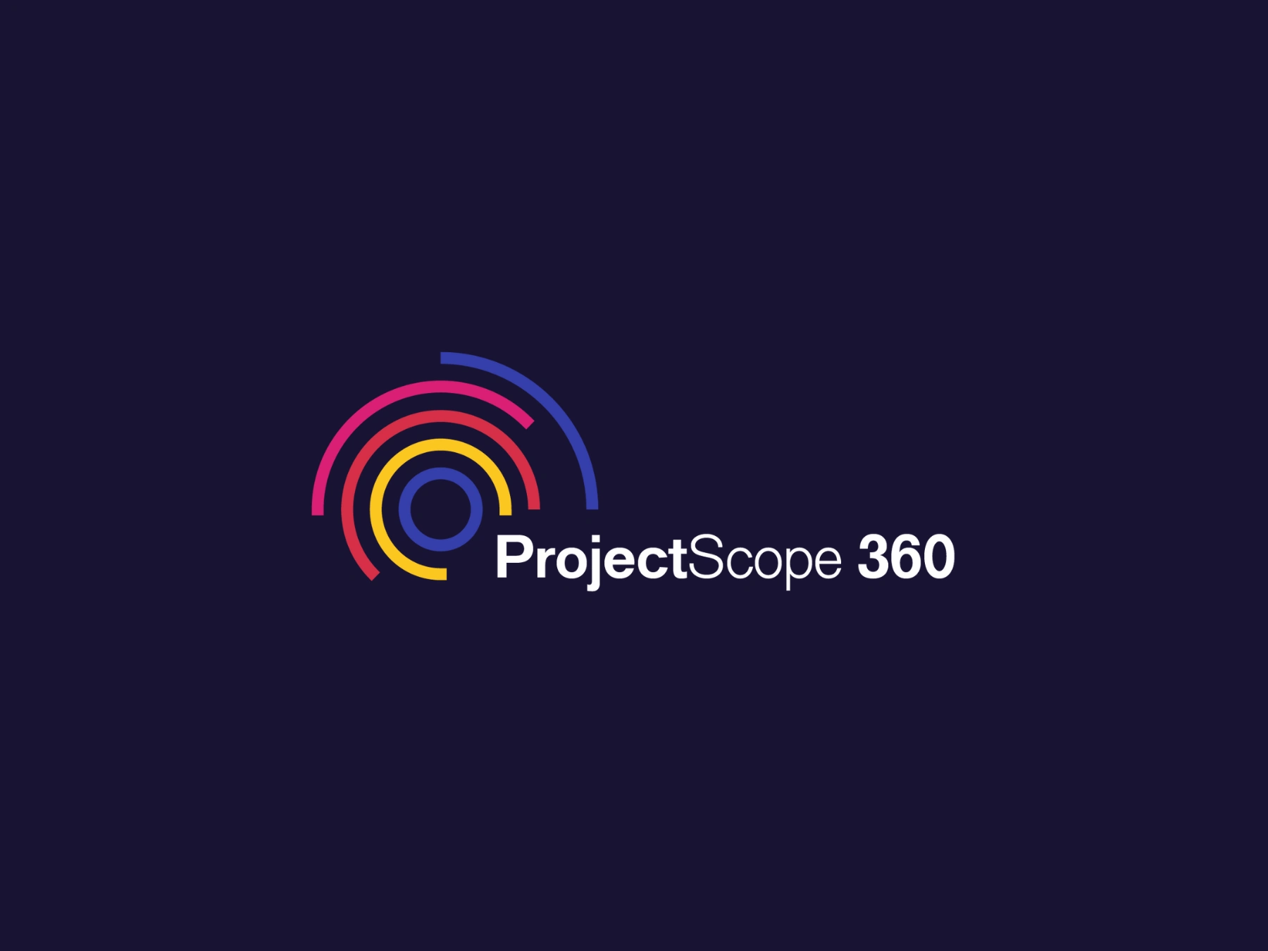
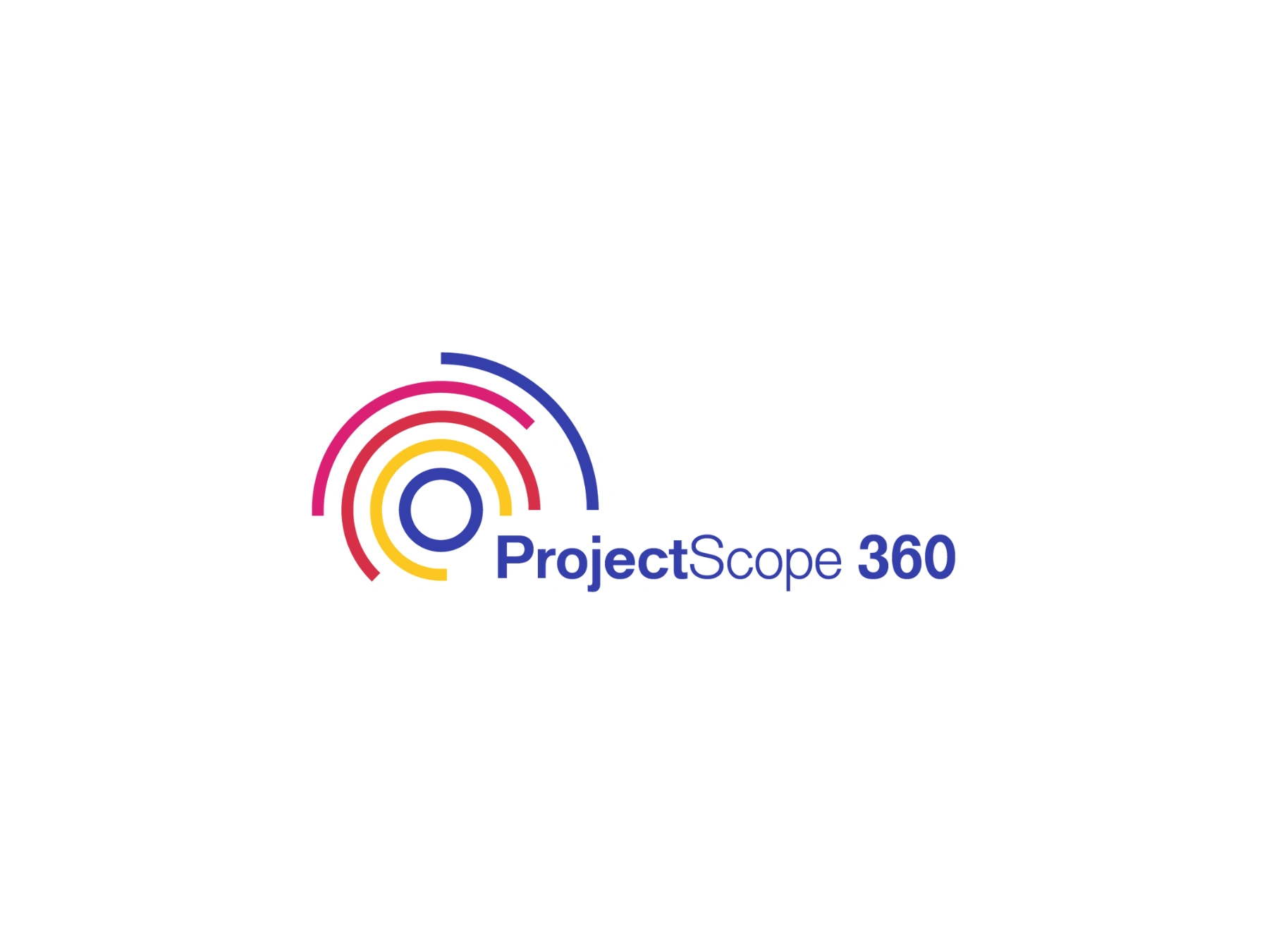
LOGO & IDENTITY DESIGN
Mark Construction & Symbolism
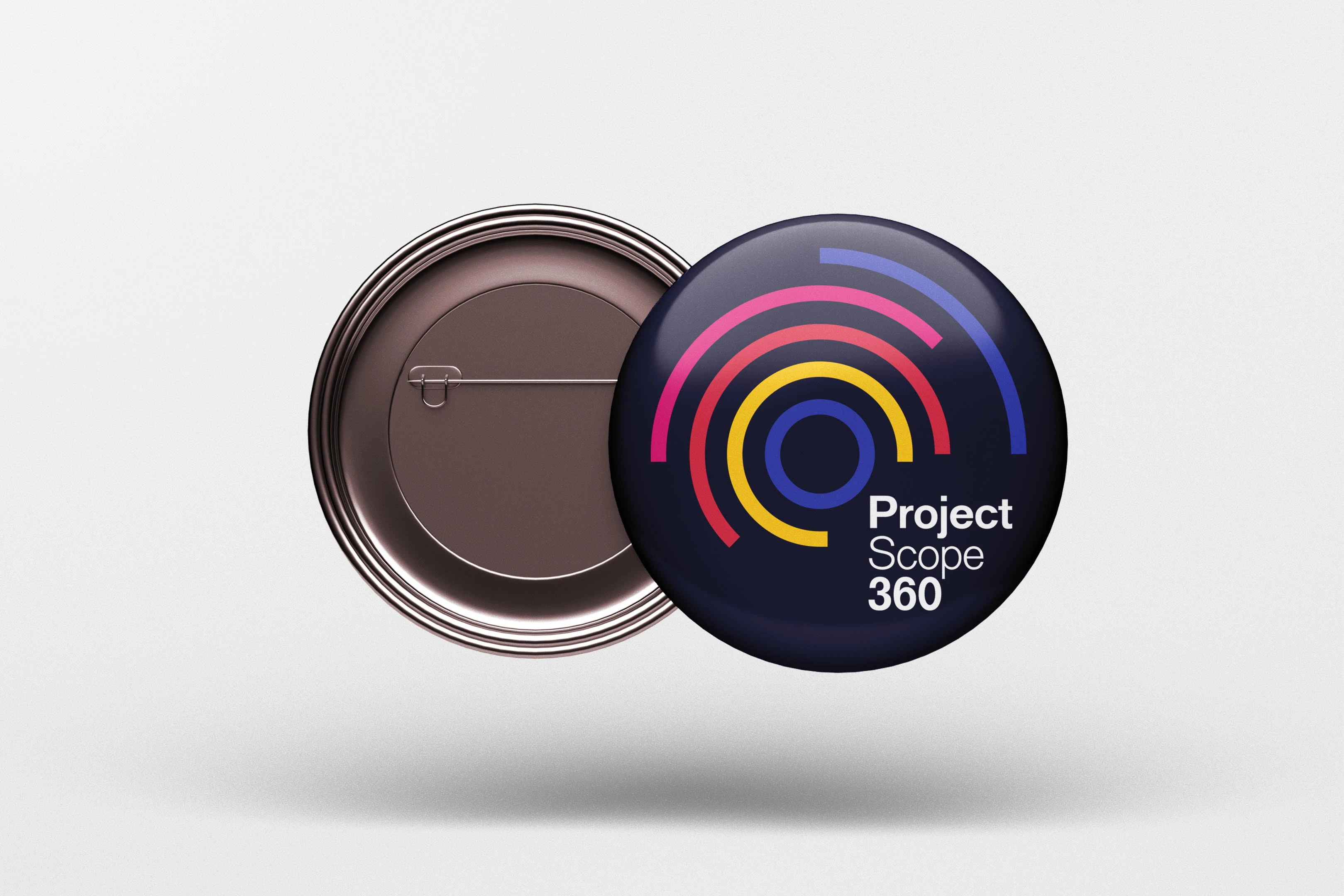
The Project Scope 360 logo is strategic symbolism executed with geometric precision.
The Circular Framework:
The dominant circular element isn't decorative—it's a direct visualization of the "360" brand promise. The circle represents completeness, cyclical support, and comprehensive coverage. Segmented sections within the circle symbolize:
Structured phases of project management
Multiple touchpoints in the client journey
Integration of training, consulting, and support services
Geometric Precision:
Sharp angles and clean intersections within the circular frame communicate the structure, clarity, and precision essential to project management discipline. The geometric language balances:
Professional authority (sharp, defined edges)
Approachability (circular, continuous flow)
Systematic thinking (organized segments)
Wordmark Treatment:
The typography uses Classic Sans—a contemporary sans-serif that bridges corporate authority with modern accessibility. The "360" receives distinctive emphasis through color contrast and spatial separation, ensuring the brand promise is immediately recognizable.
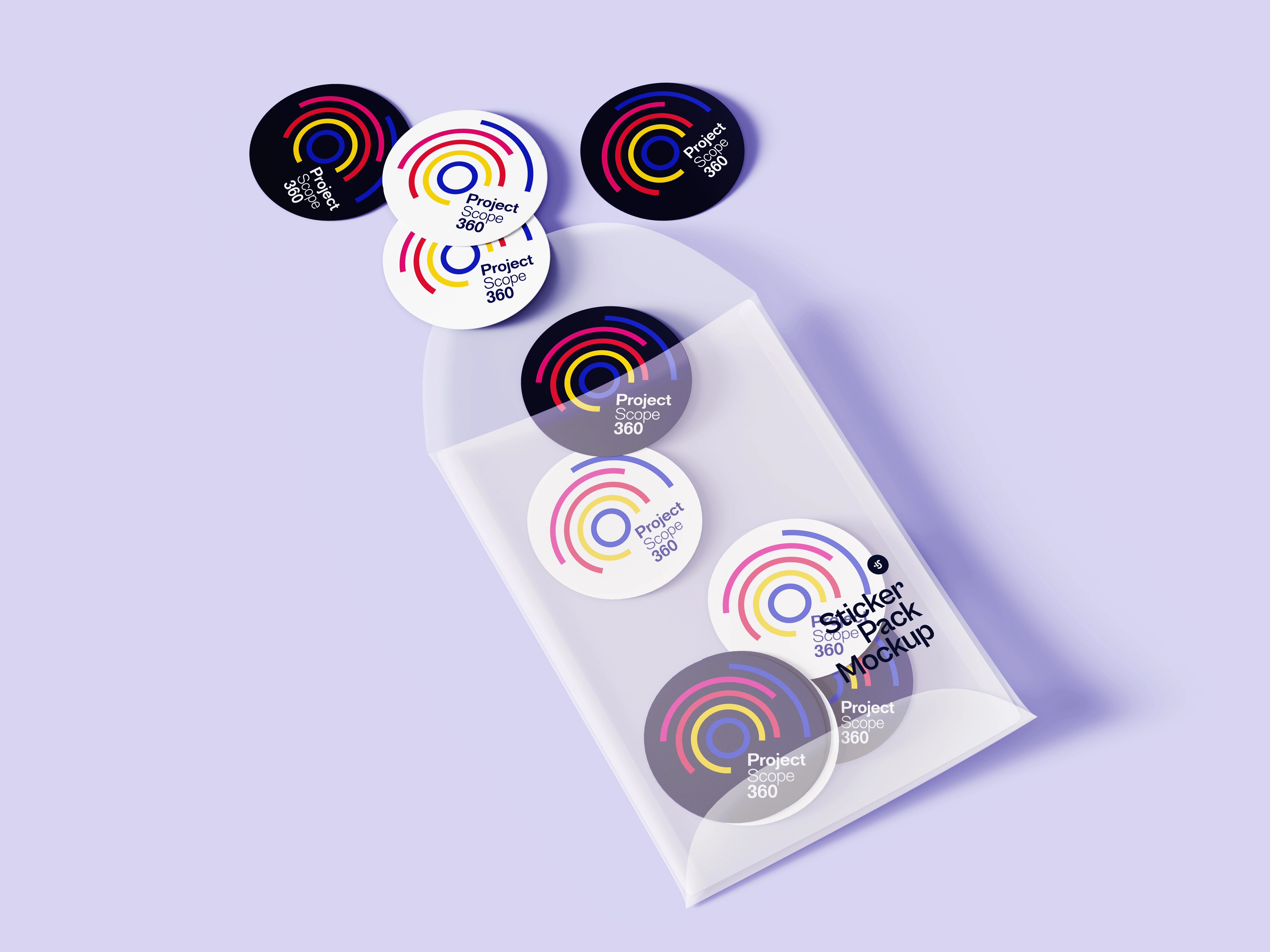
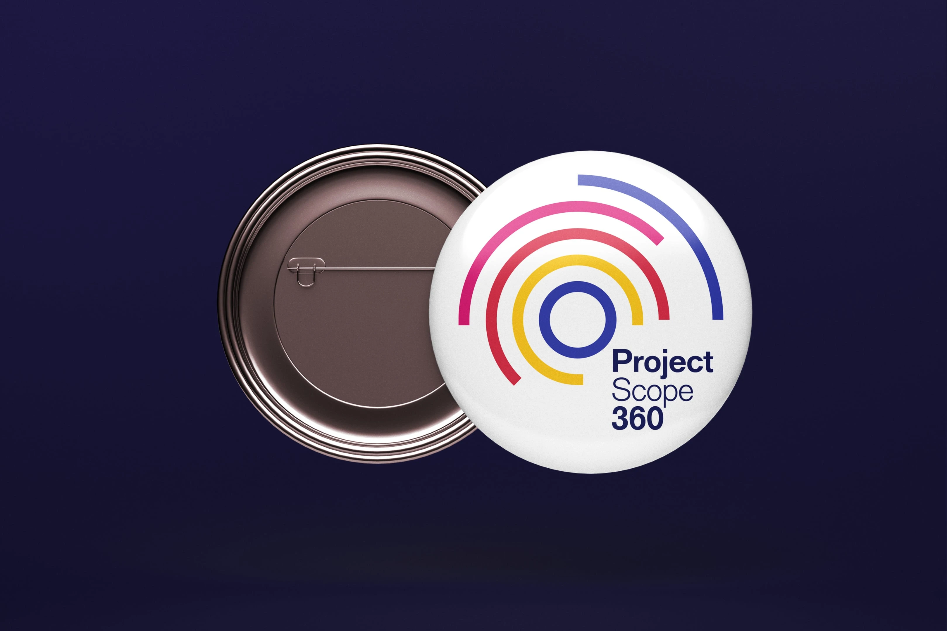
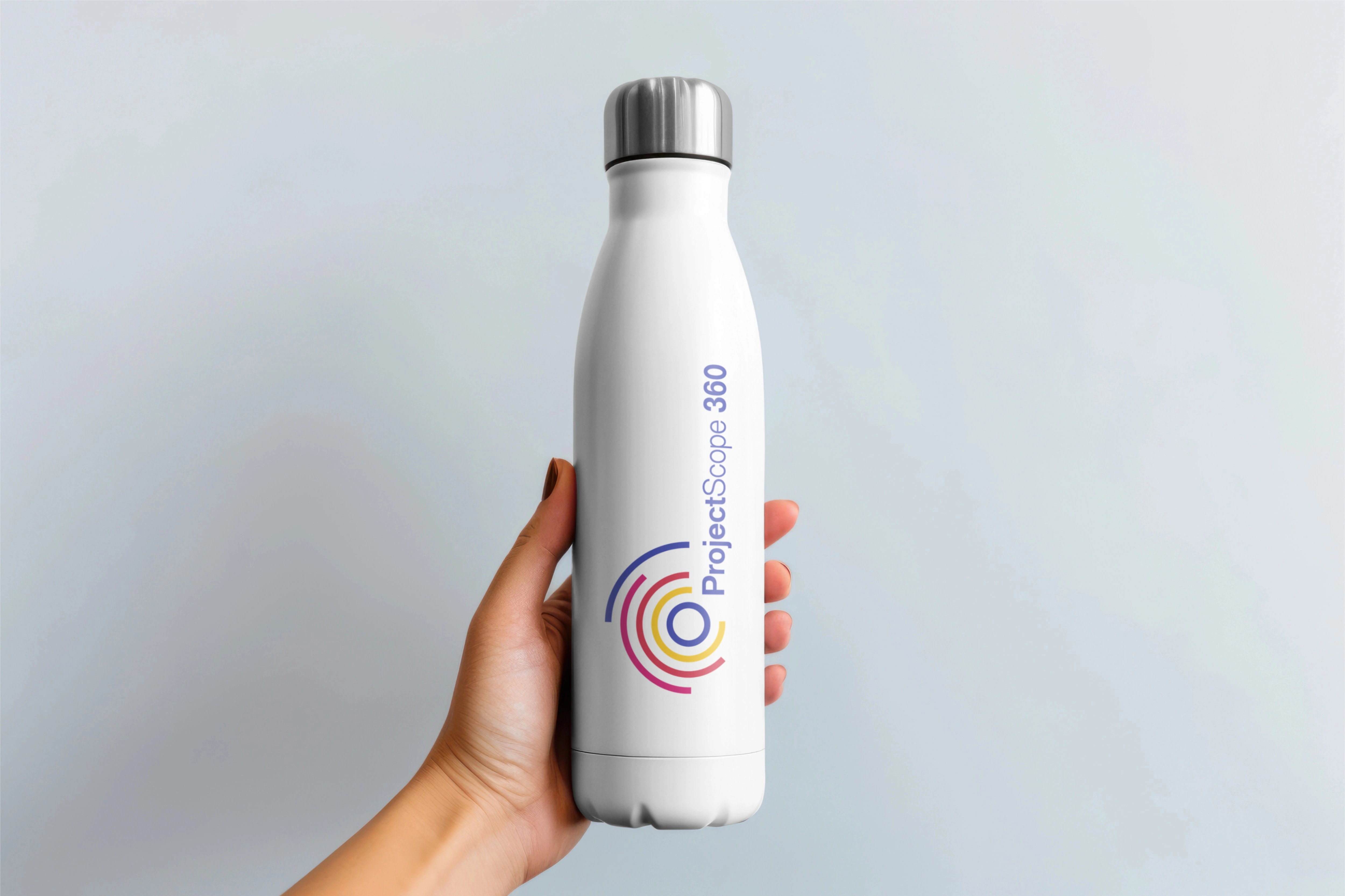
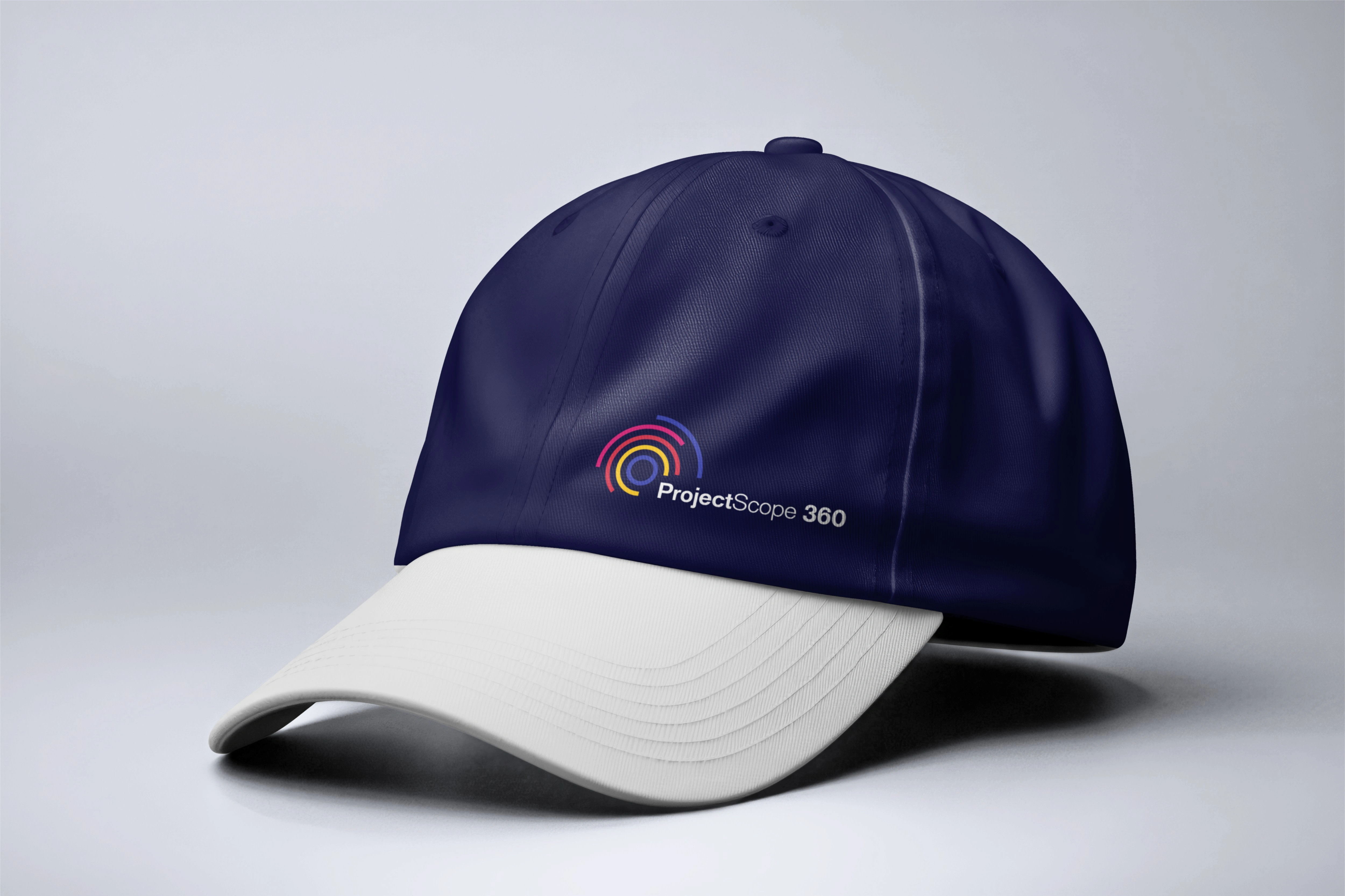
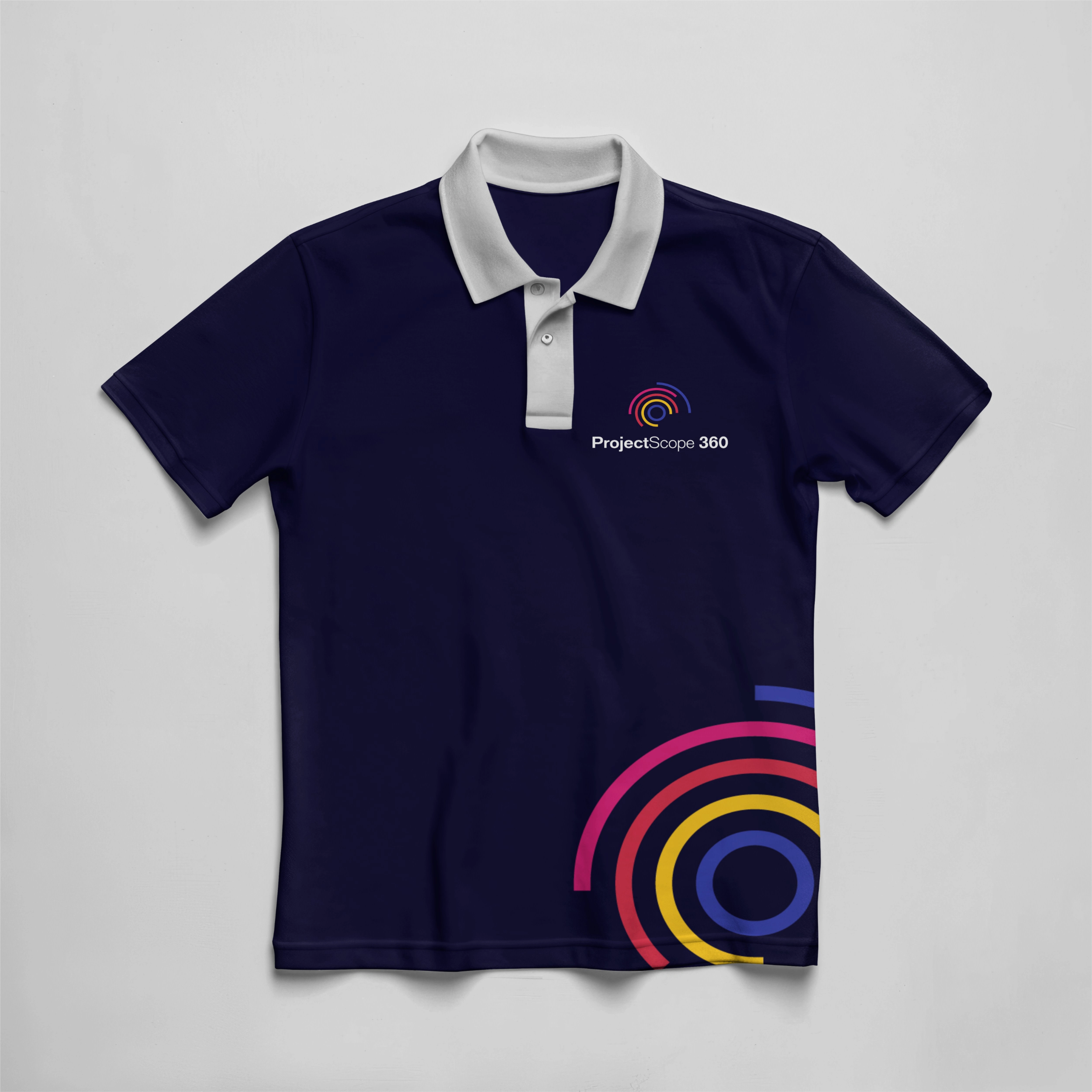
Logo System Versatility
Three core configurations ensure brand consistency across all touchpoints:
Landscape Logo – Primary application for websites, presentations, documents
Portrait Logo – Optimized for vertical formats, social media, print materials
Icon Mark – Simplified circular element for app icons, favicons, profile images
This systematic approach maintains legibility and impact at all scales, from business cards to billboards.


Color Palette: Strategic Psychology
Each color serves distinct strategic and psychological functions:
Deep Navy Blue (#16122F) – Brand anchor
Communicates professional authority, expertise depth, and trustworthy stability. Navy grounds the brand in credibility without corporate coldness.
Vibrant Blue (#353DAA) – Energy and clarity
Introduces forward momentum, innovation, and precision. Differentiates from institutional competitors.
Strategic Red (#D62F48) – Action and achievement
Reserved for CTAs, success metrics, and goal-oriented messaging. Creates urgency and drives conversion.
Optimistic Yellow (#FCC721) – Warmth and partnership
Brings human connection, learning energy, and accessibility. Prevents over-corporate perception.
Accent Pink (#D91F74) – Modern differentiation
Adds unexpected sophistication and creative problem-solving energy. Breaks institutional conventions.
Neutral System – Hierarchy and structure
Six neutral values (
#000000 to #F2F2F2) provide content hierarchy and ensure information clarity across complex educational materials.The guidelines specify exact tint variations (100%, 80%, 60%) for each primary color, ensuring consistent visual hierarchy and WCAG-compliant accessibility.
Typography: Single-Family Sophistication
Classic Sans Family
Rather than multiple typefaces, the single-family approach creates sophisticated consistency:
Bold weights for confident headers
Regular weights for readable body text
Medium weights for balanced UI elements
Classic Sans occupies the strategic intersection of contemporary, professional, and accessible—avoiding both academic stuffiness and tech startup casualness.
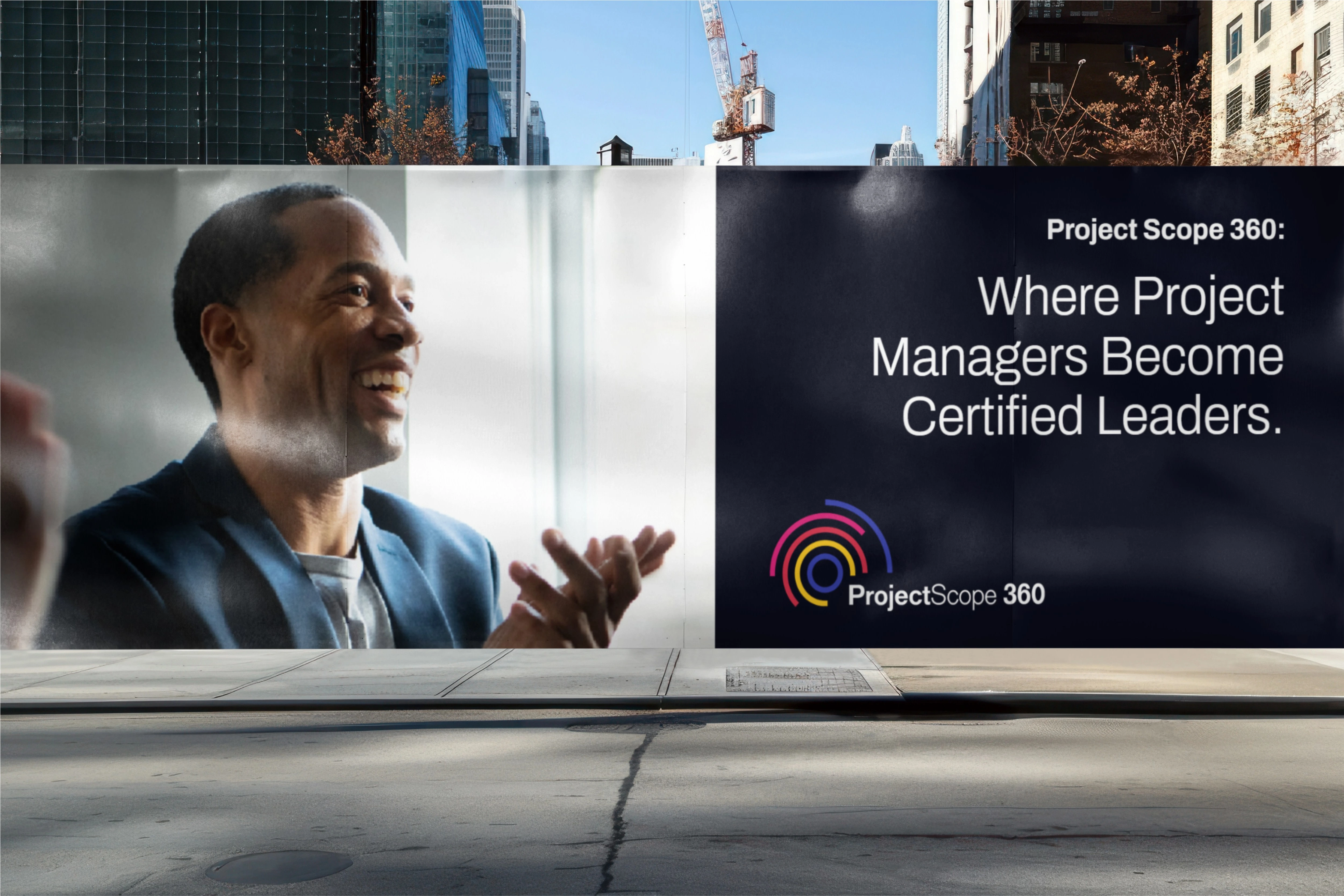
Imagery Direction
Photography Style: Human-centric, bold, corporate-leaning, warm
Execution Principles:
Every image centers actual people (students, professionals, teams)
Professional settings establish credibility (offices, business environments)
Natural lighting and genuine expressions prevent sterility
High contrast and confident compositions convey boldness
This approach ensures imagery supports the brand's dual promise: professional competence and human partnership.
BRAND GUIDELINE
Comprehensive Design System
The brand guidelines document demonstrates design system mastery through systematic documentation of every brand element and application rule.
Logo Usage Standards:
Precise clear space specifications around all logo variations
Minimum size requirements for print and digital
Four-corner display system for consistent layout placement
Prohibited usage examples (distortion, poor contrast, improper spacing)
Color Application Rules:
Primary and neutral palette definitions with exact hex codes
Tint system (100%, 80%, 60%) for hierarchical flexibility
Color pairing guidelines for optimal contrast and harmony
Usage scenarios (backgrounds, text, accents, CTAs)
Typography System:
Font family specifications and licensing information
Size scales for headers, subheads, body text, captions
Line height and spacing standards for optimal readability
Hierarchy demonstrations across different content types
Imagery Guidelines:
Photography style parameters and selection criteria
Do's and don'ts with visual examples
Tone and mood specifications
Treatment and filter recommendations
Scalable Application Templates
The guidelines showcase practical applications across:
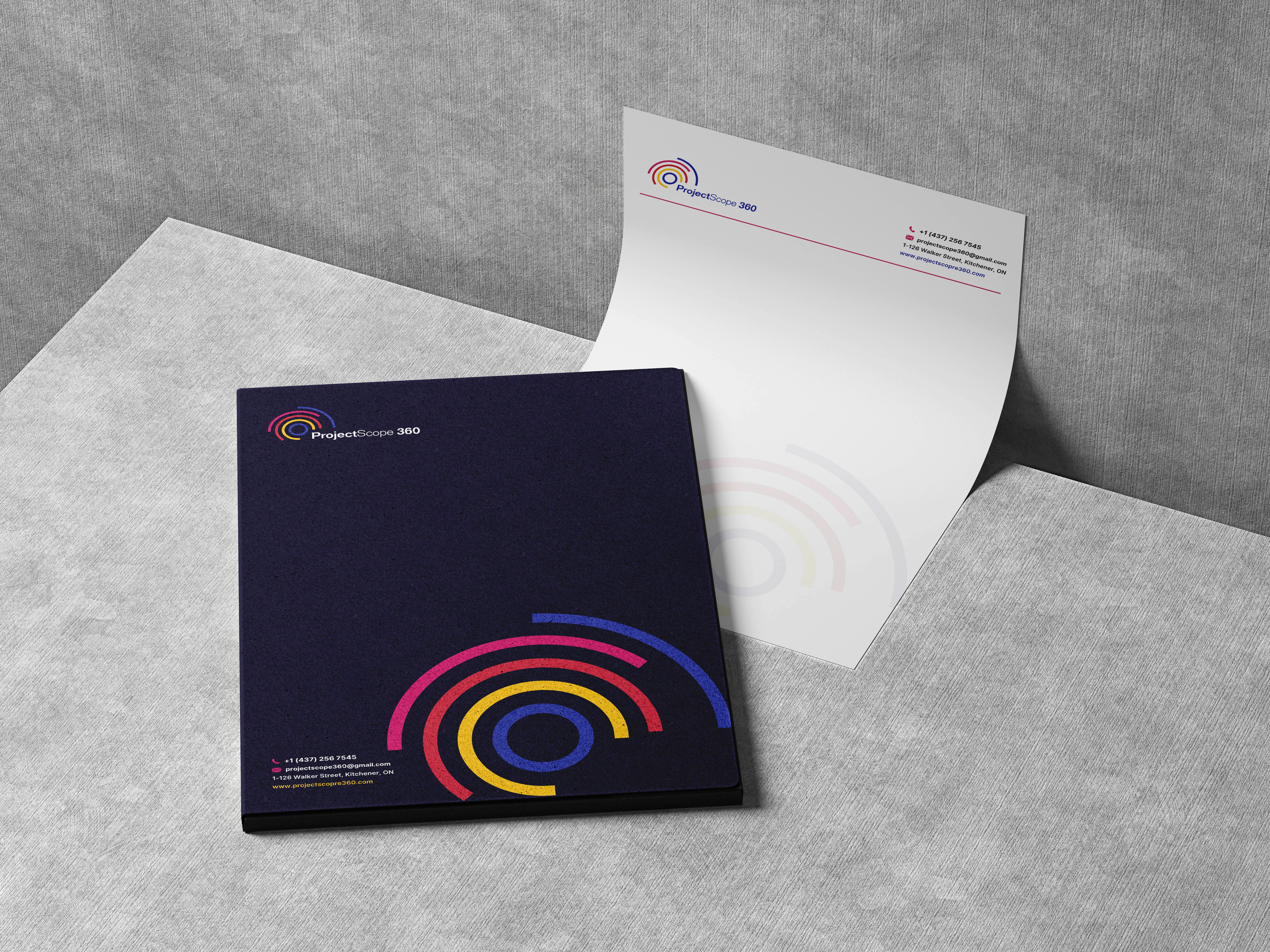
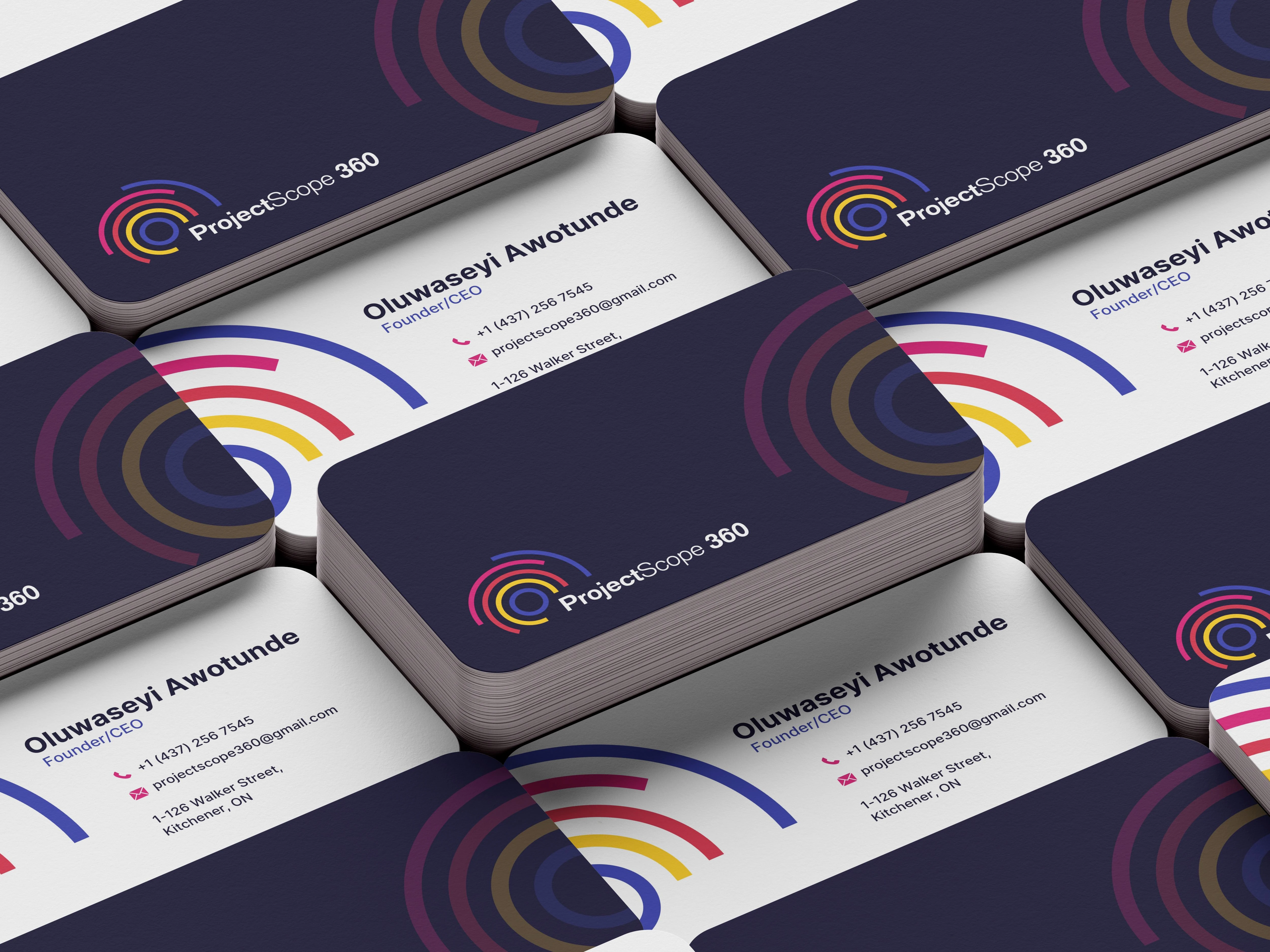
Corporate Materials: Business cards, letterheads, envelopes, presentation templates
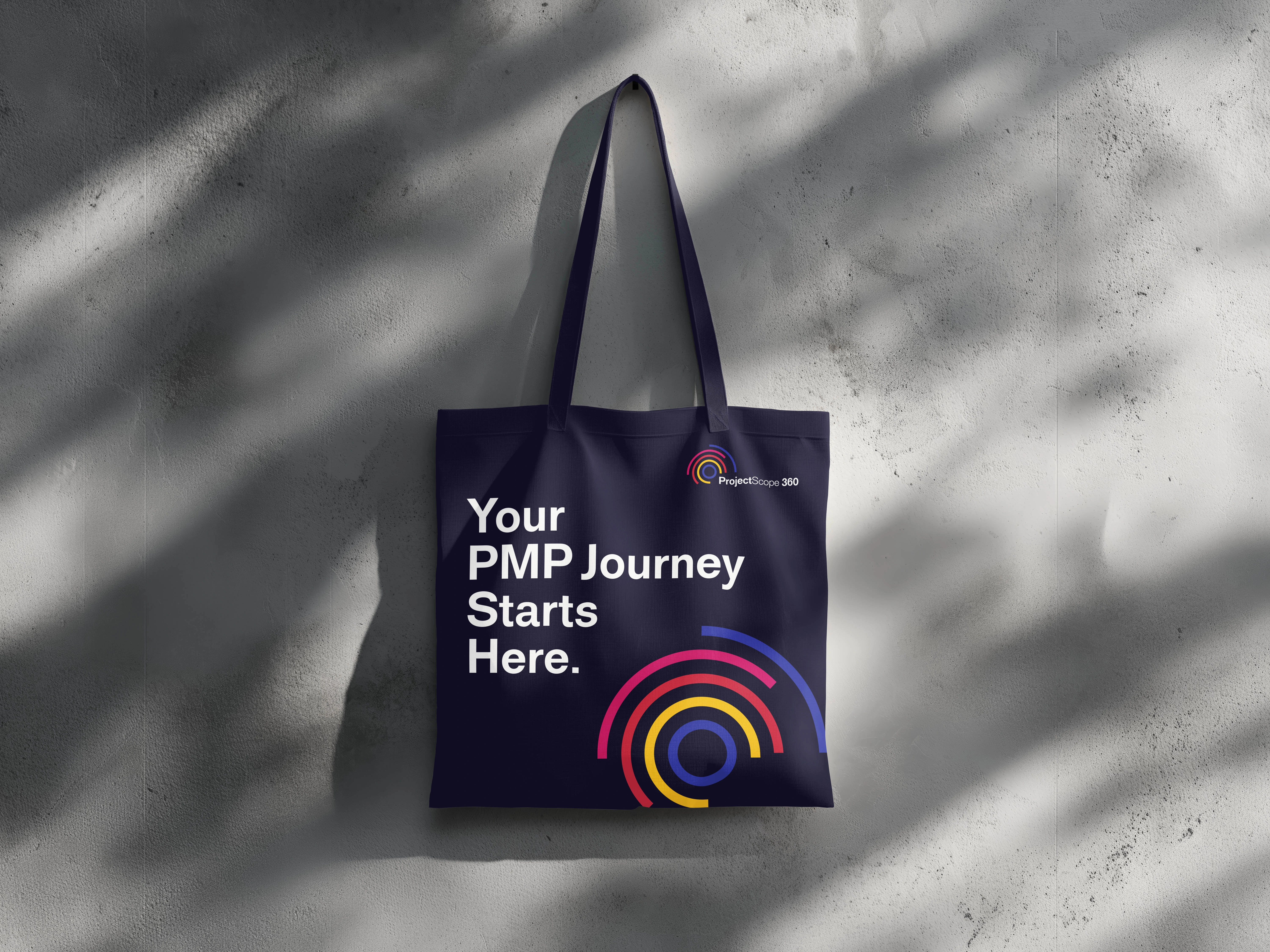
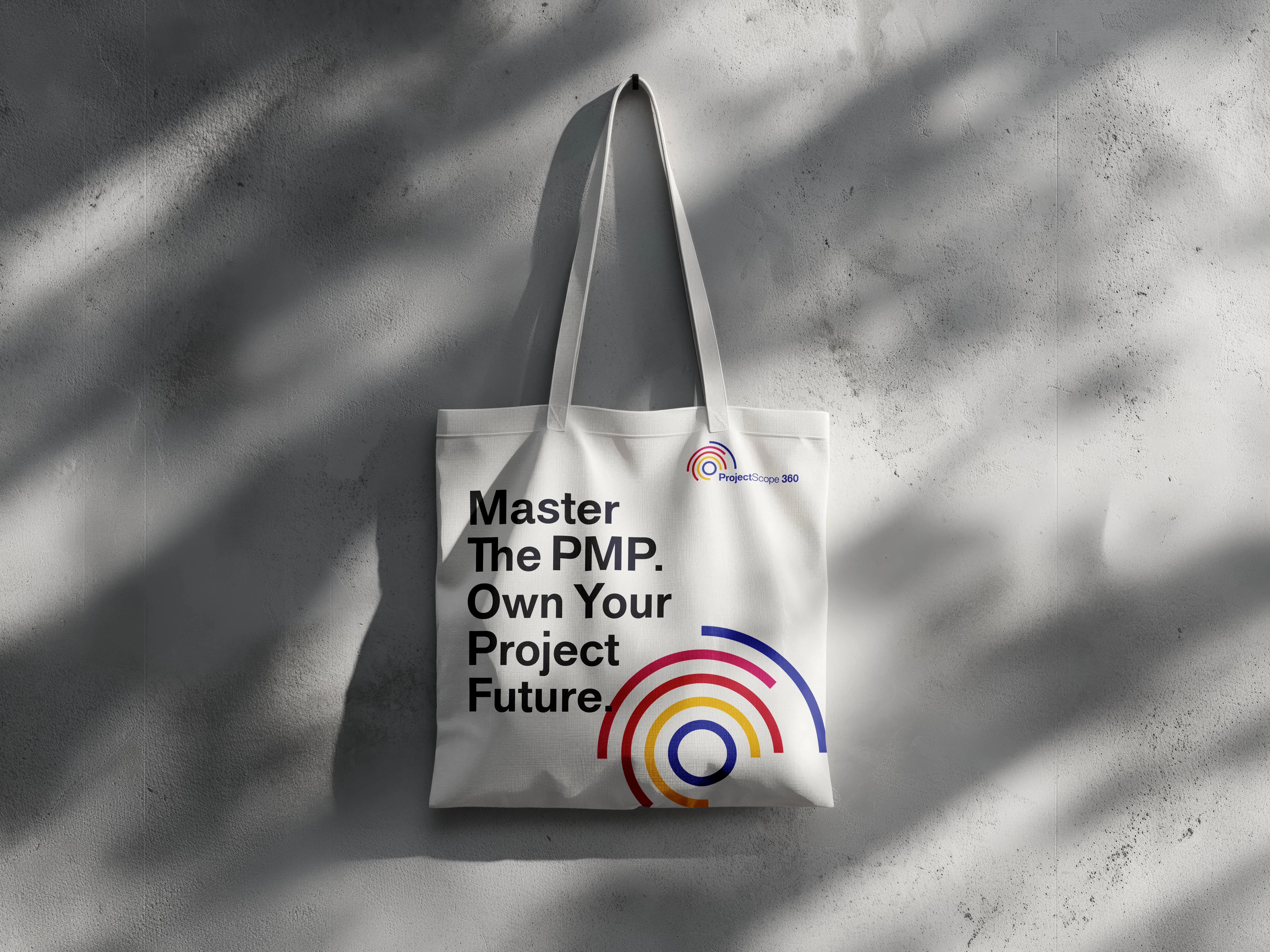
Marketing Collateral: Brochures, flyers, banners, advertisements
Digital Assets: Social media graphics, email templates, web banners
Educational Materials: Course workbooks, certificates, training guides
Each template maintains:
Consistent color relationships
Hierarchical typography
Strategic white space
Brand voice alignment
System Benefits
This comprehensive approach ensures:
Consistency – Brand looks cohesive across every touchpoint
Efficiency – Team members can create on-brand materials independently
Scalability – System grows with the business (new courses, markets, services)
Quality Control – Clear standards prevent brand dilution
Professional Perception – Systematic application builds trust and credibility.
WEBSITE DESIGN
Strategic Architecture
The website serves three critical functions simultaneously:
Portfolio showcase – Demonstrating consulting and training services
Lead generation engine – Converting visitors to course enrollments
Trust-building platform – Establishing credibility through founder story and testimonials
Design Execution & User Experience
Hero Section:
Immediately establishes value with bold headline: "Master PMP. Transform Your Career."
Trust badges (100% Success Rate, PMI Certified Trainers, Post-Certification Support) create instant credibility.
Dual CTAs provide clear paths: "Start Your PMP Journey" (primary) and "Download Free Brochure" (secondary).
Founder's Story Integration:
Personal narrative creates emotional connection, transforming the brand from faceless institution to relatable guide. The story follows proven structure: struggle → discovery → transformation → mission.
Social Proof Strategy:
Testimonials with professional photography and credentials positioned throughout scroll depth. Success stories validate the 100% pass rate claim with real human faces and names.
Course Presentation:
Card-based layouts for three service tiers:
PMP Certification Bootcamp (primary offering)
Corporate Project Management Training (B2B offering)
Consulting & Advisory (ongoing engagement)
Each card includes: duration, format, price, key benefits, and dual CTAs (enroll + learn more).
Process Visualization:
Four-step journey ("From Intent to Impact") reduces perceived complexity:
Discovery Call
Enroll & Begin
Learn & Practice
Pass & Advance
Clear, numbered progression builds confidence in the structured approach.
Trust Building Section:
Three-column layout highlighting:
Certifications & Affiliations (PMI authorization)
Instructor Credentials (10+ years experience)
Money-Back Guarantee (risk reversal).
Conversion Optimization
Strategic CTA Placement:
Above the fold (immediate action)
After founder story (emotional peak)
Following social proof (validation)
Post-FAQ section (objection handling)
Final footer push (last opportunity)
Information Hierarchy:
Typography scale and color emphasis guide eye movement toward conversion points. Red accents on primary CTAs create urgency without aggression.
FAQ Section:
Accordion-style answers address common objections:
Experience requirements (none needed)
Pass rate transparency (100%)
Support guarantee (continued until you pass)
PMI approval (yes, 35 contact hours)
Payment flexibility (installments available)
Post-certification value (lifetime community access)
Technical Excellence
Platform: Framer
Performance Features:
Mobile-responsive design (optimized for all devices)
Smooth scroll animations and micro-interactions
Lazy-loaded imagery for fast page speed
SEO-optimized structure and meta content
Google Analytics integration for conversion tracking
SSL security for payment processing
Responsive Design: The design maintains integrity across breakpoints:
Mobile-first navigation with hamburger menu
Touch-optimized button sizes and spacing
Adaptive typography scaling
Stacked layouts for narrow viewports
Optimized image formats and loading
Content-Design Synergy
The website demonstrates perfect marriage of conversion copy and visual design:
Headers use bold scale and vibrant color for emphasis
Body text maintains readability with optimal line length
White space creates breathing room and guides attention
Color accents highlight key benefits and CTAs
Imagery supports rather than distracts from content.
BRAND DESIGN MASTERY
What Makes This Project Exceptional
1. Strategic Foundation
Every design decision traces directly to brand positioning—zero arbitrary aesthetics.
2. Symbolic Depth
The logo isn't decoration; it's visual strategy. The circular framework, geometric segments, and color system all communicate the brand promise of comprehensive support.
3. Systematic Thinking
This is a design system, not a logo package. The identity generates infinite applications while maintaining absolute consistency.
4. Psychological Sophistication
Color choices are psychologically calibrated to balance authority, warmth, action, and partnership—not trendy selections.
5. Dimensional Positioning
The brand exists in calibrated tension between formal/casual, progressive/established, accessible/serious—avoiding category clichés.
6. Scalable Architecture
The identity works identically well on business cards, billboards, mobile screens, presentations, and social thumbnails.
7. Holistic Integration
Brand strategy, visual identity, guidelines, and web design aren't separate deliverables—they're unified expressions of a single brand idea: Full Circle Project Solutions.
OUTCOMES & IMPACT
Market Differentiation:
The distinctive circular mark and vibrant color palette create immediate visual separation from institutional blue-and-gray competitors.
Positioning Clarity:
The brand now visually communicates as premium-accessible—serious enough for corporate clients, warm enough for individual learners.
Conversion Infrastructure:
The website provides a complete enrollment ecosystem, reducing friction from awareness to payment.
System Longevity:
Comprehensive guidelines ensure brand consistency as the company scales into new courses, consultants, and market segments.
Professional Credibility:
The cohesive system elevates Project Scope 360 from startup to established authority in visual communication alone.
PROJECT CONCLUSION
The Project Scope 360 brand represents the intersection of strategic thinking, symbolic design, and systematic execution. It demonstrates that exceptional brand design transcends aesthetics to become a strategic business asset—communicating positioning, building trust, and driving conversion through every visual and verbal touchpoint.
"Full Circle Project Solutions" isn't just a tagline—it's embedded in every pixel, color relationship, typographic decision, and user interaction.
Contact: 👉 Blake Isaac Tile
Like this project
Posted Dec 21, 2025
Rebranded Project Scope 360 with a new identity and website for competitive differentiation.