Cover Stories: Diverse Book Cover Designs

Isaac Blake Tile


COVER STORIES
This is a curated journey through my book design work; where every pixel is a plot point and every font choice is a character arc.
In my world, we don't just judge books by their covers;
we let the covers do the talking.
Sixteen covers, sixteen small arguments about what a book is allowed to promise before you've even cracked the spine.
Here's how each one got made, and why.
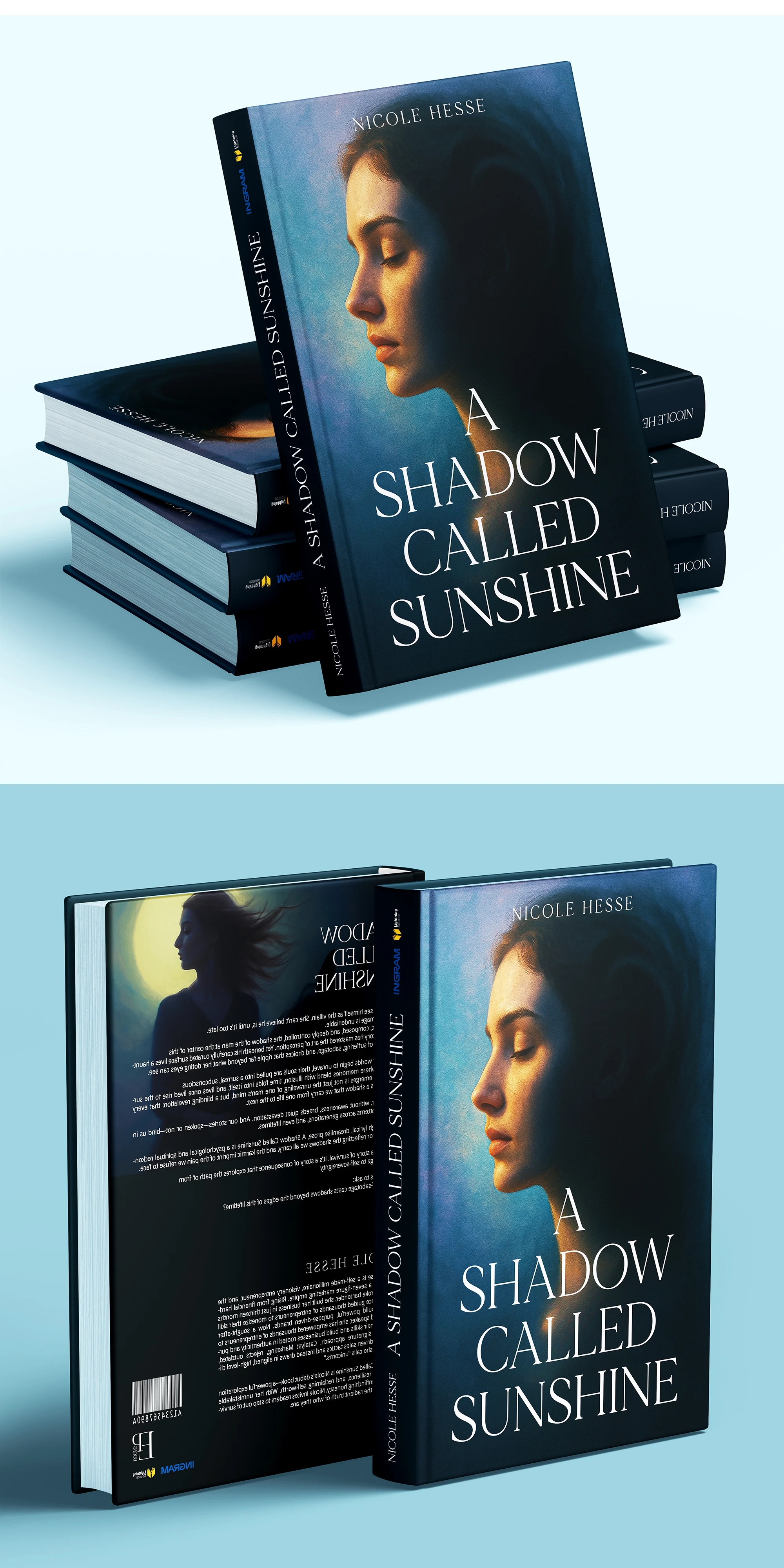
A Shadow Called Sunshine — Nicole Hesse
The brief: A woman convinced she's the hero of her own story, right up until the last page insists otherwise. So I split her down the middle, gaslight blue for the polished exterior, molten gold for whatever's smoldering underneath. That profile is pulling double duty, half elegant author portrait, half interrogation lamp. Flip to the back and she turns toward the moon; suddenly the shadow isn't following her anymore, it's leading. Sunshine's the bait. Shadow's the plot twist.
I wanted this cover to feel like a dream you’re trying to remember. The soft, ethereal glow on the subject’s face fights against the deepening blues, creating a visual tug-of-war between light and dark. It’s a "bright shadow," a design that promises a story where the sun only shines when you’re looking the other way.
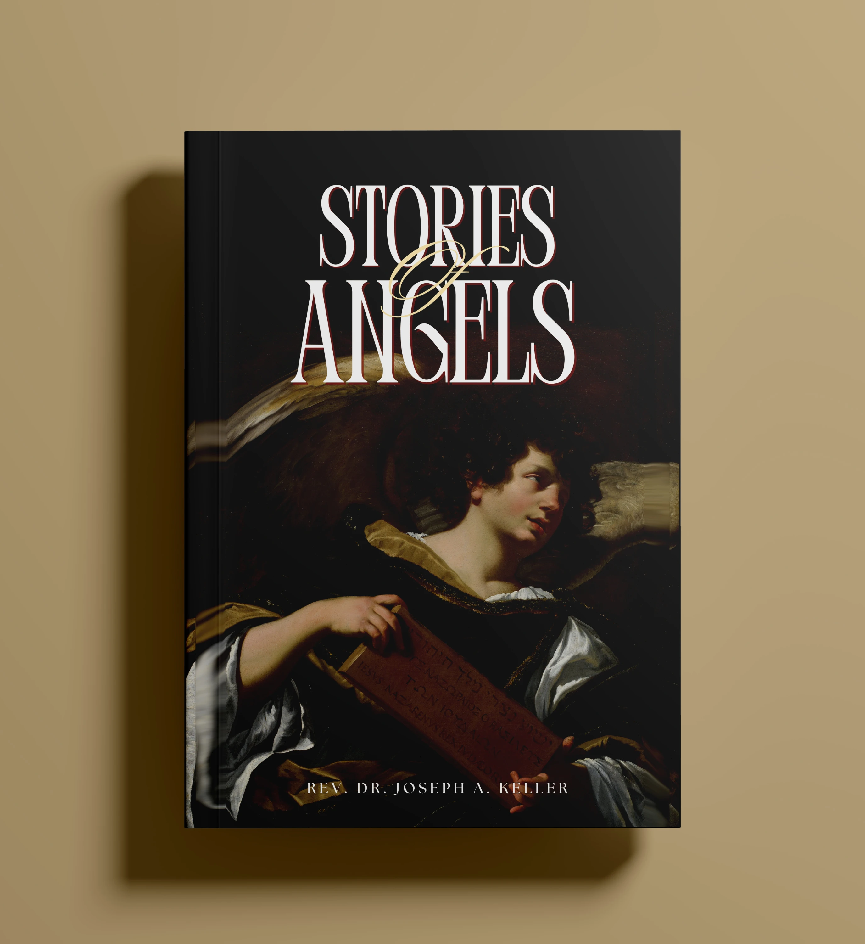
Stories of Angels — Rev. Dr. Joseph A. Keller
Nothing sells reverence like four hundred years of brushwork, so I borrowed the gravity of Baroque chiaroscuro and let one wing escape into the black; a little faith slipping past doubt. The scroll already carries the weight of scripture. I just made sure the darkness around it had somewhere holy to land.
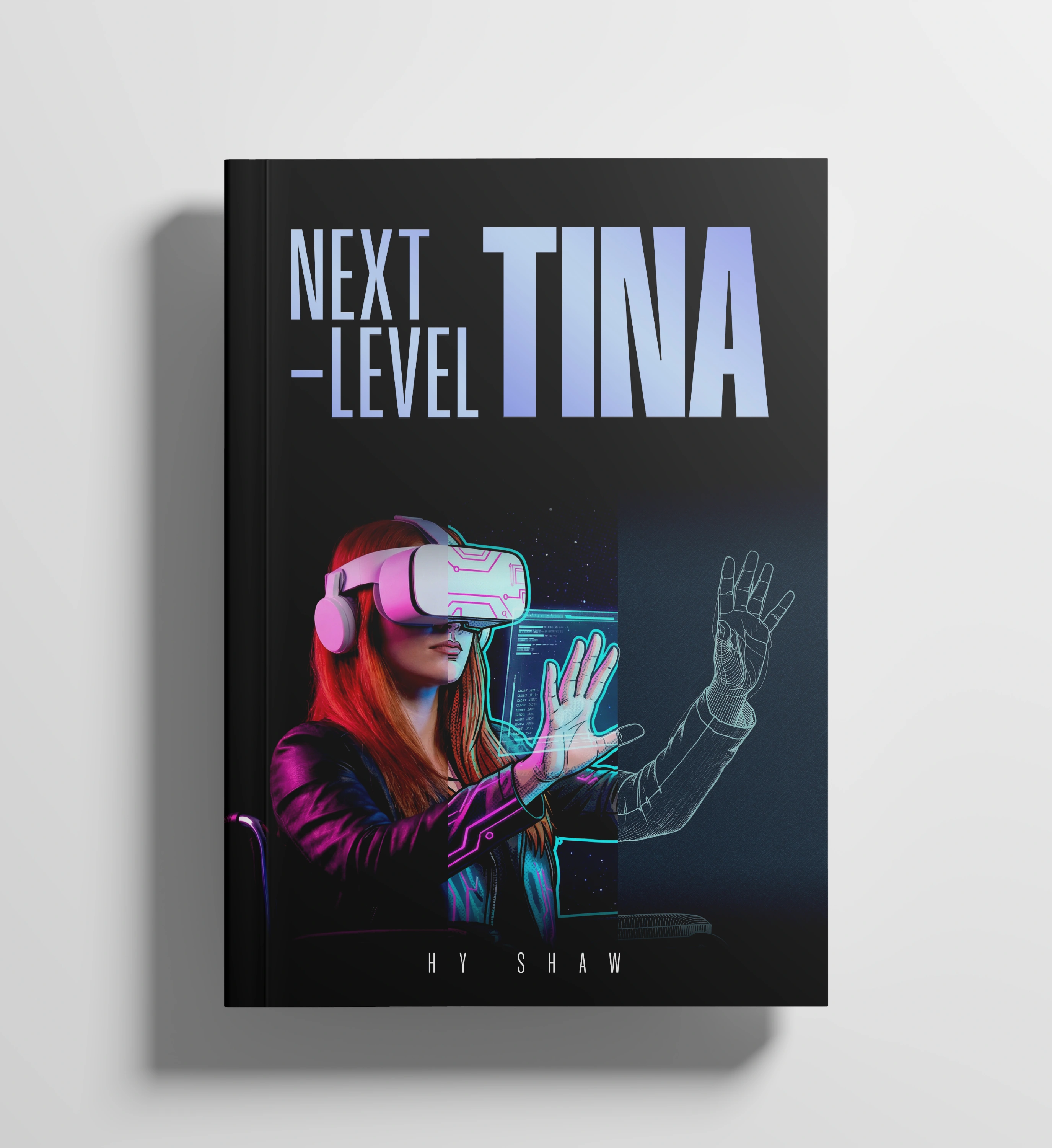
Next-Level Tina — Hy Shaw
Welcome to the "Hy" life. This design plays with the boundary of reality and digital dreaming, using neon accents to bridge the gap between the physical girl and her wireframe potential. It’s a visual "level up," suggesting that in Tina's world, the only thing more vivid than reality is what she can see through the lens.
Half of Tina renders like a photograph, because half her life still runs on old rules. The other half glitches into neon linework, because she's already logged into whatever comes next. That seam down the middle isn't a flaw; it's the load screen. VR headset as halo, wheelchair as launchpad. She's not escaping her body. She's upgrading the interface.
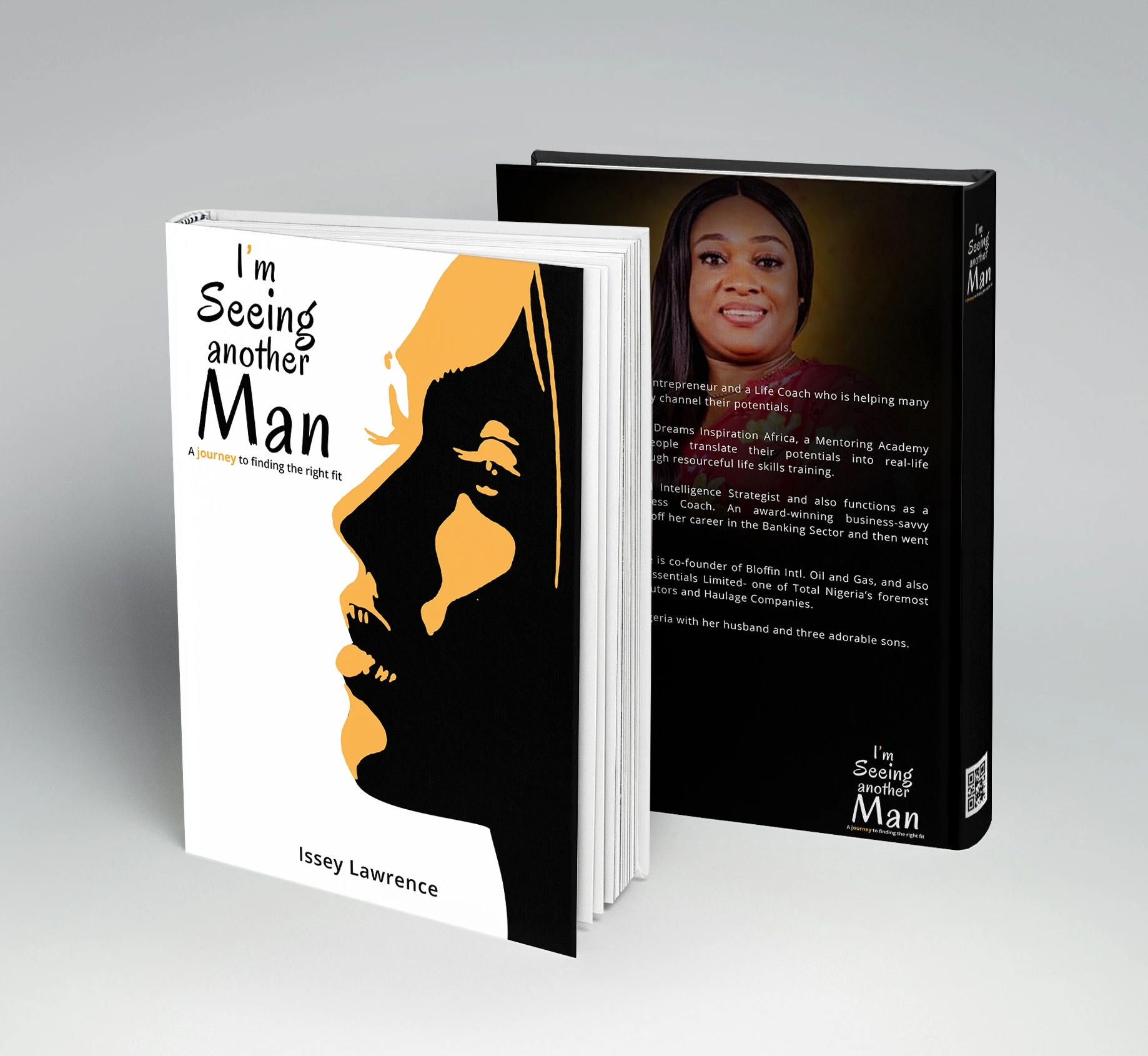
I'm Seeing Another Man — Issey Lawrence
A pun this good doesn't need much help; the title's already doing cardio. I let one profile split clean into black and amber, like the beat right before, or right after, a decision gets made. Reads as romance on a shop table, reads as a memoir about self-discovery once you crack the spine which is, frankly, the whole book folded into one silhouette.
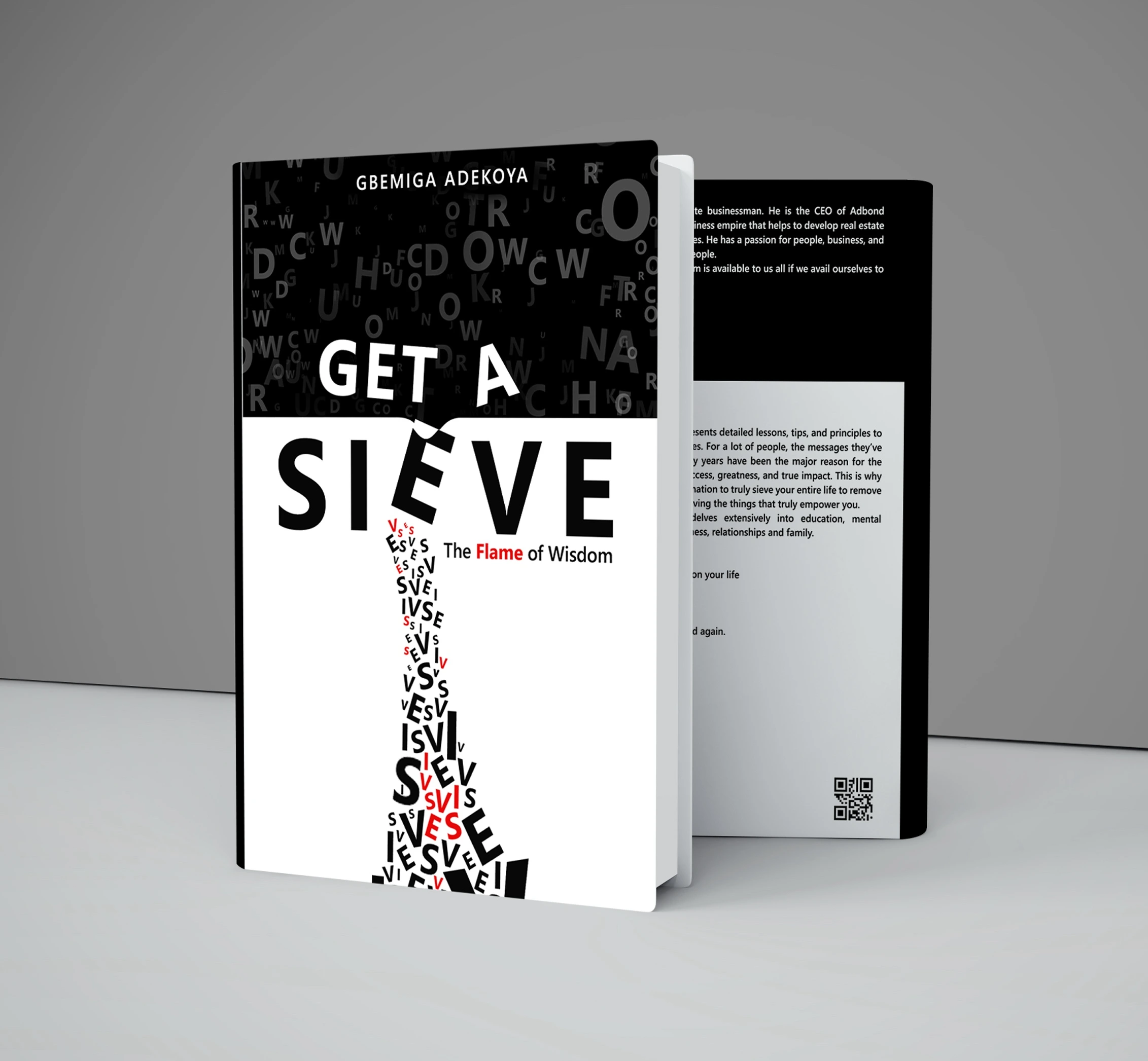
Get a Sieve: The Flame of Wisdom — Gbemiga Adekoya
Why read between the lines when you can let the letters fall where they may?.
This design uses a typographic waterfall to illustrate the act of filtering wisdom. The letters tumble down into a sieve shape, reminding the reader that truth isn't found in the bulk, but in what remains after the world has been shaken. It’s high-concept minimalism with a sharp, intellectual edge.
Wisdom, structurally speaking, is just noise with the useless letters removed. So the top half is a hailstorm of random type; every distraction, every bad take, every 2am scroll funneling down through "SIEVE" into a clean, sifted trickle of red and black. You're watching clarity get manufactured, one falling letter at a time.
Mental Toughness for Gymnasts — Katelyn Monroe
For this cover, I decided to stick the landing before the reader even opens the first page. The grit in the typography mirrors the chalk on a gymnast's hands, while the heavy red "10" provides the visual "weight" required for a book about strength. It’s a design that refuses to wobble, captured in a monochromatic moment of pure focus.
No metaphors required here, just grit, grayscale, and gravity. Stripped the color out so the only thing left to look at is muscle, ink, and the ten seconds before a routine becomes either a highlight reel or a cautionary tale. Red-and-white type because toughness doesn't do subtle it does warning labels.

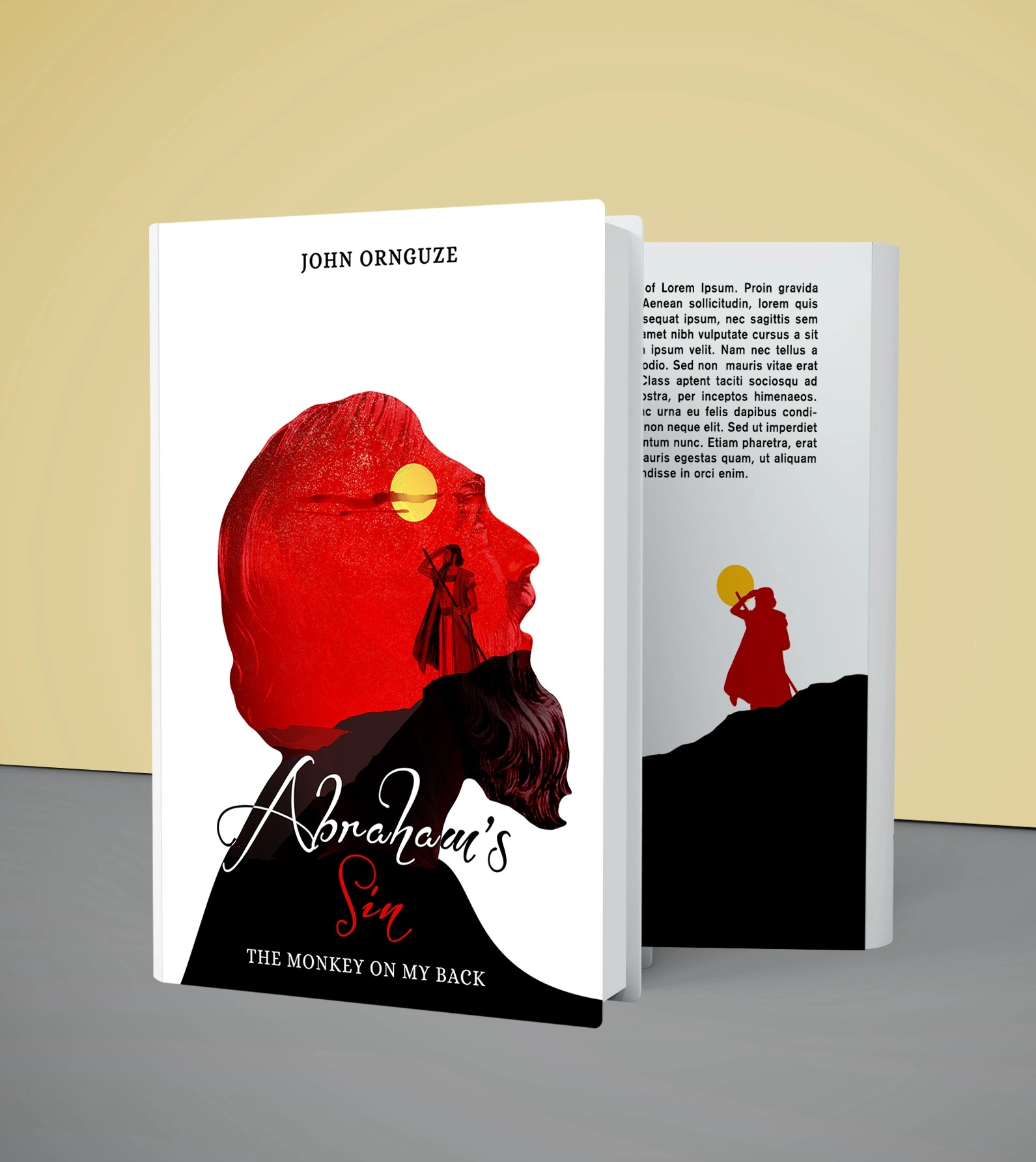
Abraham's Sin: The Monkey on My Back — John Ornguze
Guilt doesn't announce itself; it rides quietly on your shoulders while you keep walking. So that small crimson figure, trudging up a mountain range made from his own beard, is doing exactly that. The double exposure lets one man's face become the entire landscape he's stuck wandering. The title's a pun. The composition is the confession.
This design isn't just a profile; it’s a psychological landscape. By trapping a silhouette within a silhouette, I’ve visually manifested the "monkey" we all carry. The stark contrast between the fiery red interior and the void of the outer frame tells the story of a man whose internal world is far louder than his external silence. It’s a biblical-scale drama where the negative space holds all the weight of the world.
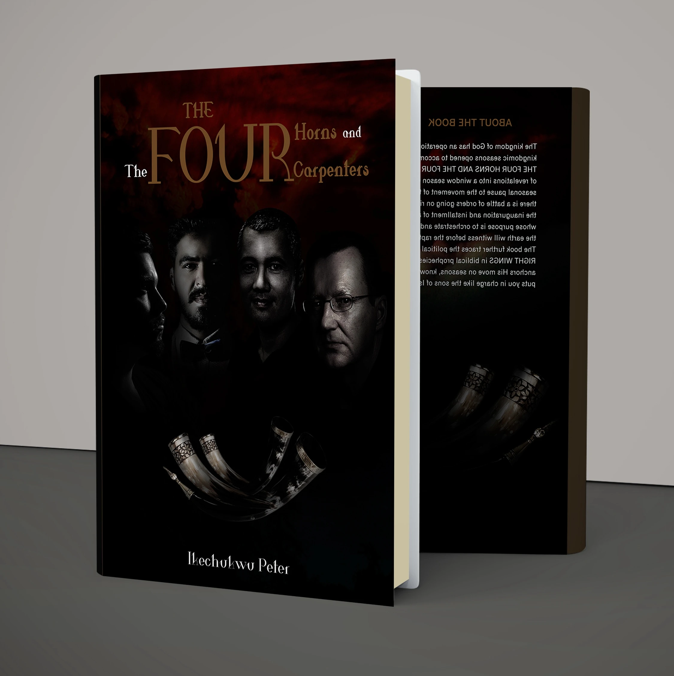
The Four Horns and The Four Carpenters — Ikechukwu Peter
Prophecy needs weight, not decoration, so the palette stops at blood and shadow and the four faces emerge like they're being summoned rather than photographed. The horns waiting at the base aren't props; they're the punctuation mark on a sentence that hasn't finished being written yet.
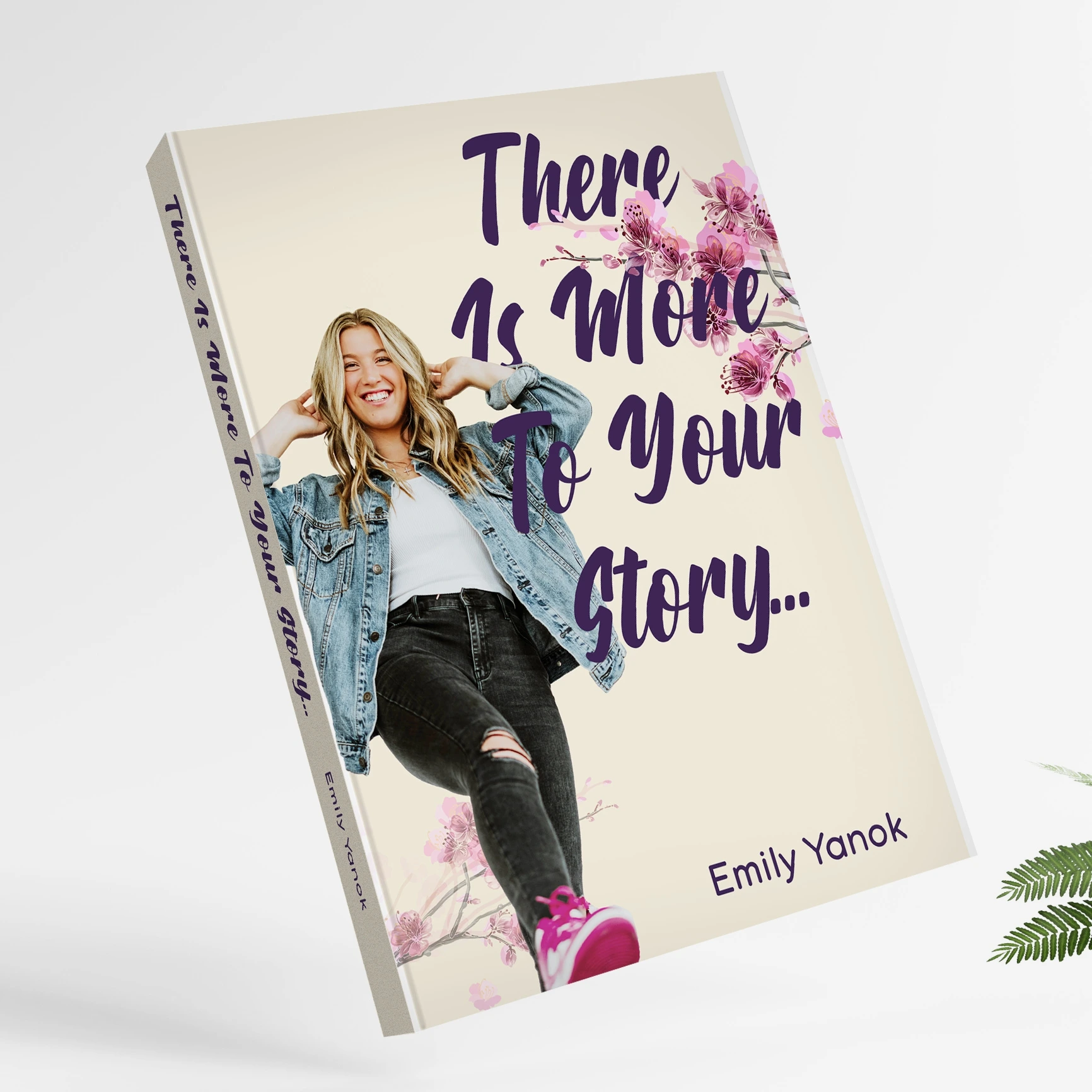
There Is More To Your Story... — Emily Yanok
Cherry blossoms because growth is pretty even when it's messy, and a subject caught mid-laugh because the whole point of this book is arguing against writing yourself off in chapter three. Soft cream, oversized purple script, this cover isn't trying to be literary. It's trying to be a permission slip.
Die Sprache: Über die Sprache der Maschinen — Heiko Weppner
(two concepts, one manuscript) A book about the language machines speak deserved two dialects on the cover.
Concept one is warm, elegant serif: Humanist script pretending machines write in cursive.
Concept two drops the pretense entirely: Rows of 0s and 1s with the real words flickering up to the surface like a message mid-decryption. Same title, two translations human, and binary.

Sometimes, the most powerful thing you can do is lower your voice
. This design is a masterclass in typographic elegance, letting the flowing, terracotta-colored serif font do all the heavy lifting
. It’s a cover that doesn't need to shout to be heard; it just needs to be spoken.
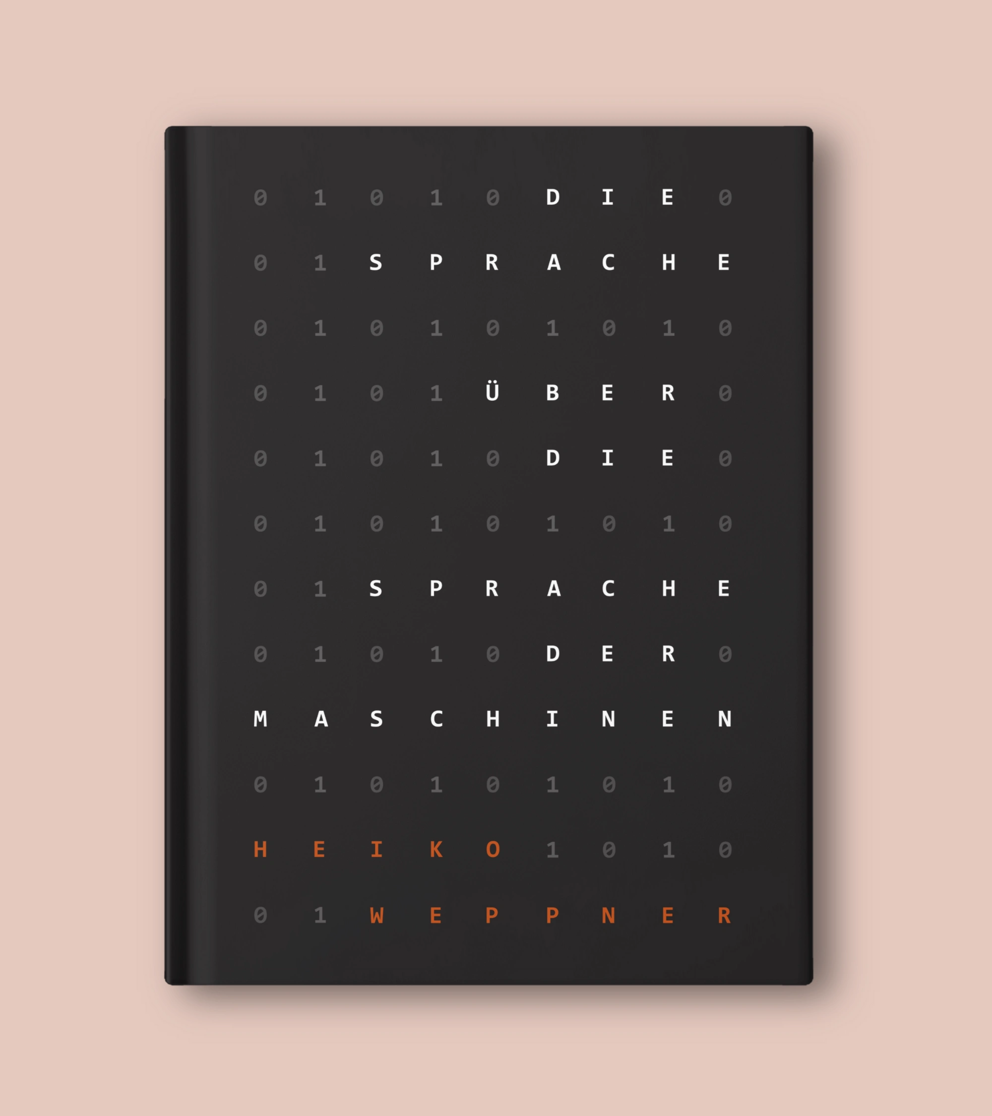
I’ve hidden a secret in the 1s and 0s
. By weaving the title through a grid of binary code, I’m forcing the human eye to do what machines do—decode
. It’s a literal "language of the machines," where the orange accents of the author's name provide the "human" spark in a cold, digital field.
101 Habits of the Greatest Traders — Ryan Andress
In the world of trading, you’re either in the red or the green. I used a massive, bold "101" to dominate the visual hierarchy, mimicking the loud, fast-paced environment of a trading floor. The subtle candlestick graph at the bottom serves as a heartbeat, reminding the reader that these habits are what keep a portfolio alive.
Candlesticks don't lie, so I let the green-and-red chart do the closing argument along the bottom while the headline hits like a ticker running in caps lock.

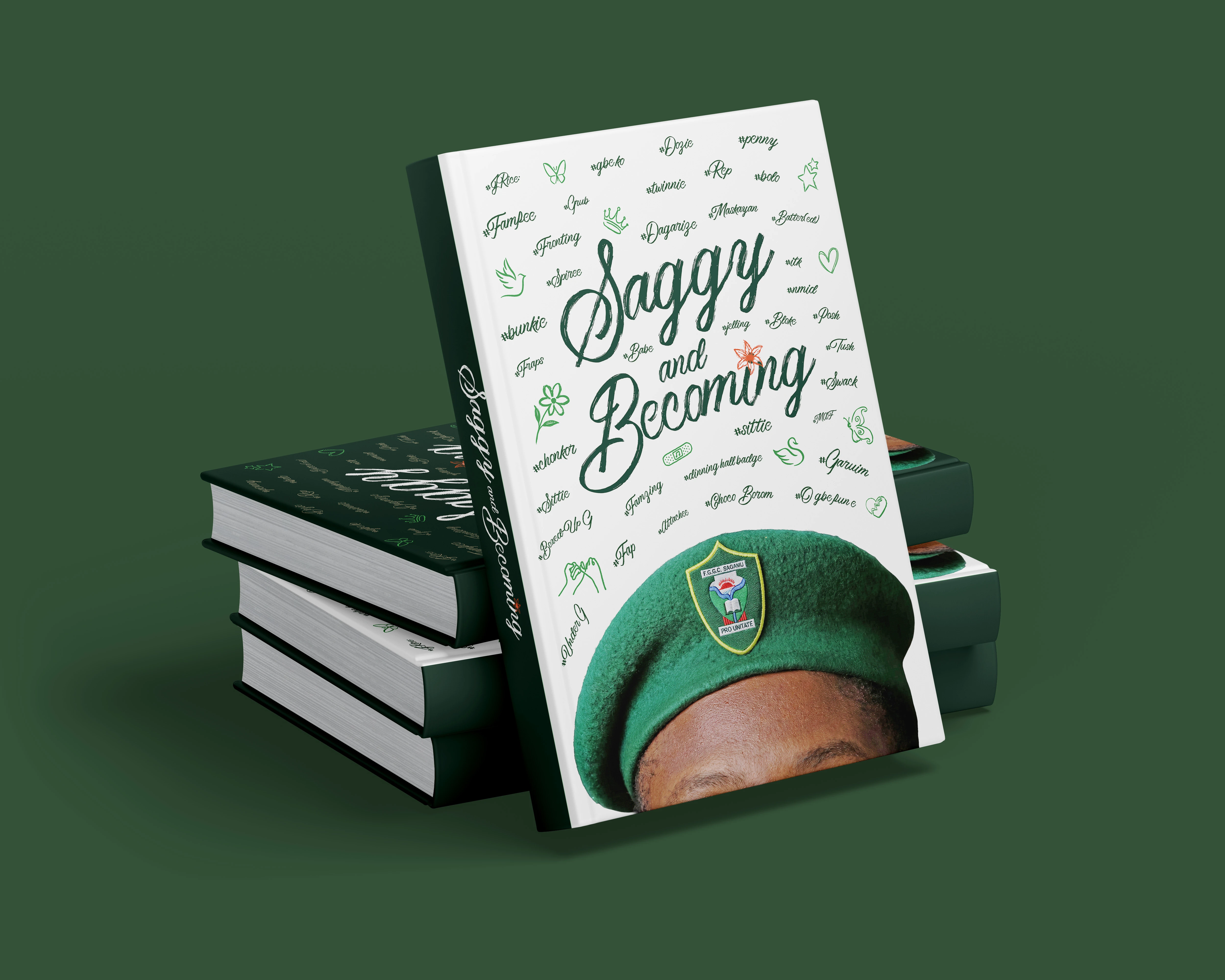
Saggy and Becoming — FGGC Sagamu, Class Reunion Edition
A nostalgic trip down the school hallway, this cover captures the "becoming" through a collage of youthful energy. The green beret serves as the anchor, a symbol of identity.
A reunion book lives or dies on inside jokes, so I built the cover entirely out of them; hand-lettered nicknames and slang scattered like confetti around a beret every alum will clock on sight. It's less a title than a roll call, and that green isn't just a school color. It's a password.
Allt Var För Liv — Aliya Dahlgren
(two concepts, one heartbreak) "Everything was for life" is a confession dressed as a title, so both covers hide something behind the subject's back; a single rose, just out of frame.
Concept one stays grounded: Denim, restraint, one bloom as the only clue something's about to go wrong.
Concept two turns the volume up: A double-exposed face, a wilting rose, two silhouettes acting out the fallout in miniature on the mountainside below.
One's the quiet before. The other's the storm itself.


Thank You!
Blake Isaac Tile
(c) Saltd Design Studio — hello@saltd.xyz
Like this project
Posted Jul 30, 2026
16 book covers, 16 genres, 16 different visual arguments. Photo manipulation, custom illustration, editorial typography, and concept-driven art direction for independent authors across fiction, faith, sports, finance, and tech.