CobaltEdge Logo Design

Isaac Blake Tile


CobaltEdge - Logo & Brand Identity
Client: CobaltEdge
Industry: Construction
Scope: Logo design, limited brand identity system
Context: New company, first identity
Overview
CobaltEdge is a modern construction company that needed a logo and foundational brand identity to launch with. The brief called for something that breaks from the typical construction industry look: no hard hats, no skyline silhouettes, no orange-and-black palettes. Instead, they wanted a mark that signals precision, modernity, and a tech-forward approach to building.
The Brief
The direction was clear: minimalist, modern, industrial, and clean. CobaltEdge positions itself as a construction company that builds with the precision and intentionality you'd expect from a tech company. The visual identity needed to reflect that.
Logo Concept
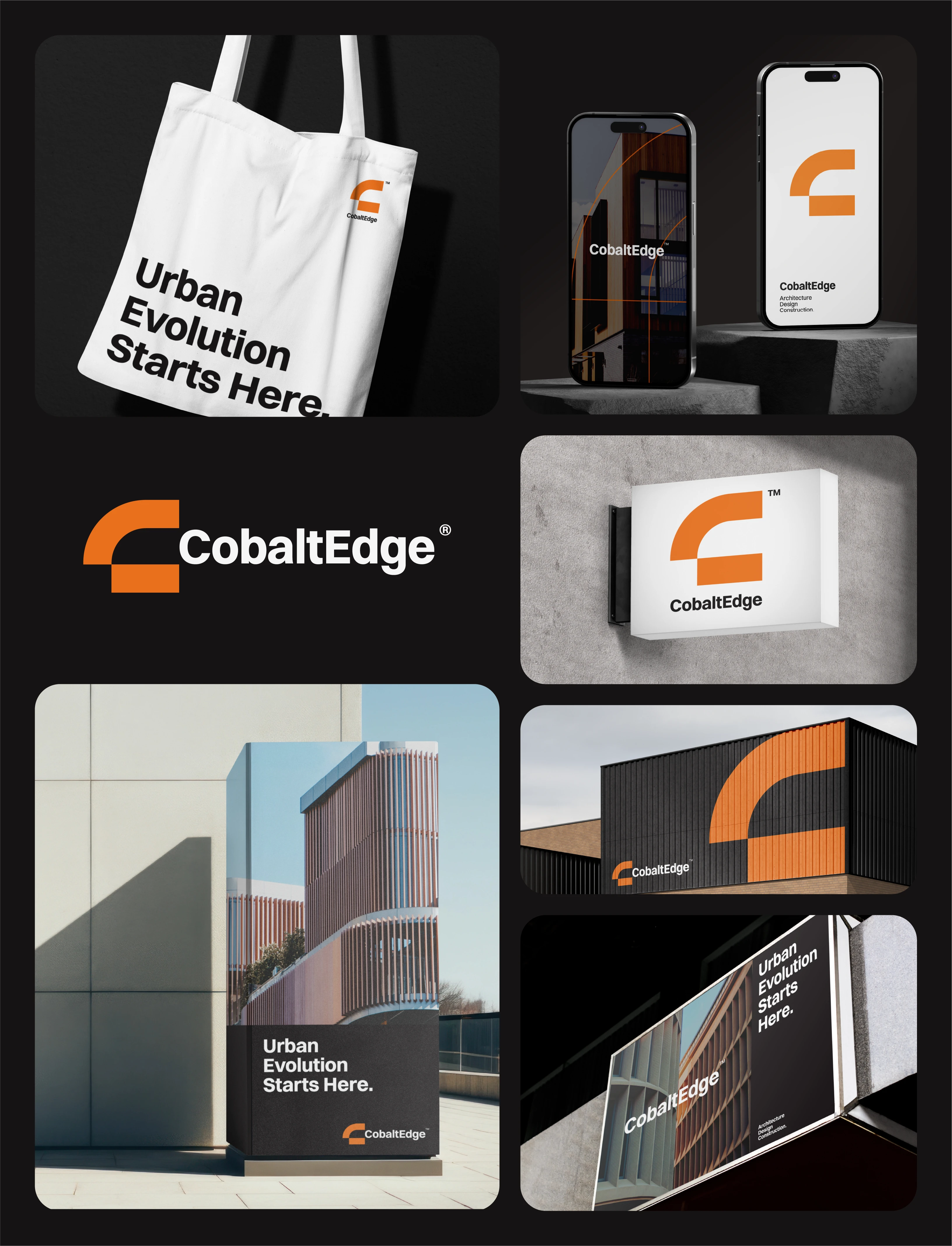
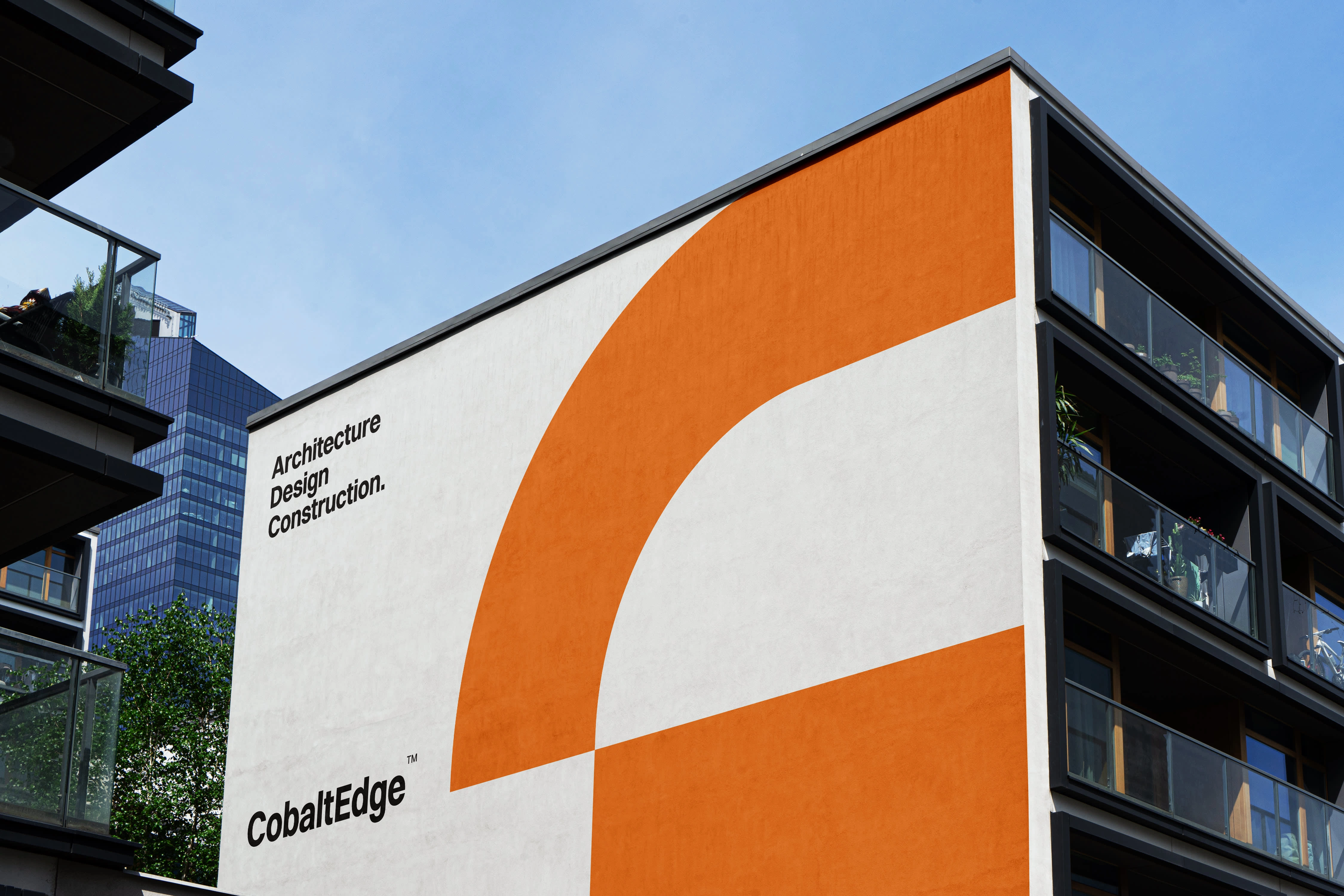
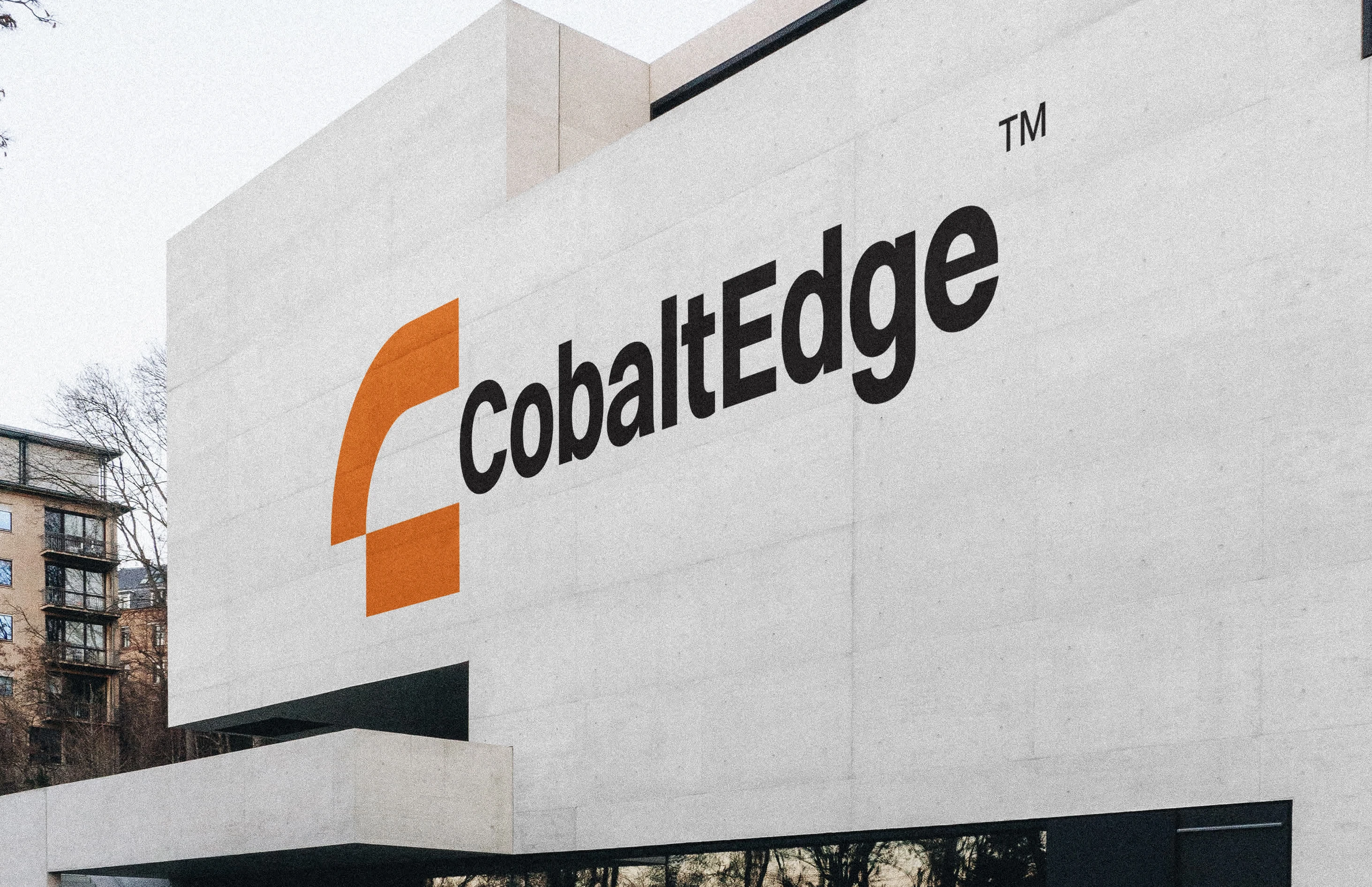
The logomark is built from the letter "C," constructed with deliberate geometric decisions:
Square-cut base: The "C" starts from a squared-off foundation rather than a traditional rounded letterform. This gives the mark an architectural quality, like a floor plan or structural cross-section
Extended rectangle: The form extends into a rectangular shape that completes the "C," creating a sense of construction in the letterform itself. The logo looks like it was built, not drawn
Stylized edge: The "C" is shaped to have a distinct edge, a direct nod to the company name and the precision of construction work. It's sharp, intentional, and structural
The result is a lettermark that communicates construction through its own geometry rather than through literal imagery.
Brand Identity Elements
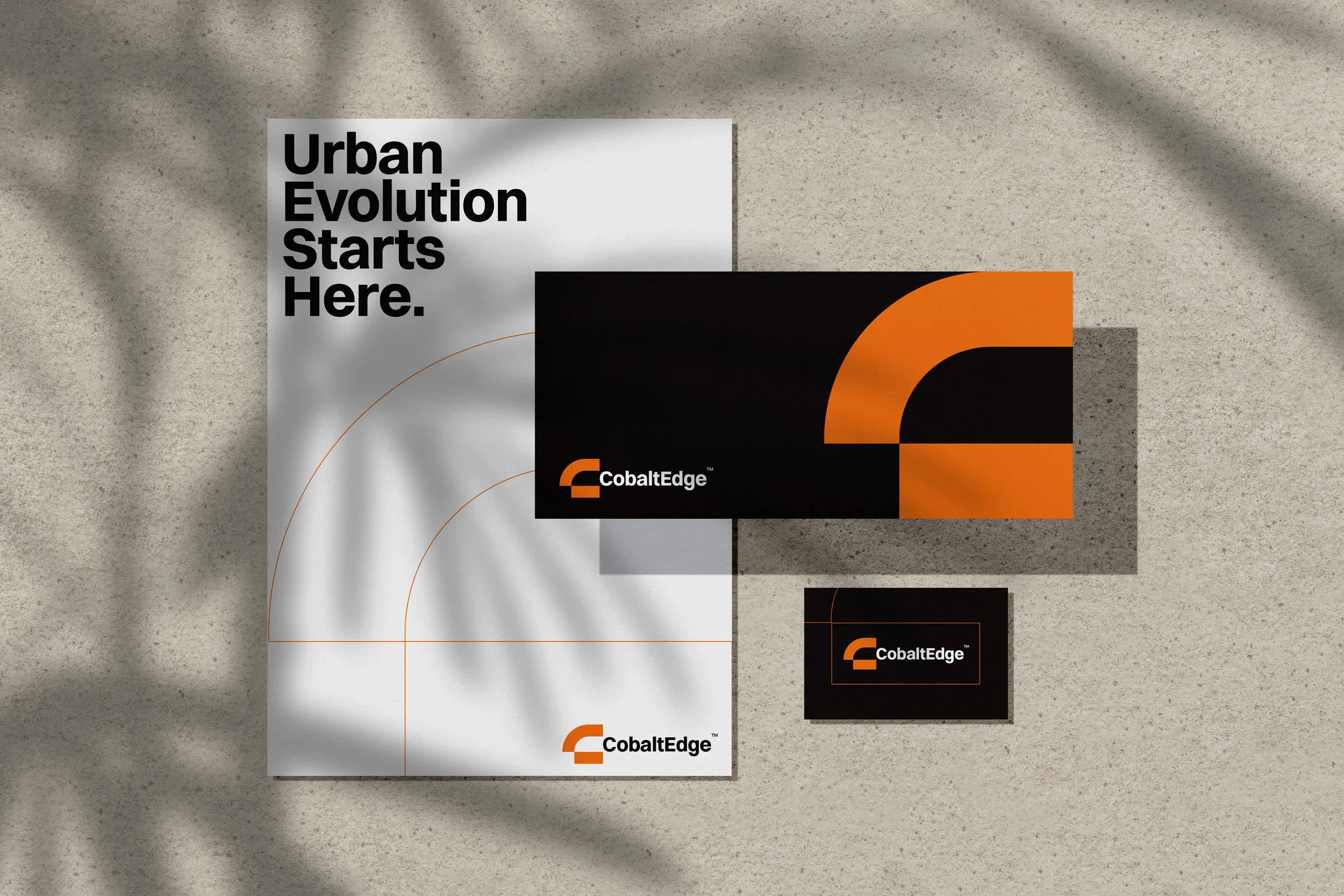
Alongside the logo, a limited brand identity system was developed to give CobaltEdge a cohesive visual foundation:
Visual Language: The identity carries the same geometric precision as the logo. Clean lines, structured layouts, and deliberate negative space throughout. Nothing decorative, everything functional.
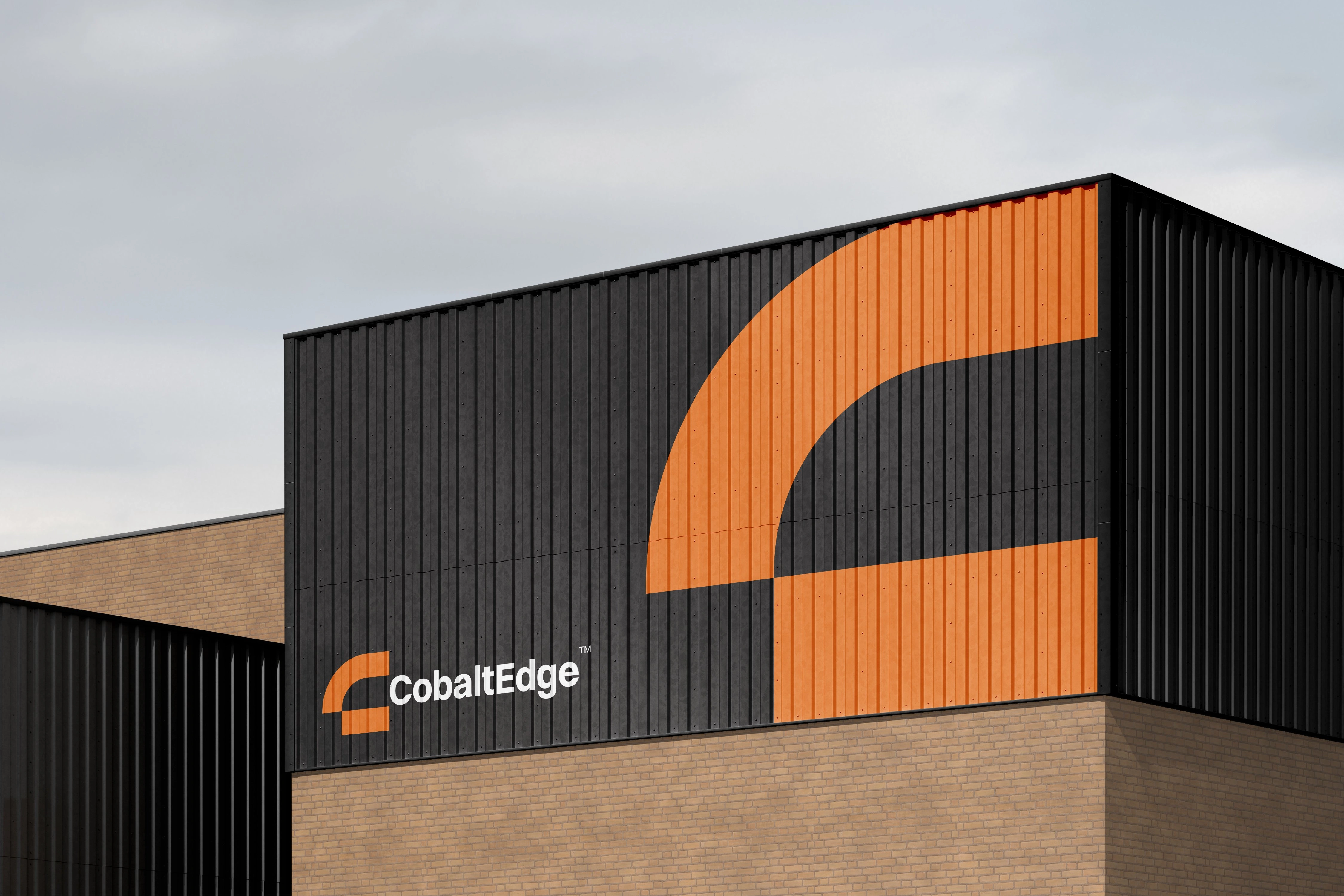
Industrial Tone: The system leans into the industrial-clean aesthetic the client wanted. Materials, textures, and applications feel grounded and physical without being rough or heavy-handed.
Tech-Forward Positioning: The overall identity reads more like a technology company than a traditional construction firm. That's intentional. CobaltEdge wanted to differentiate from competitors who default to rugged, heavy-industry visuals.
Result
A logo and limited brand identity for a new construction company that positions itself through precision and modernity rather than industry cliches. The geometric "C" mark carries the brand's core message in its structure: this is a company that builds with intention. The identity system gives CobaltEdge enough visual infrastructure to launch cohesively across initial touchpoints.


Like this project
Posted Sep 20, 2024
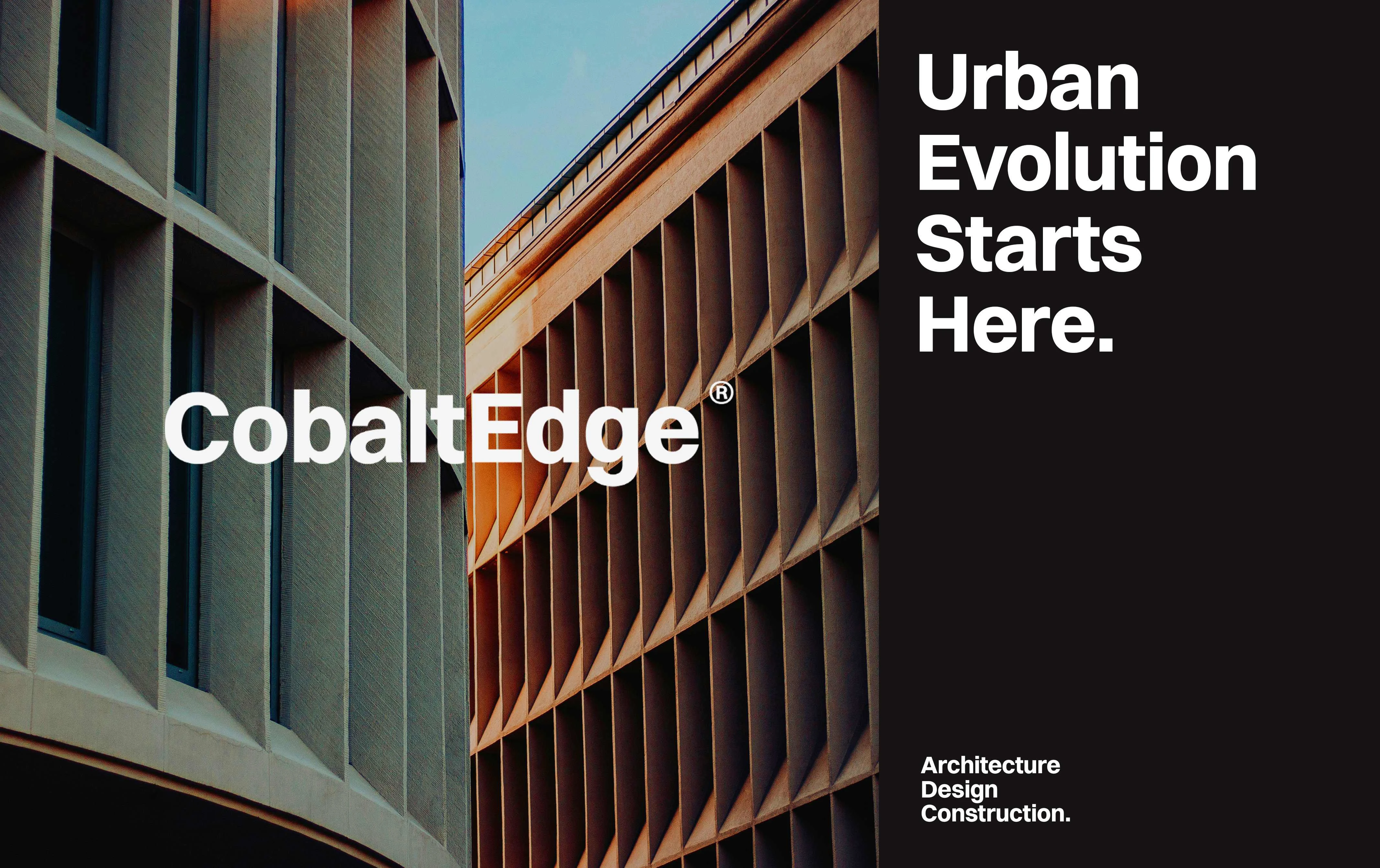
Logo and foundational brand identity for CobaltEdge, a modern construction company. The mark is a geometric 'C' that looks built, not drawn. Clean, industrial, and designed to break from typical construction branding.