Contra - A professional network for the jobs and skills of the future
Discover
Sign Up
Post a job
Sign Up
Log In
Filters
Projects
People
Filters
Featured
Web developers
Content creators
Graphic designers
Product designers
AI developers
Motion designers
Social media marketers
Animators
Video editors
Projects we love
Projects we love
Standout projects making waves around the web
View more
Message
105
Andrea DiNardo
max
The Compression Company: Landing Page Copy + Narrative
105
3.9K
Message
85
Tiago Rosado
pro
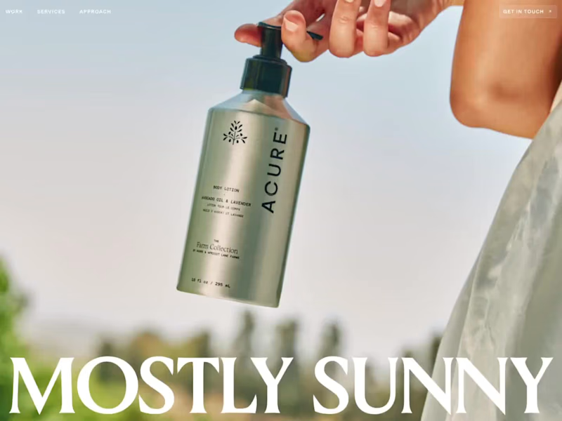
Mostly Sunny | Framer Development
85
3.4K
Message
148
Stacy · Heed Collective
pro
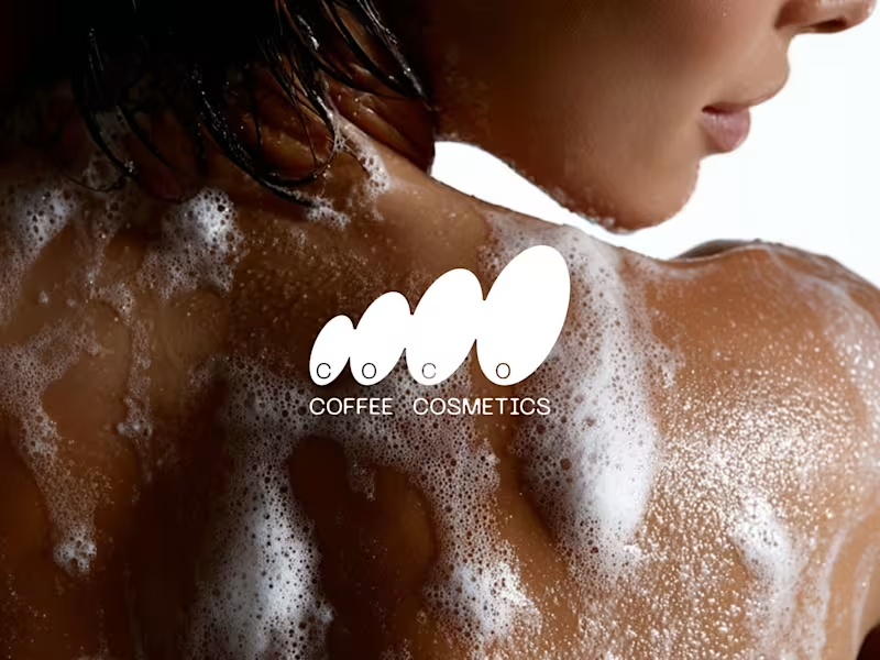
Brand Identity · Specialty Coffee Cosmetics
1
148
4.3K
Message
33
Jon Howell
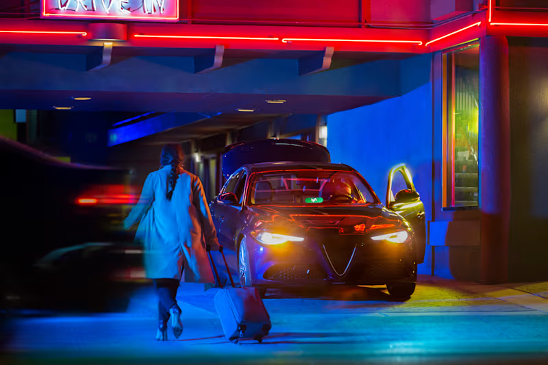
Lyft Pink
33
808
Web design projects using Framer
Framer
The best modern websites built on the leading web design tool, Framer
View more
Message
25
Nico — Brand & Logo Studio
max
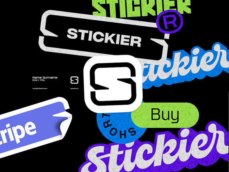
Stickier — A Brand Built to Scale Everywhere
25
1.6K
Framer is the leading tool for building websites, fast
Hire experts
Message
20
Iñaki Palacios Añaños
pro
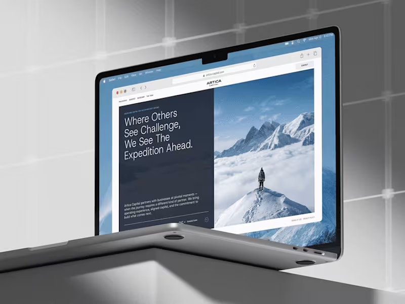
Artica Capital — High-Performance Private Equity Website
20
736
Message
17
Vítrea Studio
max
Tadaima Website Development Project
17
369
AI projects
AI
New projects from the best AI creators
View more
$2.5K+ earned
Message
37
Oleksii Strichyk ✽
max
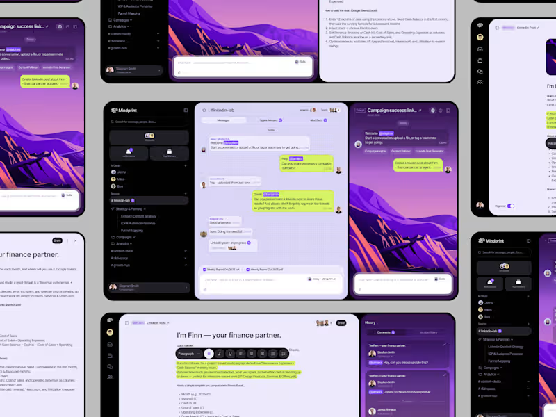
Mindprint Platform Rebrand & AI Content Experience
37
1.9K
Message
41
Daniel G Bright
max
SUPAHUMANS — The AI brand that refused to look like one
41
1.9K
Message
33
Sian V.
pro
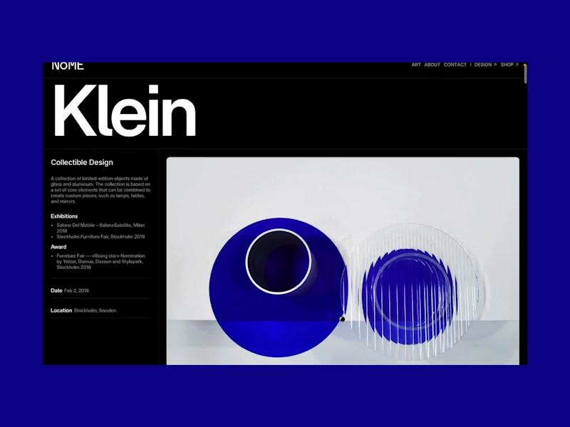
nome.art • Artist Portfolio Website
1
33
1.2K
Message
20
Cara Ellis
max
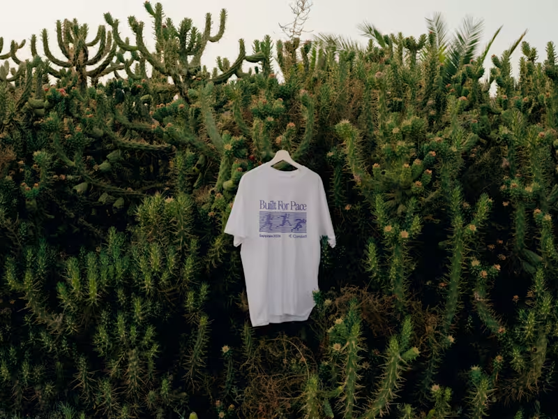
Guerilla Marketing Shirt Artworks and Design for Conduct AI
20
739
Brand design projects
Brand design
Bold visual identities and branding systems created by top independent designers
View more
Message
35
Afton & Sebastian • Branding & Web Design
max
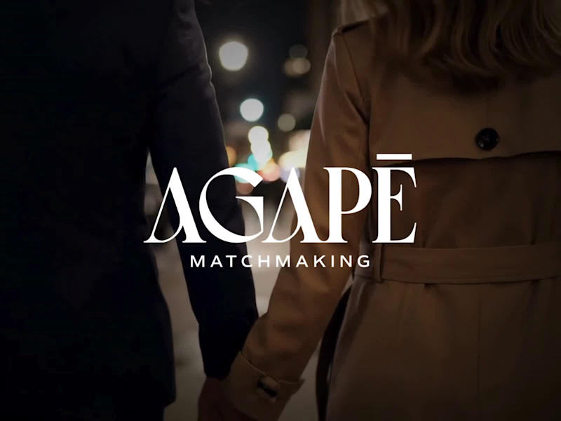
Agape Match | Branding + Kajabi Website
1
35
1.5K
Message
28
Filip Panov
max
Ctrl+Shift Brand Identity Project
28
552
Message
24
Loreta Lazarova
pro
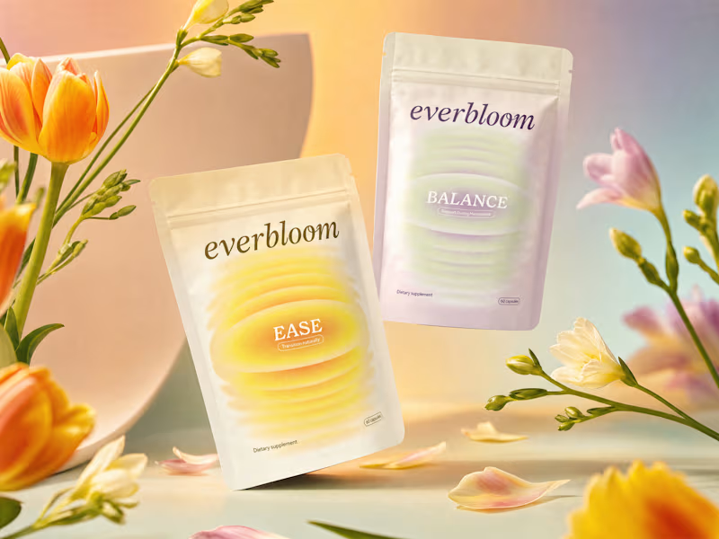
Everbloom / Packaging Design / Supplements
24
926
Message
24
Alec Minimalec
pro
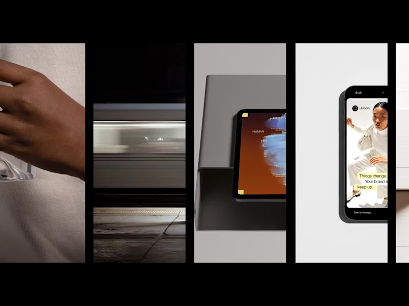
Rebranding uBloom | Creative Agency
24
419
Video editor projects
Video editing
Creative video edits made using today’s best editing tools
View more
Message
25
Nikita Skopych
max
CatchBack Product Launch Explainer Video
25
1.4K
Message
22
Jen Lai
pro
Boop | TikTok Content and Strategy
22
794
Message
12
Diego Rotmistrovsky
max
Replit Summit Loop Video Project
12
283
Message
9
Janès Zabukovec
Video for neuroscientific research paper on Stereotypes
1
9
427
Standout projects
Standout projects
More projects we love that are making waves across the web
Message
10
Jeremiah Haastrup
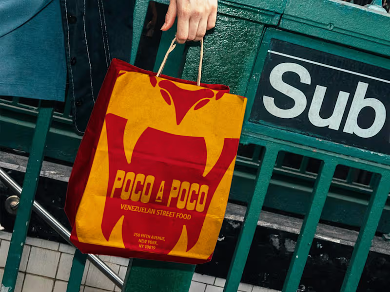
Last week, I created Poco A Poco, a concept identity system for a Venezuelan street-food truck in New York. The project was made for a competition raising donations for families affected by the earthquakes in Venezuela. This sat close to home. I have family who were there during the earthquakes, and who are now part of rescue teams helping to find people beneath the rubble. Poco a poco means “little by little.” That phrase became the heart of the project. Food discovered bite by bite. Recipes carried between generations. A migrant community building new ties in a different city. The identity grew from three ideas: origin, adaptation and community. Research into San José de Barlovento and Afro-Venezuelan culture shaped the direction. I wanted the system to feel immediate from the street and richer the closer you get. Little by little. Bite by bite. View the full project here: https://jeremiahhaastrup.com/work/poco-a-poco
3
10
125
Message
1
Ricardo Gantschnigg
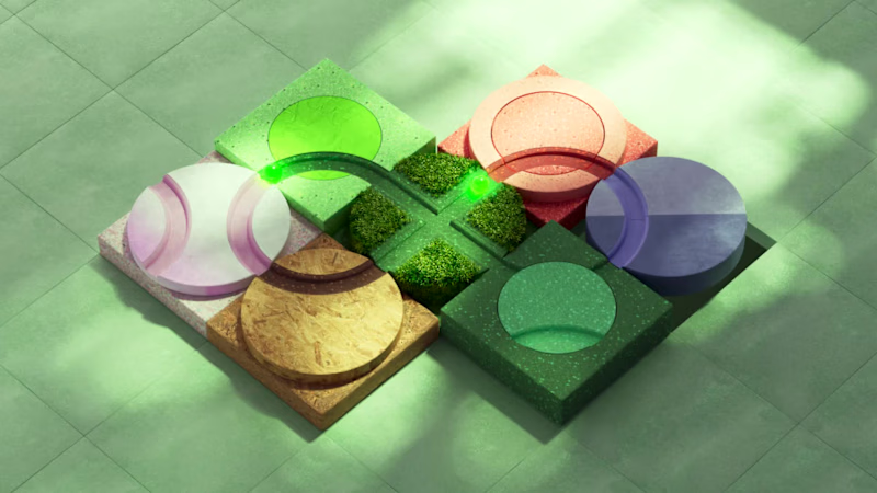
The sustainability strategy of Salzburg University of Applied Sciences is built around six interconnected areas of action. The challenge was to translate this complex strategic framework into a clear and engaging cover illustration for the university’s digital “warum!” magazine. The concept visualizes sustainability as a system in which every element influences and supports the others. Six individual forms come together to create a connected structure, demonstrating that meaningful change can only happen when all areas work in unison. The project combined conceptual development, art direction and CGI to create a distinctive editorial visual that communicates an abstract topic in an accessible and memorable way. The illustration was developed as both a static cover image and an animated digital experience.
2
1
52
Message
11
Leticia Padilla
pro
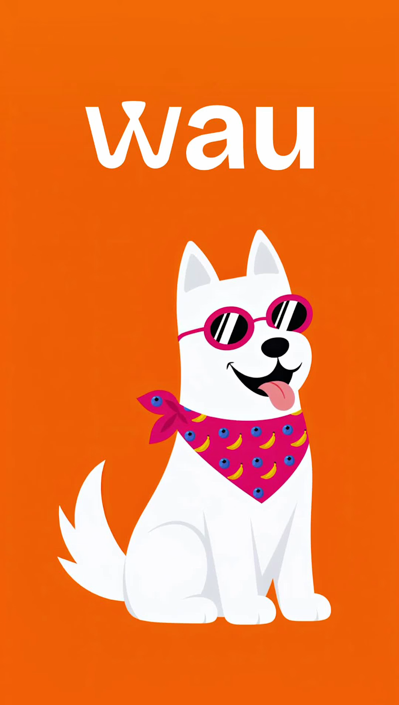
WAU began as my university graduation project for my Bachelor's Degree in Graphic Design, created long before AI became part of my design workflow. The project was inspired by UN SDG 12 (Responsible Consumption and Production). Through research, interviews, surveys and user testing, I explored the problem of household food waste and how design could help reduce it. Instead of creating a traditional cookbook, I designed a visual recipe system that helps dog owners turn leftover fruits and vegetables that are still safe to consume into healthy homemade dog treats. Beyond recipes, the book also teaches users how to identify ingredients that are still suitable for use. Recipes are organized through color-coded categories and illustrated ingredient cards based on preparation methods such as baking, freezing and refrigerating, making the experience faster and more intuitive. To reinforce the sustainability concept, I also designed the packaging with a second life in mind. After interviewing dog owners and testing the concept, I decided that the fabric wrap would become a reusable bandana for the dog, extending the product beyond the unboxing experience. Although I was proud of the original project, there were many additional ideas and presentation assets I couldn't include in my final graduation presentation. Thanks to Envato, I was finally able to create the complete presentation I had imagined years ago using its AI tools, assets and sound effects to produce realistic product photography with the exact compositions I envisioned, custom mockups for a packaging format that didn't exist, lifestyle scenes, mascot animation, and stop-motion-inspired product sequences that make the project easier to understand visually. Every AI-generated scene was carefully refined and edited to stay faithful to the original project, its research, and the design decisions developed years ago.
6
11
229
Message
11
Kris Anfalova
pro
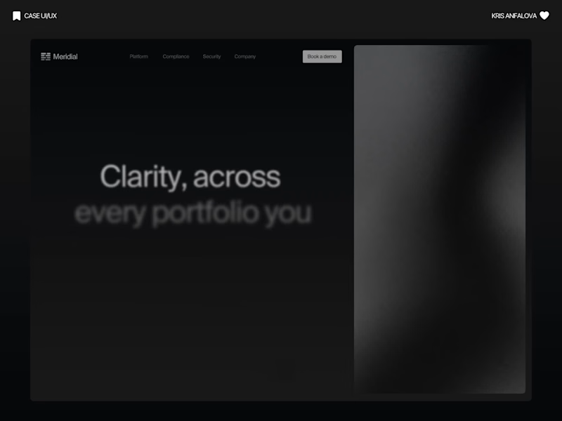
Meridial — Wealth Management Platform For Meridial, I designed a system where the one thing that matters — portfolio drift — always surfaces first, no matter how many clients an advisor is tracking. Signal over noise, even at 200+ portfolios. ⚪ The challenge: Advisors managing dozens of portfolios need to instantly spot what's drifted from target — without digging through spreadsheets or noisy dashboards that bury the signal in data. A dark, grain-textured UI gives Meridial a private-banking feel instead of typical fintech blue. The landing page proves the product directly in the hero with live allocation and drift cards, while the dashboard extends the same card system into radar charts, composition breakdowns, and a weekly digest — built so advisors can scan hundreds of portfolios at a glance. A case in making complex portfolio data resolve into one clear signal.
5
11
257
Message
37
Althea Nguyen
pro
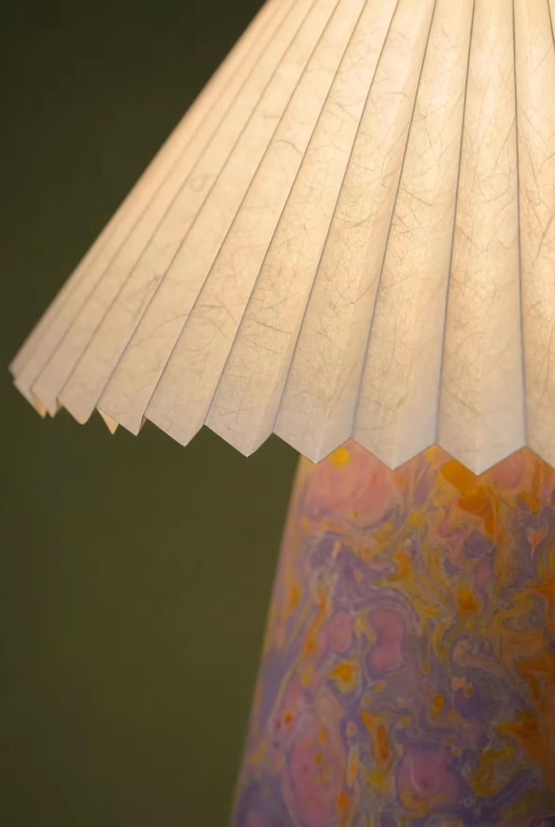
Designing a table lamp inspired by Vietnamese “áo dài” and “nón lá” with @Envato (https://contra.com/company/envato) at the centre of my workflow. Starting from a black-and-white sketch, I built the lamp's ceramic base and rice-paper shade using Envato's AI toolkit, tagging reference materials directly so AI wasn't guessing at textures it can't always read from an image alone. AI was great at generating options. It was not great at knowing which option was right; I rejected a full batch that technically worked but lost the silhouette I actually wanted, and hand-retouched a detail (the finial) that AI kept leaving unfinished. The bigger call AI couldn't make: timing this launch to back-to-school season in Vietnam, when áo dài comes back out. That's not a style choice; it's a commercial one. See the full process and the part AI couldn't do in the VIDEO below. 👇 #envatochallenge @envato
14
37
1.4K
Message
14
Aida Mrđanović
pro
There is no better feeling than getting the details just right on fully custom logotypes ✒️
8
14
228
Message
20
Leticia Padilla
pro
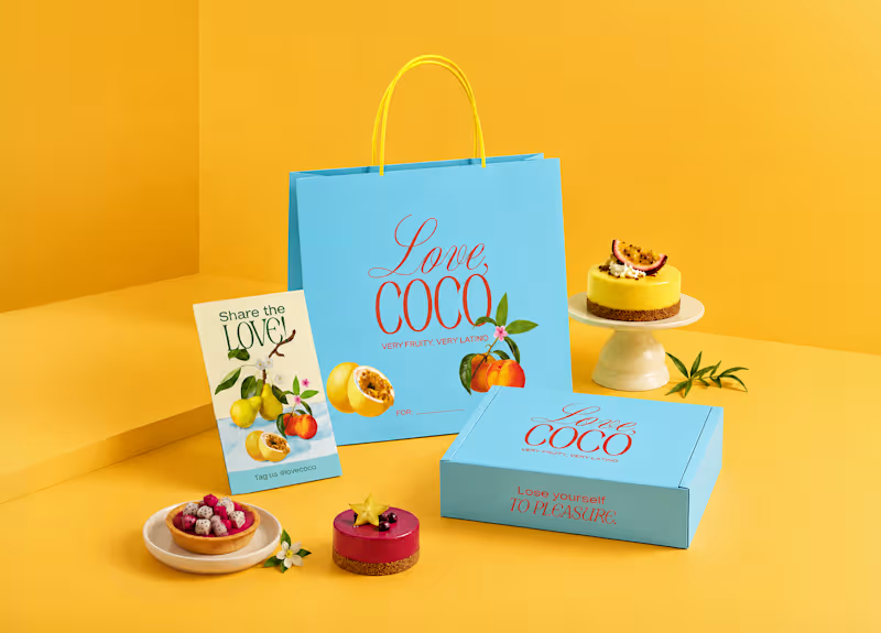
Latin tradition, reimagined. Love, Coco brings Latin-inspired desserts to the Canadian market through a contemporary visual identity. The challenge was to build a brand that communicated the quality of its ingredients and its Latin roots without relying on familiar visual clichés. Instead of recreating a traditional aesthetic, the identity needed to feel current and distinctive for a Canadian audience. The process began by analyzing the visual codes commonly used by dessert and Latin food brands, identifying what to keep and what to avoid. This research informed a visual system built around contrasting typography, a vibrant yet refined color palette, and compositions inspired by classical still lifes. These design decisions place the fruits at the center of the identity, highlighting the quality and origin of the ingredients while giving the brand a distinctive visual language.
15
20
349
Message
17
Alwan Rosyadi
pro
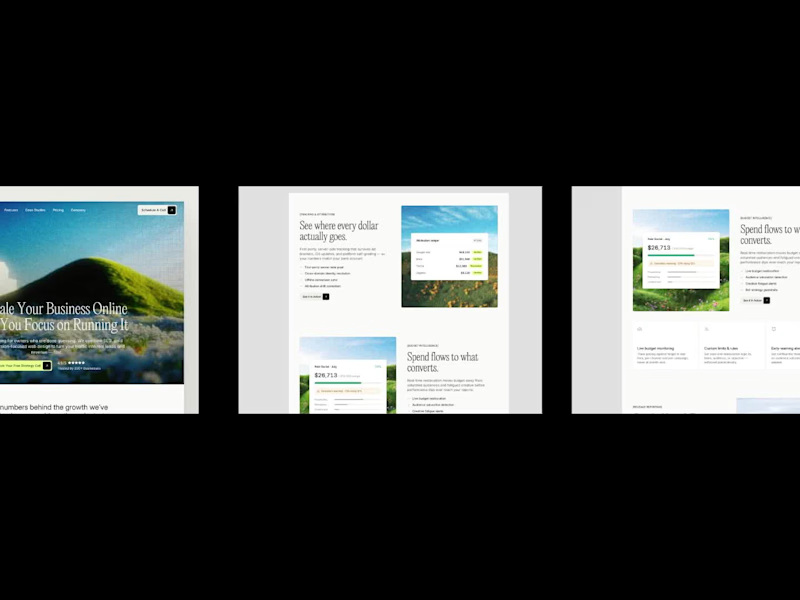
Just launched my latest Framer template a few days ago. Tensor is a modern marketing website template built for startups, SaaS, and agencies. Grab it here 👉🏻 https://contra.com/products/ijb4kt6v-tensor-marketing-attribution-website
2
17
822
Message
76
Mara Mel
pro
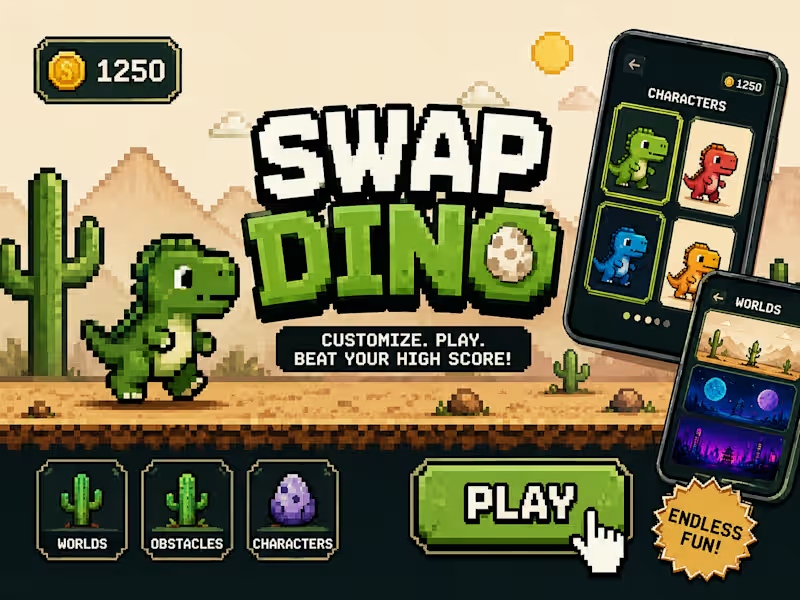
I finally built my own version. Using Flowstep, Claude (via MCP), and Figma, I turned that childhood idea into a playable MVP where you can customize your character, choose different worlds, pick obstacle packs, and jump into the game. 🎮 Play it here: https://dino-game-ten-beige.vercel.app 🎨 Flowstep prototype: https://app.flowstep.ai/file?activeFileId=a88187e9-97f9-491d-a012-026e49a0e483 Now I have one question... What's your highest score? 👀 Drop it in the comments—I want to see who becomes the SWAP DINO champion. 🦖🏆
46
76
3.3K
Message
22
Nessa Studio
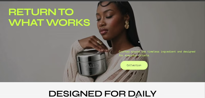
RETURN TO WHAT WORKS. The concept: TALLO is a premium ritual skincare brand inspired by the ancestral use of beef tallow. My goal was to give this timeless ingredient a fresh, modern identity by pairing premium Wagyu tallow with botanicals like honey, lavender, and vanilla, while reimagining the products through a refined chrome packaging system. Rather than designing just a website, I wanted to create a complete brand experience that felt authentic and launch-ready. From the visual identity and packaging to the ecommerce experience and storytelling, every detail was designed to position TALLO as a modern take on traditional skincare. Built with Squarespace + Finish Layer: I used Block Transforms, Loop on Scroll, Float, Stacks, Font Uploads, and Block Animations to create dynamic layouts, subtle motion, and an editorial shopping experience that brings the brand to life. Squarespace link (https://dolphin-bumblebee-yabl.squarespace.com/) Password: 4321 Tools: Squarespace · Finish Layer · Figma · loveart
13
22
742
Message
17
Chiara Arcostanzo
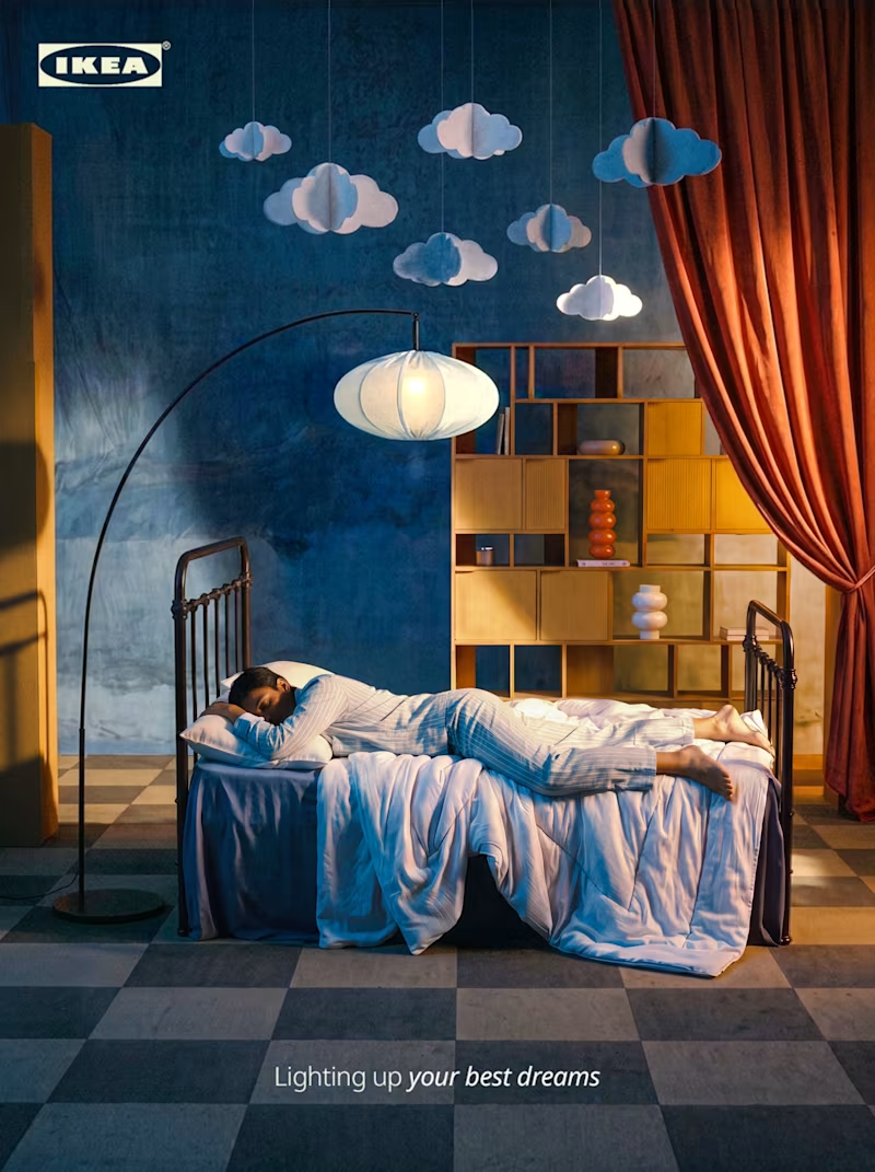
IKEA — Lighting up your best dreams AI-generated campaign concept Full creative direction and image production for a personal IKEA campaign concept: from prompt engineering to final retouch. The idea: a sleeping figure in a set built half like a bedroom, half like a stage, where light does most of the storytelling, shifting from near-darkness to a warm sunrise-like glow, as if dawn were happening just out of frame. I handled the full pipeline: prompt engineering and art direction in Claude, image production in Flora with Nano Banana Pro, post-production in Adobe Photoshop and Lightroom. From the hero shot, I also generated a coherent set of product-level close-ups using the same prompt and source image, same light, same mood, no separate shoot required. Personal concept, not affiliated with the brand.
14
17
565
Message
55
Kris Anfalova
pro
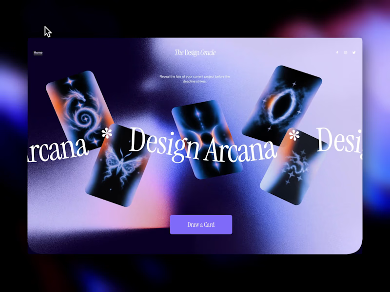
The Design Oracle is Live ✨ | Squarespace Make It Real Challenge Ever wondered if that "final_FINAL_v4" file is actually the last one? Or if the client will ask to make the logo just a little bit bigger? Let the cards decide. 🔮 I’m thrilled to unveil The Design Oracle (or Design Arcana)—an interactive, mystical tarot experience created specifically for freelancers and designers to reveal the fate of their current projects. This is my official submission for the Squarespace Make It Real Challenge. My goal was to completely break away from standard grid layouts and see how far I could push the creative boundaries using the new Finish Layer tools. Here is how the magic works behind the scenes (without a single line of custom code): Z-Axis & Overlapping: Used Fluid Engine to scatter the cards and floating stickers across the canvas, creating depth and a true "spread" feel. Hover Reveals: Leveraged native image swap effects so users can organically "draw" a card just by exploring the screen. Mobile Overrides: Rebuilt the entire chaotic desktop spread into a sleek, functional vertical stack for perfect mobile UX. After over a decade in UI/UX and brand design, I still believe the best projects start with pure creativity before locking into rigid systems. This was incredibly fun to build. Will you pull "The Golden Client" or "The Wheel of Feedback"? Take a deep breath, align your pixels, and draw your card here: https://round-herring-m73p.squarespace. Password: contrathebest I'd love to hear which destiny you got in the comments! 👇
18
55
1.4K
Message
8
Partamas Andras Roland
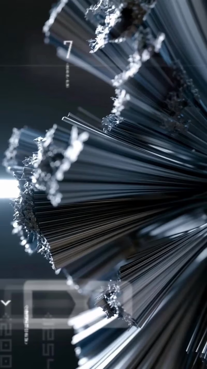
Pushing generative AI to its limits with this eyewear concept. ⚡️ No After Effects, no 3D software—just raw AI video engine control, structured physics prompting, and tight editing/sound design in DaVinci Resolve. The goal was to blend procedural fractal textures with rigid product geometry and frame-perfect audio sync. Sound ON 🔊 What do you think of this workflow?
5
8
286
Message
30
Augustus Amadi
Which is better for PlanUX: 3D Logo Mark Loader?
22
30
1.5K
Message
10
Alice D.
pro
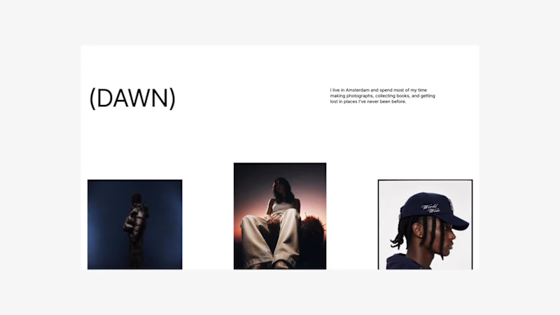
For the Squarespace Challenge, I built DAWN. DAWN is a conceptual portfolio for photographer Christopher Dawn built around a simple idea: photography should speak for itself. Website: https://maroon-sepia-dl3n.squarespace.com/ Password: DAWN Today, many creative portfolios compete for attention through excessive copy, interactions, and visual complexity. DAWN explores the opposite approach: a photography-first experience designed to remove friction between the viewer and the work. Rather than overwhelming visitors with information, the website focuses on what matters most when choosing a photographer: the images and the creative vision behind them. As part of the challenge, I joined Squarespace Circle to continue exploring how thoughtful, professional-grade design tools can help bring creative ideas to life. The project was designed around three principles: restraint, intentionality, and curation. Photography occupies the majority of the experience, supported by generous whitespace, minimalist typography, and editorial-inspired compositions. Every element was intentionally reduced to allow the work itself to become the primary storytelling medium. Inspired by contemporary editorial design and luxury fashion websites, DAWN feels closer to visiting a curated gallery than browsing a traditional portfolio. Using Finish Layer Finish Layer’s scroll animations became the foundation of the experience. Rather than using animation as decoration, they were used as tools for pacing, storytelling, and curation. One of the core ideas behind DAWN was that design decisions should always serve a purpose: including the tools used to build it. Finish Layer was never used simply for the sake of using it. Instead of incorporating every available feature, I intentionally chose the ones that best supported the concept and user experience of the project. Throughout the portfolio, photographs progressively reveal themselves and transition from isolated moments into carefully curated editorial compositions. Images begin small and gradually expand into editorial-inspired layouts as the user scrolls, creating visual rhythm, establishing hierarchy, and encouraging visitors to engage with each image before experiencing the collection as a whole. At the end of the website, Finish Layer is used to create a playful scroll-driven interaction that acts as Christopher’s introduction. As visitors continue scrolling, a series of hand-drawn elements are progressively revealed: a speech bubble, a camera, a camera flash, and finally a simple “Gotcha!” message. The sequence serves as Christopher’s personal introduction, presented in an unconventional and playful way. What appears to be a simple interaction is, in reality, a carefully choreographed scroll-driven experience designed to reveal personality through restraint. Animation is deliberately subtle and purposeful. Every transition was designed to support the photography rather than compete with it, demonstrating how Finish Layer can be used to create immersive storytelling through restraint rather than complexity. Every interaction throughout DAWN was designed to feel effortless. By embracing restraint and using Finish Layer intentionally, the project demonstrates that immersive and memorable digital experiences do not need to rely on complexity. Sometimes, thoughtful pacing, generous whitespace, and meaningful interactions are all that’s needed to let great work speak for itself. DAWN explores the idea that thoughtful design isn’t always about adding more: it is equally about knowing what to leave out. By combining editorial-inspired layouts, generous whitespace, and purposeful scroll-driven storytelling, the project demonstrates how a photography portfolio can feel immersive, playful, and highly curated while remaining remarkably simple.
10
501
Message
15
Lounès Ziani
Redouble is a complex B2B sales intelligence platform, the kind of product that's hard to explain in a sentence, let alone a video. We distilled it into a tight 30-second paid ad that cut straight to the value without losing the depth of what the platform actually does.
8
15
592
Explore projects