pro
Loreta Lazarova
Brand & Packaging Partner for Startups
- $1k+
- Earned
- 4x
- Hired
- 5.00
- Rating
- 280
- Followers
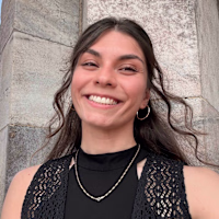
Ino / Brand Redesign / Fashion
3
56
Ino is a Bulgarian family knitwear brand with 25+ years of craft behind it - but its old identity no longer reflected the warmth, quality and heritage at the heart of the brand.
For the redesign, I built the concept around family heritage and personal signature - creating a visual system that feels refined, human and timeless, while giving Ino a more recognizable presence across packaging, social media and brand touchpoints.
42
96
2.4K
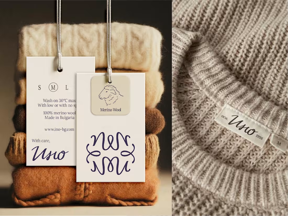
Everbloom / Packaging Design / Supplements
22
891
I’ve been exploring @FLORA these days and this is one of the results.
This 360 spin actually took a bit of experimenting. I first started with static pouch mockups using the front and back designs, hoping that with detailed prompt the tool would simply turn them into a smooth rotation but the result came out rather buggy, with random zooming and awkward movement.
So I changed the approach - I generated the pouch spin separately in Pacdora, added the front and back pouch designs for clearer guidance and kept refining the prompt until it got much closer to what I had in mind. The base static mockup itself also went through Kittl and some Photoshop tweaks before getting here.
It’s still not perfect but I really enjoy testing, combining tools and figuring out how to push AI closer to the kind of product visuals I actually want to create.
8
11
869
Not your average protein pouch 🌱
Earthful is a health & wellness brand offering tasty, nutrient-packed meal and drink replacements for active, outdoorsy people and free-spirits.
Full with hand-drawn illustrations and elements ensuring Earthful’s packaging and identity feels friendly, authentic and memorable.
What's your fav part of this identity? 😊
Check out (https://contra.com/p/AqXAmlO3-earthful-brand-identity-and-packaging-foodandbeverage?referralExperimentNid=DEFAULT_REFERRAL_PROGRAM&referrerUsername=coloretta) the full showcase in my Contra portfolio.
3
29
1.3K
Earthful / Brand Identity & Packaging / Food&Beverage
6
106
Collabify / Brand Identity / Influencer Marketing App
17
178
Working on this healthcare project turned out to be one of my fav experiences!
I took even longer time in the strategy phase to analyze and research brand's foundations and the market to ensure we position the brand correctly. And the result is a visual personality based on calmness, warmth, community and reassuring approach. 🤗
Check out the full showcase (https://contra.com/p/6R7U27Ac-awarewell-brand-identity-healthcare?referralExperimentNid=DEFAULT_REFERRAL_PROGRAM&referrerUsername=coloretta) in my profile.
2
4
654
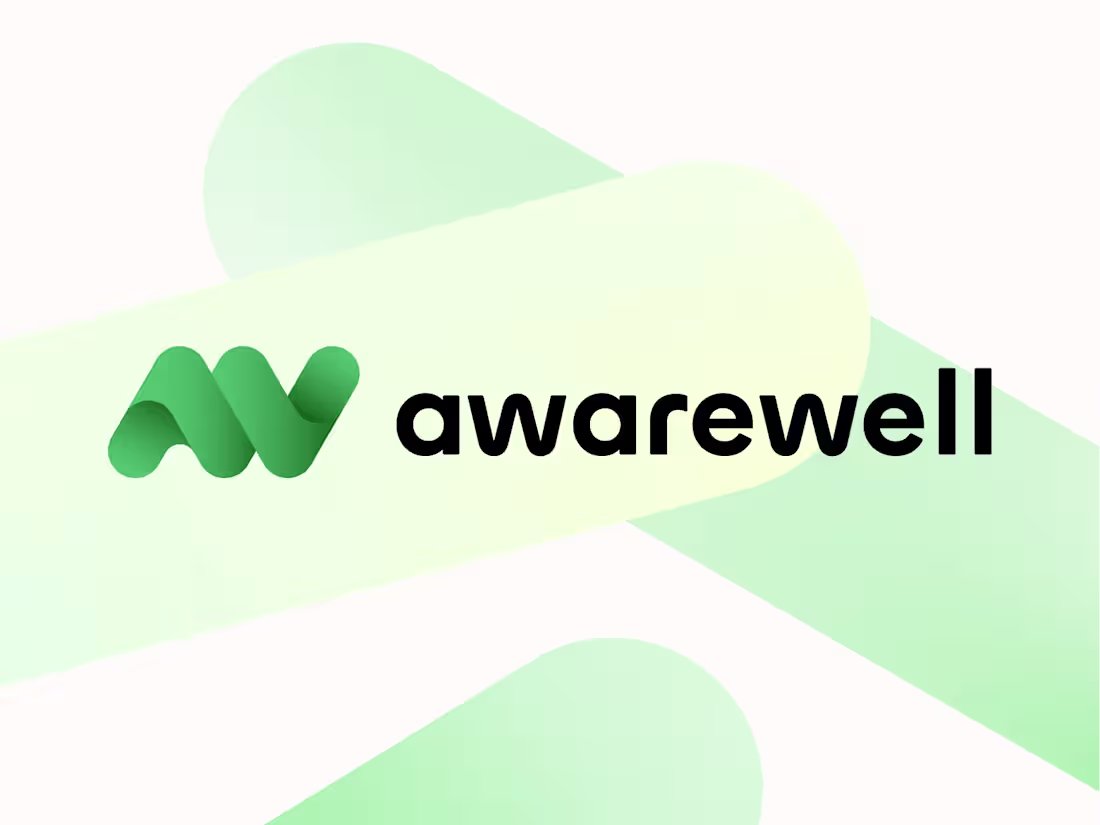
Healthcare company / Brand Identity
11
111
$1.5K+ earned
1
3
45