pro
Loreta Lazarova
Brand & Packaging Partner for Startups
- $1k+
- Earned
- 4x
- Hired
- 5.00
- Rating
- 280
- Followers
I’ve been exploring @FLORA these days and this is one of the results.
This 360 spin actually took a bit of experimenting. I first started with static pouch mockups using the front and back designs, hoping that with detailed prompt the tool would simply turn them into a smooth rotation...
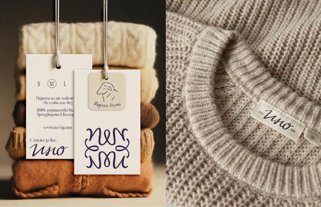
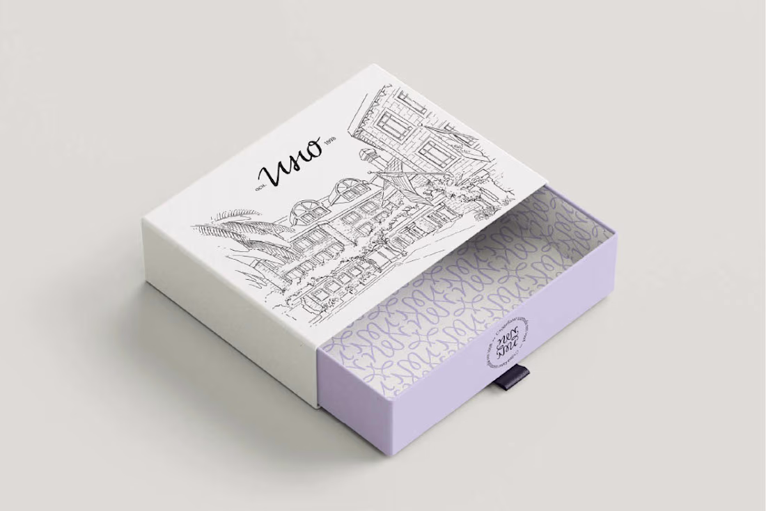
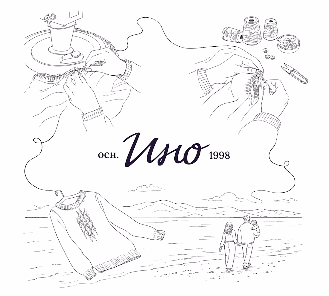
Delivery box packaging design for Ino - a Bulgarian heritage knitwear brand.
For this box, I created an illustrated packaging concept inspired by Ino’s real knitting process. The client sent footage from their factory and I translated it into illustrations. The goal was to make...
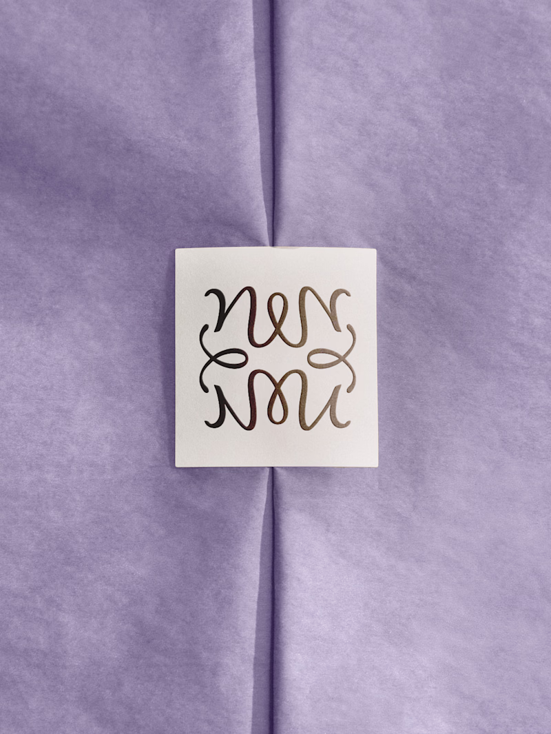
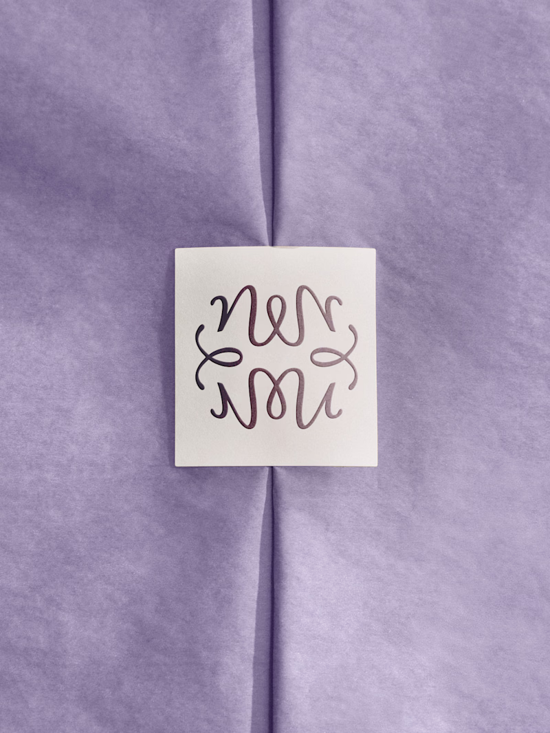
Not always your first suggestion is the final result. For Ino, the client wanted the logomark to be a bit more warmer, softer and more approachable - it matches the brand better, yes, but tbh I still very much like this sharp, iconic first version 😁 wdy think?
6 voted
55%
5 voted
45%
11 votes
Closed
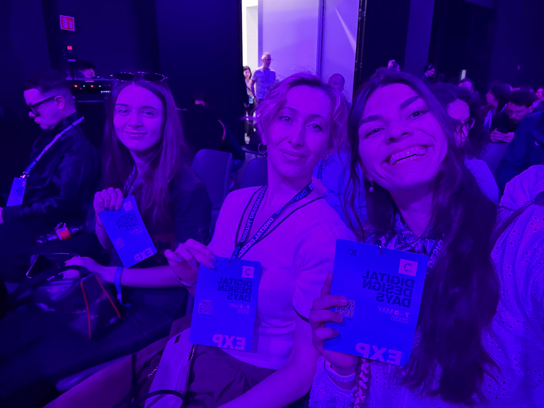
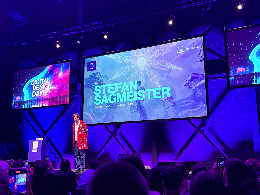
A few moments from our trip to Digital Design Days in Milan with simple.studio - the 10th anniversary edition of the event. (auguriii 🎉)
Three days of talks around AI, UX, motion, branding and the future of design. But the ideas that stayed with me most were the human ones -...
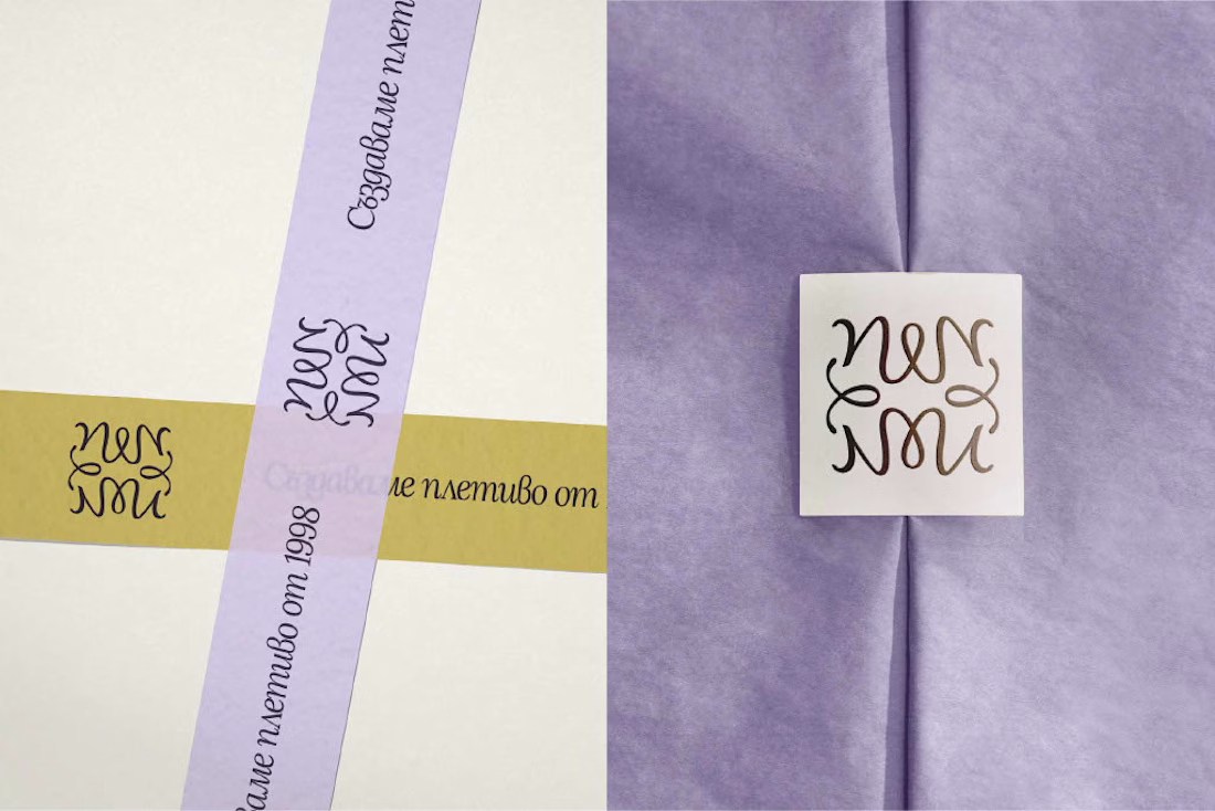
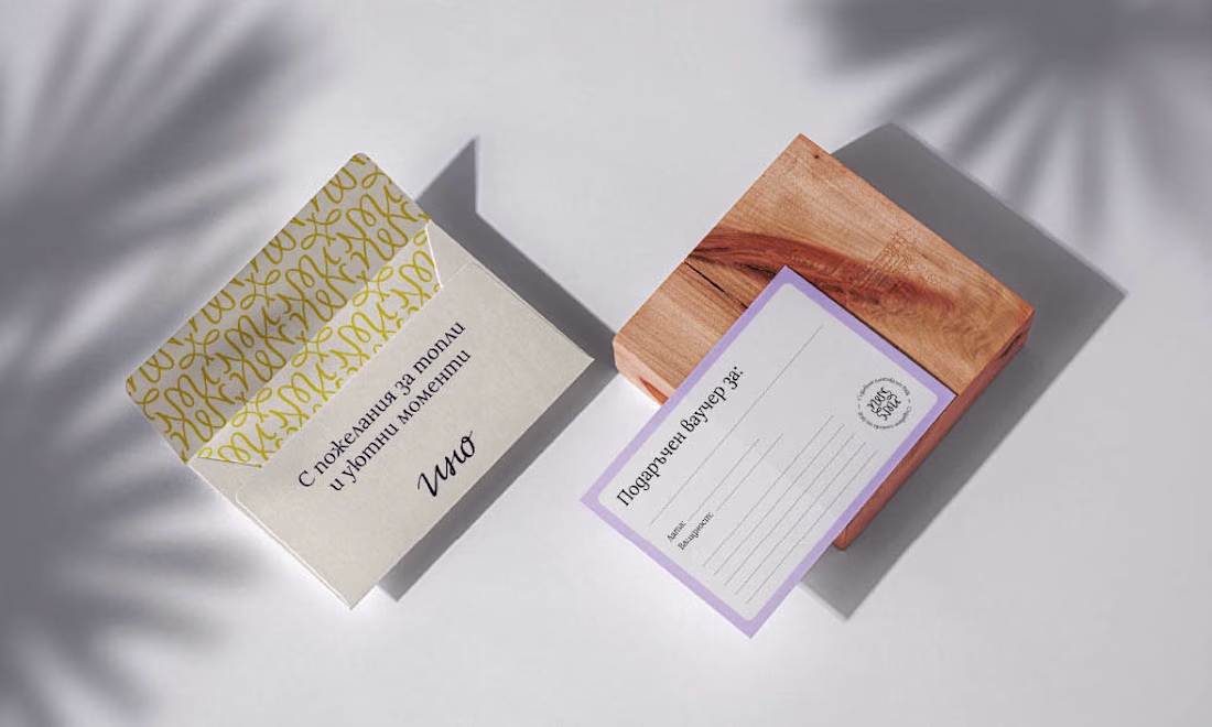
Ino is a Bulgarian family knitwear brand with 25+ years of craft behind it - but its old identity no longer reflected the warmth, quality and heritage at the heart of the brand.
For the redesign, I built the concept around family heritage and personal signature - creating a...