Ino / Brand Redesign / Fashion
Loreta Lazarova
*UPDATED DESIGN AND VISUALS
INO / Brand Redesign
Brand keywords: Craftsmanship, Heritage, Family, Authenticity, Timelessness, Comfort, Natural Materials, Warm Premium
WHAT?
INO is a Bulgarian family knitwear brand creating premium knitted clothing and accessories from natural materials, rooted in 25+ years of craftsmanship, tradition and attention to detail.
WHY?
To make knitwear feel meaningful again - comfortable, lasting and beautifully made for real everyday life, while carrying the warmth of family heritage and the precision of expert craft.
FOR WHO?
Women, men and families who value timeless style, natural materials, comfort and clothes that feel personal - pieces made to be worn often, cared for and kept for years.
How Ino looked before the redesign
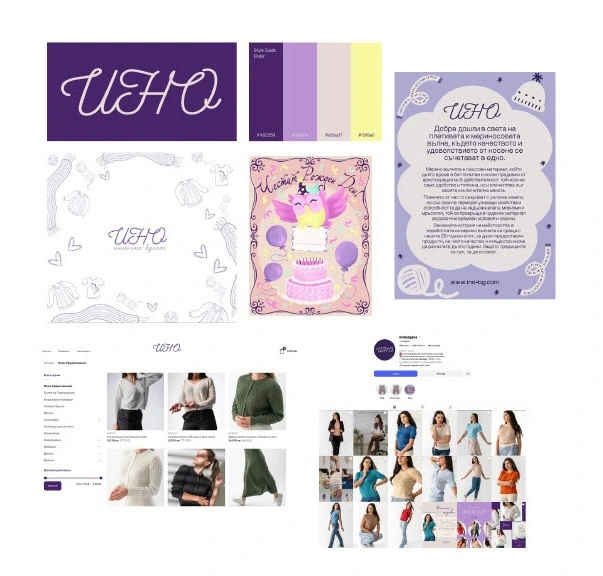
Ino before
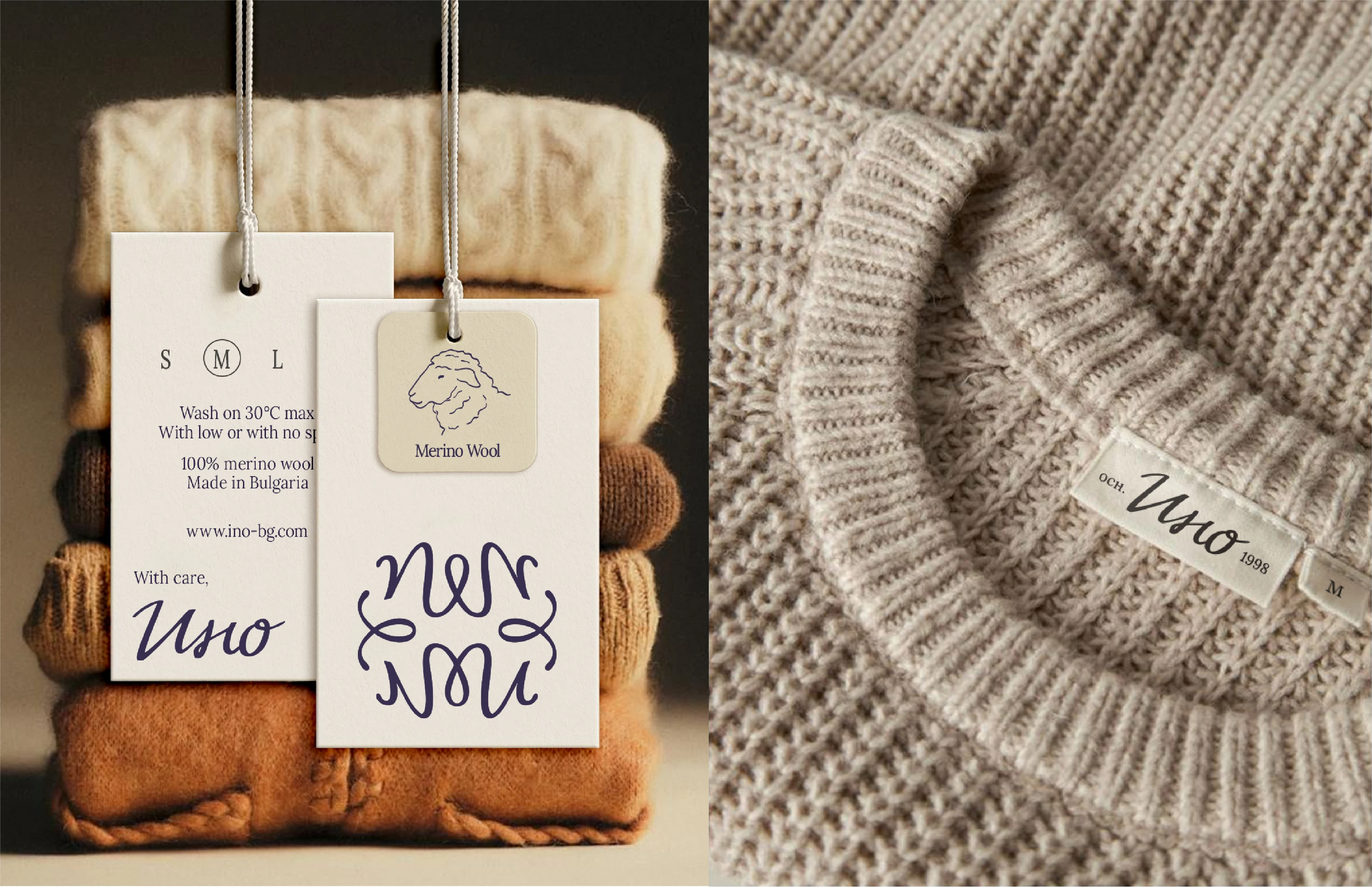
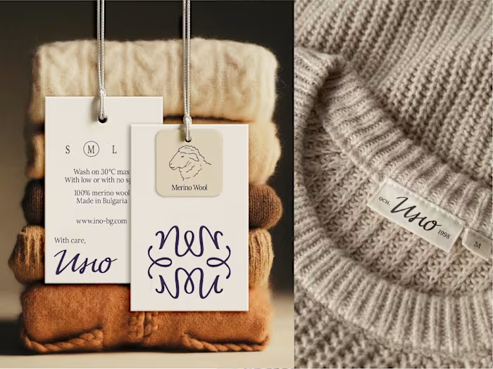
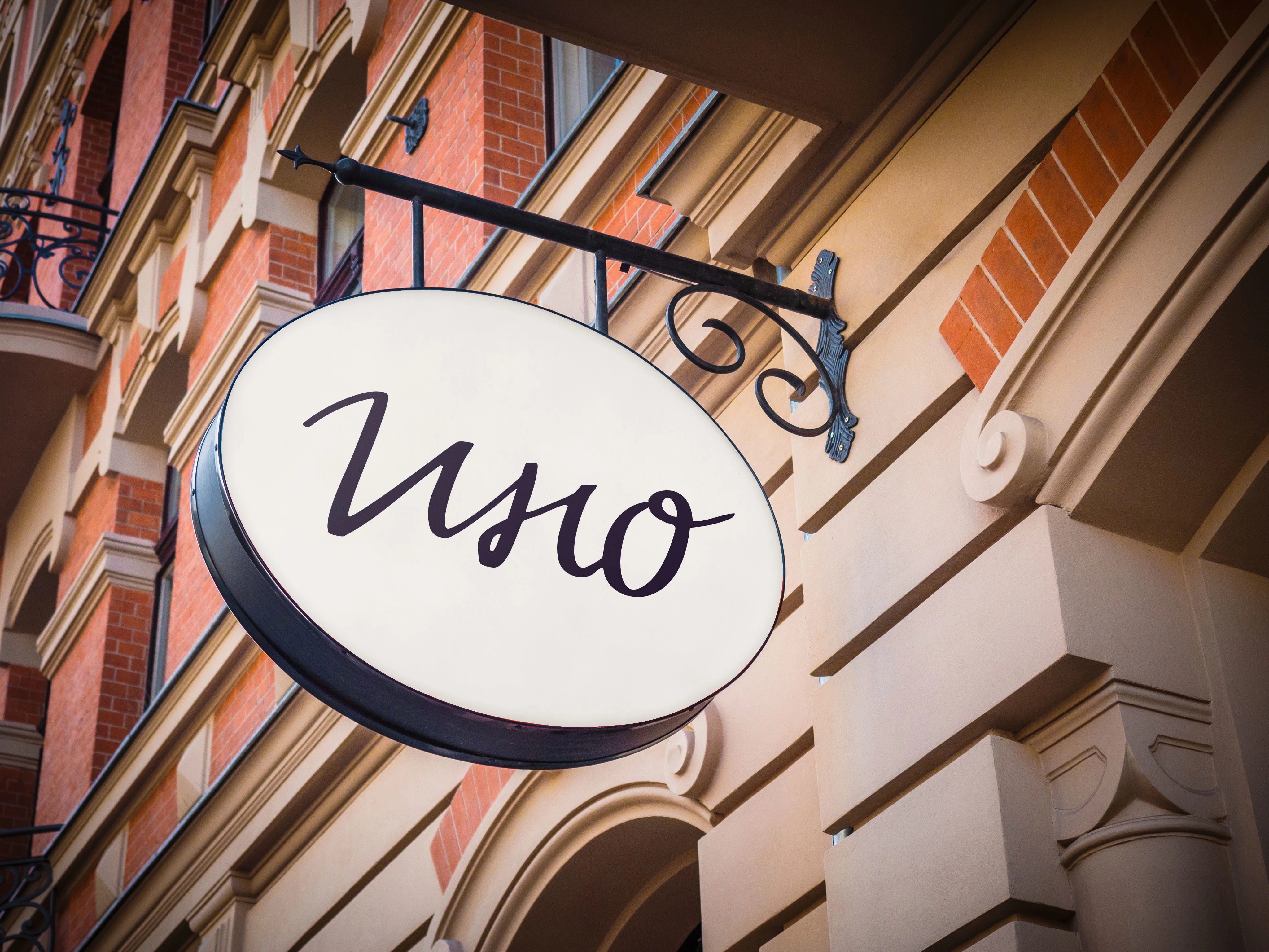
Ino after the redesign
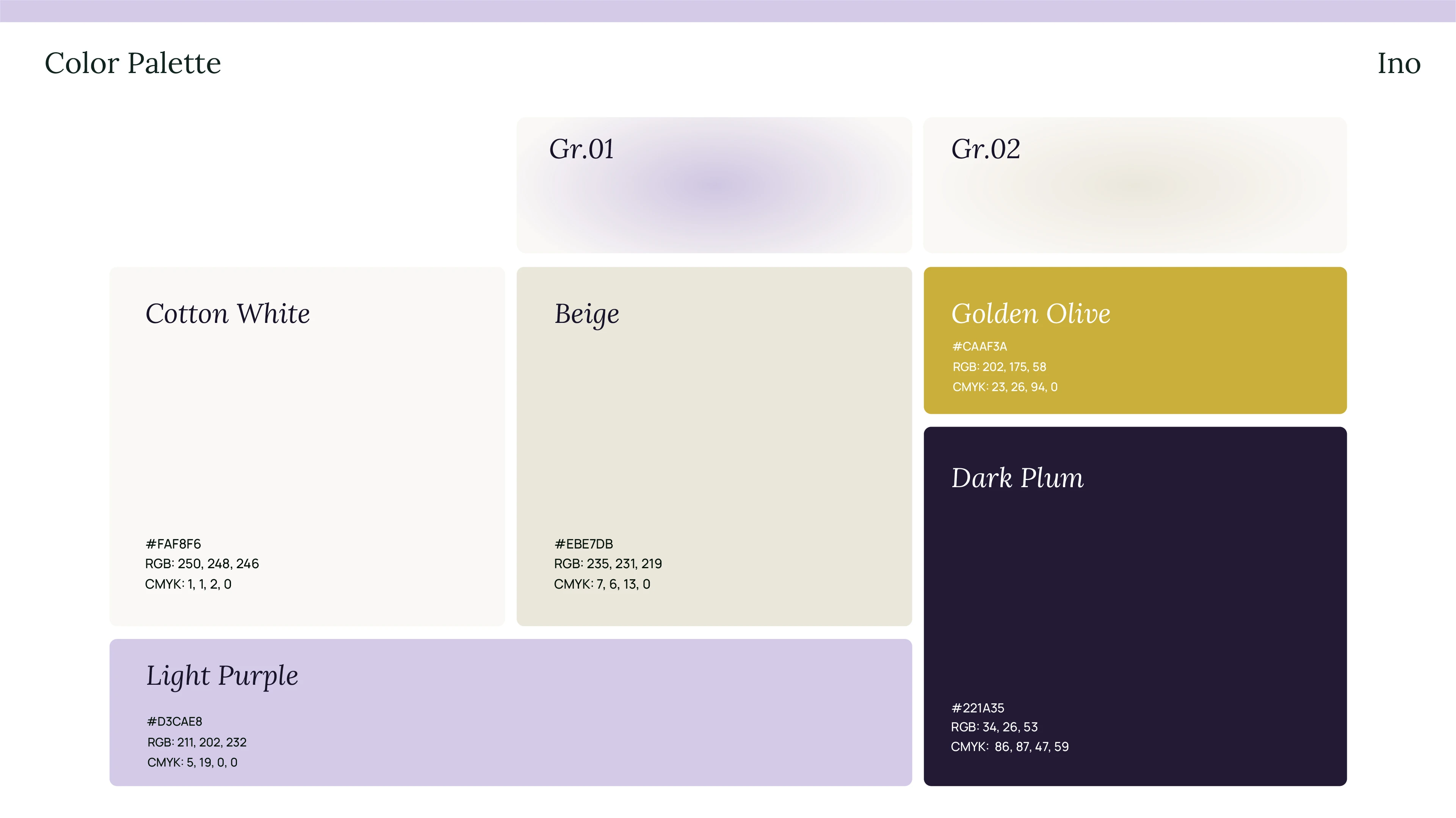
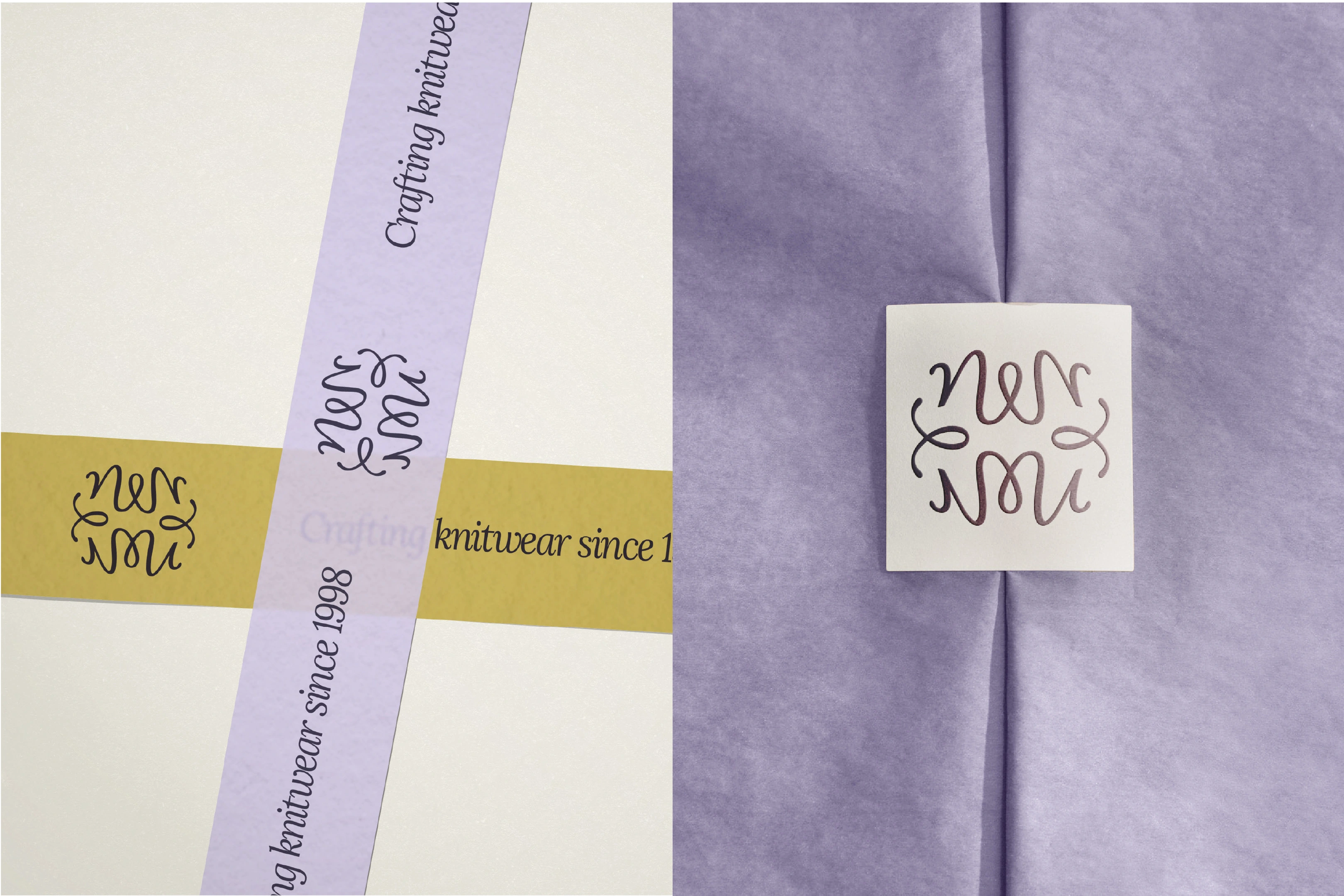
Color Palette
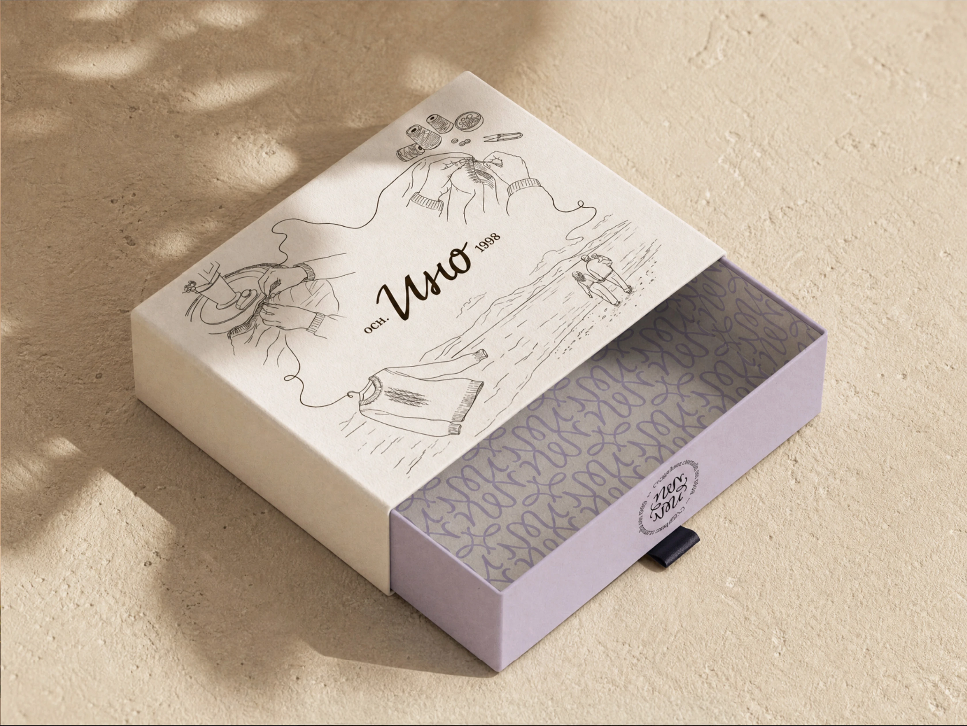
Delivery box with a storytelling. Custom illustration by me
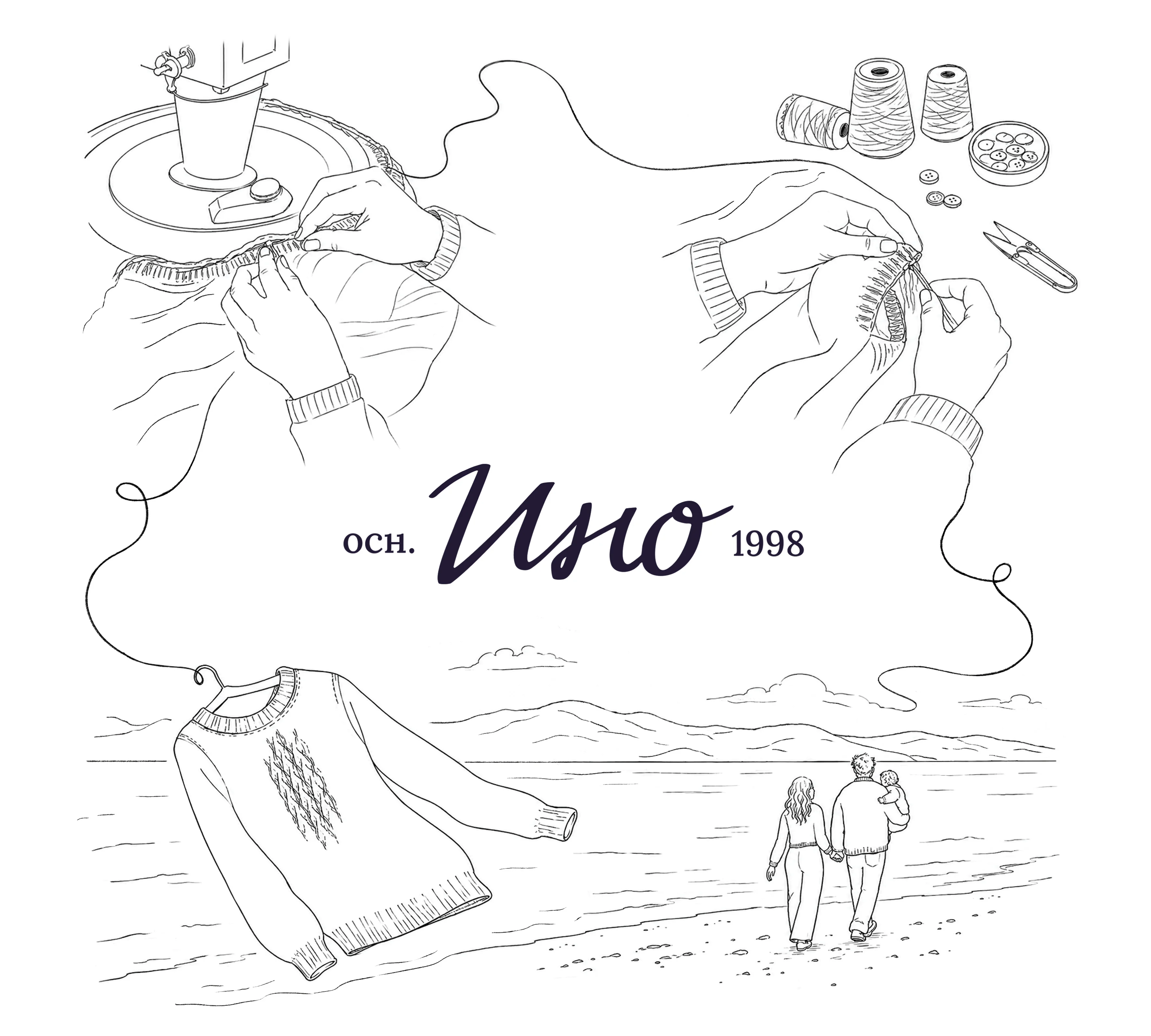
Custom Illustration with scenes inspired by the real machine knitting process.
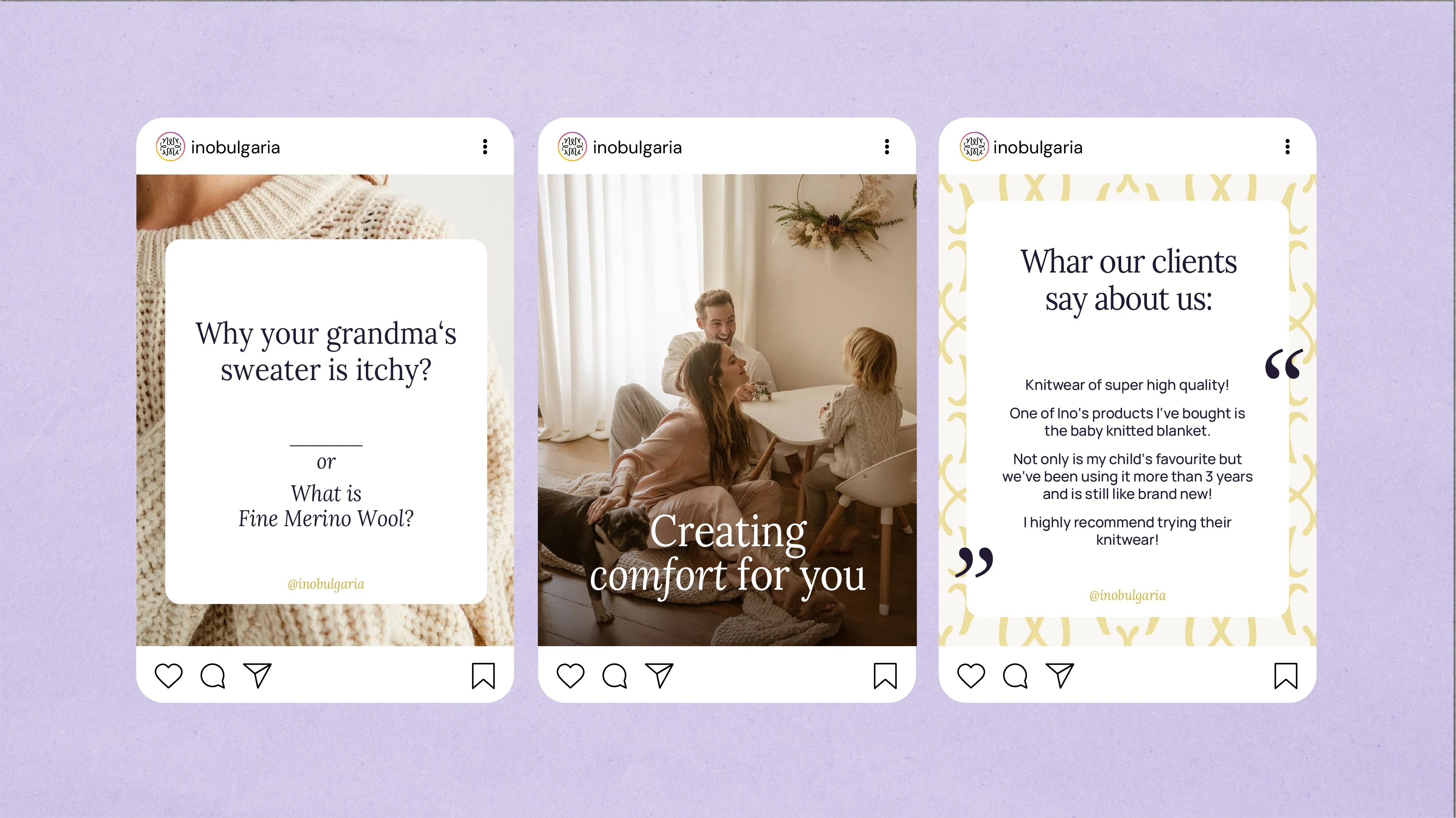
Social media visuals examples
Scope of work:
Brand Strategy
Creative Direction
Visual Identity
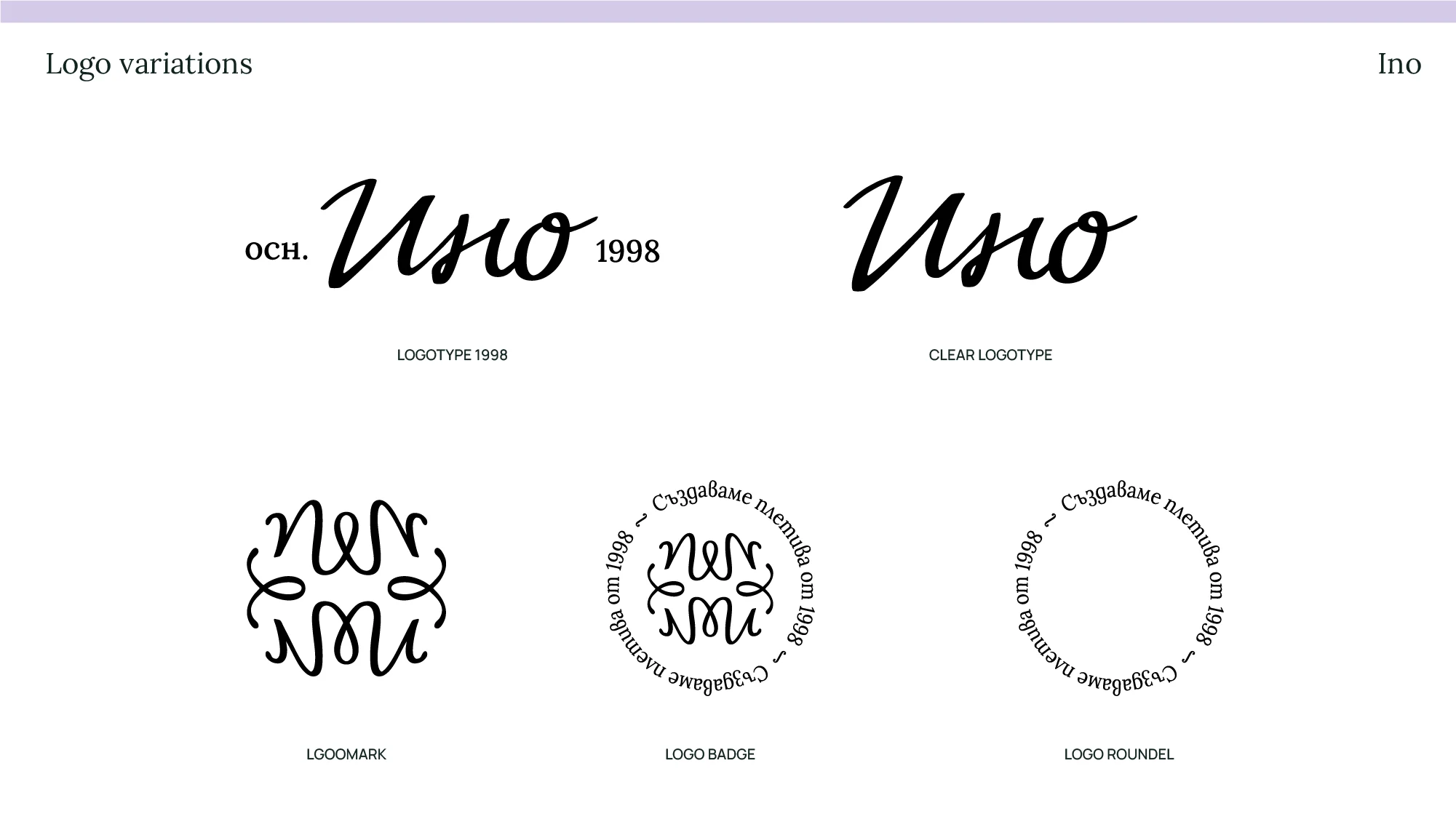
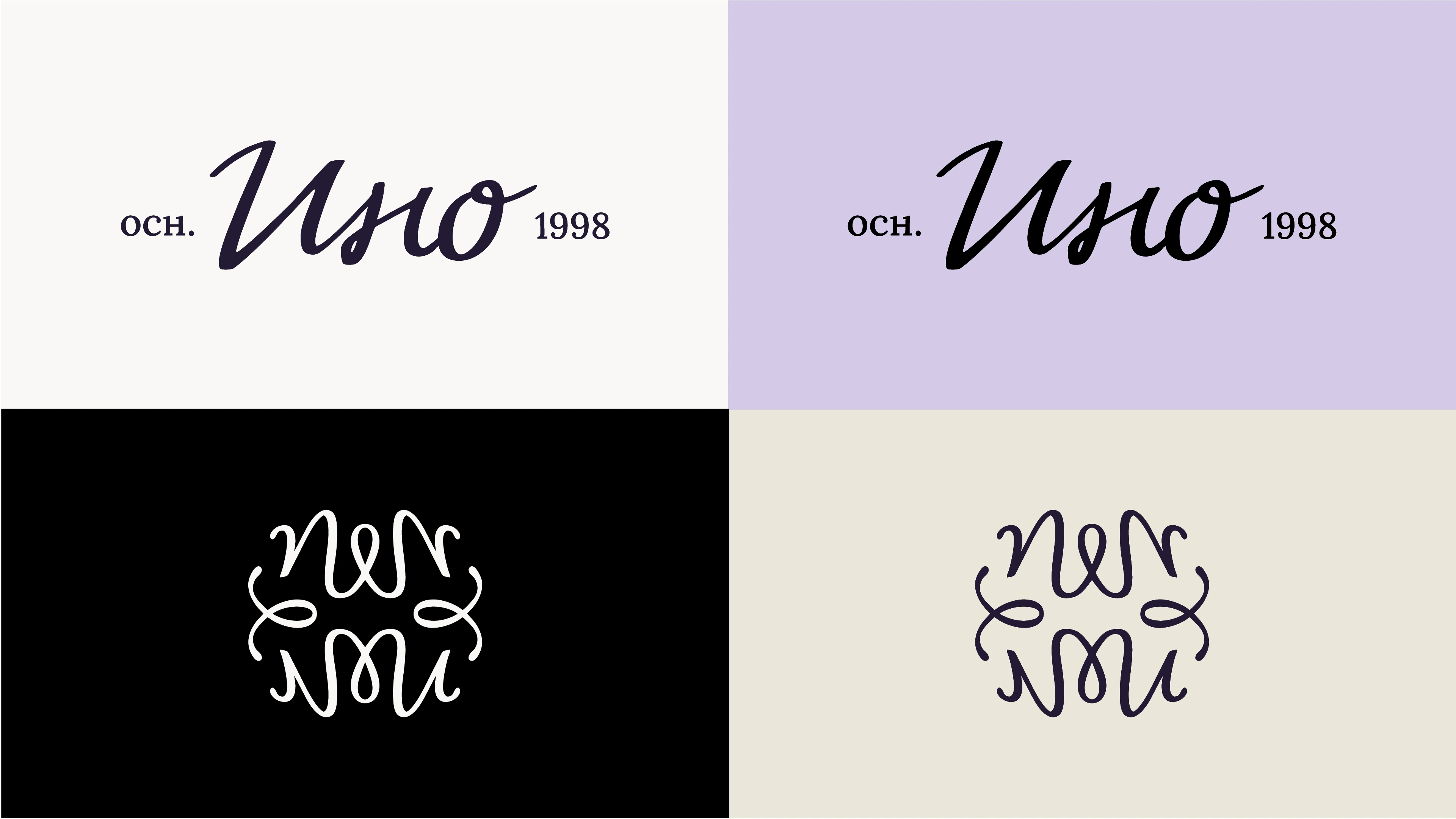
Logo System
Brand Guidelines
Packaging Design
Custom Illustration
Social Media Direction
Photography Direction
Like this project
Posted May 6, 2026
Brand strategy, visual identity, packaging design and custom illustration for INO - a family knitwear brand rooted in craftsmanship and heritage.