pro
Alice D.
Branding & Framer sites for founders who stand out.


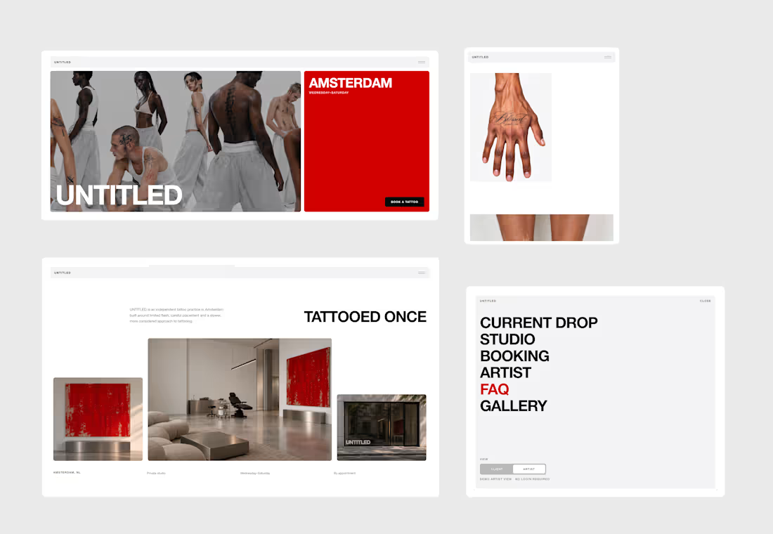
From tattoo enquiry to confirmed appointment.
UNTITLED is a fictional independent tattoo studio in Amsterdam, built around a very real problem: tattoo bookings often live in DMs.
Clients ask about prices, availability, placement, references and custom ideas, while artists spend time managing the same back-and-forth manually.
UNTITLED brings that entire process into one connected experience.
The product has two sides:
CLIENT VIEW
Clients can browse available flash, place tattoos on a 3D body model, choose a date and time, complete a demo checkout, or submit a custom tattoo request with references, placement, size, budget and preferred availability.
ARTIST VIEW
The artist dashboard brings together bookings, payments, calendar availability, flash management, custom enquiries, quotes and activity in one place.
Both views are connected, creating a fully working end-to-end demo.
A flash booking updates the artist calendar and design availability, while a custom request appears in the dashboard for the artist to review, quote and turn into a confirmed appointment.
3D PLACEMENT
The booking flow includes an interactive 3D tattoo placement system, allowing clients to choose body type, skin tone and body area, then position, scale and rotate the selected tattoo before booking.
This replaces part of the placement conversation that would normally happen through messages.
CUSTOM REQUESTS
Not every tattoo starts from an existing design.
Clients can switch from FLASH to CUSTOM and send a structured enquiry with reference images and project details.
The artist can then review the request, create a quote and propose an appointment directly from the dashboard.
Custom request → quote → approval → booking.
FULLY RESPONSIVE
The complete experience is responsive across desktop, tablet and mobile, including the website, booking flow, 3D placement interface and artist dashboard.
DEMO
UNTITLED is a functional demo built for the Lovable Challenge.
Payments are simulated and the data is session-based so the full experience can be tested repeatedly, but the core product logic is fully interactive across both Client and Artist views.
BUILT WITH LOVABLE
I built UNTITLED entirely in Lovable, from the client-facing website to the booking logic, 3D placement experience and artist dashboard.
I also applied to the Lovable Partner Program during the challenge and I’m now officially a Lovable Partner!
Live website: https://untitledamsterdam.lovable.app/
X Post (https://x.com/webdesign_alice/status/2105493970499297637?s=46&t=1ZFswUtJzT6BPLQaoOweGw)
Walkthrough video (for product and process) below.
34
59
3.9K
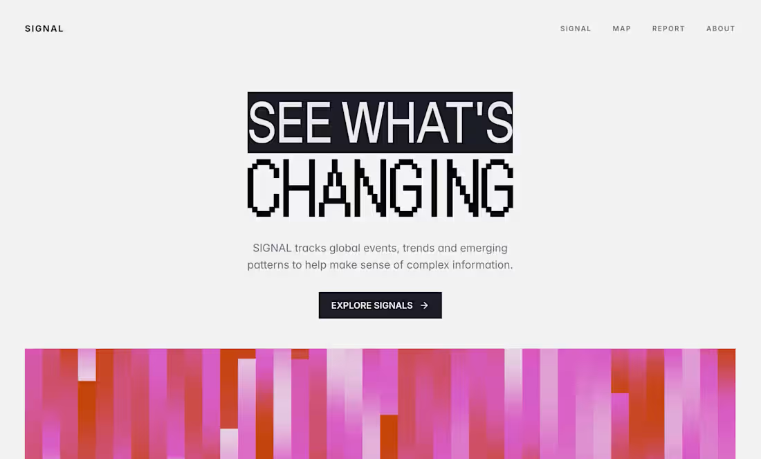
Kicking off September by working on a new website in Framer
58
88
3.5K
Excited to share my submission for this Omma buildathon: Dissolve
Live link: https://omma.build/p/dissolve-zak2ob
Dissolve is an interactive, creative web utility tool built entirely on the Omma platform. The concept is centered around dynamic deconstruction, giving users the power to dissolve visual media in real-time.
Built 100% in Omma
Omma Studio: Used to generate the custom, smooth polymer pink arch mascot card acting as the application’s flagship visual asset.
Omma Canvas: The entire product architecture, interactive state management, responsive grid layouts, custom slider controls, multi-format file exporters, and cursor-tracking mouse-tilt vectors were engineered natively inside Canvas.
Effects
Pixel: Transforms images into highly customizable pixel grids. You can adjust the block size, pixel shape, colors, and layouts, all paired with animated motion.
Dither: Converts images into retro, ink-and-paper dot patterns, featuring live-animated drifting and shimmering fields.
ASCII: Maps image brightness to text characters in real time. Features customizable character sets, boxed layouts, and live text animations.
Particle: Explodes images into interactive, physics-based particle fields that react to your cursor and snap back into place. Crucially, this effect can be exported as self-contained, working HTML or TSX code.
Imports that give you freedom: Dissolve isn’t limited to the default mascot placeholder. You can upload your own image or video and the effect engines will rebuild themselves around it instantly.
Upload an MP4 and the effects run live on the video frames: the pixel grid, dither dots, and ASCII characters all recalculate in real time as the video plays.
You can also upload a custom background image for Pixel, Dither, and ASCII: it sits behind the effect layer, composited directly on the canvas. Every import is local and sandboxed, nothing leaves your browser.
The export system was built with intention: Static effects export as PNG or JPG at ×1 to ×4 resolution. PNG is transparent when no background is set; with a background, the full canvas is included.
When a video is uploaded or animation is enabled, exports switch to GIF and MP4. The Particle effect exports as a self-contained HTML file or TSX component with all settings and physics baked in, fully responsive to any screen size.
X Post: https://x.com/webdesign_alice/status/2072697112840577441?s=46&t=1ZFswUtJzT6BPLQaoOweGw
Try it out and feel free to comment your creations below!
2
5
693
Introducing KEEPS: A Digital Home for Physical Memories
KEEPS is a mobile app designed to preserve the physical objects that carry our memories.
While most memory apps are built around photos, KEEPS is built around everything else.
Concert tickets, boarding passes, receipts, handwritten notes, invitations, conference badges, and other small objects that people often keep long after their practical purpose has ended.
The idea came from a simple observation: many of us keep these items because they represent experiences, relationships, milestones, and moments we don’t want to forget. Over time, they become scattered across drawers, wallets, books, and boxes, making them difficult to revisit and easy to lose.
KEEPS transforms these physical keepsakes into digital artifacts.
Users can scan real objects, remove backgrounds, add contextual information such as location, date, people, and personal notes, and organize them into custom collections. Artifacts can also be created from templates, allowing users to recreate memories that no longer exist physically.
The prototype includes onboarding, collections, artifact detail pages, discovery flows, creation flows, profile experiences, and a connected navigation system that allows users to move through their archive naturally.
Rather than generating the entire product in a single prompt, I used Flowstep as a design engineering tool.
I started with a visual direction created in Figma, including custom illustrations, typography, layout systems, and the overall structure.
From there, I rebuilt the product inside Flowstep screen by screen, using detailed prompts to define hierarchy, spacing, interactions, navigation patterns, and user flows.
Each screen became the foundation for the next. Existing components were reused, refined, and expanded to create a cohesive design system across the entire application. The process was highly iterative: generating, reviewing, refining, and rebuilding until the product felt consistent both visually and functionally.
The result is not simply a collection of screens, but a connected prototype with clear user journeys, interaction logic, and product intent.
KEEPS is built around a simple belief:
The smallest objects often carry the biggest memories.
Flowstep file link: https://app.flowstep.ai/file?activeFileId=cb23715a-64af-4fb6-822a-c789fb99b461
X Post: https://x.com/webdesign_alice/status/2081713836613050543?s=46&t=1ZFswUtJzT6BPLQaoOweGw
The walkthrough, screen recording of the prototype working in Flowstep, my custom illustrations, and the screens designed in Flowstep are included below.
51
94
3.9K