The network for creativity
Join 1.25M professional creatives like you
Connect with clients, get discovered, and run your business 100% commission-free
Creatives on Contra have earned over $150M and we are just getting started
Back to feedPost





the pink blocks look so fun. nice start

Best of Luck

Looks super unique, great start!! 😍

Looks so clean🌟


This project is full of creativity and passion!

Nice visual combos. Looking forward to seeing the whole thing.

Love it. so nice

The success signal looks strong! 😉

Love that font! 🔥

The pixel-style “CHANGING” type fits the Signal idea really well. Keeping the rest of the hero quiet gives both the headline and the pink/orange strip space, while “Explore signals” stays easy to find. Nice direction, Alice.


The hero section looks great, the crop image it's a estrategic decision!

Nice Work!

Awesome!

Nicely done👏

just don't add those text flip/slide animation....i'm tired of them

That pixelated type on the hero makes an immediate impression. Framer handles these typographic contrasts so well, especially when the rest of the layout stays minimal.


Amazing 🔥

Sounds good

amazing

I love the typography already


Nice work, the fonts looks unique and excellent

already interesting!

Looks clean and amazing

Great going man!

Good Start!
You welcome, Alice!
The network for creativity
Join 1.25M professional creatives like you
Connect with clients, get discovered, and run your business 100% commission-free
Creatives on Contra have earned over $150M and we are just getting started



Related posts

🎨 Brand and web design for Nura, the AI tool for real estate
See Case Study here


Amazing work


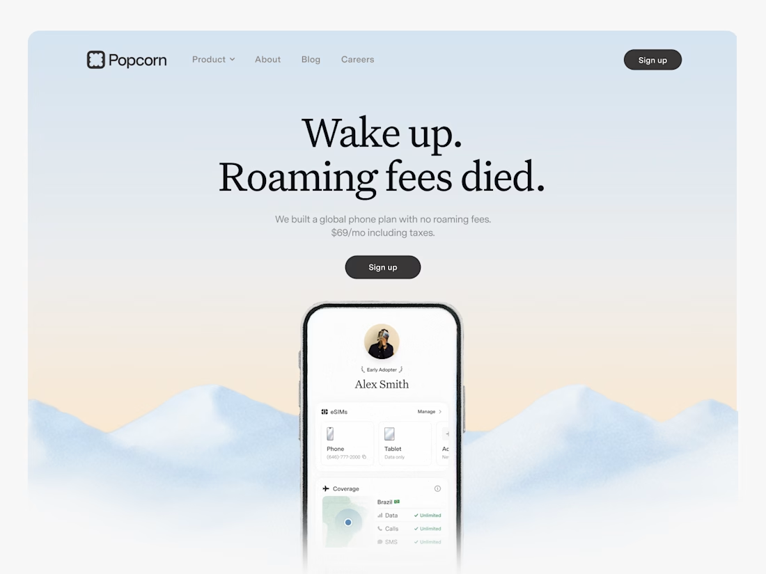

Looks great! What about readability though?
Text seems low contrast to me. Although I have a poor vision and most things seem too small and low contrast to me.
Designed a website concept for AI powered platform.
I wanted to give it a clean, minimal with a custom isometric illustration in the hero section.
Which version do you like better?
19 voted
59%
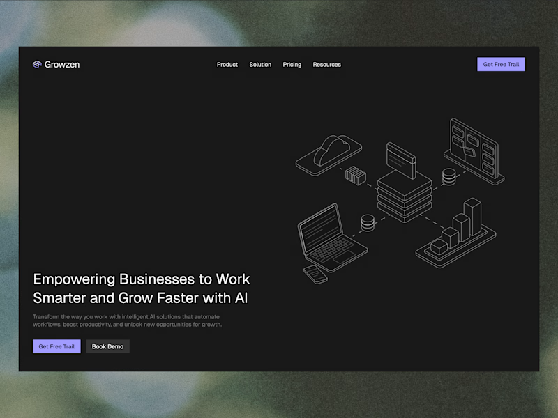
13 voted
41%
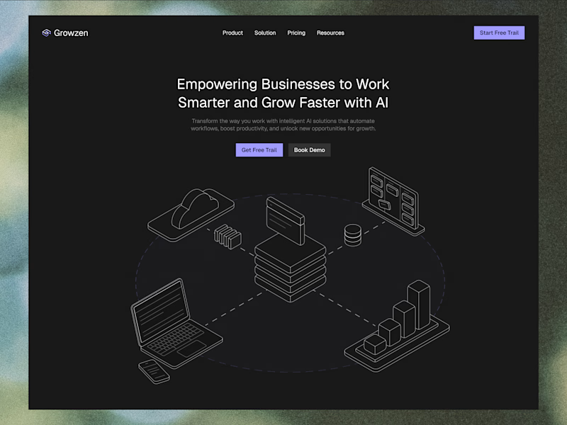
32 votes
Closed
