Contra - A professional network for the jobs and skills of the future
Discover
Sign Up
Post a job
Sign Up
Log In
Filters
Projects
People
Filters
Featured
Web developers
Content creators
Graphic designers
Product designers
AI developers
Motion designers
Social media marketers
Animators
Video editors
Projects we love
Projects we love
Standout projects making waves around the web
View more
Message
11
Maia Anderson Rembert
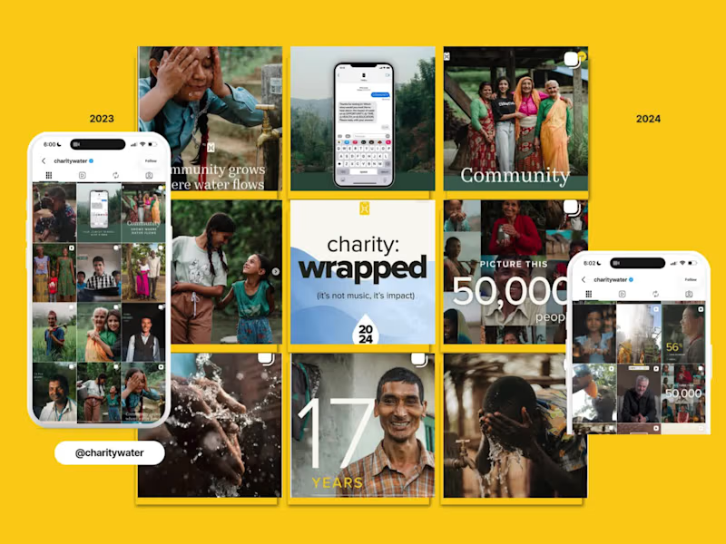
charity: water EOYG Organic Campaign Social Strategy
11
441
Message
25
Oleksandra Marchenko
pro
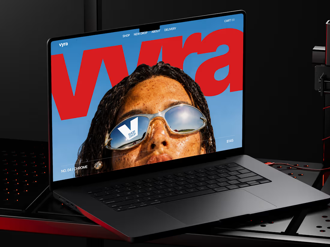
🕶️ Web design for eyewear e-commerce website | Hyperactive
25
479
Message
20
Val Guerra
pro
Explainer video for Paper
1
20
446
Message
16
Robin Holesinsky
pro
Atom.money: Brand Identity for a Regulated Fintech Platform
16
225
Web design projects using Framer
Framer
The best modern websites built on the leading web design tool, Framer
View more
Message
13
Studio Ilker
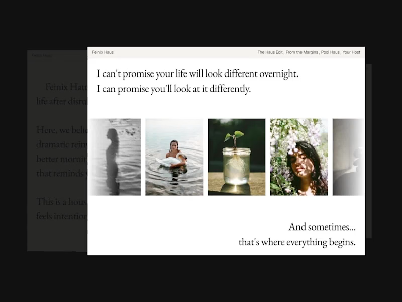
Feinix Haus Website
13
580
Framer is the leading tool for building websites, fast
Hire experts
Message
9
Creative Capital
pro
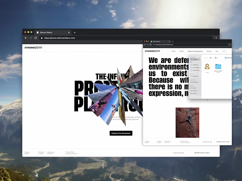
Sthorm Riders Framer Website Design
3
9
129
Message
13
Diego Colino - Vítrea Studio
max
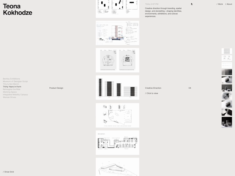
Teona Kokhodze — Framer Website Creative Director Portfolio
13
140
AI projects
AI
New projects from the best AI creators
View more
Message
17
Filip Panov
max
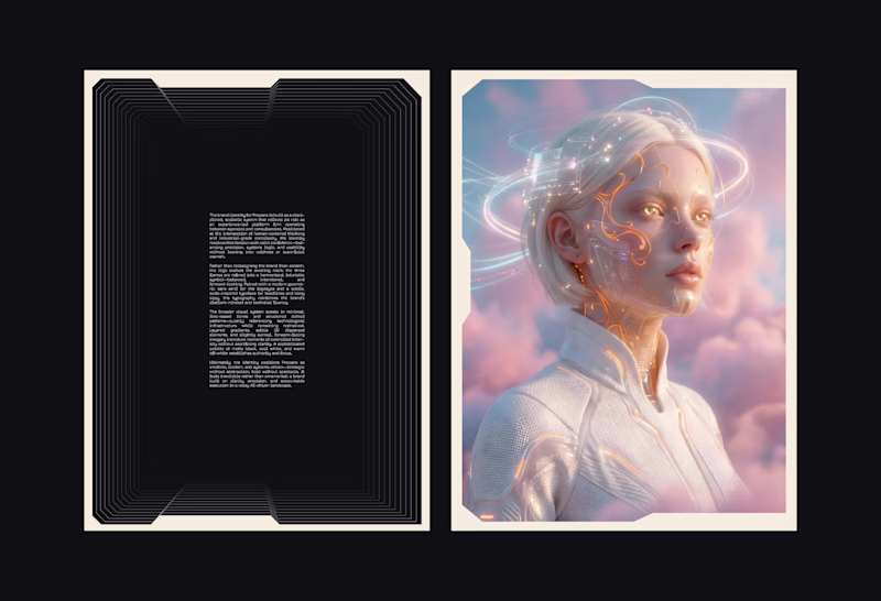
Brand Identity for Propane
17
241
Message
20
Anna asol_design
pro
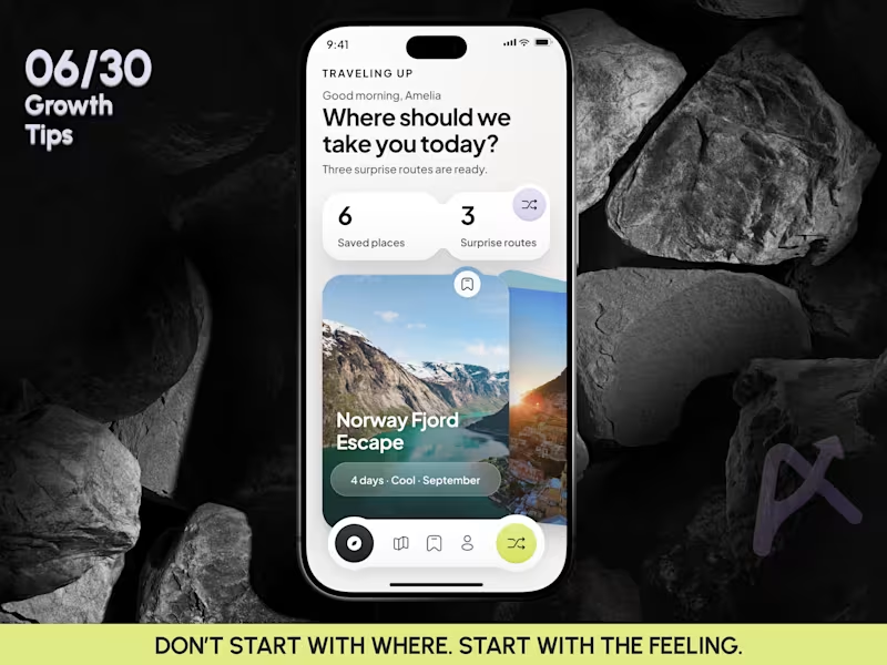
Mobile App Design | AI Trip Randomizer Planner Mobile IOS App
20
118
Message
10
Darya Batyr ✦
max
From AI-Generated to Premium: Spartan SEM Brand Identity
10
100
Message
9
Razvan Badea
pro
Alkera - Logo Design & Brand Identity
1
9
211
Brand design projects
Brand design
Bold visual identities and branding systems created by top independent designers
View more
Message
10
Virginia Roson
pro
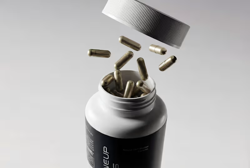
Brand Identity and Packaging Design for Maneup Labs
10
241
Message
15
Révolté
pro
Vetti Brand Identity Design
15
145
Message
10
Mateus Scopel
pro
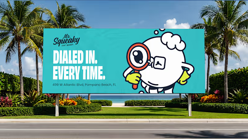
Mr. Squeaky | Brand Design
10
84
Message
6
Flávia Jackeline
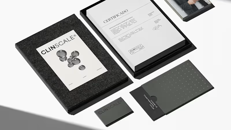
ClinScale — Brand Identity & Logo Design for Clinical Research
1
6
58
Video editor projects
Video editing
Creative video edits made using today’s best editing tools
View more
Message
3
Kayla Elorza
pro
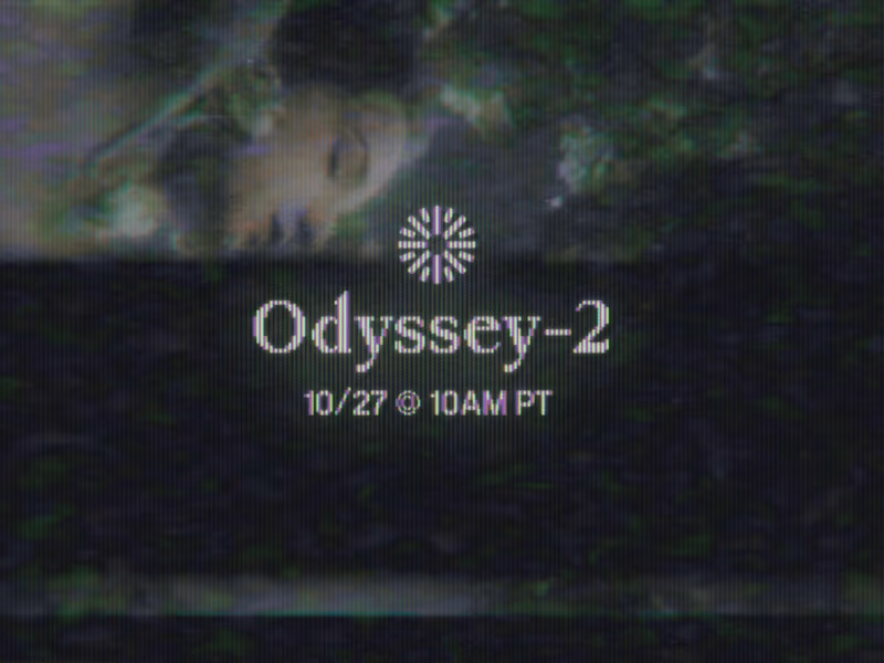
Odyssey-2 Launch Video Teasers
3
170
Message
8
Alejandra Tello
max
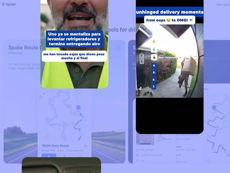
Meme-Driven Video Editing for a Delivery Driver App
1
8
162
Message
3
George Alexander-Pike
pro
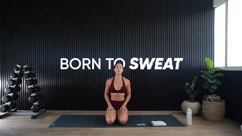
Born To Sweat Video Editing/Motion Graphics
1
3
146
Message
7
Jesse Calis
pro
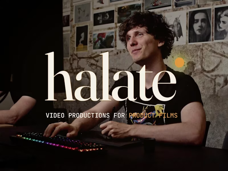
Halate Showreel
1
7
97
Standout projects
Standout projects
More projects we love that are making waves across the web
Message
1
John Nicholson
pro
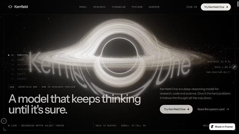
Modelhorizon, a versatile SaaS template now available for free remix on the Framer marketplace.
1
1
69
Message
15
Aizaan Nafees
pro
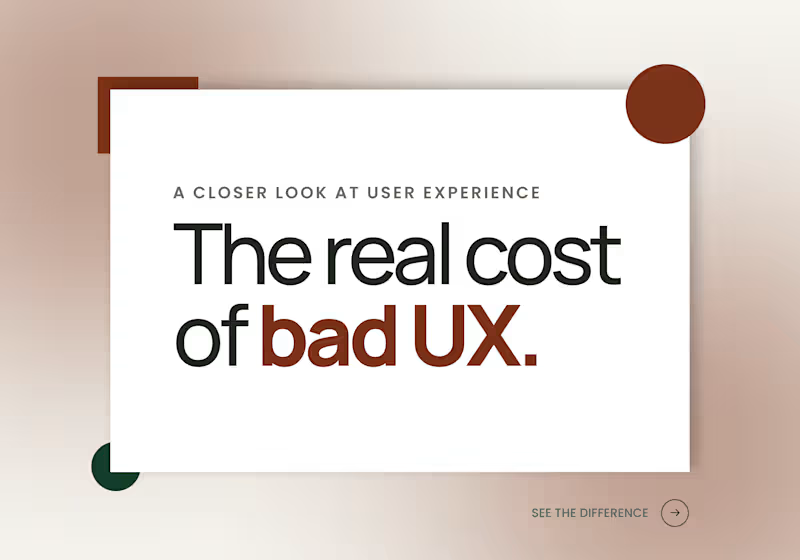
The real cost of bad UX: Cluttered layouts, and slow load times quietly push people toward competitors before they even read your value prop. Good design isn't decoration. It's retention. If you're not sure how your product's UX is performing, that uncertainty is usually the first sign it needs a look. Send me a message - happy to share quick audit on your existing design! #UXDesign #UIUX #WebDesign #UserExperience #WebsiteDesign #ConversionFocusedDesign
1
15
134
Message
23
Orbix Studio
max
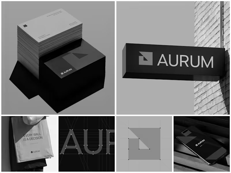
Aurum - Brand Identity System When Aurum came to me, they had a name and a vision a studio that wanted to feel deliberate, architectural, and unapologetically bold in every space it touched. No logo, no system, just a line that stuck with me from our first conversation: "every wall is a decision." That phrase became the seed for the entire identity. I started with the simplest possible geometry a square split by a triangle and built the mark from a strict construction grid so it would hold its proportions at any size, from a business card to a building-mounted sign. Once the mark was locked, I stripped the palette down to black, white, and grey. No color to hide behind just contrast, shadow, and negative space doing the work. From there, the system grew outward: letterpress-style stationery with generous shadow and texture, exterior signage designed to read cleanly against brick and daylight, a minimal mobile app screen, and a tote bag that turned the brand's own tagline into a quiet piece of merchandise. Every touchpoint had to pass the same test does it still feel like Aurum at this scale, in this material, from this distance? The result is an identity that's confident without shouting restrained enough for a business card, strong enough for a wall. Curious how I'd approach building out a system like this for your own brand want to talk through it?
9
23
361
Message
9
Munzir Kareem
pro
My 7th Framer template is finally ready! It's just took me 1 day to complete it, All thanks to astra. Launching soon on the Framer Marketplace. Would love to hear what you think
7
9
374
Message
6
Irrenium Des
pro
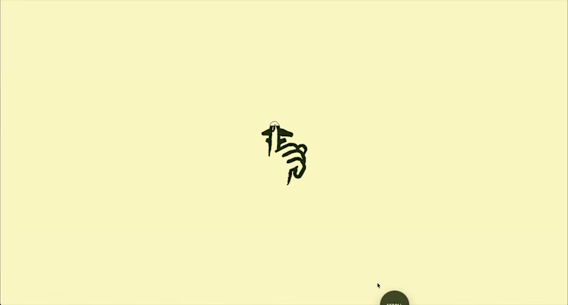
🍝 A little something I’ve been cooking recently. Had the opportunity to work with Secret Sauce Agency (https://www.secretsauce.ma/) on bringing their new digital experience to life. The goal: translate a bold creative identity into a website that feels just as distinctive, combining design, motion and development into one smooth experience. Really enjoyed bringing this one to life. Here’s a quick look at the result 👇
3
6
88
Message
13
Florencia Ezcurra
pro
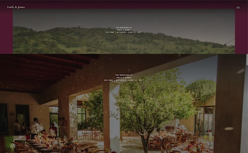
Small preview of my free Framer template for weddings 💒👰🏽♀️ Remix for free (and use as you wish!): https://framer.link/OVLj7Ay
10
13
196
Message
1
Dominik Mészáros
pro
EarnTask and Glowtify Product Design - Recent Projects
1
1
43
Message
7
Alisa Asruf
pro
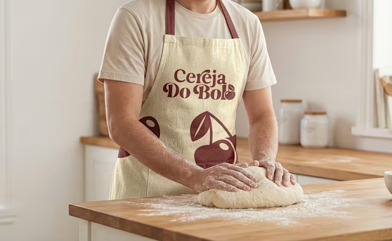
Brand Identity & Packaging Design A complete visual identity and packaging concept for Cerveja do Bolo, including branded packaging, merchandise, and outdoor signage. I developed the visual direction and applied the brand consistently across multiple touchpoints to create a cohesive and recognizable identity.
4
7
197
Message
8
Aleksandar Coric
pro
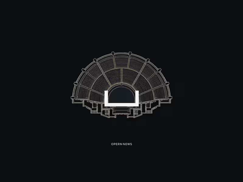
How do you design a contemporary logo for something so deeply connected to tradition? That was the main question behind my logo design for Opern.news (http://Opern.news). Opera comes with centuries of history, recognizable architecture, and a very strong cultural identity. But Opern.news (http://Opern.news) is a digital platform, a place for current stories, information, and communication. I wanted to find a simple visual idea that could connect those two worlds. The answer came from looking down at the architecture of theaters and amphitheaters. The stage and surrounding rows of seats gradually became a minimal geometric symbol. And then I noticed a second meaning in the same form: the lines also felt like broadcast waves, representing news, communication, and the flow of information. One symbol, two readings: opera + news. Opera and communication. Tradition and the present. #logodesign (https://www.linkedin.com/search/results/all/?keywords=%23logodesign&origin=HASH_TAG_FROM_FEED) #logodesigner (https://www.linkedin.com/search/results/all/?keywords=%23logodesigner&origin=HASH_TAG_FROM_FEED) #opera (https://www.linkedin.com/search/results/all/?keywords=%23opera&origin=HASH_TAG_FROM_FEED) #designprocess (https://www.linkedin.com/search/results/all/?keywords=%23designprocess&origin=HASH_TAG_FROM_FEED) #visualIdentity (https://www.linkedin.com/search/results/all/?keywords=%23visualidentity&origin=HASH_TAG_FROM_FEED) #brandidentity (https://www.linkedin.com/search/results/all/?keywords=%23brandidentity&origin=HASH_TAG_FROM_FEED)
6
8
144
Message
9
Pawel Nosal
pro
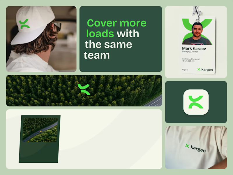
I have posted a Kargen direction a while back that didn't make the cut with a client, but the feedback was great, so I kept pushing it. This is where it landed. the concept speaks for itself once you see it move. the K carries the momentum and quietly turns into a road at the same time. the motion runs A to B, so you feel the movement, which is really what Kargen is about. There is a lot more to the identity than just this. the whole thing is meant to feel impactful, calm and professional.
8
9
97
Message
59
Kris Anfalova
pro
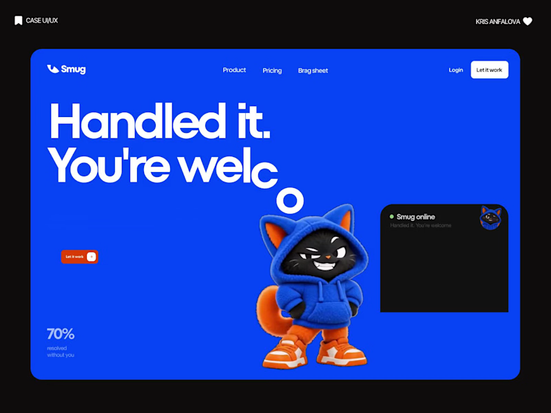
Designed the landing page for Smug — an AI support agent that resolves tickets, knows exactly when to escalate to a human, and has zero interest in pretending otherwise. Most AI support tools go the humble, over-apologetic route. Smug does the opposite — the whole brand is built around a smug little cat mascot and copy like "Handled it. You're welcome." It's a genuinely fun brief: figuring out how to make confidence read as charming instead of obnoxious. Bold electric blue and orange instead of the usual muted SaaS palette, because a product this confident shouldn't look shy about it. 💙 p.s. mascot animated this service (https://masko.ai/?via=kristina)
22
59
2.2K
Message
20
Jahid Hasan Raju
Belia - Premium Soap Brand
7
20
1.3K
Message
32
Sujon Hossain
pro
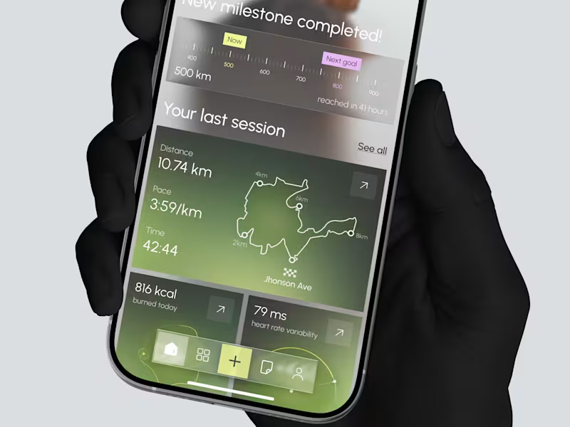
Designed two directions for a health tracking app Same data, but two very different feelings One is dark and focused, built for athletes. The other is warm and friendly, built for everyday people What do you think? Which one would you open every day, A or B?
19
32
1.1K
Message
17
Iván Willenberg
pro
New case study: the landing page for REVAI, a concept AI sales platform. The brief I gave myself was structural, not decorative: design a page where every section earns the next one. Hero makes one claim and gets out of the way. The value proposition comes before any feature gets named — because a feature nobody understands yet is just noise. Proof (testimonial, logos) sits right before the final ask, not scattered earlier where it does nothing. Art direction followed the same logic — high contrast where the page needs to make a claim, quieter and more editorial where it needs to build trust. The layout isn't there to look good in isolation. It's there to move someone from "what is this" to "I trust this" in one scroll.
13
17
297
Message
6
Juno Cruz
pro
Thank you to everyone who voted on the last post. Cyan/Blue came out as the preferred direction, and I've now taken that color system and built out the complete animated flow for the entire app, from the home dashboard through bill payment and confirmation. Attaching the full video walkthrough below so you can see how the winning direction feels in motion, including real transitions, interactions, and pacing across the entire experience. Would love to hear your thoughts on how it feels end to end.
3
6
189
Message
19
Trupal Gadhiya
pro
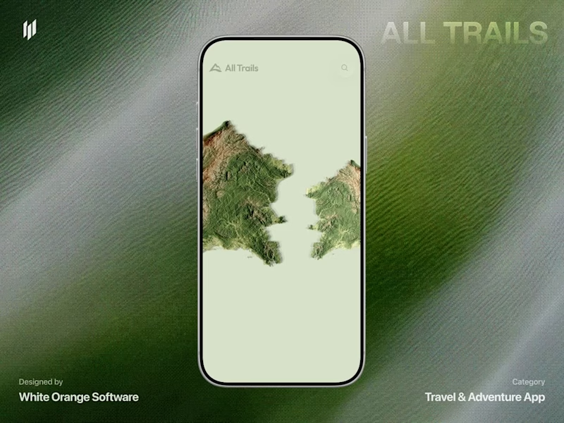
A modern AllTrails redesign concept focused on making trail discovery more visual, immersive, and intuitive. 🥾 Would love to hear your thoughts or suggestions!
19
252
Explore projects