Contra - A professional network for the jobs and skills of the future
Discover
Sign Up
Post a job
Sign Up
Log In
Filters
Projects
People
Filters
Featured
Web developers
Content creators
Graphic designers
Product designers
AI developers
Motion designers
Social media marketers
Animators
Video editors
Projects we love
Projects we love
Standout projects making waves around the web
View more
Message
72
Andrea DiNardo
max
The Compression Company: Landing Page Copy + Narrative
72
2.9K
Message
60
Tiago Rosado
pro
Mostly Sunny | Framer Development
60
2.5K
Message
125
Stacy · Heed Collective
pro
Brand Identity · Specialty Coffee Cosmetics
1
125
3.6K
Message
25
Jon Howell
Lyft Pink
25
589
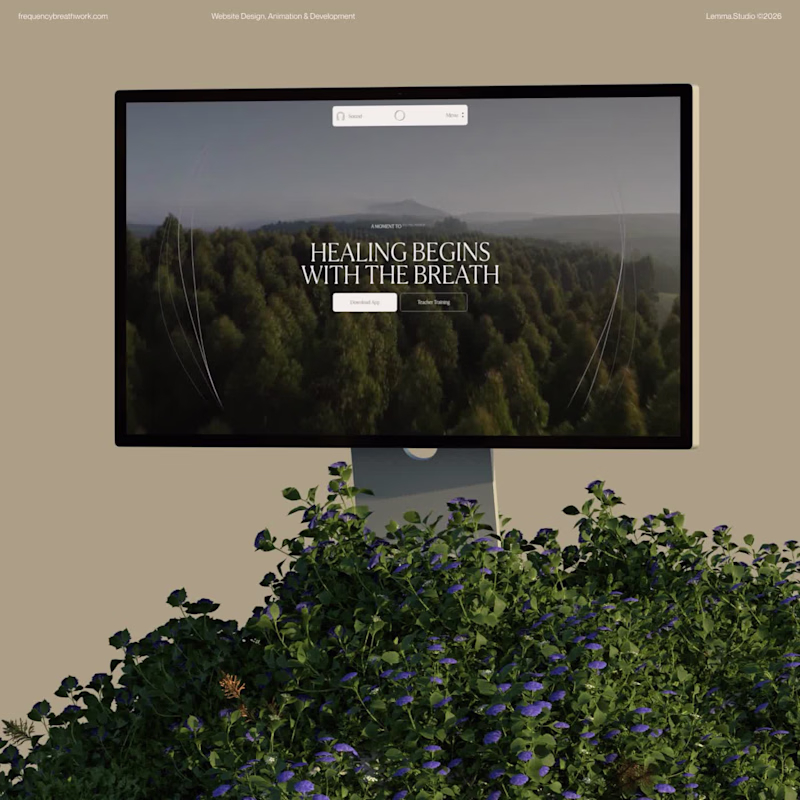
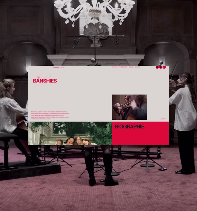
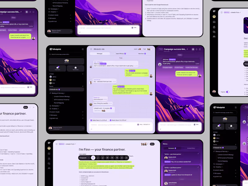
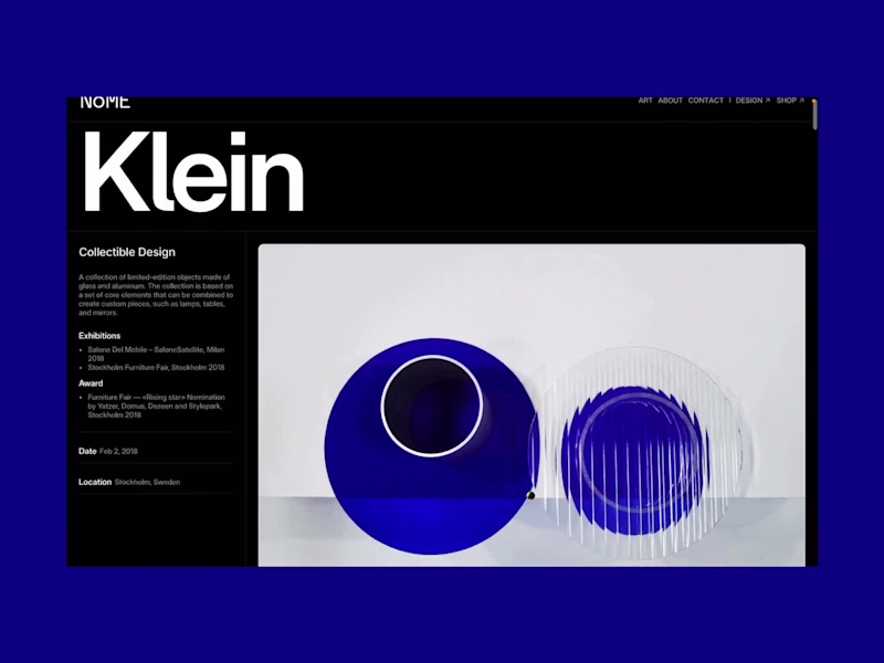
Web design projects using Framer
Framer
The best modern websites built on the leading web design tool, Framer
View more
Message
20
Great.co Studio
max
Stickier — A Brand Built to Scale Everywhere
20
1.1K
Framer is the leading tool for building websites, fast
Hire experts
Message
14
Iñaki Palacios Añaños
pro
Artica Capital — High-Performance Private Equity Website
14
515
Message
12
Vítrea Studio
max
Tadaima Website Development Project
12
256
AI projects
AI
New projects from the best AI creators
View more
$2.5K+ earned
Message
27
Oleksii Strichyk ✽
max
Mindprint Platform Rebrand & AI Content Experience
27
1.3K
Message
31
Daniel G Bright
max
SUPAHUMANS — The AI brand that refused to look like one
31
1.3K
Message
27
Sian V.
pro
nome.art • Artist Portfolio Website
1
27
896
Message
16
Cara Ellis
max
Guerilla Marketing Shirt Artworks and Design for Conduct AI
16
554
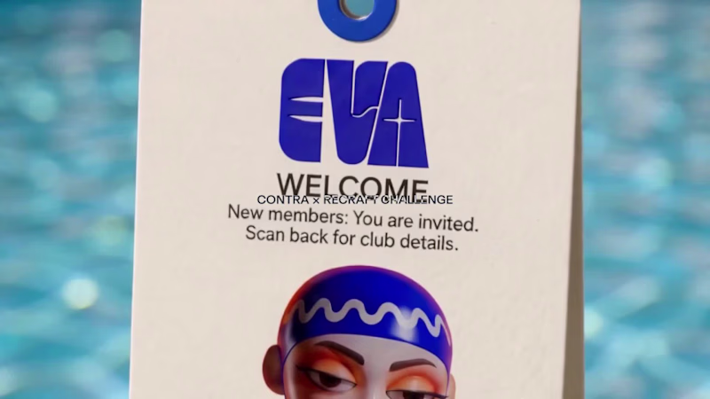
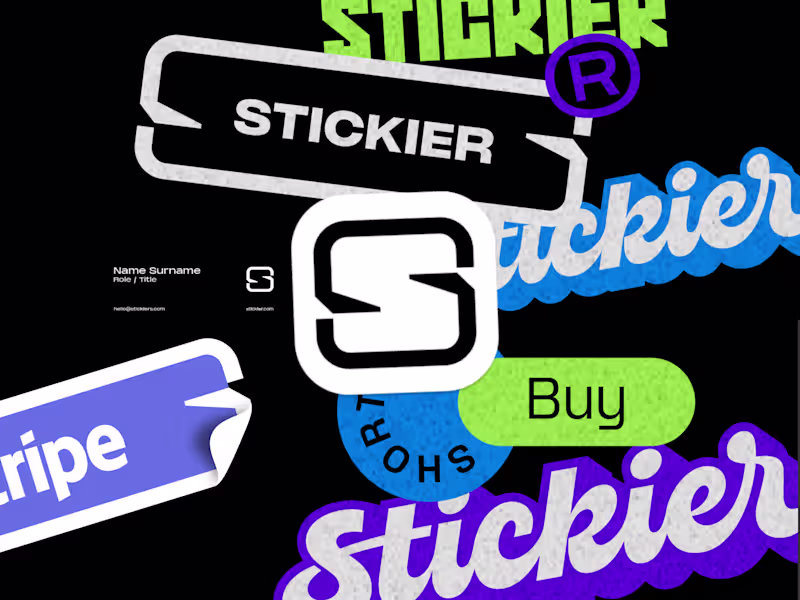
Brand design projects
Brand design
Bold visual identities and branding systems created by top independent designers
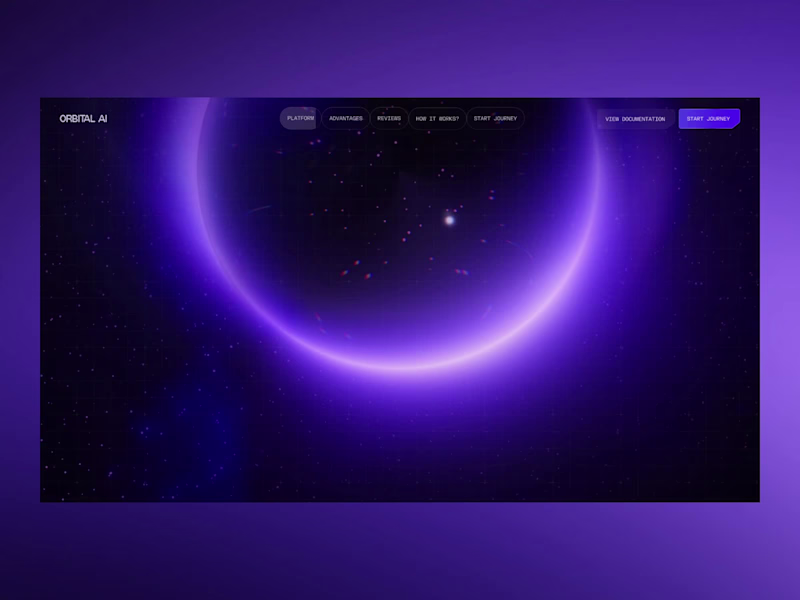
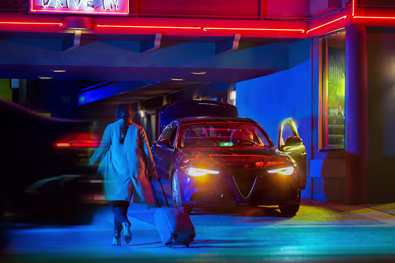
View more
Message
25
Afton & Sebastian
max
Agape Match | Branding + Kajabi Website
1
25
1.1K
Message
26
Filip Panov
max
Ctrl+Shift Brand Identity Project
26
447
Message
19
Loreta Lazarova
pro
Everbloom / Packaging Design / Supplements
19
669
Message
21
Alec Minimalec
pro
Rebranding uBloom | Creative Agency
21
369
Video editor projects
Video editing
Creative video edits made using today’s best editing tools
View more
Message
21
Nikita Skopych
max
CatchBack Product Launch Explainer Video
21
1K
Message
18
Jen Lai
pro
Boop | TikTok Content and Strategy
18
575
Message
9
Diego Rotmistrovsky
max
Replit Summit Loop Video Project
9
207
Message
8
Janès Zabukovec
Video for neuroscientific research paper on Stereotypes
1
8
378
Standout projects
Standout projects
More projects we love that are making waves across the web
Message
3
BL/S ®
A self-initiated style exploration built around one question: how far can you push pink before it pushes back? The concept fuses modern elegance with a daring visual twist — striking typography, fluid animations, and a vibrant color palette that radiates confidence without apology. Every element was designed to feel cohesive yet surprising, blending sleek minimalism with unexpected details that reward a second look. Not a brand for a specific client — a study in what bold, fearless identity design can look like when there are no constraints.
1
3
19
Message
7
Idris Lamina
pro
A cinematic portfolio concept for a film and motion studio, designed to feel more like an editorial reel than a standard agency website. The site uses a dark visual system, oversized typography, smooth scrolling, restrained motion, and a full-screen project index to make the work feel premium before the user reads a word. The focus was on pacing, atmosphere and confidence: fewer sections, stronger visuals, cleaner movement. Built as a responsive Next.js prototype with Framer Motion and Lenis-style smooth scrolling, including hero, selected work, about and contact sections.
3
7
135
Message
20
Kris Anfalova
pro
PUFFHS: Artisanal Pastry Landing Page Concept Welcome to PUFFHS, a conceptual landing page designed for a premium artisanal bakery specializing in gourmet cream puffs. This project reimagines how we browse and buy high-end digital food products. Most food e-commerce platforms and delivery apps rely on static, uninspiring grid layouts that fail to capture the true tactile appeal of the product. The challenge was to break away from standard UI patterns and create a digital shopping experience that is as mouth-watering and engaging as the pastries themselves, all while keeping complex dietary information accessible To solve this, I experimented with a highly interactive, motion-driven approach. The core UX innovation is the "Reveal the Puff" mechanic. Instead of forcing users to read long paragraphs about the ingredients, I designed a seamless micro-interaction that allows them to virtually "slice" the dessert with a single click, instantly revealing the rich filling and texture.
12
20
438
Message
30
Zaoui Sohaib
Upload any photo, then click and drag inside the canvas to peel away hundreds of ink blots and watch it emerge. Hit 100% and it's framed into a postage stamp postcard, ready to download and keep. Built entirely in Omma Preview link: Image Explorer (https://omma.build/p/zaoui-image-explorer-y9n9it)
14
30
608
Message
26
May Yang
Midnight Accord is an interactive dark-romance dossier experience built in Omma by Spline. The concept began as a secret society archive where players are invited into a private chamber and given access to classified files. From there, they can explore six character dossiers, initiate secure lines, and move through visual-novel inspired dialogue choices. I wanted the experience to feel like entering a forbidden archive: elegant, mysterious, cinematic, and a little dangerous. The visual style blends matte gothic luxury, antique gold UI, dark romantic atmosphere, dossier-style navigation, atmospheric audio, and character-focused storytelling. I imagined Midnight Accord as the opening prototype for an otome/visual novel experience where each character route could expand into deeper conversations, secrets, relationship choices, and long-term mystery. This project was built during the challenge window in Omma Canvas, using interactive page routing, custom layouts, hover effects, mobile-friendly pages, and Omma Studio-generated assets/audio. I focused on making it feel like more than a static gallery. Every page connects into a playable flow, from the landing page to the invitation, chamber, intelligence files, secure lines, dialogue choices, and connection lost screens. Live experience: https://omma.build/p/landing-hero-page-ukliek
7
26
503
Message
105
Suraj Shah
SPROUT — Grow Good Things 🌱 SPROUT is an original mascot created for a fictional eco-lifestyle brand that encourages people to make small everyday actions count—planting, recycling, protecting nature, and spreading kindness. Rather than designing just a cute character, I built an entire visual identity system around Sprout, ensuring the mascot stays instantly recognizable across every touchpoint. From the custom wordmark and color palette to merchandise, packaging, stickers, app icon, environmental storytelling, and animation, every asset was created to feel like part of one cohesive world. The floating water spirit represents life, growth, and hope, while Sprout's glowing leaf symbolizes that even the smallest act can create lasting change. This project explores how a single mascot can become the face of an entire fictional brand through consistent design, storytelling, and scalable applications. 🌱 Character Brief Name: SPROUT Role: Guardian of Growth Personality: Curious, optimistic, adventurous, compassionate, playful, and endlessly encouraging. Sprout believes every tiny action matters. Whether planting a seed, helping nature, or inspiring someone else, Sprout reminds us that big change always starts small. Recraft Project Explore the full project here: https://www.recraft.ai/project/0225d5a4-cccd-4ef5-badc-f507a21a2dfe #RecraftAI #CharacterDesign #MascotDesign #BrandIdentity #CreativeAI #Illustration #3DCharacter #DesignChallenge #BrandDesign #ConceptArt #AIArtist #MotionDesign #GraphicDesign #EcoBrand #DigitalArt
29
105
3.5K
Message
18
Desi Hernandez
pro
Hi everyone! 👋 This is my first post here, so I thought I'd share something I've been really excited to work on. I recently designed the AI Project Setup experience for ThinkEasy from scratch. The goal was to make creating research projects feel simple and intuitive, while using AI to guide users instead of overwhelming them. It was a fun challenge to figure out how to balance flexibility with clarity, and I'm really happy with how it came together. I'd genuinely love to hear your thoughts or feedback! https://www.behance.net/gallery/247586847/ThinkEasy-AI-Project-Setup #UXDesign #ProductDesign #AI #CaseStudy #UserExperience
17
18
207
Message
52
Lubos Belak
pro
Every day I walk past the same public swimming pool. On the wall is an old mural: a sun-faded graphic with flat shapes and that unmistakable 1970s leisure centre vibe. I can't help but keep looking at it. The graphics are simple, but charming. (You can see it in the middle of the video.) Then I asked myself, “What if I try to create a modern-era mascot for it?” Meet EVA EVA is the swimming pool's guardian and cheerleader. She cares about your safety, your wellbeing, your skin, and yes — even how you look once you're back on dry land. Blue swim cap. A voluminous petal-cloak. 70s-glam eyeshadow. Slightly judgy. Mostly helpful. Exactly the energy a municipal pool deserves. This is my entry for the Contra × Recraft competition. Project link: https://www.recraft.ai/project/b30fd297-8321-4db2-a417-f0a4dc71da1c
26
52
2.1K
Message
58
Katerina Fishbein
MEET MRS. PRIOR — my entry to the Recraft Challenge. https://www.recraft.ai/project/412a40c4-1f73-46f2-af9c-f2408e1e519e Mrs. Prior is the mascot of the Open Door Society — an organisation that helps women and anyone facing systemic barriers access opportunities, resources, and spaces that have been closed to them. We identify the obstacles, we find the way in, and we hold the door open for everyone who follows. She doesn't protest. She doesn't explain. She arrives, she assesses, and she begins. Her tool is a single hairpin. Her method is whatever works. Would love to hear what you think, and good luck to everyone else in the challenge ♥️
27
58
2.7K
Message
32
Brand by Umer
Another day, another happy client! 🇪🇸✨ Proud to have designed the logo for TARA, a brand based in Spain. Every project is a chance to transform an idea into a meaningful visual identity, and seeing another satisfied client makes the journey even more rewarding. Thank you for trusting me with your brand. Here's to creating logos that are simple, memorable, and built to leave a lasting impression.
41
32
752
Message
3
Artemii Lebedev
Frequency Breathwork is a breathwork platform built around the idea of connection, flow, and invisible energy. The visual concept is driven by dynamic threads that move throughout the experience, symbolizing breath patterns, human connection, and the unseen forces that shape our physical and emotional state.
1
3
116
Message
1
Artemii Lebedev
A contemporary ensemble that blends classical tradition with influences from rock, folk, and modern music, creating performances that move freely between genres and eras. The project reflects the group's experimental nature through a visually expressive experience that feels both elegant and unconventional. Inspired by storytelling, performance, and artistic collaboration, the design captures the ensemble’s unique approach to music while providing a space to explore concerts, repertoire, and the personalities behind the performances.
1
1
95
Message
40
Sara Servan
pro
Brand in a Week - Children's Media Brand Identity Iniminimo is a new generation of personalised children's media - a platform that places the child at the centre of the story. Instead of watching other characters, children become the main character in their own personalised animated music videos, built around real-life milestones and routines. The challenge: bold and playful enough to delight toddlers, modern and thoughtful enough to earn parents' trust. Expressive illustration, vibrant colour, friendly-but-not-childish typography - exciting without being overwhelming. Nothing generic. Nothing toy-like. Delivered in five focused days - from strategy to complete brand world - the result is an identity as joyful and full of heart as the platform it represents.
21
40
480
Message
49
Dima Strizhak
pro
Why overcomplicating your layout kills readability. Most content-heavy sites fail because they try to show everything at once. Sidebars, badges, related articles, and tiny fonts create cognitive overload. The user gets tired after two paragraphs and leaves. Good design is about aggressive editing. You need to manage where the eye goes first. In this layout, the hierarchy does all the work: • A massive headline sets the mood and context instantly • Generous white space prevents visual fatigue • The clean grid ensures the reader actually focuses on the text We don't need complex decorations to make a web page look expensive. We just need perfect typography and discipline. Are you building a product or content platform that feels too cluttered? Drop a link below, and I’ll tell you where your users are getting stuck.
11
49
1.7K
Message
10
BL/S ®
Most tech websites look like they were designed by a robot for another robot. This website was built to change that. A landing page exploration for a B2B SaaS or AI brand — one that actually looks like it's building the future. Deep sci-fi purples, smooth orbital gradients, and typography clean enough to eat off. Every visual decision was made to inject emotion into a space that's usually defined by sterile grey boxes and stock photography. The goal was simple: prove that complex technology can be communicated with beauty, not just clarity. SaaS and AI companies are literally shaping what's next. Their design should feel like it.
10
160
Message
19
Leticia Padilla
pro
The sound behind the symbol. A preview of the visual identity for La Original, a brand that has connected musicians with authentic instruments and trusted brands since 1979. The identity begins with a simple observation: instruments may change, styles may evolve, but they all share the same purpose. Sound. The symbol combines the initial O from Original with expanding sound waves, expressing the moment where every musical experience begins. It avoids representing a single instrument because the brand has never belonged to just one. It belongs to everything that makes music possible. Its simplified form allows the symbol to adapt across every touchpoint while preserving its clarity over time. Like music itself, the symbol is not only meant to be seen. It is meant to be felt.
16
19
703
Explore projects