The network for creativity
Join 1.25M professional creatives like you
Connect with clients, get discovered, and run your business 100% commission-free
Creatives on Contra have earned over $150M and we are just getting started
Back to feedPost
Taste Test

I was working on the stationery for Sten & Kant, an architectural identity project, and couldn’t decide between these two mockups. The designs are identical, but the camera angles create a completely different feel!
Which one do you prefer? Feedback is always appreciated.


45 voted
61%
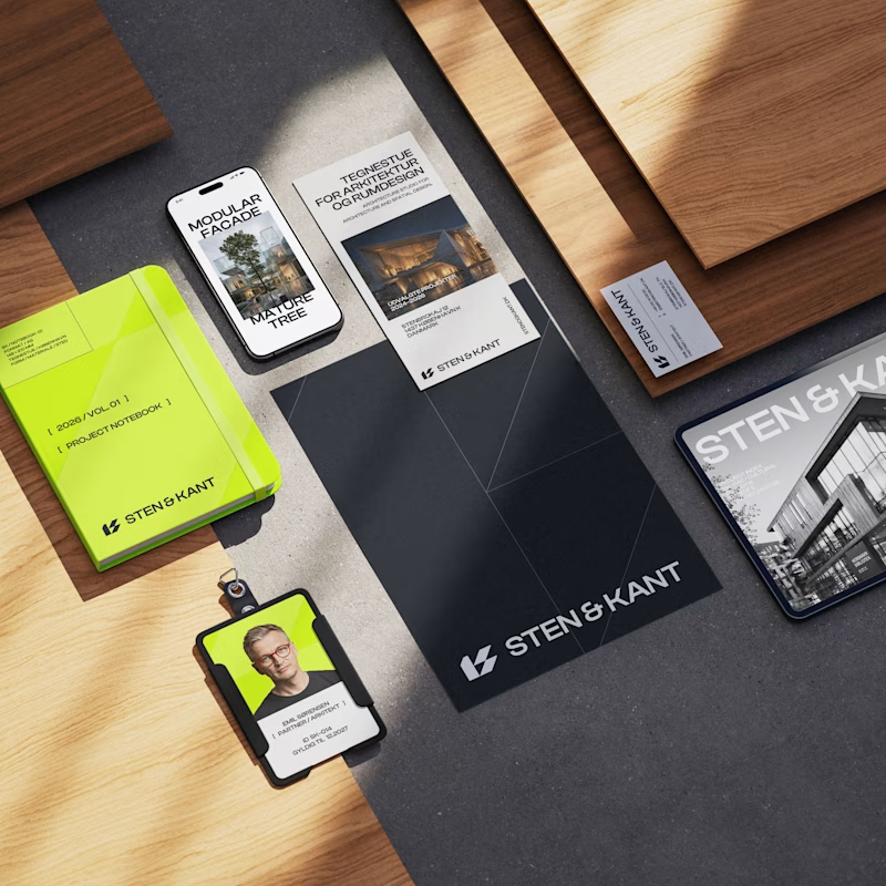
29 voted
39%
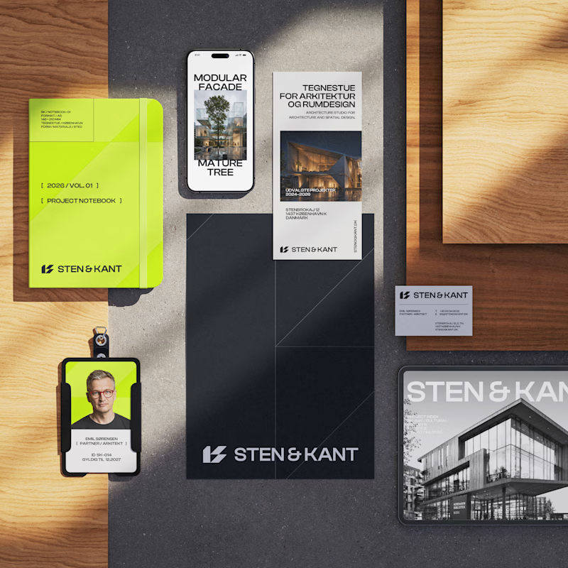
74 votes
Closed

I agree! There's something editorial and solid about the straight one, thanks for the feedback.

Angled looks good
Thanks for the feedback! I think it needs something though... maybe it's a design thing and not a mockup one!
Design looks good to me, maybe it's because I like using angled mockups though.
Still, Nice work


Awesome design !
Thank you so much @Sahil Dobariya!

angled looks better

i will go with Straight
My first instinct was also straight, but that's the good thing of these polls, angled is winning! Thanks for your feedback Emmanuel.

Looks Attractive with colour Scheme.
Thank you so much!


In my opinion, straight.

angled is always better for a reason😂
It is winning for a reason isn't it?! Haha, thanks for the feedback Amine.

Straight, the architectural branding is all about precision. The flat angle reinforces that, while the angled shot feels a bit too lifestyle.
Thank you so much for the insightful response, it's really appreciated! I love the flat angle too.

I don't think there is a right or wrong answer here, it all depends on your audience and how it needs to be presented to. I personally like more the angled version, but I'd read the room for my presentation first
That makes sense! Thank you for your feedback Rod, some say the angled is harder to read, but it looks good. So I'll have that in mind too.


Straight feels a little different (in a good way) and it feels more organized which goes hand-to-hand with a lot of stationery enthusiasts!
Oh I hadn't thought about stationery enthusiasts! But I do think the flat angle makes sense with the architectural concept. Thanks for your feedback @Sumit Joshi

Angled looks good but harder time reading

angled!!


Good work

Going with angled


Love this 👏 Have you optimized it for client conversion?


Going for the angled

straight look simple while angled give a good professional look

Angled looks better.

Ahh this mockup is such a vibe, I like both 🫣
The network for creativity
Join 1.25M professional creatives like you
Connect with clients, get discovered, and run your business 100% commission-free
Creatives on Contra have earned over $150M and we are just getting started

Challenges
View all


Related posts

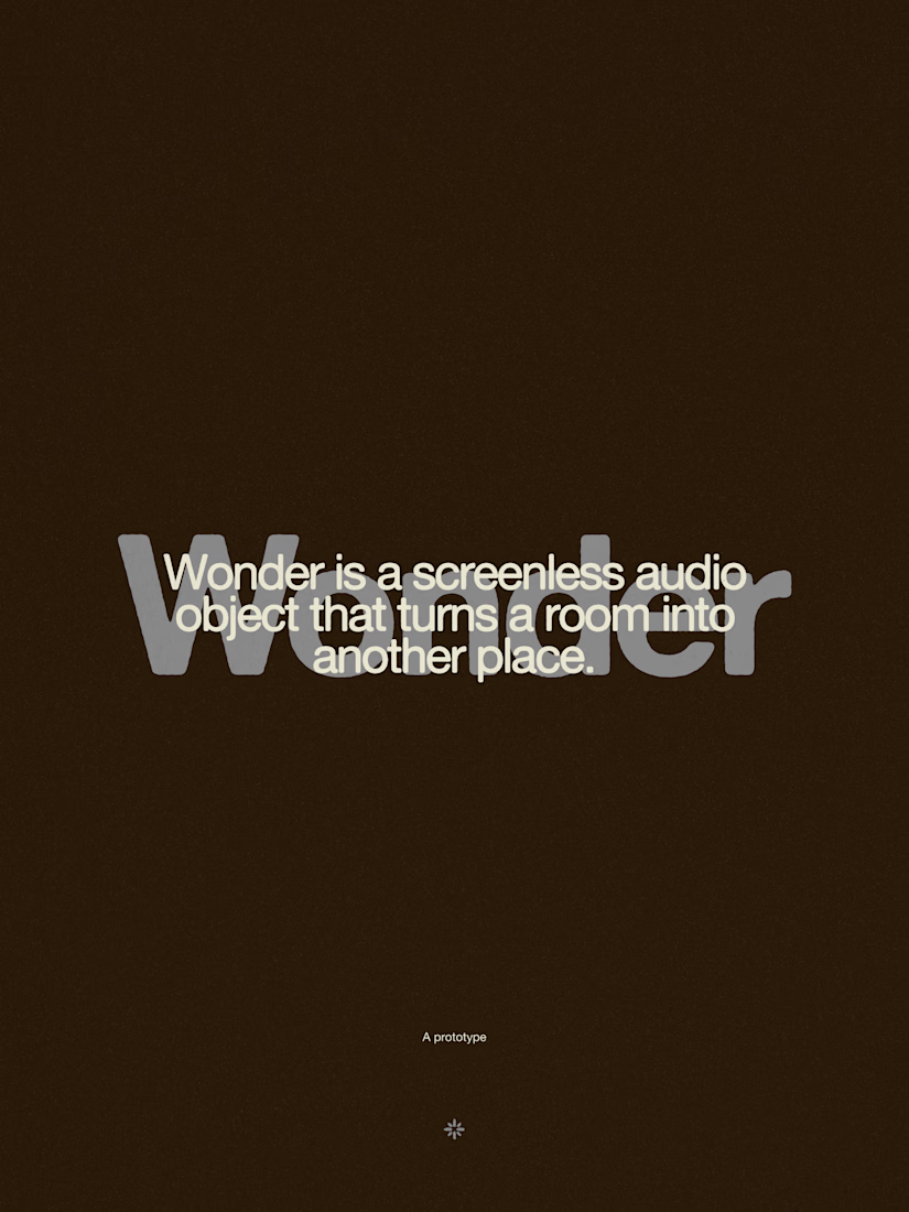
Wonder -- Visual Expressions

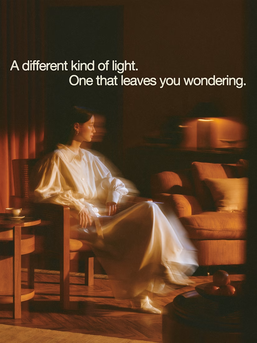

The restraint in the warm palette really lets the sound-object concept breathe—especially that shift from readable type to atmosphere.

Two case studies, two totally opposite registers.
One is carved in stone and says nothing.
One drips off a spoon and won't shut up about which field it came from.
Which one do you want first?
vectis — zero-knowledge privacy, dithered like a forgotten statue
HIVE INDEX — raw honey with a paper trail. No two lots taste the same, and we don't correct for that.
45 voted
51%
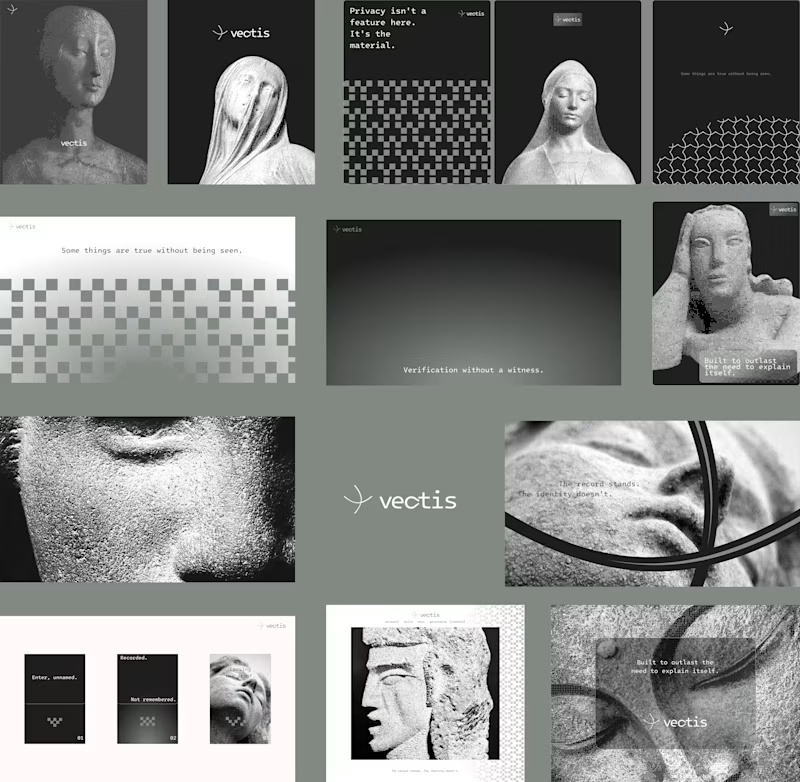
43 voted
49%
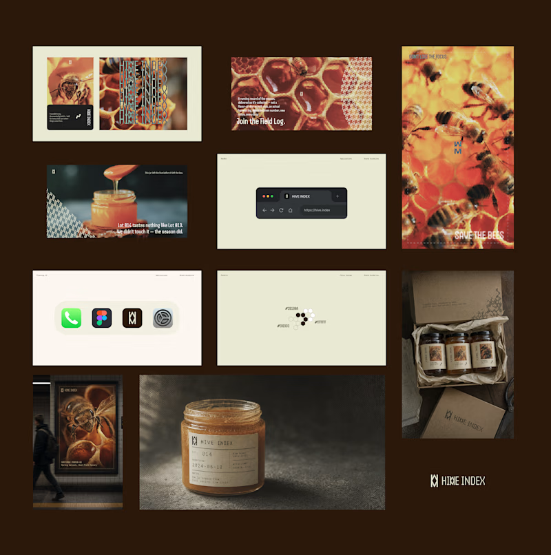
88 votes
Closed

Vectis

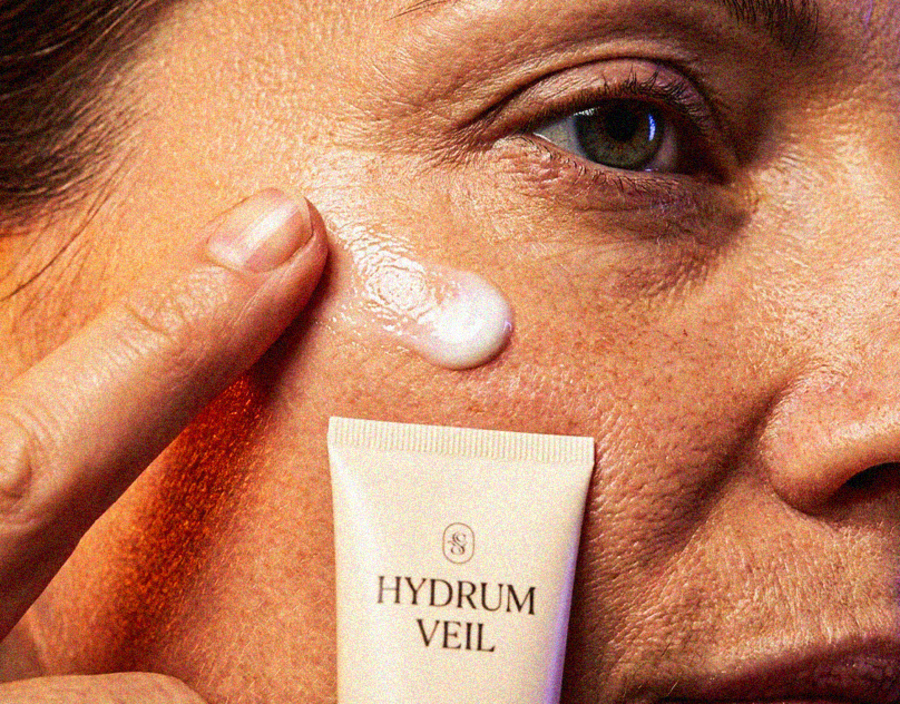
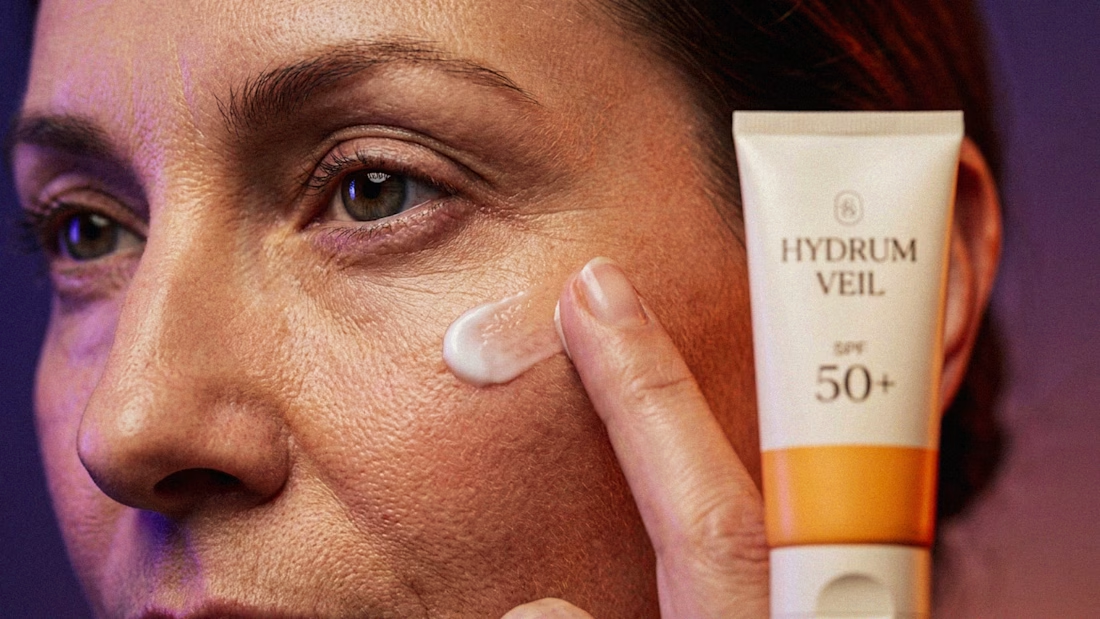
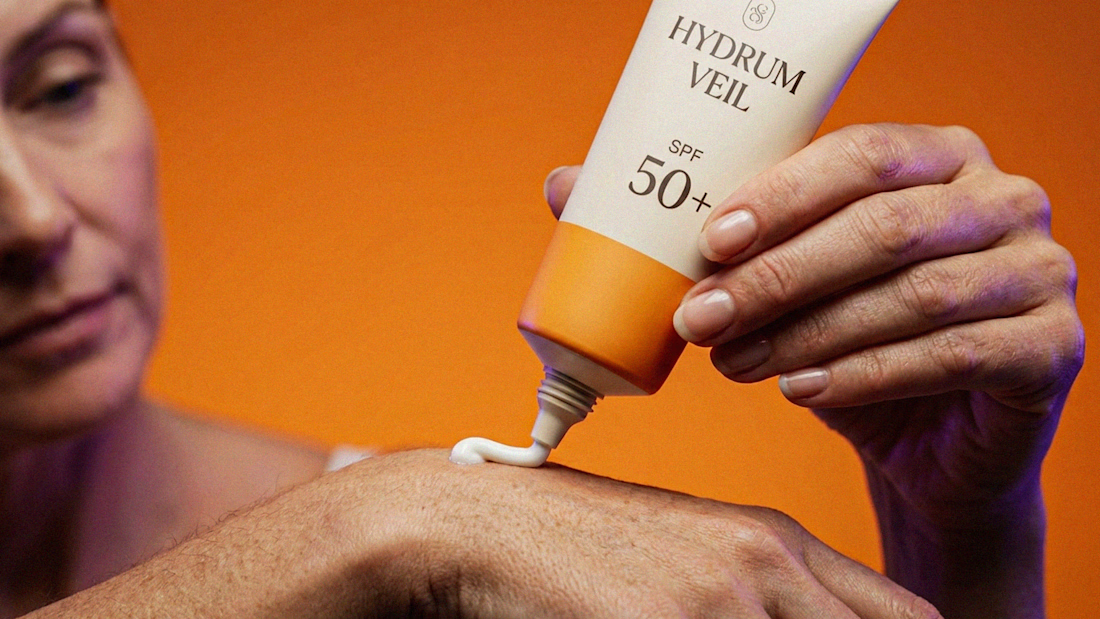
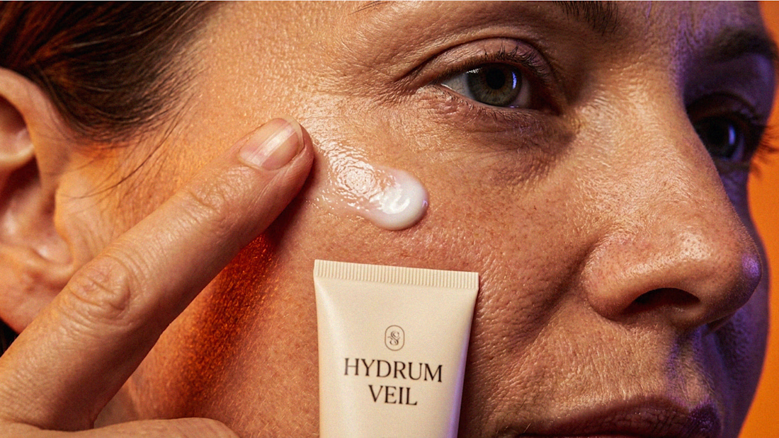
I Just Created HYDRUM VEIL 🔥
HYDRUM VEIL is a skincare brand built around a premium SPF 50+ sunscreen, developed as a complete brand identity, packaging design, and seasonal advertising campaign.
The project explores a question most seasonal beauty work gets wrong: how do you make a limited-edition campaign feel festive without making it feel cheap?
Instead of stacking decorative props, the campaign holds a strict visual system - vivid pumpkin orange, deep twilight violet, warm cream, and restrained black and lets a single product carry every frame.
Drop your replies in cmnts.....!!!!! 🙌
branddesignertastetestBrand DesignGraphic DesignPackaging DesignAdobe IllustratorAdobe PhotoshopClaude