
Ismaeel Hamza Syed
Make premium products look expensive with clean minimalism.
New to Contra
Ismaeel Hamza is ready for their next project!


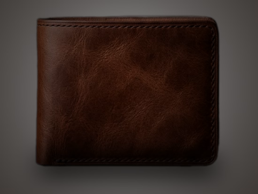
Latest exploration:
"NOIR" a leather wallet concept built around restraint and texture. Full-grain leather, handstitched detail, and a lighting setup designed to let the material speak for itself. More coming soon.
0
59
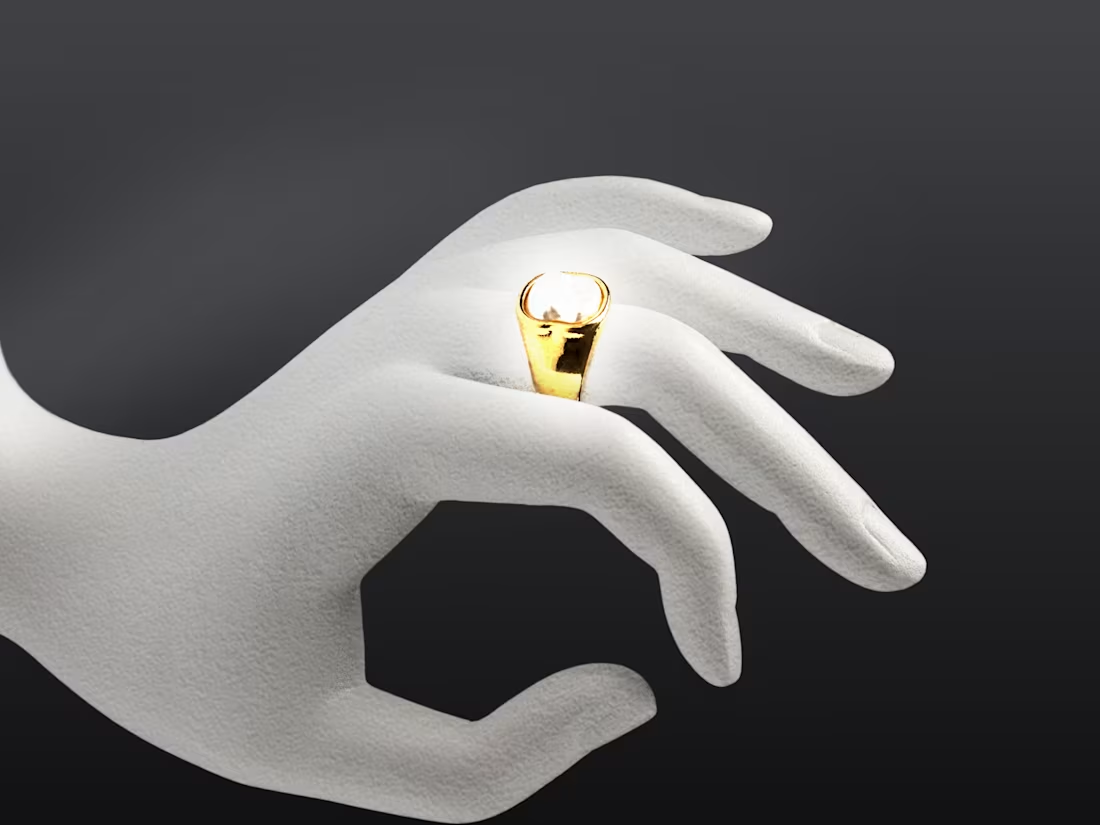
VERANO — Signet Ring Composition
A case study in visual refinement, from raw reference to finished composition. What began as a flat stock render was rebuilt piece by piece — the hand retextured from plastic to matte ceramic, a moody gold-to-charcoal gradient built to echo the ring's own tones, and the gold band and pearl highlights refined for a polished, high-contrast finish. The final composition tightens the frame around the ring itself, letting the product lead while the typography and lighting carry the editorial mood.
0
66
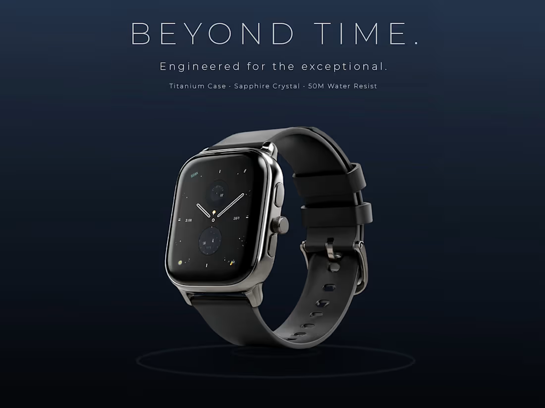
Beyond Time — Luxury Smartwatch Concept ⌚✨
Transforming a flat product cutout into a high-end commercial visual tailored for luxury markets.
Design Breakdown:
Atmosphere: Replaced flat black with a deep blue 5-stage gradient and a soft radial spotlight to pop the chrome casing.
Surface Physics: Engineered manual point-of-impact water ripples using blurred concentric paths and soft-light blending.
Lighting & Polish: Brushed custom edge-lights on the crown and finished with minimal, ultra-thin typography.
Built entirely in Photoshop.
(Swipe to see the process breakdown from raw asset to final render)
1
91
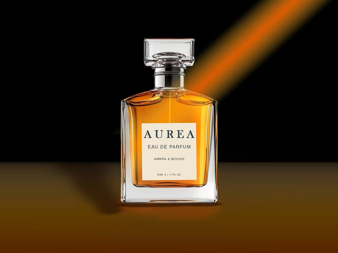
1. The Starting Asset
Started with just a raw transparent cutout of the glass bottle.
2. The Problem (Beige Background)
I initially placed it on a warm beige background, but the bottle looked like it was awkwardly floating in mid-air. It lacked depth and grounded realism.
3. Grounding & Reflection
To fix the floating effect, I switched to a jet-black background and added a warm gradient across the bottom to establish a clear surface floor. I also researched and built a crisp glass reflection on the surface to make the bottle feel heavy and physically planted.
4. Lighting & Final Polish
To bring atmosphere into the frame, I added a dramatic orange light beam coming from the top-right corner. Then I adjusted the highlights and cast shadows across the glass to match the new directional light source, along with setting up the custom label layout.
Sometimes making a product look "expensive" comes down to how well you control the lighting and environment around it.
2
151