The network for creativity
Join 1.25M professional creatives like you
Connect with clients, get discovered, and run your business 100% commission-free
Creatives on Contra have earned over $150M and we are just getting started
Back to feedPost
I Just Created HYDRUM VEIL 🔥
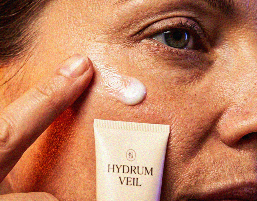
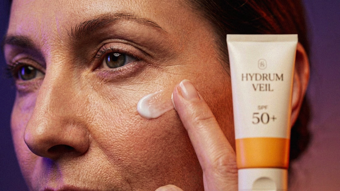
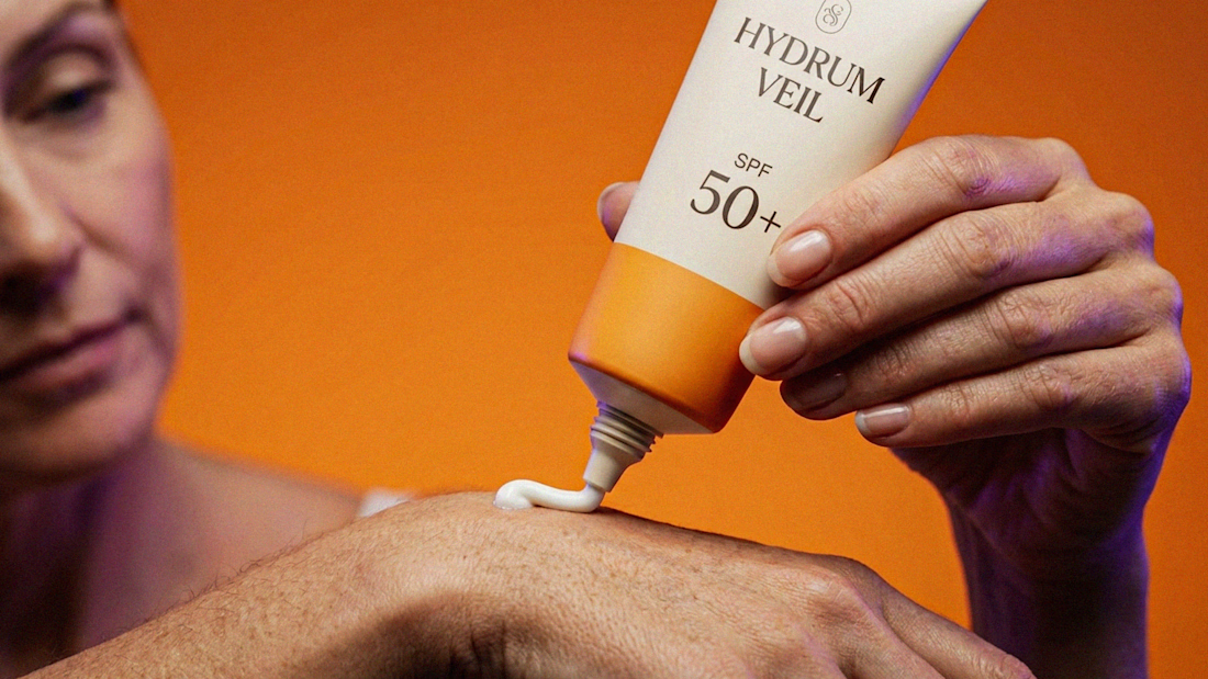
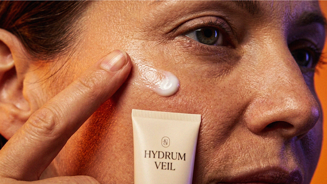
HYDRUM VEIL is a skincare brand built around a premium SPF 50+ sunscreen, developed as a complete brand identity, packaging design, and seasonal advertising campaign.
The project explores a question most seasonal beauty work gets wrong: how do you make a limited-edition campaign feel festive without making it feel cheap?
Instead of stacking decorative props, the campaign holds a strict visual system - vivid pumpkin orange, deep twilight violet, warm cream, and restrained black and lets a single product carry every frame.
Drop your replies in cmnts.....!!!!! 🙌
branddesignertastetestBrand DesignGraphic DesignPackaging DesignAdobe IllustratorAdobe PhotoshopClaude




Thanks youuuu so muchhhh......!!!!!!😍
Thanks youuuu so muchhhh......!!!!!!😍

Thanks youuuu so muchhhh......!!!!!!😍
Thanks youuuu so muchhhh......!!!!!!😍
Thanks youuuu so muchhhh......!!!!!!😍
Thanks youuuu so muchhhh......!!!!!!😍

Creative Design :)
Thanks youuuu so muchhhh......!!!!!!😍

The restrained palette is doing a lot of work here—pumpkin orange, deep twilight violet, and cream keep the campaign festive without tipping into visual noise. The single-product focus makes the whole system feel especially coherent.
Thanks youuuu so muchhhh......!!!!!!😍

This is great and clean
Thanks youuuu so muchhhh......!!!!!!😍

Thanks youuuu so muchhhh......!!!!!!😍

Strong visuals.
Thanks youuuu so muchhhh......!!!!!!😍

Looks great. Well done ✅.
The color combination is apt, works really well for this brand.
Thanks youuuu so muchhhh......!!!!!!😍

gorgeous work!
Thanks youuuu so muchhhh......!!!!!!😍

Colour palette + skin combination, is definitely giving the vibe of what is should

Yeahhh, this one deserves a repost. 👏

This is the kind of branding that makes you stop scrolling.🔥 🔥 🔥 🔥 🔥 🔥 🔥 🔥 🔥
The network for creativity
Join 1.25M professional creatives like you
Connect with clients, get discovered, and run your business 100% commission-free
Creatives on Contra have earned over $150M and we are just getting started





Related posts

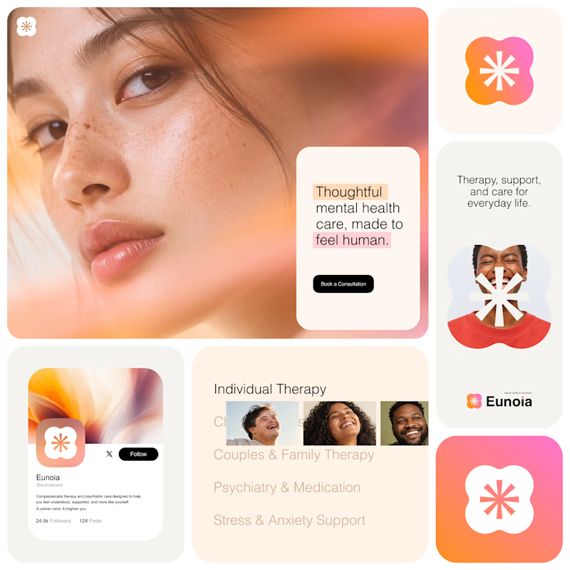
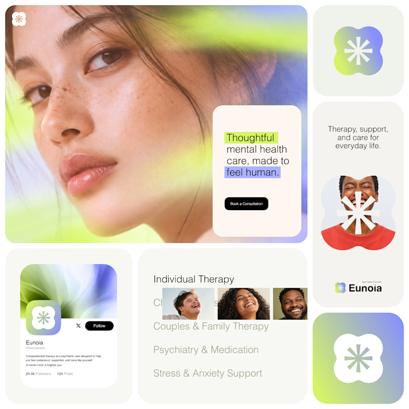
Exploring two visual directions for Eunoia, a mental health & psychiatry brand.
Direction 01 - Warm peach, orange and soft pink tones for a calm, human and comforting feel.
Direction 02 - Lime and periwinkle tones for a fresher, more optimistic and contemporary expression.
Same brand system. Different emotional energy.
32 voted
52%
29 voted
48%
61 votes
Closed

That's impactful, love to see fresh styles

How do you design a contemporary logo for something so deeply connected to tradition?
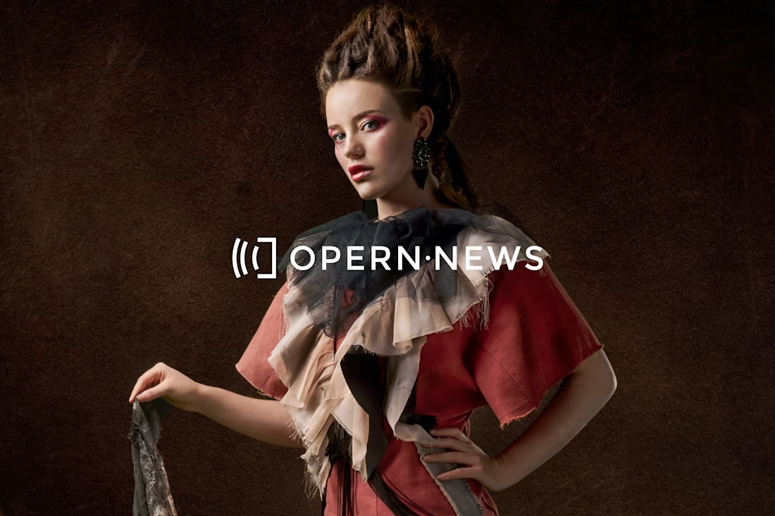
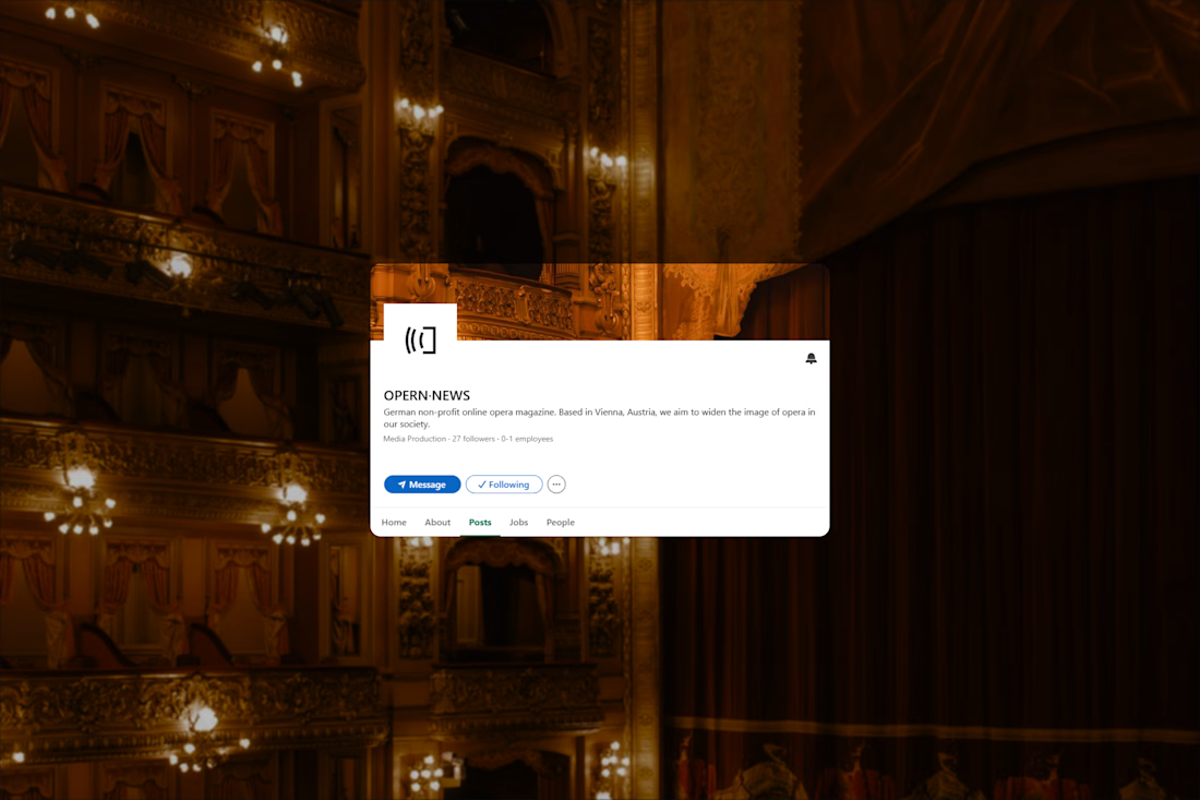
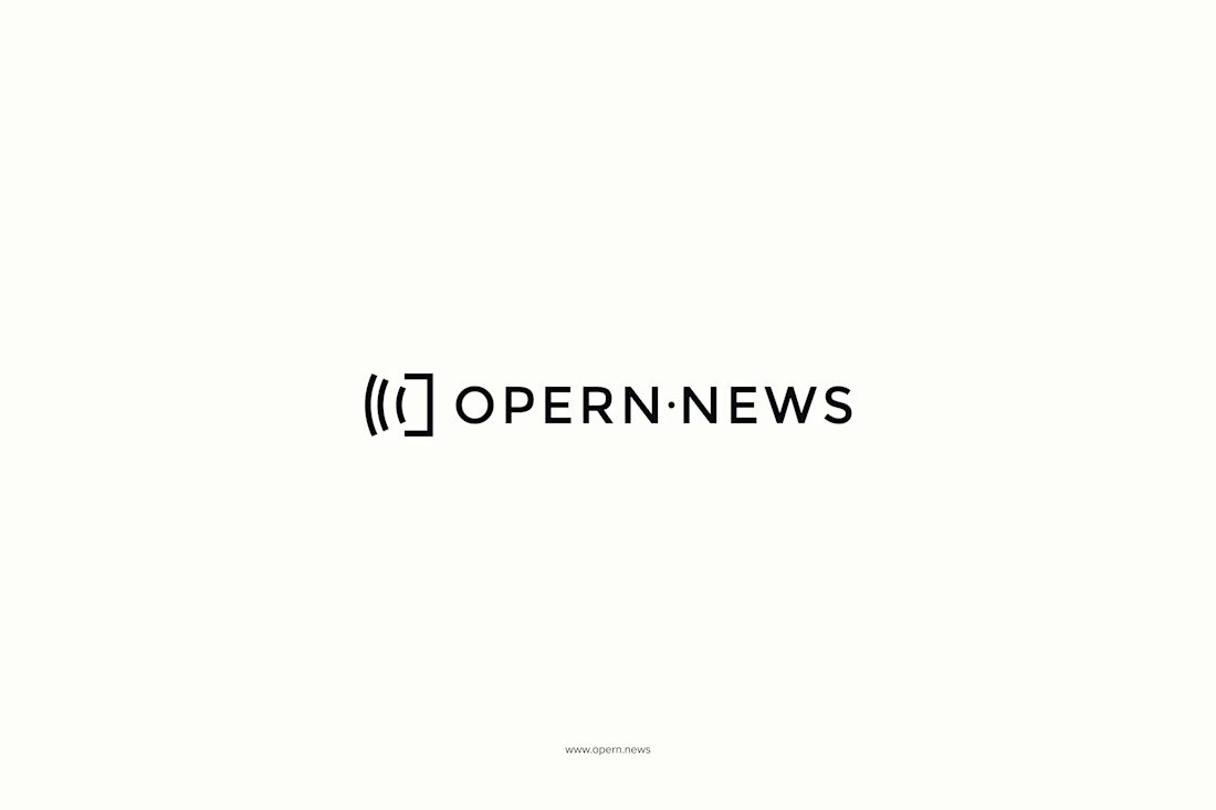
That was the main question behind my logo design for Opern.news. Opera comes with centuries of history, recognizable architecture, and a very strong cultural identity. But Opern.news is a digital platform, a place for current stories, information, and communication.
I wanted to find a simple visual idea that could connect those two worlds.
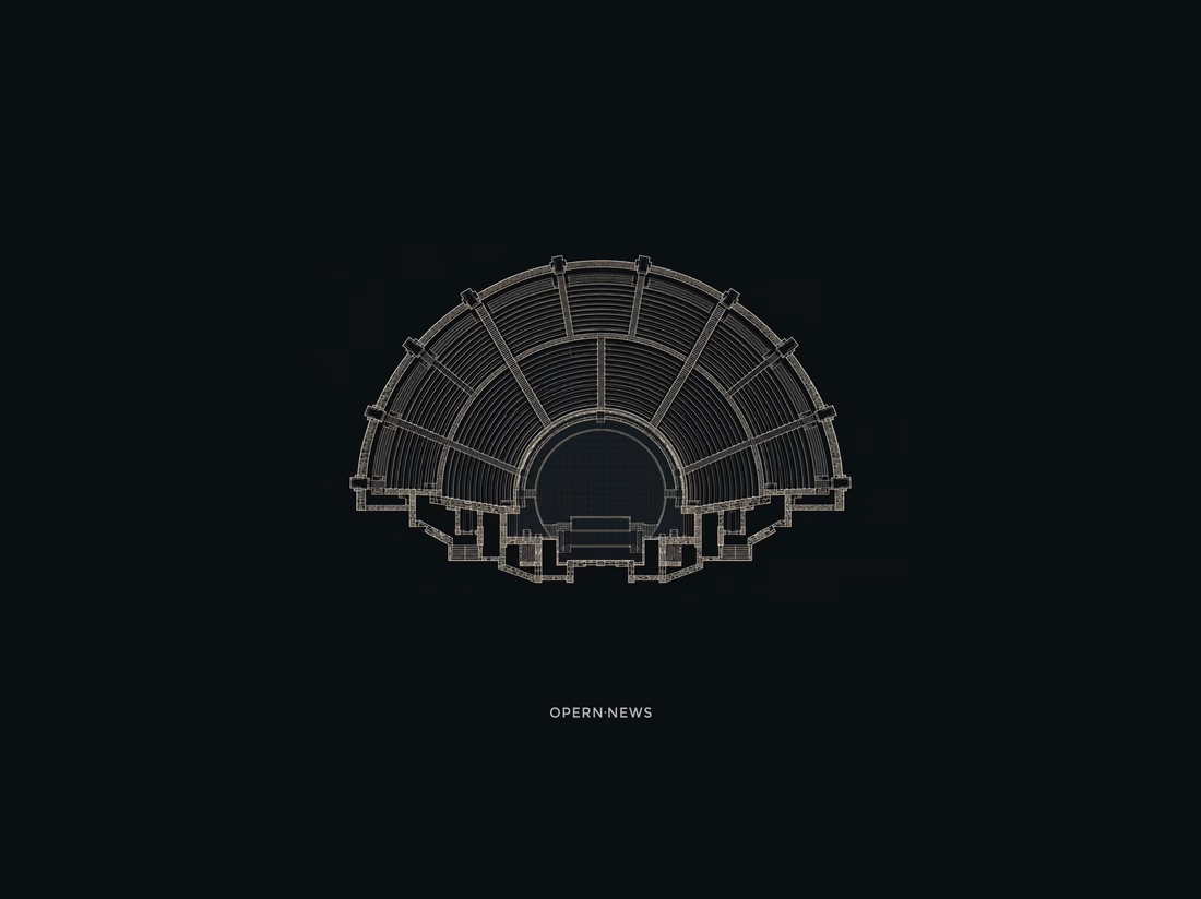
The answer came from looking down at the architecture of theaters and amphitheaters. The stage and surrounding rows of seats gradually became a minimal geometric symbol.
And then I noticed a second meaning in the same form: the lines also felt like broadcast waves, representing news, communication, and the flow of information.
One symbol, two readings: opera + news. Opera and communication. Tradition and the present.


Good project work




🔥 🔥