
achu chidera
Social Media Manager, Graphic designer, AI images and videos
- 5.0
- Rating
- 44
- Followers

Derra Visuals


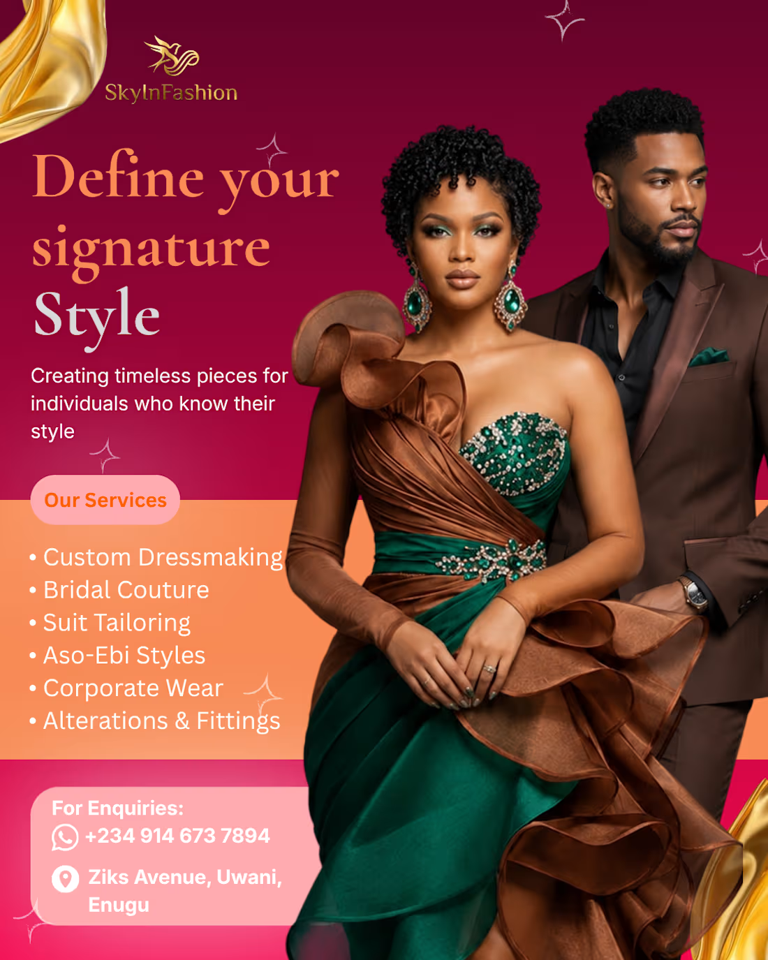
The brief for SkyInFashion was three words: luxurious, intentional, editorial.
That's the kind of brief that sounds simple until you're choosing between eight shades of wine red and none of them feel right.
A few decisions that drove the final result:
The deep wine and gold palette wasn't decoration, those tones carry a subconscious weight. Richness, longevity, ceremony. For a brand selling bridal couture and custom tailoring, that association does half the selling before anyone reads a word.
Serif for the headline, clean sans-serif for the service list. Not because it "looks good" but because the hierarchy needs to shift between feeling and function, the headline pulls emotion, the list answers questions.
The image placement was intentional too. Fashion design lives in texture and fabric movement. If you crop that out or compress it badly, you've already failed the client.
Good fashion brand design doesn't just look expensive. It makes the viewer feel like they already trust the quality, before they've even read the contact details.
What's your process when a client gives you a mood-based brief with no visual references?
1
2
138
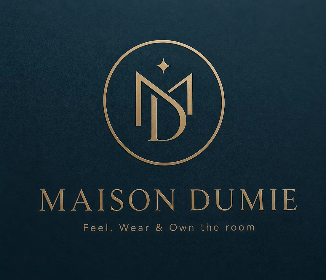
Brand Identity Creation for Maison Dumie
1
2
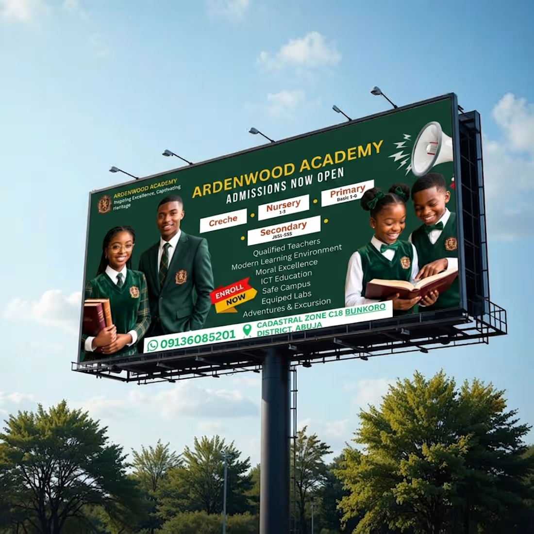
Ardenwood Academy needed an admissions banner that could compete for attention in a market where every school claims to be excellent. Parents don't read school ads, they scan them in seconds while shortlisting, so the design had to earn a second look before it earned a phone call.
Trust is the real product being sold in education marketing, not just admission slots. So I built the banner around three signals parents actually respond to: heritage, carried by the crest and the tagline "Inspiring Excellence, Captivating Heritage"; credibility, through real students in uniform instead of stock imagery; and clarity, with admission categories laid out as clean, scannable blocks instead of buried in paragraph text.
Deep green and gold were chosen to read as established and premium, since school brands need to feel permanent, not seasonal. The crest anchors the top-left where the eye lands first, the admission stages (Creche, Nursery, Primary, Secondary) are boxed for instant scanning, and contact details sit in one clear strip at the bottom, so the banner doesn't just impress, it converts.
The result is a design that does its selling in the first two seconds, before anyone reads a word of copy, the same principle behind every brand I work on: if the visual can't hold attention on its own, no amount of clever text will save it.
1
118
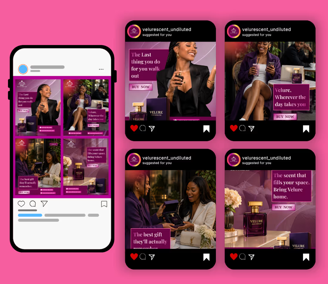
Velure — Perfume Brand Visual Identity & Social Media Campaign
The problem with most perfume ads
Bottle. Model. Tagline. It's a formula that looks nice for three seconds and gets forgotten a scroll later. Every perfume brand is fighting for the same kind of attention with the same kind of image, and most of them lose before the caption even loads.
The idea behind Velure
Velure is a fictional perfume brand and full visual identity I built to answer one question before designing a single frame: why would this brand stand out in a feed full of other perfume ads?
Instead of one graphic sitting there looking pretty, I wanted each scene to tell its own story, strong enough to be understood at a glance, before anyone reads a word. That's the real difference between decoration and communication. A design that needs text to explain itself hasn't done its job. A design that speaks first, and lets the text simply confirm it, is the one that actually sells.
What each scene says, instantly
Confidence walking out the door. A scent that follows you through the day. A gift someone will actually remember. A home that feels complete because of one bottle on the table. No caption has to work overtime to explain any of it.
Process
Brand identity: logo, color system (magenta and purple with gold accents), typography
Product styling and packaging direction
Four lifestyle scenes designed around real moments, not just product shots
Copy positioned as reinforcement, not the strategy
Why this matters for brands I work with
This is the process I bring into every project. Text isn't the strategy, it's the reinforcement. If the visual alone can't hold attention or communicate the feeling, no amount of clever copy will save it.
2
143