Web Design Studio | Framer, Webflow & AI Solutions
Web Design Studio | Framer, Webflow & AI Solutions

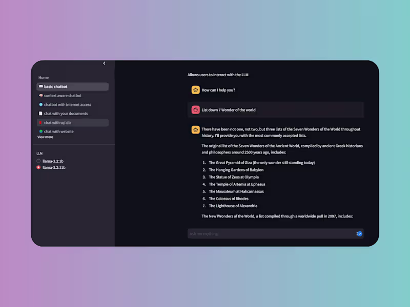
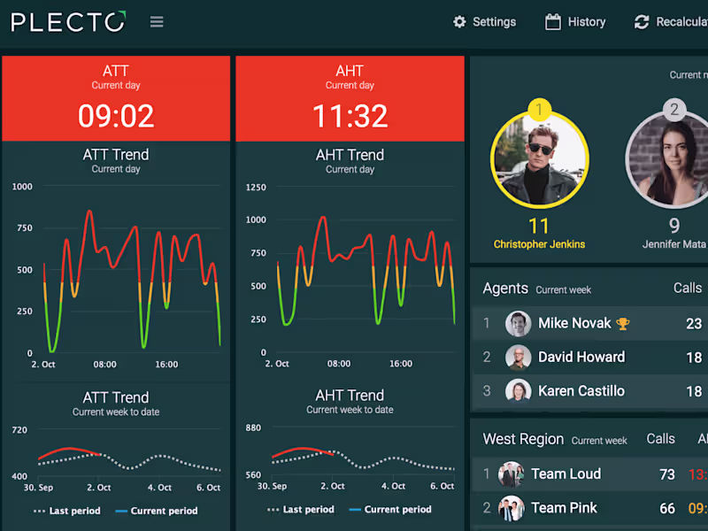
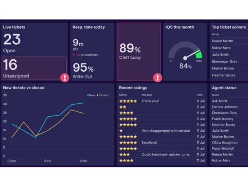
AI Automation & Business Systems Expert | Make.com, Zapier
AI Automation & Business Systems Expert | Make.com, Zapier


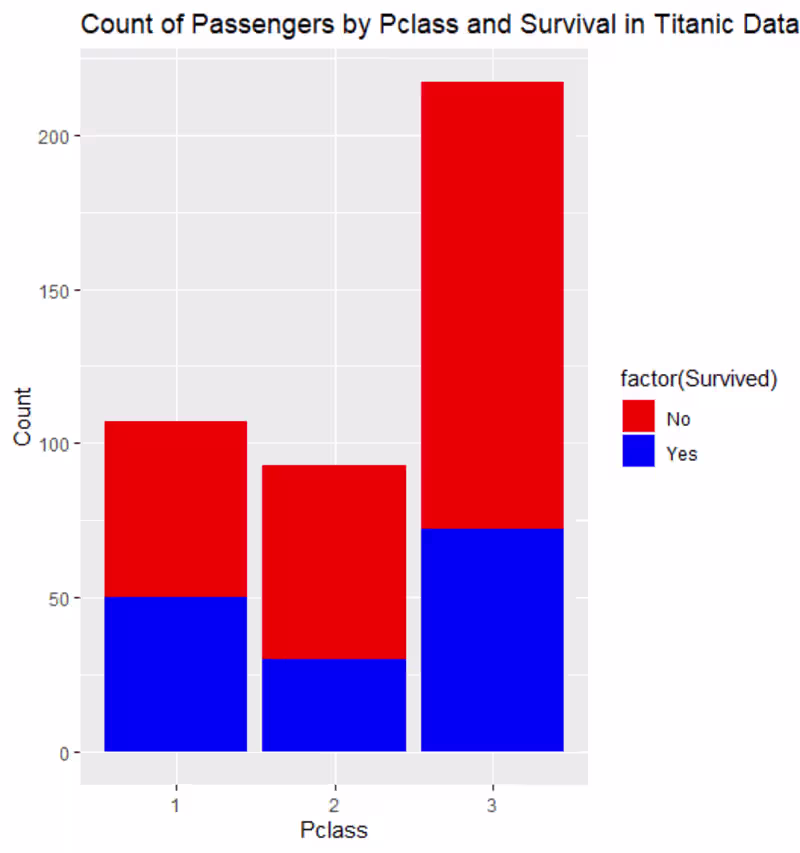
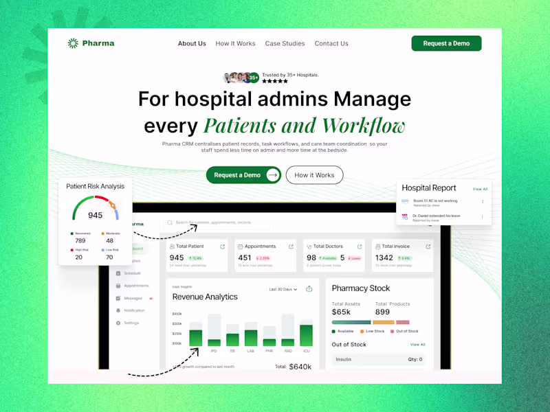
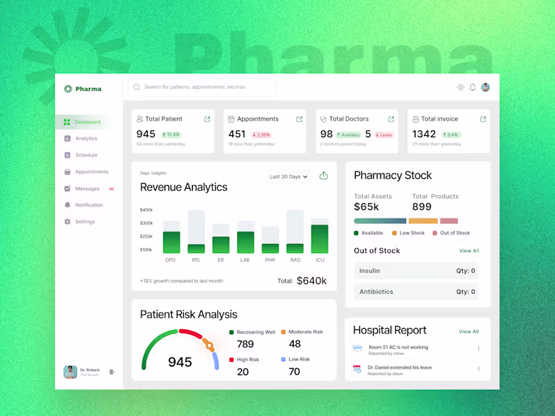
AI System Architect | Database Expert | Data Analyst
- $25k+
- Earned
- 1x
- Hired
- 5.0
- Rating
- 65
- Followers
AI System Architect | Database Expert | Data Analyst
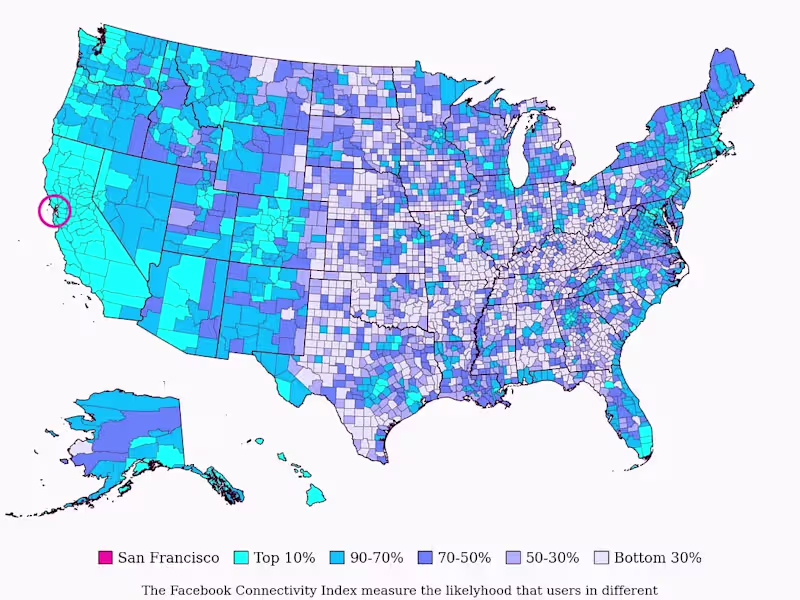
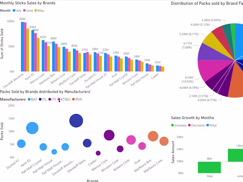
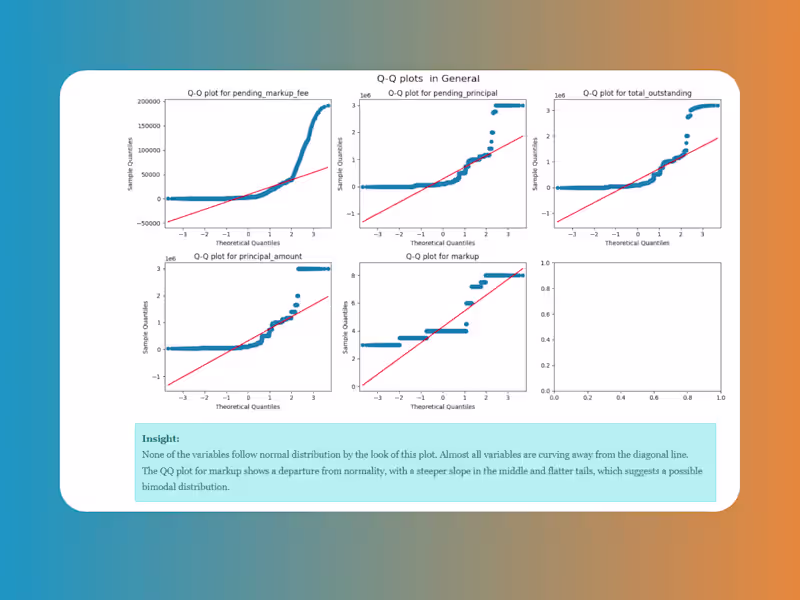
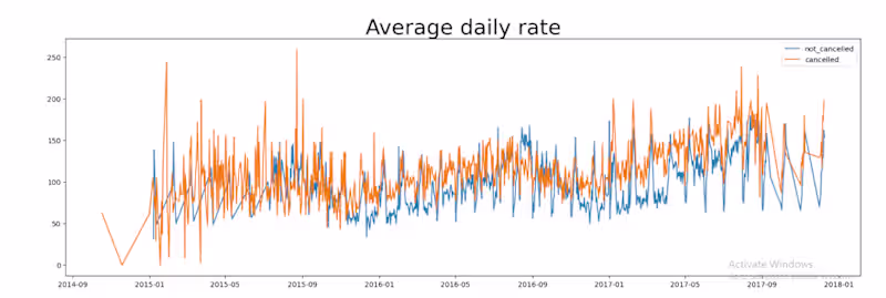
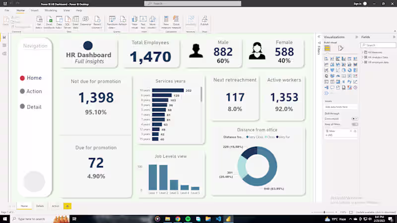
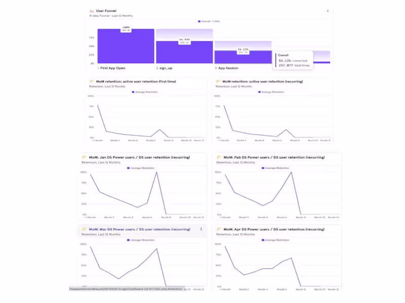
Data Analysis & Visualization | Power BI Specialist
Data Analysis & Visualization | Power BI Specialist


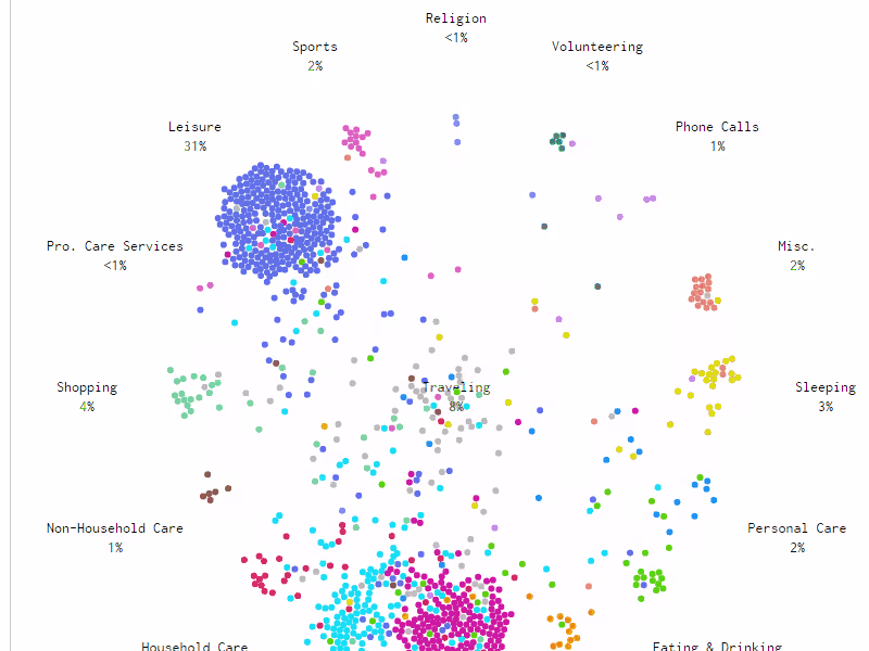
Transforming Data into Actionable Insights 🔍
Transforming Data into Actionable Insights 🔍
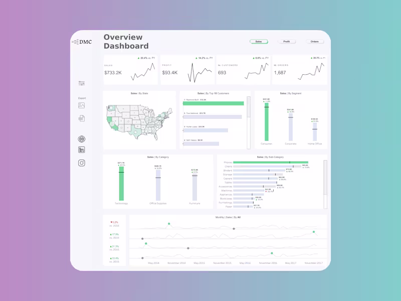
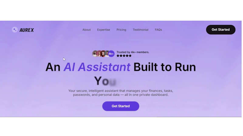
I design SaaS products that turn visitors into customers
I design SaaS products that turn visitors into customers

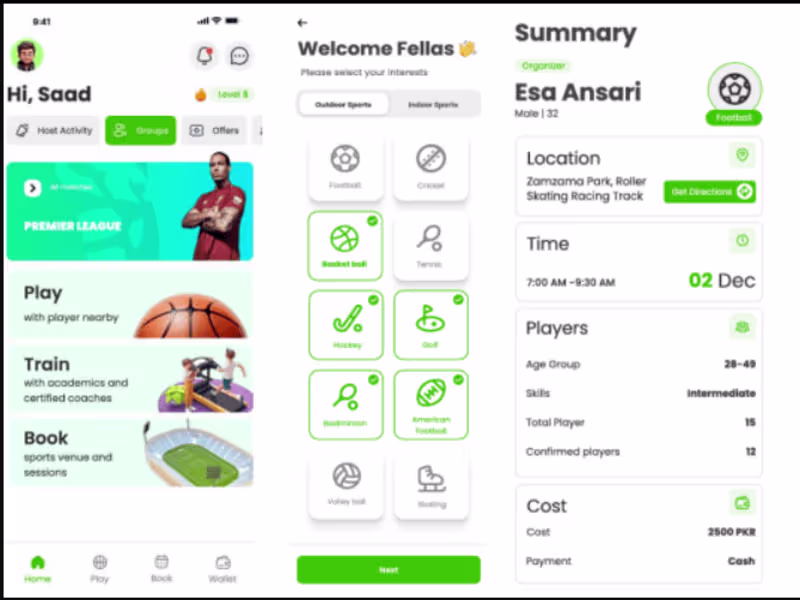
Full Stack Web|AI| Mobile App| Data Analytics Engineer
Full Stack Web|AI| Mobile App| Data Analytics Engineer
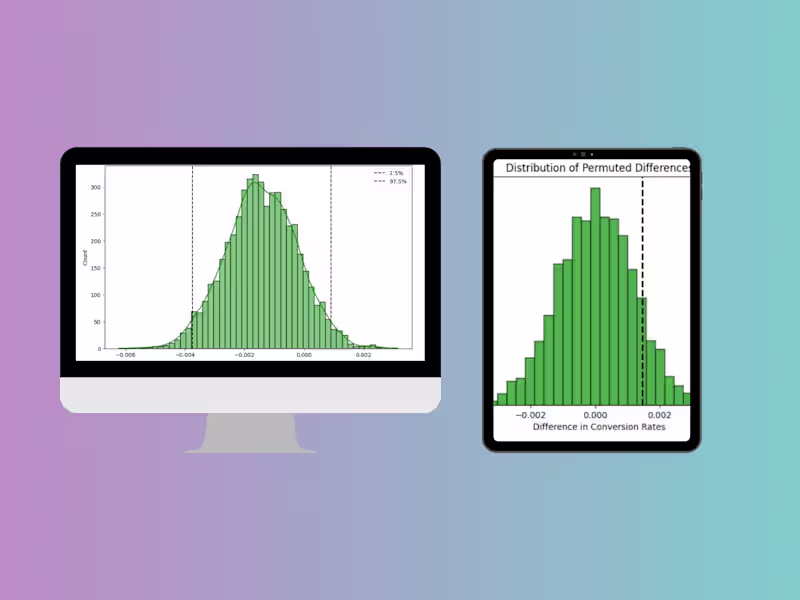
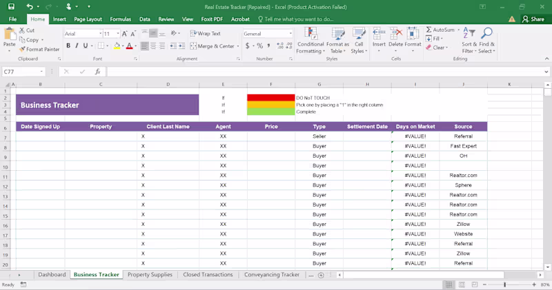
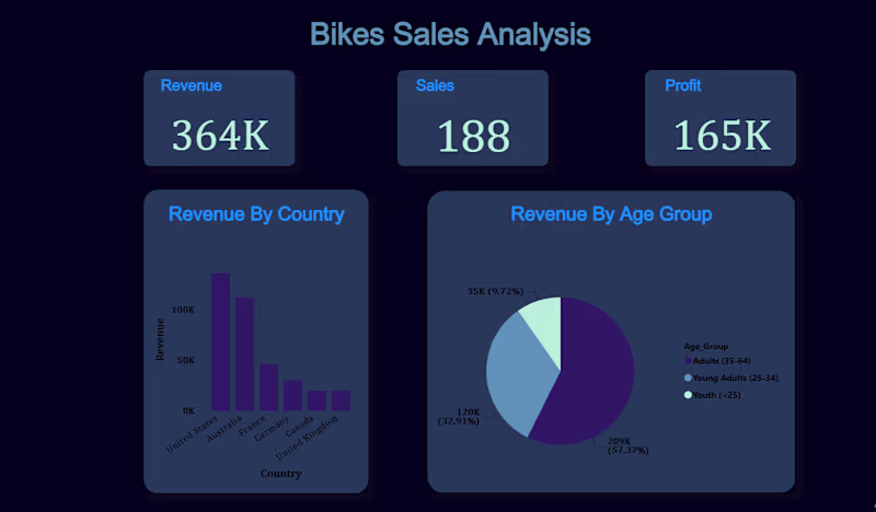
Data Analysis & AI: Results-Driven Expertise
Data Analysis & AI: Results-Driven Expertise