The network for creativity
Join 1.25M professional creatives like you
Connect with clients, get discovered, and run your business 100% commission-free
Creatives on Contra have earned over $150M and we are just getting started
Back to feedPost

I’m excited to share my Supply Chain Dashboard, built using Power BI.
In this project, I focused strongly on UI/UX design to make the dashboard clean, simple, and easy to use. The goal was to present supply chain data in a clear way so users can quickly understand performance and key metrics.
The dashboard shows important numbers using KPI cards and allows users to explore data with slicers and interactive visuals. It also includes smooth page navigation for a better user experience. This project is designed to support better, data-driven decisions through clear and visually engaging dashboards.
I’d be happy to hear your feedback or thoughts on this project.


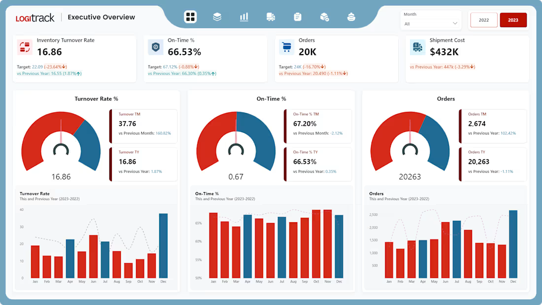
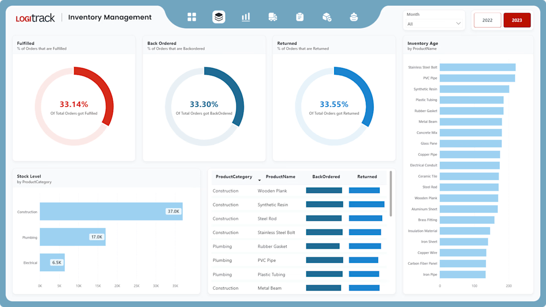
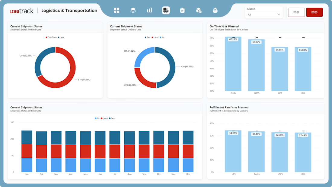
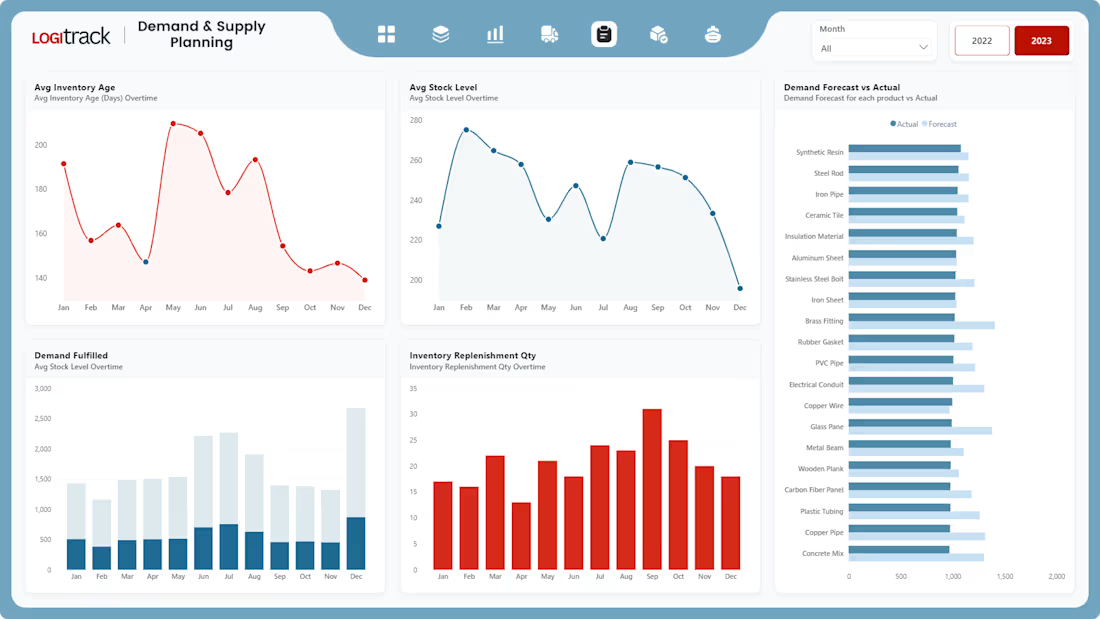

This is very well done. The emphasis on UI/UX really shows—clean layout, clear KPIs, and intuitive navigation make the dashboard easy to understand and use. Combining strong visual design with practical supply chain metrics is exactly what enables faster, data-driven decisions. Excellent work.
The network for creativity
Join 1.25M professional creatives like you
Connect with clients, get discovered, and run your business 100% commission-free
Creatives on Contra have earned over $150M and we are just getting started




Related posts


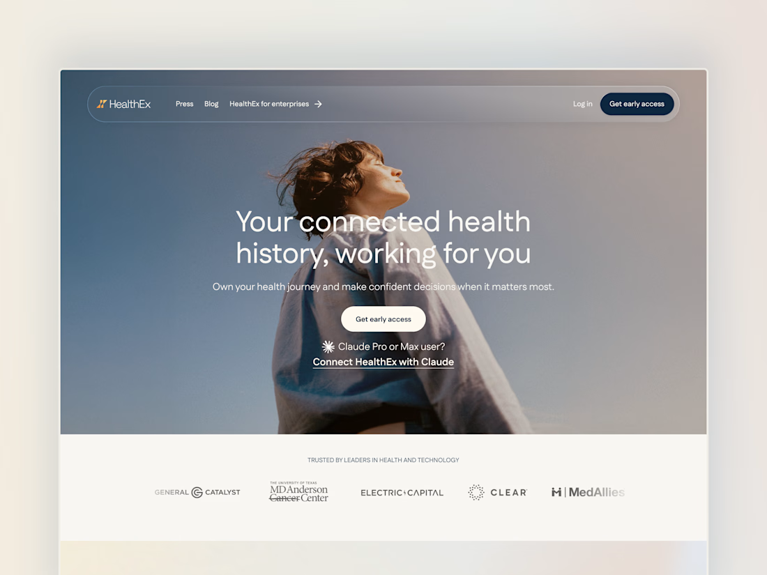
Project back from December 2025: Secret City designed the HealthEx website and hired me to build it in Framer.
P.S. they've gone through several site restructures since then (so it looks different from my snapshots), but it goes to show how easy Framer makes it for clients to manage and update their site independently.


Awesome😍

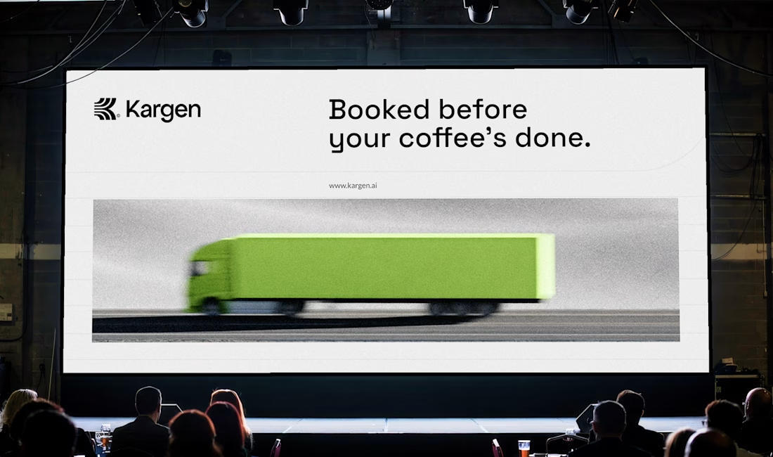
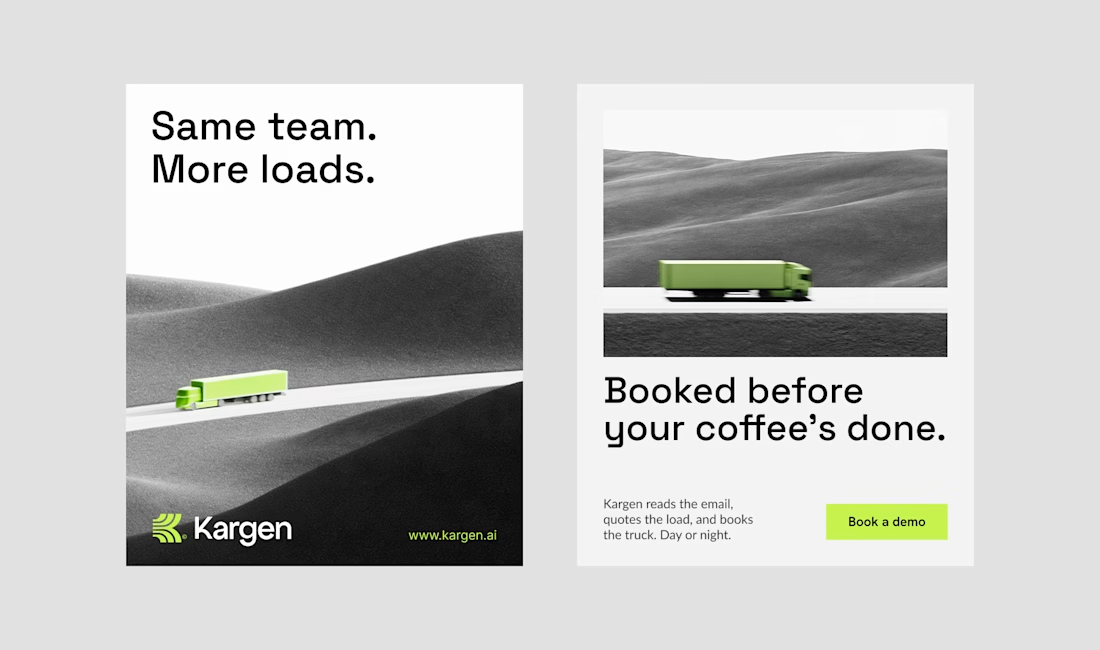
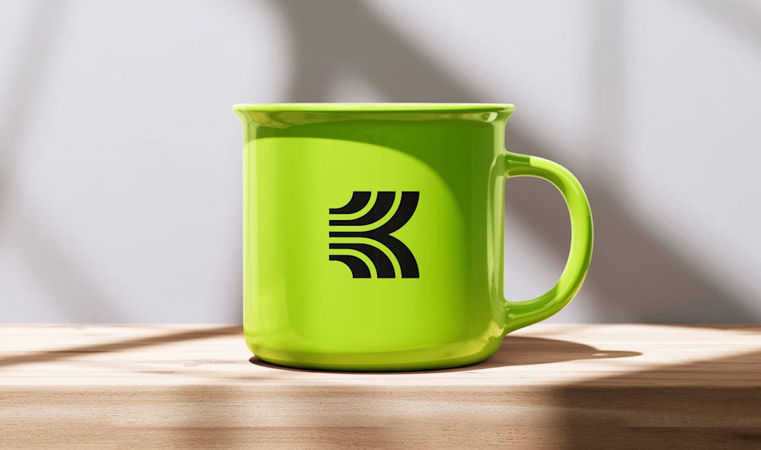
One of the directions I explored for Kargen. It didn't make the final cut, but I think it holds up. We decided to go totally different route.
Kargen is an AI that books freight on its own. It reads the email, quotes the load, and books the truck, day or night. The brand had to feel as fast as the product, but calm with the pace.




Sick 🔥

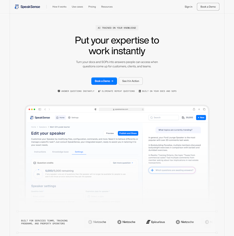
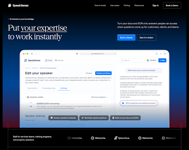
Swiss-clean or midnight-premium? Same content, different vibe. Which one looks better? 🤔
9 voted
33%
18 voted
67%
27 votes
Closed