The network for creativity
Join 1.25M professional creatives like you
Connect with clients, get discovered, and run your business 100% commission-free
Creatives on Contra have earned over $150M and we are just getting started
Back to feedPost
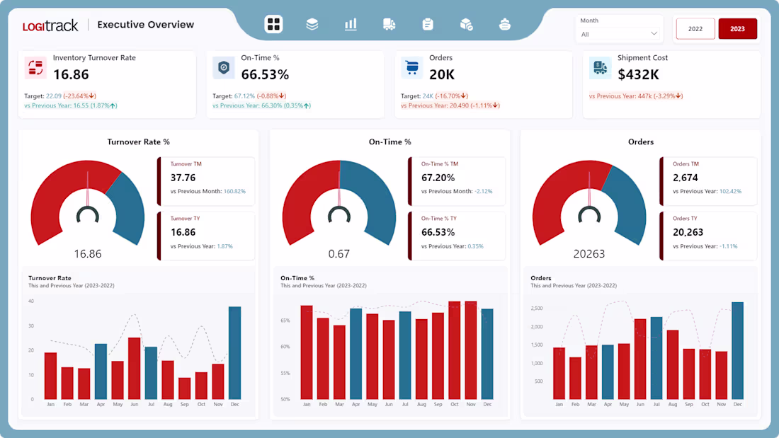
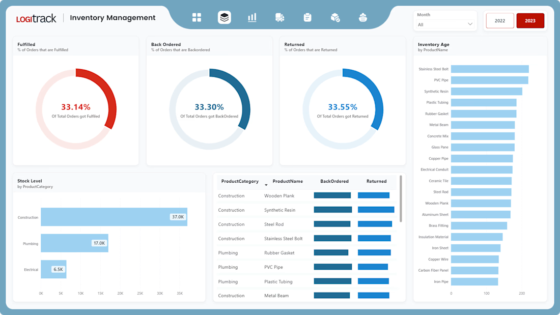
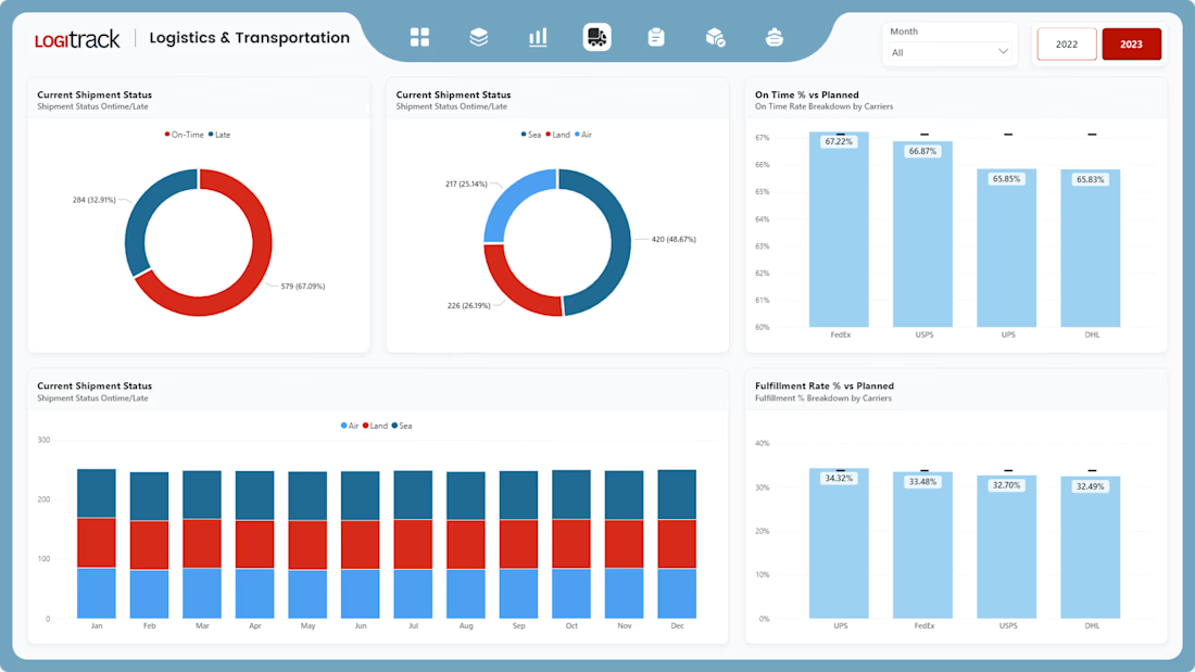
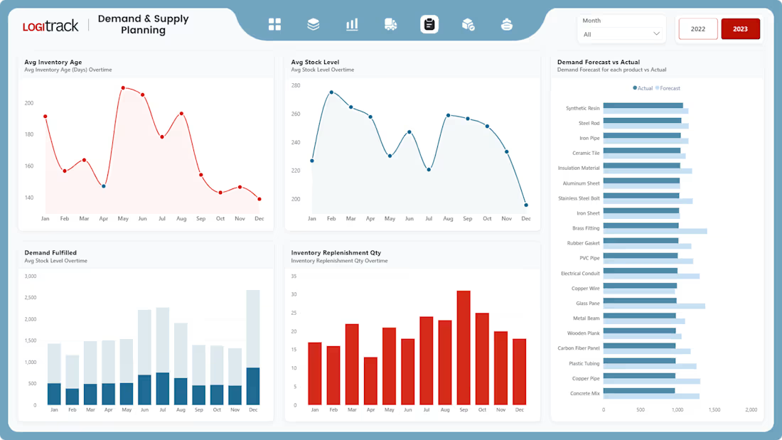
I’m excited to share my Supply Chain Dashboard, built using Power BI.
In this project, I focused strongly on UI/UX design to make the dashboard clean, simple, and easy to use. The goal was to present supply chain data in a clear way so users can quickly understand performance and key metrics.
The dashboard shows important numbers using KPI cards and allows users to explore data with slicers and interactive visuals. It also includes smooth page navigation for a better user experience. This project is designed to support better, data-driven decisions through clear and visually engaging dashboards.
I’d be happy to hear your feedback or thoughts on this project.
This is very well done. The emphasis on UI/UX really shows—clean layout, clear KPIs, and intuitive navigation make the dashboard easy to understand and use. Combining strong visual design with practical supply chain metrics is exactly what enables faster, data-driven decisions. Excellent work.
The network for creativity
Join 1.25M professional creatives like you
Connect with clients, get discovered, and run your business 100% commission-free
Creatives on Contra have earned over $150M and we are just getting started
Related posts
Kicking off the week with something exciting.
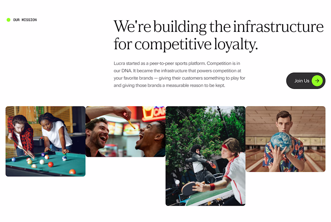
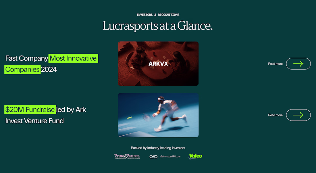
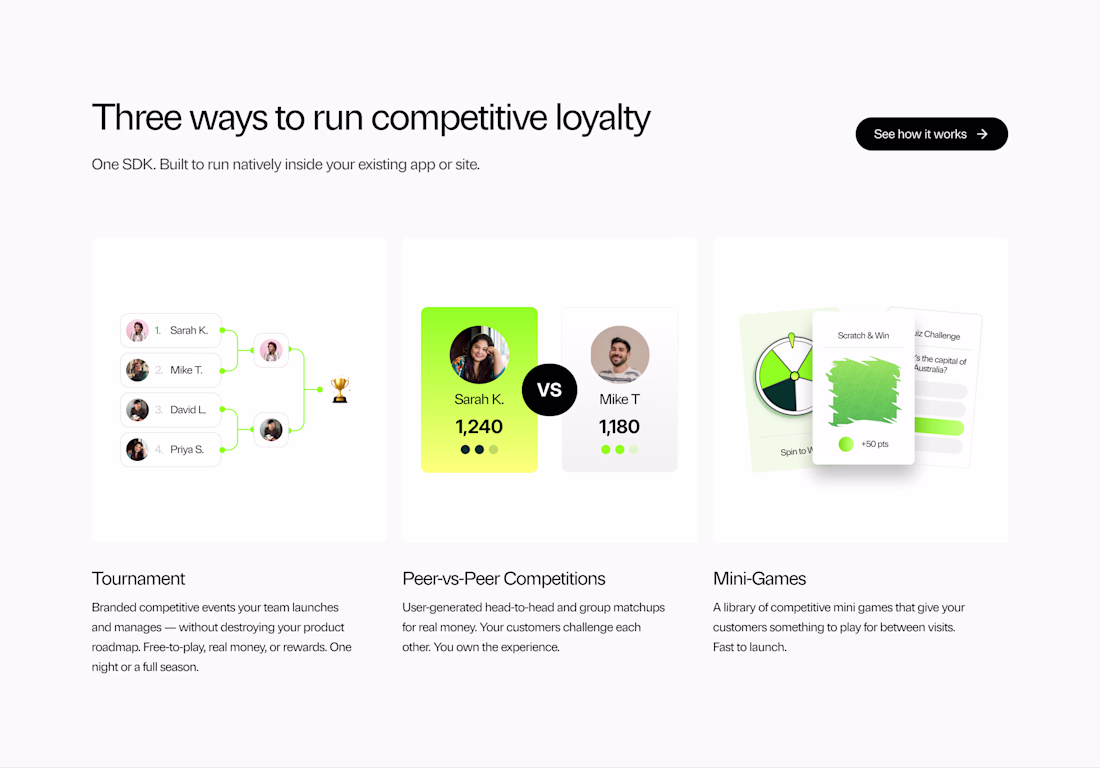
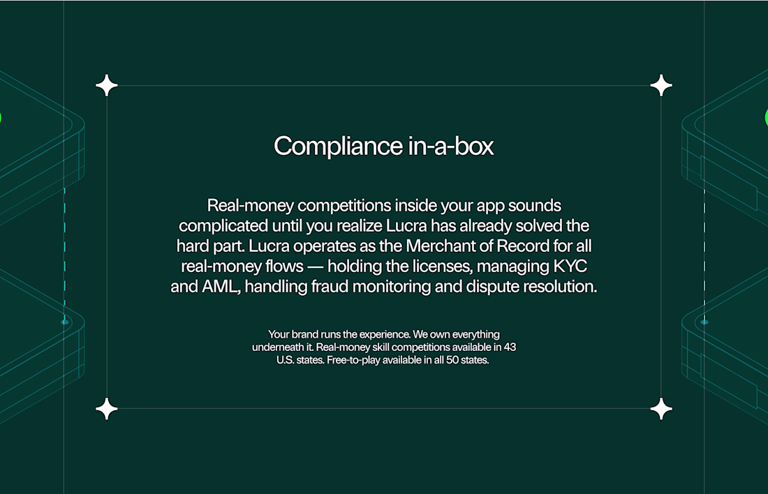
We're working on design explorations for Lucra — building the infrastructure layer for the next generation of loyalty across real-world venues and consumer experiences.
Building something and need a design partner who actually gets it? Let's talk. - https://cal.com/digitalforus/15min
⤵️ Taking on new projects.
— Website design & development
— Brand design
— Content strategy
— Framer & Webflow development
Looks nice
Hi, Contra community 🫶 We’re kicking off the new week with a new piece of work. I’d really appreciate your support 🤓❤️
Also, if you want to follow along as I grow my account from zero to 1,000 followers, follow me 🎉 Every day, I’ll post updates and show you what worked and what didn’t 🤝
Great job
Hi Contra 👋
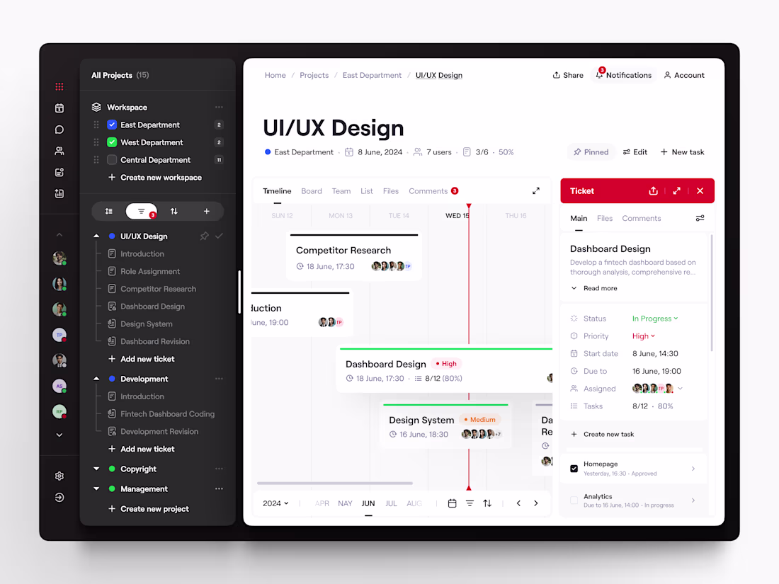
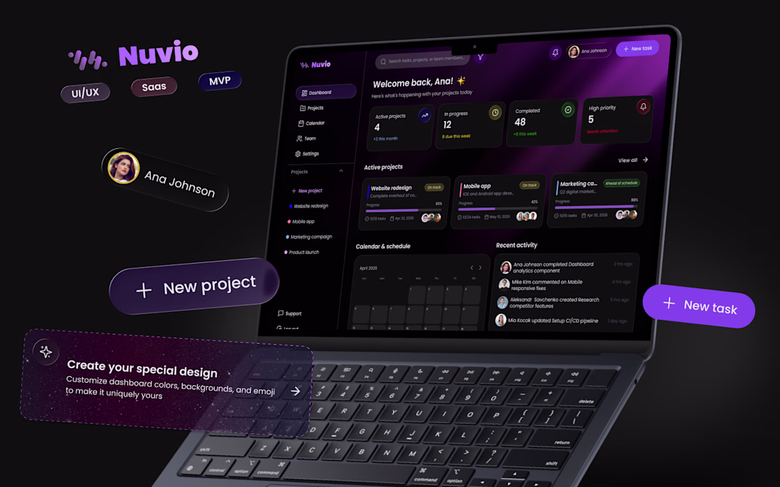
I'm Anastasiia, a UI/UX designer, and this is my first post here.
I've been in design for almost two years, and lately I've been working on a SaaS product for project and team management. It's been one of those projects that made me think deeply about collaboration, structure, and how to make complex workflows feel simple and intuitive.
I'm currently at the finish line, refining the last details, and I thought this would be the perfect time to share a first look.
Excited to be here, connect with other creatives, and share more of my journey along the way 😍
Amazing work! Welcome on Contra 😍
Trending
Claude
Claude has entered the design space. How are you using Claude Design?
Contra University
Learn from expert creatives how to earn more using next-gen AI tools.
MagicPath
The canvas is infinite, and exploration is becoming the workflow. How are you using MagicPath?
creativeaiflow
Creative AI workflows are evolving. What tools do you use, and what are their strengths and weaknesses?
freelancerlife
Freelancer life is wins, pivots, and everything in between. What’s yours right now?