The network for creativity
Join 1.25M professional creatives like you
Connect with clients, get discovered, and run your business 100% commission-free
Creatives on Contra have earned over $150M and we are just getting started
Back to feedPost
Hi Contra 👋
I'm Anastasiia, a UI/UX designer, and this is my first post here.
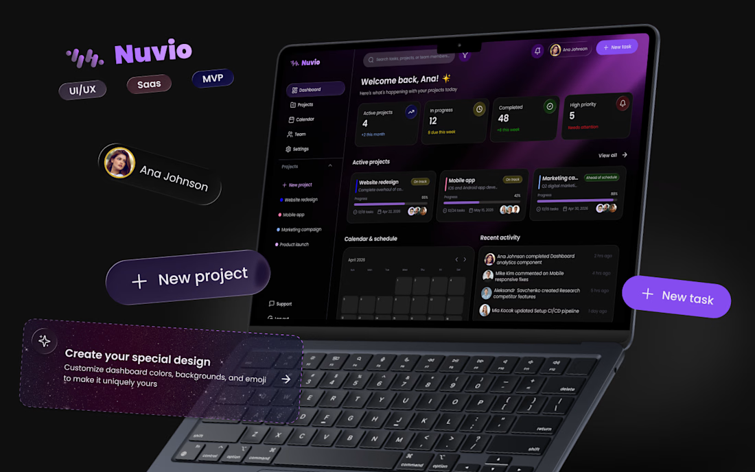
I've been in design for almost two years, and lately I've been working on a SaaS product for project and team management. It's been one of those projects that made me think deeply about collaboration, structure, and how to make complex workflows feel simple and intuitive.
I'm currently at the finish line, refining the last details, and I thought this would be the perfect time to share a first look.
Excited to be here, connect with other creatives, and share more of my journey along the way 😍



Amazing work! Welcome on Contra 😍

Thank you ❤️❤️❤️✨✨✨

Thanks Oleksandra. I bet you say that to all the newbies....:)

Great job 👏
Thank you😊

What a stellar first post! The visual hierarchy and presentation of Nuvio are top-notch. Thrilled to have you here in the community—can't wait to see more of your journey! 🔥🙌
Really appreciate this, thank you! Excited to be here and share more work soon 🙌✨

Anastasiia, it looks incredible 😍😍😍
Thank you very much ✨❤️

Wow 😮 🚀🔥 Welcome on Contra!
Thank you🫶🏻✨

Welcome on Contra!🚀
Thank you 🌸

Welcome on Contra! Interesting work!😊
Thank you for the reaction 🫶🏻🌸

Love your style! 😍
Thank you 🫶🏻

Really cool 🔥
Thank you 🥹🫶🏻

Welcome to Contra! ✨
There's something exciting about sharing the first post and putting your work out there. Wishing you lots of growth, meaningful connections, and a successful launch for your SaaS project 🚀
Thank you so much!🥹 ✨
Really appreciate your kind words and support🫶🏻

Good luck with the final details⚡️
Thank you ✨

hi! and let's stay in touch!
Of course 😁

welcome buddy
congratulations on your first post 🎉
Thank you ✨

Welcome to the community. Best of luck on your journey😊

Nice to meet you welcome to contra
Thank you ✨
Nice to meet you too
The network for creativity
Join 1.25M professional creatives like you
Connect with clients, get discovered, and run your business 100% commission-free
Creatives on Contra have earned over $150M and we are just getting started








Related posts

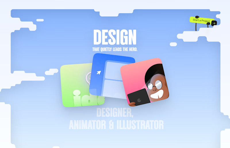
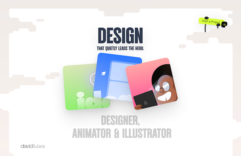
Should I go for left or right? Focusing on updating and finishing up my portfolio... and then I came across this crossroads. Another alternative is to make them switchable themes through a toggle, but I still need to decide which should be the default.
27 voted
75%
9 voted
25%
36 votes
Closed

Left is better because the text is readable, the overall blue background is not flashing to the eyes as compared to the right one.
For the top right button " Start a project ", you can add some animation so that it stands out and encourage users to click on it.

A recent SaaS website design project Done...


Excellent project, really nice


The app looks amazing, but do you think the number font might be a bit hard for people to read quickly when checking their money?