
Hashir Bhatti
Data Analysis & Visualization | Power BI Specialist
Ready for work
Hashir is ready for their next project!
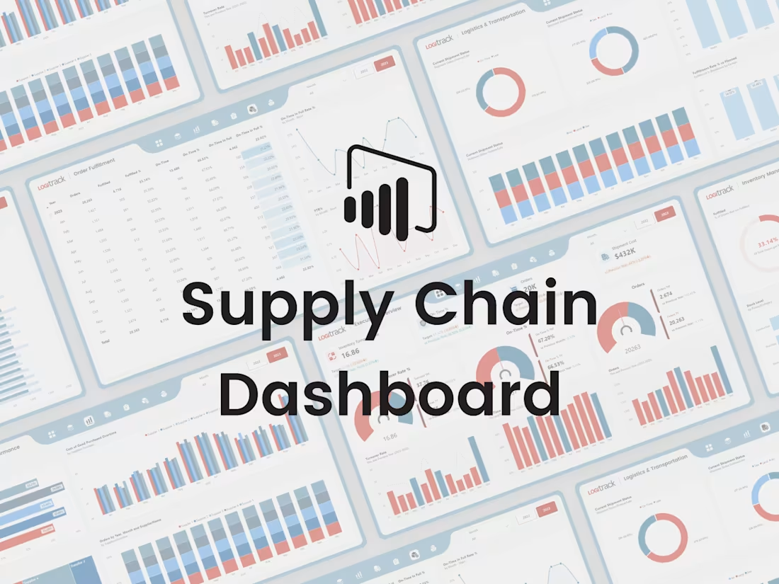
I’m excited to share my Supply Chain Dashboard, built using Power BI.
In this project, I focused strongly on UI/UX design to make the dashboard clean, simple, and easy to use. The goal was to present supply chain data in a clear way so users can quickly understand performance and key metrics.
The dashboard shows important numbers using KPI cards and allows users to explore data with slicers and interactive visuals. It also includes smooth page navigation for a better user experience. This project is designed to support better, data-driven decisions through clear and visually engaging dashboards.
I’d be happy to hear your feedback or thoughts on this project.
1
1
64
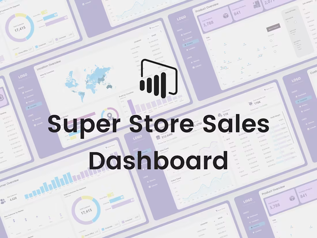
I’m excited to share my Store Sales Dashboard, created using Power BI.
I started this project by designing the dashboard in Figma and then developed it in Power BI. The focus was on making the dashboard interactive and easy to use, so users can quickly understand store performance and key sales metrics.
The dashboard displays important numbers through KPI cards and uses slicers and interactive visuals to explore the data in more detail. It also includes smooth page navigation to make the experience better. This project is all about helping businesses make better, data-driven decisions using clear and visually engaging dashboards.
Your feedback is always welcome.
1
59
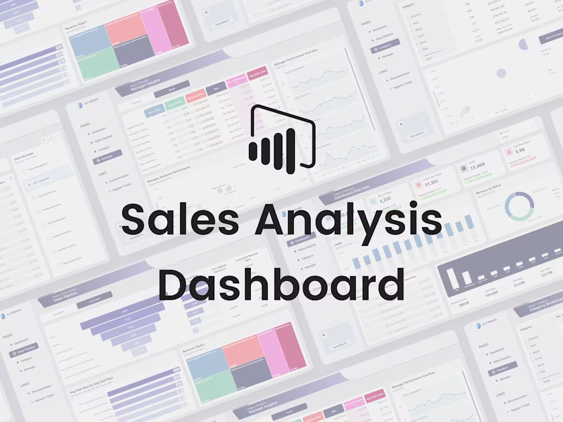
I’m happy to share another one of my Power BI projects — the Sales Analysis Dashboard.
I designed the dashboard layout in Figma first and then built it in Power BI. I used DAX to add advanced calculations and make the visuals dynamic and interactive. The main goal of this dashboard is to present sales data in a clear way so users can easily understand performance and trends.
The dashboard shows important sales metrics using KPI cards, includes slicers for quick filtering, interactive visuals for deeper analysis, and smooth page navigation for a better experience. This project focuses on turning sales data into useful insights that support better decision-making.
I’d love to hear your feedback or suggestions.
0
52
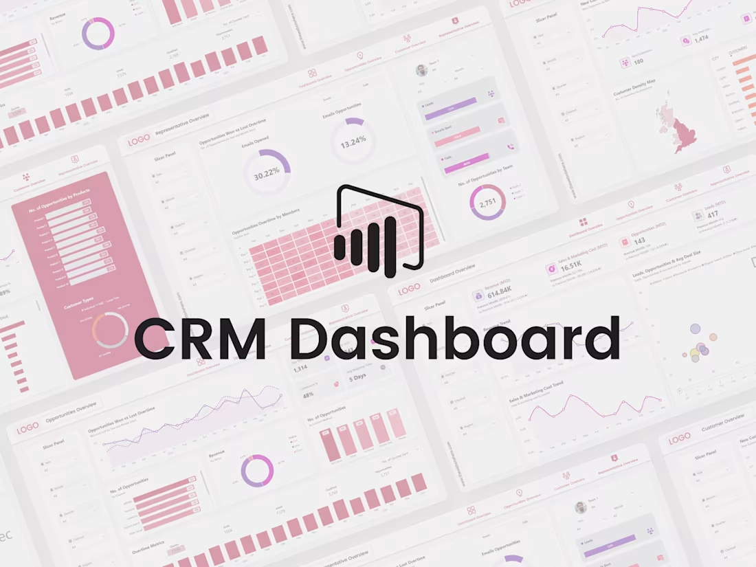
I’m excited to share my Customer Relationship Management (CRM) Dashboard, which I built from scratch using Power BI. The goal of this project was to turn complex data into clear and easy-to-understand insights.
I used DAX for data analysis and focused a lot on interactivity so users can explore the data instead of just looking at numbers.
The dashboard shows key business metrics through KPI cards, allows filtering with slicers, includes interactive visuals, and has smooth page navigation for a better user experience. Overall, this project reflects my approach of combining data analysis with good UI/UX design to support better business decisions.
I’d love to hear your thoughts or feedback on this project.
0
60