The network for creativity
Join 1.25M professional creatives like you
Connect with clients, get discovered, and run your business 100% commission-free
Creatives on Contra have earned over $150M and we are just getting started
Back to feedPost
Taste Test

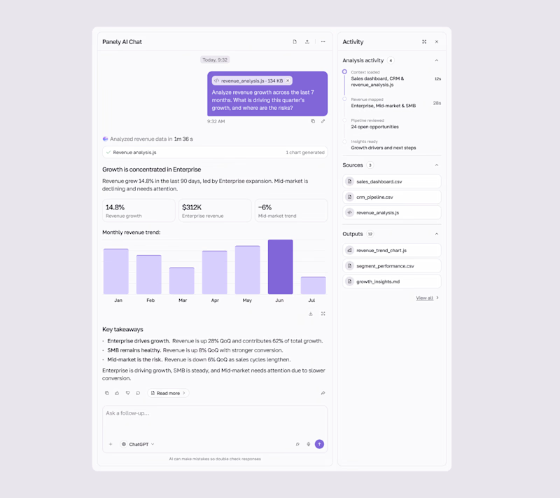
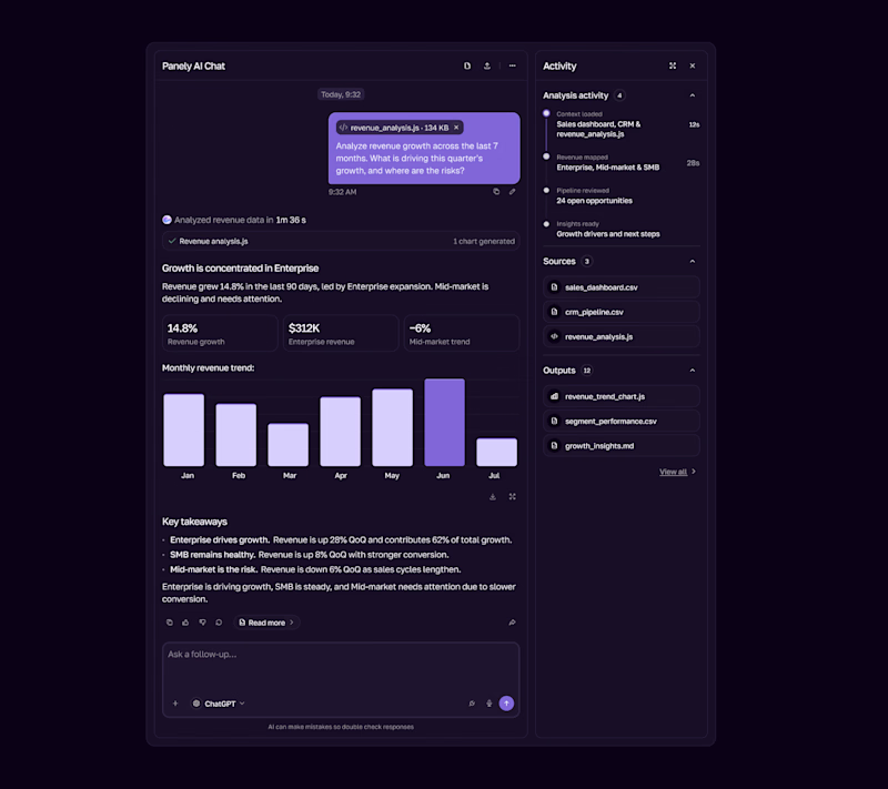

I'd pick Light for an analysis tool, the charts and sources read better on a pale surface and the violet bars still pop. Dark works as the night option. Is the sources panel on the right open by default?

Yep — sources are collapsed by default to keep the analysis focused. Users can expand them anytime, similar to Claude and ChatGPT. Both light and dark are part of the design-system showcase.
The network for creativity
Join 1.25M professional creatives like you
Connect with clients, get discovered, and run your business 100% commission-free
Creatives on Contra have earned over $150M and we are just getting started
Related posts


The little green dot moving through the grid is so satisfying

Landing page for B2B search analytics platform.
For startups, converting users is extremely crucial.
You might have 3~5 seconds to get the user's attention, so it's very important how the design looks and feels.
Premium design + animation like this helps turn users into sign-ups. Proud of this one.

Nice work

EchoMind is live on the Framer Marketplace.
It’s a calm, editorial shop template for brands that make physical things: hardware, objects, small product lines. I designed the brand, generated the product photography and built every page in Framer.
What’s inside:
20 pages, each designed for desktop, tablet and phone
CMS-driven shop with working price sort
Product pages with gallery, specs and FAQs
A build-your-own configurator with live pricing
A bag with quantities and discount codes
Journal with hover image previews
Launch, studio, support and gift card pages
The product itself is fictional: a modular mixing desk where one core listens to your mix and suggests one fix at a time. I wanted the template to feel like a real brand from day one, so it’s been built and photographed like one.
Get the template: https://www.framer.com/marketplace/templates/echomind/


Congrats on the launch, Jonathan. Designing the brand, the photography and every page yourself gives it a clear voice. What was the hardest part of building a shop template in Framer?