
pro
Nikola Mutovdzhiyski
I help founders & personal brands grow with short-form video


Fluid, Two Palettes
A motion design study built on a single idea: soft, shapeless forms drifting and swelling around a bold white FLUID set at the centre of the frame.
The challenge was to let colour define the character of the piece while the animation stayed identical. Same forms, same timing, same type.
The red version is built on contrast. Flat saturated shapes on pure black, the soft falloff doing all the shading, the type sitting hard against it like a poster. The purple version works in gradients. Violet cooling to the edges, magenta where the forms catch light, the blacks lifted into plum so the whole frame breathes softer. One is graphic, the other atmospheric.
What I did
→ Concept and art direction
→ Typography and layout
→ Motion design
→ Colour design, two finished versions
1
4
167
Core, Graded Twice
A motion design study built around a single shot: a slow five second push in on a cratered planet, small moons in orbit, a glowing core swelling at its centre.
The challenge was to make one move carry two completely different moods without touching the animation. Same camera, same timing, same composition.
The grade does all the work. The blue version pushes the blacks toward indigo, lights the rims in violet and lets a cyan core bloom out of the dark. The red version turns the rock olive and grey, sets the core burning red with a green haze moving across it, and softens the highlights so the texture reads harder. One feels distant and cold, the other close and volatile.
What I did
→ Concept and art direction
→ Scene composition and camera move
→ Motion design
→ Colour grading, two finished versions
1
3
97
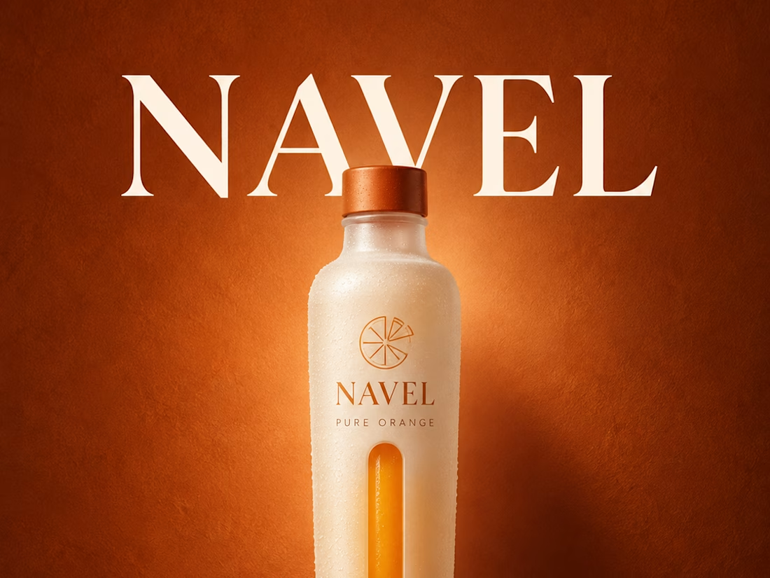
What if one bottle could carry the whole campaign?
Four frames, one object.
The pour first, bottle tipped over a branded tumbler, juice landing in a crown of splash with droplets held mid air. Then the shadow, bottle flat to the wall and a clean orange slice thrown to its left. Then overhead, lying inside a terracotta dish with light rising behind the rim. Then the portrait, wordmark large in cream serif, one hard shadow falling right. Same burnt orange, same condensation, the bottle never more than a step from centre. 👇
#brandconcept #packagingdesign #artdirection
1
2
122
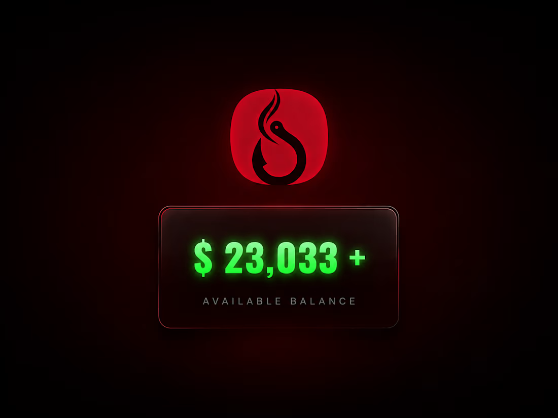
Firehook is a conservation platform built for hunters, anglers and shooting sports enthusiasts, where members vote on which projects receive funding.
The challenge was turning a voting mechanic into something people would act on. Sweden had the community and the landscape, but no mission on the board.
The edit opens on Swedish water and forest, moves through fishing and nature, then cuts to black and puts the available funding on screen. From there it shows the mechanic itself: mission cards stacking up with vote counts and amounts climbing, then a fourth card left deliberately empty. The gap is the message.
What I did
→ Script Writing
→ Concept and Narrative
→ Video Editing
→ Motion Graphics
→ UI Animation
→ Sound Design
→ Kinetic Typography
1
139