The network for creativity
Join 1.25M professional creatives like you
Connect with clients, get discovered, and run your business 100% commission-free
Creatives on Contra have earned over $150M and we are just getting started
Back to feedPost

Solar Energy Website
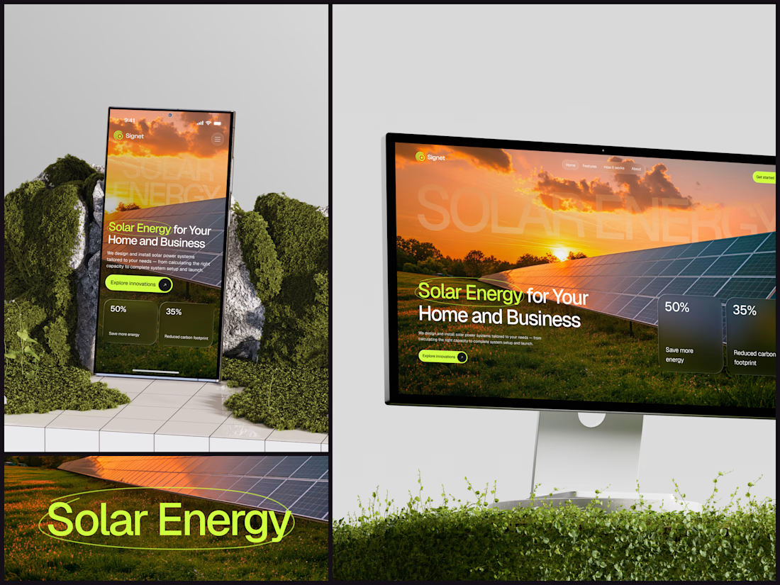
A thin lime circle tells you which two words this page is about.
The headline sits over a sunset photo of a panel field. The "Get started" and "Explore innovations" buttons share the circle's lime, so the eye moves from the circled words straight to the next step.
Large faded capitals repeat those two words across the sky, faint enough to stay inside the photo. On mobile they break onto two lines, and the headline and button stack above two frosted cards.
Only two words of "Solar Energy for Your Home and Business" are lime, and the whole page follows them.
Designed by the Hue & Machine team.
#SolarEnergy #RenewableEnergy #CleanTech #WebDesign #LandingPage #HeroSection #UIDesign #ResponsiveDesign #MobileDesign #FigmaDesign




Nice work

Nice work!

Matching the buttons to that lime circle is a smart way to lead the eye from the headline straight to the CTA. The faded capitals across the sky add depth without fighting the photo.

Wow cool😍

I like that electric yellow/green ! 🟡 🪴

Love the visual hierarchy and overall presentation.

Letting two lime words drive the whole page is a nice bit of restraint. Does the circle draw itself around them on load, or is it static? Feels like the one spot where a little motion would really pay off.

This is really cool, Nice job Dmytro

The sunset photo behind the headline really sells the solar story, and the lime circle guiding the eye to the two key words is a smart touch. Clean hierarchy too — both CTAs are easy to spot at a glance.


Awesome visual on both desktop and mobile version

Really impressive work! Your creative approach and attention to detail are worth appreciating.

Circling the two key words is such a simple move but it works. Tying the button color to that lime circle makes the whole flow feel intentional.

Nice work

Clean work from Hue & Machine team! 🔥 The way the hero section adapts from mobile to desktop without losing the message is really impressive.
I also design responsive landing pages like this — Real Estate, Solar, and Business websites that look sharp on phone and TV/desktop. Love seeing this level of craft on here. Well done! 👏

Clear ui ux sense

The lime circle is a smart way to anchor the eye — it tells you the two words that matter before you read anything else. I like how the buttons share that same lime so the eye moves straight to the next step. One thing I'd test on mobile is the headline contrast where the sunset...


The lime accents stand out against the warm sunset imagery and draw attention to the headline and calls to action. The planted mockup setting also reinforces the solar theme. Well presented, Dmytro.
The network for creativity
Join 1.25M professional creatives like you
Connect with clients, get discovered, and run your business 100% commission-free
Creatives on Contra have earned over $150M and we are just getting started



Related posts

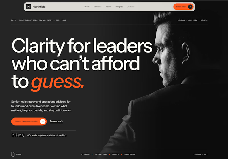
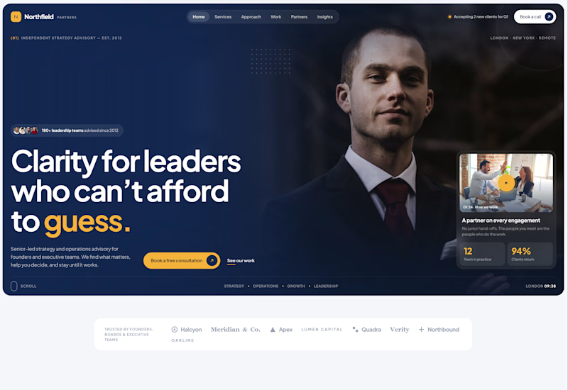
Exploring two different hero directions for a new project.
Same message, two completely different visual approaches.
Which one makes a stronger first impression?
A or B? Curious to hear your thoughts!
36 voted
90%
4 voted
10%
40 votes
Closed

Both are strong. I lean towards the dark version, because the orange accent on the italic "guess." pops and the profile portrait gives it a more editorial, confident feel. The navy one reads a bit more corporate, which could suit a more conservative audience. Nice exploration!

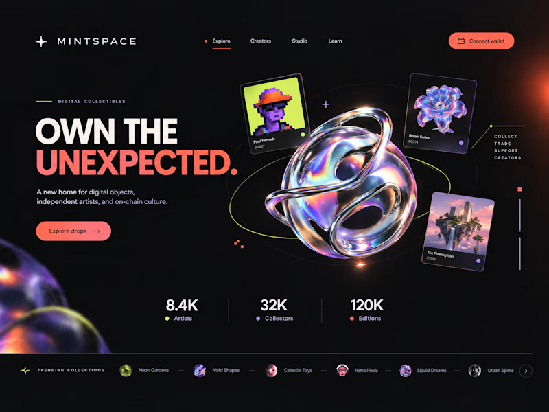
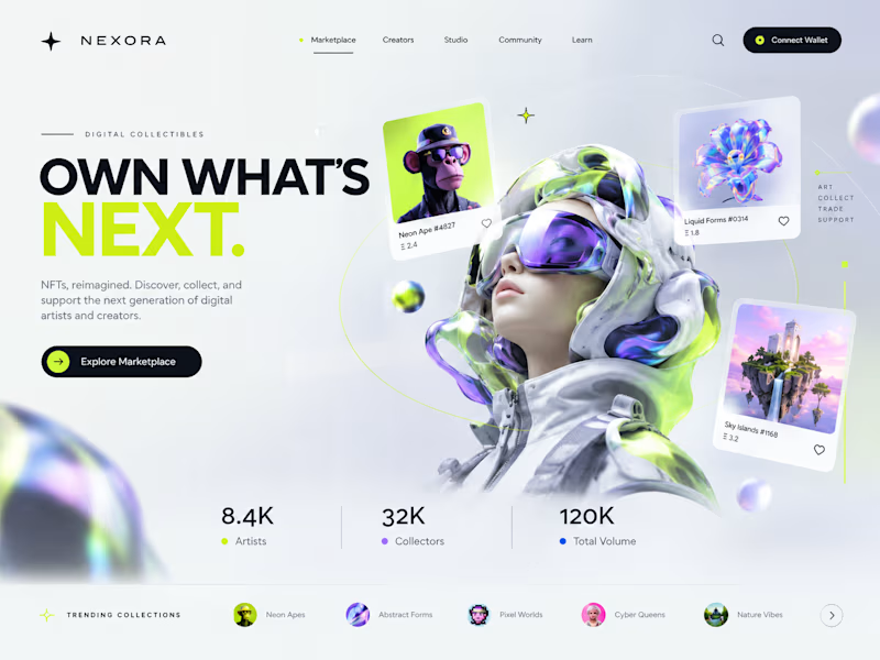
Two directions. One NFT marketplace.
Which visual direction would you choose?
🖤 A — Dark & Futuristic
🤍 B — Bright & Minimal
Both explore the future of Web3, but with completely different visual identities.
Drop your vote in the comments: A or B?
#UIUXDesign #WebDesign #NFT #Web3 #ProductDesign
10 voted
29%
25 voted
71%
35 votes
Closed

Strong design, well done

AI-Powered Physiotherapy Clinic Dashboard | Smart Appointment Scheduling
A modern AI-powered dashboard concept designed for physiotherapy clinics to simplify appointment scheduling, therapist management, and daily operations. The interface focuses on improving workflow efficiency with an intuitive calendar, smart booking experience, patient scheduling, and a clean visual system.
The design features an elegant and minimal UI, helping healthcare professionals manage appointments, therapists, and patient availability with ease. Every screen is crafted to deliver a fast, accessible, and user-friendly experience while maintaining a premium SaaS aesthetic.


so nice work