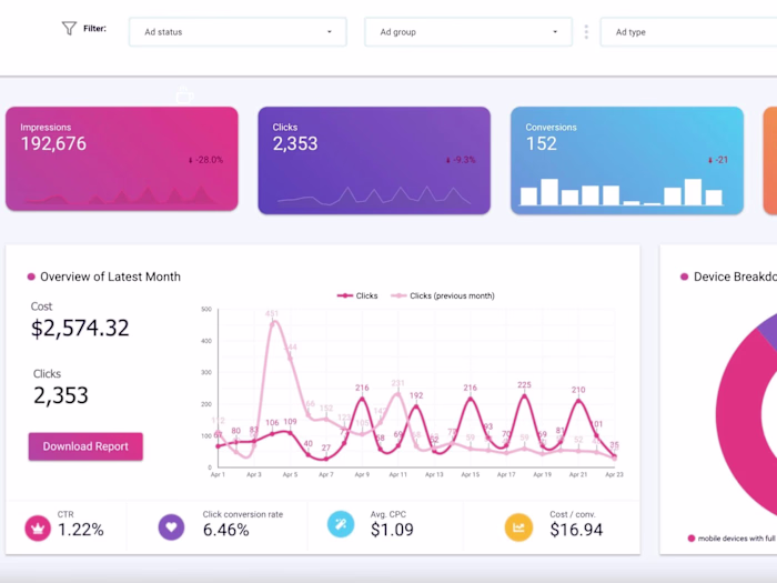
BI Specialist for Meta Ads Dashboard Integration
Approve request to show earnings
View
Tayyab Ali
Verified
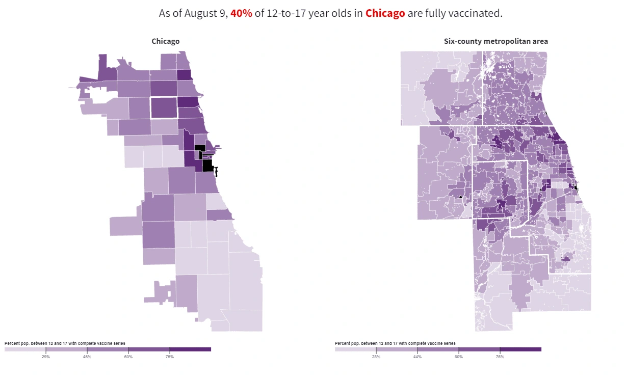
This data visualization shows the percentage of 12-to-17-year-olds who are fully vaccinated against COVID-19 in Chicago and the surrounding six-county metropolitan area, as of August 9.
Key Elements:
Title and Highlight: The title emphasizes that as of August 9, 40% of 12-to-17-year-olds in Chicago are fully vaccinated. The percentage is bolded in red to draw attention.
Left Map (Chicago):
Focuses specifically on neighborhoods within Chicago.
Each area is shaded in varying tones of purple to black.
Darker areas represent higher vaccination rates, while lighter shades indicate lower rates.
A few neighborhoods in the central and north areas show the highest coverage (dark purple to black), while many on the south and west sides remain lighter.
Right Map (Six-County Metro Area):
Shows a broader view including suburban areas outside of Chicago.
The same color gradient applies, with lighter purple indicating lower vaccination rates and darker purple indicating higher rates.
Vaccination coverage appears more varied across the suburbs, with some areas showing strong coverage and others much lower.
Legend:
Located below each map, it quantifies the color gradient, ranging from around 28–29% (light purple) to 75–76% (dark purple) for the percentage of the 12–17 population that is fully vaccinated.
Interpretation:
The maps reveal a geographic disparity in vaccination rates among adolescents, with certain neighborhoods and suburban areas significantly outperforming others. This visualization is useful for public health officials to identify areas needing targeted outreach or intervention.
Would you like help interpreting specific neighborhoods or trends shown in the maps?
Like this project
What the client had to say
Highly recommended!
Eyüp Aramaz, Aramaz Digital
Aug 4, 2024, Client
Posted Feb 20, 2025
Development of dashboards from Graph database data extration through vertor embeddings and create a pipeline that can visuslize vaccine real-time accross the US
Likes
2
Views
147
Timeline
Jul 4, 2024 - Aug 4, 2024
Clients
Aramaz Digital