
Rehbaz Ali
Framer Designer & Developer — SaaS, AI & B2B Websites
- $1k+
- Earned
- 5.00
- Rating
- 149
- Followers
Finora — AI-Powered Investment Platform
1
0
Marketing Platform — eCommerce Email & SMS Agency
8
5
Personal Branding Site — Luxury Marketing & Brand Strategy
7
5
I stopped chasing clients the day I became a Framer Expert.
Before the Expert Program — I was sending proposals, following up, explaining my skills over and over to strangers who didn't know me.
After — clients land on my Framer Expert dashboard, see the work, and message me ready to start.
No cold outreach. No convincing. No chasing.
The dashboard does the selling before I say a word.
Every project then moves to Contra — contracts, payments, everything clean and professional.
The system that changed everything for me:
→ Apply for Framer Expert
→ Build a premium dashboard with your real work
→ Connect it to your Contra profile
→ Let inbound clients find you
If you're a Framer designer still grinding cold DMs — this is the move.
Build the profile. Let the work speak.
📩 All my projects start on Framer Expert and are managed here on Contra. DM me if you're building something.
#FramerExpert #Framer #FreelanceTips #BuildInPublic #Contra #WebDesign #FigmaToFramer #LandingPage #NoCode
3
22
1.5K
Website Builder UI — Landing Page Design
1
5
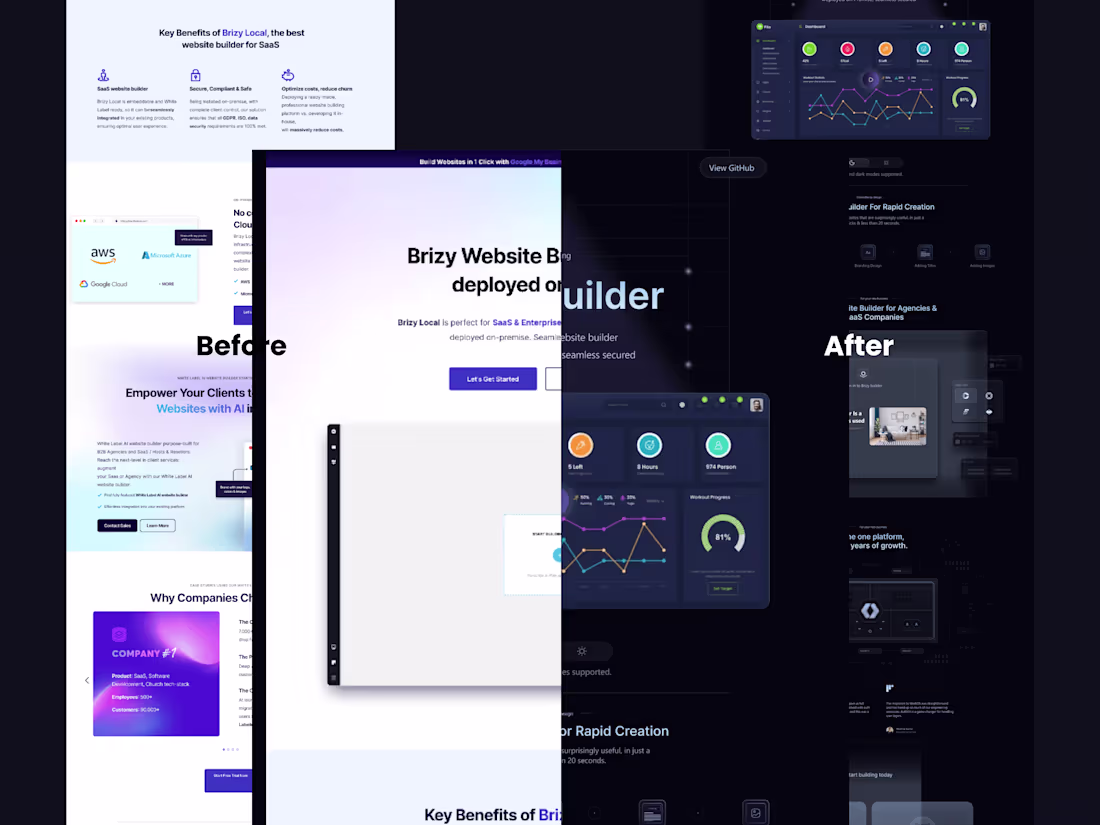
Stop looking like every other agency.
http://framer.link/rYKBchn
Premium Framer template. Built for agencies that want to impress from the first scroll.
Free for the first 30 users.
Then it becomes $120.
2
191
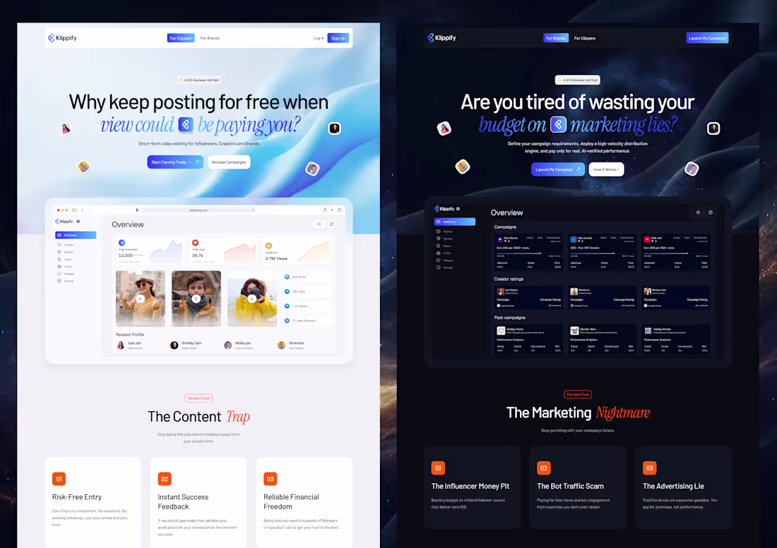
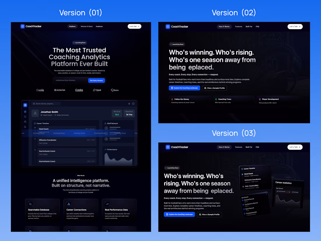
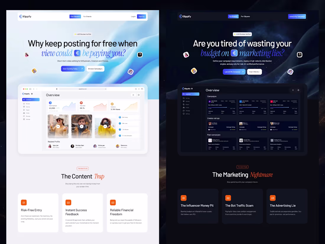
2 hero directions. Same platform. Two completely different audiences.
This is Klippify — a short-form video platform connecting Clippers and Brands.
The brief was clear: design for two people visiting the same site but wanting completely different things.
So I built two worlds.
Version 01 → Light & Creator-First
Soft blue gradients, warm creator photos, "Why keep posting for free?"
For Clippers — content creators who want to monetize their screen time.
Version 02 → Dark & Brand-Focused
Deep space aesthetic, bold typography, "Are you tired of wasting your budget?"
For Brands — marketers who are done gambling on fake influence.
Same product. Two entry points. Two emotional truths.
The dashboard mockup stays consistent across both — because the tool is the same. Only the story changes.
That's what strategic design actually is.
Not just making it look good — making it speak to the right person before they read a single word.
Working on a SaaS, creator platform, or marketing tool?
Let's build something that converts both sides.
📩 DM me on Contra.
#SaaSDesign #UIDesign #WebDesign #LandingPageDesign #FramerDesign #FigmaToFramer #Contra #BuildInPublic #CreatorEconomy #StartupDesign
1
18
912
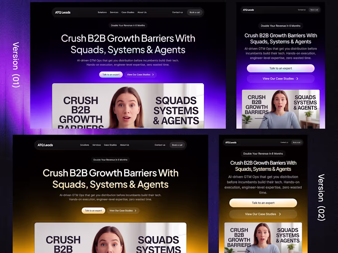
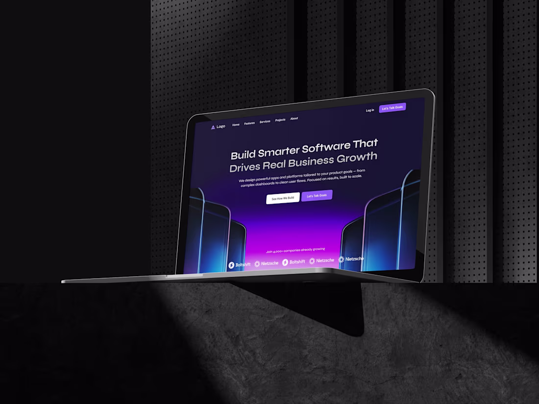
B2B Growth AI GTM Agency Landing Page
10
8
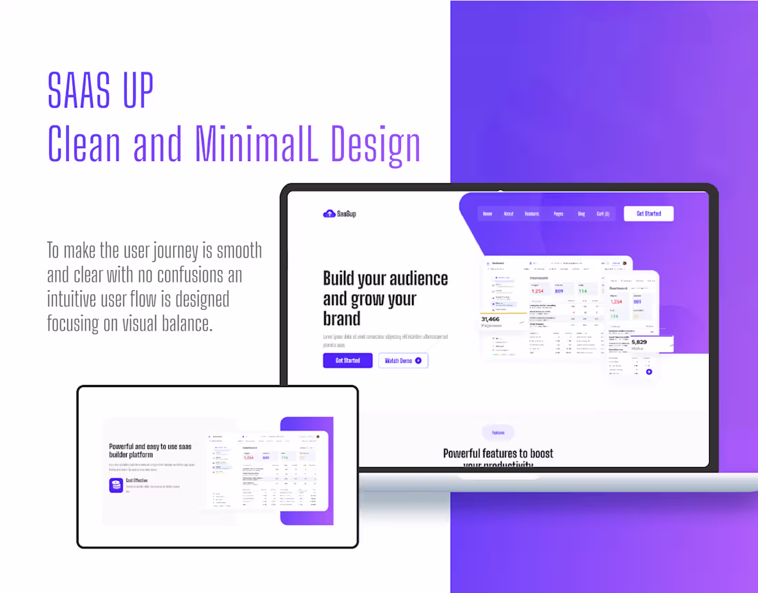
SaaS Website — Conversion-Focused Landing Page
0
6
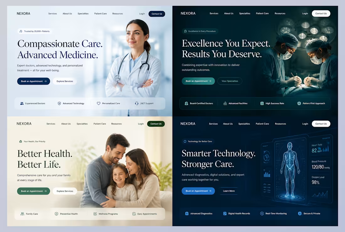
4 hero directions for one healthcare brand. Same client. Same product. Completely different worlds.
This is what "exploring directions" actually means.
The brief for NEXORA — a medical platform — was simple: make it feel trustworthy, modern, and professional.
But "trustworthy" means something different to every patient.
So I designed 4 versions, each speaking to a different emotional truth:
Version 01 → Clean & Human
Light background, approachable doctor, "Compassionate Care."
For patients who want warmth and reassurance.
Version 02 → Dark & Authoritative
Surgical theatre, deep teal, "Excellence You Expect."
For patients who want precision and expertise.
Version 03 → Warm & Family
Soft cream tones, family photo, "Better Health. Better Life."
For patients thinking about long-term family care.
Version 04 → Tech & Futuristic
3D body scan, data overlays, "Smarter Technology. Stronger Care."
For patients who trust innovation over tradition.
Same brand. 4 different patients. 4 different first impressions.
This is why I never deliver one direction without exploring the full range first.
The client picks the one that matches their audience — not just the one that looks good.
Working on a healthcare, wellness, or medical brand?
Let's build something that earns trust before anyone reads a word.
📩 DM me on Contra.
#HealthcareDesign #UIDesign #WebDesign #LandingPageDesign #FramerDesign #FigmaToFramer #Contra #BuildInPublic #MedicalWebsite #SaaSDesign
5
19
761
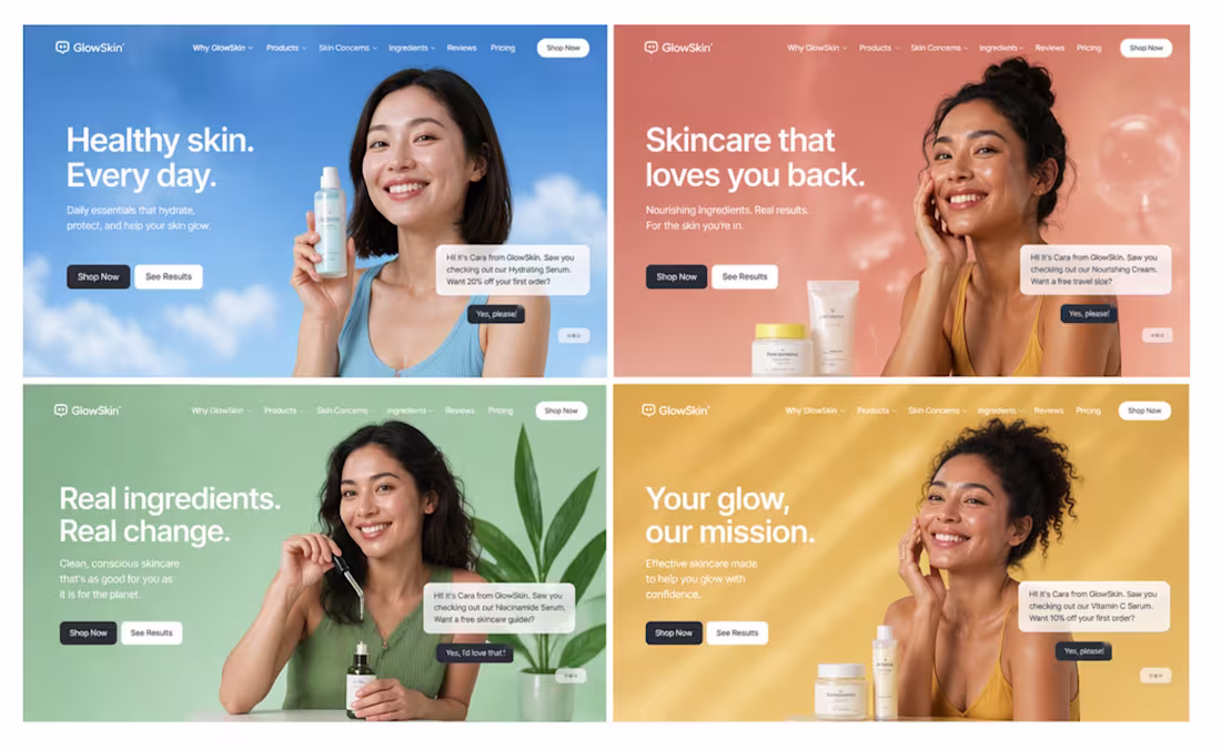
The skincare industry has a trust problem.
89% of skincare brands look identical online.
Generic white backgrounds.
Vague promises like "better skin."
Zero personality.
A skincare brand came to me with this exact problem:
"We have great products. But our website looks like everyone else's."
The challenge:
→ Stand out in a saturated market
→ Appeal to different customer segments
→ Build immediate trust
→ Convert browsers to buyers
The solution:
Instead of ONE generic design, we created FOUR brand personalities:
Version 1 (Blue): Clean, clinical trust
Version 2 (Coral): Warm, nurturing care
Version 3 (Green): Natural, ingredient-focused
Version 4 (Yellow): Energetic, lifestyle-driven
Same brand. Different emotional triggers.
Why this works:
Your audience isn't one person.
Your website shouldn't speak to just one mood.
Some customers want clinical trust.
Some want warm connection.
Some want natural ingredients.
Some want lifestyle energy.
The result:
A/B testing showed Version 2 (coral) converted 3.4x better for their core audience.
But they kept all 4 variations live for different campaigns.
The lesson for skincare/wellness brands:
Stop trying to be everything in one design.
Create multiple brand expressions.
Test which resonates.
Double down on what converts.
Built in Framer for fast iteration.
Swipe to see all 4 variations →
Is your brand stuck looking like everyone else?
Comment "BRAND" - I'll send you the differentiation framework.
2
18
988
Exploring multiple directions is key to building a strong website.
Here are 3 versions for the same product:
• One focused on clarity
• One on bold messaging
• One balancing visuals + storytelling
Each creates a different experience.
That’s why I approach projects with both design and development in mind — not just visuals, but how everything works together.
If you need help with a project, feel free to reach out.
And if you’d like the design file, just comment “design” 👇
18
851
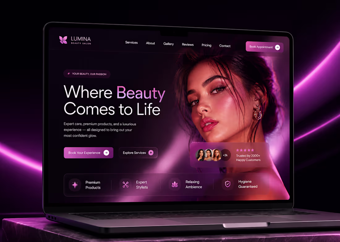
Just finished exploring a new direction for beauty and wellness websites.
Instead of using the usual salon layouts, I focused on creating a premium luxury experience with cinematic visuals, elegant typography, and high-end product marketing aesthetics.
Designed to make a strong first impression while keeping the experience clean, modern, and conversion-focused.
Built in Framer.
Always exploring new ways to make service businesses look like premium brands.
5
480
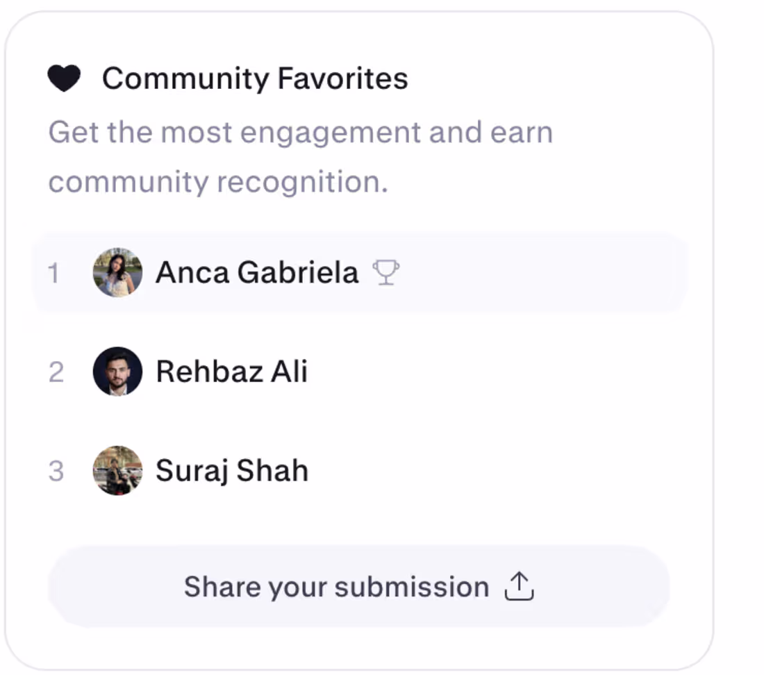
I’m currently ranked #2 in Community Favorites 🎉
Grateful for the support so far. I built my submission for the @Base44 #GiveItAGlow challenge to help a real local business improve its online presence with better design, automation, and real business utility.
Would love your support ❤️
2
4
211
For the @Base44 #GiveItAGlow challenge, I redesigned JosBeauty — a real beauty business — into a more premium, modern, and useful online experience.
The challenge is about choosing a real local business, improving its digital presence, and adding automation that helps the business work better — not just creating a pretty website.
Previous online presence:
Website: https://josbeautystore.com/
Instagram: Jo's Beauty Store 🌿
New website:
https://shyen-mind-flow.base44.app
For this project, I focused on creating a cleaner and more professional beauty brand experience. The new site includes a polished homepage, service sections, treatment details, before/after content, beauty-focused blogs, mobile-responsive design, and clear booking CTAs.
I also added automation to make the website more useful for the business:
• AI FAQ chatbot to answer questions about services, pricing process, treatments, booking, and aftercare
• Appointment inquiry flow to help visitors request a booking
• Lead capture automation to collect client details
• Admin dashboard to help the owner manage inquiries
• Blog-to-booking CTAs to turn educational content into potential appointments
The goal was to give JosBeauty a stronger online presence and a better way to turn visitors into real clients.
This is more than a redesign — it is a practical business tool built to improve trust, answer customer questions, capture leads, and support bookings.
Built with @Base44 for #GiveItAGlow.
33
69
3.1K
"Money is not a problem."
Those 5 words changed everything.
That's what my client said when we started.
And from that moment — I stopped designing.
I started obsessing.
1 week.
7 days straight.
Working 24/7.
Over 25+ hero directions explored.
Research. Concept. Design.
Scrap it. Research again. New concept. New design.
Repeat.
Most designers would have delivered something nice on day 2 and called it done.
But "nice" isn't what a premium client is paying for.
They're paying for the version that doesn't exist yet.
The one you only find after you've exhausted every obvious idea.
Idea 1 was good.
Idea 10 was better.
Idea 15 made me uncomfortable — which meant it was close.
Idea 25+ is where the real design lives.
I'm not building a landing page.
I'm building a brand's first impression.
The thing a stranger sees before they decide to trust you with their money.
That deserves more than a good night's sleep.
Still not done. Still searching.
Because premium isn't a style. It's a standard.
To every client who ever said "just make it look good" —
this is what it actually takes to make it great.
💬 How many directions do YOU explore before you commit to one?
#BuildInPublic #WebDesign #FramerDesign #LandingPageDesign #UIDesign #Contra #DesignProcess #PremiumDesign #FigmaToFramer #DesignerLife
2
17
625
Kids don’t defeat fear by reading advice.
They understand it better when they can see it, shape it, shrink it, rename it, and laugh at it.
That’s the idea behind Monster Movie Studio — a cinematic interactive cartoon experience where children turn big fears into funny little animated monsters.
Instead of building another dashboard or basic kids app, I wanted this to feel like a playable cartoon episode.
A child can:
→ create a clay-like 3D monster
→ choose what made the monster feel big
→ drag magical tools onto it
→ direct a tiny cartoon scene
→ shrink the scary shadow
→ turn a roar into music
→ make the monster dance
→ transform it into a tiny helper
→ print a movie poster
→ share a gentle parent note
The whole experience is designed around one principle:
Every action should speak.
Not just buttons.
Not static cards.
Not a form with cute colors.
A tap should change the scene.
A drag should transform the monster.
A completed action should feel cinematic.
A child should feel like they are directing a tiny animated movie.
Built with Figma Make for the Config Makeathon.
Project link: https://www.figma.com/make/eNYnLXh4d7MYx8tjTXi6fR/Build-App?fullscreen=1&t=aiwhWUeEtZQaFBed-1&code-node-id=0-9
Monster Movie Studio — turn big fears into funny little cartoons.
40
41
4K
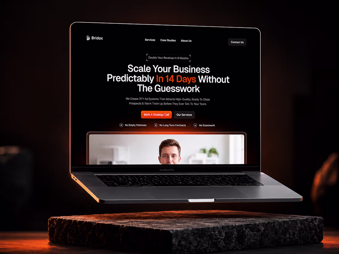
BEFORE: "We help businesses grow"
AFTER: "Scale Your Business Predictably In 14 Days Without The Guesswork"
Same service.
Different conversion rate.
This agency landing page does what most don't:
Makes a SPECIFIC promise with a CLEAR timeline.
The elements that make this work:
Headline: Specific outcome + timeframe
Trust badges: Addresses top 3 objections
CTA: Direct action ("Book A Strategy Call")
Visual: Professional + human element
Theme: Dark = premium positioning
Compare to typical agency sites:
Generic: "Full-service digital agency"
This: "14-day predictable scaling system"
Generic: "Contact us to learn more"
This: "Book A Strategy Call"
Generic: "Trusted by clients"
This: "No Empty Promises, No Contracts, No Guesswork"
The lesson:
Specificity sells.
Vagueness scrolls.
Built in Framer for maximum conversion.
What's YOUR landing page promise?
Is it specific enough?
1
19
1.1K
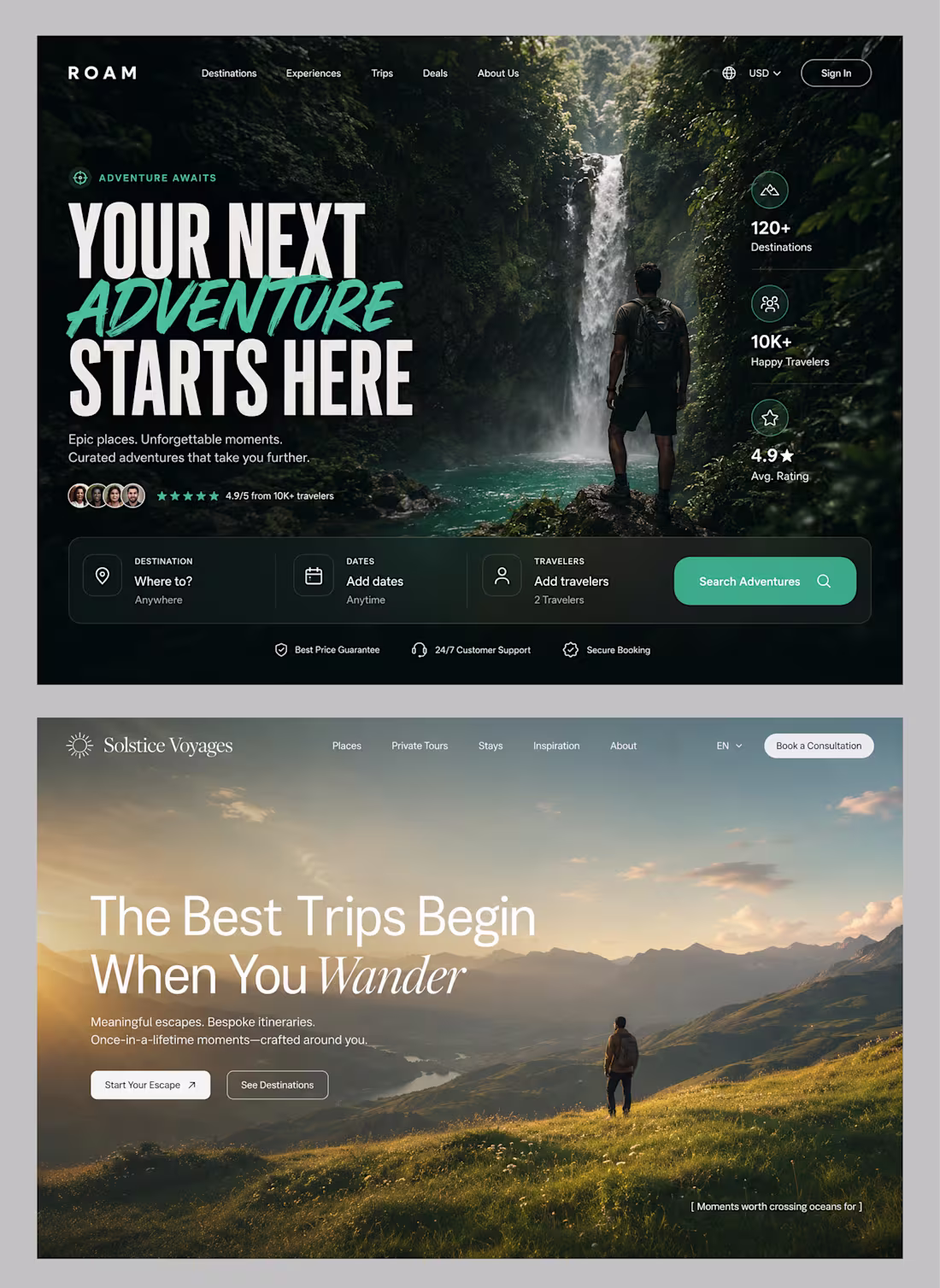
Two directions for travel websites that instantly change the feeling.
Direction 1: Adventure.
Bold typography. Dark atmosphere. High energy.
Made for people chasing excitement.
Direction 2: Escape.
Soft visuals. Open landscapes. Calm luxury.
Made for people chasing peace.
Same industry.
Completely different emotion.
That’s the part most websites miss.
People don’t just book trips.
They book a feeling.
Designed these two concepts to explore how visual direction changes perception, trust, and user intent.
Which one would you choose?
Version 01 or Version 02?
12
872
B2B SaaS Website — Enterprise Design
1
6
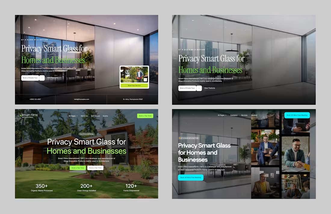
Exploring different hero directions for a Privacy Smart Glass website.
Same product.
4 completely different approaches.
1️⃣ Conversion-Focused
Clean layout with a strong CTA designed to push visitors to book immediately.
2️⃣ Premium Minimal
Minimal interface and high-end visuals to position the brand as luxury.
3️⃣ Lifestyle Driven
Product shown in a real home environment so users can instantly imagine the experience.
4️⃣ Human + Social Proof
Combining product visuals with people and meeting cues to build trust for consultation-driven businesses.
Good design isn’t just about aesthetics.
It’s about choosing the right psychology for the business goal.
Which direction do you think works best — 1, 2, 3, or 4?
2
18
979
Hero Section Ideas
14
694
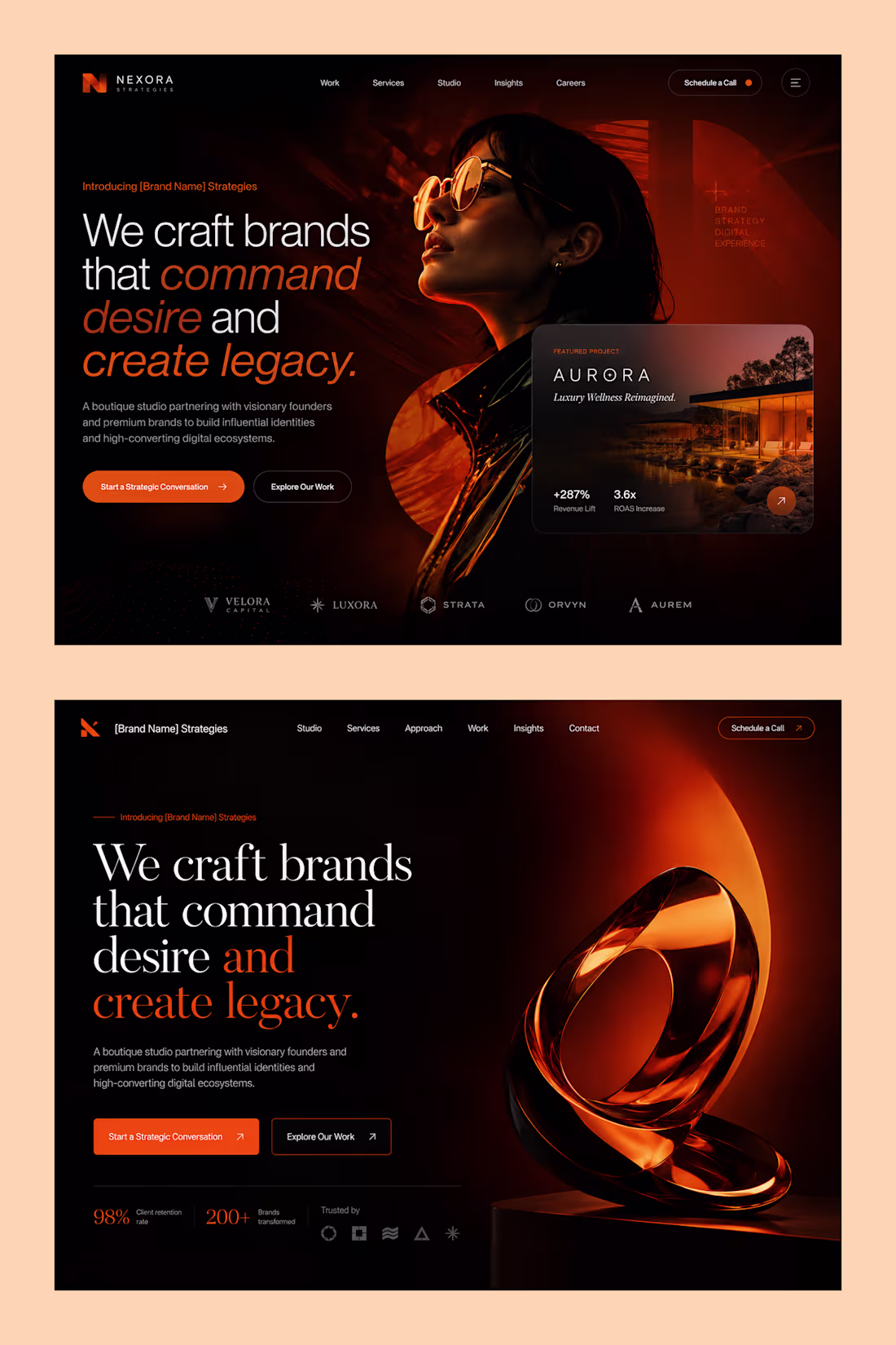
2 hero directions. One brand strategy agency. Both built to command a room.
This is NEXORA — a boutique studio for visionary founders and premium brands.
The brief: make it feel powerful, premium, and impossible to ignore.
So I designed two worlds. Same headline. Completely different energy.
Version 01 → Human & Editorial
Dark background, cinematic portrait, warm orange accents.
The "Featured Project" card floats in — Aurora, Luxury Wellness. +287% Revenue Lift.
For founders who want proof before they even scroll.
Version 02 → Object & Atmosphere
Same darkness. But this time — a molten 3D sculpture dominates the right side.
No faces. Just form, light, and weight.
For brands that want to feel like art, not just a service.
The headline stays identical across both:
"We craft brands that command desire and create legacy."
Because the message never changes.
Only the visual emotion does.
That's the real job of a hero section — not to explain what you do.
To make the right client feel something before they read a word.
Working on a brand agency, studio, or premium service website?
Let's build something that commands attention.
📩 DM me on Contra.
#BrandDesign #UIDesign #WebDesign #LandingPageDesign #FramerDesign #FigmaToFramer #Contra #BuildInPublic #LuxuryDesign #AgencyWebsite
8
21
840
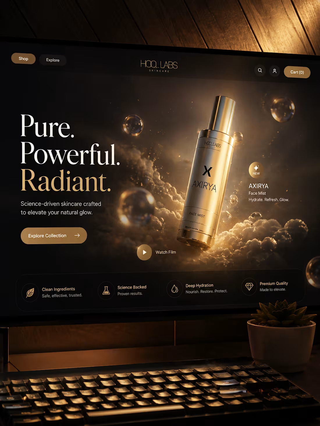
Designed a luxury skincare landing page concept focused on atmosphere and product perception.
The direction combined:
• cinematic lighting
• premium gold tones
• editorial typography
• immersive composition
• product-first storytelling
The goal was to create a high-end digital experience that feels elegant before the user even interacts with the product.
Designed in Figma.
4
17
729
10 versions of the same design.
Still not done.
Same layout every time.
Same typography.
Same components.
But every image changes everything.
This is the part of design nobody shows.
Not the final reveal.
Not the client handoff.
Not the "project shipped" post.
Just me.
Switching images.
Asking the same question every time.
"Does this feel like a brand?"
Red woman. Too aggressive.
Dark silhouette. Too mysterious.
Blue tone. Too cold.
The layout is done.
The structure is solid.
The components are built.
But the image?
The image is the soul.
Get it wrong and the whole thing feels empty.
Still searching for the one that makes it feel alive.
That's the real work.
Not the build.
The feeling.
2
18
959
Software Development Company — Conversion Landing Page
0
0
Most AI products show you results.
I wanted to show you the process.
So I built MIRROR — a cinematic AI surveillance interface designed entirely in Figma Make.
Instead of static sections and generic cards, every interaction reveals how the system thinks:
• Real-time identity analysis
• Object detection overlays
• Behavioral tracking
• Detection systems and capabilities
• Live subject profiling
• Technical specifications
• Interactive data visualizations
• Hover states, reveals, and system reactions
The goal wasn't to design another dashboard.
The goal was to create an experience that feels like you're inside a classified intelligence system.
Every screen was designed to feel alive.
Every section responds.
Every interaction reveals something new.
Built with Figma Make as part of the Config Makeathon.
Would love to hear what feature or interaction you'd add next.
60
103
9.1K
Aesthetic Glow — Clinic Website
0
1
I explored a new product website concept for the Config Makeathon — AURASONIC X1, a premium wireless headphone experience.
The goal was to move away from a basic ecommerce layout and create something more cinematic, bold, and product-led.
I wanted the website to feel like a campaign, not just a product page.
The direction:
Style meets sound.
A dark red and black visual world with oversized typography, premium headphone imagery, dramatic lighting, wood-inspired structures, floating feature cards, animated sound waves, and section-by-section product storytelling.
The experience includes:
bold hero section with premium product visuals
sound experience section with animated wave graphics
material and design breakdown
76-hour battery performance section
noise control interaction
colorway selector
lifestyle campaign visuals
technical specs
reviews
final animated buy section
I focused on making every section feel visual and useful — not just text and cards.
The idea was to create a product website that feels expensive, immersive, and memorable, with animations that support the product story instead of just decorating the page.
Built in Figma Make as part of the Config Makeathon.
Still more I’d love to improve:
more product rotation states
stronger color switching interactions
deeper scroll animations
better sound-wave motion
more lifestyle visuals
checkout flow
But the core direction is clear:
A premium headphone launch website with bold visuals, cinematic motion, and product storytelling at the center.
link:https://www.figma.com/community/file/1646482011315918788/landing-page-design
#ConfigMakeathon @figma #FigmaMake #ProductDesign #UIDesign #WebDesign #EcommerceDesign #AIDesign
3
11
932
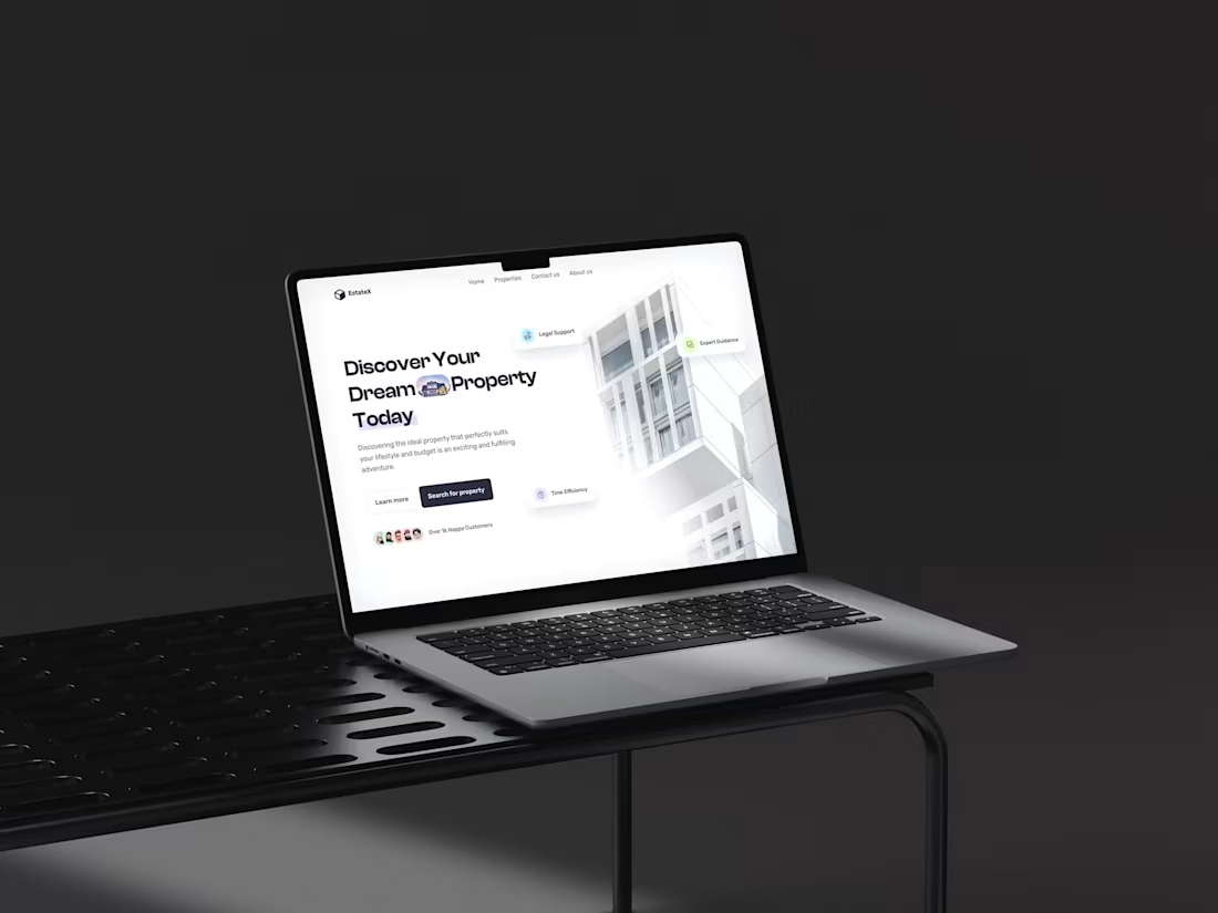
Real Estate Agency — Property Discovery Website
0
0
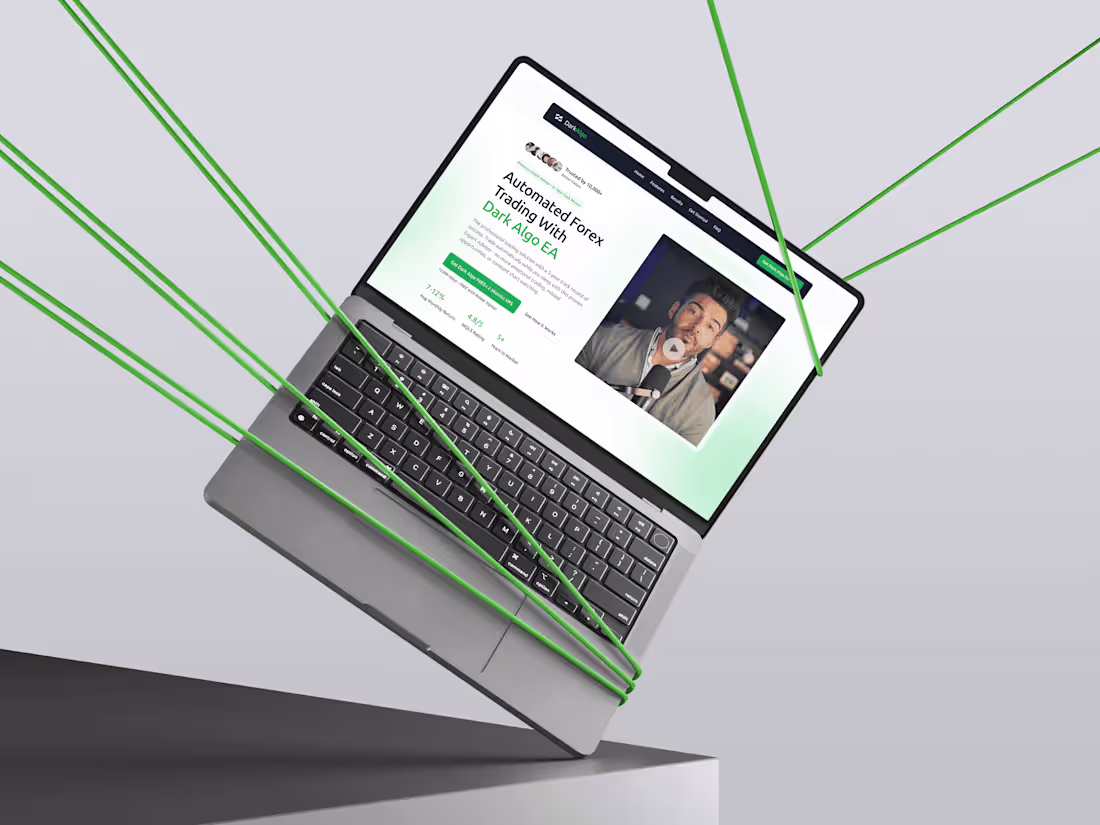
Dark Algo EA — Forex Trading Bot Website
0
0
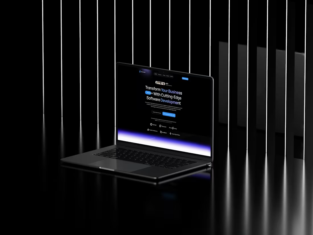
CodeCraft Solutions — Dev Agency Website
0
0
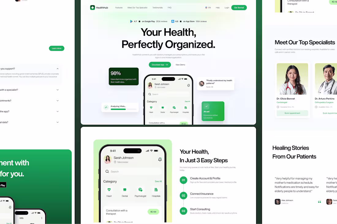
Health Hub — Patient-Friendly Health App Website
0
0
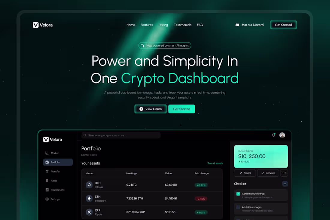
Velora — Crypto Dashboard Landing Page
0
1
I joined the Config Makeathon and built BriefOS — a client brief operating system for designers, studios, and freelancers.
The problem I wanted to solve is something almost every designer deals with:
Client projects rarely start clean.
They usually start with scattered notes, vague goals, random references, unclear positioning, mixed opinions, and no approved direction. That chaos creates slow starts, endless revisions, weak strategy, and confusion between the designer and the client.
So I built BriefOS to turn that mess into a clear, structured website blueprint.
The idea:
Client chaos → AI signal extraction → website blueprint → visual direction → wireframe → client approval
Inside BriefOS, a designer can collect messy client input, organize it into useful categories, extract important signals, build a sitemap, generate copy directions, choose visual routes, adjust wireframes, and send decisions into a client approval room.
I wanted the product to feel less like a generic AI tool and more like a real project command center.
What I built:
Command Center to track the full project workflow
Intake Wall for messy client notes, links, screenshots, and references
Signal Extractor to identify offer, audience, CTA, tone, gaps, and contradictions
Blueprint Builder for sitemap, homepage structure, copy, and conversion path
Visual Lab for mood, palette, typography, layout direction, and style routes
Wireframe Studio for reviewing and refining the homepage structure
Approval Room for client decisions, comments, approvals, and revision requests
I also focused on making the experience interactive instead of just “AI magically does everything.”
The user can tag notes, approve or reject signals, choose direction, reorder sections, compare options, adjust wireframes, and approve final decisions.
Built using Figma Make as part of the Config Makeathon.
The goal was simple:
Help designers move from confusion to clarity faster — while keeping strategy, copy, design, and client approval connected in one workflow.
Still more I’d love to improve:
deeper real data inputs
stronger drag-and-drop behavior
better client presentation mode
more polished animations
live export options
more visual direction templates
But for this version, I’m happy with the core concept: a useful AI workflow product built around a real design problem.
preview link:https://www.figma.com/make/LhthPqSGpwgLBKVoJdQLHG/Begin-Project?fullscreen=1&t=aPQZNZHYQiD53qn0-1&code-node-id=0-9
#ConfigMakeathon @figma #FigmaMake #ProductDesign #UIDesign #AIDesign #WebDesign #DesignTools #Contra
24
36
3K
AFTERCUBE — AI Visual Worlds From Raw Ideas
For the Google Stitch Challenge, I created AFTERCUBE — a dark cinematic AI visual studio that turns raw ideas into website concepts, brand systems, motion direction, and immersive digital worlds.
The idea was simple:
What if one rough prompt could become a complete visual direction?
Not just a layout.
Not just a dashboard.
A full world.
AFTERCUBE is designed as a premium creative engine where users can start with a raw idea and generate cinematic website concepts, visual identity direction, interface systems, brand atmospheres, featured world concepts, and motion-ready digital experiences.
The final landing page tells a clear story:
Raw idea → visual engine → generated worlds → start creating
Process
I spent around [add hours here] hours exploring, designing, breaking, rebuilding, and refining this concept.
This was not a one-shot design. I went through 20+ iterations before finding the final direction.
Some early versions felt too much like generic SaaS dashboards. Some sections looked like separate websites instead of one continuous experience. A few visual directions were too cluttered, too flat, or not premium enough.
So I kept stripping things back and rebuilding around one stronger visual language:
dark cinematic background
burnt-orange energy
oversized editorial typography
3D character and engine visuals
subtle grid texture
premium Framer-style spacing
animated interactions
strong section rhythm
The biggest challenge was keeping the page consistent while moving from hero to product explanation to showcase sections. I wanted the whole page to feel like one visual world, not random screens stitched together.
How I used Stitch
I used Stitch to rapidly explore different layouts, test visual directions, refine the brand system, and push the final landing page into a more polished prototype direction.
The workflow included:
Exploring multiple concepts and brand names
Testing different dark visual systems
Locking the final direction around AFTERCUBE
Building the cinematic hero section
Creating the Visual Engine section
Adding Featured Worlds as generated concept examples
Creating a final prompt-driven CTA
Adding motion ideas, hover states, glow interactions, and scroll animation direction
What I focused on
My goal was not to create another generic AI landing page.
I focused on:
strong first impression
cinematic art direction
bold typography
premium dark UI
orange energy system
clear product storytelling
interactive motion
visual consistency
a page that feels like a real creative AI product
Future direction
If I had more time, I would expand AFTERCUBE into a deeper product prototype with:
a full AI generation flow
additional inner product pages
more generated world examples
more custom 3D elements
animated world-building states
a detailed brand system page
export screens for Framer, Figma, and campaign assets
interactive prompt-to-world transitions
This version focuses on the core brand, landing page, and product story first. The next step would be turning it into a fuller interactive product experience.
Feedback on Stitch
Stitch was useful for fast ideation and visual exploration. It helped me test multiple directions quickly and move from rough concept to polished landing page much faster than starting from a blank canvas.
The hardest part was maintaining consistency across sections. Some outputs looked like separate pages, so I had to keep refining prompts around continuity, layout rhythm, spacing, and brand discipline.
Overall, Stitch was powerful for exploration, but the best results came from treating it like a creative partner — testing, correcting, refining, and pushing the design direction intentionally.
Final concept
AFTERCUBE is an AI visual studio for turning rough creative thoughts into cinematic digital worlds.
One prompt.
One engine.
A complete visual world.
Prototype: https://stitch.withgoogle.com/preview/2647123046716225432?node-id=7b022a8e6ba245dd9a77627c3cc9e5ee
43
84
6.2K
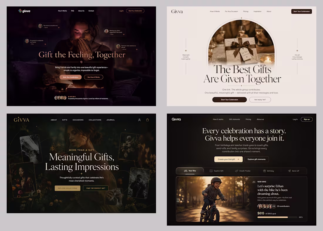
B2C CASE STUDY: Gift & Celebration Brand
Budget: $3,500
Timeline: 2 weeks
Client satisfaction: "Game-changing"
Project: Givva (Gift Experience Platform)
Industry: E-commerce / Gifts / Celebrations
Business Model: D2C (Direct-to-Consumer)
What we delivered:
Version 1 (Dark, luxury): Premium gift positioning
Version 2 (Light, minimal): Modern aesthetic appeal
Version 3 (Dark, storytelling): Emotional connection focus
Version 4 (Dark, celebration): Community-driven moments
Client feedback:
"We thought we needed ONE perfect design.
You showed us we needed to understand our FOUR different customer types.
Now we can target each with the right message.
This is game-changing."
What made the difference:
→ Multiple audience research
→ Strategic variation creation
→ Clear conversion strategy per version
→ Client education on segmentation
Built in Framer.
Delivered in 2 weeks.
Client now testing all 4 versions with real traffic.
This case study is for:
✓ E-commerce brands
✓ Gift/celebration companies
✓ D2C startups
✓ Brands with multiple customer segments
Swipe to see all 4 versions →
Running a B2C brand with multiple customer types?
Comment "B2C" - Let's create your strategic variations.
4
25
1K
Every AI startup launches with the same problem.
The product is ready.
The technology works.
The founder is confident.
But the website?
Looks like it was built in a weekend.
No clear message. No visual trust. No reason to believe.
And in the AI market — where 50 new startups launch every single day —
your first impression is your only impression.
Investors judge in 7 seconds.
Clients decide in 3.
If your website doesn't communicate credibility the moment someone lands on it —
they're already gone.
I've seen brilliant AI founders lose deals not because their product was weak.
But because their website made them look like a side project.
That's exactly why I built this Framer template.
Designed specifically for AI startups and operations studios entering the market.
→ Hero that tells your story in 3 seconds — no confusion
→ Live workflow card that shows your AI already working
→ Problem section that speaks directly to your buyer's pain
→ Clean services grid — clear, credible, ready to convert
No months of back-and-forth with designers.
No $5,000 custom build before you've even validated the market.
Just launch. Look credible. Start closing.
This template was built for the founder who is ready to move fast — and can't afford to look small.
Dropping soon on Framer.
🔗 Follow to get notified the moment it's live.
📩 Need it customized for your brand right now? DM me on Contra.
#AIStartup #FounderLife #FramerTemplate #WebDesign #SaaSDesign #AIDesign #BuildInPublic #Contra #FramerDesign #StartupLaunch
2
11
553
I joined the Google Stitch Challenge on Contra and built a cinematic space journey concept.
The idea started simple:
What if a website didn’t feel like a landing page…
but like the control center for a mission?
So I explored a full experience around:
flight configuration
destination selection
launch dashboard
safety briefing
space journal
mission storytelling
The goal was not just to make screens look good, but to create a visual system that feels immersive, structured, and cinematic.
I used Google Stitch to move fast, test layouts, and turn the idea into a working prototype direction. Some parts took multiple tries, especially getting the hierarchy, spacing, and visual flow right — but that was the fun part.
Still more I’d love to improve if I get time:
motion details, stronger 3D elements, more interaction states, and the rest of the journey pages.
Overall, this was a great experiment in using AI as a design partner — not to replace taste, but to explore faster and push ideas further.
Built for the Google Stitch Challenge on Contra.
Prototype:
https://stitch.withgoogle.com/projects/14377284544676862199
#GoogleStitch #Contra #DesignChallenge #UIDesign #WebDesign #AIDesign #ProductDesign
17
80
5.2K
Most gaming landing pages look loud.
Too many effects. Too much chaos.
No direction.
So I tried the opposite.
A dark, cinematic landing page concept for a racing game built with:
⚡ Minimal animations
🎵 Immersive sound design
🏎️ High-speed visual storytelling
🌑 Clean UI with neon contrast
The goal wasn’t just to make it “look cool.”
It was to create the feeling of:
speed, tension, and adrenaline — before the game even starts.
Every motion was intentional.
Every glow had a purpose.
Every section was designed to keep attention locked in.
Designed & developed in Framer.
If you’re building a gaming brand, startup, or launch campaign:
Your landing page shouldn’t feel like a template.
It should feel like a trailer.
Watch the full experience ↓
#WebDesign #GamingUI #Framer #LandingPageDesign #UIDesign #GameDesign #CreativeDeveloper #MotionDesign #SaaSDesign #Portfolio
6
18
730
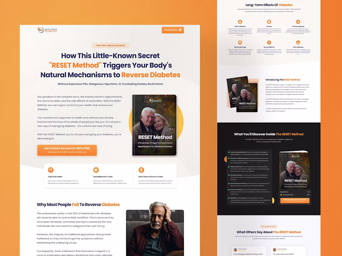
Reset Method — Book Landing Page Design Built in Framer
9
4
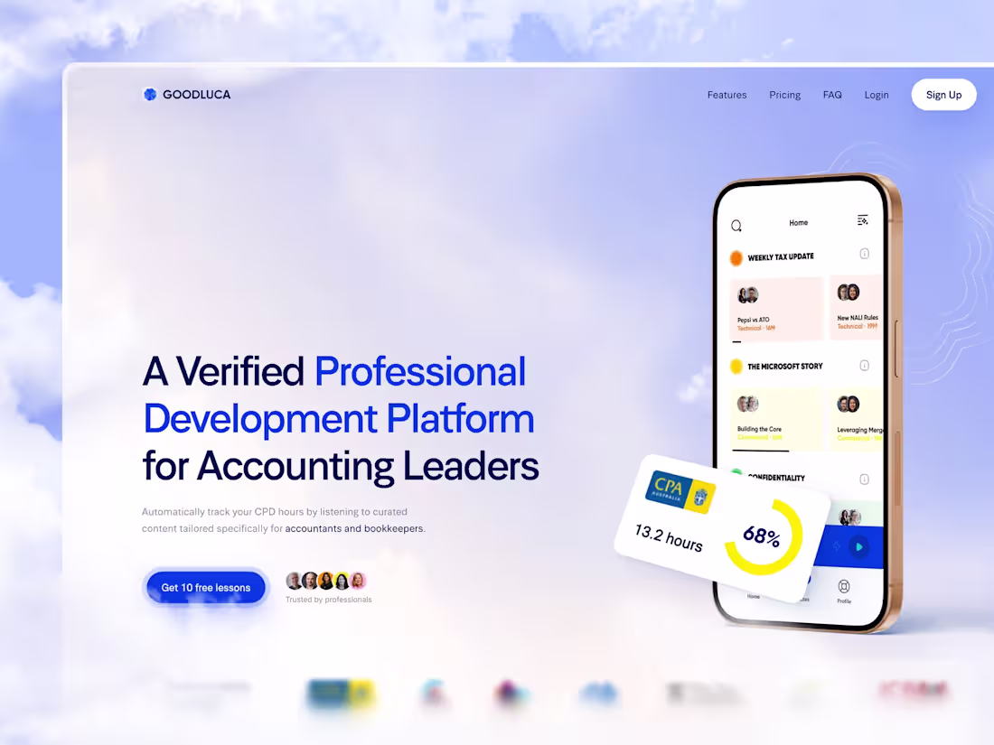
GoodLuca — Professional Development Platform
0
0
🚗 I built something I've never seen
anyone do before on ElevenCreative Flows.
A fully cinematic luxury hypercar
advertisement — generated entirely by AI.
No camera. No crew. No studio.
Just a prompt, a pipeline, and persistence.
I tried this over 10 times. Wrong models,
burned credits, failed nodes, daily limits
hit — everything that could go wrong, did.
But I kept going. Because I knew what
This could look like if it worked.
This is Scene 1 — The Alps.
Watch what happens when AI meets
cinematic storytelling. 🏔️
Full template drops soon 👇
#ElevenCreative #ElevenLabs #AIVideo
#elevencreativeflows
15
19
928
Most kids’ apps still feel like forms with cute colors.
Pick an option.
Tap next.
See a card.
Done.
I wanted WonderNest to feel different.
WonderNest is a magical interactive feeling playground where children don’t just answer questions — they build, touch, drag, unlock, collect, and watch the world react.
The idea is simple:
Children often feel things before they can explain them.
So instead of asking them to describe every emotion, WonderNest lets them create a tiny magical world around it.
They can:
→ drag weather into the sky
→ place a buddy inside the world
→ draw a feeling seed
→ grow that seed into a story
→ tap clouds to soften rain
→ drag an umbrella over Milo
→ light lanterns with kind words
→ cool a volcano with slow breaths
→ collect story badges
→ save each story to a magical shelf
The goal was to make emotional expression feel less like answering a form and more like playing inside a living cartoon world.
Every action creates a visible reaction.
A tap changes the weather.
A drag grows the world.
A completed game unlocks a badge.
A finished story becomes a collectible book.
Built for the Config Makeathon using Figma Make.
Still improving the motion, interactions, and visual polish — but this direction feels much closer to the kind of experience kids would actually want to explore.
WonderNest: a tiny story world for big feelings.
2
15
821
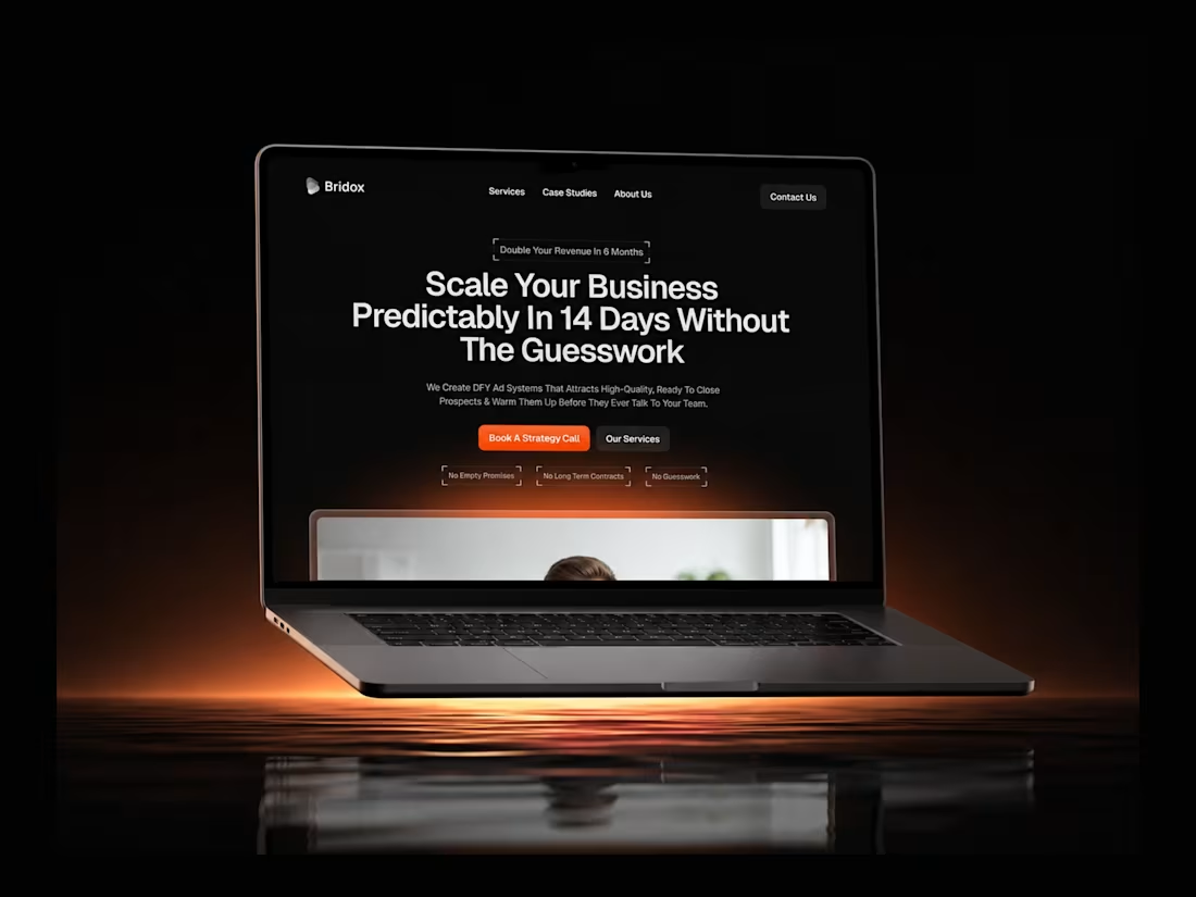
Bridos — B2B Lead Generation & Growth Website
9
8
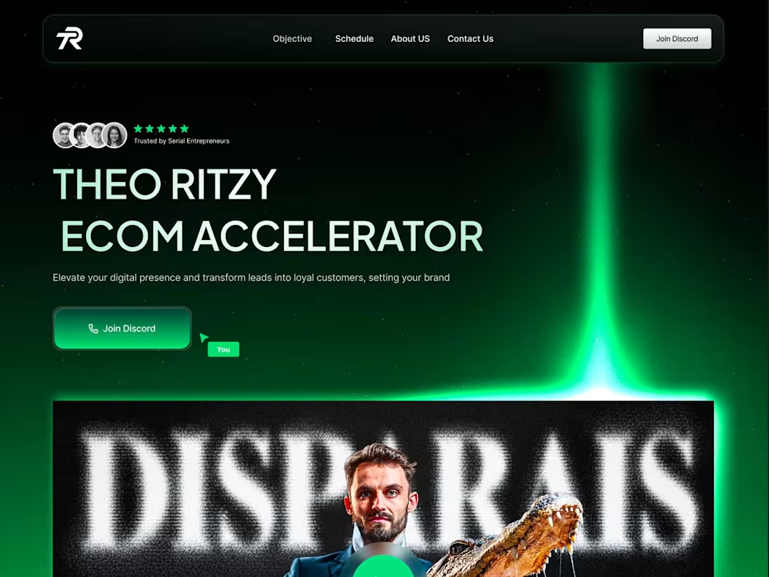
Grand Prix Ecom — 90-Day eCommerce Accelerator
5
9
This is what a website looks like before it becomes “design.”
No colors.
No animations.
No fancy UI.
Just structure.
Right now I’m building a new Framer template — and this is the phase most people rush through.
Wireframes.
Where decisions are made:
• what users see first
• how they move
• where they convert
If this isn’t right, nothing else matters.
Design doesn’t fix confusion.
It just decorates it.
Final version dropping in a few days.
If you want early access, comment “template” or DM me 👇
8
24
816
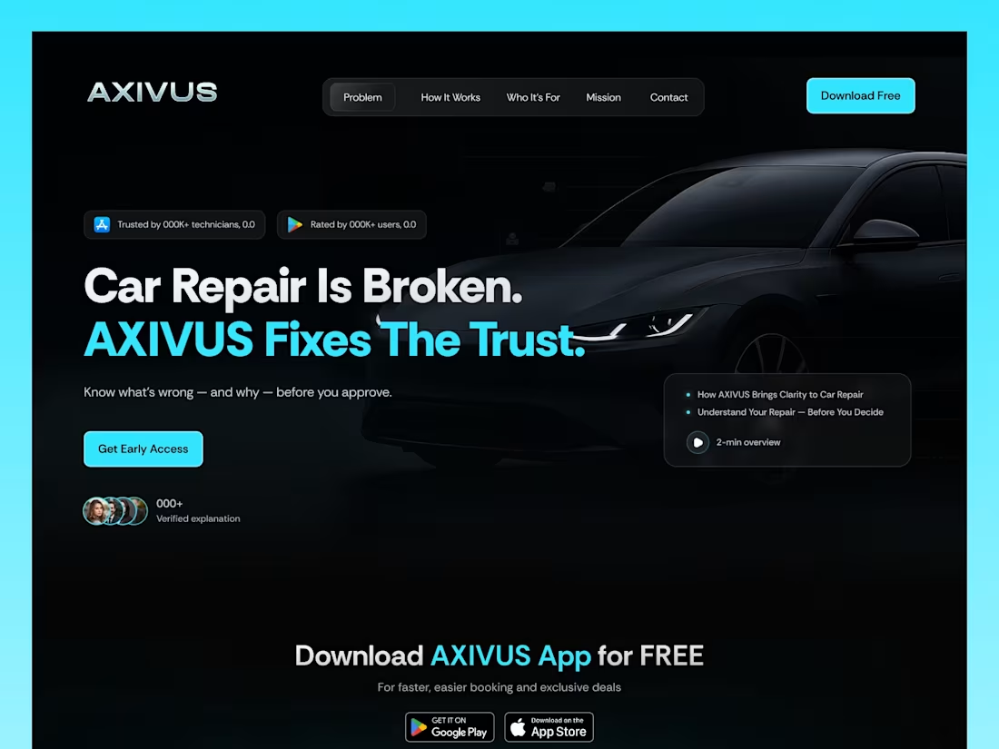
Axivus Auto — Car Repair Clarity Platform
8
8
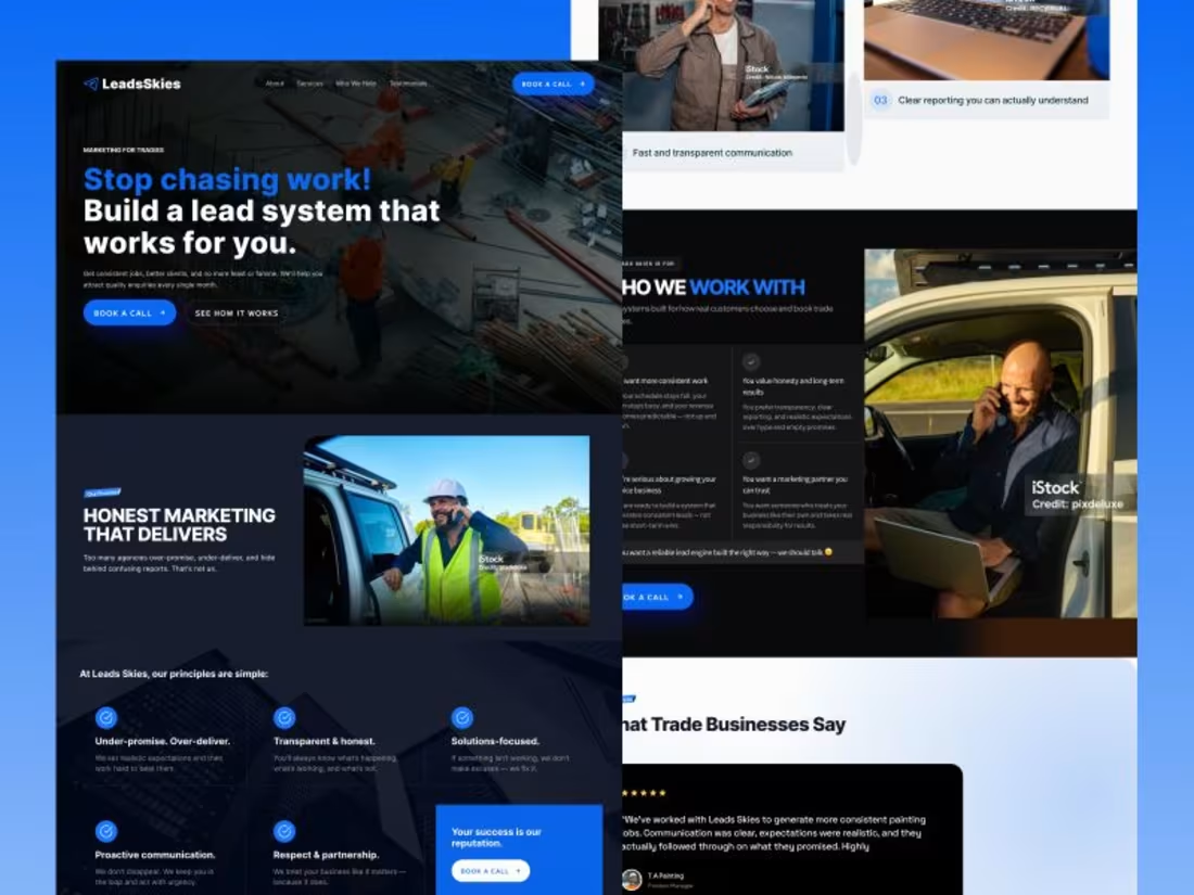
LeadsSkies — Modern Website Design & Development
10
8
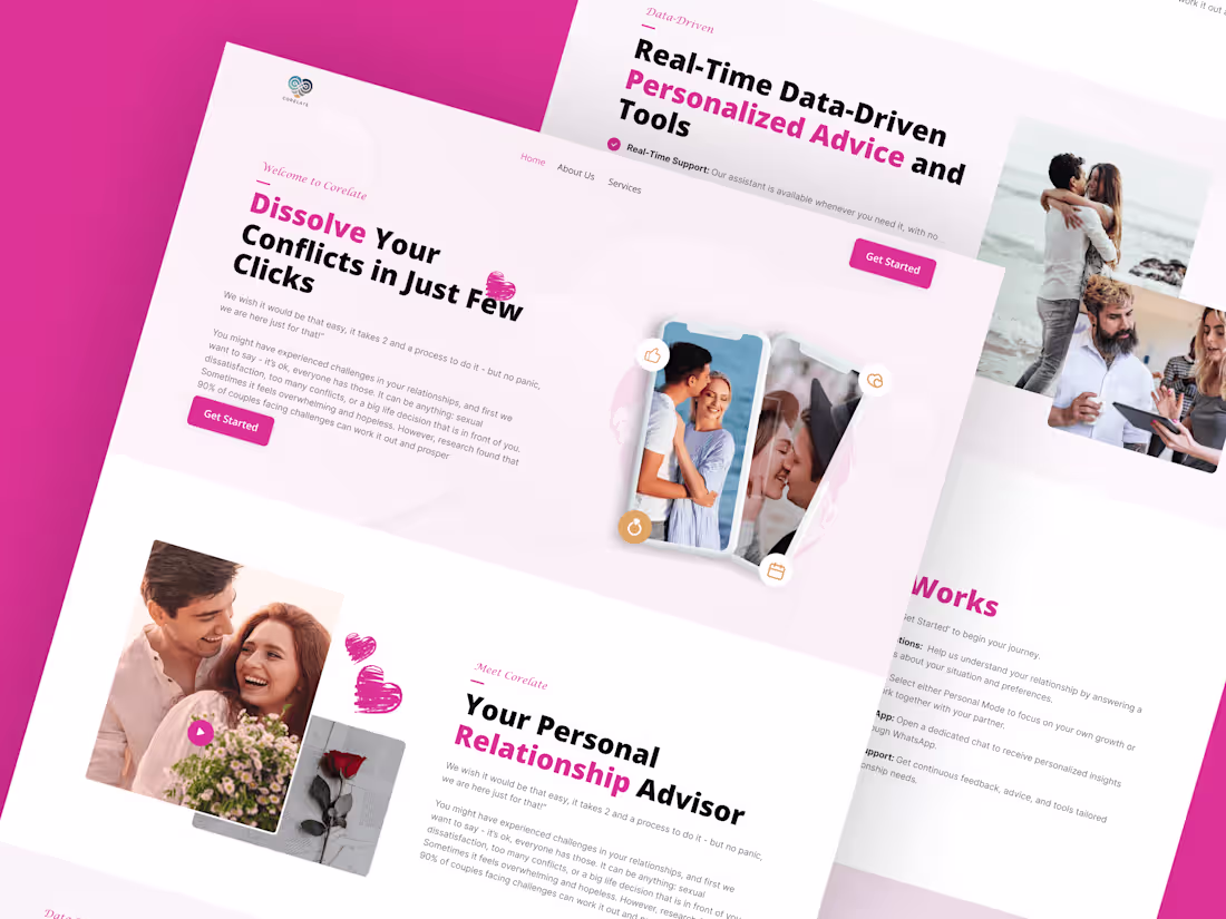
Dating App — Landing Page Design
1
6
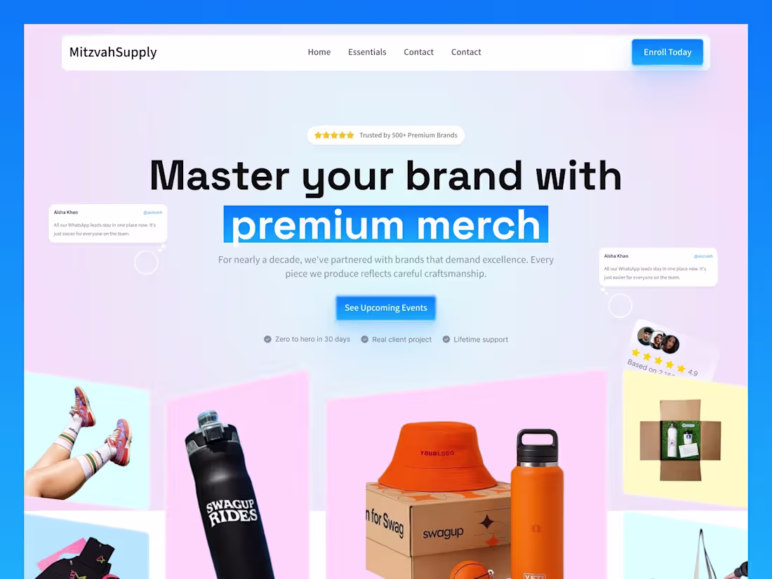
Mitzvah Supply — eCommerce Website Built in Framer
9
3
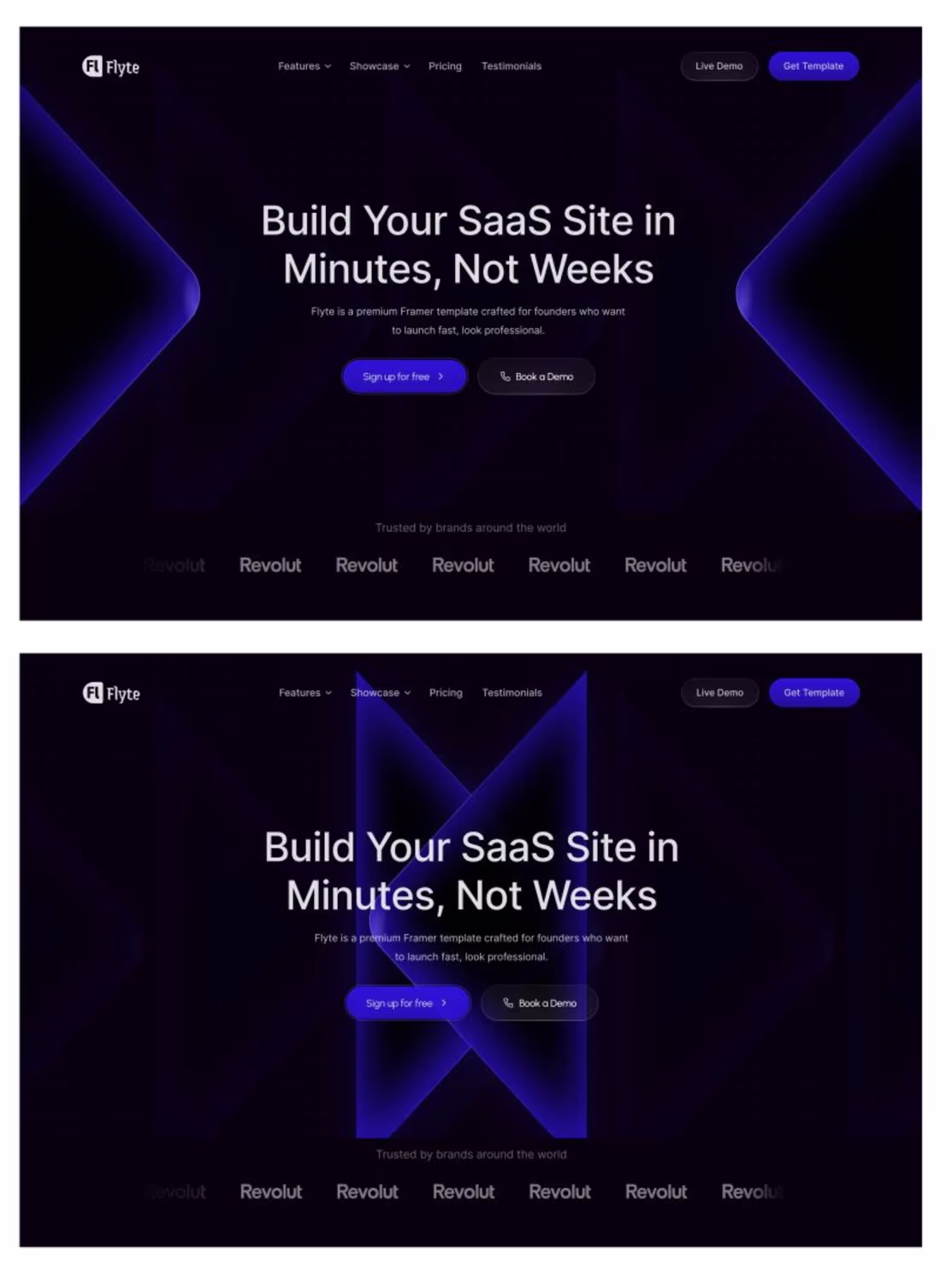
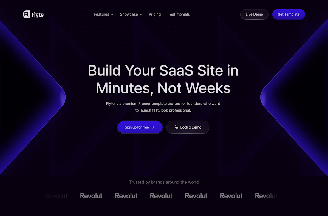
Flyte — Premium Framer Template for Founders
9
3
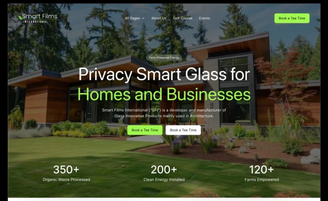
Smart Glass — Privacy Glass Hero Section
9
6
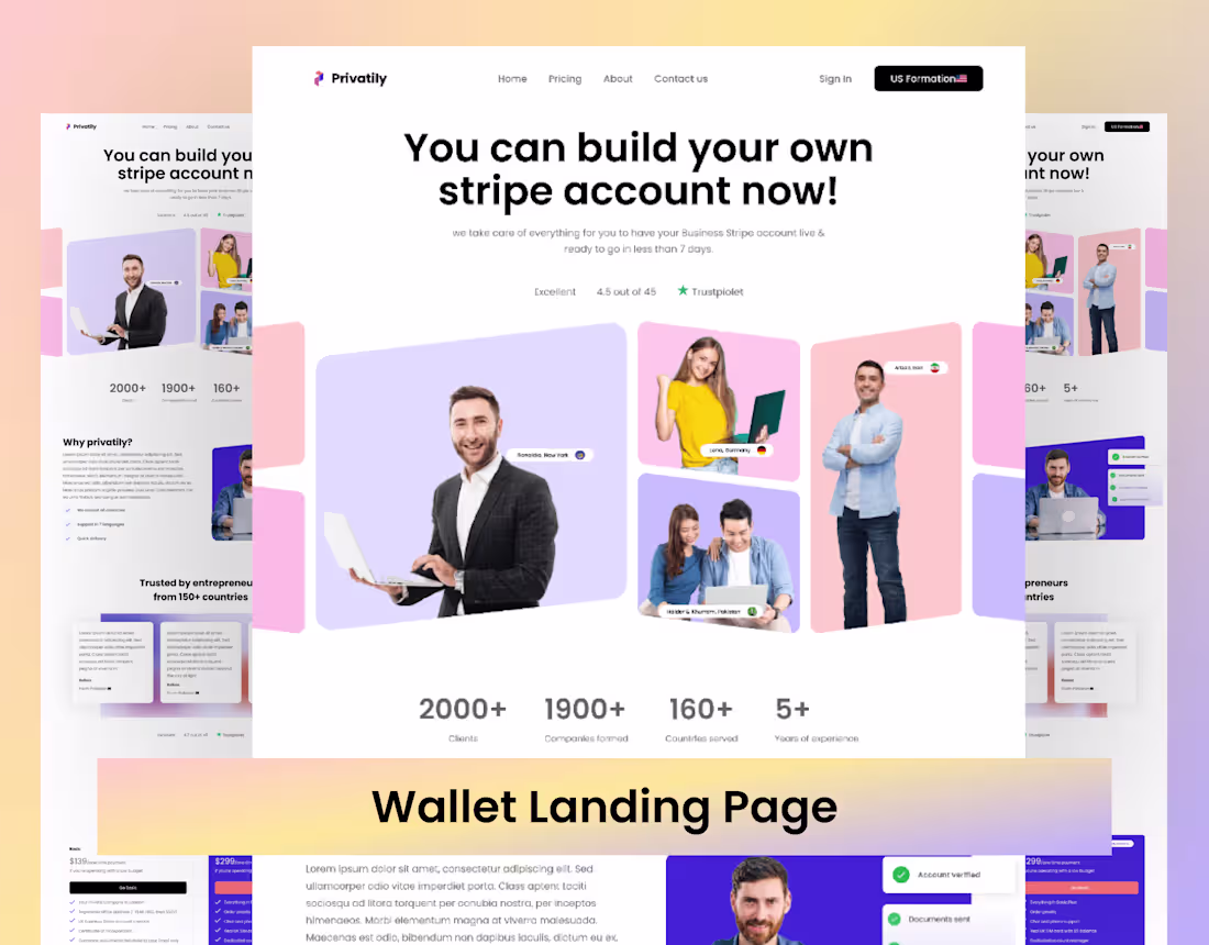
Crypto Wallet — Landing Page UI Design
1
7
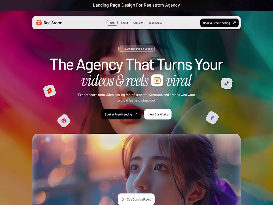
RellStrom — Viral Video & Reels Agency
9
7
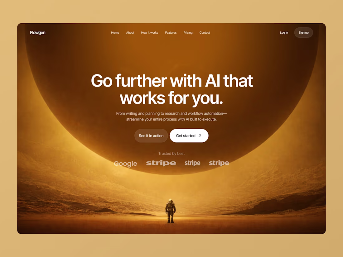
Flowgen — AI Workflow Automation Platform
9
6
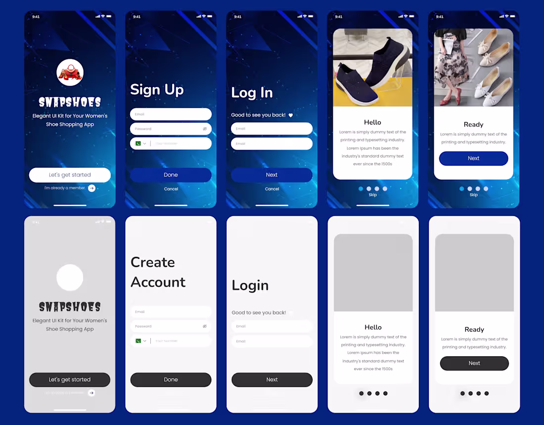
Shopping App — Full Mobile UI Design
0
6
Challenge accepted. 🖥️
"Please don't send this to engineering" — challenge accepted.
I built NEXUS: a 5-section impossible depth interface that lives entirely in CSS and vanilla JS. No WebGL. No game engine. Just the browser being pushed somewhere it was never meant to go.
Here's what engineering would hate:
→ 22 concentric portal rings, each at a different Z-depth, all spinning simultaneously
→ Full mouse parallax across every layer in real 3D perspective space
→ Live neural mesh with 60 animated nodes
→ Quantum console with live typewriter terminal output
→ Real-time system vitals, threat radar, and waveform charts
Navigate with scroll or arrow keys. Move your mouse. Watch depth happen.
This is exactly the kind of UI Rive was made to push further — and I can't wait to see where this challenge goes.
#ImpossibleUIWithRive
14
53
3.1K
Website Builder Platform — Drag & Drop UI Design
0
7
Just submitted my entry to the #OmmaBySpline Buildathon 🚀
Built a fully interactive 3D smartphone market share visualization — hover to explode segments, drag to rotate, real-time label tracking as the chart spins.
As an independent creator on Contra, challenges like this push me to build things I wouldn't normally ship. No client brief. No revisions. Just pure creative execution.
$15K prize pool · 589+ participants · Deadline Apr 8
#Spline #3D #WebDesign #BuildInPublic #Contra #Buildathon #InteractiveDesign
6
23
1.2K
Shopify Store — E-Commerce UI/UX Design
0
3
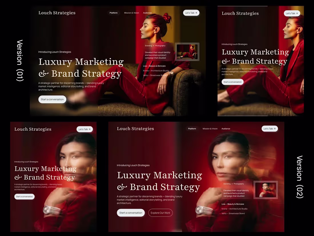
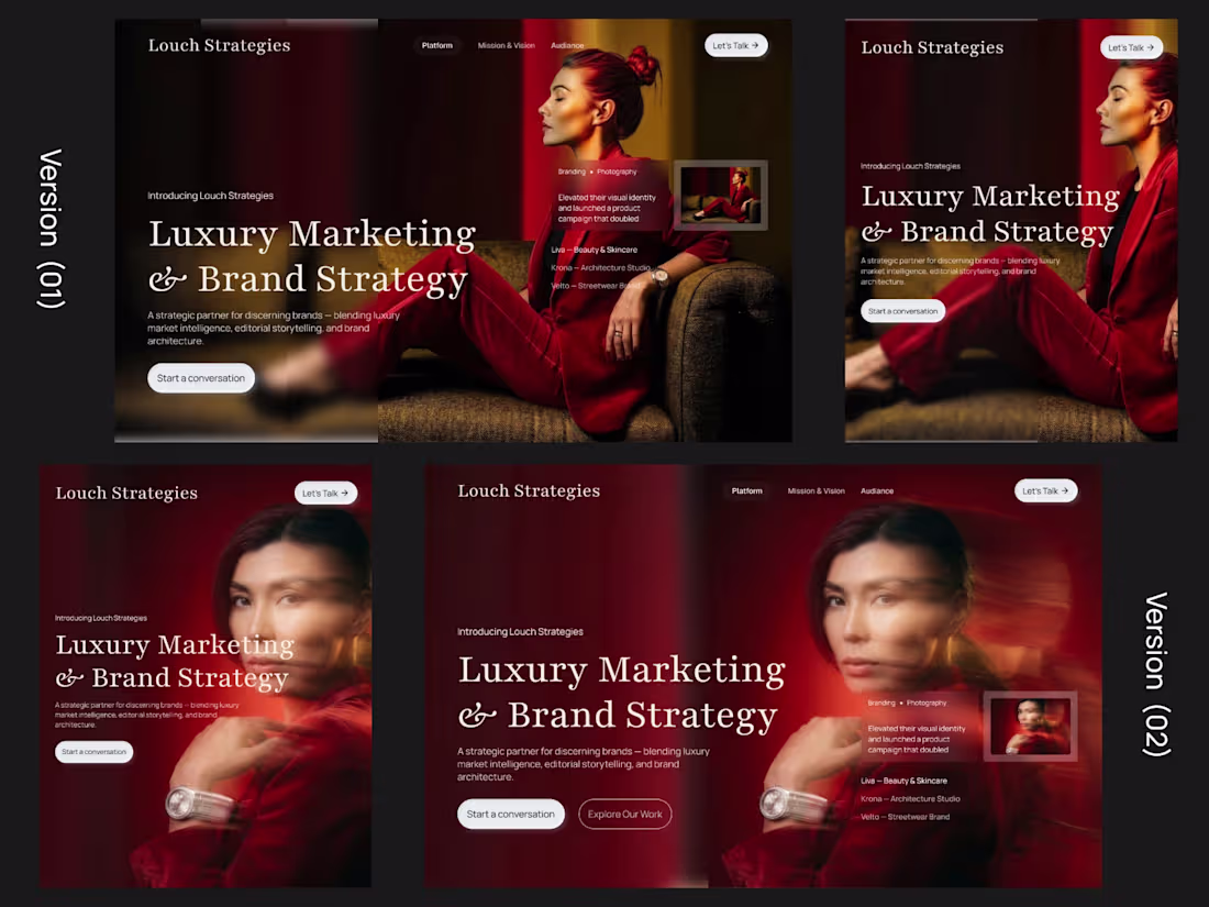
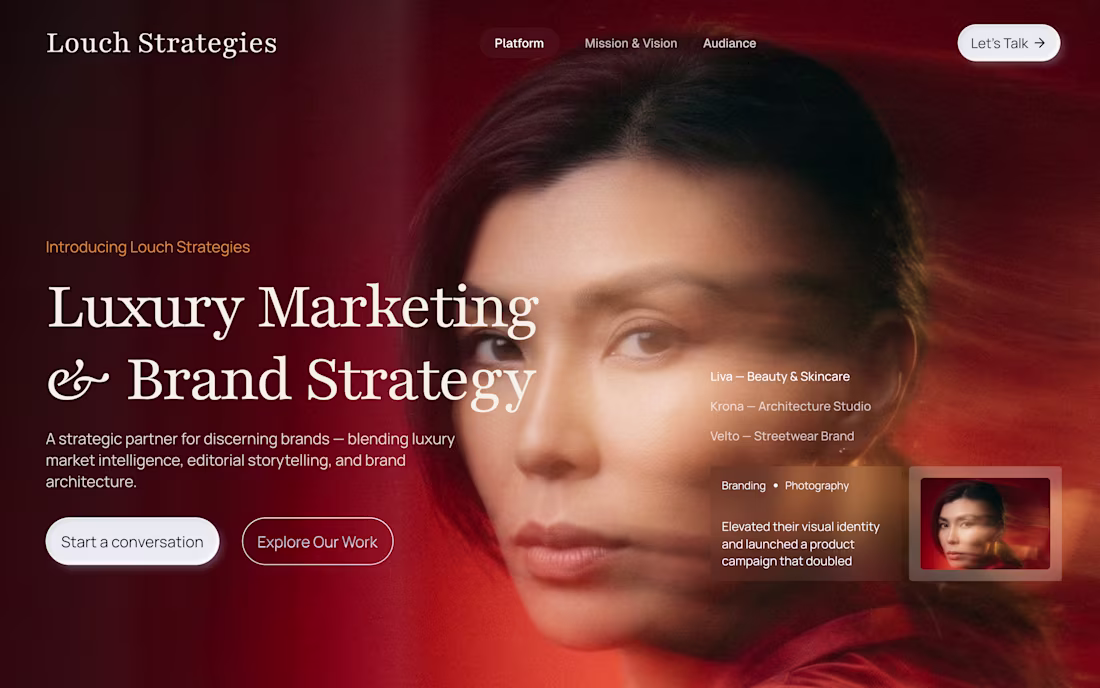
Designed 2 hero directions for a luxury marketing agency — both fully responsive. ✅
The client — a brand strategy firm from Dubai — needed a landing page that felt editorial and high-end, but still built to convert.
Most luxury sites look beautiful but don't convert.
Most conversion-focused sites look too corporate.
The challenge: make it both.
Here's how I approached it:
Version 01 → Editorial with social proof
Full-width dark layout, strong typography, client proof panel built into the hero.
Desktop + mobile designed together from the start.
Version 02 → Motion + depth
Added blur, double exposure, layered photography.
Two CTAs — "Start a conversation" and "Explore Our Work."
Desktop + mobile, fully responsive.
Both directions were approved by the client. ✅
Now moving into Framer development.
This is the kind of work I love — where design psychology meets real business positioning.
If you're building a premium brand and need a landing page built in Framer or Webflow, let's talk.
📩 DM me on Contra.
#LandingPage #FramerDesign #LuxuryBranding #WebDesign #FigmaToFramer #Contra #UIDesign #BuildInPublic
10
21
1.4K
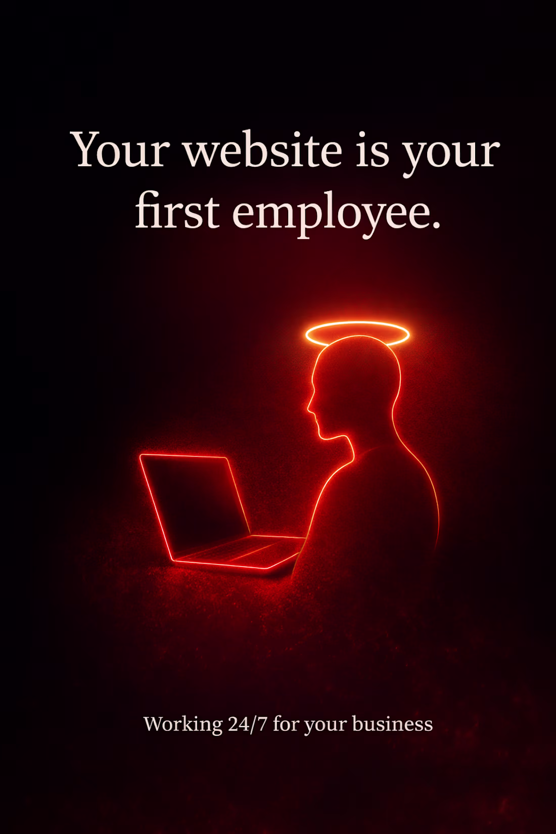
One thing I’ve learned working on websites:
Your website is essentially your first employee.
It works 24/7 — explaining what you do, building trust, and helping potential clients decide whether to contact you.
Many websites fail at this, not because the product or service is bad, but because the message and experience aren’t clear.
Great websites combine strong messaging, thoughtful design, and seamless performance.
A website shouldn’t just exist.
It should actively work for the business behind it.
2
18
758
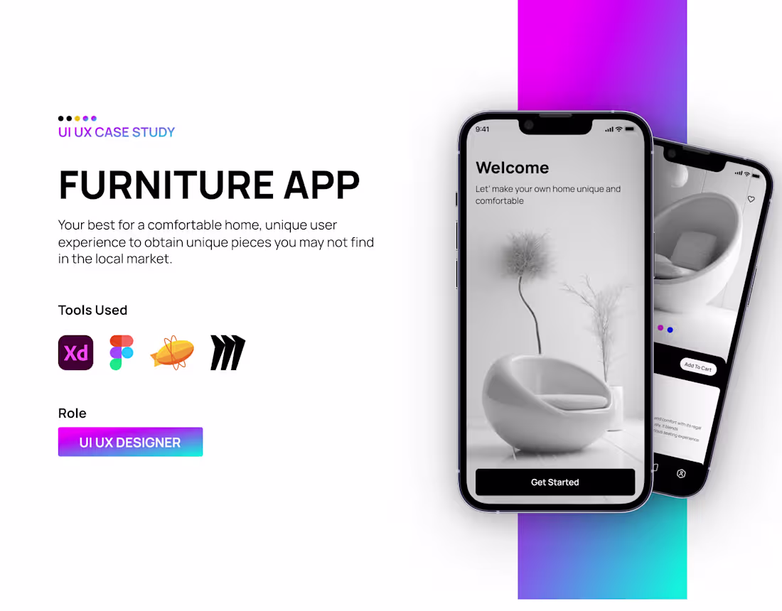
Furniture App — Full UI/UX Case Study
1
2
Just redeemed a free Figma Pro upgrade through the #FigmaMakeathon 🎉
Really appreciate the opportunity provided by Contra and Figma.
Excited to explore more advanced features and experiment with new design ideas during the Makeathon.
Looking forward to seeing what everyone builds 🚀
1
16
741
Just joined the #FigmaMakeathon 🚀
Excited to experiment with new UI ideas, explore creative concepts, and build alongside such a talented community of designers.
Events like this are always a great way to push creativity and try things you normally wouldn’t in regular projects.
Looking forward to sharing what I create during the Makeathon.
If you're participating too, I’d love to see what you're building 👇
https://on.contra.com/DGMqLP
8
20
806
A few months ago I got a message from a client I worked with back in my agency days.
"Hi, you worked on the design" — and he shared the old Figma link.
I opened it and smiled. It was a full website I designed and developed for him years ago — Figma to Webflow, clean execution, delivered on time.
He loved it so much he kept coming back to the same site... until now.
He's ready for round 2. New project, same trust.
Nothing beats that moment when your work speaks for itself years later.
Grateful for every client who trusts the process, and every project that turns into a relationship.
If you're building something and looking for a partner who delivers clean, high-converting web experiences (Framer/Webflow), feel free to drop a message. I'd love to hear your story.
16
680
Completed a fully responsive landing page design for Monster Gallery Icons 🧩
Grateful to work with such a thoughtful client—loved the idea and the creative direction from start to finish.
Design that feels fun, usable, and polished.
14
675
FinTech Product — Full UX/UI Case Study
0
5
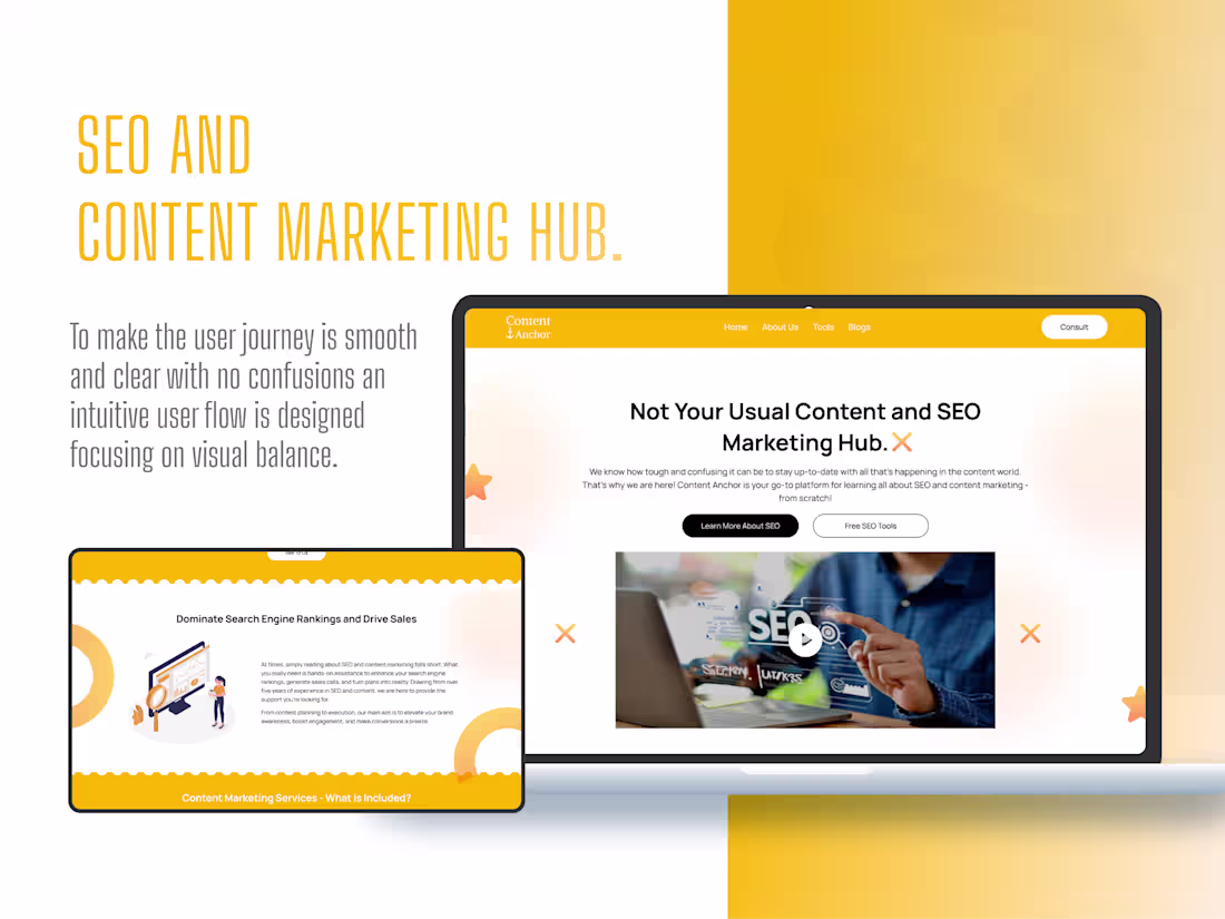
SEO & Content Marketing Hub — UI/UX Design
0
5
Klippify — Influencer Marketing SaaS Platform
9
6
Designed a fully responsive landing page for a fresher ✨
Built directly in Framer for speed, animations, and clean UX.
Simple. Modern. Mobile-first.
@Framer
16
646
Designed a modern, high-impact landing page for a music studio.
16
599
Saas Product
1
16
610
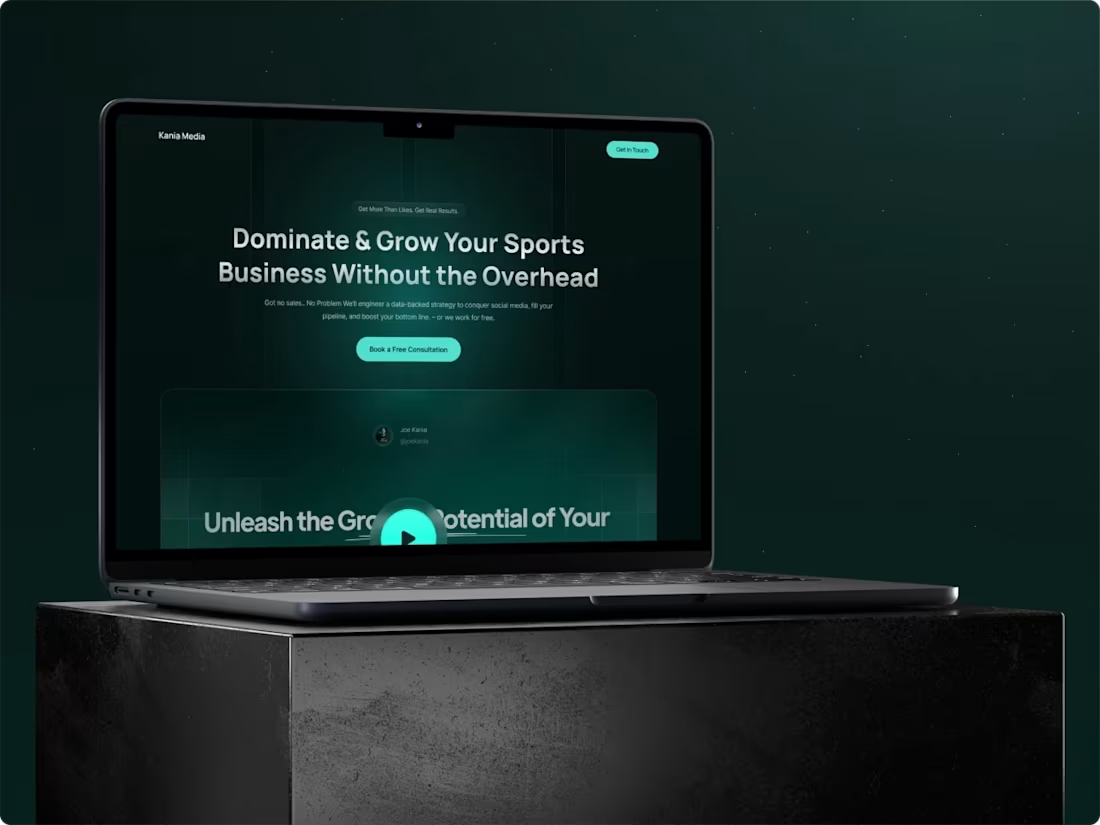
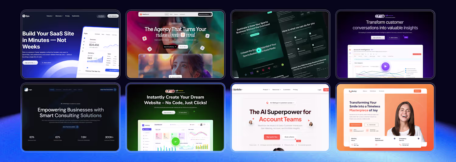
KaniaMedia is a marketing agency specializing in the sports business sector.
15
567
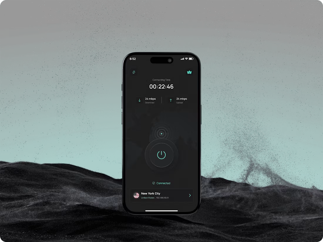
Wirefox VPN | Mobile App
7
4
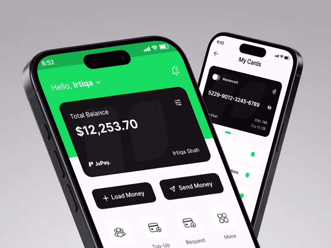
JuPay Finance App
7
5
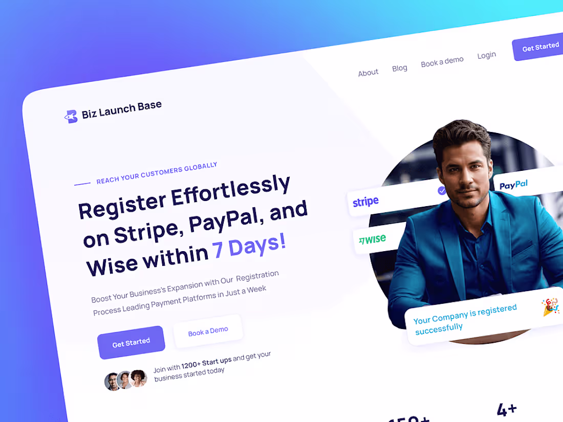
Biz Launch Base Landing Page
7
4
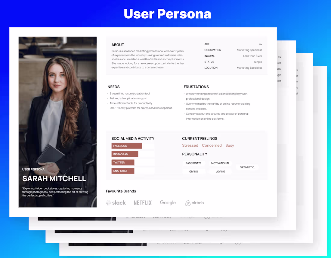
User Persona & UX Research — Design Foundation
0
3
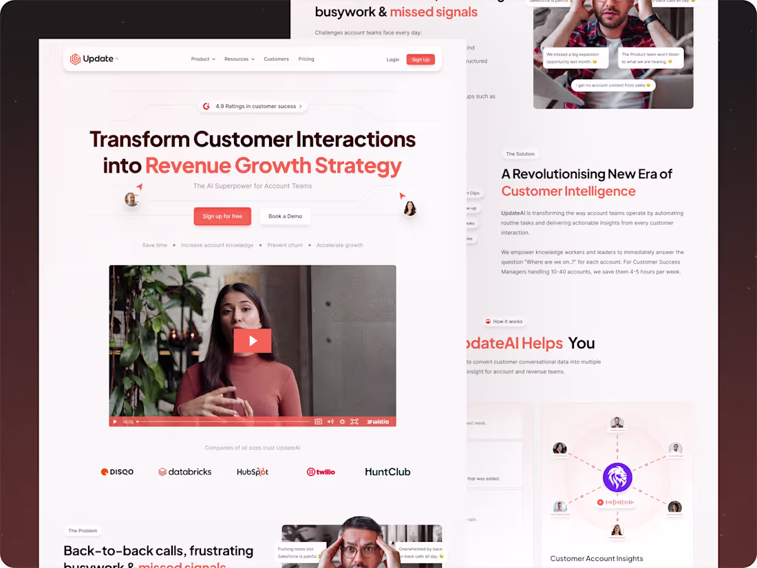
Update.ai Website Design
8
4
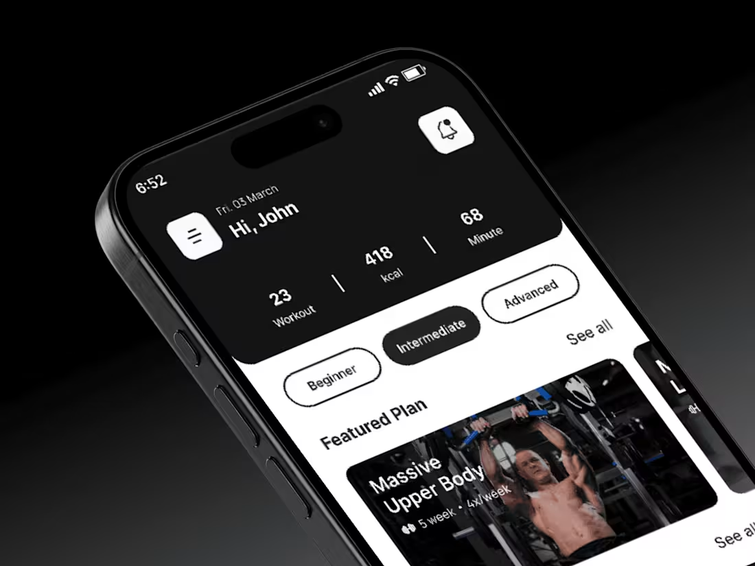
PowerPulse Workout App
7
5
Analytics Dashboard — Data Visualization UI
0
7
Luna Blaze Artist Website
0
4
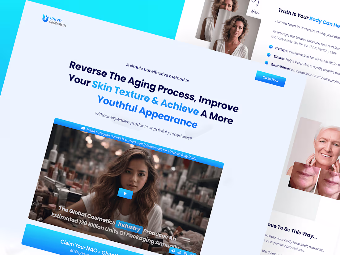
NAC+ Glutathione Landing Page Design
7
3
Reset Method Design Project
7
4
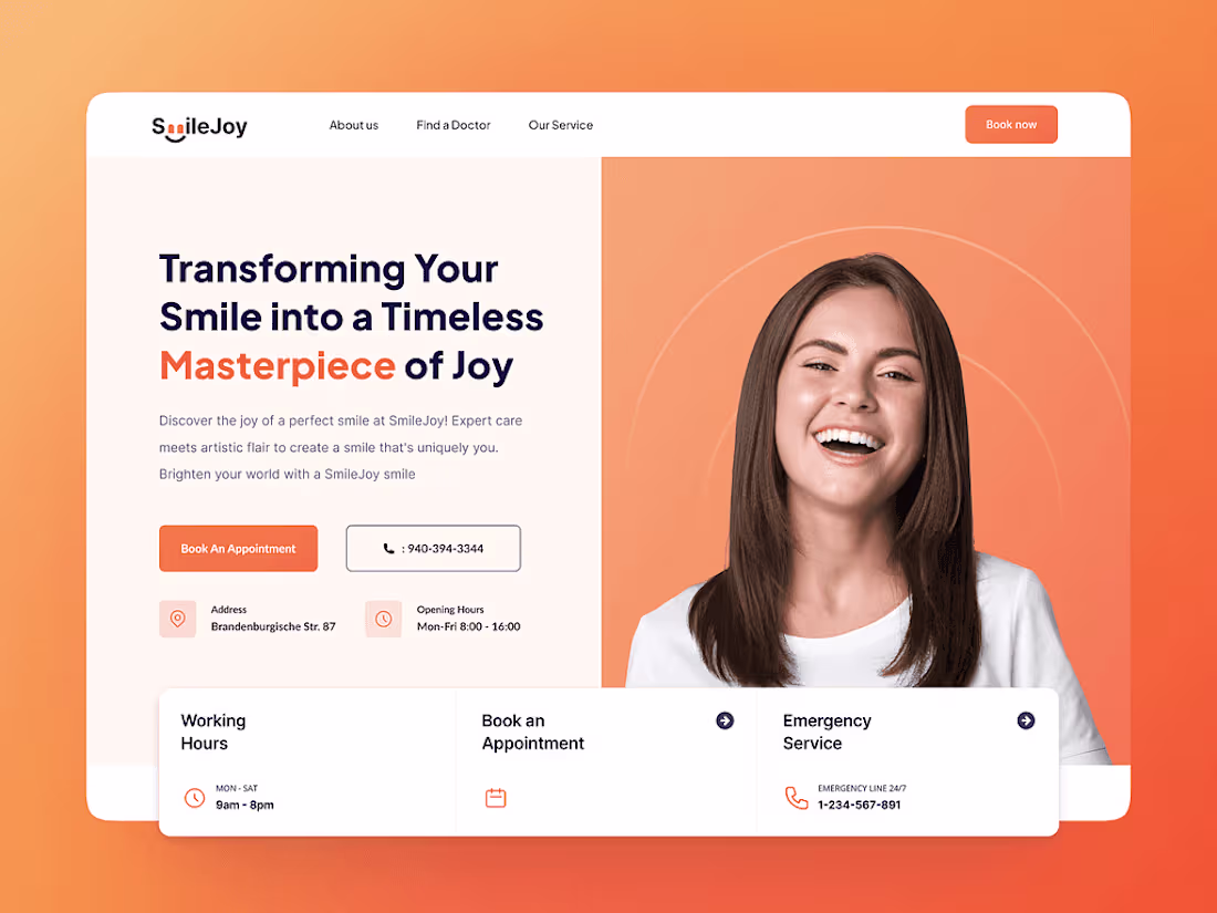
SmileJoy Marketing Landing Page
7
2
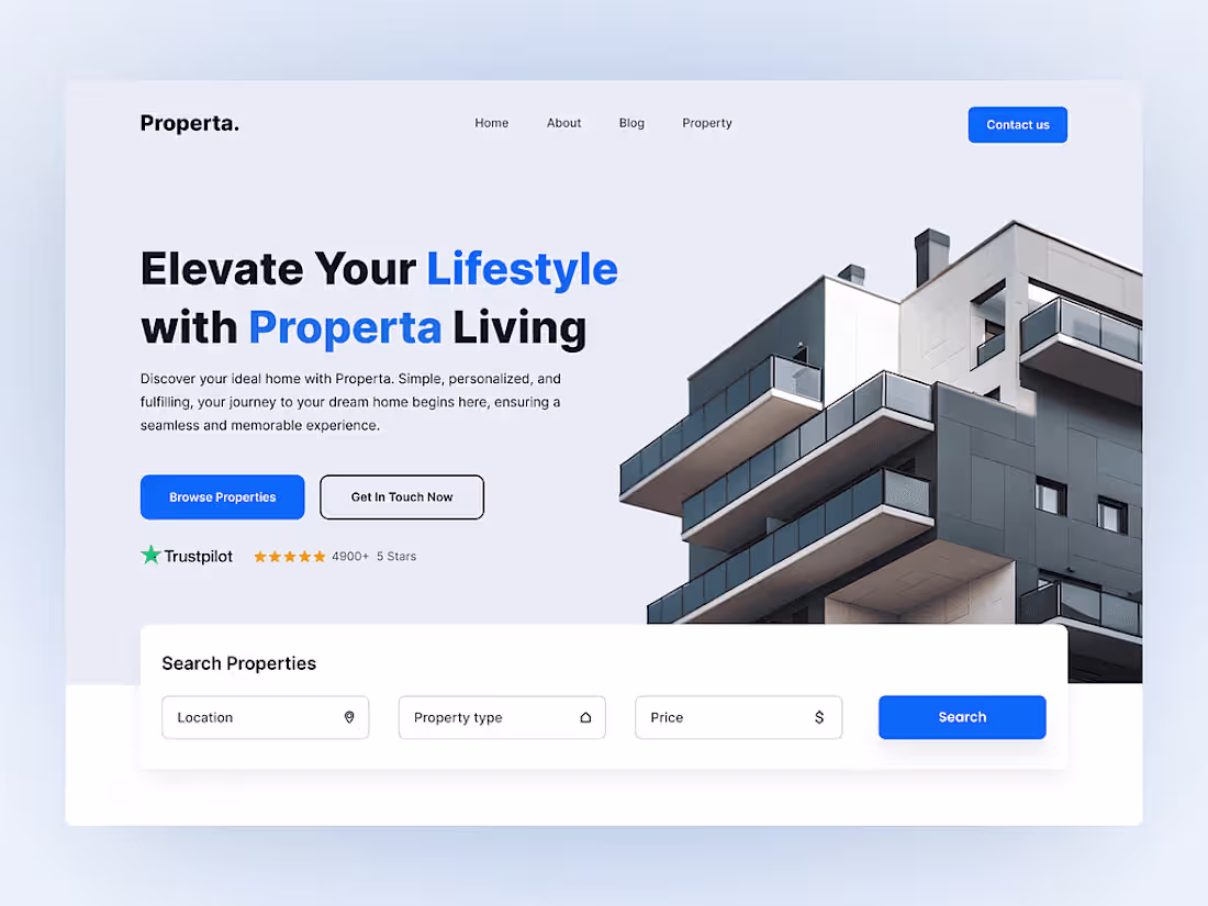
Properta Landing Page Design
7
4
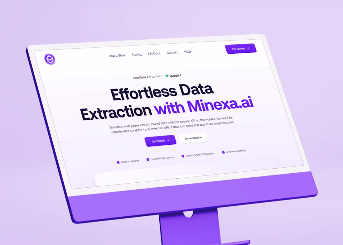
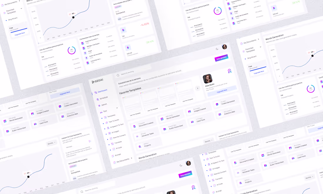
Minexa.ai | Website Design
6
9
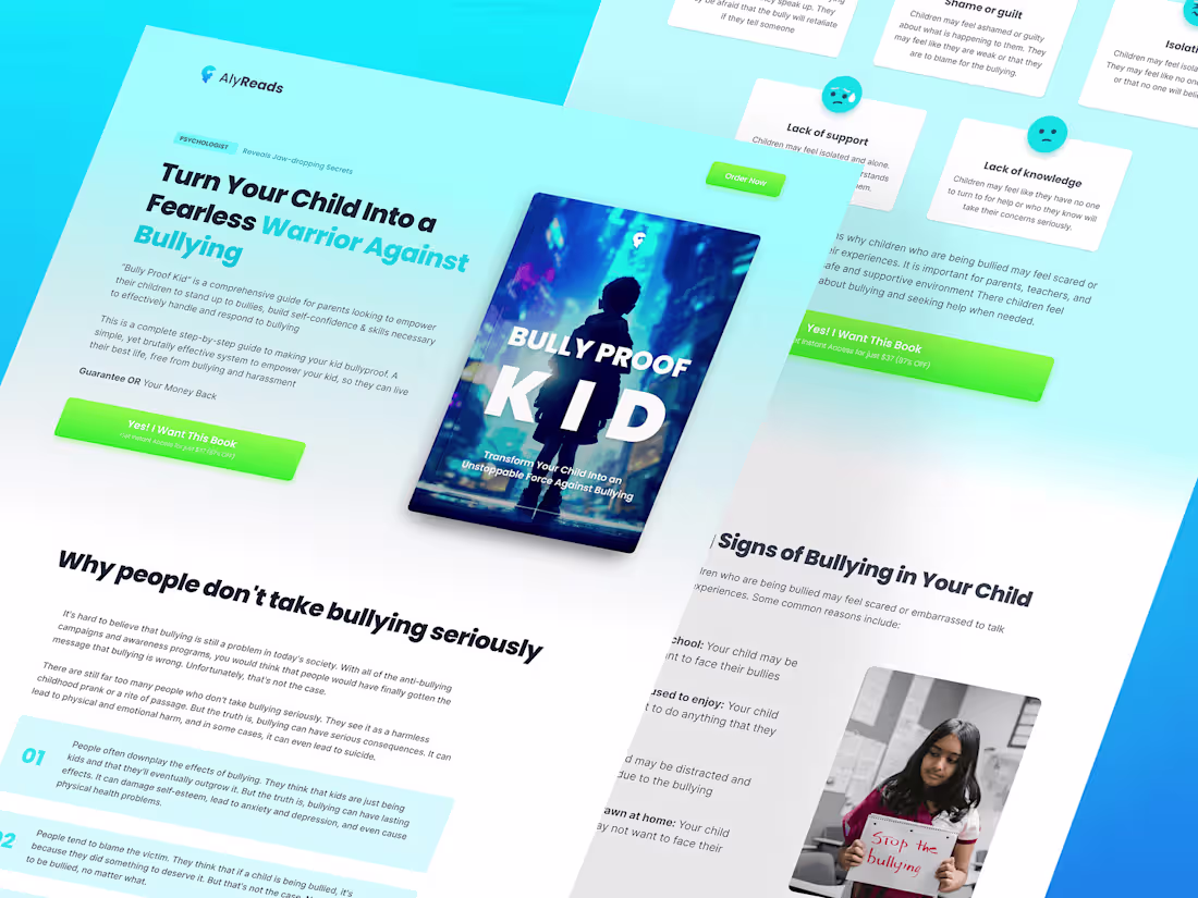
Bully Proof Kid Landing Page
5
8
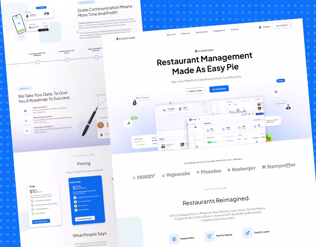
Restaurant Management System — UI/UX Design
0
6
Update.ai Website Design
0
4
Reset Method Book Design
0
7
Biz Launch Base | Landing Page Design
0
7
Properta Landing Page Design
0
6
GoodLuca — Professional Development Platform
0
0