Analytics Dashboard — Data Visualization UI
Rehbaz Ali
Overview
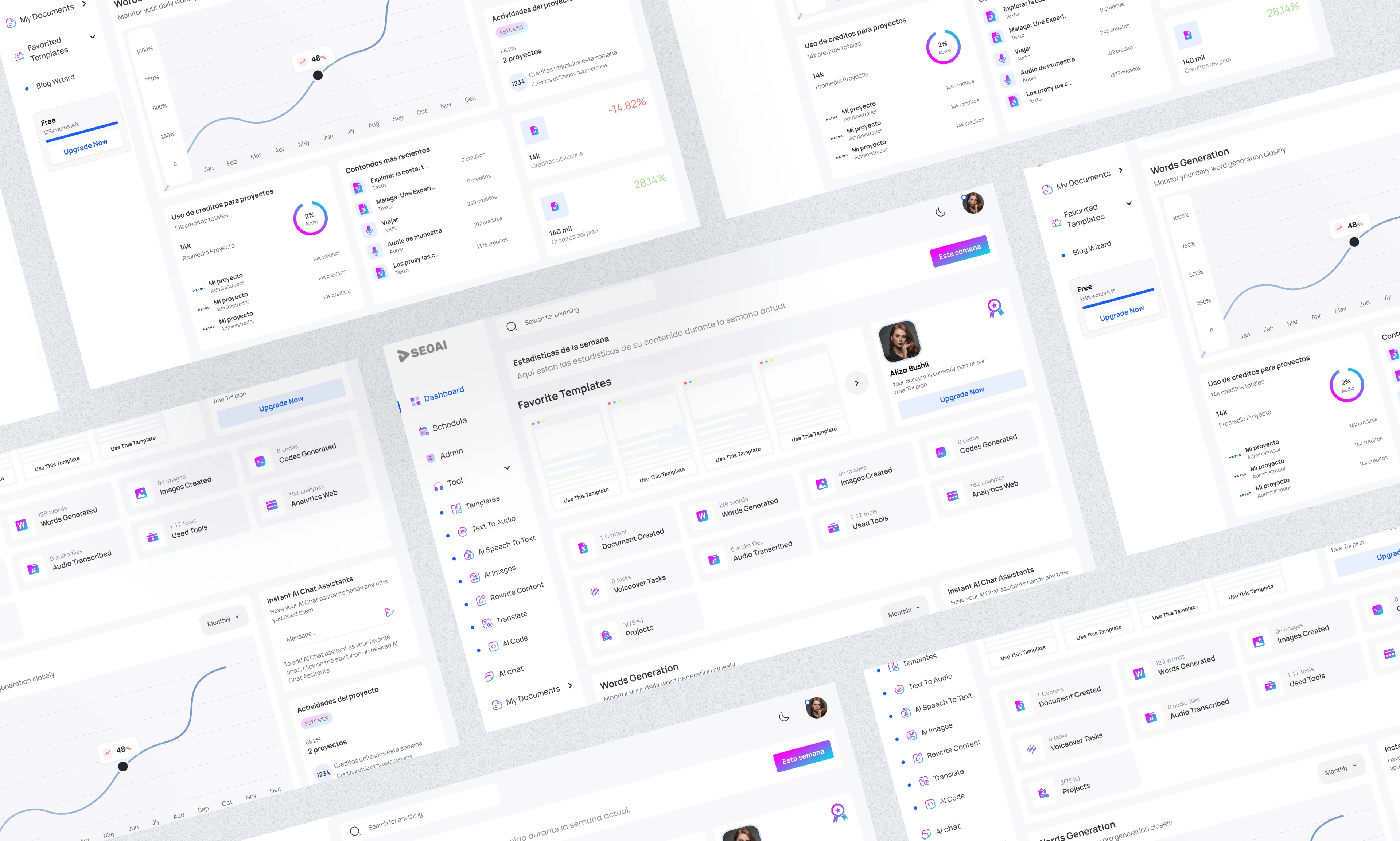
A data-rich analytics dashboard designed for clarity, speed, and daily usability. The goal was to surface the most important metrics at a glance while giving power users the ability to drill down into granular data without feeling overwhelmed.
The Challenge
Dashboards fail when they try to show everything at once. The design challenge was prioritization — deciding what data lives above the fold, what gets secondary placement, and how to make complex data sets readable at a glance.
Design Approach
The layout follows a Z-pattern reading flow, placing the most critical KPIs in the top-left and working down to detailed charts and tables. A collapsible sidebar keeps navigation accessible without eating into the data canvas.
Key design decisions:
KPI cards with trend indicators (up/down vs. previous period)
Clean chart library with consistent color coding across all data types
Dark mode support for extended screen time
Responsive grid that adapts from full desktop to tablet
Filters and date range selectors always visible in the top bar
Screens
Analytics dashboard full view
Like this project
Posted Jun 15, 2026
Likes
0
Views
4