Software Development Company — Conversion Landing Page

Rehbaz Ali


Description
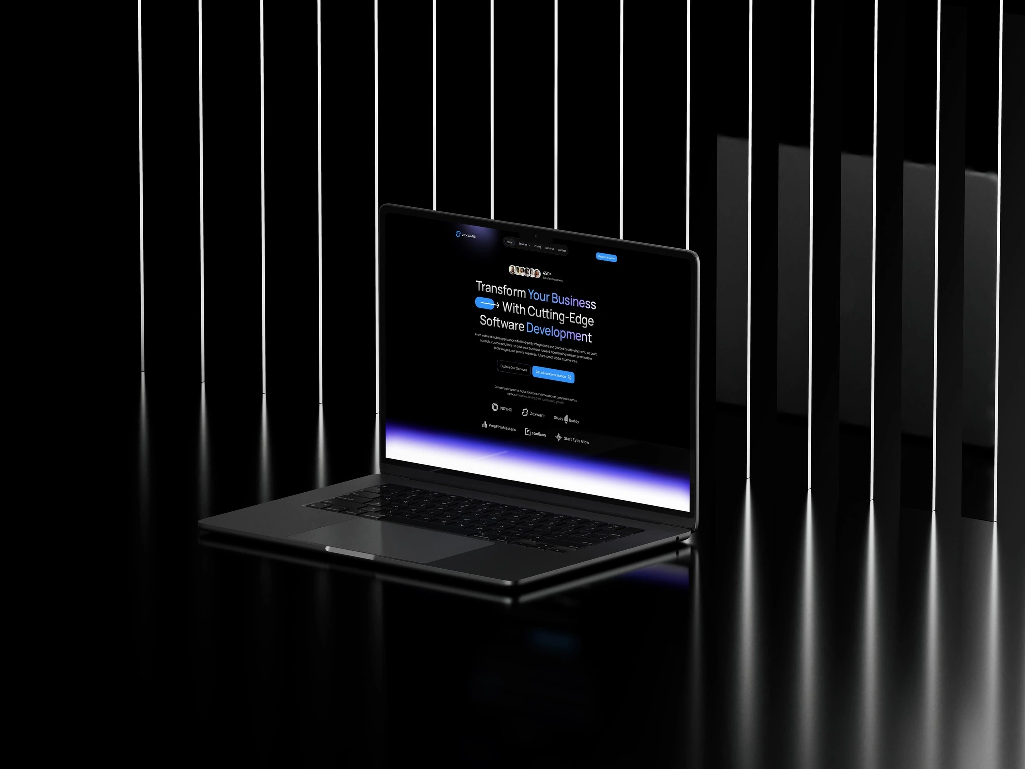
A software development company needed a landing page that did one thing well: convert. The brief was stripped back by design — one offer, one CTA, no distractions. The page needed to communicate technical credibility fast and move qualified visitors toward booking a discovery call before they had a reason to leave.
Software Dev Company Hero
Problem
Software agencies often make the same mistake: they try to say everything on the homepage. Services, tech stacks, team bios, case studies, blog posts — all competing for attention on a single page. The result is a site that says a lot but converts nobody.
This client needed the opposite. A focused, confident page that speaks directly to one type of buyer — a founder or product lead who needs a reliable dev partner — and gives them exactly one next step.
Solution
As the UI/UX Designer and Framer Developer, I designed and built the full landing page with a single conversion goal in mind.
The page opens with a direct, outcome-focused headline that speaks to the buyer's core need: reliable software delivery, on time. Social proof (client logos, a key result) appears within the first scroll to establish credibility before the visitor has a chance to doubt.
The CTA — "Book a discovery call" — appears three times across the page: above the fold, after the proof section, and at the bottom. No secondary CTAs, no navigation links to distract. Just one clear path forward.
How It Works
Brief Alignment — Defined the single conversion goal (discovery call bookings) and the primary buyer persona (founders and product leads).
Copy Strategy — Structured the page narrative around the buyer's core question: "Can I trust this team to deliver?" Assisted by ChatGPT for structure and Claude for directness.
Design — Built a clean, professional visual system in Figma with a strong typographic hierarchy and minimal visual noise.
Development — Built and shipped in Framer with fast load times and full mobile responsiveness.
SEO — Structured headings and meta content for search visibility in the software development services space.
Tools Used
Figma — Wireframes, design system, page layout
Framer — Full site build and deployment
ChatGPT — Copy structure and conversion strategy
Claude — Headline refinement and tone
Like this project
Posted Jul 26, 2026
A conversion-focused landing page built around one clear offer, early proof, and a single CTA designed to move visitors into discovery calls.
Likes
0
Views
0