SaaS Website — Conversion-Focused Landing Page

Rehbaz Ali


Description
A SaaS product needed a landing page that converted. The brief was precise: reduce the gap between a visitor understanding the product and signing up for a trial. The existing page had strong traffic but weak conversion — visitors were landing, reading, and leaving without acting.
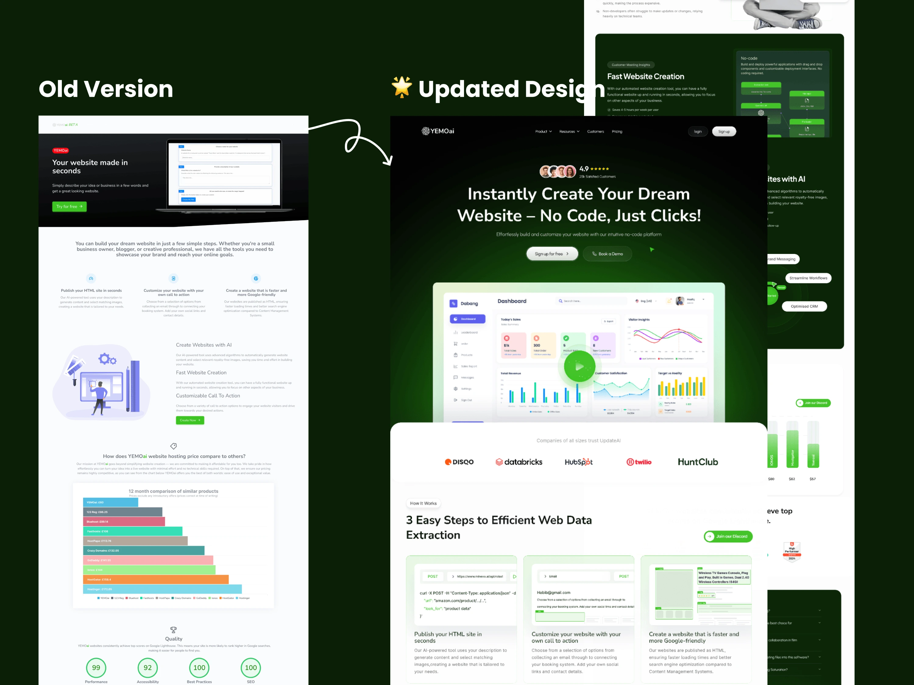
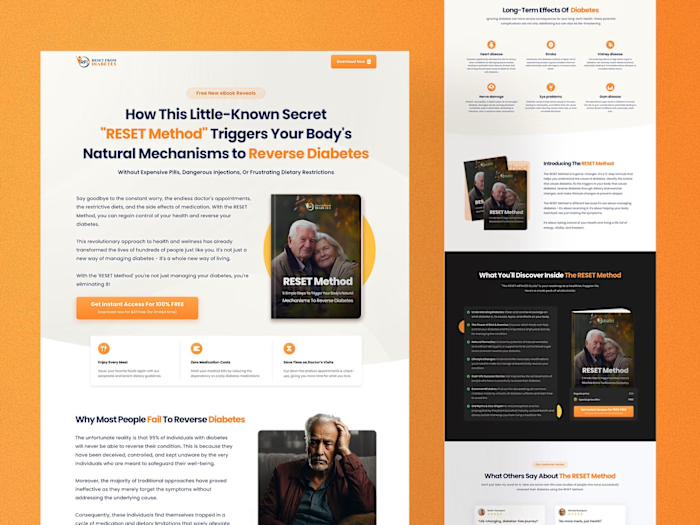
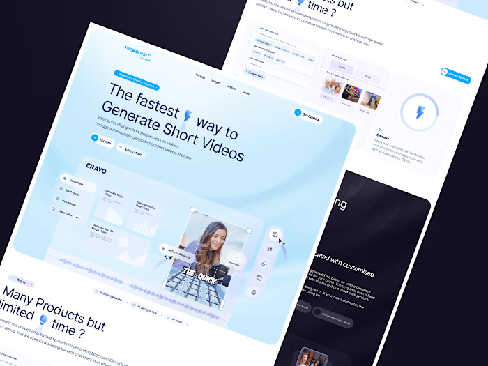
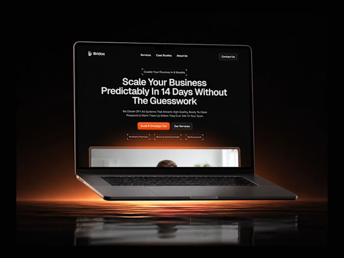
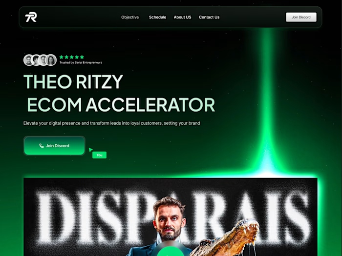
SaaS Landing Page Hero
Problem
SaaS landing pages have a specific conversion problem: they try to explain everything. Feature lists, integration grids, pricing tables, FAQs — all competing for attention on a single page. The result is a visitor who understands the product intellectually but never feels the pull to act.
This product had a genuinely strong value proposition. The problem was it was buried under layers of feature copy that answered questions nobody was asking. The page needed to be rebuilt around the visitor's core decision: "Is this worth 5 minutes of my time to try?"
Solution
As the UI/UX Designer and Framer Developer, I redesigned the full landing page around a single conversion goal: free trial signups.
The hero was rebuilt around one outcome statement and one CTA. No secondary actions, no navigation links competing for clicks. The product preview appears immediately below — a clean UI screenshot that shows the product working, not just describes it.
The page flow was restructured as a deliberate funnel: hero → key benefit → social proof → pricing → CTA. Each section answers the next question a hesitant visitor would ask, reducing drop-off at every stage.
How It Works
Conversion Audit — Identified the key drop-off points in the existing page and mapped the visitor's decision journey.
Page Architecture — Restructured the content hierarchy around the conversion funnel, cutting features that didn't directly support the trial CTA.
Design — Built a clean, product-forward visual system in Figma with a strong typographic hierarchy and a minimal color palette.
Development — Built and shipped in Framer with smooth scroll interactions and full mobile responsiveness.
Copy — Rewrote all page copy with Claude for clarity, outcome-focus, and conversion-driven tone.
Tools Used
Figma — Conversion audit, wireframes, design system
Framer — Full site build and deployment
Claude — Copy rewrite, outcome-focused messaging, conversion tone
Like this project
Posted Jun 15, 2026
A conversion-focused SaaS landing page designed to move trial-hesitant visitors from feature awareness to signup with minimal friction.
Likes
9
Views
16