Dating App — Landing Page Design
Rehbaz Ali

Overview
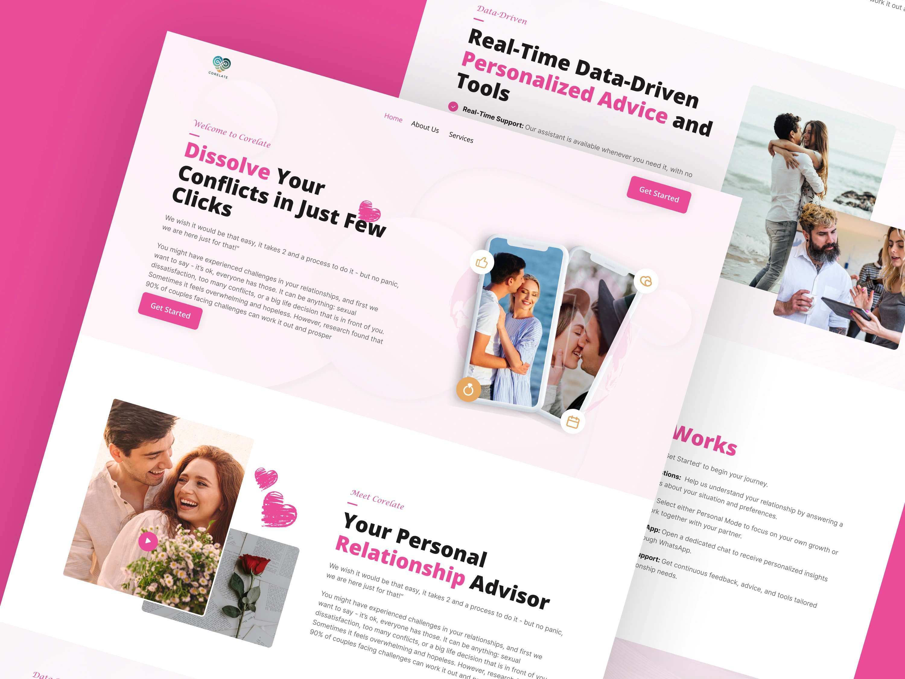
A landing page design for a dating app — built to drive app downloads and sign-ups. The design balances warmth and approachability with a modern, premium aesthetic that sets the app apart from generic dating platforms.
The Challenge
Dating apps live or die by first impressions. The landing page needed to communicate the app's unique value proposition immediately, build emotional resonance with the target audience, and convert visitors into downloads within seconds.
Design Approach
The page leads with a lifestyle-focused hero — real people, real connections — rather than product screenshots. The value proposition is communicated through benefit-led copy and social proof, with the app store download CTAs always visible.
Key design decisions:
Warm, inviting color palette (soft pinks, deep purples) aligned with the brand
Lifestyle photography over UI screenshots in the hero
Feature highlights framed around outcomes ("Find your person") not features ("Advanced matching algorithm")
App store badges prominently placed above and below the fold
Testimonials with photos for authenticity
Mobile-first layout since nearly all traffic converts on mobile
Screens
Dating app landing page hero
Features and social proof section
Like this project
Posted Jun 15, 2026
Likes
1
Views
2