Health Hub — Patient-Friendly Health App Website

Rehbaz Ali


Description
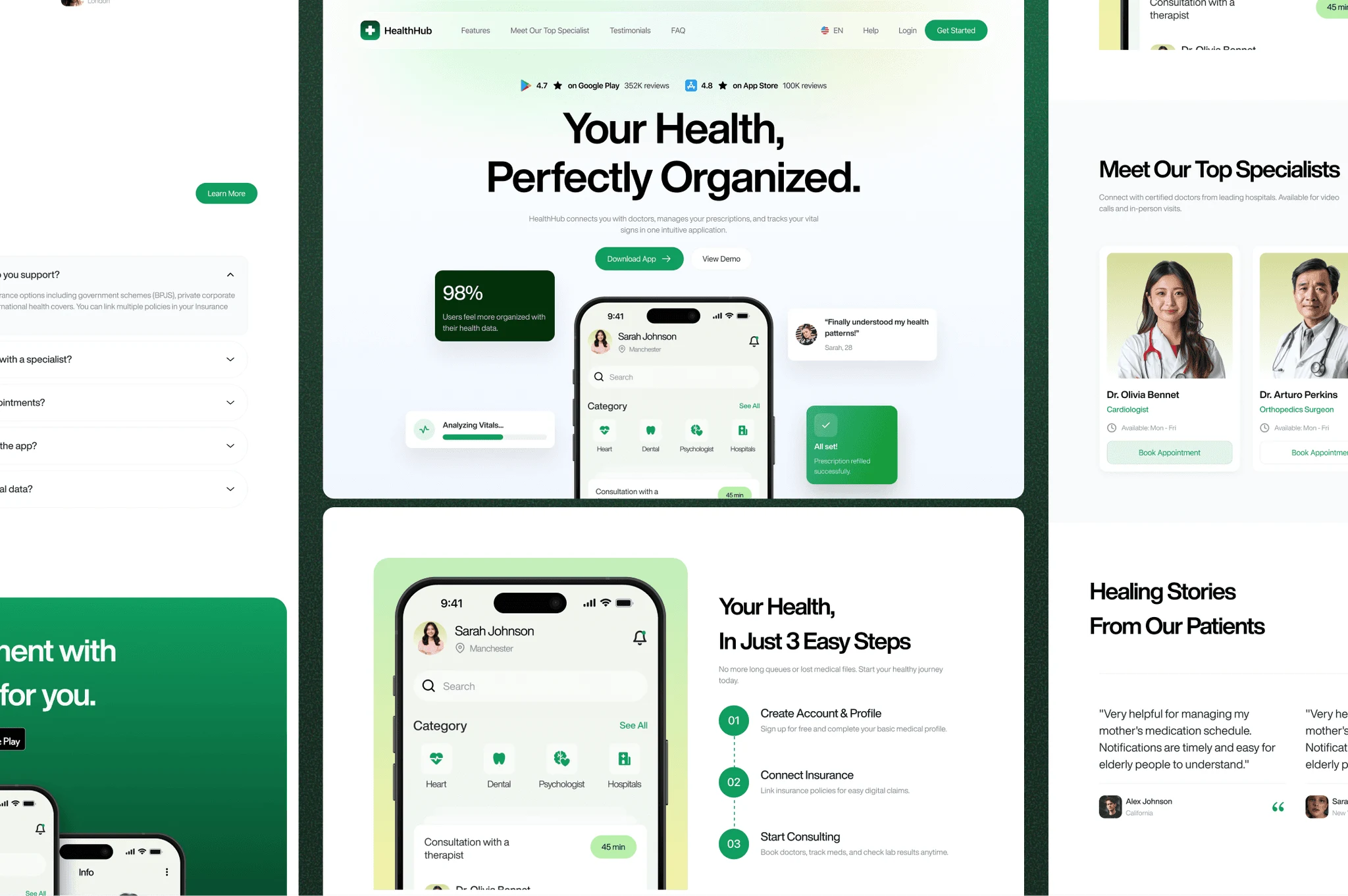
Health Hub is a website concept for a health app designed to simplify the patient experience. The platform organizes appointments, prescriptions, and insurance into a single, easy-to-navigate interface. The design brief was clear: build trust through clarity, reduce anxiety through calm visuals, and make the path to signup feel natural — not clinical.
Health Hub Hero
Problem
Healthcare websites have a trust problem. They're either too corporate — cold, dense, and intimidating — or too casual, which undermines credibility with patients who are making real decisions about their health. Health Hub needed to sit in the middle: warm enough to feel human, structured enough to feel reliable.
The additional challenge was information architecture. Appointments, prescriptions, and insurance are three distinct user needs. Presenting all three without overwhelming the visitor required careful sequencing and a strong visual hierarchy.
Solution
As the UI/UX Designer and Framer Developer, I designed the full website experience with a patient-first lens.
The visual language was built around softness — rounded components, a calm color palette, and generous whitespace that signals care without sacrificing professionalism. Every section was designed to reduce cognitive load, not add to it.
Navigation was simplified to three core paths: Book an appointment, Manage prescriptions, and Check coverage. Each path leads to a focused landing section with a single CTA, reducing decision fatigue for users who are often already stressed.
How It Works
Research — Mapped the key patient journeys (booking, prescriptions, insurance) and identified the friction points in existing health app websites.
Information Architecture — Structured the page flow to address each user need in sequence, with clear visual separators between sections.
Design — Built a soft, trust-first visual system in Figma with a calm palette, rounded UI components, and accessible typography.
Development — Built and shipped in Framer with full mobile responsiveness and smooth scroll interactions.
Copy & Messaging — Wrote patient-facing copy assisted by ChatGPT for structure and Claude for empathetic tone.
Tools Used
Figma — UX wireframes, design system, component library
Framer — Full site build and deployment
ChatGPT — Copy structure and content strategy
Claude — Empathetic tone and messaging refinement
Like this project
Posted Jul 26, 2026
A calm, patient-focused website concept for a health app that organizes appointments, prescriptions, and insurance in one place.
Likes
0
Views
0