Contra - A professional network for the jobs and skills of the futureDiscover

Web design projects using Framer

Framer

The best modern websites built on the leading web design tool, Framer
View more

Standout projects

Standout projects

More projects we love that are making waves across the web
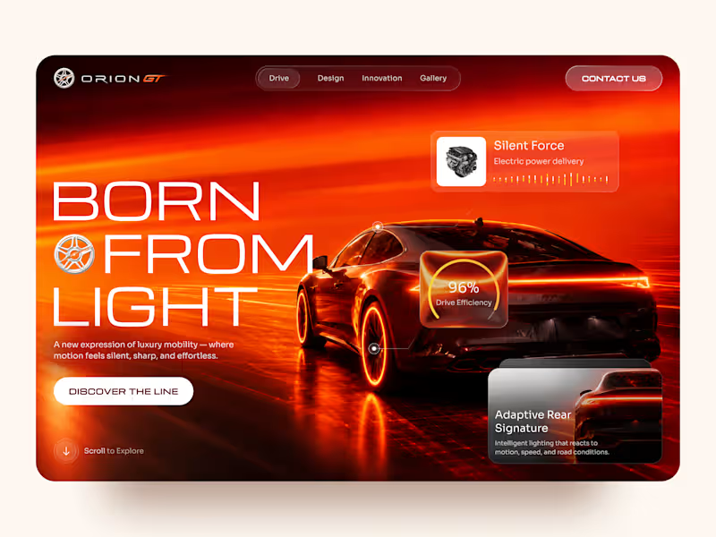
Cover image for Orion GT — Luxury Automotive
Orion GT — Luxury Automotive Landing Page 🏎️🔥 Orion GT is a landing page concept for a premium performance car brand, built around speed, innovation, and a cinematic digital experience. The goal was to make the vehicle feel like more than a product — creating an immersive introduction where lighting, motion, typography, and interface details reinforce the feeling of performance and exclusivity. Special attention was given to: • a cinematic hero composition that makes the vehicle the main visual focus; • a high-energy red and orange palette inspired by speed, heat, and light 🔥; • oversized typography that strengthens the premium, futuristic character; • floating performance UI elements that communicate features without interrupting the visual experience; • glass-style interface cards for drive efficiency, electric power delivery, and adaptive lighting; • a clear “Discover the Line” CTA integrated into the storytelling; • responsive mobile layouts that preserve the atmosphere while simplifying the composition 📱; • a minimal mobile navigation designed to keep the experience focused and immersive. The result is a bold automotive experience that combines luxury presentation with a technology-driven interface — turning the landing page into part of the product experience itself. Looking to create a premium website for your automotive, mobility, or technology brand? Let’s build something that feels as powerful as the product. ⚡
11
17
1K
Cover image for How do you turn movement
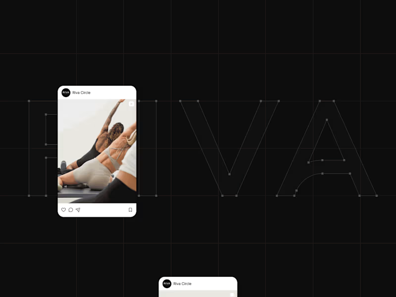
How do you turn movement into a visual identity without literally showing movement? That was one of the questions behind the branding for Riva Circle, a Pilates studio based in St. Gallen, Switzerland. Riva Circle came to us as a completely new brand. The task was to build the brand from the ground up and create a visual language that could define how Riva Circle would be perceived from the very beginning. The goal was to create something modern and dynamic, but without being loud or overly expressive. We wanted the brand to feel refined and contemporary, while still capturing something essential to Pilates: movement, control, balance, and the connection with the body. That became the starting point for the wordmark. We explored how we could translate the expression of the body and the movement of Pilates into typography. Rather than illustrating movement directly, we looked for a way to make it part of the letterforms themselves. This led us to a custom typographic treatment where a simple continuous line becomes part of the letters. Most importantly, that line appears within the letter A, creating a subtle but distinctive gesture. From that detail, we developed the visual language of the brand. The result is intentionally simple, clean typography, a restrained visual system, and a recognizable symbol built from the same idea of movement. For me, that balance was really important. The brand needed to have enough character to be recognizable, but not so much visual noise that it would compete with the experience Riva Circle is offering. And I think the brand has proven that direction quite well. Just one year after launching, Riva Circle has grown, established a recognizable presence, and, most importantly, built a strong community around the studio. So, this project was ultimately about taking something as expressive as movement and finding a very simple visual expression for it. One that can stay relevant as the brand continues to grow.
10
23
1.1K