The network for creativity
Join 1.25M professional creatives like you
Connect with clients, get discovered, and run your business 100% commission-free
Creatives on Contra have earned over $150M and we are just getting started
Back to feedPost
How do you turn movement into a visual identity without literally showing movement?
That was one of the questions behind the branding for Riva Circle, a Pilates studio based in St. Gallen, Switzerland.
Riva Circle came to us as a completely new brand. The task was to build the brand from the ground up and create a visual language that could define how Riva Circle would be perceived from the very beginning.
The goal was to create something modern and dynamic, but without being loud or overly expressive. We wanted the brand to feel refined and contemporary, while still capturing something essential to Pilates: movement, control, balance, and the connection with the body.
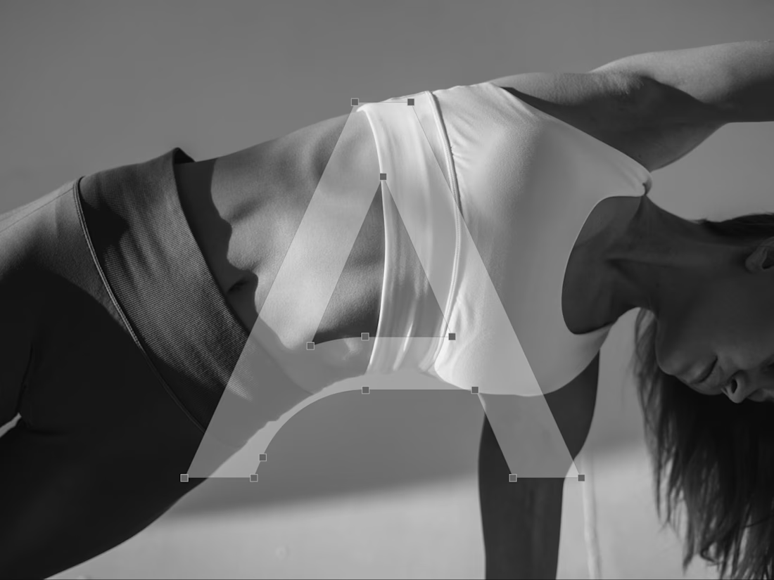
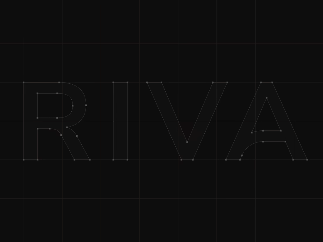
That became the starting point for the wordmark. We explored how we could translate the expression of the body and the movement of Pilates into typography. Rather than illustrating movement directly, we looked for a way to make it part of the letterforms themselves.
This led us to a custom typographic treatment where a simple continuous line becomes part of the letters. Most importantly, that line appears within the letter A, creating a subtle but distinctive gesture. From that detail, we developed the visual language of the brand. The result is intentionally simple, clean typography, a restrained visual system, and a recognizable symbol built from the same idea of movement.
For me, that balance was really important. The brand needed to have enough character to be recognizable, but not so much visual noise that it would compete with the experience Riva Circle is offering.
And I think the brand has proven that direction quite well. Just one year after launching, Riva Circle has grown, established a recognizable presence, and, most importantly, built a strong community around the studio.
So, this project was ultimately about taking something as expressive as movement and finding a very simple visual expression for it. One that can stay relevant as the brand continues to grow.


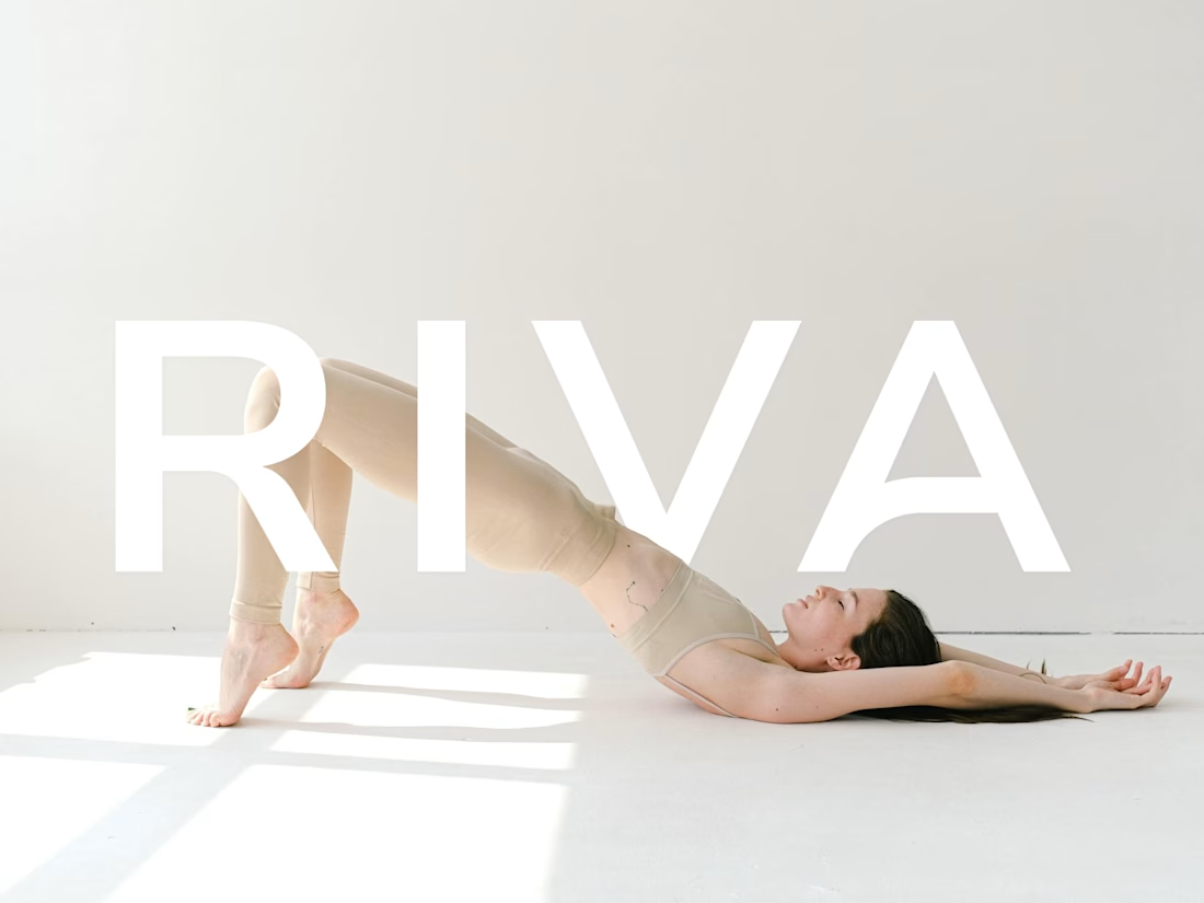
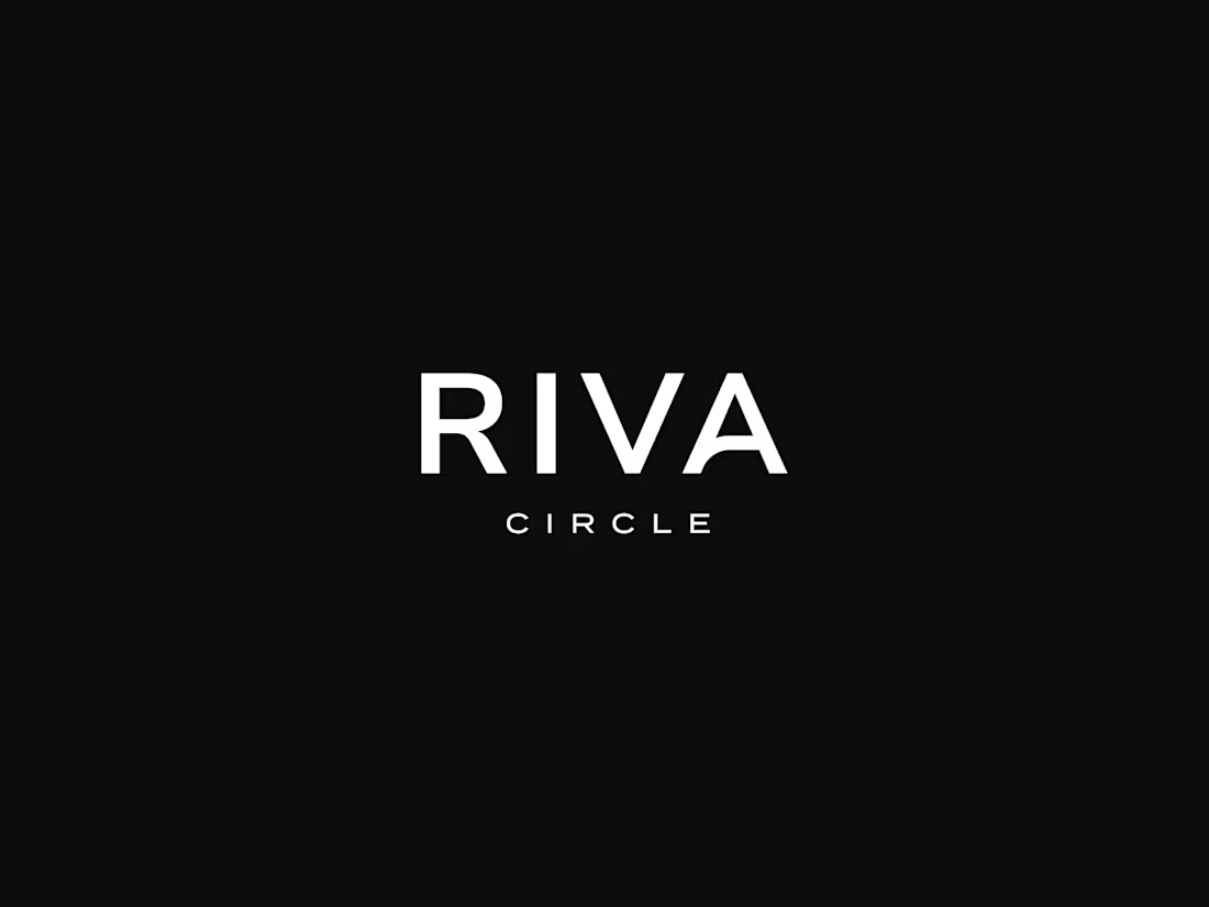

The contrast between the airy photography and the near-black Riva wordmark is striking—the motion-led identity feels present without needing a literal movement graphic.

Thanks Ahmed!

Thank you 🙌

Creative work :)
Thank you, Umar 🙌

Clean and simple, love it.

Lovely visuals

simplicity alongside the complexities that come with something as natural as movement feels just right, lovely work.
Thank you, Nicolette 🙌
The network for creativity
Join 1.25M professional creatives like you
Connect with clients, get discovered, and run your business 100% commission-free
Creatives on Contra have earned over $150M and we are just getting started
Trending
retrofuturism
Share your favorite designs from the past exploring the distant future. Or your own take on the aesthetic 🚀
halftone
Dots. Texture. Grain. Let's see your designs using the halftone technique.

Midjourney
Creatives are showing off what they're making with Midjourney.
colorgrade
Video editors sound off: How do you enhance the mood of your video in color grading?
Challenges
View all


Related posts

New Brand Guidelines delivered.
While it may seem trivial, this asset remains a key component of our final deliverables for every project. We offer a recommended guide for the proper use of the brand, with various layout options permitted within the visual language. This ensures the brand can expand over time with a truly functional visual system.
We always strive to be as concise as the brand allows, establishing the foundation for its effective use. This empowers the client to make informed decisions and implement each brand element in the ideal scenario with optimal adjustments.

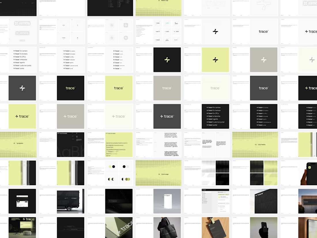

"As concise as the brand allows" is the hard part, because the guidelines that get ignored are almost never the thin ones. Curious whether you pair the PDF with a live component library so the document only has to explain the rules and doesn't also have to enforce them - that split has saved me a lot of pages.

Project Showcase: Brand Identity Design for Burger Lover 🍔🎨
As a designer working with small businesses, I recently led the visual identity design for Burger Lover, a fast-casual restaurant looking to establish a distinct, memorable presence in a competitive market.
My focus was on translating the brand’s core personality into a clean, cohesive visual system that bridges the gap between digital marketing and physical packaging.
Key Design Deliverables
Logo & Visual Identity: Crafted a modern, scale able mark built for high legibility on everything from app icons to storefront signage.
Packaging & Touch points: Designed branded takeout boxes, custom burger wraps, and sticker seals engineered to create an elevated unboxing experience.
Color Palette & Typography: Paired appetite-stimulating primary tones with strong display typography to establish instant visual recognition.
Social & Marketing Assets: Developed structured templates to ensure consistent visual hierarchy across digital channels.
I’d love to get feedback from fellow designers! How do you feel about the packaging layout and visual balance? Any insights on the typographic hierarchy would be greatly appreciated.


Sick 🔥

Boho logo & brand identity design
We started with pencil and paper is now a complete brand identity.
Warm.
Organic.
Full of character.
Just like the spaces BOHO is designed to create.
From rough lines to the final wordmark.
Here’s how it all came together.
What do you think of the final identity?
#brandidentity #logodesign #branding #interiorbranding #visualidentity
The chocolate-and-rust palette gives the identity a grounded warmth, and the progression from wordmark to interior system makes the concept feel complete. The contrast keeps the serif mark distinctive without losing approachability.