
Md Suman Ali
Brand Strategist & Identity Designer for Property Developers


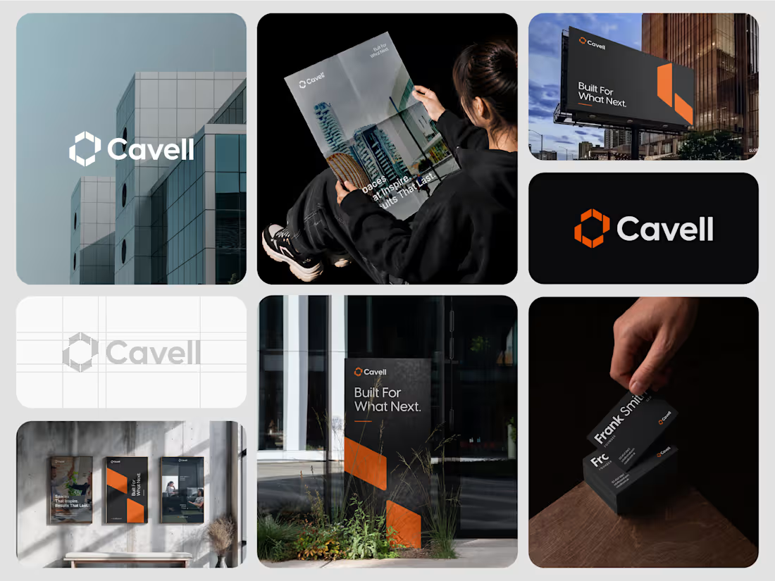
Cavell - Commercial Real Estate Brand Identity
1
6
Cavell | Brand Identity Design for UK Property Development
Modern, confident, and built for what’s next.
Cavell is a UK-based real estate and property development company focused on creating high-quality commercial spaces for businesses and organisations.
At Dizift Studio, we developed a modern visual identity that reflects Cavell’s focus on architecture, business growth, and long-term value.
The identity combines a distinctive geometric brandmark, clean typography, and a bold orange-and-black color palette to create a professional and recognisable presence.
What We Designed:
→ Custom geometric logo and brandmark
→ Primary and secondary color palette
→ Typography system
→ Brand identity guidelines
→ Business stationery
→ Signage and environmental branding
→ Marketing and promotional applications
Every element was designed to work together, creating a consistent identity across digital and physical touchpoints.
Brand Message: Built for What Next.
Creative Direction: Modern, Minimal, Architectural, Professional.
2
1
64
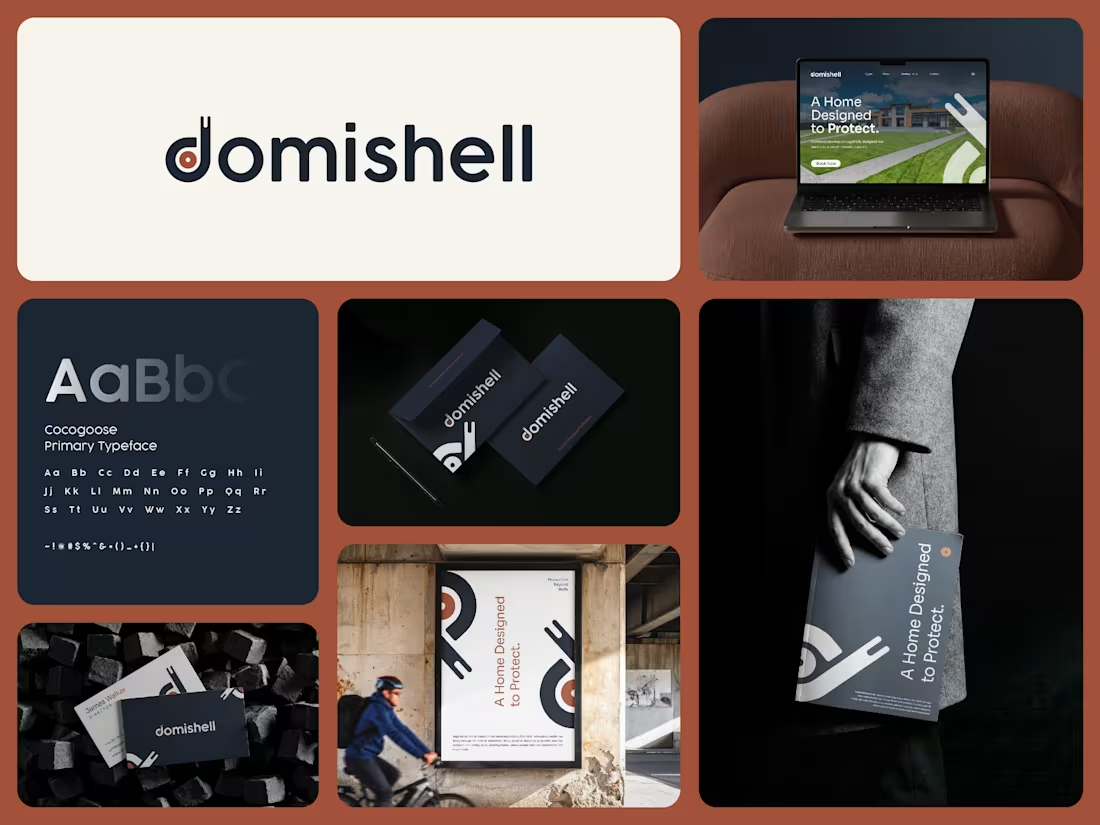
Domishell | Real Estate Brand Identity & Logo Design
1
4
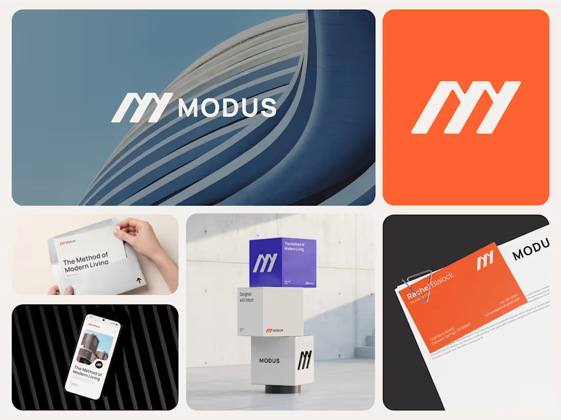
MODUS — Brand Identity for a Contemporary Architecture Studio.
How do you build an identity that feels as considered as the spaces it represents?
That was the starting point for MODUS, a contemporary architecture studio focused on creating purposeful spaces for modern life.
The brand itself is built around the same principles MODUS brings to architecture: form, function, precision, and human experience.
I wanted the identity to feel architectural without falling into the usual clichés.
The symbol uses simple geometric forms to create a distinctive M, giving the brand a sense of structure, movement, and progression. From there, the visual language expands through bold typography, generous layouts, architectural imagery, and a confident orange and violet palette.
The result is a system designed to work across everything from stationery and digital experiences to social media and environmental applications.
At the heart of the identity is one simple idea:
The Method of Modern Living.
MODUS is about more than how a space looks. It’s about thoughtful planning, architectural precision, and creating spaces that feel intentional and timeless.
I'd love to hear what you think.
1
3
241