
How do you make a property brand stand out in a competitive market?
That was the challenge behind Cavell, a UK-based commercial real estate and property development company focused on creating spaces where businesses can grow.
The challenge was to develop an identity that felt professional and trustworthy, without looking like another generic property brand.
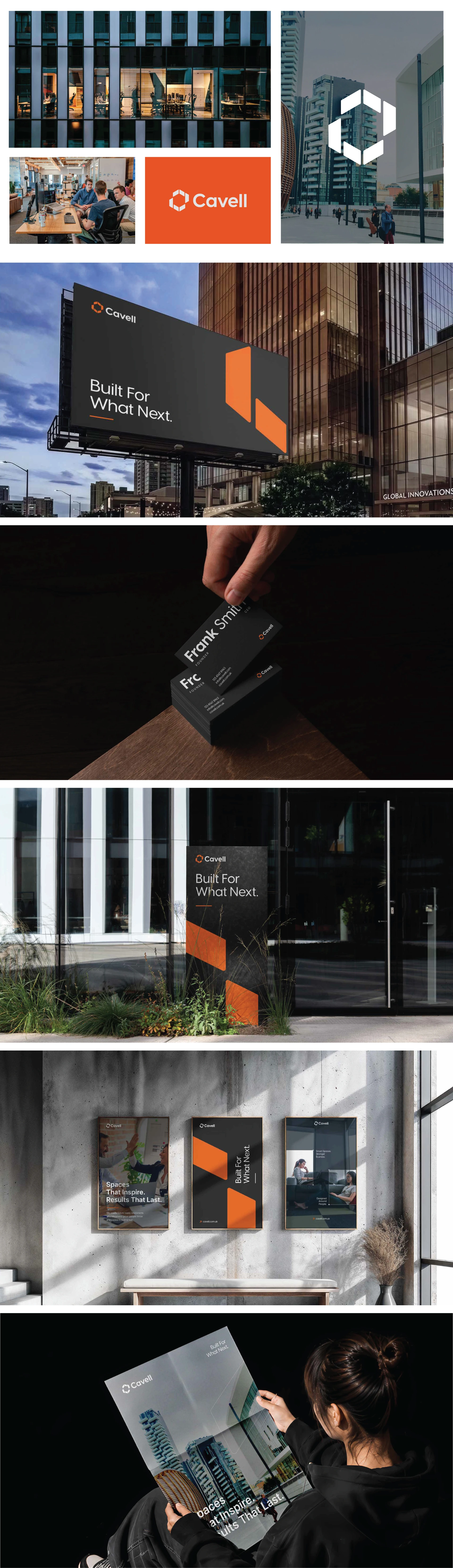
At Dizift Studio, we approached the project with one simple idea: connect the brand to architecture while keeping everything clean and memorable.
We created a geometric C-inspired symbol, paired with bold orange, black, and modern typography. Every element was carefully considered to give Cavell a confident and recognizable presence.
The result is a flexible visual identity designed to work across business cards, brochures, building signage, and large-scale billboards.
A brand that feels modern, distinctive, and ready for what comes next.
Built for What Next.
Designed with care by Dizift Studio.
Behind every project are hours of thinking, sketching, and refining. If you appreciate the work, a little ❤️ means a lot to our creative team!
Which part of the Cavell identity caught your attention first?
Have a brand idea of your own? Let's bring it to life. Feel free to reach out!

0 likes · 2 views · Nov 11, 2026


