The network for creativity
Join 1.25M professional creatives like you
Connect with clients, get discovered, and run your business 100% commission-free
Creatives on Contra have earned over $150M and we are just getting started
Back to feedPost
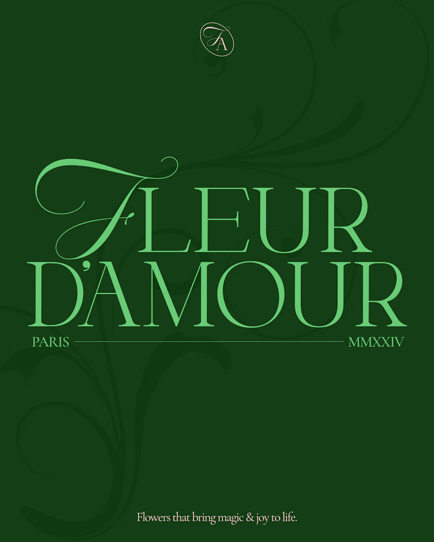
🌸 Fleur d'amour part 1.
Fleur d'amour is a beautiful flower shop in Paris, making sure the beauty and magic of their flowers reaches people lives to make them better, happier, and serene.
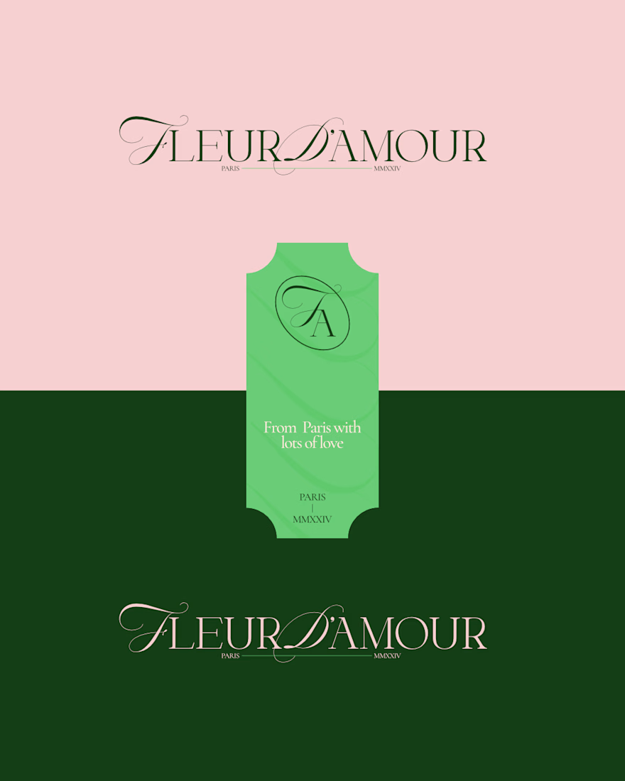
The brand direction is elegant, a bit premium, and somewhat minimal, communicated through a mix of curvy typography and a thin elegant serif.
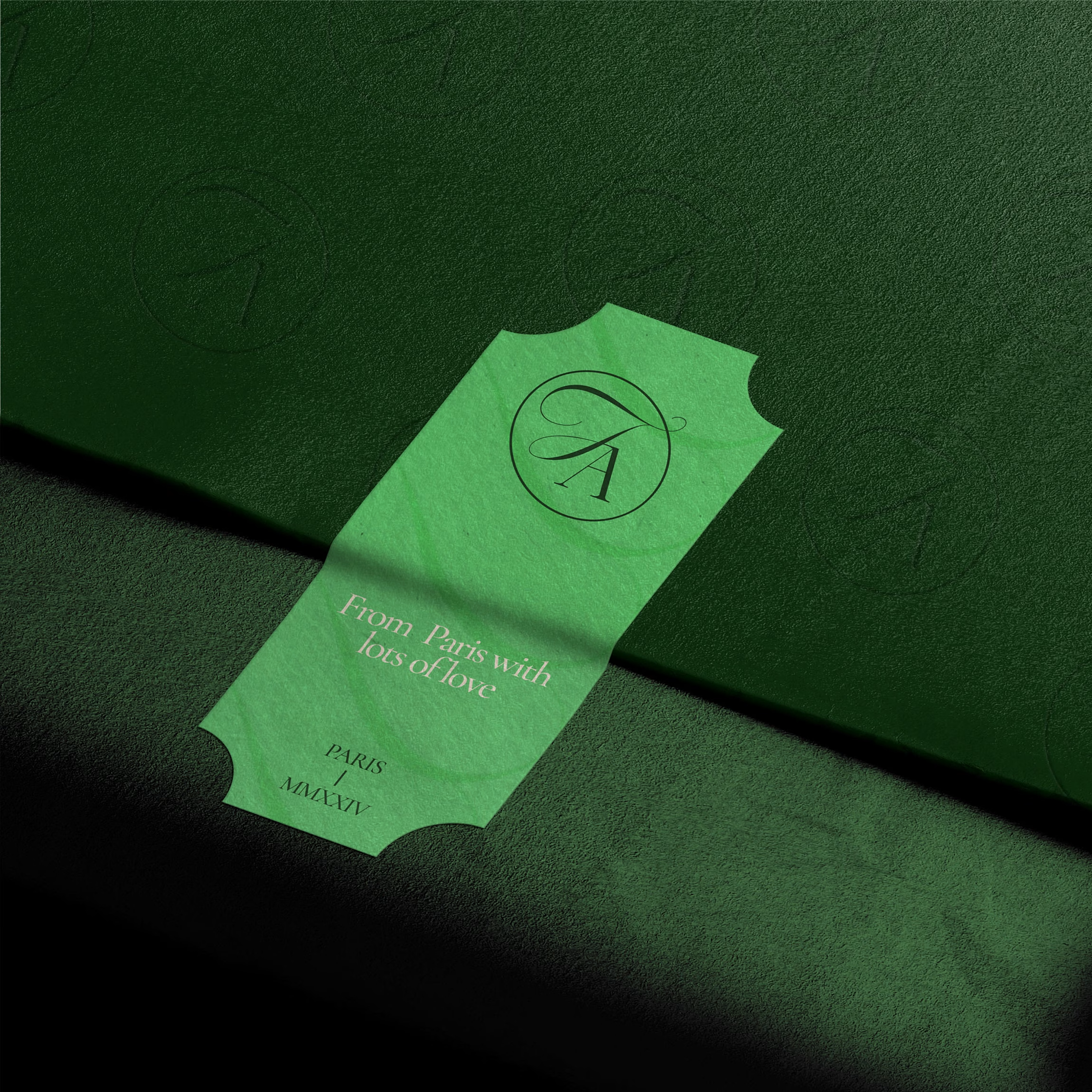
I developed a scalable logo suite to make sure each application can have an option that fits.
What do you think?
(This is a fictional project aimed for exploration)




Yeah for sure!! The typography is my favorite part tbh

The script mark next to that thin serif does the premium work without extra ornament. The ticket lockup feels especially right for a Paris flower shop.
Yup creating that elegance with simplicity was the goal!!

I really like how you presented the work in that short video. How did you do it? Did you use a specific program?
Thank youu!! I appreciate the goat btw.
Oh there's a site for that. Check animos.app I think you'd really like it since mine caught your eye.
animos.app
animos — Motion templates for design showcases
Showcase your designs in motion. 25 ready-made animation templates — drop in your work, tweak, and export an MP4, all in your browser.
Thanks a lot, bro I'm definitely going to use it ;)
The network for creativity
Join 1.25M professional creatives like you
Connect with clients, get discovered, and run your business 100% commission-free
Creatives on Contra have earned over $150M and we are just getting started

Challenges
View all


Related posts


Web Design for Contra Labs — an extension of the Brand Identity we created.
Translating the visual language, principles, and character of the identity into a cohesive digital experience.


Which book cover design theme speaks the clearest?

6 voted
38%

10 voted
62%

16 votes
Closed

Building a wellness brand around what customers actually want.
For Nocta, I developed the brand identity from the consumer perspective: what does someone looking for wellness want to feel when they discover a new DTC brand?
I translated those insights into a brand direction that feels trustworthy, modern, approachable, and premium, avoiding the usual clinical or overly “wellness” visual language.
The result is a flexible identity designed to work across digital channels, from the website and social media to packaging and other customer touchpoints.
See the full project →
https://www.behance.net/gallery/256801253/Nocta


