From AI-Generated to Premium: Spartan SEM Brand Identity

Darya Batyr ✦
Verified


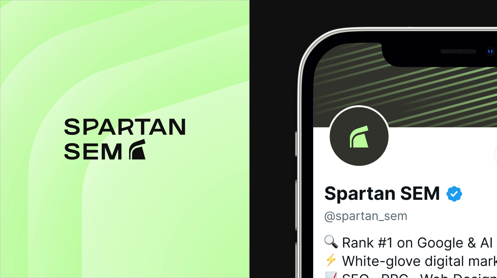
Spartan SEM: from mascot diven starting point to premium brand identity
Spartan SEM is a results-driven digital marketing agency specializing in high-stakes verticals - law firms, medical practices, and home services businesses competing in some of the most saturated markets in the country. Founded on a simple promise (results over rankings, partnership over process), the agency had outgrown its original visual identity: an AI-generated logo and color scheme that no longer matched the caliber of the work or the ambition of the business.
Challenge
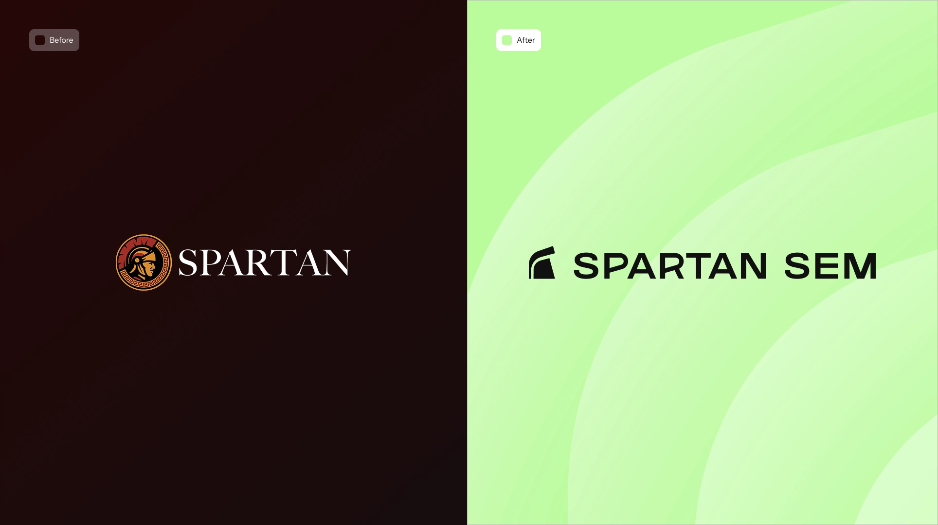
Spartan SEM's founders needed a brand that could go head-to-head with larger, established competitors - without losing the personal, owner-led relationship that actually won and retained their clients. The existing identity leaned busy, generic, and unintentionally "sports-team" in feel: an overcomplicated warrior icon, a muddy color palette, and serif typography that read more law-firm-in-1995 than modern digital agency.
The brief demanded a careful balance: bold enough to project power and competitive edge, refined enough to feel premium and trustworthy, and warm enough to still feel human - resolving the tension between "fighter" and "partner" that defined the founders' own vision for the company.
Solution
The process began with in-depth discovery sessions to extract the real strategic drivers behind the rebrand - competitive positioning, target verticals, emotional resonance, and brand personality - translated into a full creative direction phase exploring multiple visual territories before converging on a distinct color and typographic system.
Icon development moved through several rounds of iteration, evolving from literal warrior imagery toward a fully abstract, typography-led mark - one that carries the Spartan reference subtly, rewarding a closer look rather than announcing itself outright. Extensive client collaboration shaped every stage: structured feedback rounds, side-by-side concept comparisons, and iterative refinement of icon, wordmark, color, and typography, all tied directly back to the original discovery insights to keep the process strategic rather than purely aesthetic.
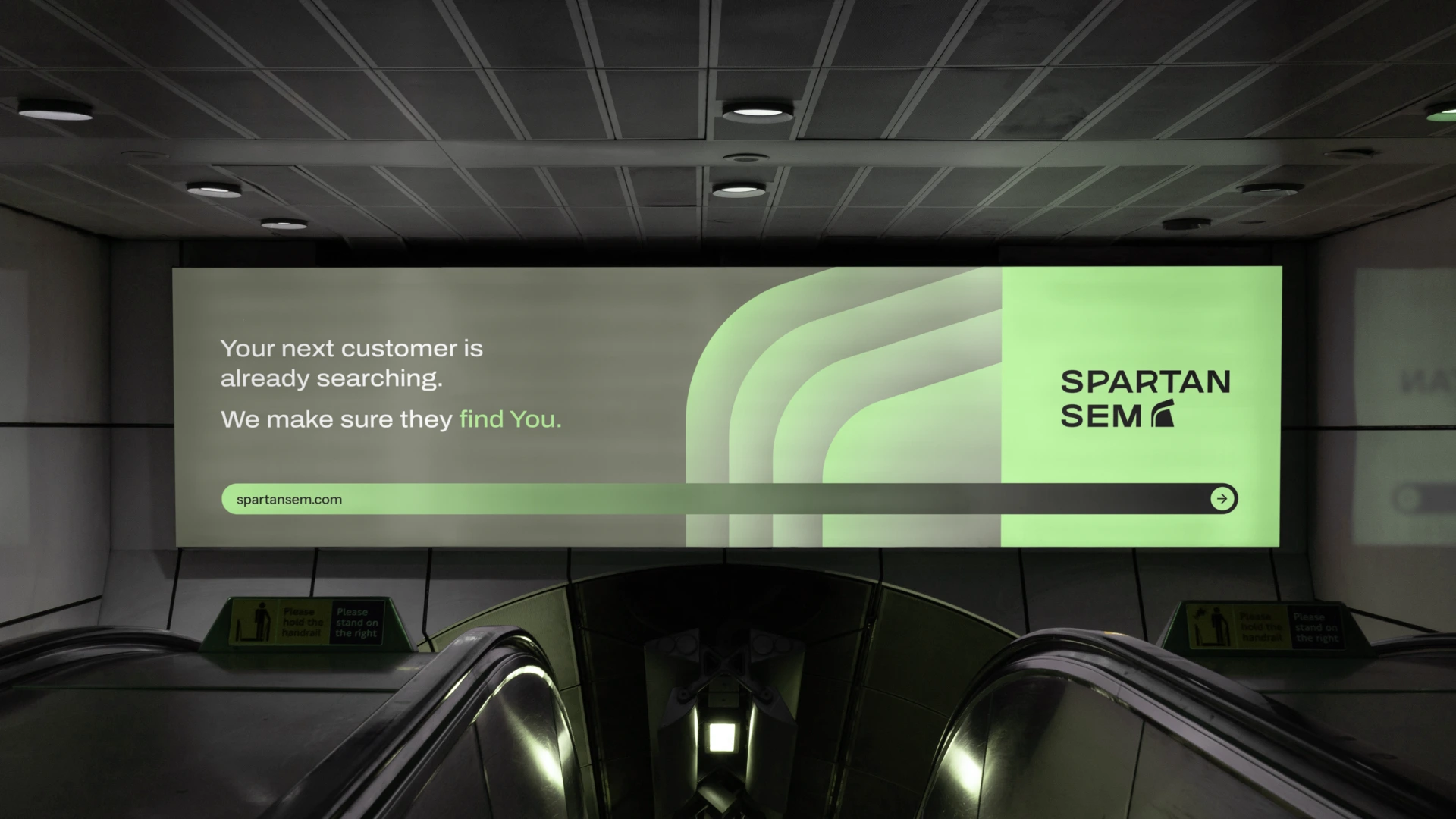
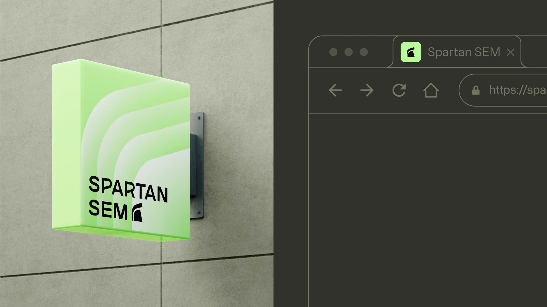
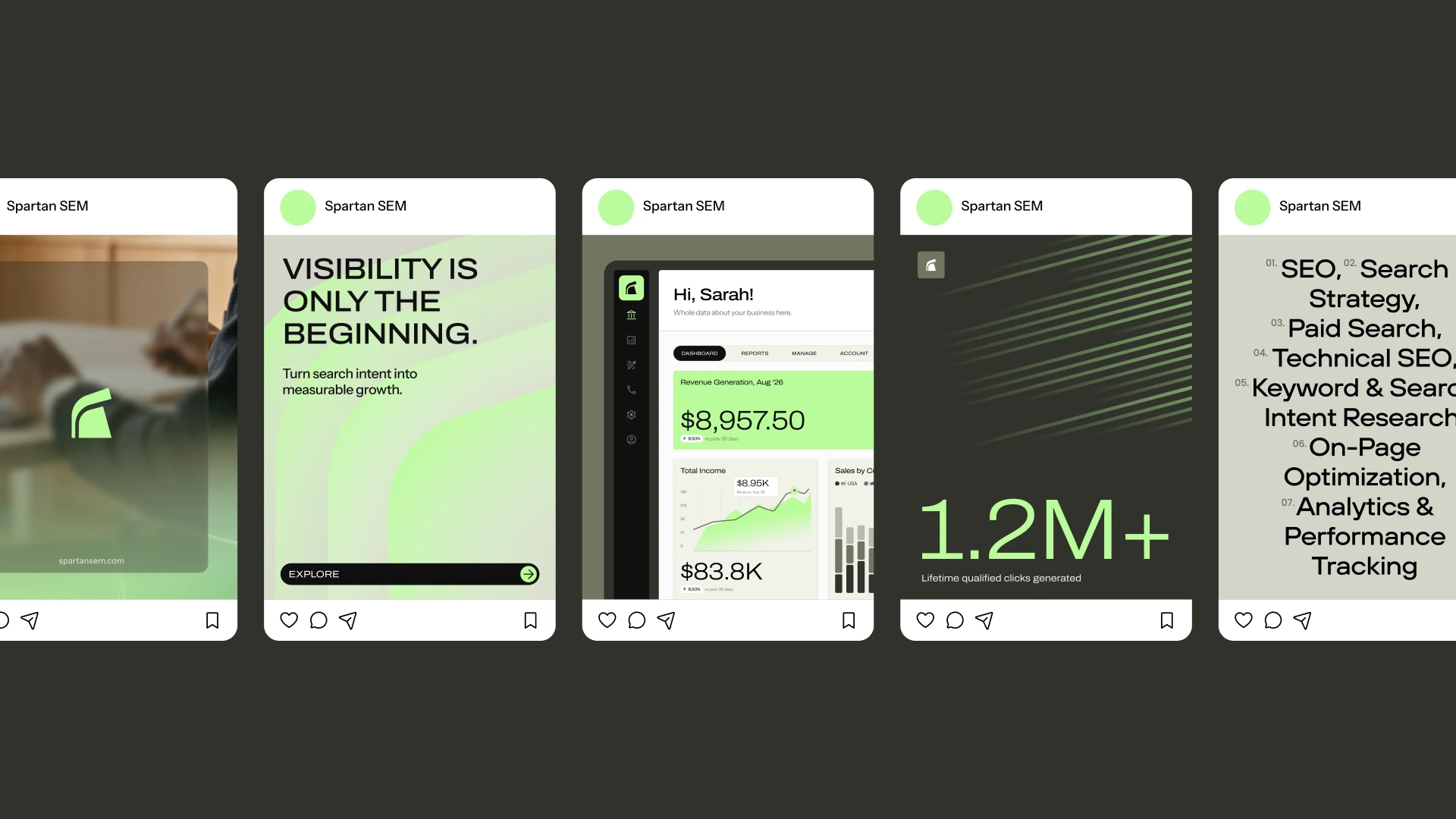
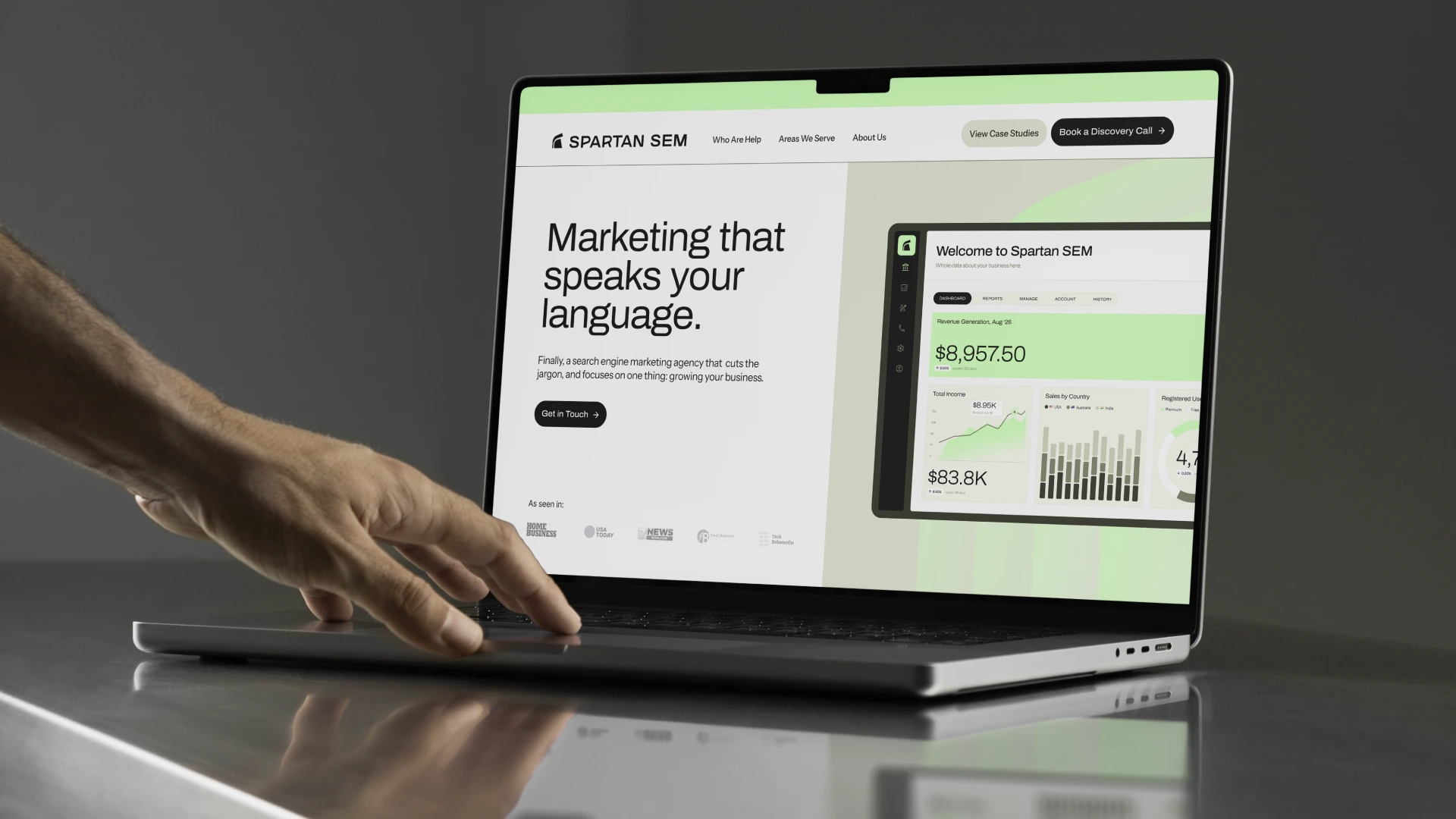
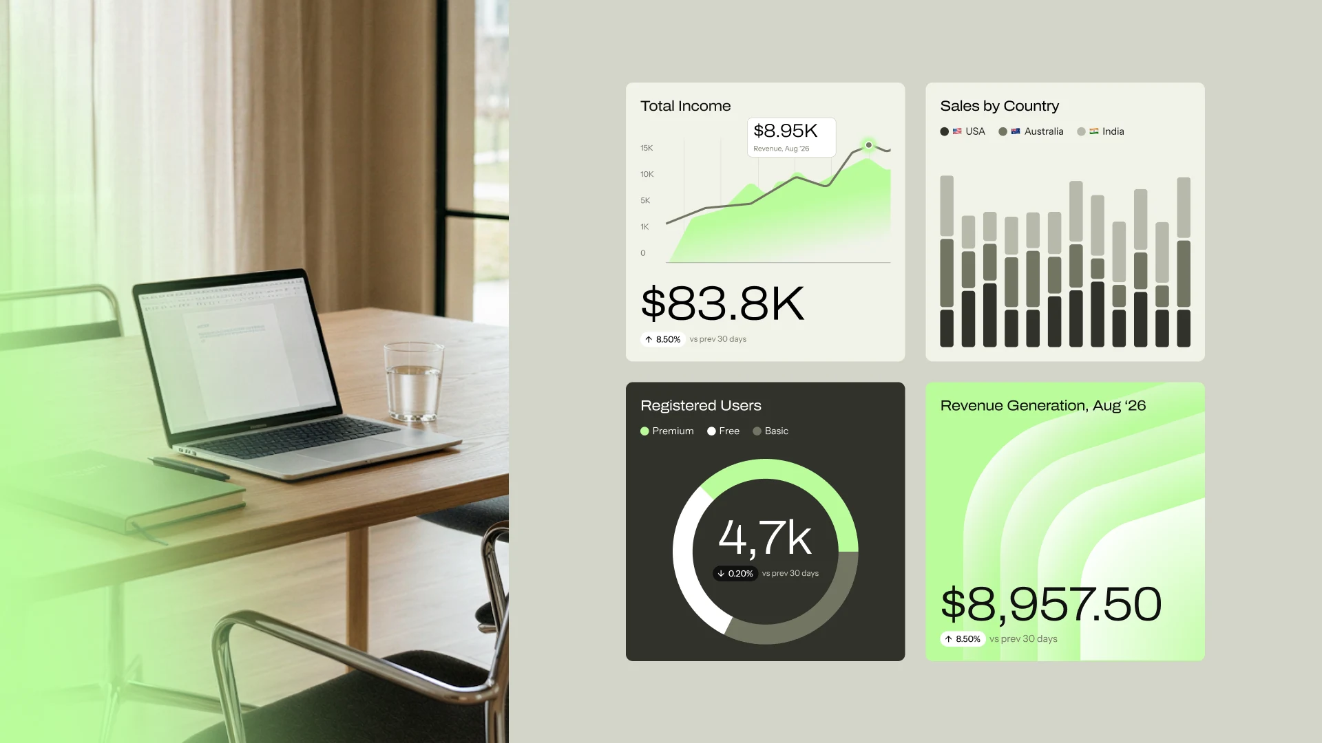
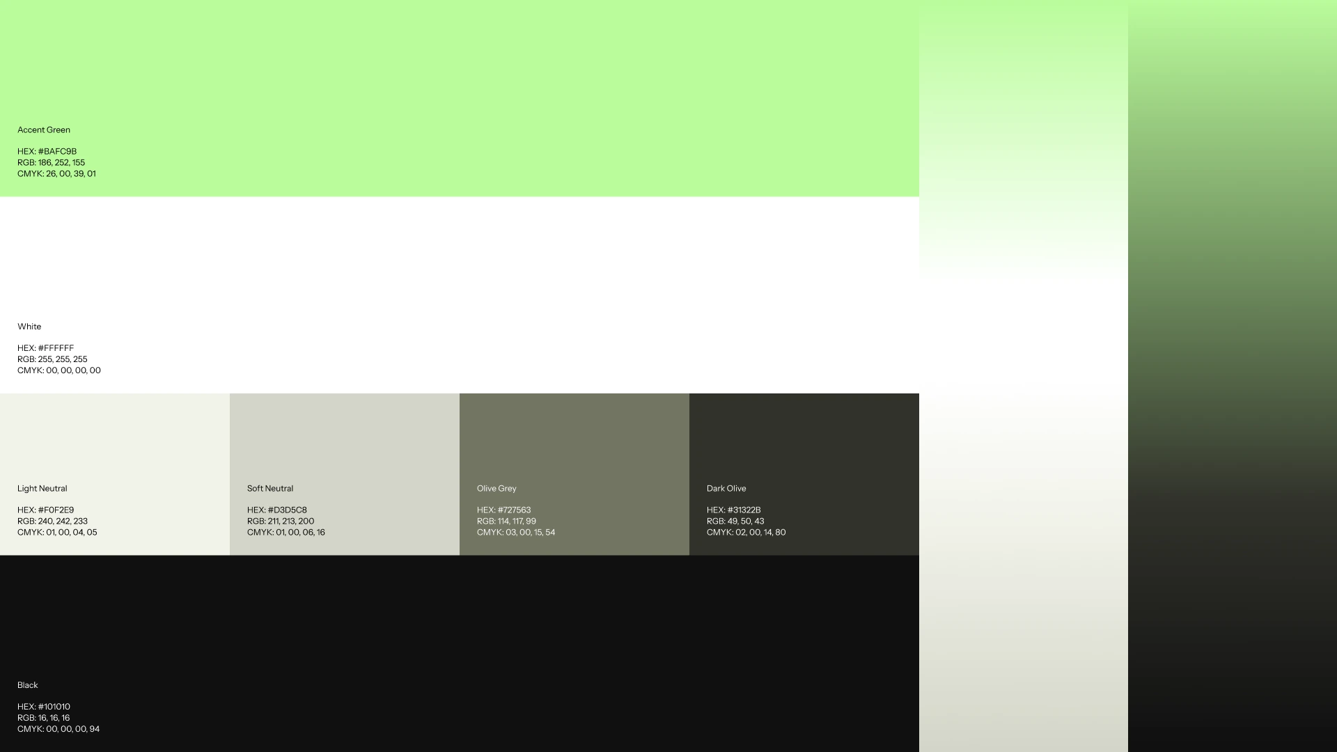
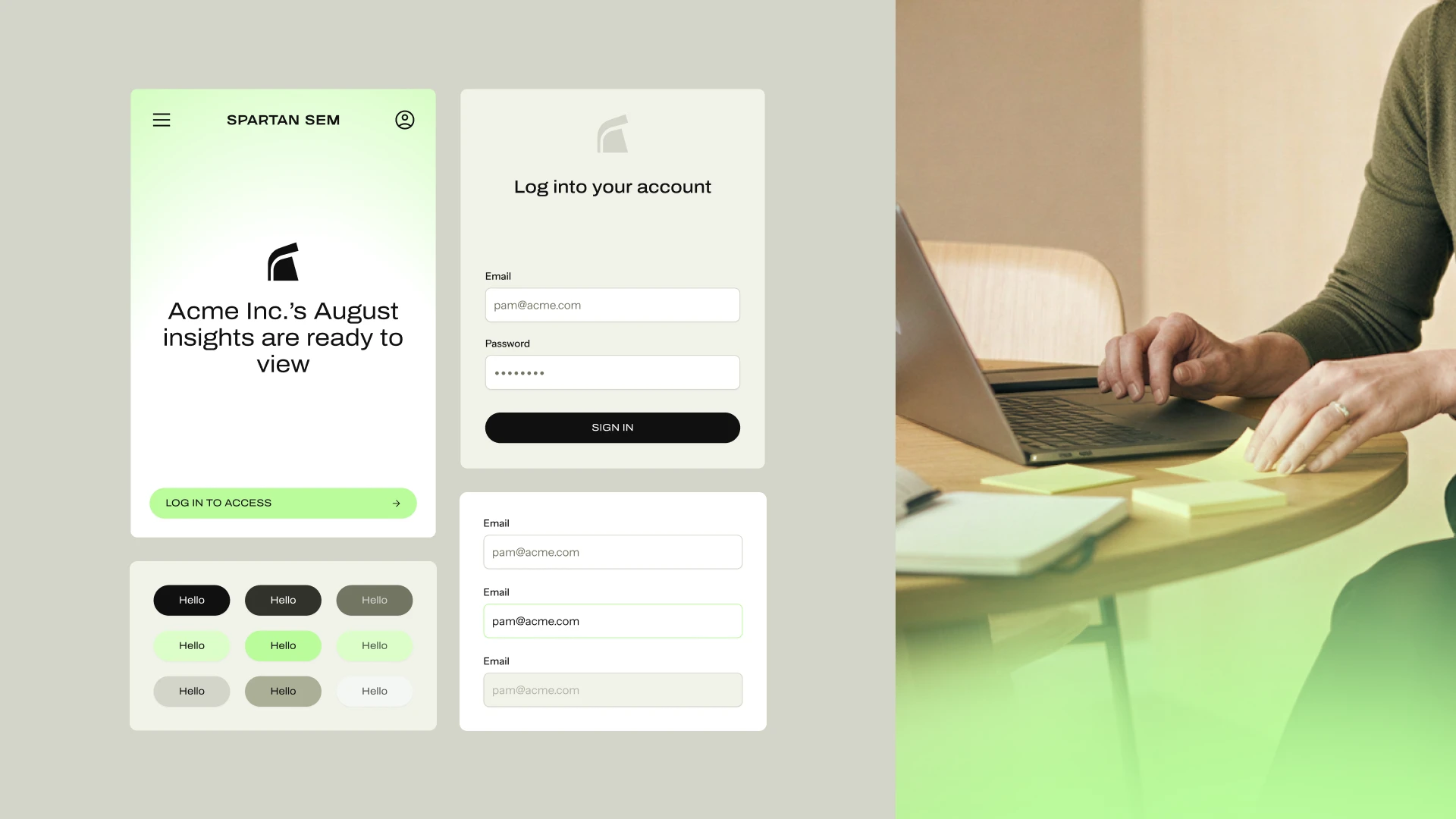
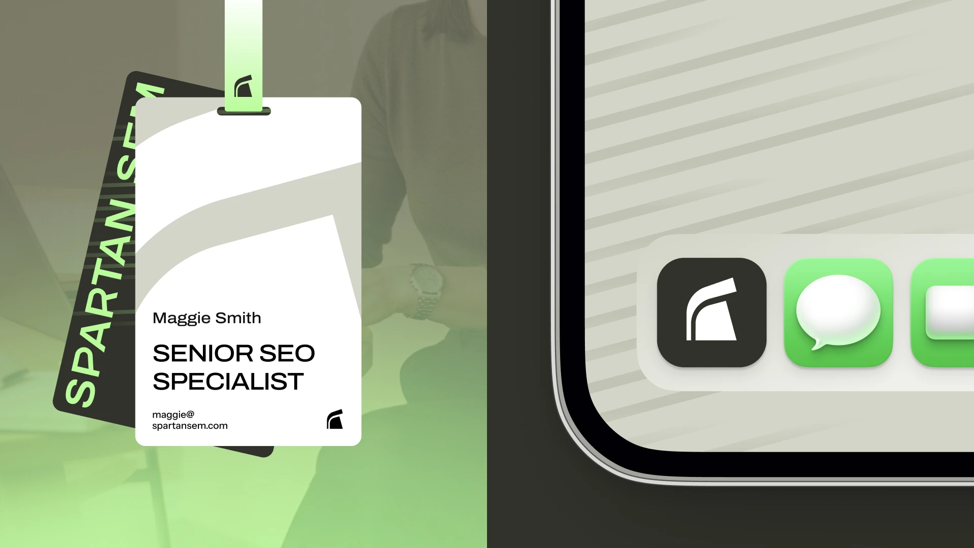
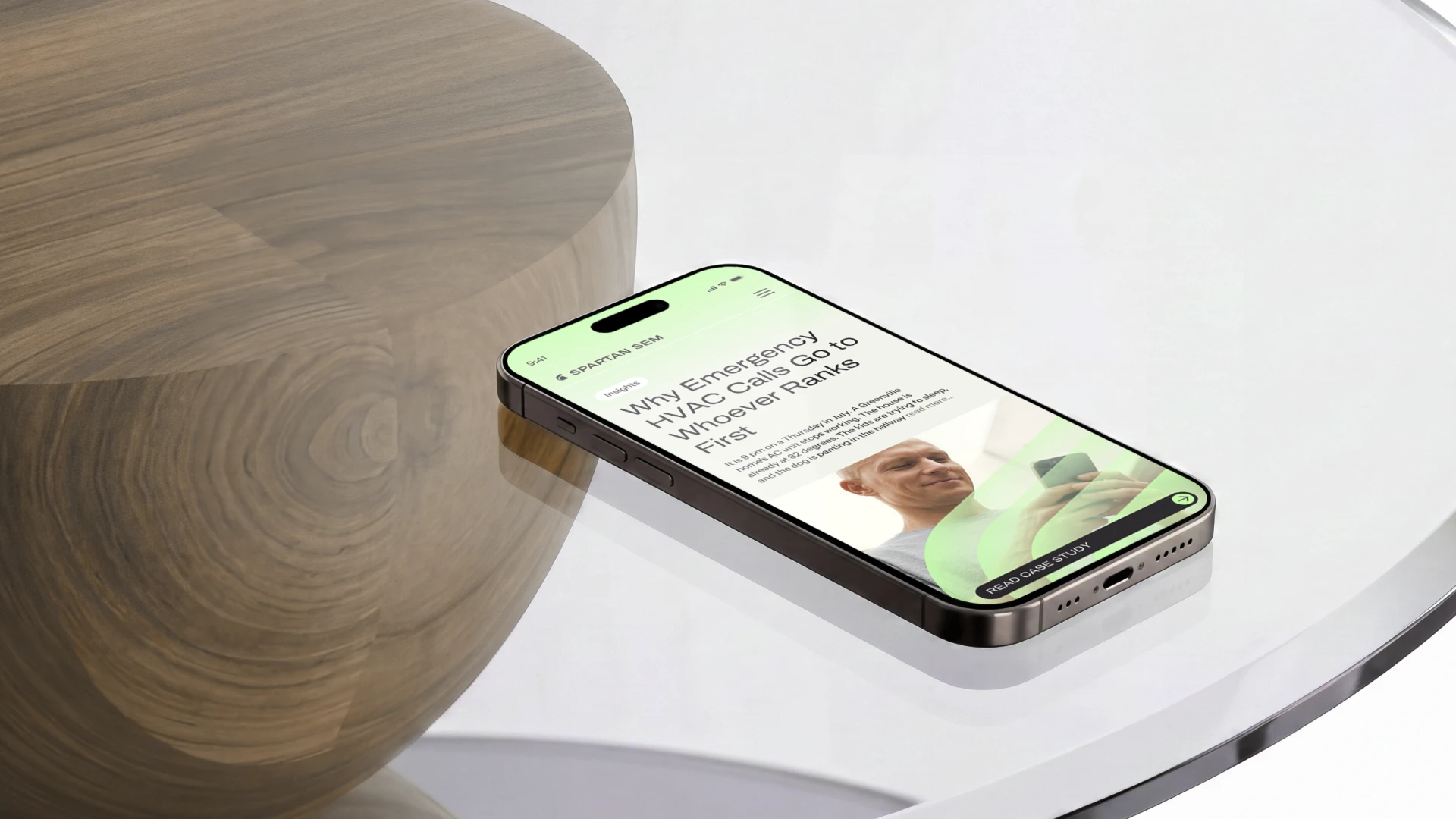
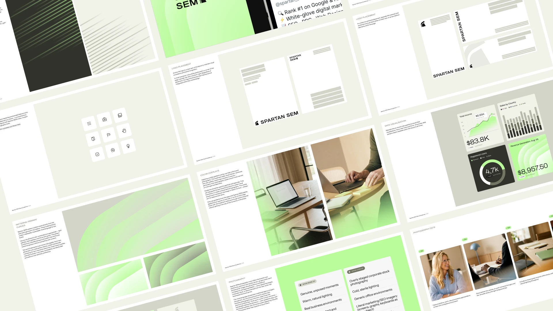
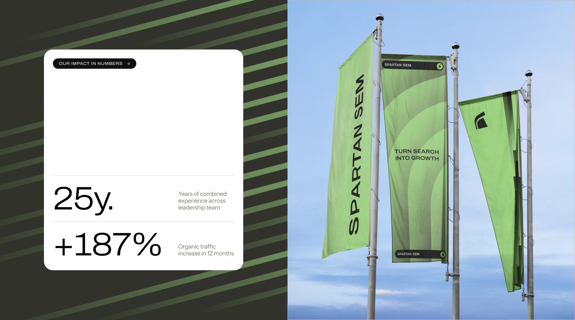
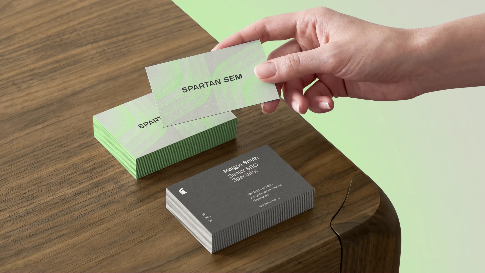
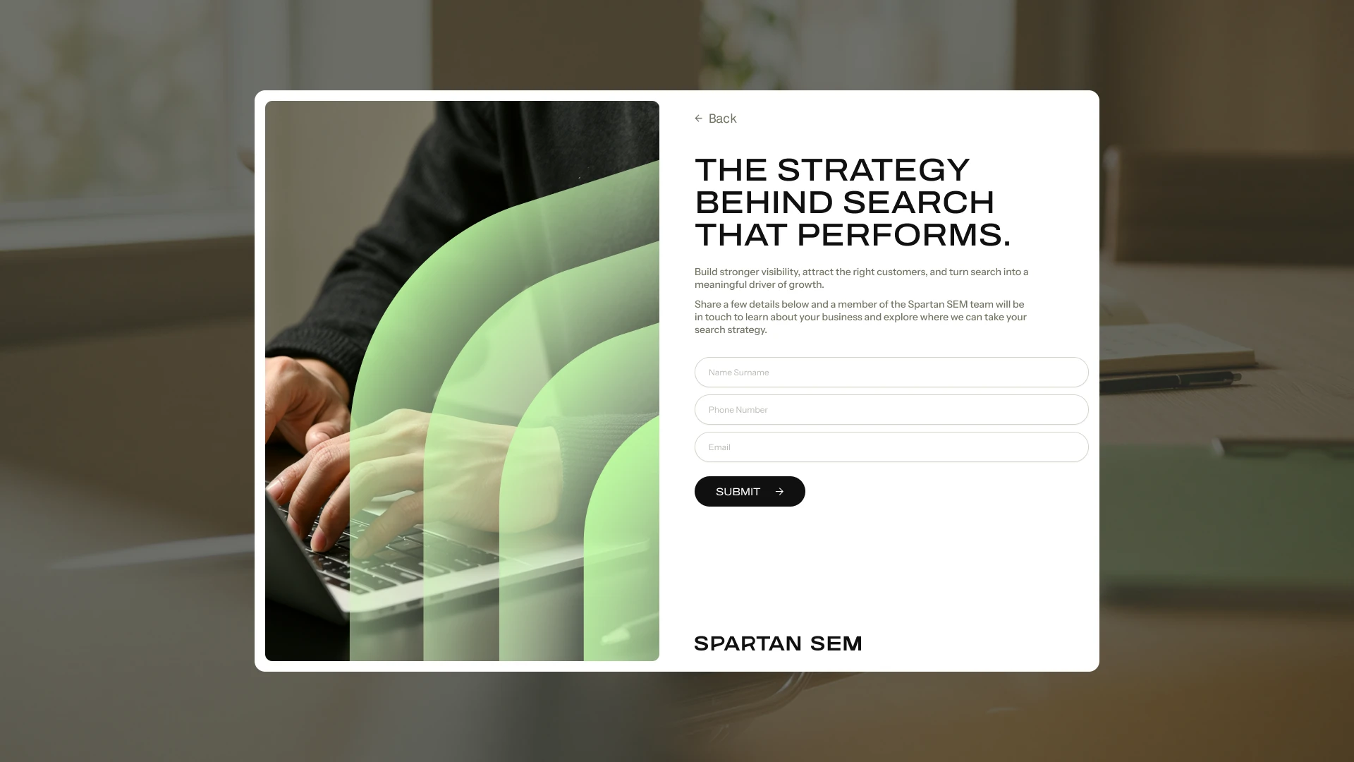
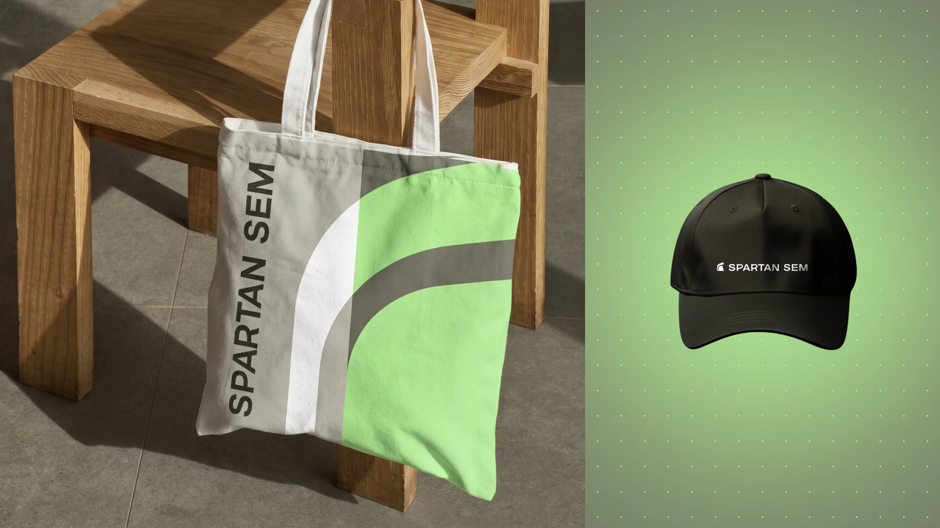
The final system paired a bold, expanded typeface with a fresh accent green and a considered neutral palette, supported by a flexible pattern language, defined photography direction, and a complete set of logo lockups built for scalability across digital, print, and product applications.
Outcome
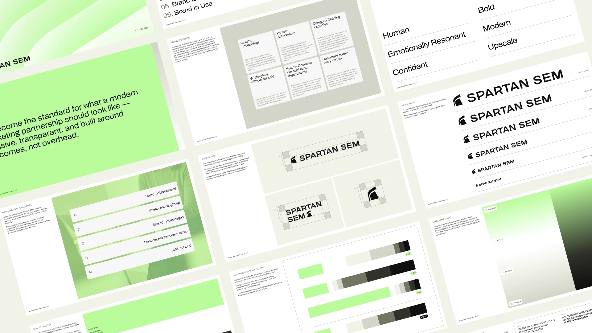
Spartan SEM emerged with a complete, premium brand identity - logo suite, color system, typography, patterns, and photography guidelines - delivered as a comprehensive brand manual alongside a full asset handover package. The result: an identity confident enough to compete for the biggest clients in the room, distinctive enough to stand apart from every direct competitor in the field, and flexible enough to grow with the business across new verticals and touchpoints for years to come.

Like this project
Posted Sep 3, 2026
A strategic rebrand for Spartan SEM, transforming its AI-generated identity into a premium brand designed to compete in high-stakes digital marketing markets
Likes
11
Views
113
Timeline
Jul 14, 2026 - Aug 25, 2026
Clients
Spartan SEM