Preventive Health Brand Identity Refresh
Darya Batyr ✦
Verified
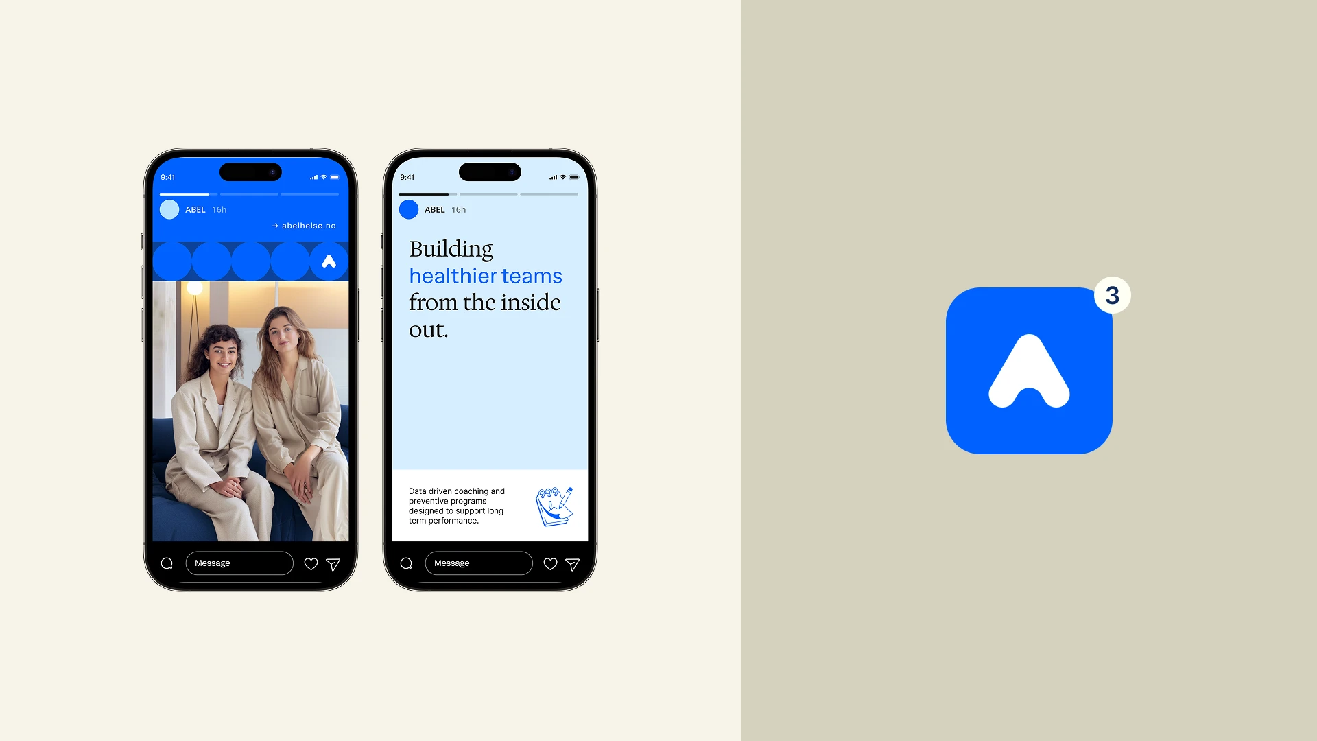
ABEL
Preventive Workplace Health - Brand Identity Refresh & Guidelines
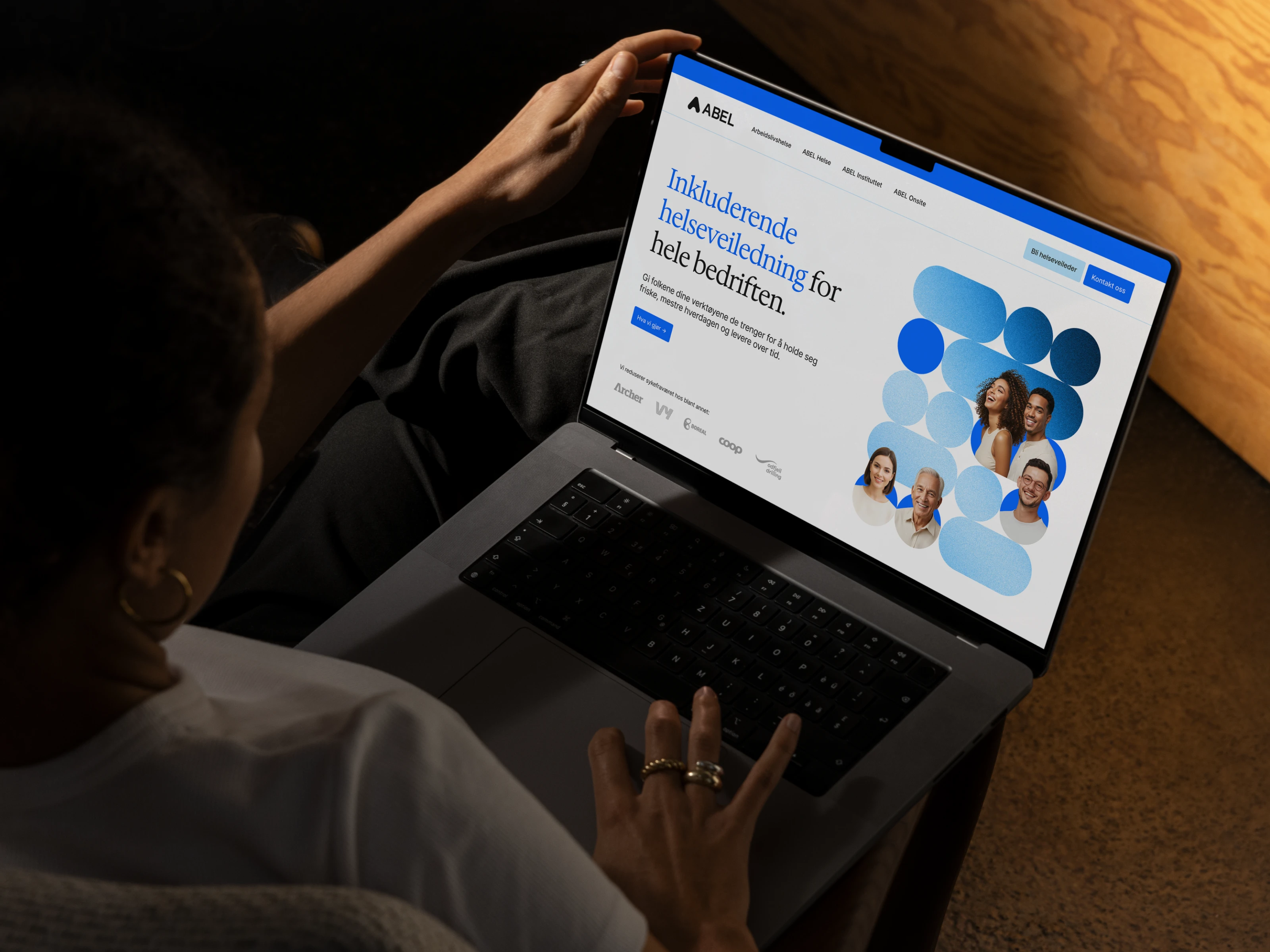
I partnered with ABEL, a Norwegian preventive workplace health company, to transform their existing identity into a structured, scalable brand system - built to support both institutional credibility and human connection across a rapidly growing organization.
The outcome is a refined, future-ready identity designed to perform across digital, print, and operational environments, while remaining accessible to internal teams working primarily within Google Workspace.
The Challenge
ABEL operates in a complex space. They sell into organizations - HR leaders, executives, and government bodies - while serving individuals through health coaching and preventive support. The brand needed to communicate credibility, structure, and measurable outcomes at the top level, while still feeling approachable and human to the end user.
We positioned the brand around a clear core idea:
Calm competence in workplace health.
Rather than choosing between corporate and human, the identity is built on controlled tension:
Professional ↔ Approachable
Structured ↔ Human
Minimal ↔ Warm
Clinical credibility ↔ Modern clarity
The goal was not to simplify this tension, but to systemize it - so it could scale consistently across the organization.
Process
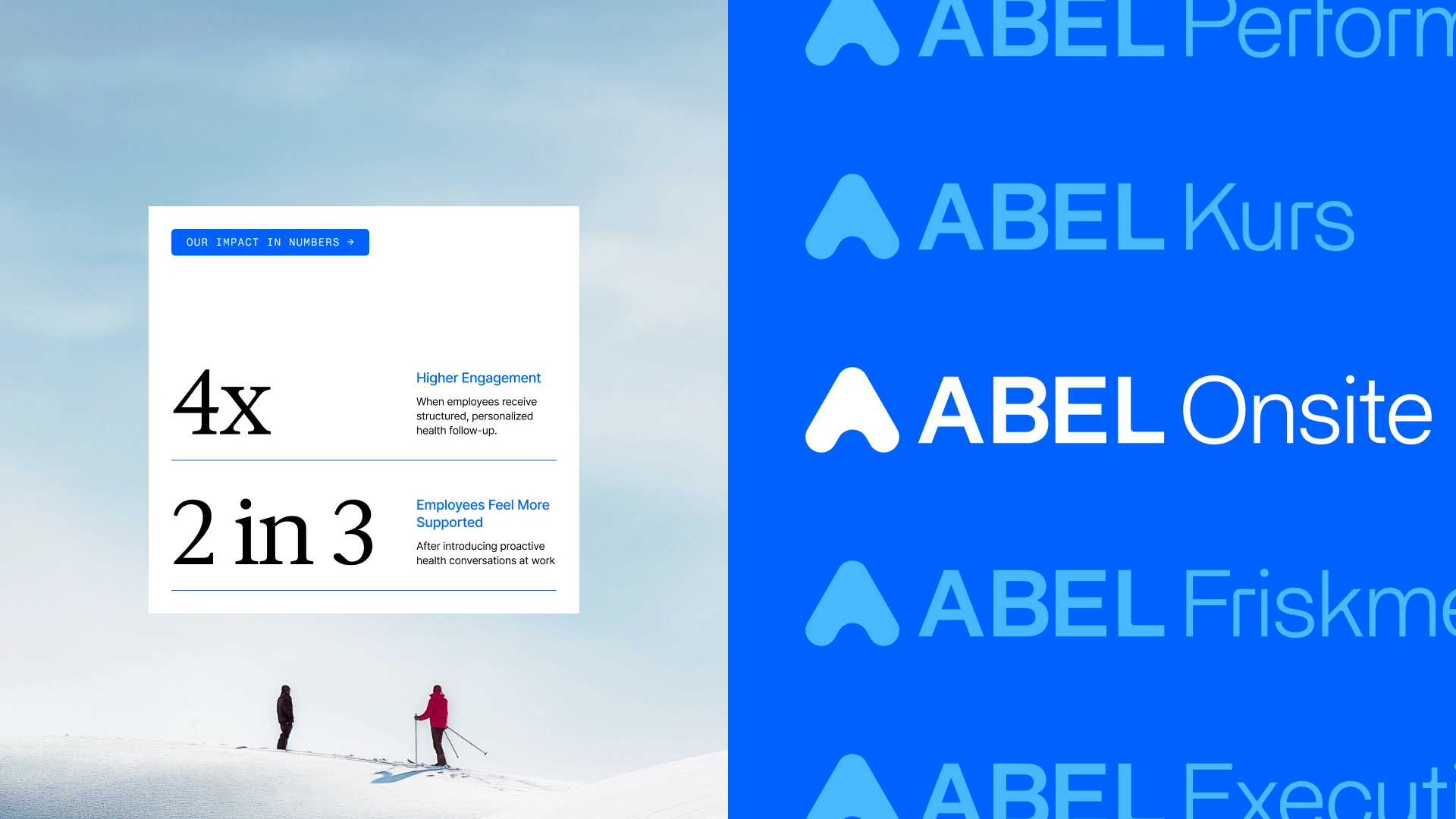
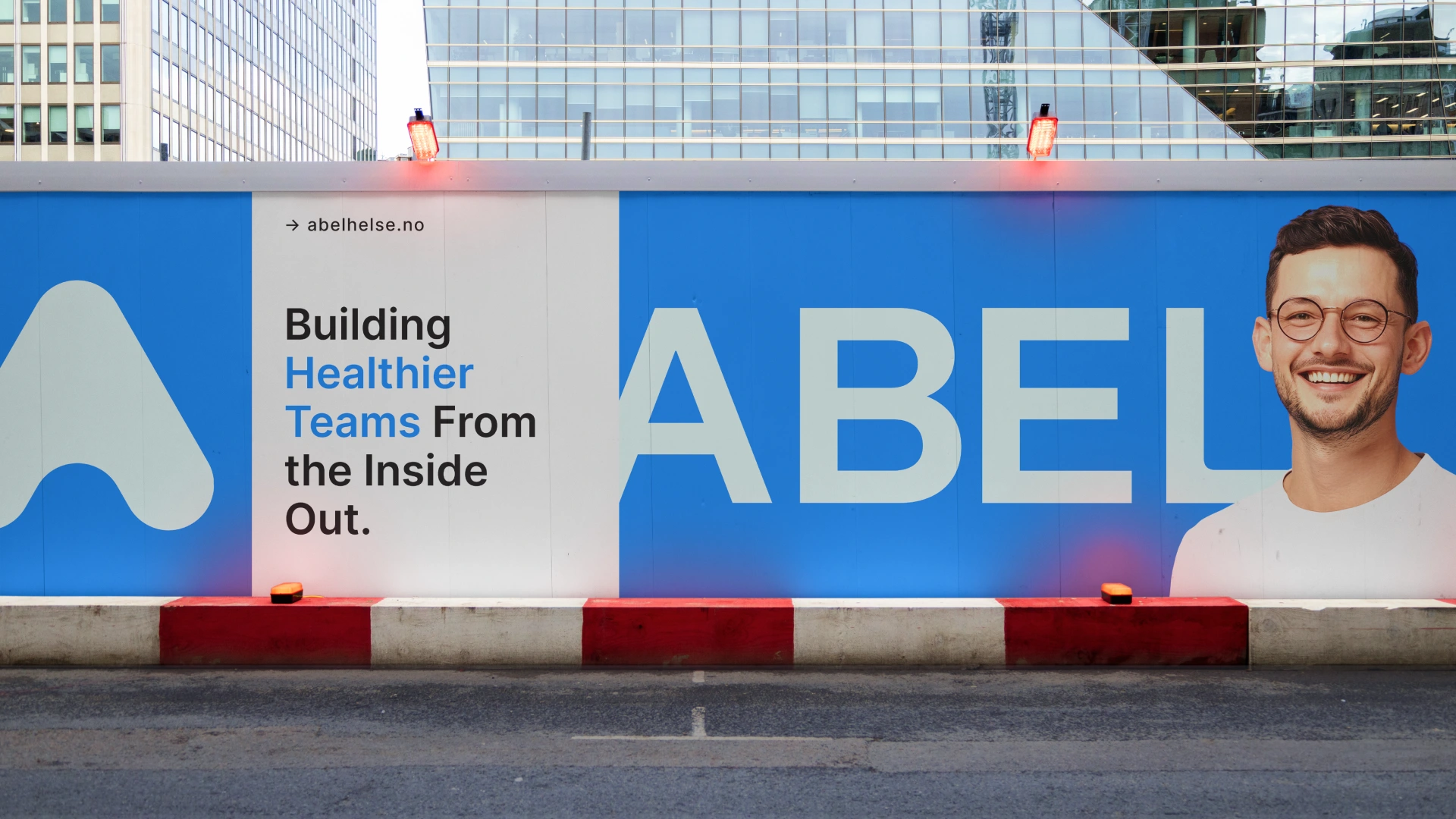
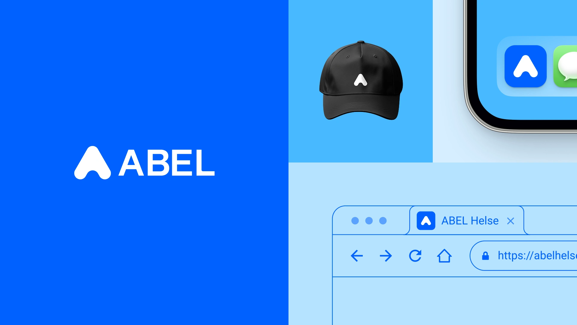
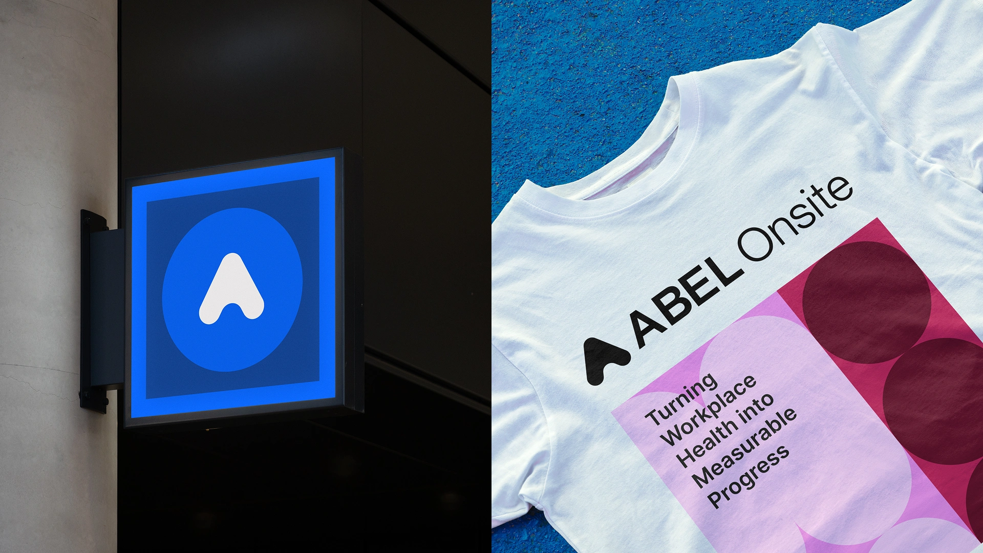
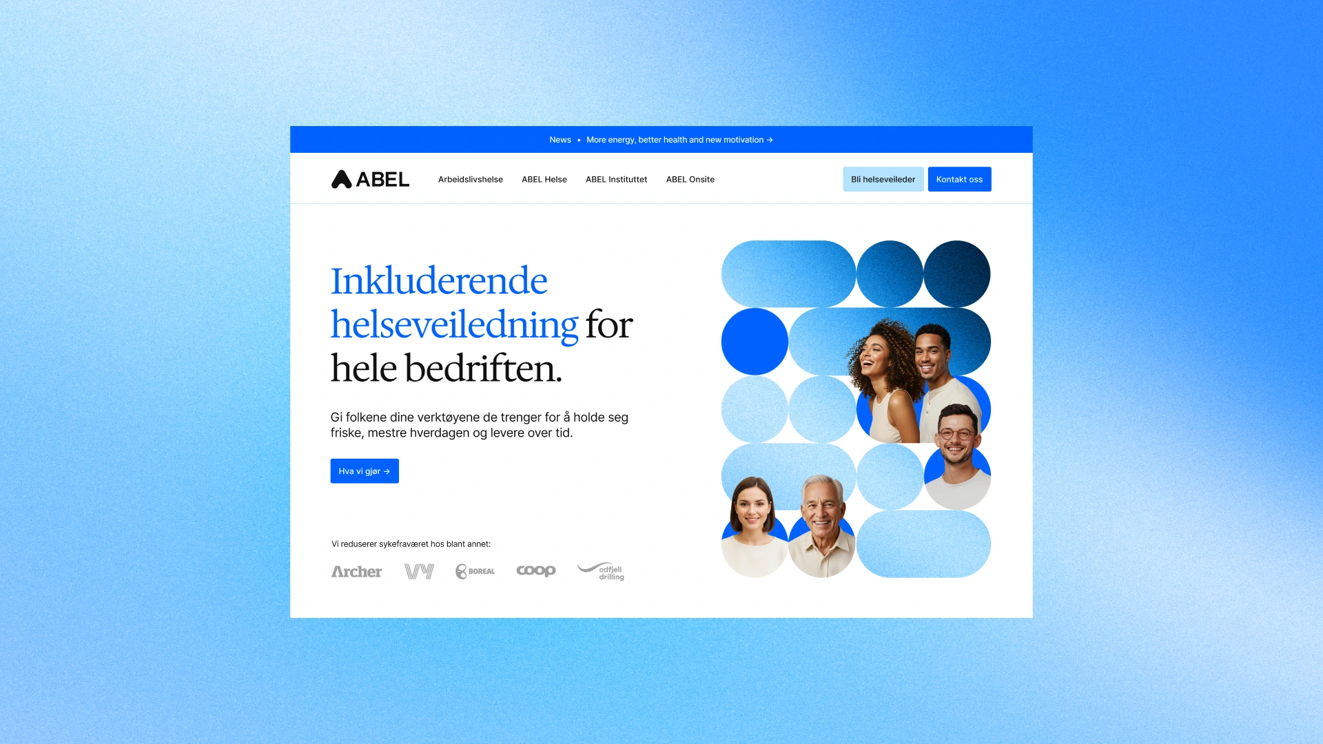
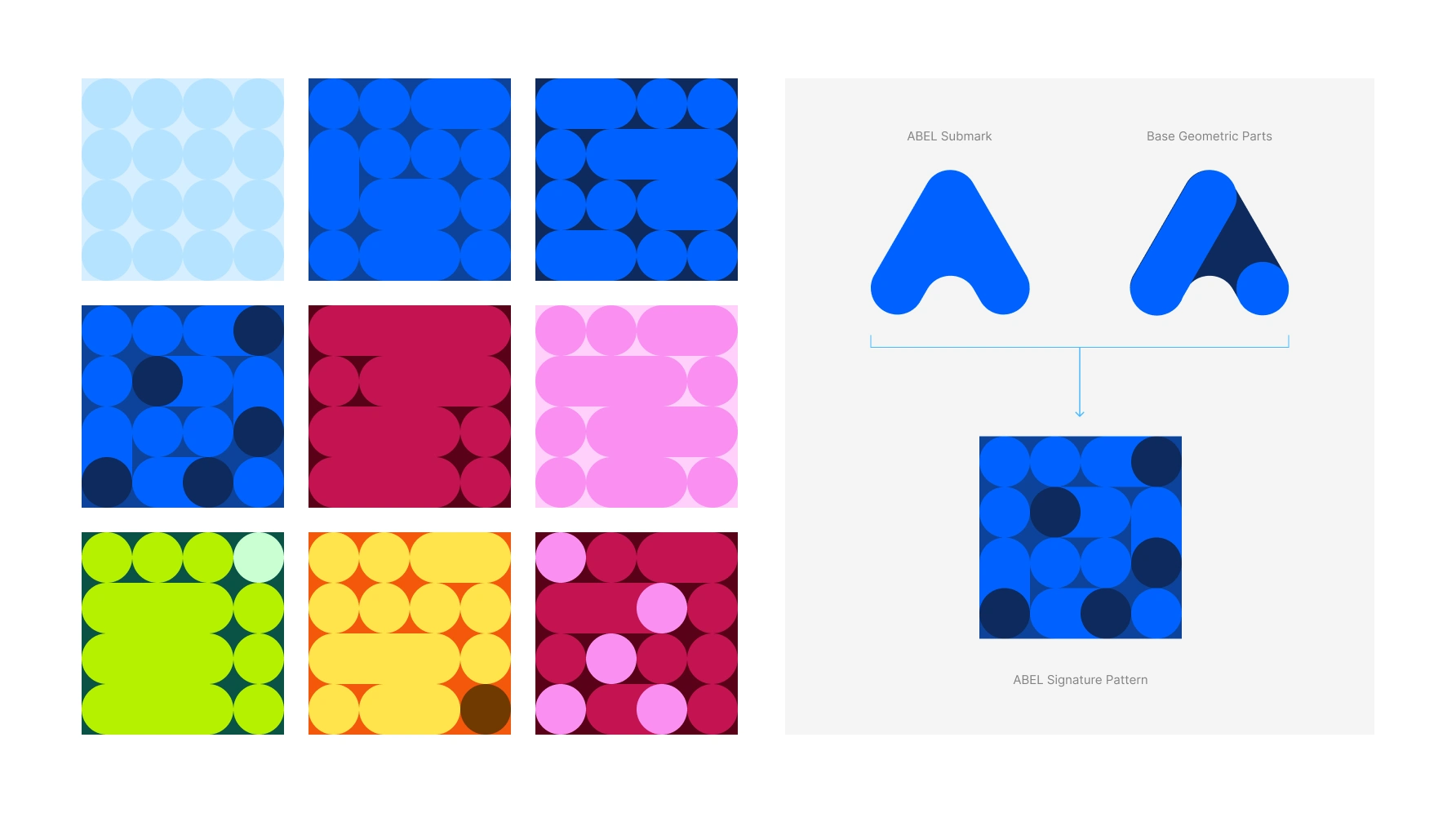
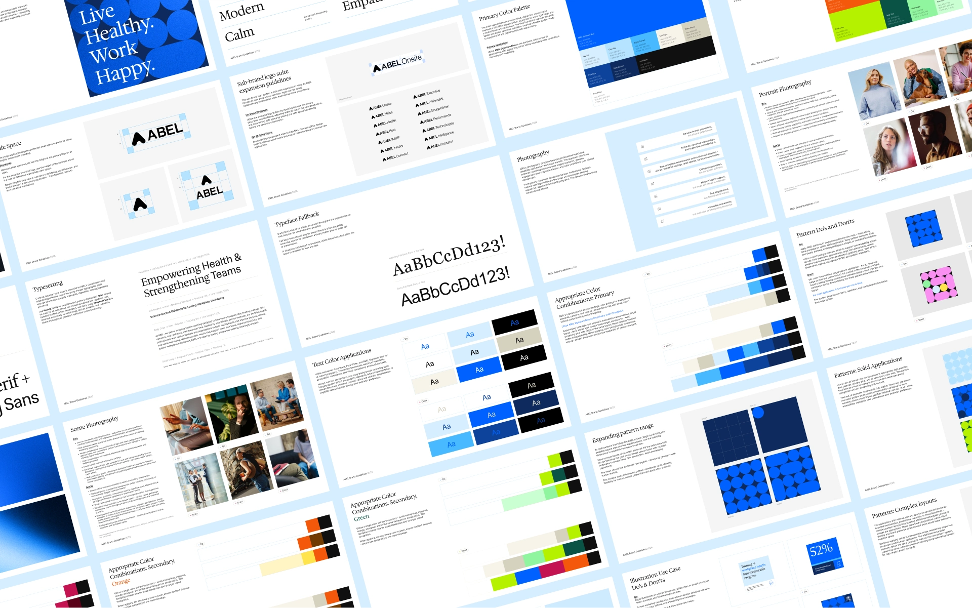
The work focused on evolving ABEL’s identity into a system that could scale with the business. Rather than replacing the logo, we refined it - introducing subtle geometric improvements to balance, spacing, and overall cohesion.
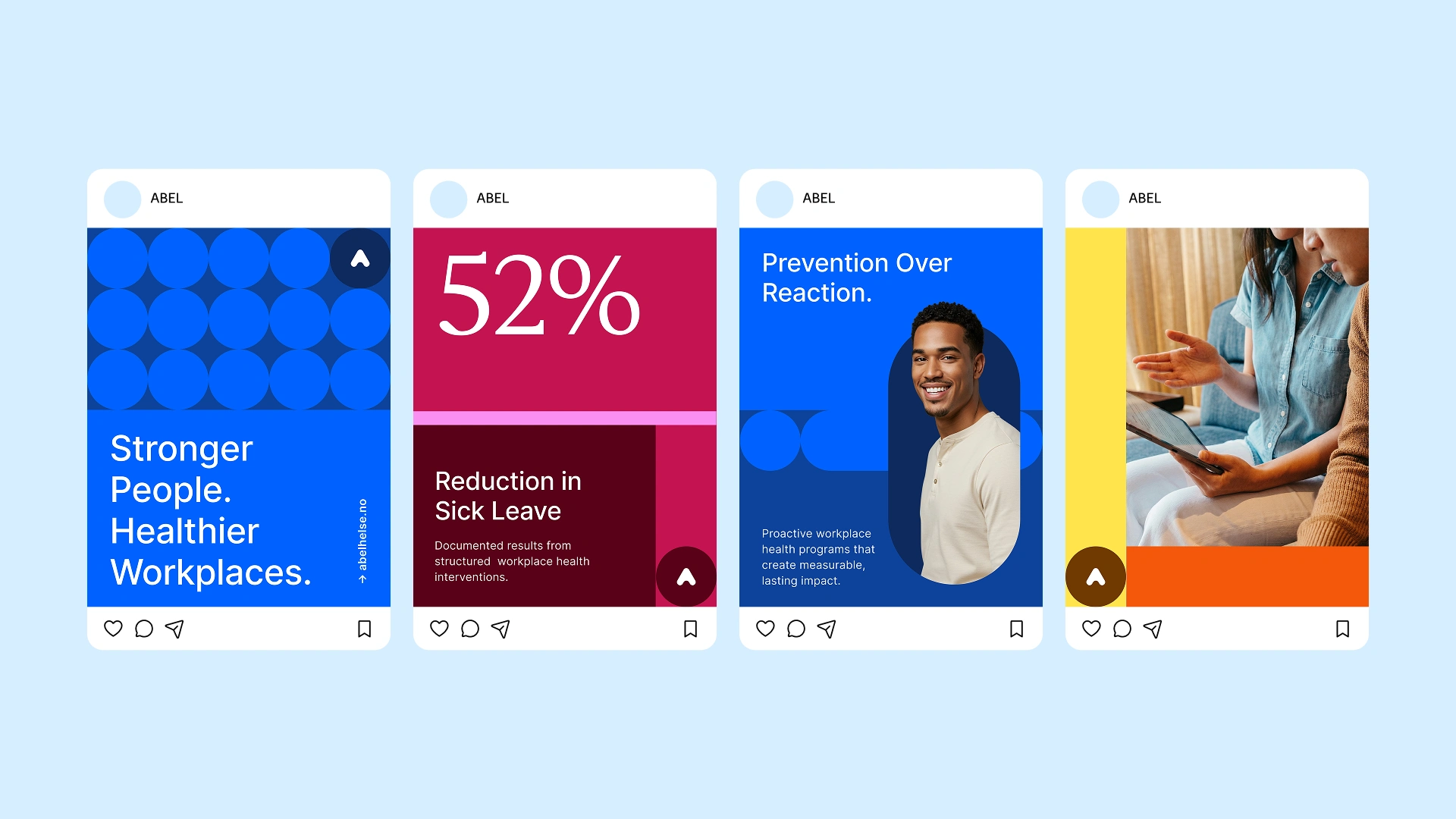
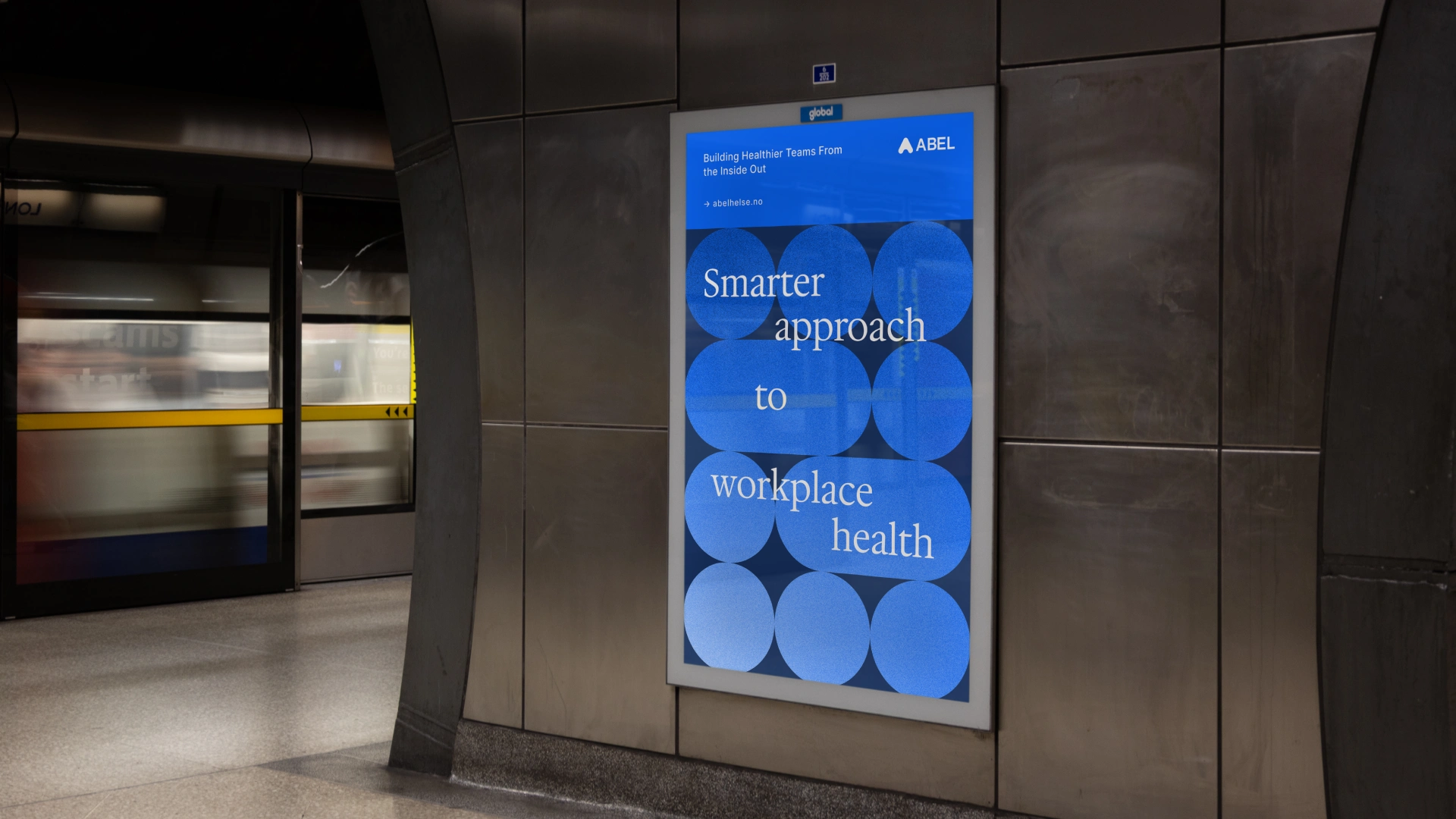
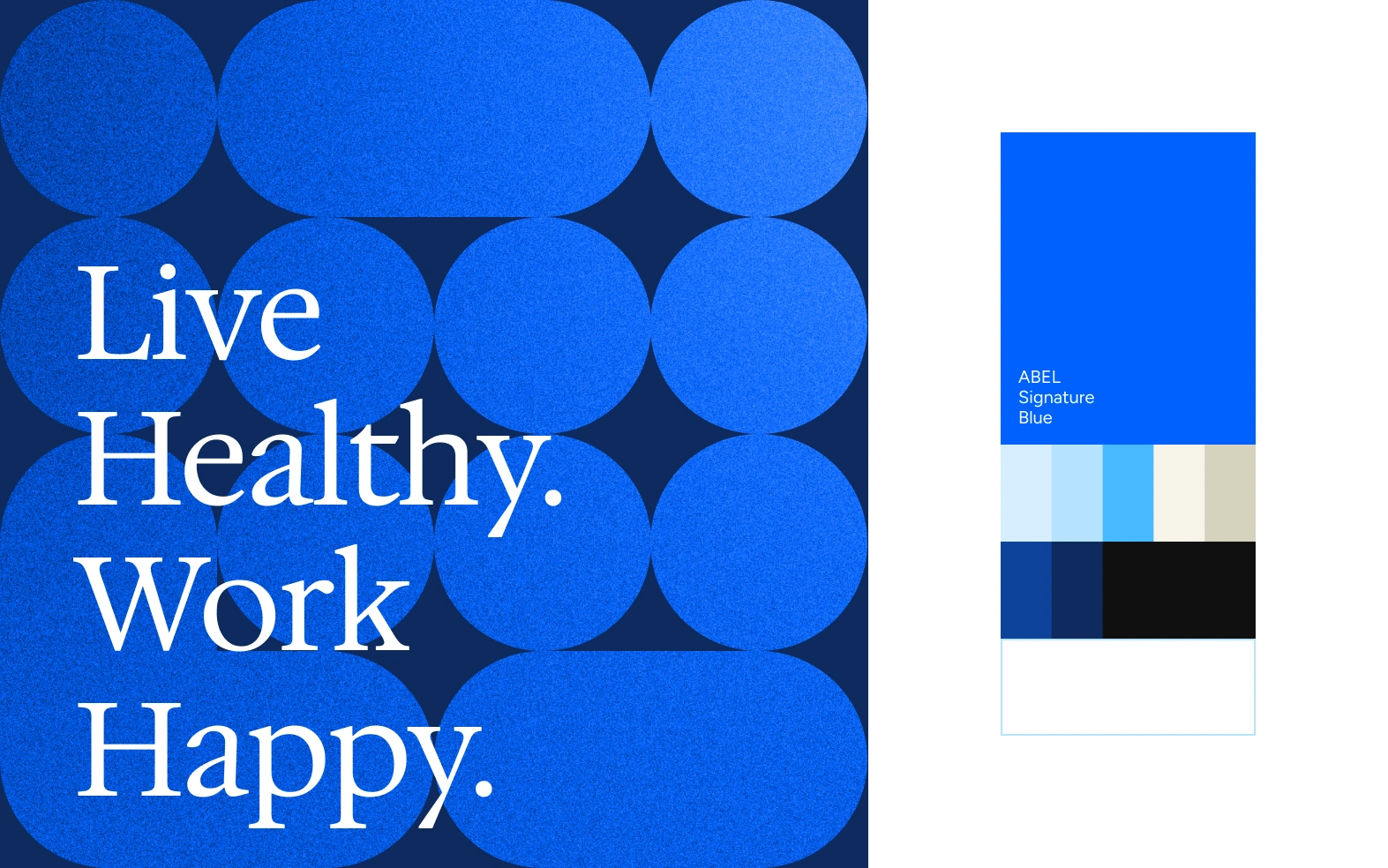
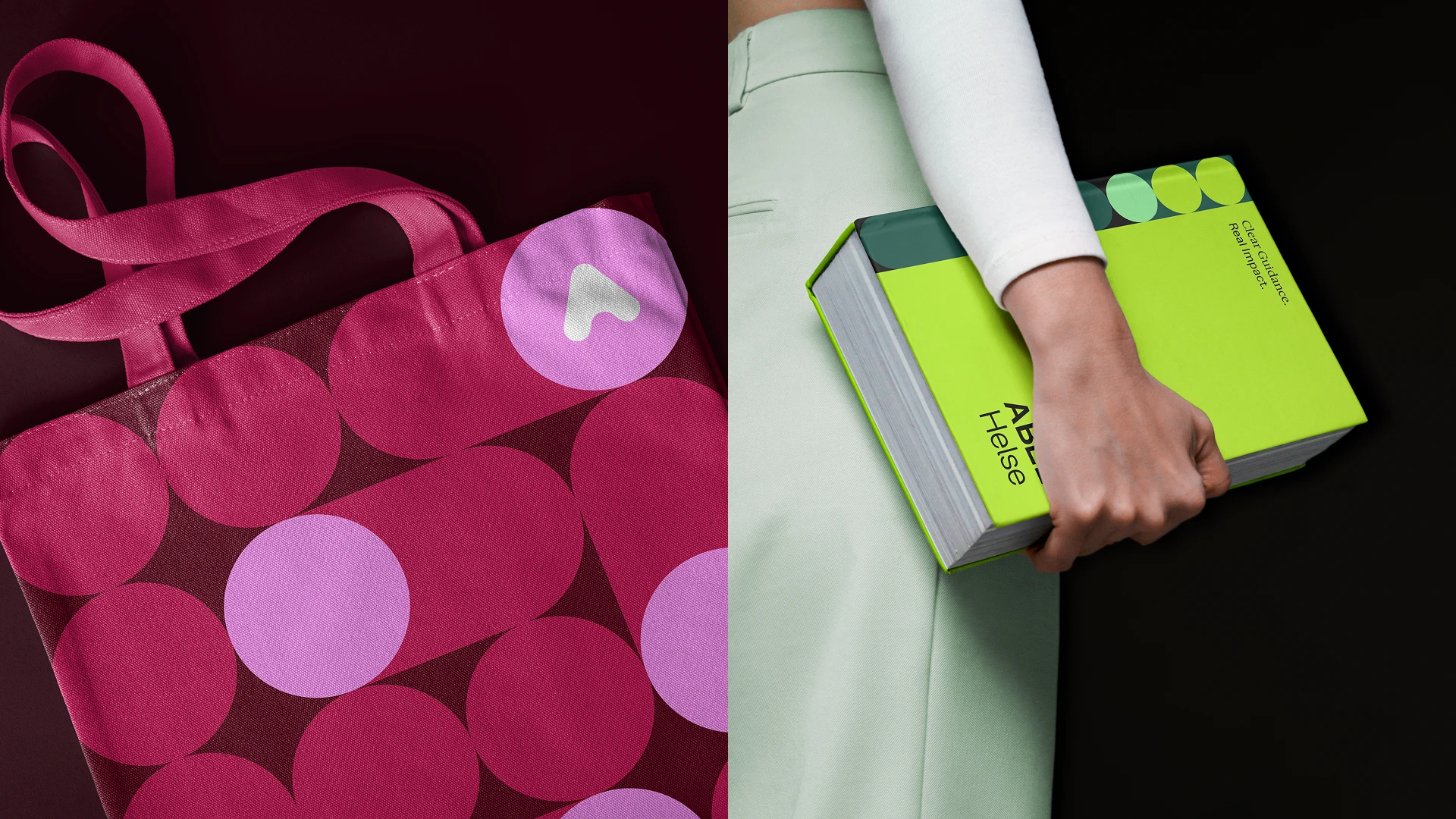
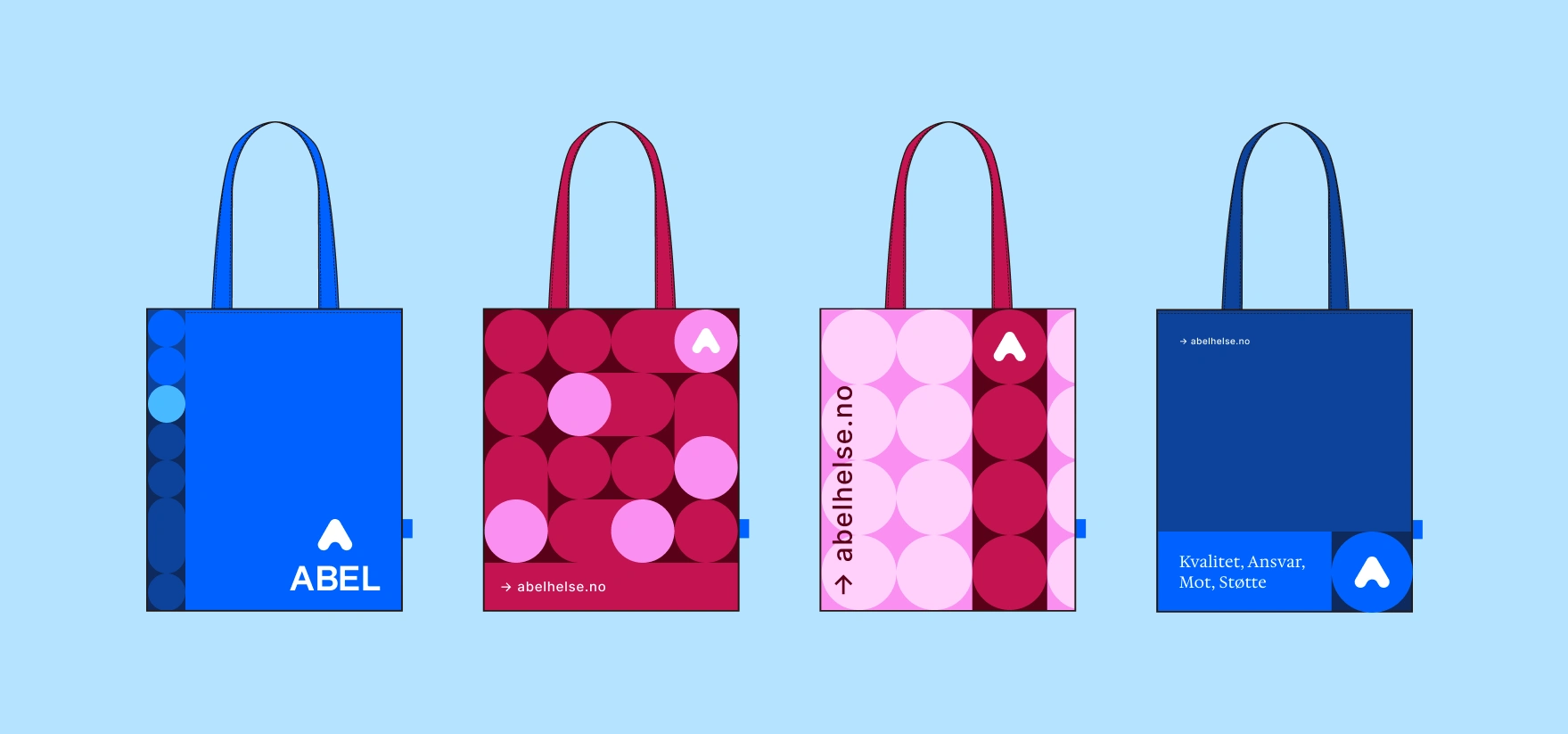
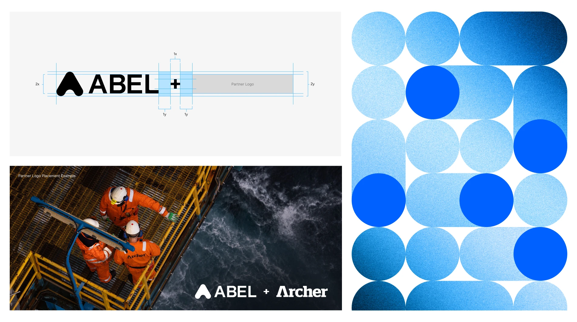
From there, we built out a more intentional color system. The core blue was expanded into a full tonal range to support flexibility across digital and print, while secondary colors were elevated beyond functional use into active parts of the brand expression - bringing more range without losing control.
The typography system was designed to be both structured and practical. A combination of Hedvig, Inter, and Fragment Mono establishes a clear hierarchy while remaining fully compatible with Google Workspace, making it easy for internal teams to implement consistently.
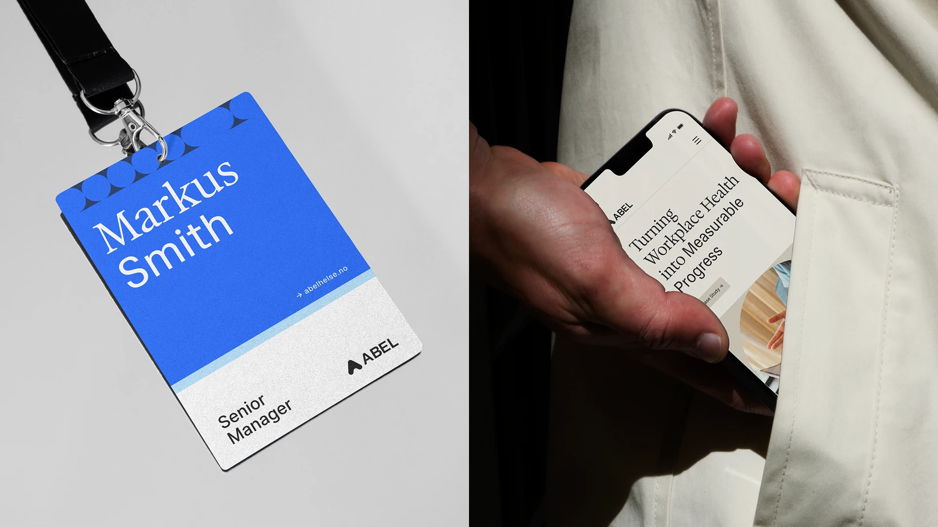
This was supported by a broader visual language - patterns, illustration, and detailed photography directions - designed to be modular, repeatable, and easy to apply across a wide range of use cases.
All of this was consolidated into a comprehensive, highly usable brand manual, covering sub-brands, co-branding scenarios, and everyday application.
Outcome
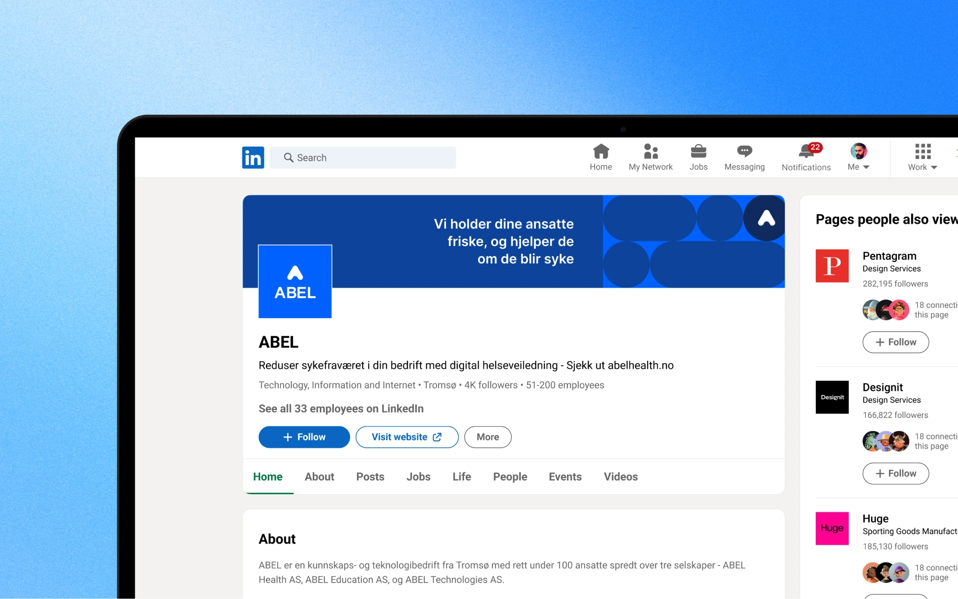
ABEL is set to operate with a brand that is clearer, more consistent, and built for scale, with a system ready to perform across presentations, product environments, print materials, and partnerships - while clearly communicating the company’s value: structured, preventive health programs with measurable impact.
Like this project
What the client had to say
Working with Darya on ABEL’s brand refresh was a great experience. She was thorough and detail-oriented. The final brand guidelines pushed our brand in a far more professional and consistent direction.
Henrik Holt, Abel Technologies
Mar 12, 2026, Client
Posted Apr 27, 2026
A strategic brand refinement, focused on strengthening credibility through logo refinement, strategic design system, and digital-first brand consistency.
Likes
0
Views
36
Timeline
Jan 8, 2026 - Mar 12, 2026
Clients
Abel Technologies