Creative Capital's Work | ContraWork by Creative Capital/High-craft
/Internet souls
/Ahead of the curve
- $1k+
- Earned
- 1x
- Hired
- 5.0
- Rating
- 43
- Followers
Sthorm Riders Framer Website Design Olera · Social Media
Social as an extension of the brand, not an afterthought. We extended Olera's world into social, same palette, same organic textures, same restraint, alongside product photography that puts the Molecular Serum in use, on skin, in hand, in the everyday ritual it was designed for. One system, one story, across every touchpoint.
Follow the story at https://www.instagram.com/oleraskincare/ Olera · Packaging Design
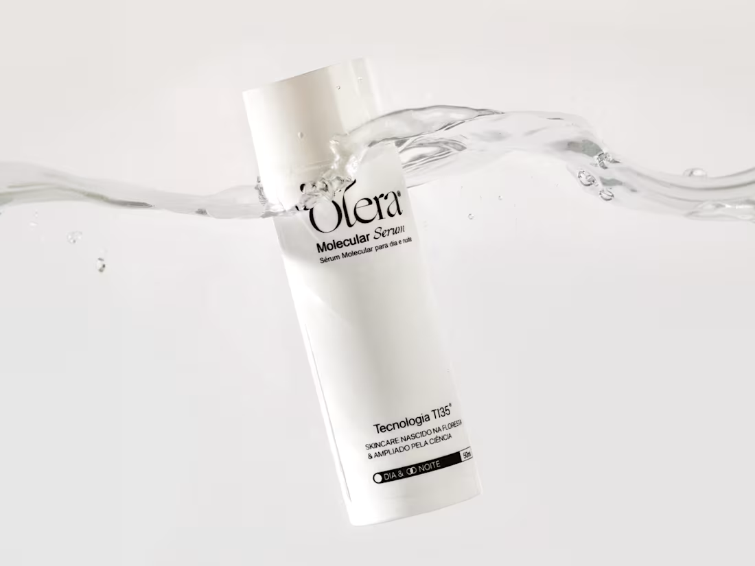
We designed Olera's first product, the Molecular Serum, both bottle and pack. The bottle stays deliberately minimal, a clean cylindrical form that lets the serif wordmark and TI35 mark do the talking without any extra noise. The pack carries that same restraint but picks up an accent color pulled straight from the brand palette, giving the line a way to differentiate future products without breaking the system. Every spec on the redlines, from type sizes to icon placement, was built to meet regulatory requirements for the skincare industry and market Olera launches in, so the minimalism is functional as much as it is aesthetic.
See more at https://www.instagram.com/oleraskincare/ Olera · Branding
We built Olera's identity around a single idea: science and nature as one force. The wordmark is set in a serif, a deliberate choice to bring sophistication and heritage into a category often dominated by cold, clinical sans-serifs. Its stroke varies in weight along each letter, thick to thin, echoing the organic, hand-grown nature of the açaí seed at the core of the brand. Deep in the Amazon, this is where the story starts, and where the palette, textures, and typography all point back to. Earthy greens, organic motion, and a mark that reads both clinical and rooted. Beauty as regeneration, not extraction.
See more at https://www.instagram.com/oleraskincare/