Contra - A professional network for the jobs and skills of the future
Discover
Sign Up
Post a job
Sign Up
Log In
Filters
Projects
People
Filters
Featured
Web developers
Content creators
Graphic designers
Product designers
AI developers
Motion designers
Social media marketers
Animators
Video editors
Projects we love
Projects we love
Standout projects making waves around the web
View more
Message
108
Andrea DiNardo
max
The Compression Company: Landing Page Copy + Narrative
108
4K
Message
88
Tiago Rosado
pro
Mostly Sunny | Framer Development
88
3.5K
Message
150
Stacy · Heed Collective
pro
Brand Identity · Specialty Coffee Cosmetics
1
150
4.4K
Message
34
Jon Howell
Lyft Pink
34
825
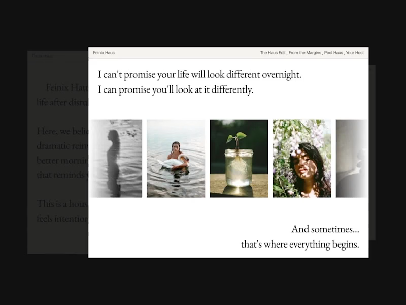
Web design projects using Framer
Framer
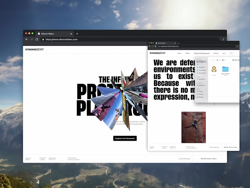
The best modern websites built on the leading web design tool, Framer
View more
Message
25
Nico — Brand & Logo Studio
max
Stickier — A Brand Built to Scale Everywhere
25
1.6K
Framer is the leading tool for building websites, fast
Hire experts
Message
21
Iñaki Palacios Añaños
pro
Artica Capital — High-Performance Private Equity Website
21
759
Message
18
Vítrea Studio
max
Tadaima Website Development Project
18
374
AI projects
AI
New projects from the best AI creators
View more
$2.5K+ earned
Message
39
Oleksii Strichyk ✽
max
Mindprint Platform Rebrand & AI Content Experience
39
2K
Message
41
Daniel G Bright
max
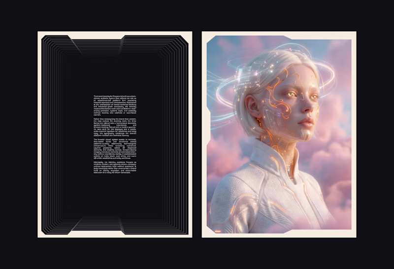
SUPAHUMANS — The AI brand that refused to look like one
41
1.9K
Message
33
Sian V.
pro
nome.art • Artist Portfolio Website
1
33
1.2K
Message
21
Cara Ellis
max
Guerilla Marketing Shirt Artworks and Design for Conduct AI
21
747
Brand design projects
Brand design
Bold visual identities and branding systems created by top independent designers

View more
Message
35
Afton & Sebastian • Branding & Web Design
max
Agape Match | Branding + Kajabi Website
1
35
1.5K
Message
29
Filip Panov
max
Ctrl+Shift Brand Identity Project
29
562
Message
26
Loreta Lazarova
pro
Everbloom / Packaging Design / Supplements
26
945
Message
25
Alec Minimalec
pro
Rebranding uBloom | Creative Agency
25
425
Video editor projects
Video editing
Creative video edits made using today’s best editing tools
View more
Message
26
Nikita Skopych
max
CatchBack Product Launch Explainer Video
26
1.4K
Message
23
Jen Lai
pro
Boop | TikTok Content and Strategy
23
811
Message
13
Diego Rotmistrovsky
max
Replit Summit Loop Video Project
13
289
Message
9
Janès Zabukovec
Video for neuroscientific research paper on Stereotypes
1
9
429
Standout projects
Standout projects
More projects we love that are making waves across the web
Message
17
Julia Arenzano
[New Project] I was walking through São Paulo when I spotted a newly opened bar called Cajá. The bar had no logo, no sign, nothing—but it did have one thing: a cheerful bird singing upstairs. That became the primary inspiration for this logo and the project's overall design. As this was a personal project, I had freedom to explore new possibilities, but I also faced the challenge of being my own client and finding myself in a position familiar to designers: never feeling that the work is truly finished.
12
17
186
Message
2
Enrique Maldonado
A short glimpse into the life of a video editor: from endless hours of cutting footage to the satisfaction of bringing a story to life.
2
2
104
Message
8
Gabriel Emanuel
Just launched my new portfolio! 🚀 I'm a UX/UI Designer & Framer Developer, focused on creating modern websites, mobile apps, and digital experiences. I'd love to hear your feedback from the Framer community! If you're looking for someone to design or build your next Framer website, I'm currently available for new projects. 🌐 https://www.gabriel-emanuel.com Looking forward to connecting! 🤝
6
8
95
Message
6
Vaskrsije Panić
New project delivered 🚛 Cargo Jet Logistics — a website built to match a 3PL that runs 24/7. Clean, fast, and built to convert shippers into leads. 👉 See the full project: cargojet.vercel.app (http://cargojet.vercel.app)
1
6
62
Message
13
Kseniya Kovaleva
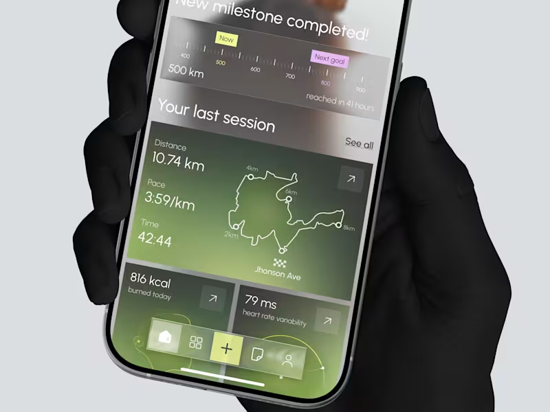
Sharing screens from one of the latest project - VeinBand, a wearable that tracks vascular health through a sleek rose gold band, pairing pulse speed and resting pulse readings with a "vascular age" score that makes cardiovascular data feel personal. Warm, sun-washed imagery grounds the product in real life, while the interface underneath stays calm and editorial — serif typography, soft neutral tones, and a single warm copper accent that reads more wellness ritual than clinical dashboard.
3
13
76
Message
41
Klym Yevtushenko
pro
FreshLock — Food Packaging Landing Page Design 🍎📦 FreshLock is a modern landing page concept created for a food packaging brand focused on preserving freshness, reducing waste, and presenting innovative packaging solutions through a clean digital experience. The goal was to communicate product benefits instantly while making the website feel fresh, premium, and trustworthy. The visual direction combines bold typography, minimal layouts, realistic product imagery, and vibrant red accents to create a strong first impression while keeping the focus on the product. Special attention was given to: • a product-first hero section that immediately highlights freshness and packaging quality; • clean visual hierarchy that makes key messages easy to scan; • responsive desktop and mobile layouts optimized for every device 📱; • trust-building elements showcasing product quality, freshness, and customer confidence; • bold CTAs that encourage users to explore the product and learn more; • a minimal interface that lets the packaging and product visuals become the center of attention; • a scalable landing page design suitable for future product launches and marketing campaigns. The result is a modern, conversion-focused landing page that helps communicate product value, strengthens brand credibility, and creates an engaging experience from the very first screen ✨ Looking to create a modern landing page for your food, packaging, FMCG, or consumer product brand? Let's build something fresh together 🚀
18
41
547
Message
2
Ricardo Gantschnigg
2025 3D Showcase
2
25
Message
3
Ricardo Gantschnigg
Cybersecurity is often visualized through familiar clichés: dark hackers, warning signs, locks and shields. For this edition of Salzburg University of Applied Sciences’ digital “warum!” magazine, the challenge was to communicate security differently—as something positive, trustworthy and connected. The concept centers on a familiar safety buckle whose strap is woven from flowing streams of data. As the data comes together and locks into place, an abstract digital process becomes a clear and relatable moment of protection. The project combined concept development, art direction and CGI to create a distinctive editorial cover that communicates a complex technological topic without relying on fear or threat-based imagery. Developed for both static and animated use, the visual introduces the magazine’s central theme while translating digital security into a simple, memorable metaphor.
2
3
49
Message
8
samin panah
pro
Motion graphic made for Bubs. A Swedish candy brand What do you think?
3
8
190
Message
4
Brady Patterson
pro
New Agency Website for @paulstreetco (https://www.instagram.com/paulstreetco/) 🌟 The visual direction leans into high-contrast typography, clean structure, and confident negative space, balancing editorial credibility with the energy of a performance-driven agency. Every section was designed to communicate authority without overexplaining it. We designed the experience in @framer (https://www.instagram.com/framer/) giving each service room to breathe while building in moments of interaction and discovery that reward the scroll. Check out the full site at: www.paulstreet.co (http://www.paulstreet.co)#websitedesign (https://www.instagram.com/explore/tags/websitedesign/) #webdesign (https://www.instagram.com/explore/tags/webdesign/) #framer (https://www.instagram.com/explore/tags/framer/)
2
4
89
Message
14
Tarun Baskar
pro
Introducing my 5th Framer template, Alpine. ✨ A premium portfolio template built for AI developers showcasing agents, tools, and automation work. it’s 100% free on the marketplace. Check it out below. 👇
11
14
184
Message
1
Ricardo Gantschnigg
Schlütersche Mediengruppe is a German media company with a broad portfolio of specialist media brands. The challenge was to create a contemporary corporate identity that could unify the organization while preserving the relevance and recognition of its individual brands. The new system is built around the idea of “Powerful Connections.” Graphic elements derived from the company’s distinctive Ü create a flexible visual language that brings structure, movement and connection to the brand. The project included the corporate identity, logo system, segment colors, typography, key visual system, motion principles and a comprehensive 145-page brand manual. The identity received two Winner distinctions at the German Brand Award 2026: Brand Revival of the Year and Brand Design – Corporate Brand.
2
1
56
Message
4
samin panah
pro
Product Motion Videos for Goodiset We produced a series of short product motion videos: candy buckets opening, pouring, and stacking, shot and animated to feel snackable and native to social feeds (Meta, TikTok, YouTube). Each video was built to double as both paid ad creative and organic content, cut to different aspect ratios and lengths depending on placement. The videos became a core part of Goodiset's content system, feeding directly into their paid media across six channels and giving their product pages and social presence a much stronger sense of texture and appetite appeal than photography alone could deliver.
4
172
Message
7
Oluwaseun Akintade
Trying to make the morph a little smoother for my app.. fade the type out, reshape the card, fade it back in. feels way less chaotic than springing every glyph mid-resize.
2
7
215
Message
5
Hulya Masharipov
Terra - one hidden place on Earth, every day. I've always loved Who Wants to Be a Millionaire? Whenever there was a question about a place I'd never heard of, I'd think, "How have I never heard of this?" So I built Terra. Every morning, it reveals one hidden place, its story, why it matters, and what makes it special. If you ever visit, you'll already know what you're looking at. And yes, there's a daily geography quiz—that's where the idea began. Guess the place, earn XP, build your streak, and collect discoveries in a rarity-based Passport—a Pokédex for Earth's hidden places. I designed the entire app in Flowstep, mostly through its MCP server from Claude Code. I'd prompt changes from the terminal and watch the canvas update live, making it easy to iterate before writing production code. The result: 14 screens with one dark, earthy, cinematic design system. Link to Terra: https://app.flowstep.ai/file?activeFileId=54deb511-7110-4d92-9ed0-36d95ab10e8d
2
5
240
Message
43
Alice D.
pro
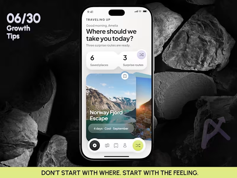
Introducing KEEPS: A Digital Home for Physical Memories KEEPS is a mobile app designed to preserve the physical objects that carry our memories. While most memory apps are built around photos, KEEPS is built around everything else. Concert tickets, boarding passes, receipts, handwritten notes, invitations, conference badges, and other small objects that people often keep long after their practical purpose has ended. The idea came from a simple observation: many of us keep these items because they represent experiences, relationships, milestones, and moments we don’t want to forget. Over time, they become scattered across drawers, wallets, books, and boxes, making them difficult to revisit and easy to lose. KEEPS transforms these physical keepsakes into digital artifacts. Users can scan real objects, remove backgrounds, add contextual information such as location, date, people, and personal notes, and organize them into custom collections. Artifacts can also be created from templates, allowing users to recreate memories that no longer exist physically. The prototype includes onboarding, collections, artifact detail pages, discovery flows, creation flows, profile experiences, and a connected navigation system that allows users to move through their archive naturally. Rather than generating the entire product in a single prompt, I used Flowstep as a design engineering tool. I started with a visual direction created in Figma, including custom illustrations, typography, layout systems, and the overall structure. From there, I rebuilt the product inside Flowstep screen by screen, using detailed prompts to define hierarchy, spacing, interactions, navigation patterns, and user flows. Each screen became the foundation for the next. Existing components were reused, refined, and expanded to create a cohesive design system across the entire application. The process was highly iterative: generating, reviewing, refining, and rebuilding until the product felt consistent both visually and functionally. The result is not simply a collection of screens, but a connected prototype with clear user journeys, interaction logic, and product intent. KEEPS is built around a simple belief: The smallest objects often carry the biggest memories. Flowstep file link: https://app.flowstep.ai/file?activeFileId=cb23715a-64af-4fb6-822a-c789fb99b461 X Post: https://x.com/webdesign_alice/status/2081713836613050543?s=46&t=1ZFswUtJzT6BPLQaoOweGw The walkthrough, screen recording of the prototype working in Flowstep, my custom illustrations, and the screens designed in Flowstep are included below.
16
43
1.1K
Explore projects