Iván Willenberg - Web Designer | Contra
Work by Iván Willenberg
Sign Up
Post a job
Sign Up
Log In
pro
Iván Willenberg
Strategic Web Designer & Art Director
Message
Follow
5.00
Rating
6
Followers
Followed by
Tan |
,
Diego S
, and
K. R
Argentina
Work
Posts
Reviews
Services
About
Argentina
4
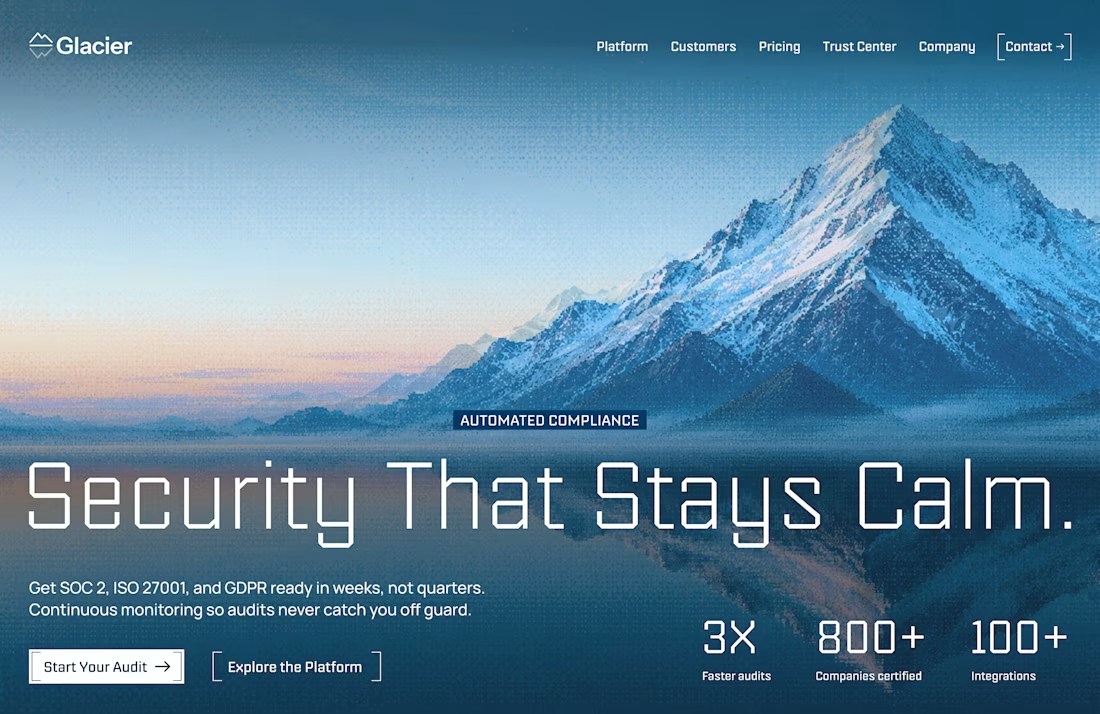
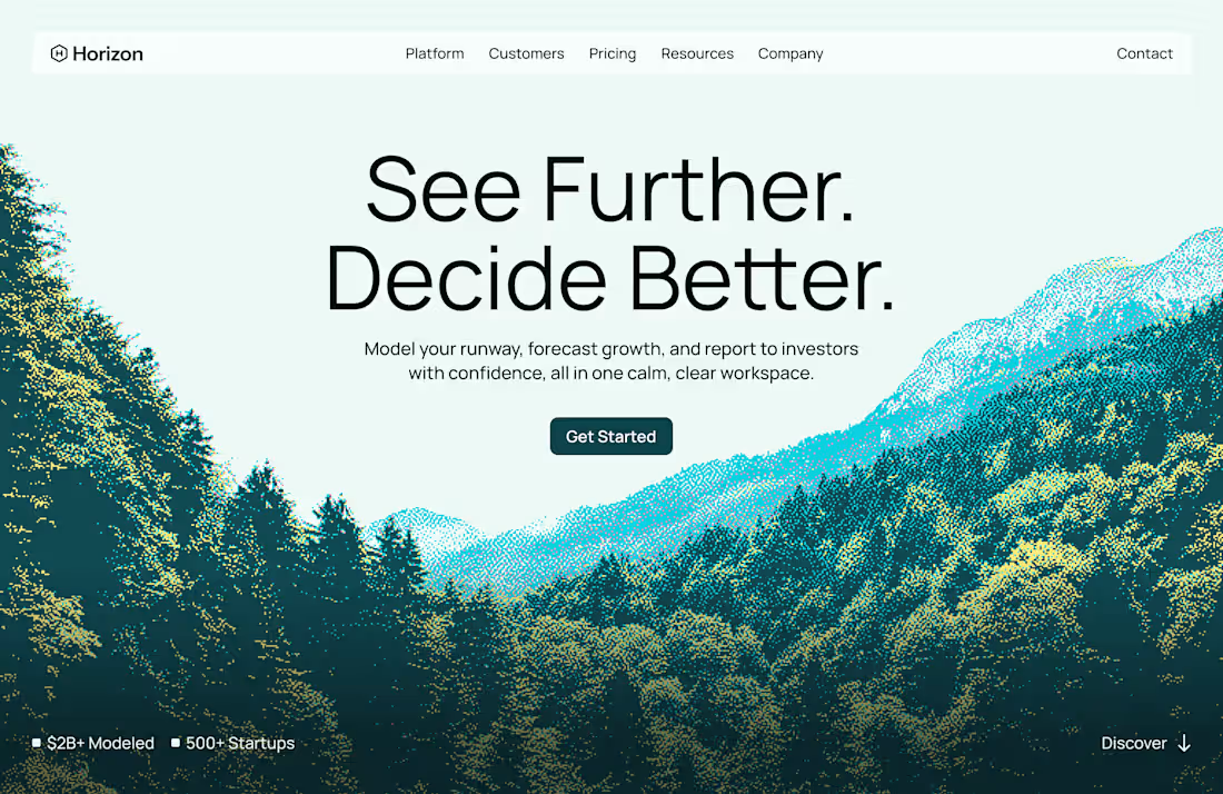
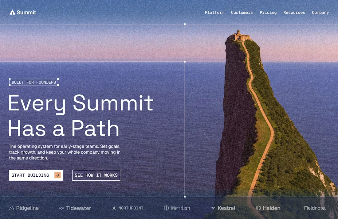
Most B2B websites don't have a design problem. They have a positioning problem. I recently saw two different Fractional CFO firms using the exact same homepage headline: ❌ "Fractional CFO Services for Growing Businesses." If your competitors can copy-paste your primary headline without changing a word, your website is stating your job title — not building authority. A strategic hero section shifts the focus toward positioning, outcomes, or pain points: 🟢 Positioning: "Strategic CFO advisory for B2B founders scaling past $1M ARR." 🟢 Outcome: "Board-ready metrics and cash flow control for confident decisions." 🟢 Pain-Point: "Eliminate financial guesswork before your next major expansion." Same service. Different perception. When positioning and visual hierarchy align, your site stops sounding like a commodity and starts acting as an active filter for high-value clients. Here’s how that strategic shift looks in a clean hero section design
2
4
106
1
A practice I did this morning to exercise art direction and layout. Editorial design is something I really enjoy and try to incorporate into web design whenever a project allows it. In these kinds of exercises, I like to start by looking at photos and images, and when one catches my attention and inspires me to design, I build the whole context around that image. For this case, I looked for an article on mixology and found one about the history of cocktail-making, which felt perfect. I also think a good challenge for a designer is to make a large block of text not only look good in the design but also invite the reader to actually want to read it instead of skipping over it. The color palette comes directly from the image, which is perfect. For typography, I tried several options and I believe the final choice is the right one, both for the title and for the subtitle and body text. Empty spaces are very important in this kind of design—they give breathing room so the eye doesn’t get tired and everything feels harmonious. I’d love to know what kind of practices other designers do outside of client work. Hope you like it, any feedback is welcome!
1
67
4
Branding for UpwardFi a fractional controller and accounting services provider. Working with this client was great. They wanted colors, geometric shapes, and a design that represented creativity — something that didn’t look too serious or scream numbers. Here is a sneak peek
3
4
135
3
Design exploration using Framer. Hero section concept for the launch of an eyewear brand. Feedback is welcome!!
2
3
94