REVAI AI Sales Platform Landing Page Design

Iván Willenberg


REVAI: Landing Page Design for an AI Sales Platform
Most AI sales tools say "AI does the work for you." Few of them make it visible.
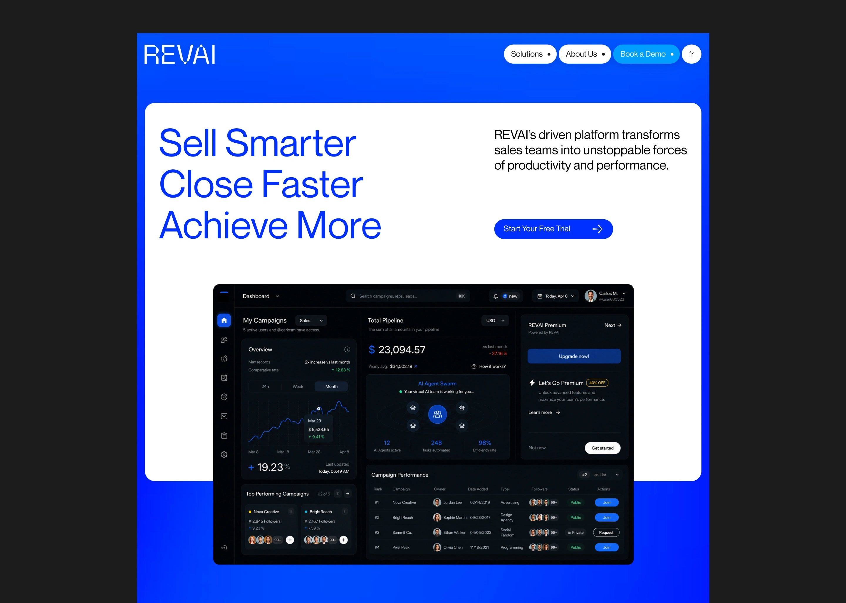
REVAI is a concept landing page for an AI sales platform, designed around one idea: show the work, not the claim. An actual swarm of agents working inside the product, not a line in a features list.
I designed it in Figma, art directed the visual system and built it in Framer. It started as a case study. Today it's also a real template anyone can use for their own product.


The Idea
A landing page doesn't fail because the hero image isn't slick enough. It fails when it doesn't guide attention in order: hook, then value, then proof, then the ask. With no hierarchy, every section competes at the same volume, and nothing is remembered by the time the visitor reaches the bottom.
The brief I gave myself:
• Put the claim first, alone
• Show the product working, not described
• Let features earn their place after the value is clear
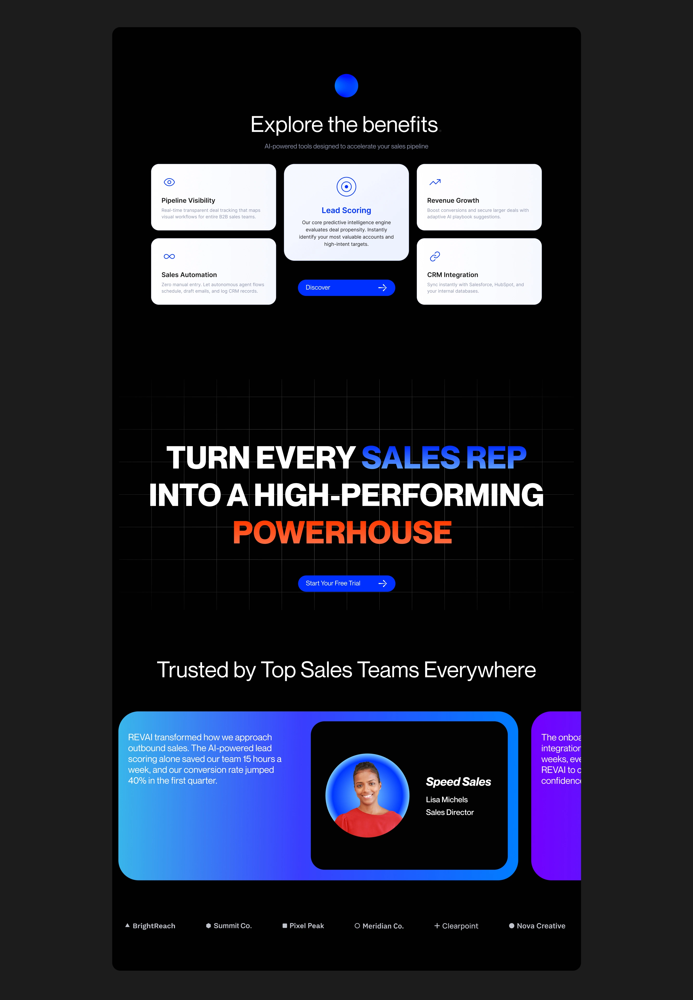
• Place the proof right before the ask
• Keep it fully responsive and easy to reuse
So What I Did Was
I treated it like designing a product, not a page. Every section has one job.
1. Structure First
The page runs in the order a visitor decides: hook, value, proof, ask. The claim opens the page on its own, with the product right below it. The swarm section shows agents at work, so the value is visible before any feature is listed.
2. Visual Direction
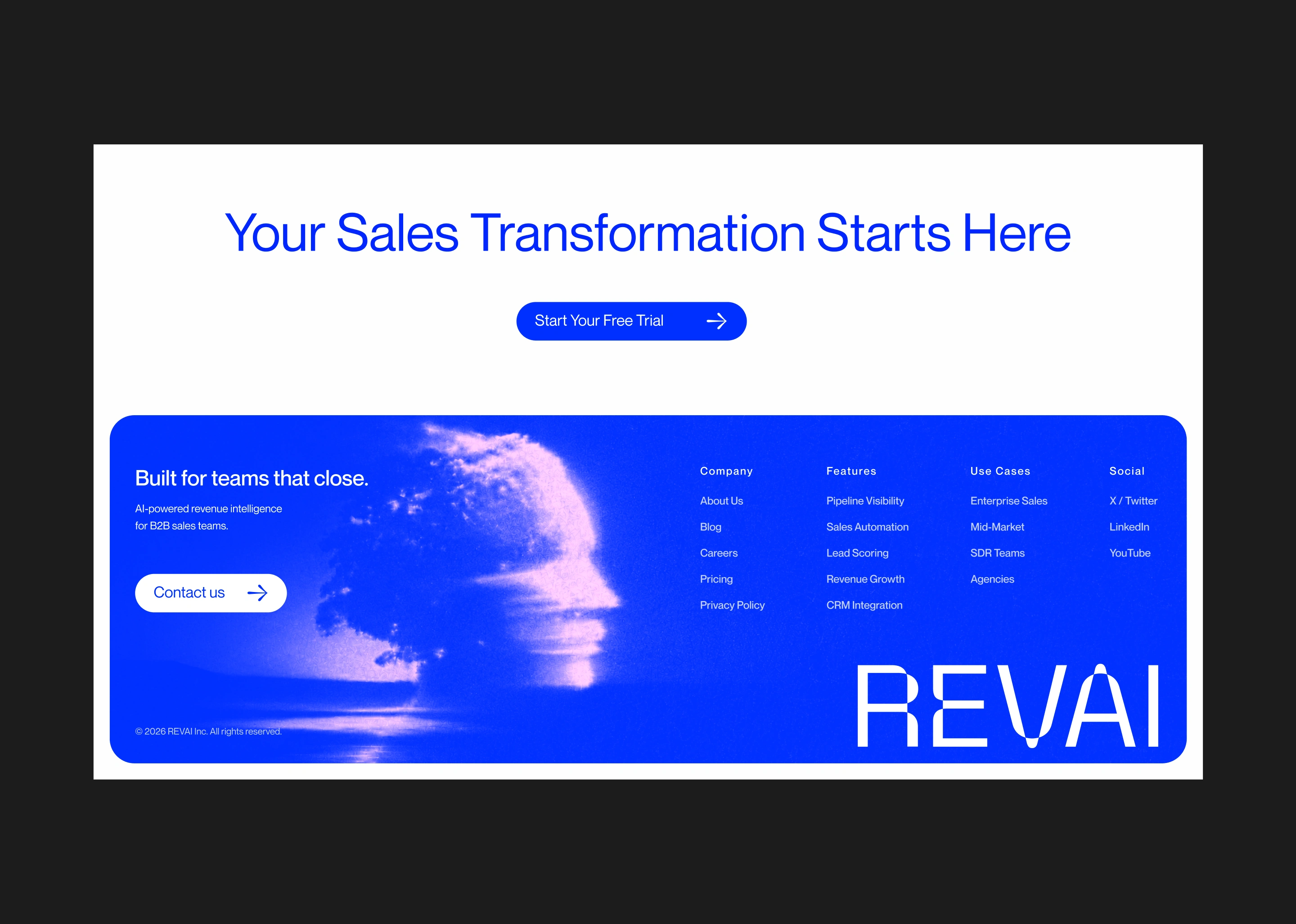
Confident and clean, not decorative. I landed on:
• A single electric blue, with white and near-black as the contrast
• Soft animated gradients that give depth without noise
• Big, plain headlines that carry the message
• Motion with a purpose: headlines that reveal letter by letter, a gradient headline for the call to action, an opening loader, and light scroll reveals
3. Built to Be Reused
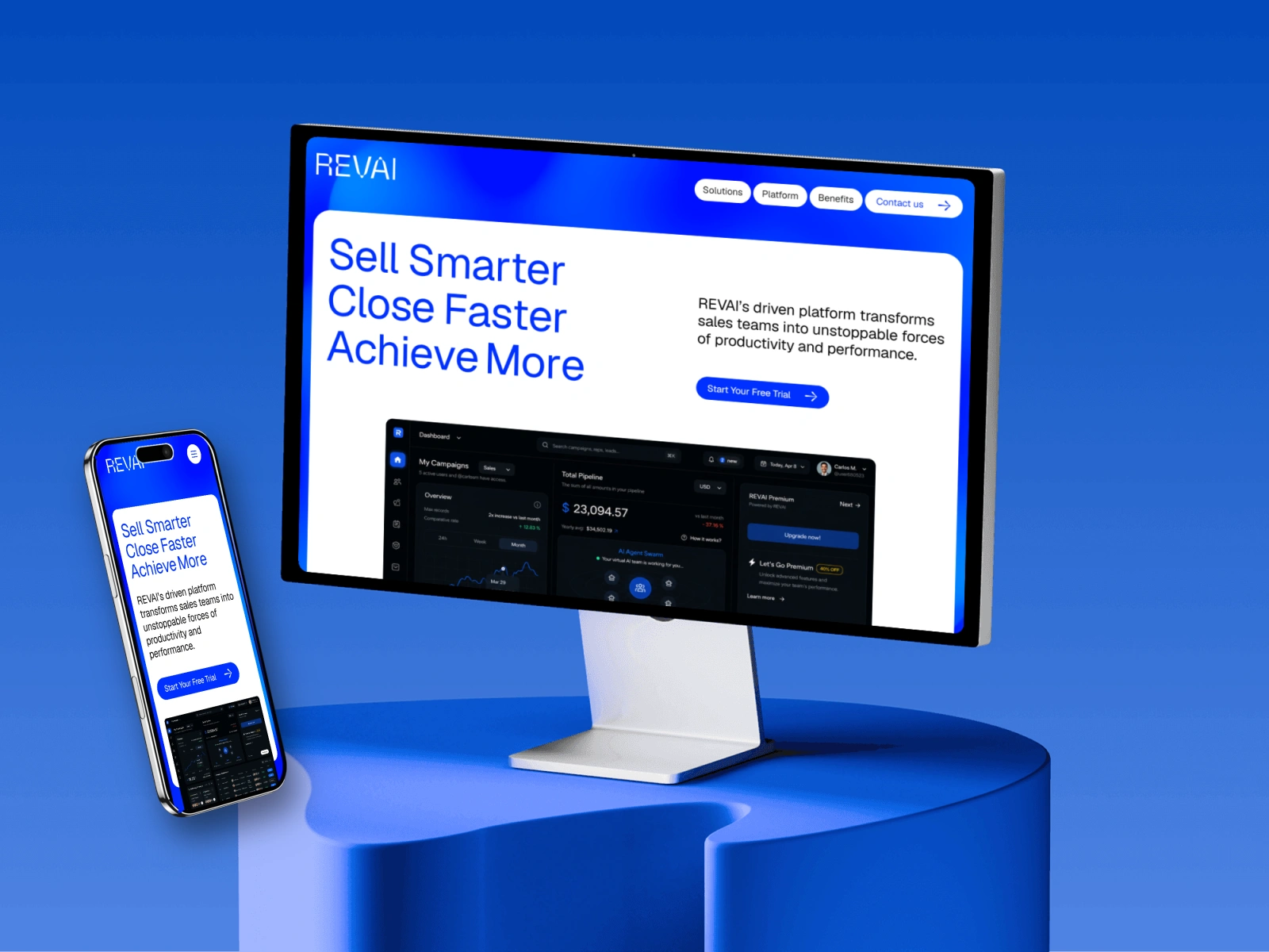
Built fully in Framer, with color and text styles, shared components and a Design System guide page, so changing the brand takes a few clicks. Desktop, Tablet and Phone were designed and checked one by one, including a mobile menu that expands from a button.
Final Thoughts
Nothing on the page is there for decoration. Every section is doing a job. That's the part I care about most: structure that guides attention, then a finish that makes it worth remembering.
See the template live:
Link to the template: https://www.framer.com/marketplace/templates/revai/
Like this project
Posted Oct 12, 2026
Designed a reusable landing page for an AI platform using Figma and Framer.