The network for creativity
Join 1.25M professional creatives like you
Connect with clients, get discovered, and run your business 100% commission-free
Creatives on Contra have earned over $150M and we are just getting started
Back to feedPost

What do you think about this link in bio Framer template?


wow the background glow is impressive
Yea, it really is scroll stopper
Definitely, I cannot but agree man

Nice work
Thanks ❤️

Great work 😍
Thank you so much ❤️

Amazing
Thank you ❤️

Link in bio pages live or die on how fast someone gets who you are, and Designer and Developer in big type does that in one glance. The moody black and white keeps it feeling personal, not corporate. Clean template, I would actually use this.
Thanks for such a kind words, ill be starting a offer very soon on my templates ❤️


Amazing🚀
Thank you ❤️

stunning!
Thanks ❤️
The network for creativity
Join 1.25M professional creatives like you
Connect with clients, get discovered, and run your business 100% commission-free
Creatives on Contra have earned over $150M and we are just getting started


Related posts

EchoMind is live on the Framer Marketplace.
It’s a calm, editorial shop template for brands that make physical things: hardware, objects, small product lines. I designed the brand, generated the product photography and built every page in Framer.
What’s inside:
20 pages, each designed for desktop, tablet and phone
CMS-driven shop with working price sort
Product pages with gallery, specs and FAQs
A build-your-own configurator with live pricing
A bag with quantities and discount codes
Journal with hover image previews
Launch, studio, support and gift card pages
The product itself is fictional: a modular mixing desk where one core listens to your mix and suggests one fix at a time. I wanted the template to feel like a real brand from day one, so it’s been built and photographed like one.
Get the template: https://www.framer.com/marketplace/templates/echomind/


Congrats on the launch, Jonathan. Designing the brand, the photography and every page yourself gives it a clear voice. What was the hardest part of building a shop template in Framer?

Not every website needs more elements.
Sometimes, it needs better decisions.
A thoughtful layout.
A strong typographic hierarchy.
The right images.
Consistent spacing.
A clear navigation.
And enough room for the design to breathe.
These details might seem small, but together they shape how people experience a website.
That's one thing I appreciate about working with Framer: the opportunity to explore layouts, interactions, and visual details while keeping the experience intentional.
For me, good web design isn't about adding more.
It's about knowing what to keep, what to remove, and what deserves attention.
Less noise. More meaning. Better experiences.
What's one small design detail that immediately makes a website feel premium to you?
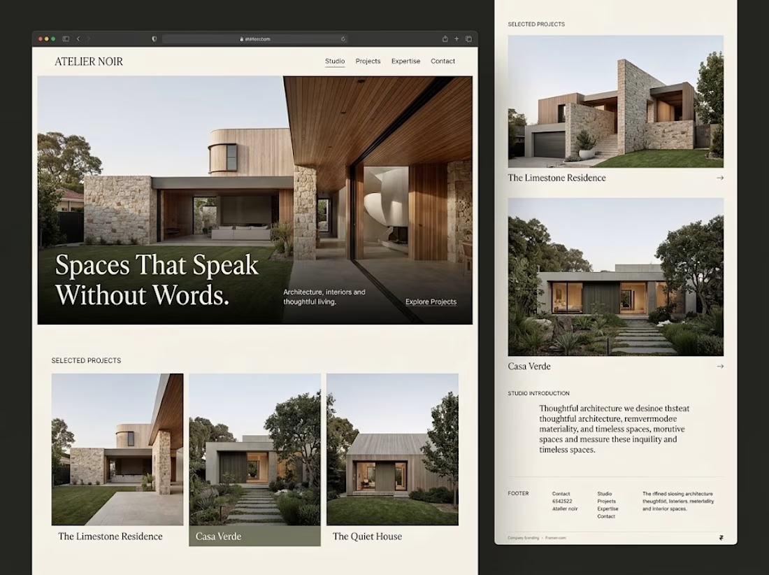

Generous whitespace for me. The serif headline over the photo on your Atelier Noir layout is a good example.


☕ CORVO is live: a Framer template for coffee roasters & cafés.
16 pages · Shopify shop · subscriptions · gift cards · events & journal CMS · fully responsive
https://framer.link/aYVd6cF

