Freelance Data Visualizers in United States
Sign Up
Post a job
Sign Up
Log In
Filters
2
Projects
People
Erin Riggers
pro
Houston, USA
Data-Driven Solutions with Developer Precision
$5k+
Earned
2x
Hired
5.0
Rating
57
Followers
Follow
Message
Data-Driven Solutions with Developer Precision
1
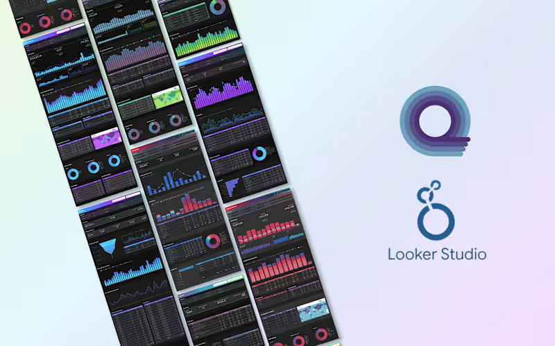
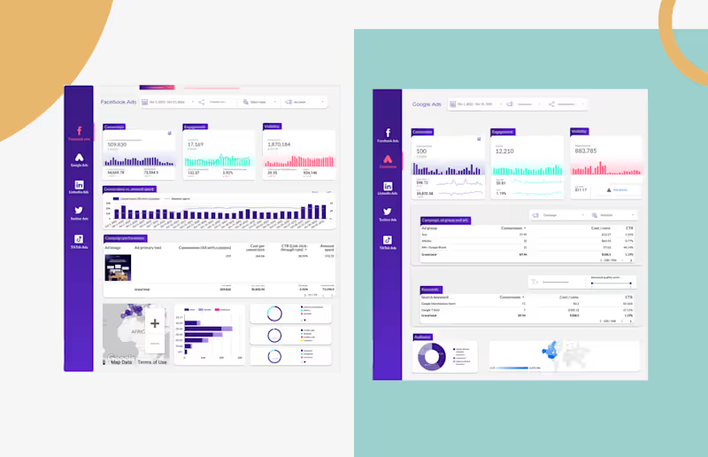
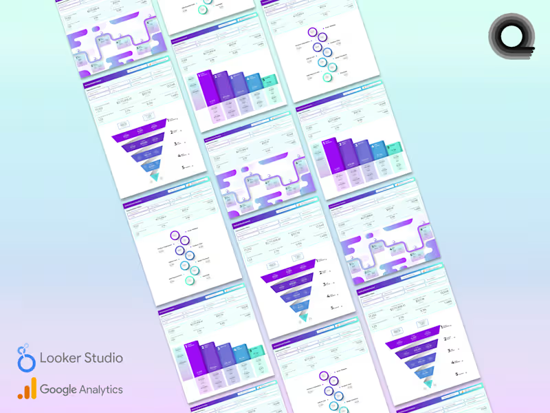
I posted another couple of new Looker Studio dashboards in my Contra shop today and thought I would share some related eye candy with ya'll. This is a bundle of four funnel and timeline data visualizations / infographics that I created specifically for Google Analytics e-commerce events. I was inspired to create this after having stumbled upon a slough of similar GA4 ecommerce-related dashboards that were woefully visually unappealing. Creating more beauty in the world around me is one of my prime movers. https://contra.com/products/mYxjErTV-ga4-ecommerce-funnel-visualization-pack
1
157
$5.4K+ earned
3
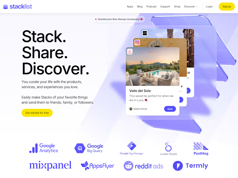
Marketing Stack Audit and Optimization for Stacklist
3
132
2
Transforming Marketing Insights with GA4
2
60
2
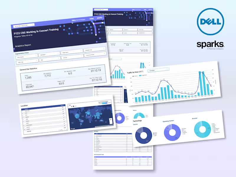
DELL Virtual Dev Conference Analytics Looker Studio Dashboard
2
25
Data Visualizer
(8)
Follow
Message
Shekh Al Raihan
pro
New York, USA
Senior Product Designer with 8+ years of experience

1x
Hired
4.4
Rating
35
Followers
Follow
Message
Senior Product Designer with 8+ years of experience
0
Appilix — Web-to-App Platform | UI/UX Case Study
0
3
0
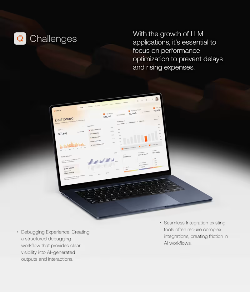
Quantix LLM Application | A UI/UX Case Study
0
6
0
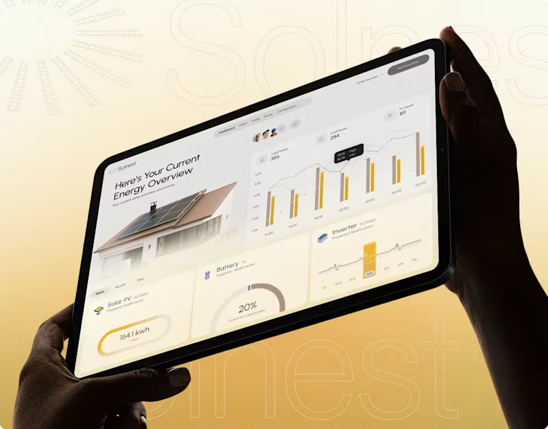
Solenest - Solar Monitoring Platform Case Study
0
6
4
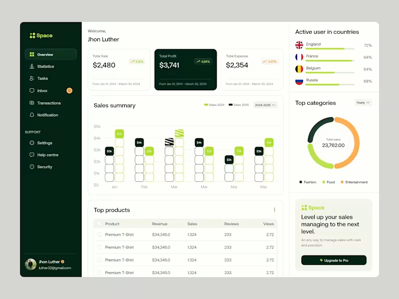
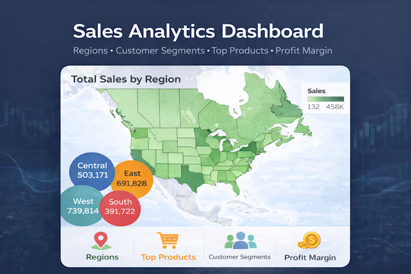
Sales Analytics Dashboard Design | The Space Dashboard is a sophisticated, data-centric SaaS platform designed for e-commerce managers and business owners. It focuses on high-level financial tracking, Sales, Profits, and Expenses. through a dark-themed sidebar and a light, breathable content area. The interface balances high-density data visualization with an approachable, clean aesthetic to ensure users can monitor global performance metrics without cognitive overload. Key Design Features: Unified Global Tracking: Real-time user distribution maps and country-specific engagement bars. Category Breakdown: An intuitive donut chart for "Top Categories" (Fashion, Food, Entertainment) to identify revenue drivers quickly. Product Performance Table: A clean, actionable list view for "Top Products" featuring revenue, sales volume, and user sentiment (reviews). Modular "Upgrade to Pro" Widget: A non-intrusive, conversion-focused call-to-action designed to drive SaaS revenue.
2
4
256
Data Visualizer
(7)
Follow
Message
Andy Luo
Washington, USA
Bridging the gap between data analysis and market
$50k+
Earned
1x
Hired
5.0
Rating
25
Followers
Follow
Message
Bridging the gap between data analysis and market
8
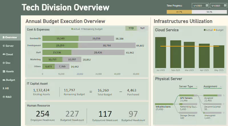
Budget Execution Analysis PowerBI Visualization
8
229
2
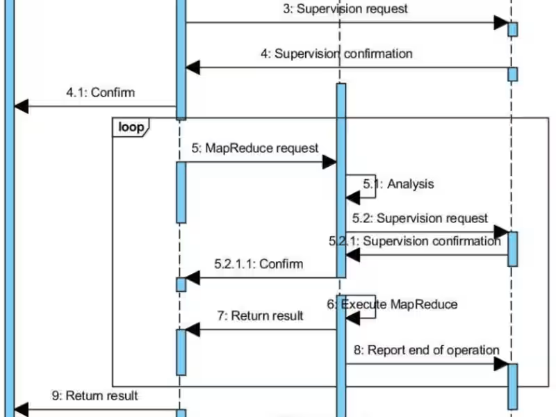
Agile and Technical System Diagram Designing
2
39
2
Recommendation System: Planning & Management
2
27
1
Bitcoin Price Prediction Using ML
1
24
Data Visualizer
(1)
Follow
Message
Amy Frank
Phoenix, USA
Business systems & internal tools | Salesforce Certified
33
Followers
Follow
Message
Business systems & internal tools | Salesforce Certified
0
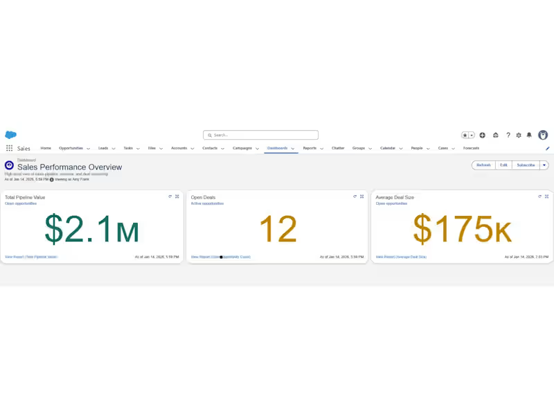
Salesforce Sales Cloud Setup (Pipeline & Reporting)
0
17
0
Sales & Profit Dashboard in Tableau
0
7
0
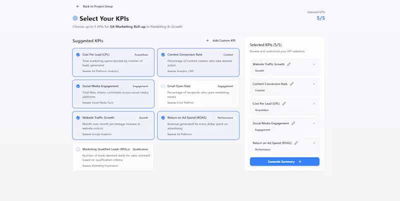
KPI Scope Builder – Decision-First KPI Planning
0
7
0
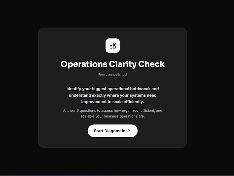
Operations Clarity Check | Business Operations Diagnostic Tool
0
15
Data Visualizer
(2)
Follow
Message
Aurelie Dussenne
New York, USA
Data visualization expert for actionable insights
$25k+
Earned
1x
Hired
26
Followers
Follow
Message
Data visualization expert for actionable insights
1
Custom Invoicing Solution with Microsoft Paginated Reports
1
67
2
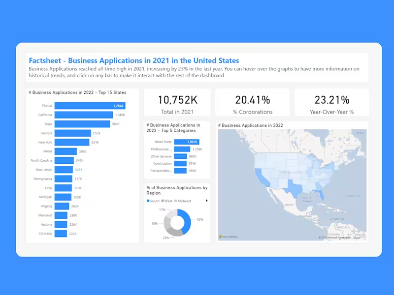
Transforming Complex Census Data into Actionable Insights
2
96
1
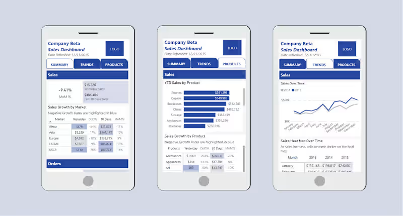
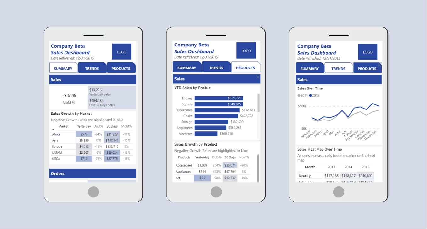
Wendy's - Power BI Mobile App
1
203
View more →
Data Visualizer
(3)
Follow
Message
Kyle Chaplin
pro
Wesley Chapel, USA
Translating ambiguity into clarity.
Follow
Message
Translating ambiguity into clarity.
0
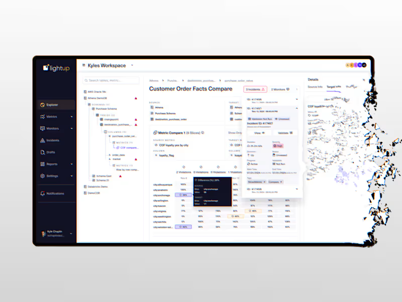
No-code Enterprise Data Quality Monitoring Tool
0
13
0
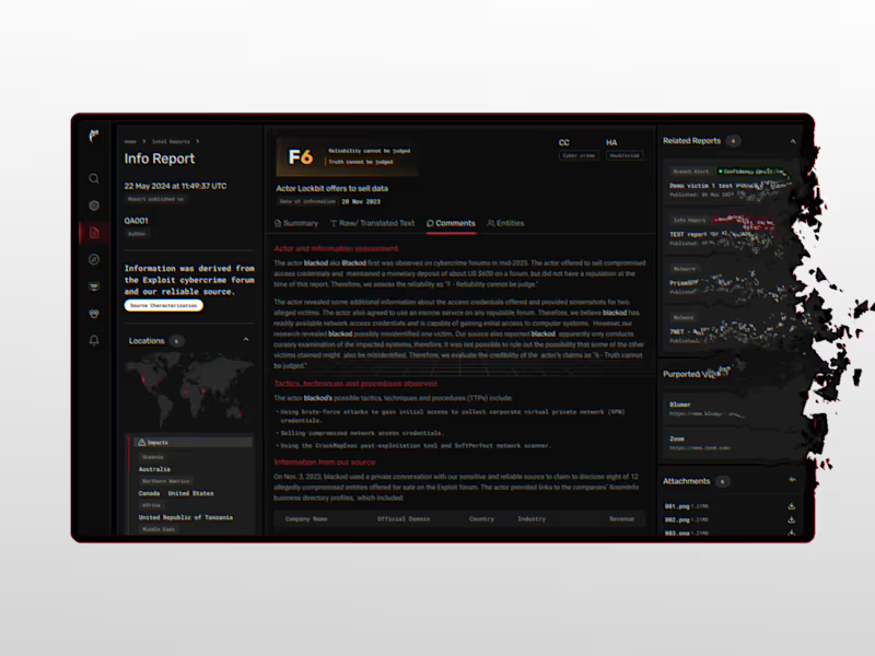
Modernization of Intel 471 Threat Intelligence Platform
0
9
1
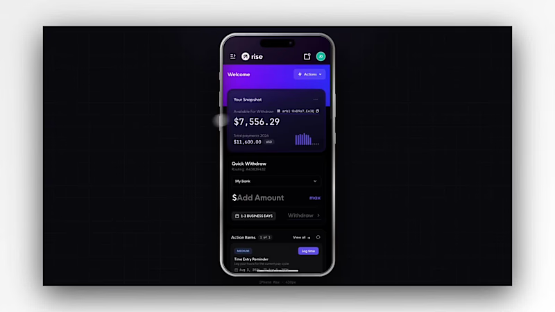
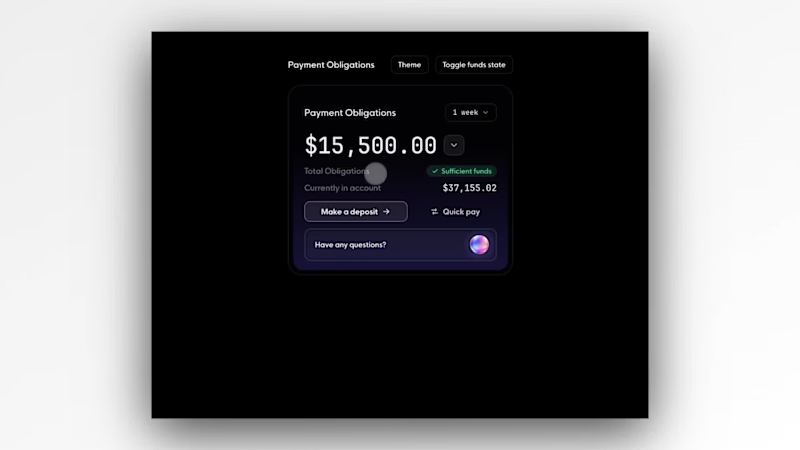
One of the more interesting challenges in payroll is making financial obligations feel immediately understandable. Organization admins don’t just need to know what’s due—they need confidence that payroll is covered, visibility into what’s driving the total, and a clear next step when it isn’t. This concept explores that idea by turning payment obligations into a single, actionable experience: surfacing funding status at a glance, breaking down where costs come from, and providing AI-powered answers to the questions admins are most likely to ask. The goal wasn’t to add more data, but to reduce uncertainty around one of the most critical moments in the payroll lifecycle.
1
37
2
I wanted to see how far I could push simplicity. Instead of asking merchants to interpret dozens of charts and KPIs, the experience starts with a single health score that quickly communicates the current state of the business. From there, supporting metrics provide just enough context before guiding attention to the one issue that matters most. The goal was to reduce cognitive load without sacrificing confidence in the data.
2
98
Data Visualizer
(2)
Follow
Message
Sebastian Blanco
Miami, USA
Business Automation Expert
1x
Hired
5.0
Rating
2
Followers
Follow
Message
Business Automation Expert
0
PPC Agency saves 30hrs/wk with automated Ad Performance Report
0
6
0
Marketing Agency saves $50K/yr with Social Media Reports
0
8
0
500% Closing Rate increase with Zapier+HubSpot structure
0
13
0
50% Faster Real State Deal Closing with Zapier Automation
0
13
Data Visualizer
(2)
Follow
Message
Evan ONeil
Houston, USA
Impactful Data Visualization & Mapping Expert
Follow
Message
Impactful Data Visualization & Mapping Expert
0
Tennis Analysis Infographic
0
11
0
Intuitive and Impactful Custom Air Monitoring Dashboard
0
32
0
Data analysis and Map-based Storytelling for 'The Houston Arrow'
0
10
View more →
Data Visualizer
(3)
Follow
Message
Explore people