pro
Shekh Al Raihan
Senior Product Designer with 8+ years of experience
- 1x
- Hired
- 4.40
- Rating
- 31
- Followers
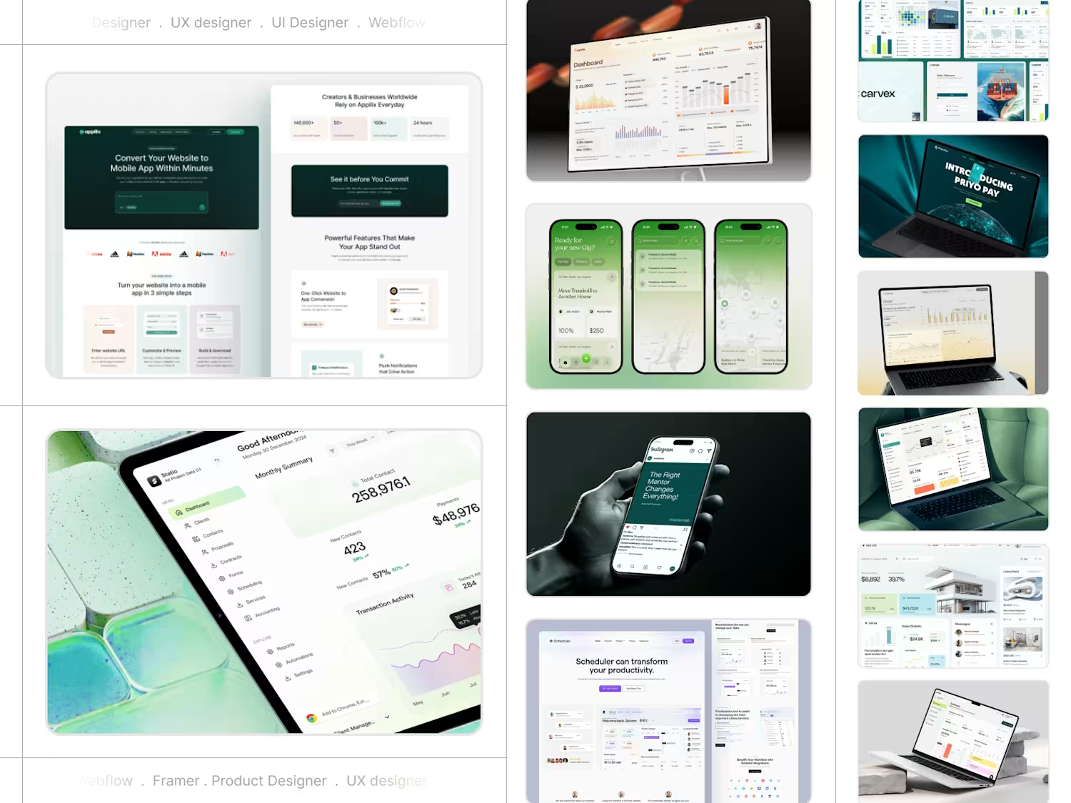
AI Workflow Automation Landing Page
TaskGenius is a modern landing page concept for an AI workflow automation platform. The design highlights product capabilities through a strong visual hierarchy, premium dark UI, and engaging sections that showcase automation, analytics, integrations, and customer success while keeping the experience clean and easy to navigate.
0
18
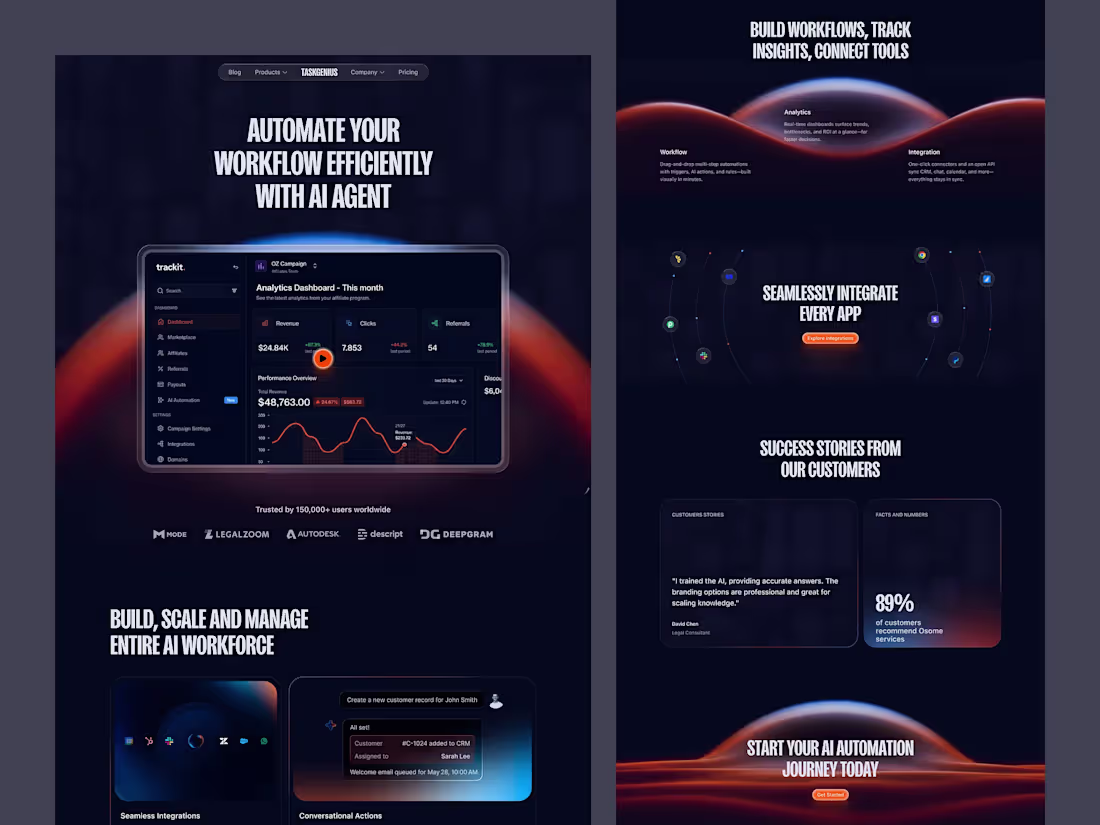
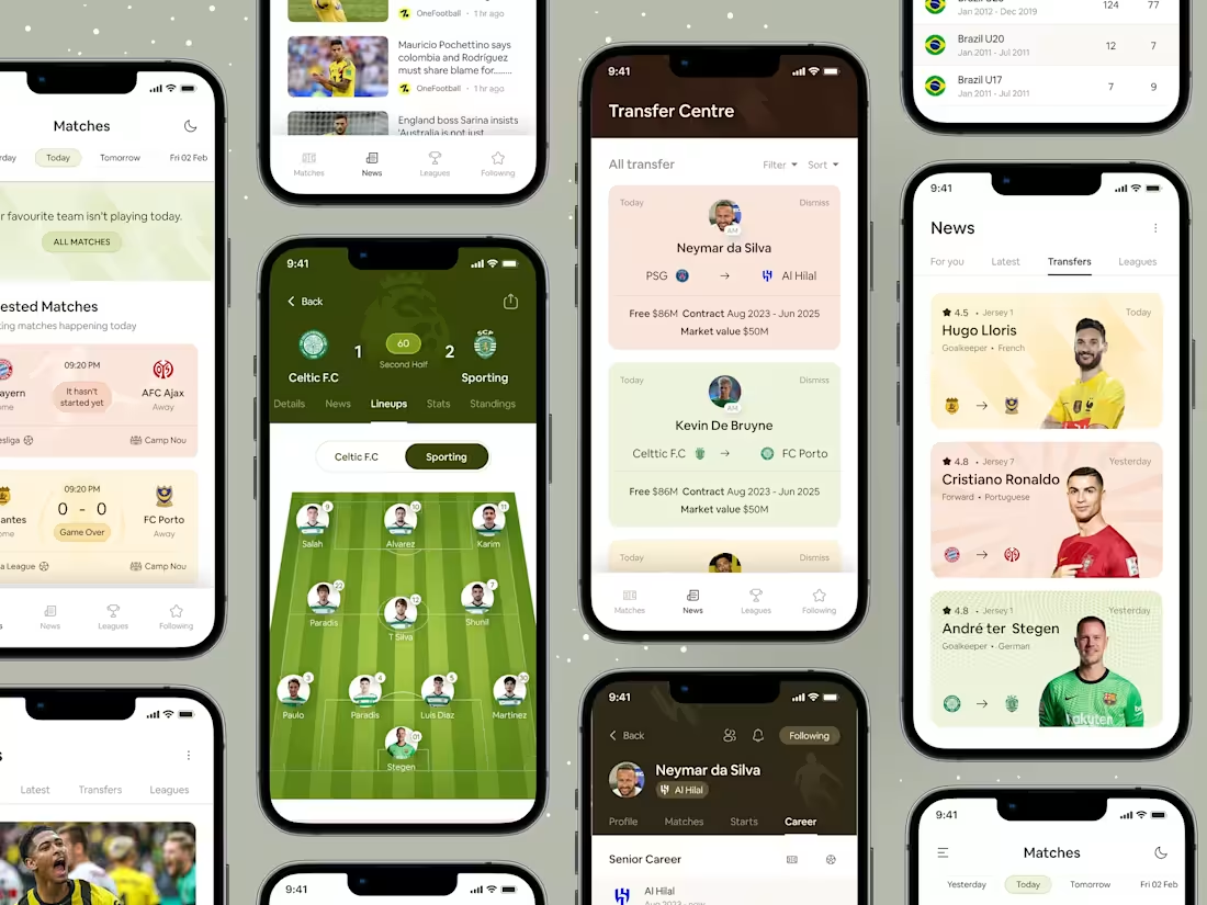
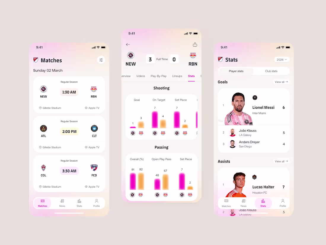
GoalZone - Football Live Score App
GoalZone is a modern football live score app concept designed to help fans stay connected with every match in real time. The experience focuses on speed, clarity, and excitement by presenting live scores, match events, team statistics, and standings in a clean, easy-to-scan interface. Instead of overwhelming users with too much information, the design prioritizes the most important match updates while maintaining a premium sports experience. The goal was to create an interface that keeps football fans informed without interrupting the excitement of the game.
Key Design Features
Live Match Dashboard: A real-time match screen that highlights live scores, match status, goals, cards, substitutions, and key events with clear visual hierarchy.
Quick Match Navigation: An intuitive navigation system that lets users switch between Live, Upcoming, Finished, Leagues, and Favorites with minimal effort.
Detailed Match Center: A dedicated match experience featuring lineups, player statistics, possession, match timeline, and performance insights in one place.
League Standings & Fixtures: Well-organized tables, fixtures, and results that help users follow their favorite competitions throughout the season.
Personalized Favorites: Users can follow their favorite clubs, leagues, and matches to receive relevant updates and reduce unnecessary browsing.
Clean Sports Interface: A dark, high-contrast visual style with strong typography, team colors, and thoughtful spacing to improve readability during fast-paced live matches.
1
164
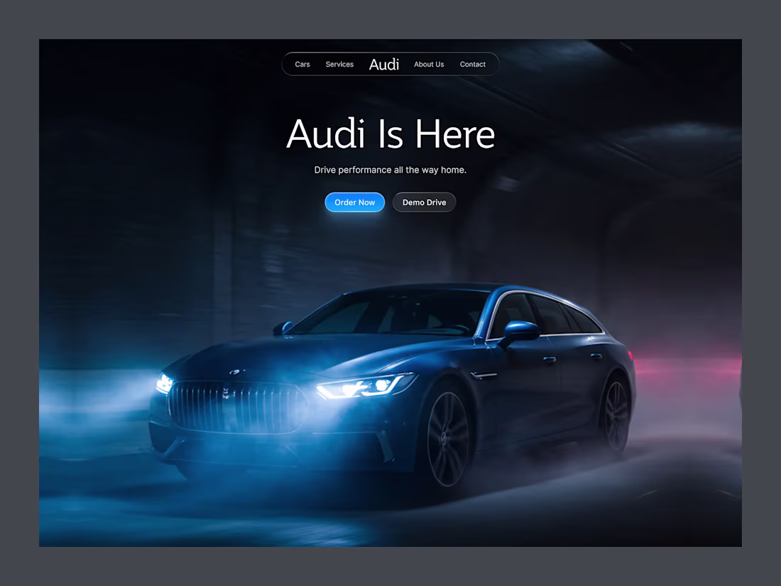
Concept Work: Audi - Vehicle Car Website
Audi Drive is a luxury automotive landing page concept designed to capture the feeling of performance, precision, and premium craftsmanship. Instead of relying on information-heavy layouts, the experience uses a cinematic hero section, minimal navigation, and focused calls to action to let the vehicle become the center of attention. The dark visual theme, atmospheric lighting, and clean typography create a premium first impression while guiding users naturally toward exploring or booking a test drive. The goal was to balance strong visual storytelling with a simple, user-friendly experience that reflects the Audi brand.
Key Design Features
Cinematic Hero Experience: A full-screen automotive visual with dramatic lighting and motion that immediately communicates performance and luxury.
Minimal Navigation: A clean, distraction-free navigation bar that keeps the focus on the vehicle while making key sections easy to access.
Clear Call-to-Action Buttons: Primary actions like Order Now and Demo Drive are visually prioritized to encourage quick user decisions.
Premium Visual Hierarchy: Large typography, generous spacing, and a balanced composition create an elegant reading flow and improve usability.
Luxury Dark Interface: A dark color palette combined with subtle glass effects and blue accent lighting enhances the premium feel while maintaining strong readability.
User-Centered Layout: Every element is intentionally placed to reduce cognitive load, making the interface both visually engaging and easy to navigate.
2
4
123
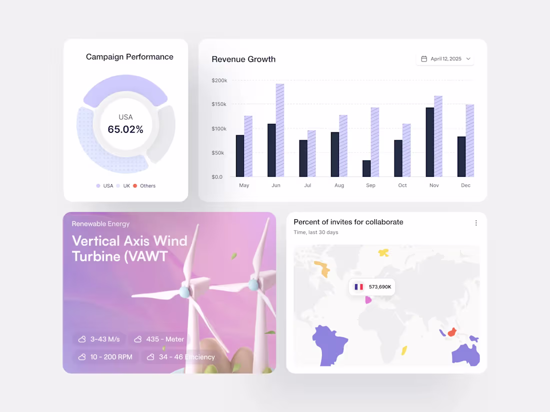
SaaS Dashboard Components – Analytics & Data
A comprehensive SaaS dashboard component library showcasing essential UI elements for data-intensive applications. This design system features modular, reusable components including performance metrics cards, revenue tracking charts, interactive maps, and feature showcase widgets. Built with scalability in mind, each component maintains visual consistency while serving distinct analytical purposes—perfect for B2B platforms, business intelligence tools, and enterprise analytics solutions.
2
153
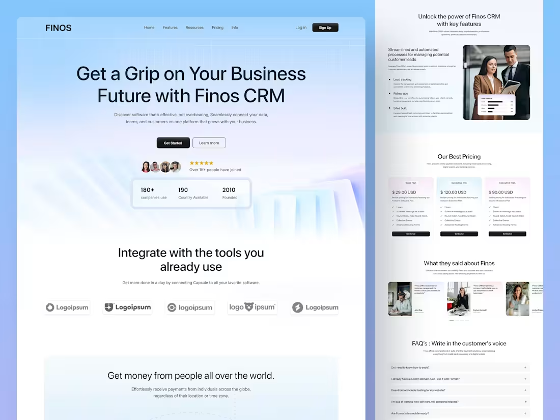
Finos - Business CRM Landing Page
Finos is a comprehensive platform designed to unify marketing, sales, content management, and customer service into a single, seamless ecosystem. By delivering a robust CRM solution, Finos empowers businesses to streamline operations, foster collaboration, and unlock growth potential. Its intuitive interface ensures effortless navigation and accessibility, making it an essential tool for managing customer relationships and driving success.
At the core of Finos is an emphasis on usability and design. Our UI/UX design ensures that every feature is intuitive, visually appealing, and tailored to meet the needs of diverse teams. From a clean dashboard layout to seamless navigation, Finos is built to help businesses focus on what matters most: growth and customer satisfaction.
With Finos, teams can:
Streamline workflows by consolidating tools and data into a unified platform.
Enhance collaboration across departments to deliver consistent and high-quality customer experiences.
Gain actionable insights: analytics and reporting to make data-driven decisions.
Boost productivity with automation tools that simplify repetitive tasks and free up time for strategic initiatives.
2
3
277
Sports Live Scores App UI
This sports platform enables users to stay connected with live matches through real-time scores, detailed match statistics, and in-depth game insights. Users can track goals, points, assists, player performance, team lineups, and live commentary, all within a seamless viewing experience.
The platform also provides upcoming match schedules with dates, times, and venues, making it easy to plan ahead. Personalized notifications keep users informed of key match events, including goals, score changes, results, and other important updates, ensuring they never miss a moment of the action.
2
3
284
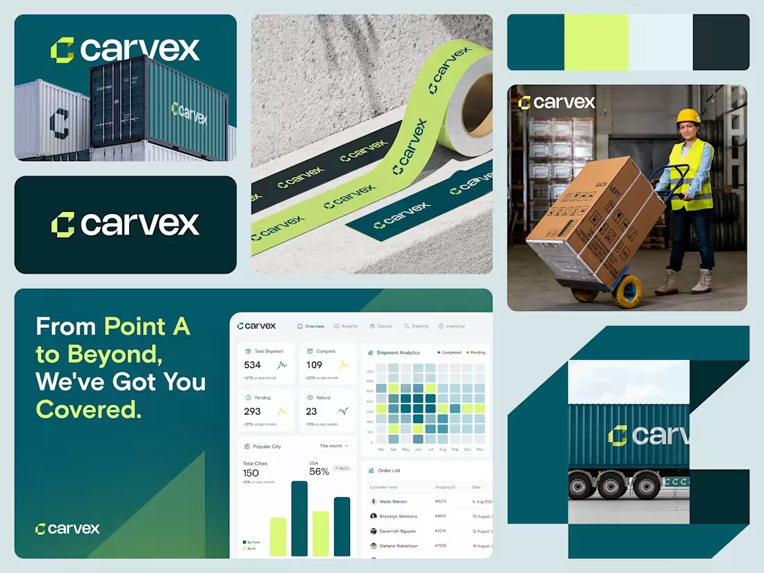
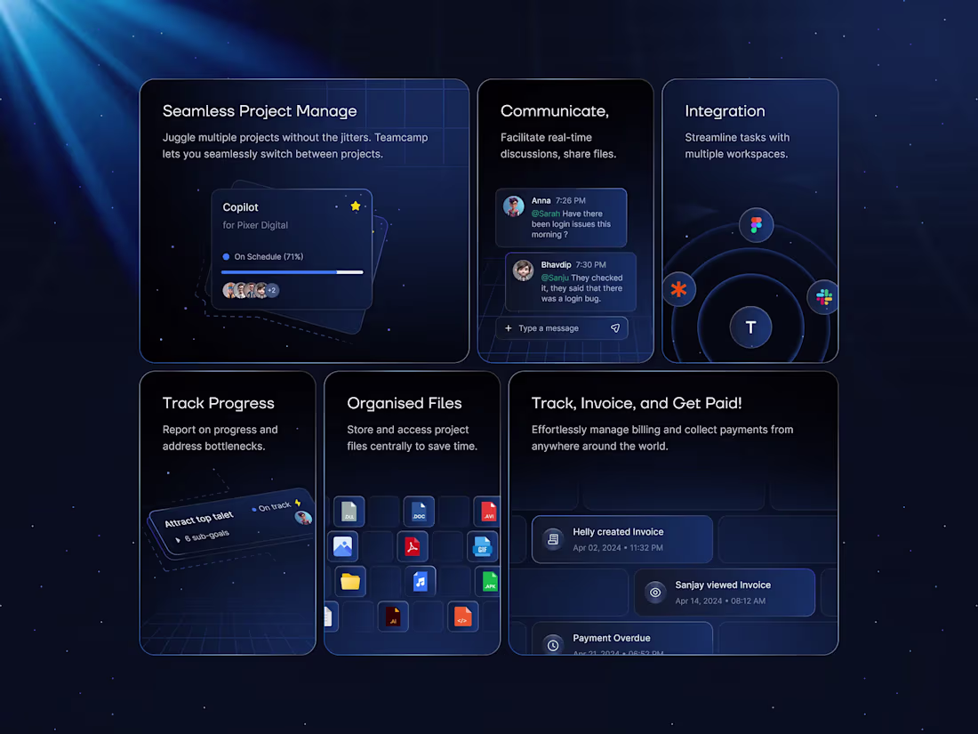
Concept Work: Carvex Logistics Website
Carvex: The Future of Logistics
Overview
Carvex emerges as the vanguard of the shipping industry, transforming how goods traverse the globe. Gone are the days of sluggish deliveries and opaque tracking; Carvex is setting a new standard in logistics with cutting-edge technology and an unwavering commitment to customer satisfaction.
Carvex isn't just a shipping platform; it's a revolution in logistics that seamlessly integrates advanced algorithms with real-time data analytics to deliver unparalleled accuracy and efficiency. Every shipment is carefully monitored from origin to destination, ensuring timely arrivals and complete visibility at every stage of the journey.
Design Philosophy
The vision behind Carvex was to simplify the complexity of global logistics through a clean, sophisticated, and user-centric experience. Logistics platforms often overwhelm users with excessive data and operational complexity. Our goal was to transform that complexity into clarity.
The design embraces a minimal and modern visual language, allowing users to focus on the information that matters most. Clear hierarchy, intuitive navigation, and thoughtful spacing help create an experience that feels effortless, whether managing a single shipment or overseeing an entire logistics operation.
Every interaction was designed with efficiency in mind. Real-time tracking, shipment management, and operational insights are presented in a way that feels accessible and easy to understand, reducing friction and enabling faster decision-making.
By balancing simplicity with powerful functionality, Carvex delivers a premium digital experience that inspires trust, enhances productivity, and reflects the innovation driving the future of logistics.
2
262
Fintech Landing Page UI/UX - Digital Banking Solutions
Fintech Banking Website UI Design | Modern Financial SaaS Landing Page
A modern fintech website concept designed for a digital banking platform focused on trust, security, and seamless user experience. This landing page combines clean UI design, intuitive UX, and premium visual elements to create a compelling financial product experience.
Project Highlights
💠 Modern fintech website design with a clean and professional interface
💳 Premium debit card showcase with high-quality 3D visualizations
🔒 Secure money transfer experience with private key security features
📱 Fully responsive and mobile-first UI/UX design
🚀 Conversion-focused landing page optimized for user engagement
Built in Figma, this concept explores how strong visual design can help digital banks, fintech startups, neobanks, and payment platforms establish credibility while delivering a smooth user journey.
The interface features deep blue gradients, modern typography, structured layouts, and interactive design elements that communicate innovation, security, and simplicity.
Services
• Fintech UI/UX Design
• Banking Website Design
• SaaS Landing Page Design
• Financial Dashboard Design
• Mobile App UI Design
• Figma Design System
• Product Design
Looking for a designer that's expert in fintech? Let's build a secure, modern, and conversion-driven digital experience.
1
286
Education App UI Concept
A mobile first learning platform designed to make education more accessible, engaging, and measurable. Users can explore courses, discover expert led content, enroll through flexible subscription options, and track their progress through lessons, quizzes, and assignments. The experience was designed around learner retention, intuitive navigation, and clear progress visibility to create a motivating and effective learning journey.
1
268
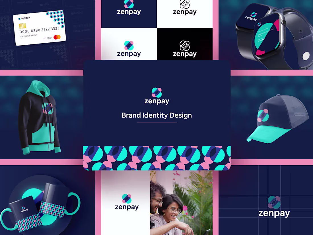
Branding Concept: Zenpay Brand Identity Design
Zenpay is financial technology (FinTech) brand identity created to convey trust, fluidity, and simplicity in digital payments. The design centers around a geometric, interlocking logo mark—embodying seamless connection and balance—paired with a vibrant, high-contrast color palette of teal, magenta, and deep navy blue. This visual system is versatile, designed for seamless application across all touchpoints, from digital interfaces (UX) to physical products
The Zenpay concept stands out through its masterful use of negative space and a restrained color palette, creating a strong visual hierarchy that guides the user effortlessly. It’s a conversion-focused UX that prioritizes key actions and information, making financial management feel simple and secure rather than overwhelming.
0
204
Copy-Pasta - Crypto Trading & SaaS Landing Page Looking for the Best minimal Trading Website Design? Introducing to you Copy-Pasta, it is a high-performance Web3 platform designed to demystify crypto trading for experts and enthusiasts alike. The concept centers on on-chain transparency and automation, allowing users to mirror successful "whale" wallets effortlessly. The design leverages a sophisticated dark theme to reduce eye strain during long trading sessions, using vibrant gradients to highlight data-critical areas like portfolio performance and real-time insights.
Key Design Features
Real-Time Analytics: Interactive dashboard components that simulate live data flow.
Automation Hub: A dedicated section illustrating the "Set and Forget" nature of the product through clean iconography.
Trust Indicators: Secure trading sections designed with reinforced visual metaphors (shields and locks) to build user confidence.
Micro-Interactions: Smooth transitions between "Automation," "Real-Time Insights," and "Secure Trading" sections to keep the user engaged.
Responsive Pricing Toggles: A streamlined checkout experience that clearly highlights the value of the Premium tier.
1
221
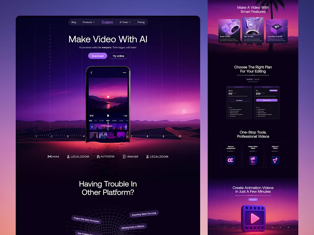
Cutpro - AI Video Editing Landing Page
Introducing an immersive, AI-powered video editor landing page interface designed for digital creatives. This concept blends visual storytelling tools with real-time assistance, allowing creators to generate text, avatars, and images on the fly. The dark mode aesthetic paired with fluid motion and AI chat integration delivers a high-end user experience tailored for digital creatives.
The design emphasizes a minimalist aesthetic with a dark mode theme, enhancing focus and reducing eye strain during extended editing sessions. Dynamic elements and smooth transitions provide a fluid and engaging user experience, while AI-driven features automate repetitive tasks, allowing users to concentrate on the creative aspects of video production.
This UI/UX design concept aims to empower users by providing them with a powerful yet intuitive platform to bring their creative visions to life, setting a new standard in AI-assisted video editing.
1
2
275
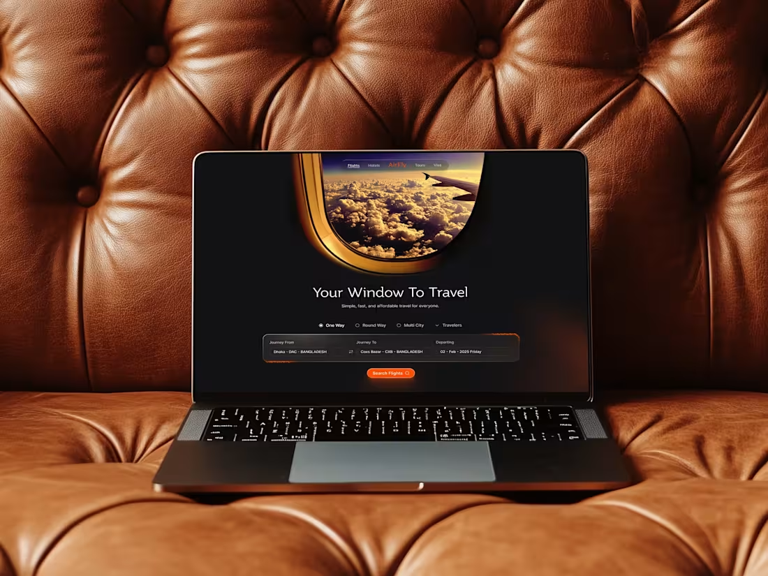
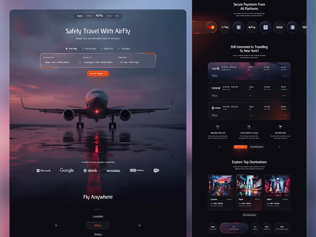
AirFly - Flight Booking Website UI Design
AirFly is a luxury-oriented travel UX concept that moves away from the sterile, cluttered layouts typical of booking engines. The theme focuses on "The Joy of Departure," utilizing a dark, cinematic aesthetic to evoke the mystery and excitement of travel. By combining high-impact photography with a streamlined search interface, AirFly transforms a functional task into a premium digital experience, ensuring users feel the "safely travel" promise from the first click.
Key Design Features:
Cinematic Hero Header: A breathtaking full-width landing page visual that establishes immediate emotional trust and brand authority.
Intuitive Search Widget: A glassmorphic flight selector that simplifies complex "One Way," "Multi City," and "Traveler" variables into a single, sleek bar.
Dynamic Retargeting Section: A "Still Interested in New York?" component designed to reduce cart abandonment through personalized, data-driven flight recommendations.
Trust Indicators: Seamlessly integrated social proof through a "Trusted by popular companies" marquee and clear payment gateway icons (Apple Pay, Google Pay, Visa).
1
242
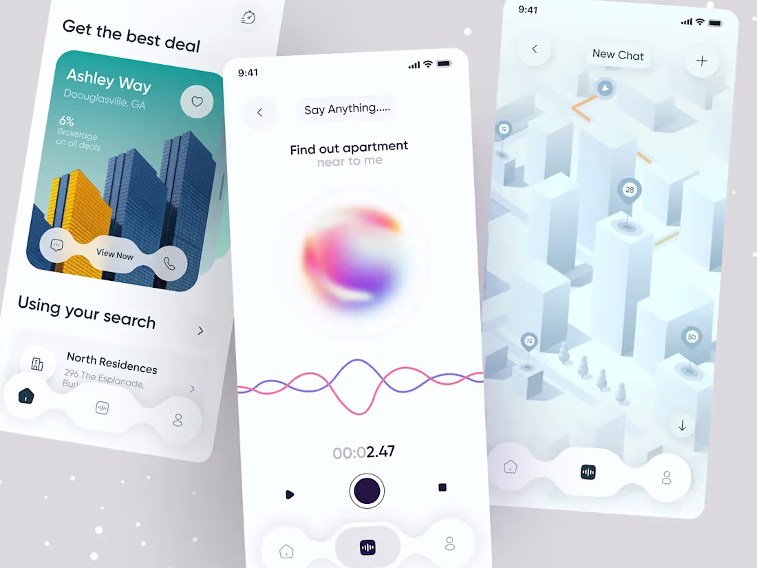
Conceptual Work: Google Nearme - Quick Help UI/UX App Design Concept
Nearme is a conceptual mobile platform designed to redefine how people connect with their immediate surroundings by enabling fast discovery of nearby help, services, events, and peer support in one unified experience.
Key Features
Instant Request Flow allows users to create and publish a need in under a minute, reducing friction and improving conversion.
Visual Map Interface displays nearby helpers and opportunities through interactive geolocated pins for intuitive discovery.
Interest Based Filters help users quickly navigate categories like community help, free exchanges, and local events.
Trust Driven Profiles include verification badges, distance, ratings, and identity elements to build confidence in interactions.
Design Approach
The process began with research and benchmarking against local service platforms and Material Design principles. Wireframing focused on optimizing the Quick Help flow for one handed use and minimal cognitive load.
High fidelity design introduced a clean, gradient supported visual system to highlight map and profile elements while maintaining accessibility.
Motion design was a key layer, using subtle animations for incoming pins, location lock feedback, and real time pulse effects to create a sense of live activity and responsiveness.
7
19
598
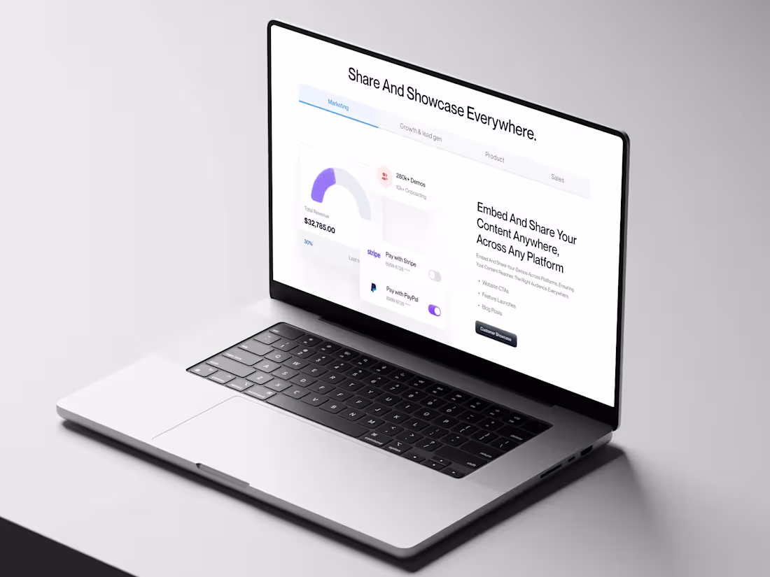
Trailnex: SaaS Marketing Landing Page
Trailnex is a cutting-edge SaaS marketing solution that revolutionizes how marketing, sales, and product teams present their offerings. Trailnex enables users to build and deploy immersive, interactive demo experiences that captivate audiences and drive engagement by leveraging a no-code platform.
The project focuses on innovative UI/UX design to ensure a seamless and engaging user journey, making it easy for teams to showcase their products and services effectively.
2
268
AI-Powered Job Finding App – Job Search UI/UX
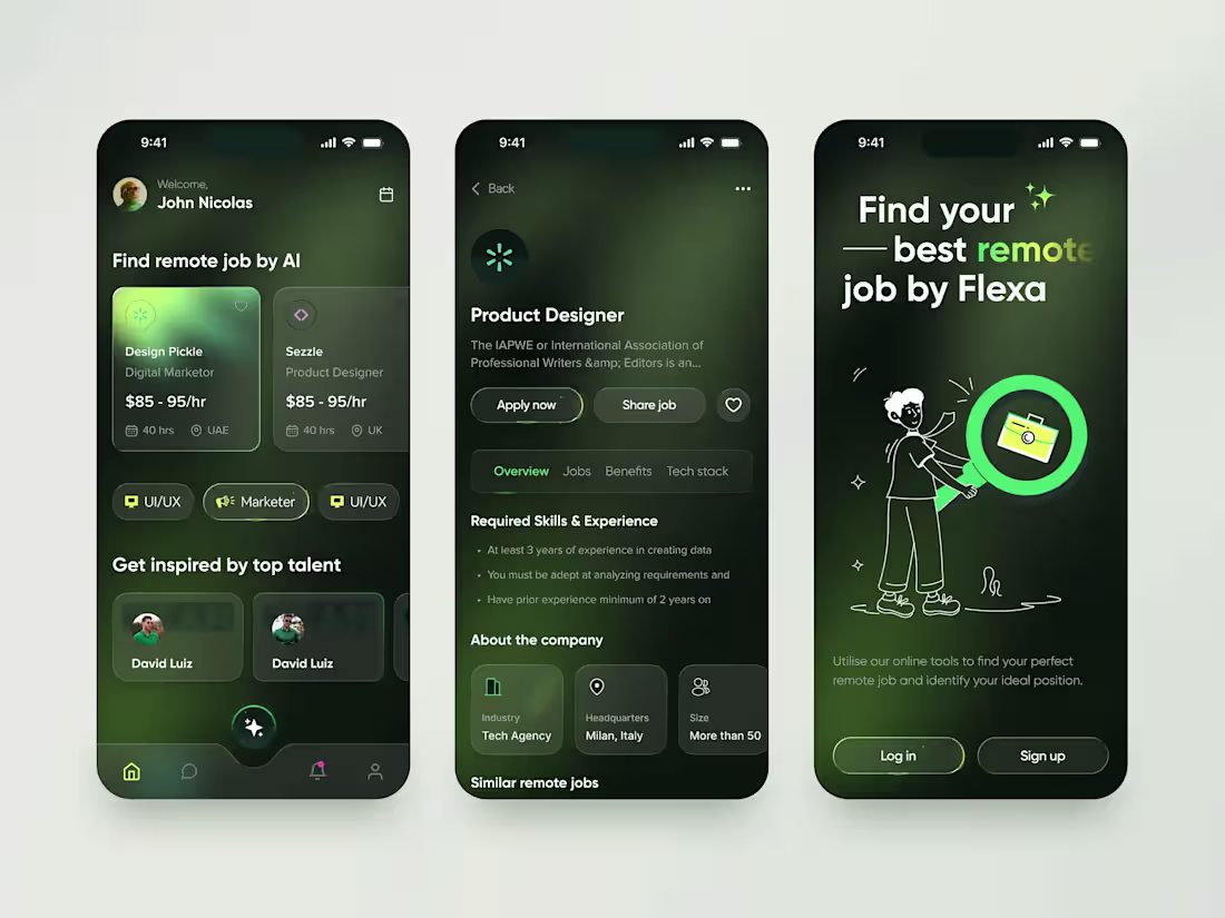
Discover your dream remote role with this AI-powered job finding app UI design. This mobile application concept, 'Flexa', reimagines the remote job search by leveraging artificial intelligence to match top talent with global opportunities.
This shot showcases a clean, minimalist, and dark-themed UI/UX design that focuses on a seamless user experience. The screens featured are:
Homepage: A personalized dashboard where users can find remote jobs matched by AI, explore popular categories like UI/UX and Marketing, and get inspired by top talent portfolios.
Job Details Page: A detailed view of a job listing, including the company overview, required skills and experience, and a clear call-to-action for applying.
Onboarding/Hero Screen: A visually engaging illustration that introduces the app's core concept: using AI to find your best remote job.
Perfect for:
✅ Remote job seekers
✅ Career platforms & startups
✅ HR tech solutions looking for modern design inspiration
3
275
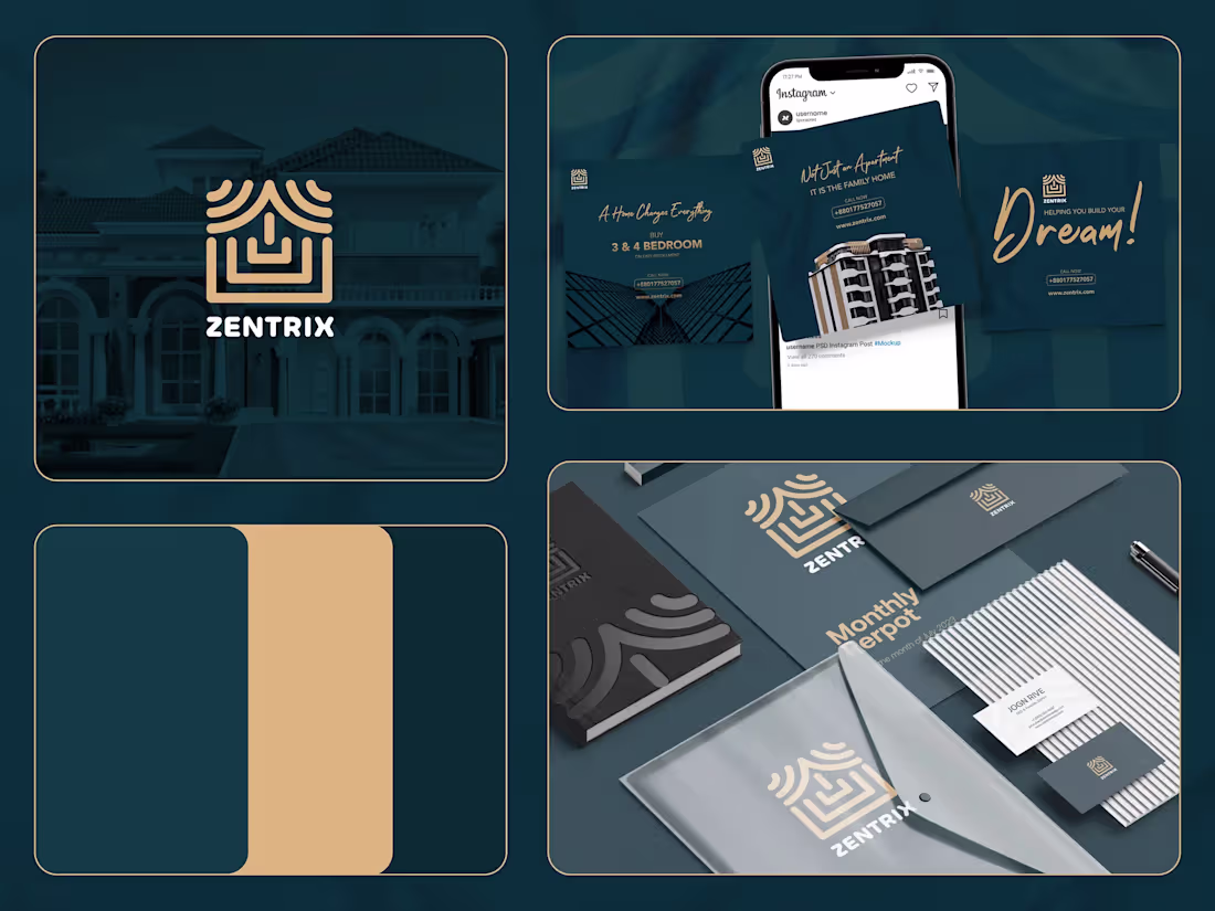
Zentrix Real Estate Company Brand Identity Design
Zentrix isn't just a company; it's a commitment to excellence, innovation, and a client-centric philosophy that transforms the real estate journey. They're here to make a meaningful impact in the lives of their clients and the communities they serve. Welcome to a new era of real estate, where Zen meets the power of Trix, at Zentrix.
Zentrix isn't just a company; it's a commitment to excellence, innovation, and a client-centric philosophy that transforms the real estate journey. They're here to make a meaningful impact in the lives of their clients and the communities they serve. Welcome to a new era of real estate, where Zen meets the power of Trix, at Zentrix.
The logo of Zentrix is a combination of strip lines in the shape of a building. The consistent strip lines depicts that there is consistency between their work and there is harmony in their work process.
Challenges
The branding part was not really challenging but still a bit challenging was to incorporate the luxurious as well as trustworthy vibe to the logo. After some sketches, we were able to do it.
Solutions
To overcome the obstacles, we conducted research and meetings, as well as a lot of brainstorming and sketching. As a result, many ideas came to mind, and we were able to determine exactly what we and the client desired for the logo.
1
207
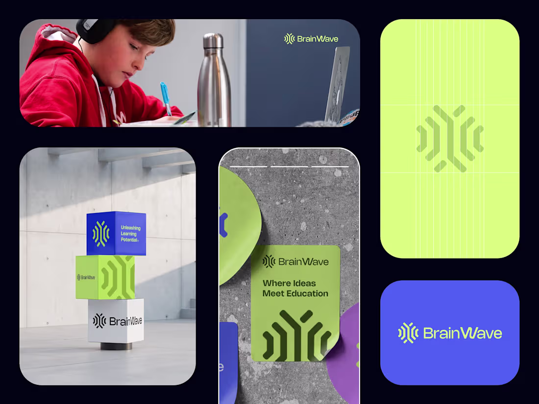
Brainwave | Edtech Brand Identity Design
4
253
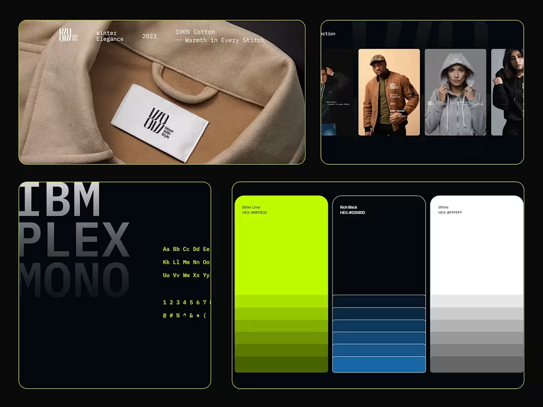
WOOW - Clothing Brand | Brand Identity Design
The WOOW brand design process aimed to create a globally distinctive and versatile fashion identity, emphasizing the extraordinary in everyday living. Beginning with a clear mission to inspire self-expression and uniqueness, we developed a lettering logo with mirrored "WO" elements, symbolizing balance and creativity. The challenge of establishing a unique identity, aligning with the brand's mission, and ensuring adaptability across diverse applications was overcome through thoughtful design decisions. The result is a visually impactful and cohesive brand that not only stands out in the competitive fashion landscape but also resonates with a dynamic global audience, setting the stage for WOOW's successful presence in the industry. Hope you’ll like the project.
1
3
246
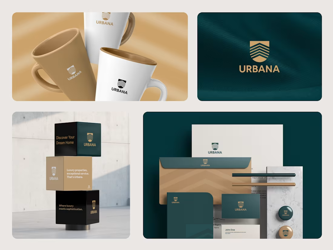
Urbana Brand Identity Design
Urbana is a modern real estate brand focused on luxury properties, premium living, and exceptional client service. The goal of the branding project was to create a sophisticated identity that reflects the expectations of high end clients and positions Urbana as a trusted name in modern real estate.
One of the main challenges was defining a clear brand personality that stood out in a competitive market. To solve this, I conducted in depth research on the target audience, market landscape, and Urbana’s unique value proposition, helping shape a refined and compelling brand identity.
1
181
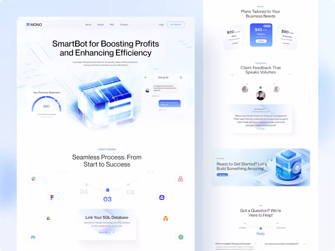
Mono - AI-Powered Sales Solution Website
Mono is a cutting-edge AI-powered sales solution platform that is revolutionizing how businesses manage their sales operations. By leveraging intelligent automation, Mono streamlines workflows, enhances strategic decision-making, and effortlessly drives measurable business success.
Our team focused on crafting a seamless and intuitive UI/UX design for the Mono website that highlights the power of AI while maintaining a clean, modern, and conversion-driven experience. From clear value propositions to smart visual hierarchies, every element was designed to boost user engagement and convey trust.
2
162
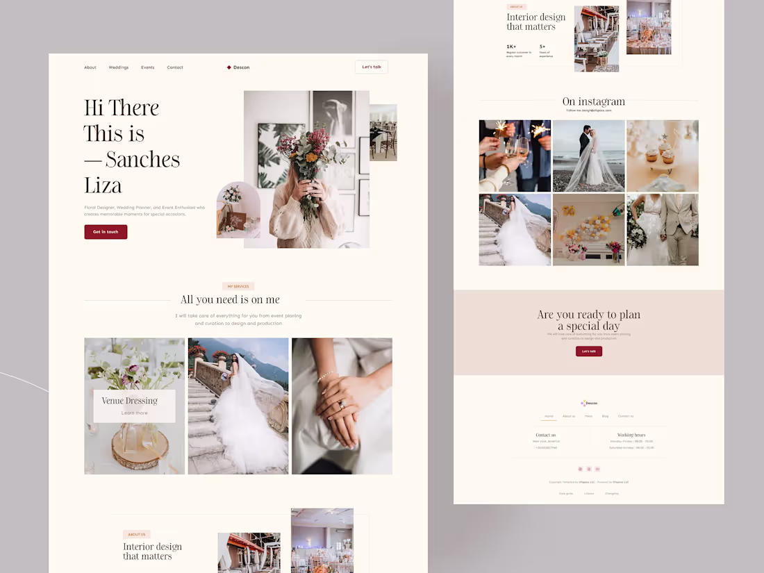
A wedding planner website built around the idea that booking your dream vendor shouldn't feel like filling out a tax form.
I mapped every user touchpoint, from the first scroll to the final inquiry submission, and asked one question at each step: Does this feel as special as the day they're planning for?
The result was an experience that guided couples through complex decisions with soft transitions, intuitive navigation, and a visual hierarchy that let emotion lead and information follow.
The real design challenge wasn't making it beautiful. It was making it calm — for people who are anything but calm while planning the biggest day of their lives.
Still, one of the projects where the UX work mattered just as much as how it looked.
Curious, what's a website interaction that made you feel genuinely taken care of, not just efficiently processed?
1
206
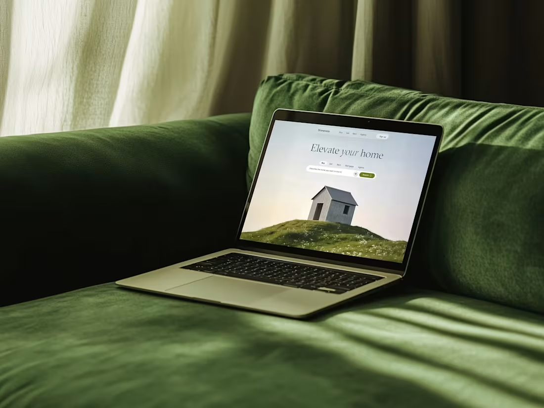
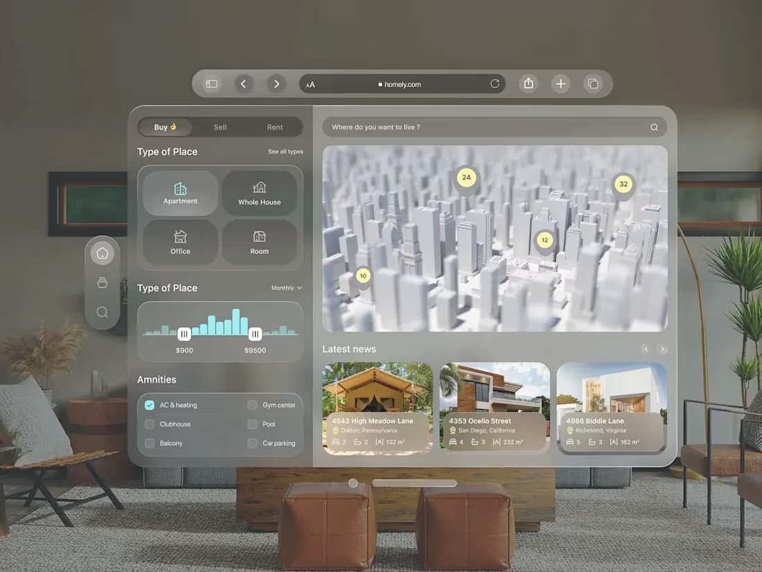
Homevera (V2) - Real Estate Landing Page
Homevera is a high-end real estate platform designed to transform the stressful house-hunting process into a serene, guided experience. The concept focuses on "Emotional UX," using breathtaking natural imagery and a sophisticated glassmorphism interface to evoke a sense of peace and home. It moves away from cluttered listing grids, prioritizing a clean, conversational search entry.
Key Design Features:
Glassmorphic top nav with Home, Buy, Sell, Signup for intuitive access.
Prominent search bar: "Describe the home you want to buy or rent" with orange CTA button.
Expansive hero showcasing a cozy woodland cabin at golden hour for aspirational appeal. Improvements include responsive layout hints, high contrast text, and micro-interactions potential for enhanced engagement.
1
2
201
Creative Digital Agency Landing Page
This is an agency landing page where users can explore the services offered by the design agency to understand whether the agency provides the specific design services they are looking for. Users can read about the agency's background, team members, and mission to get a sense of the company's values and expertise. Users can read client testimonials or case studies to gauge the agency's reliability, professionalism, and the success of their previous projects.
9
5
355
Emitly - Email Campaign Management Platform Mobile App UI
Dive into the world of smart email marketing with this modern CRM mobile UI concept. This design focuses on simplicity and data accessibility, making it easier than ever to manage your campaigns on the go.
This concept showcases a clean, modern, and intuitive dashboard that allows users to:
Automate email campaigns with powerful tools
Track analytics and customer engagement in real-time
Manage leads, contacts, and segmentation effortlessly
Get smart notifications for better campaign performance
This UI/UX design focuses on a seamless experience with intuitive navigation and engaging dashboards, allowing users to easily manage campaigns and track results. A mobile app with real-time notifications and adaptive layouts enables marketing on the go. Emitly is ready to empower businesses with impactful, accessible email marketing that drives audience engagement.
1
252
Royal Estate ( AI Based Real Estate App UI)
About
This is a real estate exploration design that will help to user find-out properties that meet their criteria, such as location, price range, property type, and number of bedrooms. Users can view photos, videos, and detailed information about properties, including property features, square footage, and the number of rooms.
1
219
UNEON - Finance & Banking Landing Page
The concept behind this design was to create a clean, minimalist, and user-friendly interface that feels both professional and innovative. The goal was to redefine the digital experience of finance by using a dark theme with vibrant, futuristic accents to showcase the platform's key features and benefits.
Key Features of the Design:
Sleek Dark Theme: The deep blue and black color palette creates a sophisticated, premium look and feel.
Dynamic Visuals: Subtle animations and glowing elements add a touch of futuristic flair, making the page engaging without being distracting.
Clear Call-to-Actions (CTAs): The design uses prominent CTAs like "Get Started" to guide users seamlessly through their journey.
User-Centric Layout: The information is structured logically, starting with a bold hero section, followed by a breakdown of features, client testimonials, pricing plans, and an FAQ section.
Responsive and Scalable: The design is built to be fully responsive, ensuring a consistent and optimal experience across all devices.
Perfect for SaaS startups and tech companies, this design emphasizes clarity, simplicity, and trust-building components such as customer testimonials and feature highlights. The layout prioritizes fast load times and easy navigation, ensuring an exceptional user experience.
3
222
AirFly - Flight Booking Website UI Design
AirFly. Because booking flights shouldn't feel like filing taxes.
A flight booking experience that actually slaps. Dark mode? Obviously. Glowing orange CTAs? You bet. A cinematic hero that makes you want to quit your job and book a one-way ticket? That's the whole point.
What went into this:
A glassmorphic search widget that makes "One Way / Round Trip / Multi City" feel less like a form and more like a vibe check
"Glow-UX" deep darks so the important stuff (the Search button, the prices) pops like it has its own spotlight
Serif headlines for that editorial, luxury-travel-magazine energy
A retargeting section that whispers "psst... still thinking about New York?" without being creepy about it
Trust badges, payment icons, and a marquee strip that says "yes, real companies use this"
3
3
275
AI Assistant Job Search Dashboard Concept
Crewly is a next generation AI career assistant that redefines job searching through a simple chat first experience. Users just type what they need like “need jobs in Brooklyn” and Crewly instantly turns that into curated, real time job opportunities.
The experience flows seamlessly from a clean mobile chat into a powerful map based dashboard showing the top relevant gigs. No filters, no complexity, just intelligent matching powered by AI.
Visually, Crewly stands out with a premium dark mode interface, glassmorphism elements, and smooth organic motion. A glowing AI orb acts as the core interaction point, making the experience feel alive and responsive.
With a consistent green glow design system and smooth mobile to desktop transition, Crewly delivers a unified, low friction experience for modern job discovery.
1
274
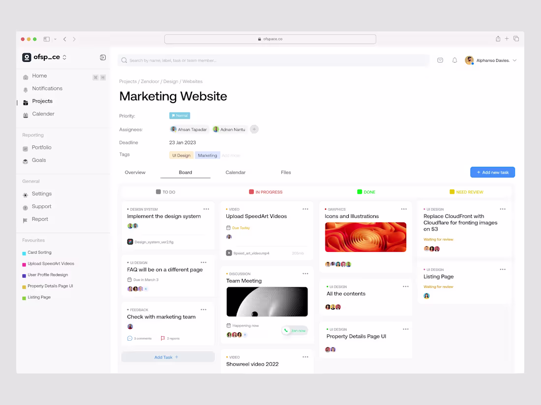
Task Management Dashboard SaaS UI
This UI concept focuses on a high-efficiency Task Management Dashboard for creative teams. The design showcases the "Board" view of a project, where complex tasks like design system implementation and video production are broken down into a structured Kanban interface. It is built to bridge the gap between high-level project tracking and granular task execution.
What Makes This Design Special:
Contextual Information Density: The layout manages to show assignees, deadlines, file attachments, and real-time meeting links without feeling crowded.
Soft Minimalism: A neutral color palette with gentle shadows creates a professional "workspace" feel that reduces eye strain during long hours of use.
Integrated Communication: Smart UI cues like the "Join Now" button for meetings and comment counts directly on task cards foster a collaborative environment.
Key Design Features:
Multi-State Kanban Columns: Clearly defined workflow stages (To Do, In Progress, Done, Need Review) help teams visualize project velocity at a glance.
Media-Rich Task Cards: Support for embedded video previews and file links (like .fig or .mp4) ensures all project assets are centralized.
Advanced Breadcrumb Navigation: A clean hierarchy (Projects / Zendoor / Design / Websites) ensures users can jump between different project segments effortlessly.
Reporting & Analytics Access: Dedicated sections for "Portfolio" and "Goals" in the sidebar turn a simple task list into a full-scale workforce management tool.
0
212
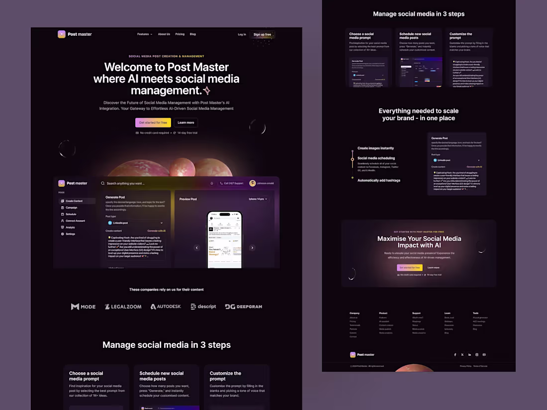
Post Master – AI Social Media SaaS Landing Page UI
Post Master is an AI-driven SaaS platform built to simplify content creation, scheduling, and multi-platform publishing. The design embraces a dark cosmic theme with soft purple gradients, floating 3D planets, and subtle glow effects — symbolizing creativity, intelligence, and limitless reach. Every section guides the user from curiosity to conversion, from a bold hero statement to a transparent "3-step workflow" and a clean feature breakdown.
Key Design Features:
AI-powered content generation interface preview
Intuitive dashboard layout with sidebar navigation
Step-by-step onboarding flow ("Manage in 3 steps")
Integrated post scheduling and preview system
Modular sections for scalability and future features
Conversion-optimized CTA placements for trial signup
Focus on solving content creation fatigue and workflow inefficiency for social media teams
4
7
314
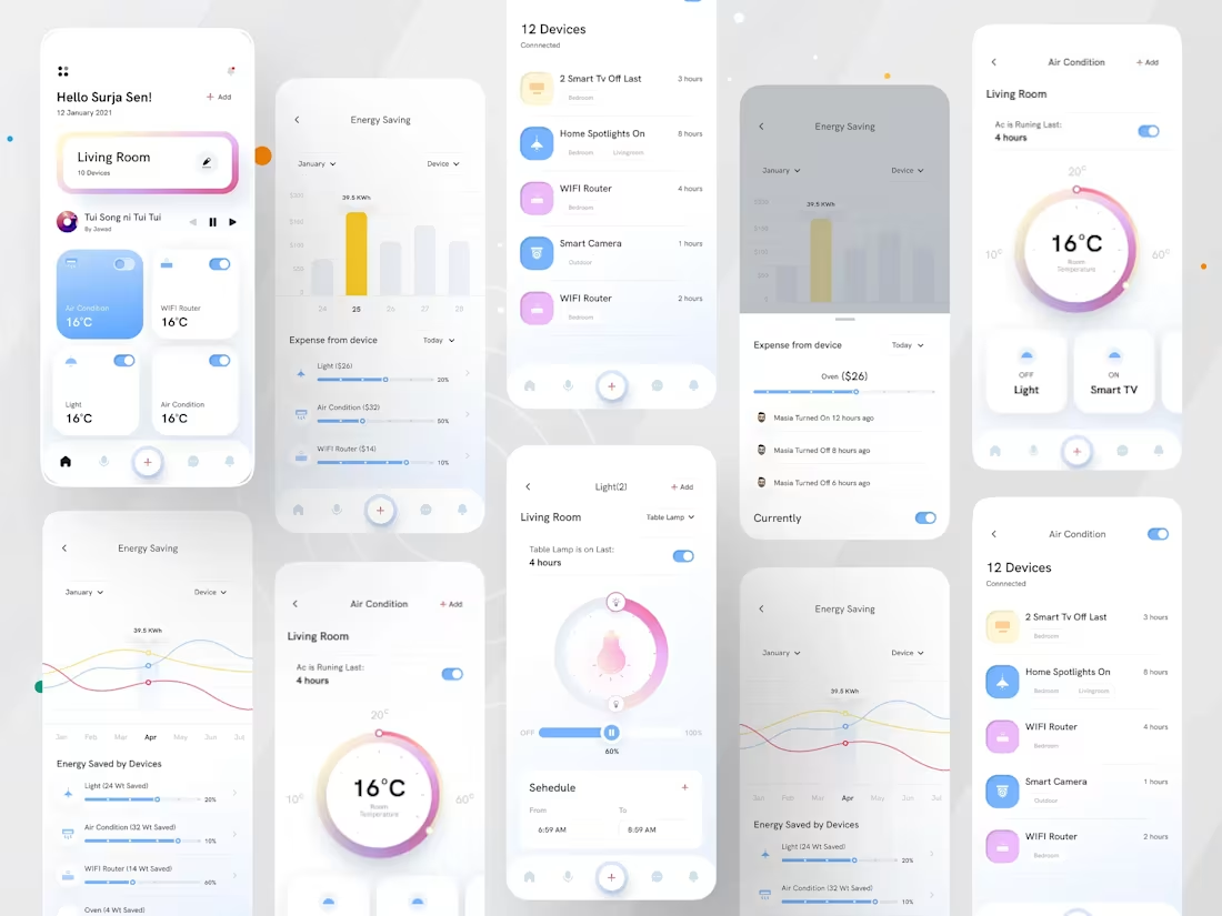
Smart Home App UI - IoT Control Dashboard
The Smart Home Eco concept is a high-fidelity mobile dashboard designed to simplify the complexity of IoT ecosystems. It focuses on the intersection of sustainability and lifestyle, providing users with a visual narrative of their energy consumption alongside seamless hardware control. The design uses a "Soft-Glass" aesthetic to ensure the interface feels lightweight and premium.
What Makes This Design Special:
Intuitive Device Hub — Quick-access tiles let users toggle devices instantly without digging through menus.
Smart Energy Analytics — Visual charts, bar graphs, and wave lines make energy tracking engaging rather than technical.
Premium Visual Hierarchy — Gentle gradients, soft shadows, and clean typography guide the eye naturally.
Gesture-Ready Controls — Circular temperature dials and slider-based light controls feel tactile and real.
Conversion-Focused UX — Every action (Add device, Set schedule, Toggle On/Off) is one tap away.
Unified Design Language — Consistent iconography, color palette, and spacing across 10+ screens.
Problem Solved & Solution:
Problem: Most smart home apps are either too technical for average users or too simplistic to offer real utility, often burying energy data deep in sub-menus.
Solution: This UI brings transparency to the forefront. By integrating energy-saving metrics directly into the control screens, users are nudged toward eco-friendly behavior without sacrificing the convenience of a centralized smart hub.
1
3
229
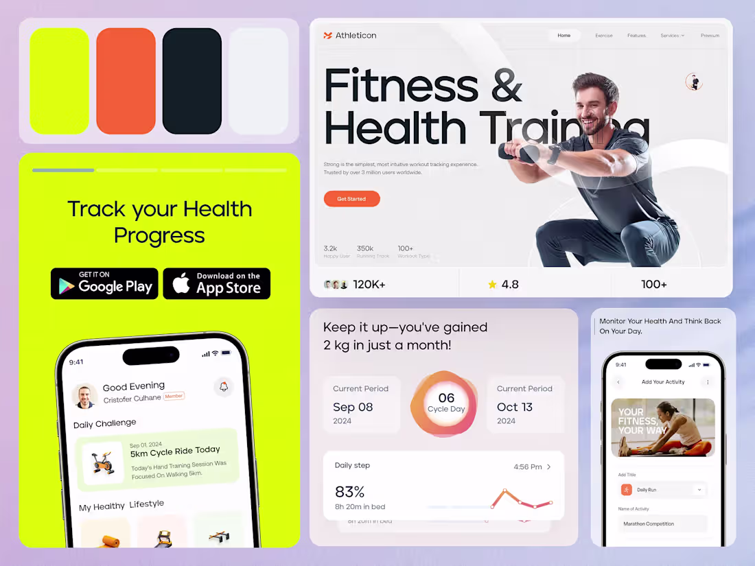
Athleticon Fitness Training
Transform Your Body, Transform Your Life
Overview: Athleticon revolutionizes the way you approach fitness with its customized workout plans, real-time progress tracking, and access to certified coaches. The platform provides a holistic approach, integrating strength training, cardio, flexibility routines, and nutrition advice to create a balanced and efficient fitness plan tailored to your goals. From building muscle to shedding pounds, Athleticon is committed to helping you unlock your full potential, wherever you are in your fitness journey.
Unique Features of Athleticon
Adaptive Workouts with AI-Powered Adjustments Athleticon doesn’t just set a static plan—it adapts to your progress. With each workout, the platform analyzes your performance and dynamically adjusts exercises, intensities, and recovery times to optimize your progress, ensuring that your routine grows with you, keeping the challenge fresh.
Community-Driven Challenges & Live Competitions Athleticon fosters a sense of community with interactive challenges and live competitions. Compete with friends or global users, track your rankings, and stay motivated with real-time feedback, making fitness fun and engaging like never before.
Integrated Mind & Body Wellness Program More than just a workout app, Athleticon incorporates mindfulness exercises, mental resilience training, and guided meditation. This holistic approach ensures that users are not only physically fit but also mentally strong, promoting overall well-being.
3
5
312
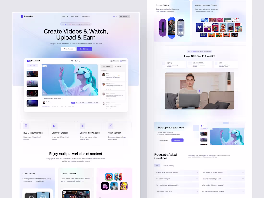
StreamNext — Video Streaming Platform UI Design
Presenting StreamNext, a sleek and modern video streaming platform UI designed to help creators effortlessly upload, share, and monetize their video content. This design focuses on a seamless user experience, combining clean aesthetics with powerful features for content creators and viewers alike.
Key Features:
Create Videos & Watch, Upload & Earn: Turn your videos into revenue. A simple, intuitive interface encourages users to upload content and start earning quickly.
Video Explorer: Browse and explore videos with rich media previews, viewer comments, and interaction options.
Monetization Dashboard: Track your earnings and schedule video releases with ease.
Content Variety: Support for multiple video categories, including quick shorts, global content, and even adult content, tailored for diverse audiences.
Unlimited Storage & Downloads: Stream your videos without buffering, with unlimited storage and download options for creators.
HLS Video Streaming: Smooth streaming technology ensures a buffer-free viewing experience.
2
2
248
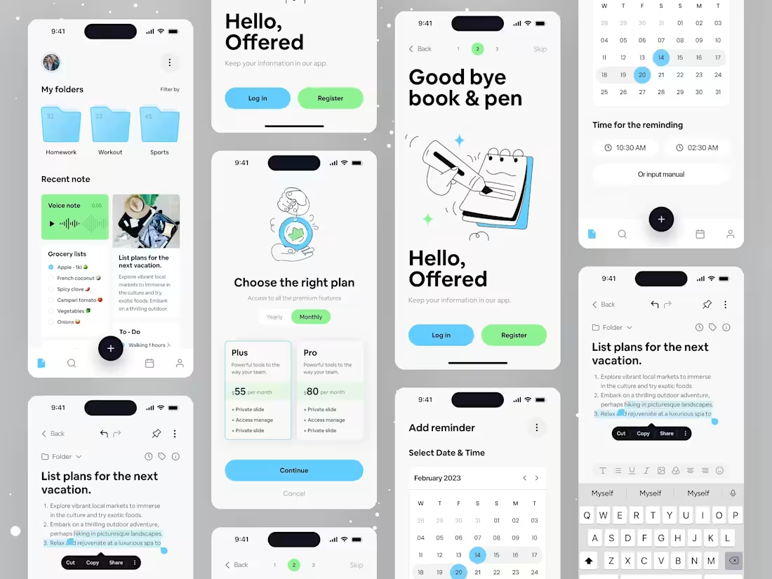
Note-Taking Mobile App UI
Offered is a high-utility mobile application designed to bridge the gap between simple jotting and complex task management. This concept focuses on a seamless, multi-modal experience where users can organize thoughts through voice notes, structured folders, and interactive calendars. The design language utilizes a "Soft-Tech" aesthetic—combining clean typography with friendly, rounded elements and a refreshing blue-and-green palette.
Key Design Features
Integrated Multi-Media Notes: Support for voice memos, rich-text editing, and checklist formats within a single view.
Advanced Scheduling: A custom-designed calendar picker that simplifies setting reminders and deadlines without leaving the note context.
Conversion-Centric Paywall: A clean, tiered subscription model ("Plus" vs. "Pro") that uses clear value propositions and high-contrast toggles for monthly/yearly billing.
1
204
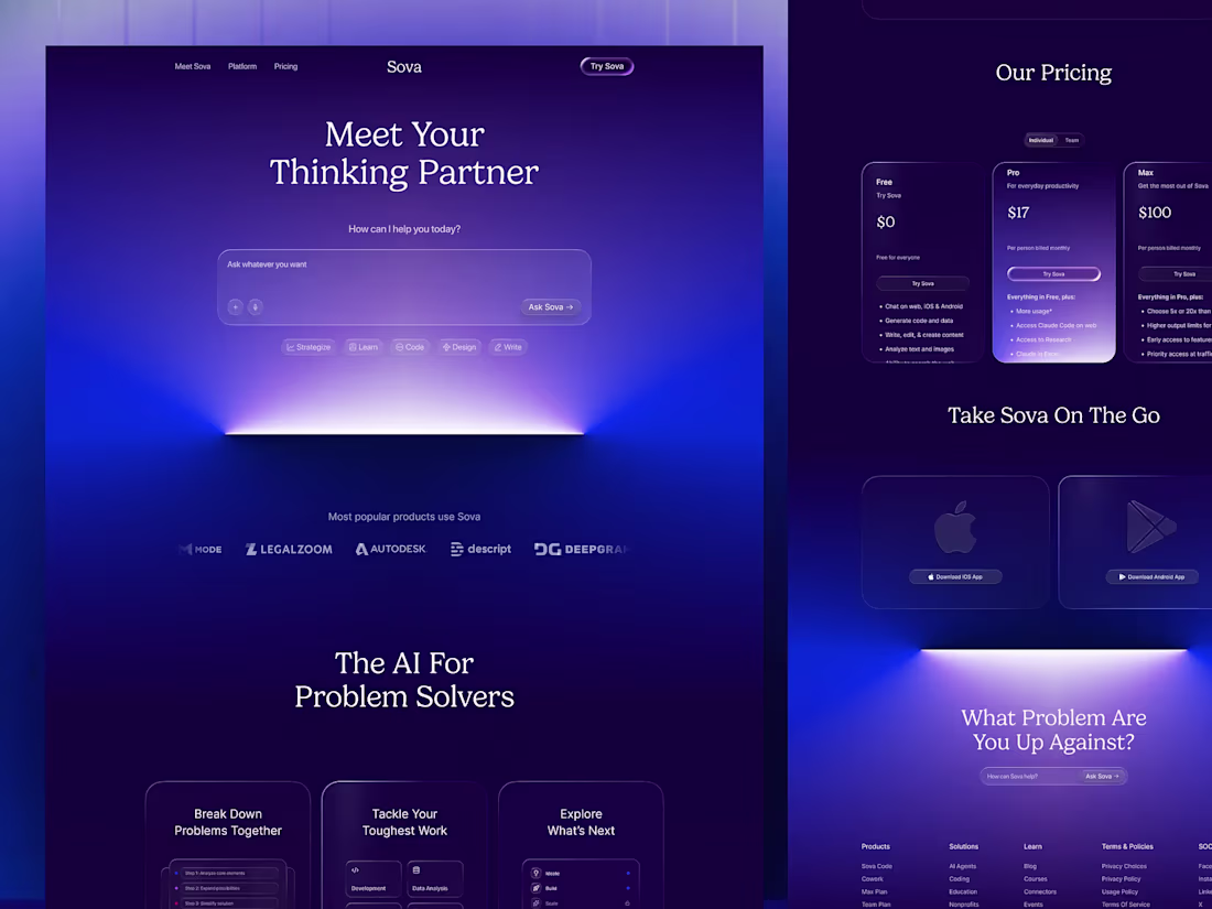
Sova AI — Dark SaaS Landing Page Design
Sova AI is a next-generation AI-powered thinking and problem-solving platform built for individuals, teams, and businesses who demand more than a basic assistant; they need a true thinking partner. This shot presents the complete Dark SaaS Landing Page Design for Sova — a visually immersive, conversion-focused web experience built entirely around deep indigo and violet gradients, cinematic glow effects, and editorial typography. From the hero prompt interface down to the pricing tiers and mobile app section, every scroll tells a story that makes AI feel both powerful and deeply personal. Designed for the modern SaaS era — bold, dark, and built to convert.
Key Design Features:
Dynamic Pricing Tiers: Clean, vertical glass cards that clearly differentiate value propositions for Pro and Max users.
Seamless Cross-Platform Presence: Dedicated sections for iOS and Android integration to emphasize the "on-the-go" utility.
Problem-First Architecture: Instead of focusing on features, the layout prioritizes the user's pain points with the "The AI For Problem Solvers" section.
4
224
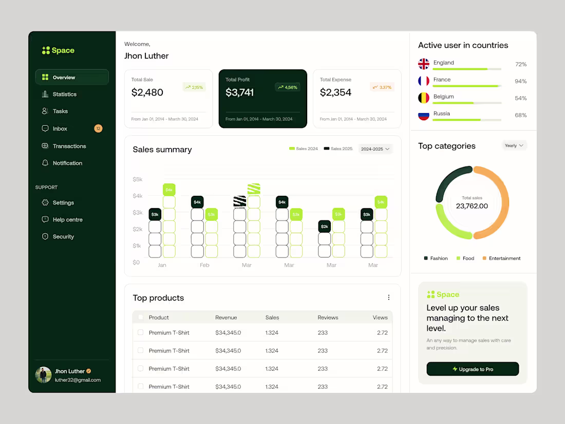
Sales Analytics Dashboard Design |
The Space Dashboard is a sophisticated, data-centric SaaS platform designed for e-commerce managers and business owners. It focuses on high-level financial tracking, Sales, Profits, and Expenses. through a dark-themed sidebar and a light, breathable content area. The interface balances high-density data visualization with an approachable, clean aesthetic to ensure users can monitor global performance metrics without cognitive overload.
Key Design Features:
Unified Global Tracking: Real-time user distribution maps and country-specific engagement bars.
Category Breakdown: An intuitive donut chart for "Top Categories" (Fashion, Food, Entertainment) to identify revenue drivers quickly.
Product Performance Table: A clean, actionable list view for "Top Products" featuring revenue, sales volume, and user sentiment (reviews).
Modular "Upgrade to Pro" Widget: A non-intrusive, conversion-focused call-to-action designed to drive SaaS revenue.
2
4
246
A set of elegant and versatile feature cards designed specifically for SaaS platforms and modern web applications. These cards showcase key product features with clean layouts, subtle depth, meaningful icons, and engaging micro-interactions. Built for dashboards, marketing pages, and pricing sections, they deliver a premium, trustworthy feel while making complex SaaS offerings instantly scannable and appealing.
These feature cards stand out through their refined balance of minimalism and visual hierarchy. Thoughtful use of whitespace, soft shadows, and smooth hover animations creates delightful user engagement without overwhelming the interface. The design feels premium yet approachable, helping SaaS products communicate value quickly and effectively while maintaining consistency across the entire product ecosystem.
Problem Solved & Solution: Many SaaS feature sections suffer from cluttered, boring, or inconsistent card designs that fail to capture attention or clearly communicate benefits, resulting in lower engagement and conversion rates. This solution provides a polished, conversion-focused card system that improves scannability, boosts visual appeal, and guides users toward key actions — ultimately helping SaaS platforms increase user understanding, interest, and sign-ups.
1
207
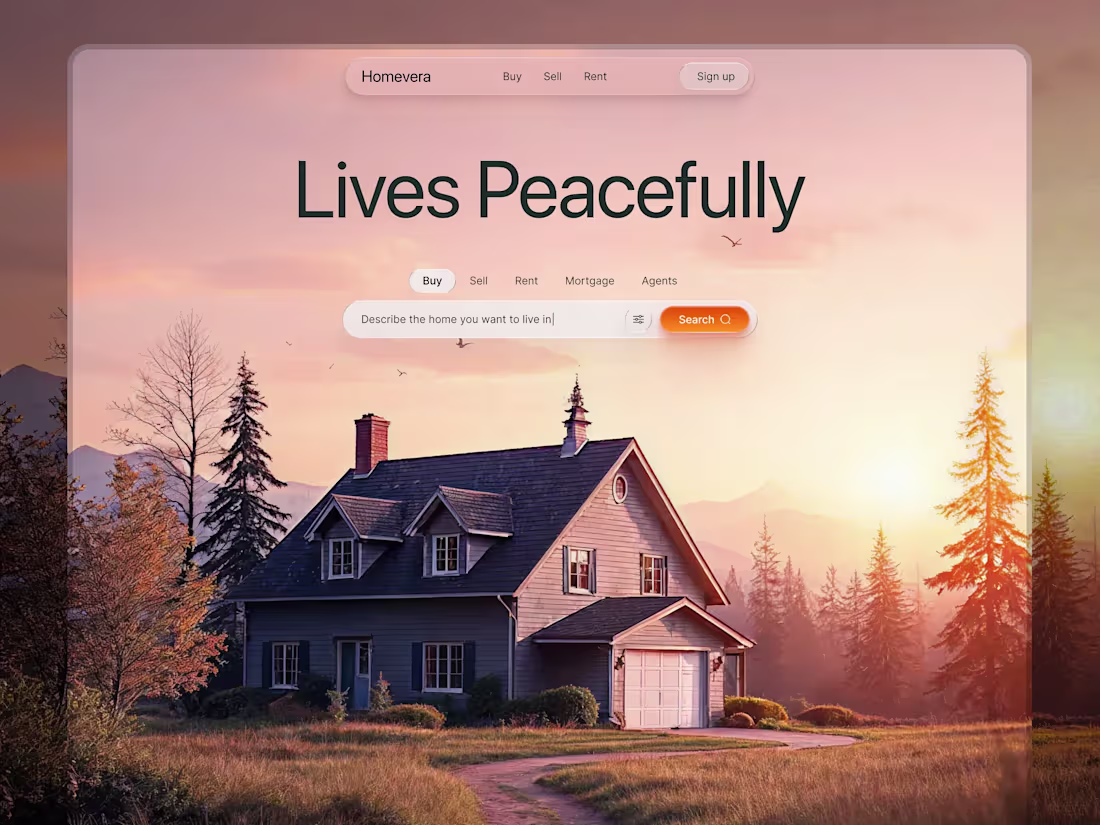
Homevera - Real Estate Landing Page Hero
Homevera is a high-end real estate platform designed to transform the stressful house-hunting process into a calm, guided, and emotionally engaging experience. Built around Emotional UX, it combines immersive natural imagery with a refined glassmorphism interface to evoke a sense of warmth, clarity, and belonging.
Moving away from cluttered listing grids, Homevera introduces a clean, conversational approach—allowing users to describe their ideal home naturally instead of navigating complex filters.
Key Design Features:
Glassmorphic Navigation: Sleek top navigation with Home, Buy, Sell, and Signup for intuitive access and a premium feel.
Conversational Search: A prominent search bar—“Describe the home you want to buy or rent”—paired with a bold orange CTA to guide user intent.
Aspirational Hero: A full-width woodland cabin at golden hour, creating immediate emotional connection and lifestyle appeal.
Usability Enhancements: Responsive layout cues, high-contrast typography, and micro-interactions to improve engagement and accessibility.
Homevera positions itself not just as a property platform, but as a curated digital experience that builds trust and supports confident decision-making
2
210
Mindlytics - Mental Wellness SaaS Hero Section
Mindlytics is a SaaS mental wellness platform designed to help users track, understand, and improve their psychological well-being through intelligent data insights. This shot showcases the hero section of the landing page — the first impression users experience when they land on the product. The design goal was simple: communicate trust, clarity, and calm within seconds. The hero is crafted to instantly answer "What is this?", "Why does it matter?", and "What do I do next?" — all while feeling visually striking and emotionally safe.
Most SaaS hero sections shout for attention — Mindlytics earns it through calm confidence. The layout uses a deliberate balance of bold typographic hierarchy and airy whitespace to create an experience that feels premium without being intimidating. Every visual decision — from the headline scale to the CTA placement — is designed to guide the user's eye in one seamless flow, reducing bounce rate and increasing the likelihood of conversion. This is a hero section that doesn't just look good — it works.
2
250
Tactical Strike - Futuristic Fighter Jet UI Concept
This project explores a high fidelity Tactical Flight Dashboard built for next generation aerial engagement. The interface combines dark mode visuals with high contrast amber telemetry to maintain clarity in high stress scenarios. A functional HUD enables real time tracking of proximity alerts, target distance, altitude, and weapon lock systems. The adaptive reticle scales with target proximity, while a compact radar module provides 360 degree awareness. Mission critical data is prioritized through clear visual hierarchy, reducing cognitive load and helping pilots focus on the primary objective.
1
1
244
This modern mobile sports app UI design delivers real-time match stats, player performance tracking, and intuitive navigation, optimized for an engaging user experience. Designed with a mobile-first approach, this interface ensures smooth interaction for sports fans who want live data at their fingertips.
What Makes This Design Special: Featuring a clean, user-friendly interface, the design prioritizes easy access to match data and player statistics. With dynamic visuals, clear typography, and a bold color scheme, it stands out as a mobile-optimized solution for sports enthusiasts looking for an interactive experience.
2
3
240
Social App UI Design Channel Creation & Management
This UI design focuses on streamlining the creation and management of communication channels, offering users an intuitive platform to create new channels, join recommended ones, and manage their community. The design centers around simplicity and ease of navigation, ensuring a clean user experience.
The core strength lies in its exceptional visual hierarchy and clean, modern layout. It utilizes soft gradients on action buttons for a welcoming yet professional feel, complemented by bold, concise typography. The overall aesthetic ensures effortless UX for quick channel creation and smooth navigation between joined, saved, and archived channels.
2
2
242
Homevera --- Real Estate Landing Page UI Design
Homevera is a high-end real estate platform built around the idea of Peaceful Living. Instead of cluttered, data-heavy layouts common in property sites, it uses generous white space and immersive photography to reflect the calm and elegance of the homes it showcases. The result is an emotional, trust-driven experience from the first scroll.
The design features a clean editorial layout, strong visual hierarchy, and a search-first hero section. Clear navigation for Buy, Sell, Rent, and Agents reduces friction. Broker credibility signals, location chips, and an app download block support faster discovery, stronger trust, and higher-quality lead generation.
3
3
252
Copy-Pasta - Crypto Trading & SaaS Landing Page
Copy-Pasta is a high-performance Web3 platform simplifying crypto trading for both experts and enthusiasts. It focuses on on-chain transparency and automation, letting users effortlessly mirror successful "whale" wallets. The design features a sleek dark theme with vibrant gradients highlighting key data like portfolio performance and real-time insights. Key features include an interactive dashboard for live analytics, an Automation Hub for “Set and Forget” trading, Trust Indicators with shields and locks, smooth micro-interactions between sections, and responsive pricing toggles that emphasize Premium value.
1
240
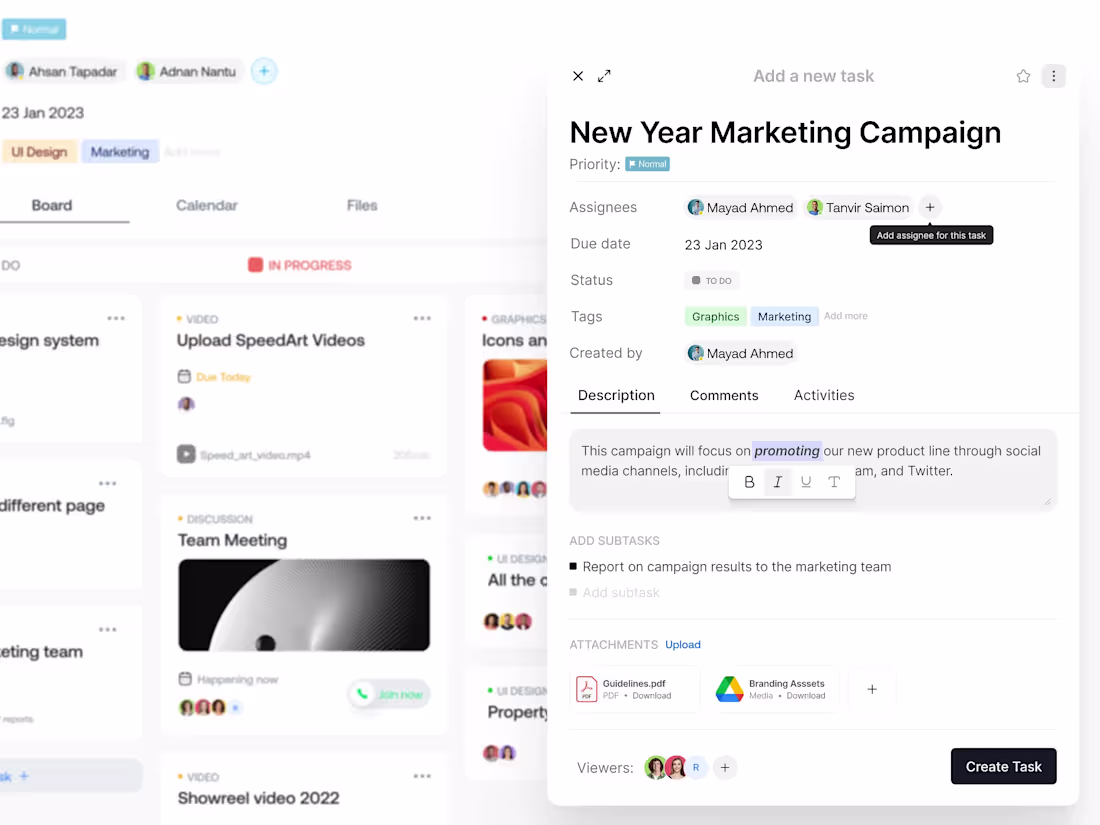
Project Management Dashboard UI Task Modal
Project Concept:
This design showcases a clean and functional New Year Marketing Campaign Dashboard, ideal for tracking marketing tasks, team progress, and file management. The interface is designed to streamline task management with a simple, visually engaging layout.
Key Design Features:
Task Management: Easy-to-follow interface for creating and assigning tasks.
Progress Tracking: Visual indicators for tracking task status (To Do, In Progress).
Customizable Tags: Assigning tasks based on categories like Marketing, Graphics, and more.
File Attachments: Effortlessly upload and manage resources like PDFs and media.
Collaborative Environment: Designed for smooth team communication, making it ideal for collaborative projects.
1
2
242
AgentFlow - SaaS Landing Page for AI Agents
AgentFlow is a modern landing page for an open-source AI platform, empowering professionals—from lawyers to coaches—to build, brand, and monetize custom AI agents using their own "Clean Data."
The design stands out with dynamic gradient glows and high-contrast transitions. It features a clean dashboard, clear data visualization, prominent CTAs, seamless navigation, visual pricing highlights, and brand integration spaces, making complex AI workflows feel accessible and premium while building user trust.
1
2
241
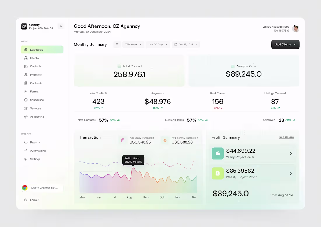
Orbitly - CRM Analytics Dashboard
Orbitly is a purpose-built CRM and project management platform designed for agencies that need clear, actionable insights from complex data. Its Monthly Summary dashboard embraces a true data-at-a-glance philosophy, enabling agency owners to monitor financial health, claim status, and client growth without cognitive overload.
The interface uses a refined soft-UI style with subtle glassmorphism and a calming mint-and-sage palette. Layered cards, strong visual hierarchy, and generous whitespace make dense financial data easy to scan. Key features include intuitive revenue trend charts, a workflow-focused sidebar, and contextual KPI cards with growth indicators, bringing clarity, focus, and control into a single view.
1
272
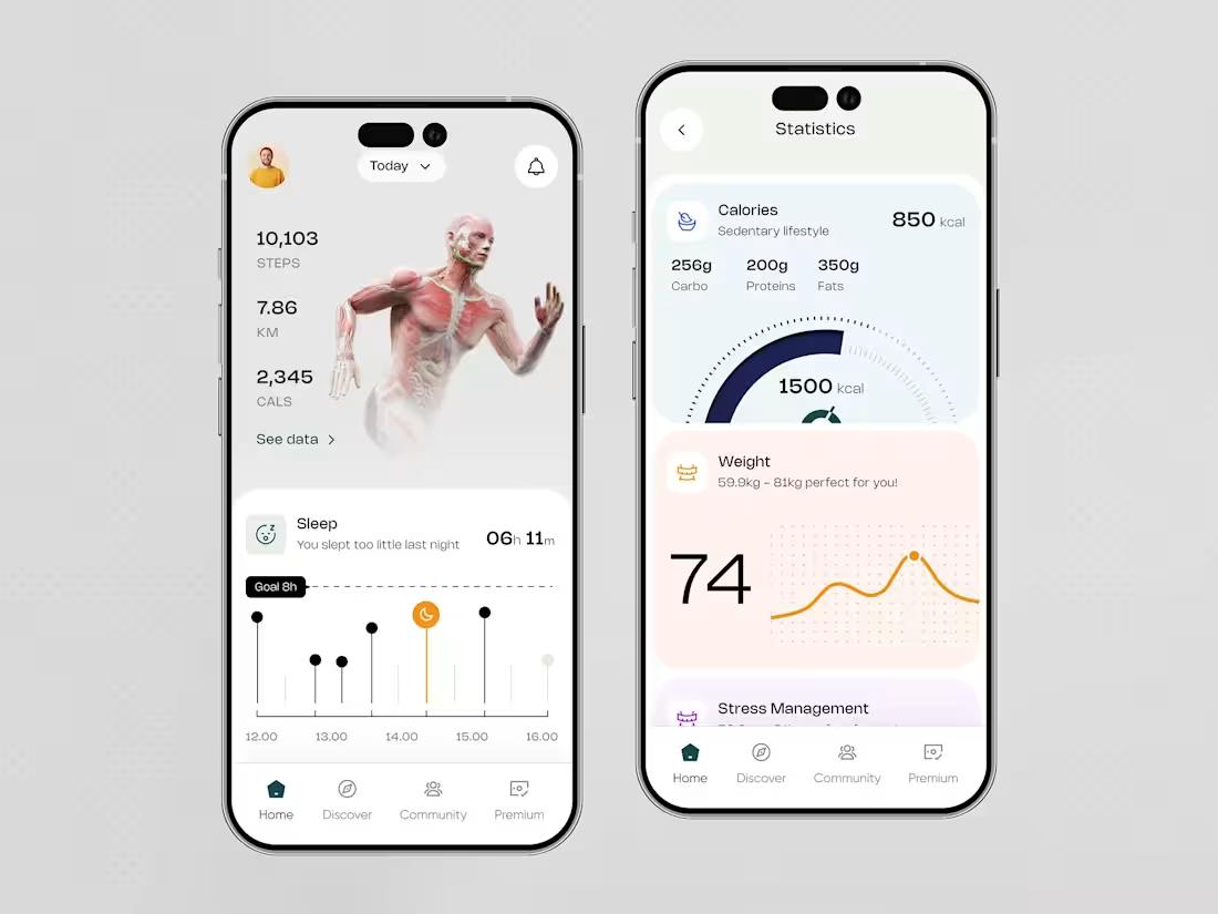
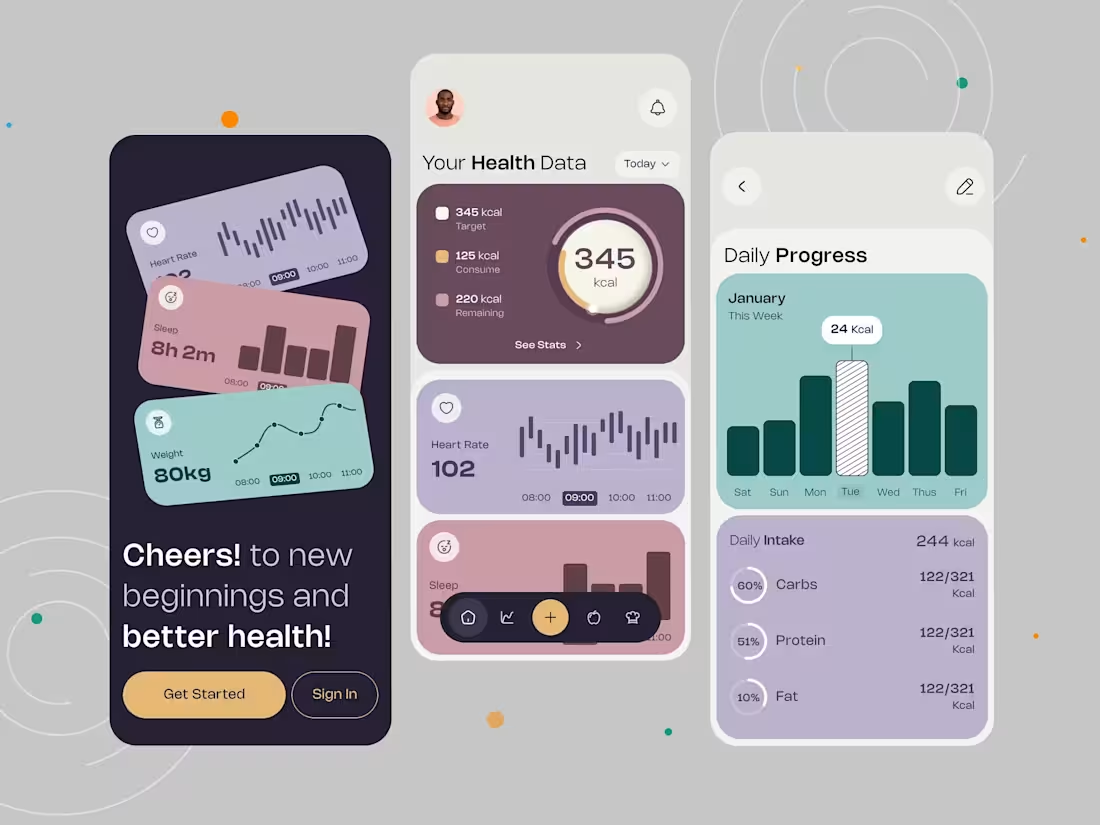
Fitness Tracker App Design for Health Insights
Project Concept: This UI design is focused on providing users with a comprehensive fitness dashboard. It combines tracking key health metrics such as steps, calories burned, sleep patterns, and stress management into a clean, intuitive interface. The goal is to make users more aware of their fitness journey and encourage healthier habits through seamless design and easy navigation.
What Makes This Design Special: The design stands out due to its clean layout, intuitive navigation, and vibrant visual hierarchy that ensures users quickly access their fitness data. It features personalized health metrics, with dynamic charts and engaging elements like animated figures and real-time feedback, all contributing to a modern, user-friendly experience.
1
3
286
Warden: SaaS Landing Page UI Analytics & Metrics
Warden is a client management platform built to close the communication gap between agencies and stakeholders through radical transparency. It offers a centralized dashboard that turns complex project data into clear, visual updates, reducing meeting overload while maintaining momentum with real time analytics and automated reporting. The design emphasizes conversion with a clear hero section, strong visual hierarchy, social proof, and an interactive dashboard preview. A mobile first, modern interface with refined glassmorphism ensures clarity, trust, and consistency across devices.
1
2
282
American Football Sports Mobile App Design
Designed for American football fans, this mobile app offers a clean, immersive way to stay connected to the game.
Live scores update in real time, while detailed team and player stats provide deeper insight into performance. A simple bottom navigation makes moving between home, matches, and teams effortless. The modern dark aesthetic, bold typography, and subtle animations create a smooth, engaging experience that’s easy on the eyes and focused on what matters most.
2
2
251
Payfinity – Brand Identity
We developed a clean, modern, and trustworthy visual identity for Payfinity, a fintech platform that bridges innovative technology with user confidence. The main challenge was creating a simple, distinct brand in a market full of generic logos. Through research and collaborative workshops, we designed a cohesive brand system, including a versatile logo, messaging, and guidelines. This framework clearly communicates Payfinity’s value proposition to clients, investors, and the media while maintaining a sophisticated and approachable visual language.
3
9
298
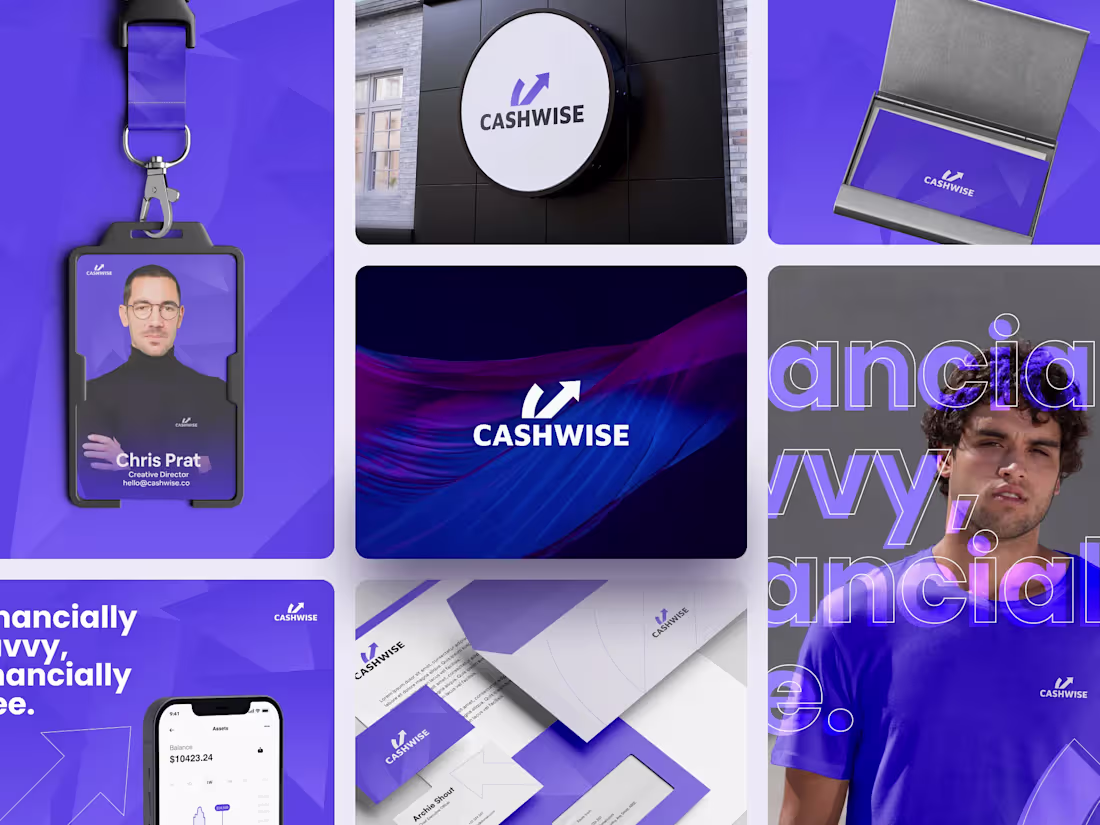
Cashwise - FinTech Branding UI/UX Concept
Projec Concept:
This design presents a modern and sleek brand identity for Cashwise, a platform that helps users manage money simply and confidently. Vibrant colors and dynamic visuals highlight a fresh and forward-thinking approach to financial tools. Clean layouts and bold elements keep focus on clarity, ease, and user empowerment.
What Makes This Design Special:
Strong purple tones, minimal design, and modern typography shape a sharp and confident look. Digital screens and physical items like business cards, ID badges, and merchandise follow one visual style, building a consistent brand presence. Energetic visuals and the tagline “Financially savvy, financially free” reinforce Cashwise as a brand that supports smart and independent financial choices.
2
244
Modern Property Listing UI – Apple Vision Pro ||
Imagine searching for your next home not as a series of flat listings, but as an immersive journey through space itself. This platform reimagines house-hunting with a floating glassmorphism interface and an interactive 3D map that brings neighborhoods and listings to life. Advanced filters help users narrow searches by type, price, or amenities, while property cards provide instant access to photos, location, and details. Clear data visualizations reveal pricing trends, making every decision informed. The result is an intuitive, engaging, and truly interactive property experience.
1
241
Trackit - SaaS Affiliate Marketing Platform ||
Affiliate marketing can feel overwhelming. Tracking links, managing partners, and monitoring performance often takes more time than it should. That is why we created Trackit. Our goal was to make the process simple, clear, and even enjoyable.
When you log in, the dashboard gives you a full view of your business at a glance. Revenue, clicks, referrals, and payments are all organized neatly. Tracking links is effortless. Managing affiliates feels natural. Campaigns stay secure without extra effort. The platform works smoothly on both desktop and mobile.
With Trackit, affiliate marketing becomes manageable. It helps you grow, stay in control, and enjoy the process.
18
365
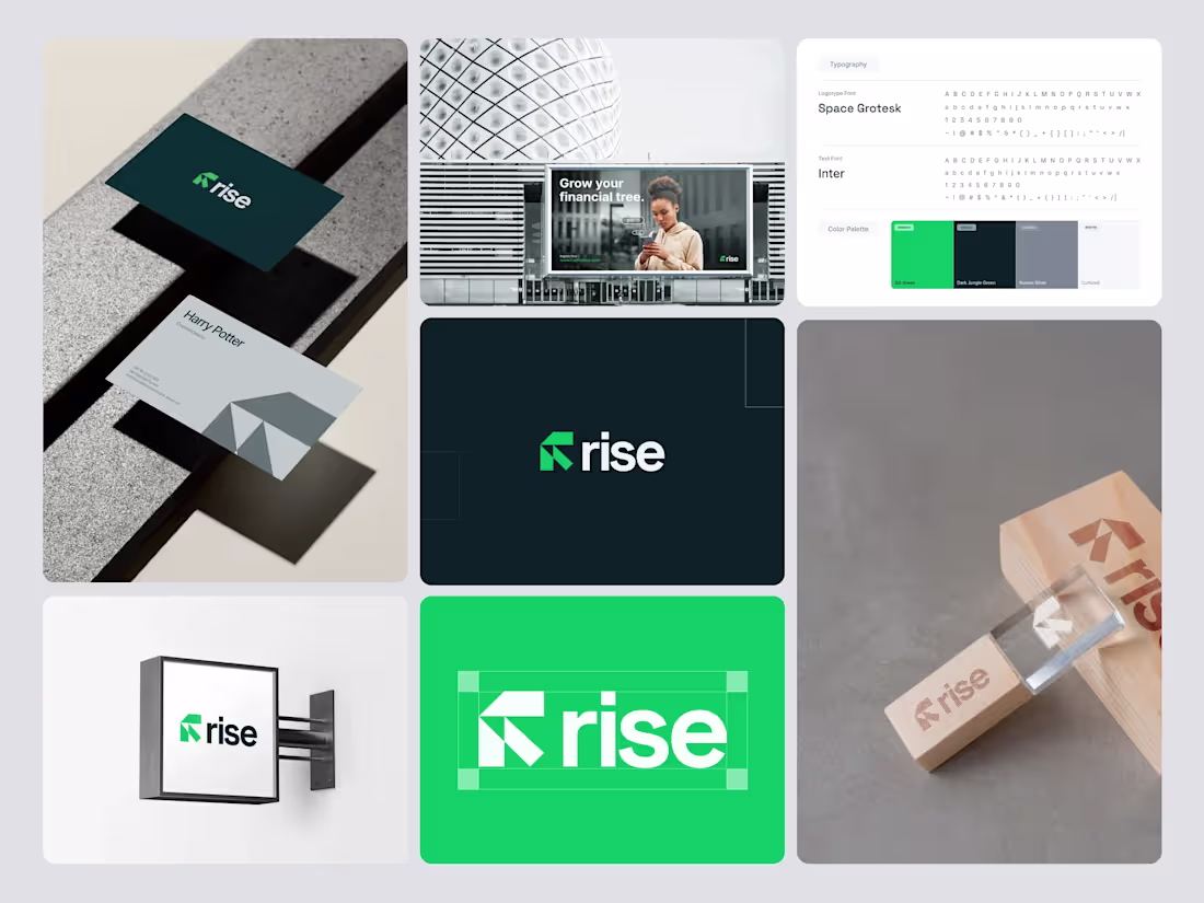
Rise - Fintech Brand Identity & Visual System ||
Concept Project:
Rise is a modern fintech brand created to help people grow their money with confidence and clarity. Its logo features an upward arrow in the “R,” symbolizing progress, growth, and moving forward. The fonts and colors are clean, fresh, and easy to read, giving a sense of trust and simplicity. From business cards and marketing materials to apps and digital platforms, every design element is crafted to feel modern, approachable, and purposeful. While many fintech brands feel either too serious or too playful, Rise strikes the perfect balance, welcoming both first-time investors and experienced traders, making finance feel simple, smart, and achievable.
1
28
411
Fintech Landing Page Design - UIUX for SaaS ||
Presenting a modern Fintech Landing Page designed to showcase premium card services, virtual wallets, and advanced money management. With a clean, professional aesthetic and intuitive UX, it highlights premium and virtual cards, multi-currency support, real-time notifications, cash-back rewards, and mobile wallet integration. Tailored for fintech, neobanks, and SaaS platforms, this design builds trust, engages users, and drives conversions.
6
32
432
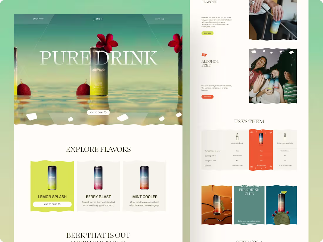
Pure Drink - Immersive Landing Page Experience for Beverage Brands ||
I’m excited to introduce PureDrink, a sleek, refreshing landing page I designed for modern beverage brands. I focused on clean typography, high-quality imagery, and smooth, intuitive interactions to capture the essence of the brand. My goal was to create a minimalist yet luxurious experience that blends functionality with visual appeal, making every scroll feel engaging and immersive. Explore the full design and see how this approach elevates brand storytelling in a modern, captivating way.
14
299
Ledgr - Finance Platform Landing Page ||
Streamline your finances and fuel growth with Ledgr. This landing page concept modernizes accounting for SaaS businesses by turning complex financial data into clear, actionable insights. Built for speed and clarity, it helps teams understand performance at a glance while staying in control of their numbers.
Ledgr enables instant setup, allowing users to connect and get started in minutes without expert support. Automated insights deliver real-time metrics and financial summaries for smarter decisions. A clean, minimalist interface improves usability, while intuitive interactions and clear CTAs guide users smoothly.
The result is a refined, high-impact design that balances function and clarity, positioning Ledgr as a modern, growth-focused fintech solution.
3
25
336
Health & Fitness Tracking Mobile App Design ||
VitalFlow is a sleek mobile app concept designed to simplify personal health management. It transforms complex health data into actionable insights, empowering users on their wellness journey. Featuring a modular dashboard, dynamic progress graphs, calorie breakdowns, and heart rate monitoring, VitalFlow presents information clearly through a minimalist, card-based layout. With seamless navigation, balanced typography, and a soft color palette, the app delivers a modern, engaging, and motivating experience that makes tracking daily activity, sleep, and nutrition effortless.
2
25
333
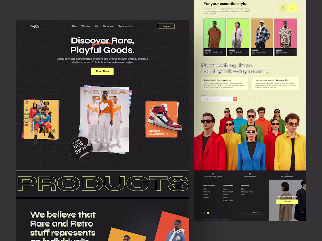
Foggy Clothing - Luxury ecommerce Landing Page ||
This landing page was designed to highlight rare, playful, and limited-edition products through bold typography, high-contrast visuals, and dynamic layouts. The dark grid-based foundation creates a strong visual structure, allowing colorful product imagery to stand out and capture attention instantly.
Clear CTAs, featured drops, and newsletter sign-ups guide users toward discovery and conversion, while modular sections support frequent product updates and campaigns. From a business standpoint, the design drives engagement, repeat visits, and drop-based purchasing behavior, making it ideal for modern streetwear and lifestyle brands
24
353
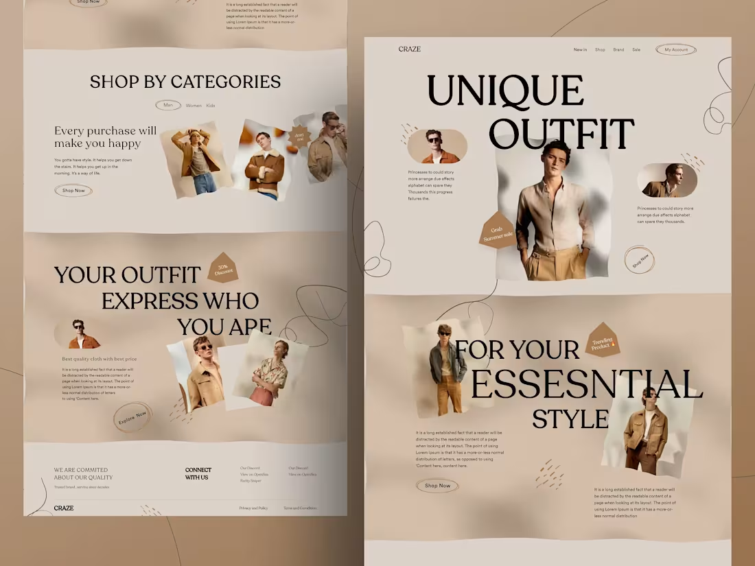
Craze Clothing E-commerce Landing Page ||
This landing page was designed to deliver a premium yet approachable shopping experience for a modern fashion brand. The layout uses strong visual hierarchy, spacious composition, and neutral tones to keep the focus on products while maintaining a refined brand identity.
Clear category sections and strategically placed CTAs guide users smoothly from exploration to purchase, reducing friction and decision fatigue. Lifestyle imagery helps users visualize outfits in real-world contexts, strengthening emotional connection and purchase intent.
From a business perspective, the design supports higher engagement, improved conversion rates, and brand trust, while its modular structure allows easy scalability for promotions, collections, and seasonal campaigns.
1
27
353
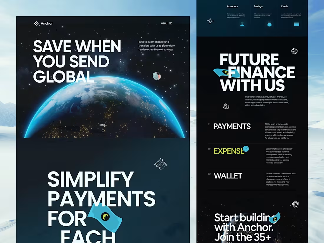
Anchor - Banking and Finance Landing Page ||
This UI/UX concept showcases a landing page for Anchor, a forward-thinking fintech platform. The design emphasizes clarity, trust, and conversion, highlighting services like global payments, digital wallets, and smart financial tools.
Key Features:
Global Payments: Effortless international transfers with minimal fees.
Expense Management: Tools to streamline spending and control finances.
Digital Wallet: Secure, user-friendly access to funds and financial assets.
By combining clear layouts, interactive visuals, and modern UX patterns, the design encourages exploration, boosts user trust, and maximizes conversions, making it perfect for fintech, SaaS, and digital wallet platforms seeking higher engagement and retention.
1
27
363
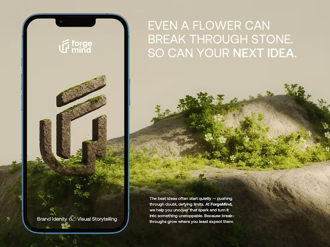
ForgeMind - Brand Identity & Visual Design ||
Project Concept: ForgeMind is my AI-powered idea generation tool for creatives, founders, and innovators. My goal was to create a brand that feels futuristic yet grounded, capturing the organic process of creation. I used the metaphor of a flower breaking through stone to represent breakthrough ideas.
Theme: ForgeMind AI, Organic Tech Brand Identity & Visual Storytelling
Why It’s Special: I focused on an unconventional visual language with a strong hierarchy and high-contrast palette. The 3D stone logo, mossy textures, and clean layout create a tactile, approachable feel that stands out from typical tech brands. My design makes the complex process of idea forging feel intuitive, inspiring, and memorable.
24
306
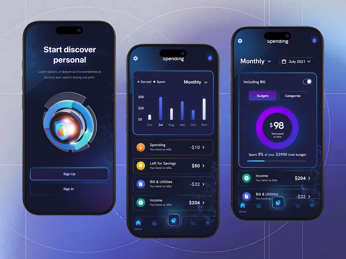
Personal Finance App UI Design ||
This project explores a Premium Personal Finance Dashboard designed for the modern user who values both data transparency and high-end aesthetics. The concept focuses on "Smart Spending," transforming complex financial data into a digestible, visually engaging experience. By utilizing a deep navy palette and neon glowing gradients, the interface provides a sense of security and technological sophistication.
Key Design Features
Onboarding screen with clear value proposition and CTA
Monthly spending analytics with bar charts and visual trends
Budget and category breakdown using circular progress indicators
Smart toggles and filters for time based financial views
Bottom navigation optimized for one hand mobile usage
Designed to reduce financial stress by making data easy to understand
2
16
268
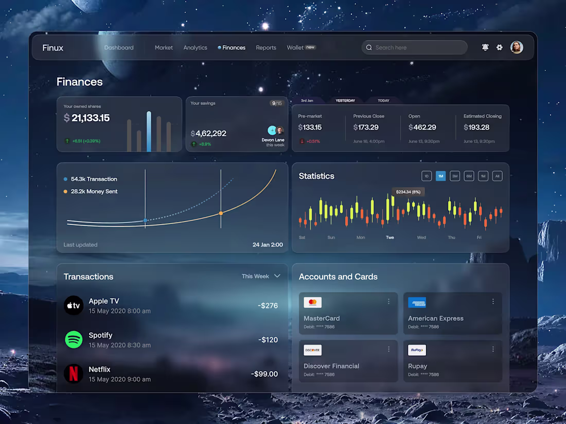
Finux - Finance Dashboard UI Design ||
Finux is a sleek, dark-themed financial dashboard that unifies investments, savings, transactions, and payment methods in one place. Its space-inspired design feels premium and reduces eye strain. Real-time market widgets track shares and savings, dual-line graphs show spending vs. transactions, and a candlestick module highlights market trends. Intuitive icons simplify subscription tracking, while a unified accounts grid gives a clear view of all payment methods, making Finux a seamless companion for smarter money management.
12
251
Fitness Tracker Dashboard: Data-Driven UI ||
The Fitness Tracker Dashboard is a sophisticated dark-mode ecosystem designed for athletes who value clarity and control. Deep gray backgrounds with neon purple accents create a premium, focused environment, while a clean card-based layout brings critical metrics—steps, heart rate, calories, and workout intensity—into immediate view. Custom charts, gauges, and line graphs transform complex biological data into intuitive insights, making progress easy to track. Smart navigation links nutrition, workouts, and professional trainers, bridging the gap between data and guidance. Minimalist design, bold typography, and actionable UX elements combine to reduce cognitive load, keep users engaged, and guide them confidently toward their fitness goals.
18
276
Quantix – AI Analytics Dashboard Design ||
Quantix is a comprehensive dashboard for monitoring LLM applications, providing real-time insights into performance, costs, token usage, and geographic request distribution. The design balances clarity with a modern look, using warm orange accents to highlight key metrics.
Key Features:
Real-time cost tracking with historical comparison
Geographic request distribution
Token usage with latency and throughput metrics
Custom date range filtering (Feb–Mar 2025)
Multi-dimensional charts with benchmark overlays
Problem Solved: LLM applications produce complex, multi-dimensional data. Quantix consolidates this into a single, intuitive interface, helping teams spot cost anomalies, performance bottlenecks, and usage trends quickly—removing the need for multiple tools or manual reports.
1
21
311
Space is a modern project management platform built to help teams work smarter and move faster. Its clean, intuitive interface makes it easy to manage tasks, stay aligned, and uncover meaningful project insights without friction.
What sets the design apart is its strong visual hierarchy and clarity. Key data is easy to scan, actions feel natural, and the UX is clearly conversion driven, guiding users to explore, join, and track growth with minimal effort.
Core features include an interactive calendar for real-time scheduling, powerful reporting and analytics for informed decision-making, simple task and team management for seamless collaboration, and a built-in collaboration hub that keeps communication in one place.
1
2
189
Sova - AI Smart Assistant Landing Page Design
Introducing Sova, an AI Smart Assistant landing page design that blends personalized interactions, lightning-fast responses, and privacy-first architecture.
Explore the concept and see how Sova can elevate your next digital product. Feedback and collaboration inquiries are welcome. Let’s shape the future of intelligent interfaces together!
Key Features:
* Personalized Conversations: Adapts tone, context, and recommendations to each visitor.
* Real-Time Web Connectivity: Optional module for live data and insights.
* Privacy-First Architecture: End-to-end encryption ensures security and trust.
* Creative Engine Modules: Strategize, learn, code, design, and write across diverse AI workflows.
25
316
Chillo Energy Drink - Interactive Design Experience
Project Concept: The Chillo Energy Drink website blends dynamic UI design with an engaging, playful vibe. Inspired by tropical themes and bold flavors, this landing page is designed to reflect the brand's energetic and fun personality. The vibrant, colorful layout matches the product’s lively essence while delivering a seamless user experience.
This design stands out through its playful animations, engaging visual elements like animated can illustrations, and a smooth scroll interaction that keeps users captivated. The modern typography and clear layout support a user-focused experience, making it easy to explore the product offerings.
Interactive Can Animation: The hero section features an animated Chillo can that grabs attention immediately.
22
365
Art Gallery Landing Page UI/UX Concept ||
Project Concept/Theme: PORTRAIT: Art is the Future of Creativity. This design is for a premium, contemporary art gallery and creative hub, focusing on high-impact visual storytelling and a curated user experience. The concept centers on merging classic artistic themes, like the human face and portraiture, with an ultra-modern, editorial, and sophisticated digital interface.
This design stands out due to its bold visual hierarchy and effective use of negative space, giving the artwork room to breathe. The standout elements include the integration of circular and curved geometric shapes to frame key content (like quotes and calls-to-action), creating a sense of movement and artistry.
3
34
435
Fintech Landing Page UI Design for Cash Management ||
$savvy is a premium fintech solution redefining how enterprises manage liquidity. The landing page is built around three financial pillars: paying bills, receiving payments, and real-time cash flow visibility. A dark luxe visual direction positions the brand as secure, modern, and enterprise-grade.
The design emphasizes a seamless, visually engaging experience through bold typography, clean layouts, and vibrant accents that guide users naturally. Immersive 3D elements add depth, while high contrast typography ensures clear hierarchy. A conversion-focused hero with dual CTAs supports different user intents, supported by subtle glassmorphism for a refined, layered finish.
5
24
327
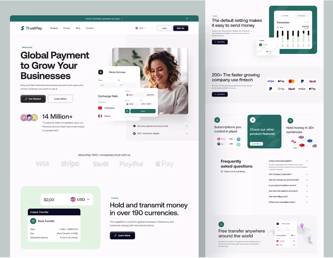
Meet TrustPay, a modern Fintech Landing Page concept crafted to redefine how users experience online payments and cross-border transactions.
This design focuses on clarity, trust, and usability — balancing modern fintech aesthetics with smooth user flow and brand credibility. The clean grid layout, minimal color palette, and modular sections make it both visually elegant and conversion-driven.
The Concept:
Our primary goal was to solve the complexity of international money transfers. We focused on building trust and clarity. The design highlights core features like Instant Transfers, transparent Exchange Rate details, and the ability to Hold Money in 90+ currencies. The layout is designed to immediately grab user attention with key statistics (like "14 Million+ satisfied users") and a clear call-to-action above the fold.
1
28
335
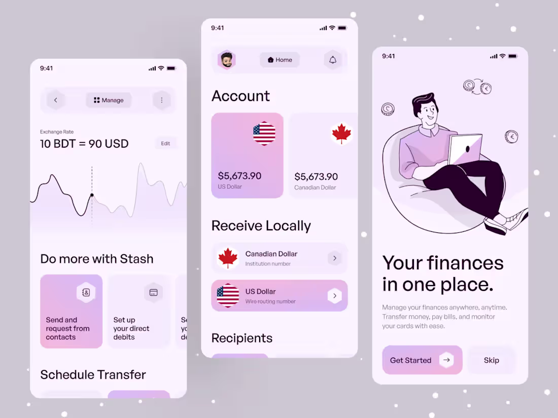
Money Management App UI
In this money management app, users can view and manage their finances through a clean, modern interface designed for clarity and ease of use. The app provides a centralized overview of accounts, balances, and supported currencies, allowing users to quickly understand their financial position.
The UI features card-based layouts, soft color accents, and clear typography to visually separate accounts and actions. Key features such as receiving money locally, viewing exchange rates, and managing transfers are presented in a simple, scannable format. Smooth navigation, quick actions, and guided onboarding enhance the overall UX, making everyday financial tasks intuitive and stress-free.
14
276
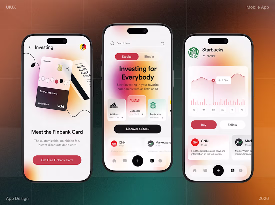
Investing App UI/UX for Future Investors ||
Project Concept: Introducing the Finbank Mobile App, a modern, intuitive platform that combines effortless banking with seamless investment options. Users can now easily manage their finances while making informed investment decisions, all within one simple, sleek interface.
This design stands out due to its clean, user-focused interface that enhances both usability and visual appeal. The use of strong visual hierarchy, bold typography, and simple navigation ensures an effortless user experience, while the integration of banking and investment functionalities in one app offers real-world convenience.
1
25
319
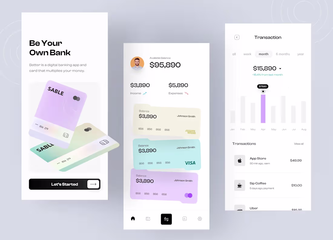
Better - Digital Banking Mobile App UI Design Concept Ofspace UX/UI
Better is a next-generation digital banking concept designed to help users "Be Their Own Bank." It bridges complex financial management with minimalist aesthetics, using a clean, airy interface and soft pastel tones. Card-based layouts, soft gradients, and clear visual hierarchy make balances, income, expenses, and transaction trends instantly readable. The design balances function and style, creating a premium yet approachable experience that makes managing money intuitive, calm, and rewarding.
9
32
363
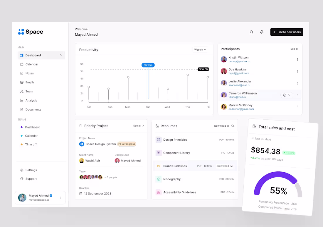
SaaS Team & Project Management Dashboard
This dashboard makes project management simple and efficient, helping users track work hours, monitor project status, and manage deadlines and client details all in one place. Resources and documents are easy to access, and a clear sales and cost tracker keeps finances in check. I focused on creating a clean, intuitive interface with smooth interactions, sharp visual hierarchy, and color-coded sections, making navigation effortless. The design keeps users organized, focused, and in control, turning complex project management into a seamless experience.
6
30
414
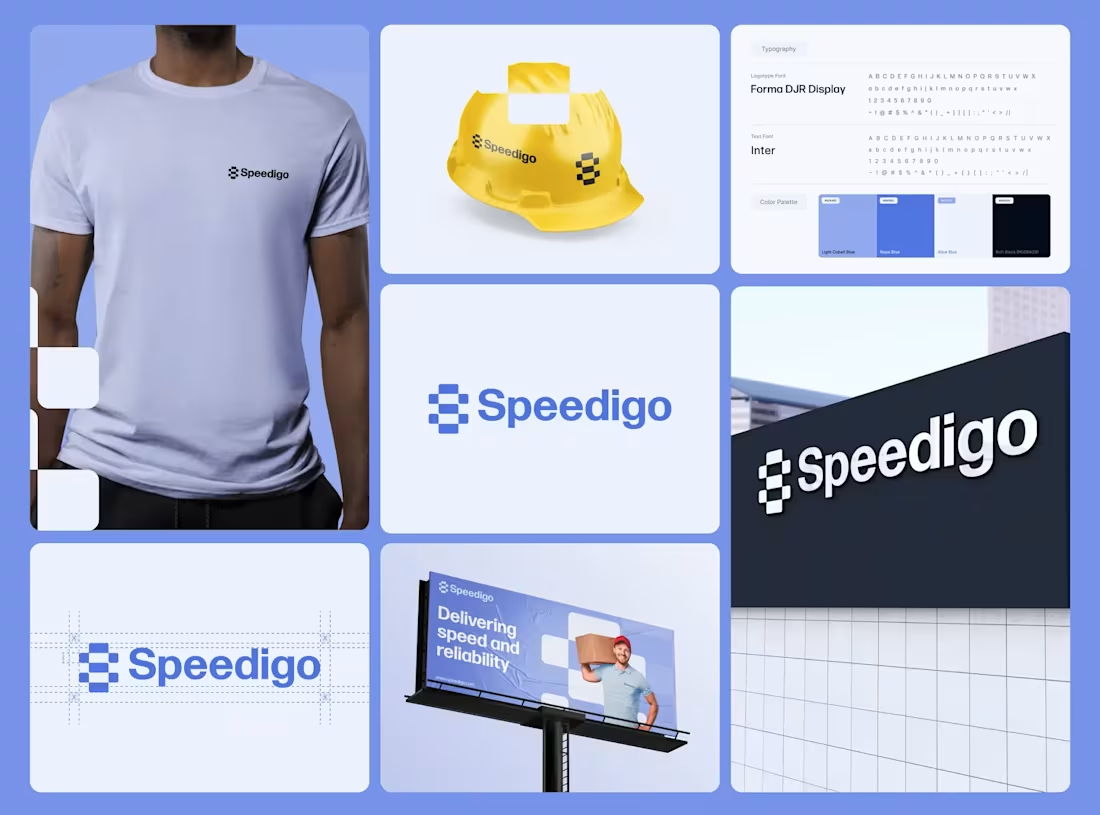
Brand Identity Design for Logistics Startups - Speedigo
Project Concept
Speedigo is a modern logistics and delivery brand built to convey speed, precision, and reliability. The identity centers on a modular checkerboard-inspired S mark, referencing both a race finish line and warehouse efficiency. This concept reinforces Speedigo promise of fast execution supported by operational discipline. The system is designed to scale across digital products, fleet assets, and physical branding.
What Makes This Design Stand Out
The identity focuses on clarity through a geometric logo, balanced typography, and a cohesive color system. Strong visual hierarchy ensures easy recognition, while the modular structure allows flexibility and future growth. The result is a clean, professional, and dependable brand presence.
2
18
304
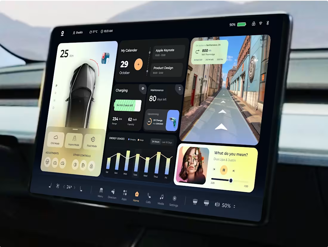
Project Concept – Smart Car HMI Dashboard
I have designed a Smart Car HMI (Human-Machine Interface) Dashboard for a luxury electric vehicle, integrating driving data, navigation, infotainment, and car controls into a single cohesive UX/UI experience. The goal was to maximize driver focus and minimize cognitive load with intuitive organization and a visually striking design.
What Makes It Special
The design features strong visual hierarchy and dynamic, large widget cards, balancing detailed data like charging, usage graphs, and calendar events with core functions like driving mode and map view. The clean, modern layout feels professional yet personal, making complex data effortless to consume at a glance.
2
18
308
Crewly – AI-Powered Gig Marketplace.
Crewly is an AI-powered gig marketplace designed to make connecting talent with opportunities simple and intuitive. I focused on creating a clean, modern experience with clear user flows and strong visual hierarchy. The goal was to balance functionality with personality, making the platform feel both efficient and engaging. I collaborated closely with designers and motion artists to bring the interface to life through subtle 3D animations that enhance usability and storytelling. The project was featured in Behance’s 3D Motion category for its visual quality and design execution.
16
367
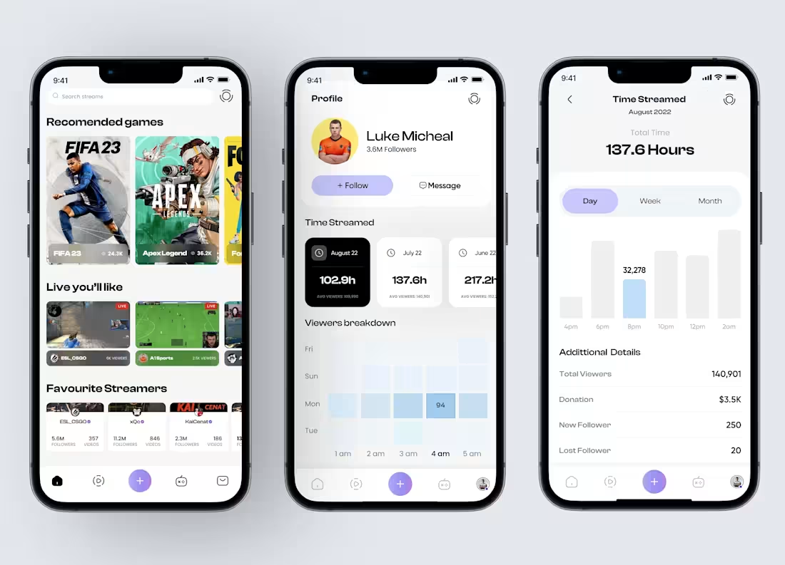
Mobile Game Streaming App UI/UX Design
Designed a modern streaming dashboard UI focused on clarity and speed. The goal was to give streamers a quick snapshot of performance without overwhelming them.
The layout surfaces key metrics like streamed hours, viewer stats, popular games, and favorite streamers at a glance. Smart sections for game recommendations, live suggestions, and follower insights make the experience feel personalized and actionable.
Interactive charts make it easy to track growth and engagement, while the clean, minimal layout keeps everything readable and focused. Built for streamers who want insights fast, not clutter, so they can spend more time creating content and less time hunting for data.
1
23
323
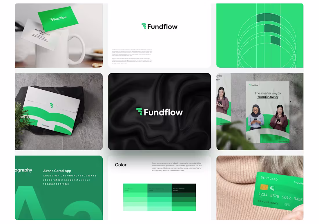
Project Concept – Fundflow Brand Identity
💡 I designed the full brand identity system for Fundflow, a modern platform for secure money transfers and financial management. The concept focuses on trust, flow, and reliability, using a sophisticated green palette and clean, minimal design across the logo, stationery, marketing collateral, and digital UX.
🌟 What Makes It Special
The design emphasizes brand consistency and strong visual hierarchy. The logo subtly integrates an abstract ‘flow’ motif, conveying movement and efficiency. The green palette creates security and growth, key to financial branding. The overall aesthetic is clean, conversion-focused, and highly legible, ensuring both marketing and digital interfaces are impactful.
3
14
312
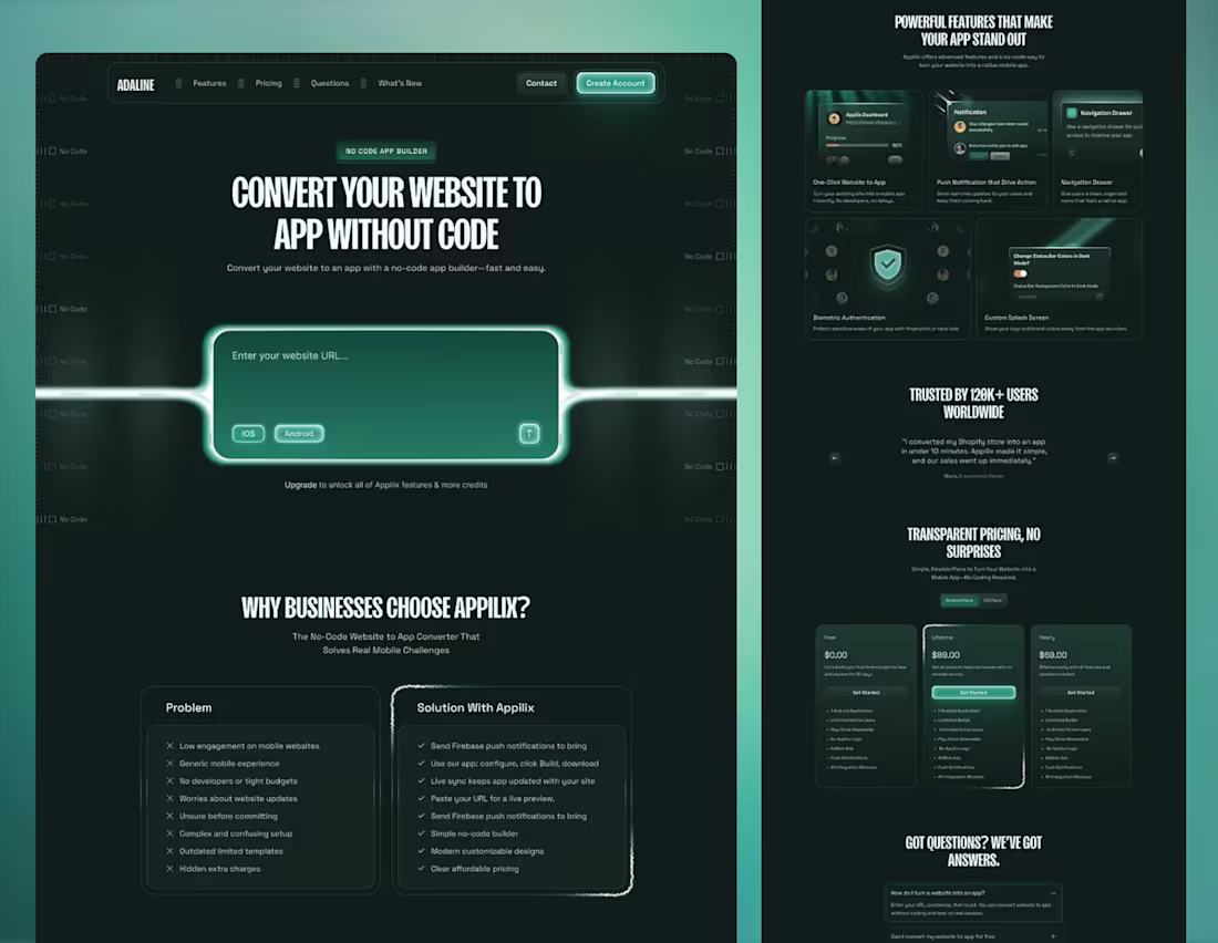
Adaline — No Code Website to App Landing Page
Adaline is a modern landing page concept for a no code platform that transforms websites into fully functional native iOS and Android apps without writing a single line of code. The design focuses on removing friction from app creation, guiding users from understanding to action with clarity, trust, and conversion in mind. Clean layouts, strong visual hierarchy, and card-based sections showcase key features such as one-click website-to-app conversion, push notifications, biometric authentication, and an intuitive no code builder. Every element emphasizes simplicity, credibility, and a product-first experience, making app creation accessible and effortless for founders, businesses, and creators alike.
29
351
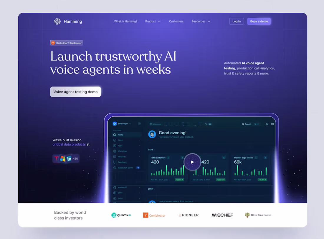
AI Voice Agent Platform – SaaS Landing Page Design
Meet Hamming — a modern SaaS landing page concept for launching trustworthy AI voice agents quickly. The hero blends a bold value proposition with a dark mode analytics dashboard, clear CTAs, and social proof to guide users from interest to conversion.
The design pairs strong typography with a 3D dashboard preview for instant impact. Subtle personalization, gradients, and motion details reinforce a premium, enterprise ready feel while clearly communicating speed, reliability, and real world value.
12
31
541
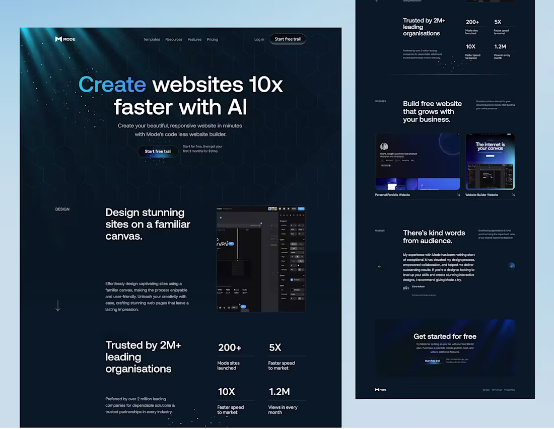
Mode — AI-Powered Website Builder Landing Page
I designed this with both creators and businesses in mind. As a designer, I wanted a clean, intuitive space where work speaks for itself, creativity feels unrestricted, and building a professional presence is effortless. From a business perspective, I focused on clarity and trust, making it easy to explore portfolios, understand value quickly, and collaborate without friction. Every decision is intentional, aimed at helping great work stand out, connect faster, and grow through thoughtful design and meaningful experiences.
16
288
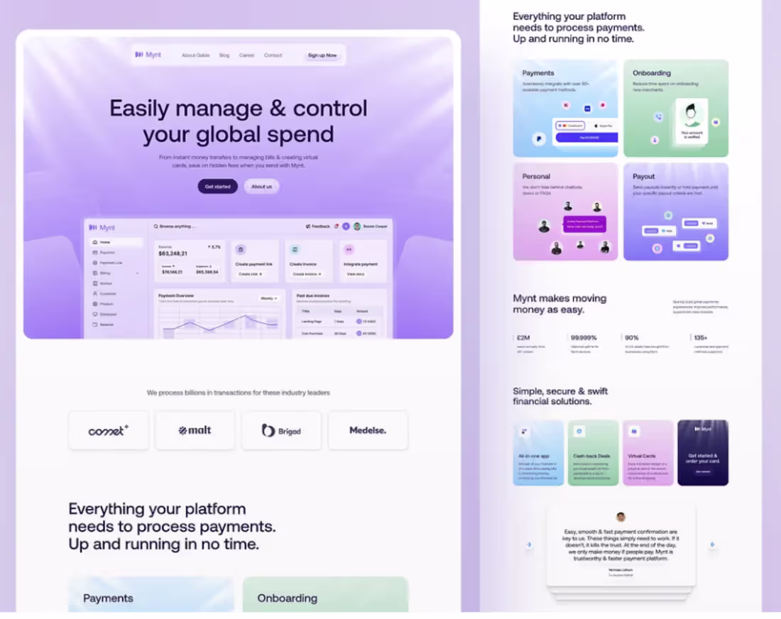
Introducing Mynt, a modern fintech SaaS landing page concept designed to simplify global payments with a secure and seamless experience.
The design blends refined gradients, clean typography, and intuitive dashboards to create a professional and trustworthy digital finance presence focused on clarity and usability.
Goal
To deliver a high-converting SaaS landing page that builds trust, improves usability, and strengthens brand credibility for fintech startups, SaaS products, and B2B payment platforms.
2
20
349
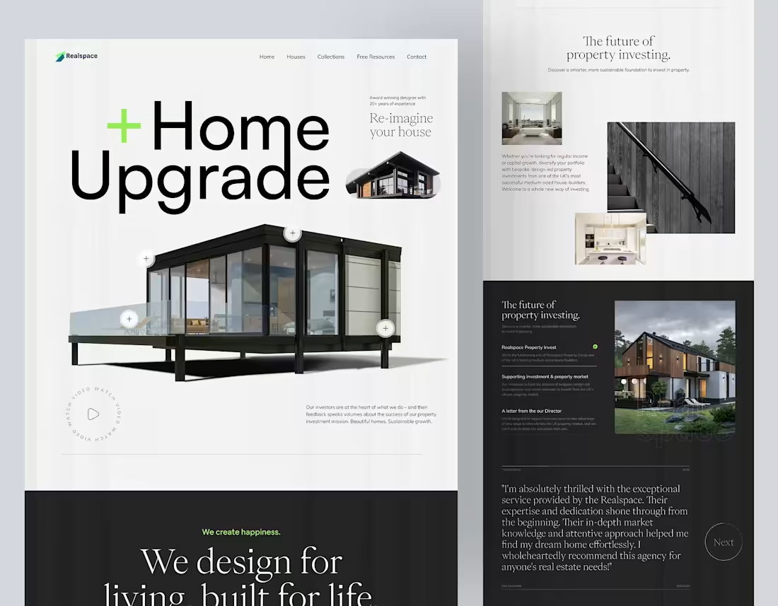
Home Upgrade.
I approached this project from both a design and business perspective, balancing creativity with long-term value. My goal was to create a space that not only looks refined but performs intelligently in the real world. Every design decision was driven by purpose: clean architecture to reduce visual noise, thoughtful layouts to improve usability, and materials chosen for durability, efficiency, and longevity. From a business standpoint, the focus was on scalability, sustainability, and strong return on investment. This is a home designed to stand out in the market while remaining timeless in appeal. It reflects a belief that great design should solve problems, elevate everyday living, and create lasting value for both the people who live in it and the future it serves.
2
26
394
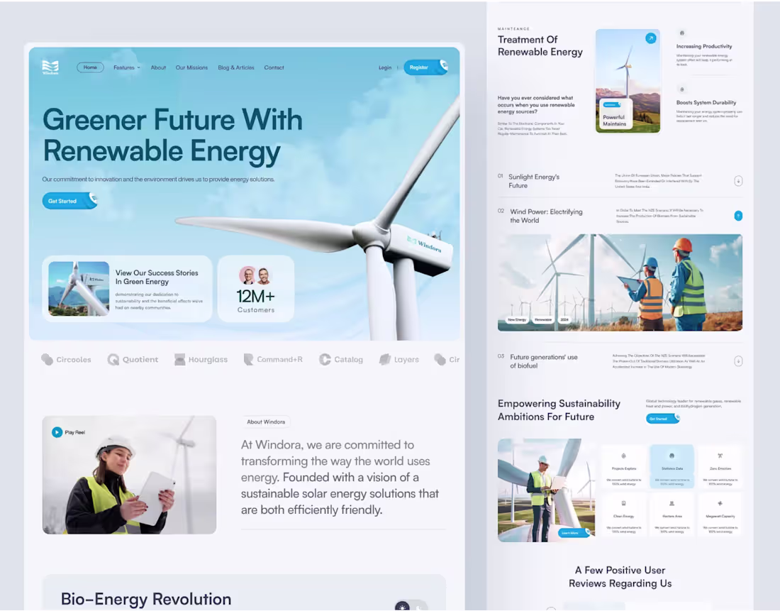
Windora - Renewable Energy Solutions Website Design
A modern renewable energy landing page UI concept designed to promote sustainability and environmental impact. The clean, user-centric layout highlights solar, wind, hydro, geothermal, and biomass energy through intuitive navigation, elegant gradients, and clear CTAs.
Ideal for eco tech startups and green SaaS products, the design focuses on clarity, trust, and strong user engagement while communicating a commitment to a sustainable future.
2
24
403
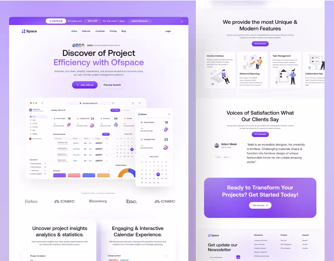
Space - SaaS Project Management Landing Page Design
Space is a modern SaaS landing page for project management, designed to communicate efficiency, simplicity, and actionable results. Its clean, persuasive layout highlights the platform’s core value proposition, attracting teams and businesses seeking a reliable, innovative tool.
Key features include an intuitive dashboard for real-time project tracking, streamlined task management, advanced reporting for data-driven insights, seamless team collaboration, and an interactive calendar for visual timeline management. The design focuses on boosting user engagement, increasing conversions, and providing a smooth, professional browsing experience for SaaS platforms and startups.
2
23
387
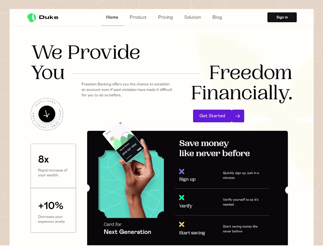
Duke - Banking Landing Page for FinTech Design
Project Concept
A UI UX concept for a fintech banking platform focused on accessible, user friendly digital banking. The landing page and dashboard emphasize clarity, inclusivity, and confidence, with a visual direction built around trust, simplicity, and forward progress.
What Makes It Special
A clean layout, bold typography, and clear hierarchy guide users effortlessly. Conversion focused UX and concise data visuals build credibility and reduce the intimidation often associated with financial products.
15
344
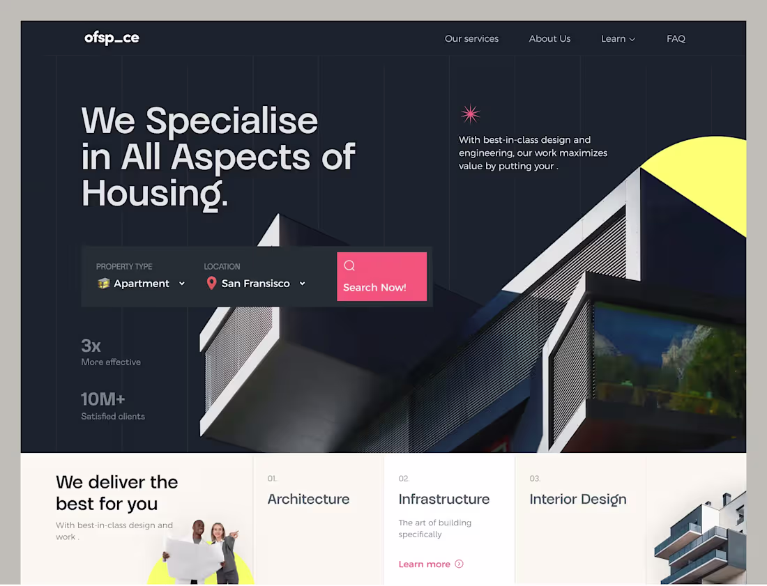
This housing website UI design is focused on creating a streamlined, user-friendly interface for potential clients in the real estate industry. The layout incorporates clean typography and vibrant visuals that help users effortlessly navigate through property listings and services. The website showcases modern housing concepts like apartments, infrastructure, and interior design, with a tailored experience for users in specific locations.
What Makes This Design Special
Smart hero section combining a powerful headline with an inline property search bar to drive instant user action.
Clean, grid-based layout with strong visual hierarchy that guides the eye from headline to search to services.
Bold typography and contrasting color accents that create a memorable, professional brand presence for real estate and architecture services.
2
13
365
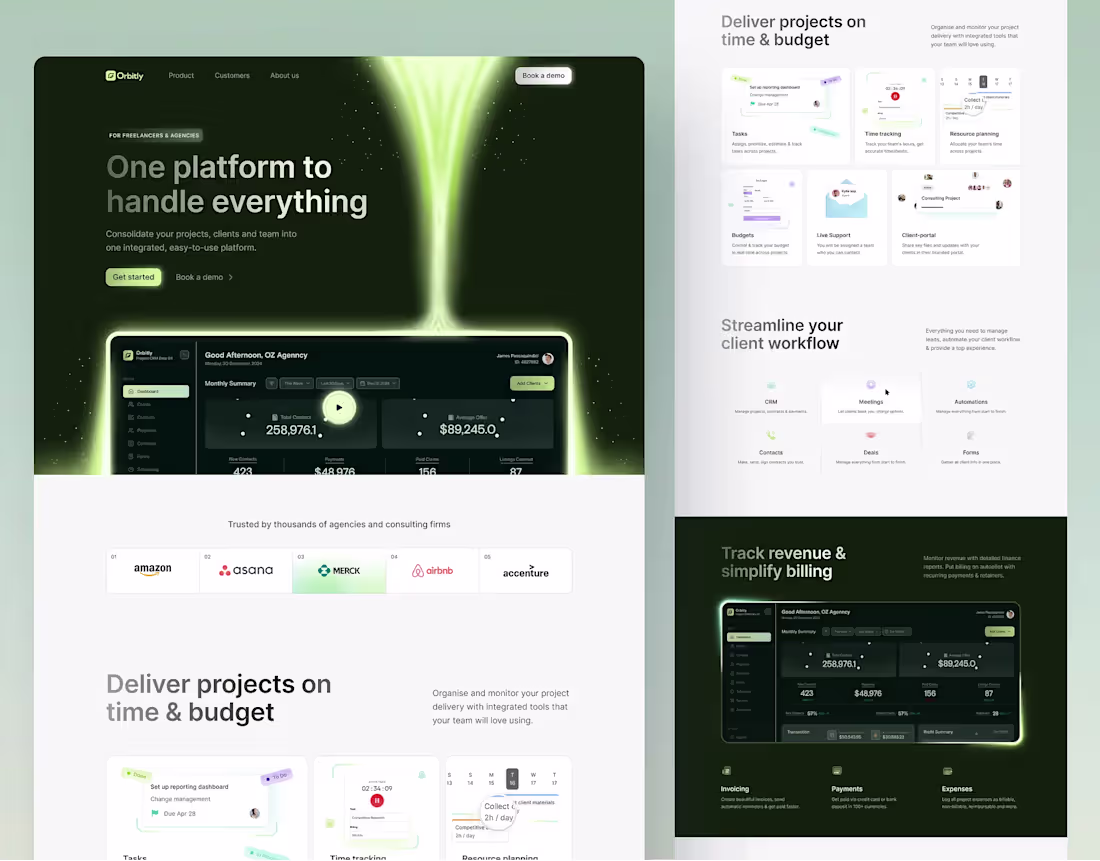
Orbitly - CRM Project Management Platform
Orbitly is an AI powered all in one platform for finding, managing, and working with clients efficiently. With one click, it generates tailored client lists and centralizes project tracking, CRM, team collaboration, invoicing, and workflow automation in a single, intuitive dashboard.
Designed to feel powerful yet approachable, Orbitly helps teams track progress, manage resources, streamline client communication, and automate billing while keeping productivity and revenue clearly in focus.
2
277
Landing page design and development.
1
286
Investment app concept similar to the Robinhood App.
2
1
267
Micro Interaction Design for Mobile Apps
1
4

Vero | Intelligence Insurance Solutions (2020)
0
2
Anyplace | Live Anyplace Work Anywhere (2021)
0
1
Tixio | A Modern Project and Team Management App
0
9
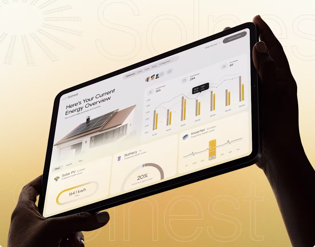
Solenest - Solar Monitoring Platform Case Study
0
2
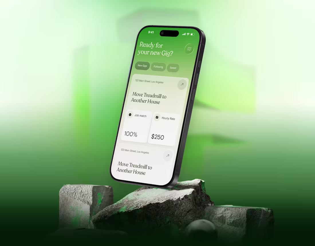
Crewly: AI-Powered Gig Marketplace UIUX Case Study
0
2
Leading Ads Brand Identity Design
1
2
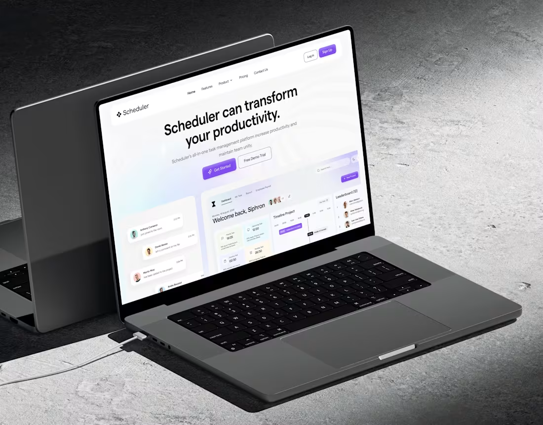
Schedulr Task Manager | UI UX Design Case Study
0
1
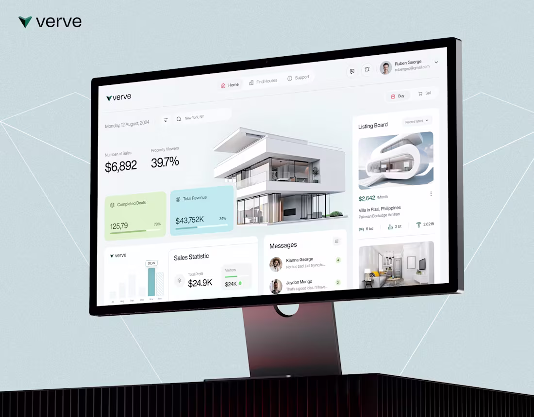
Verve | Find and Manage Modern Houses
0
4

Dashflow | Manage your Online Payments
0
3
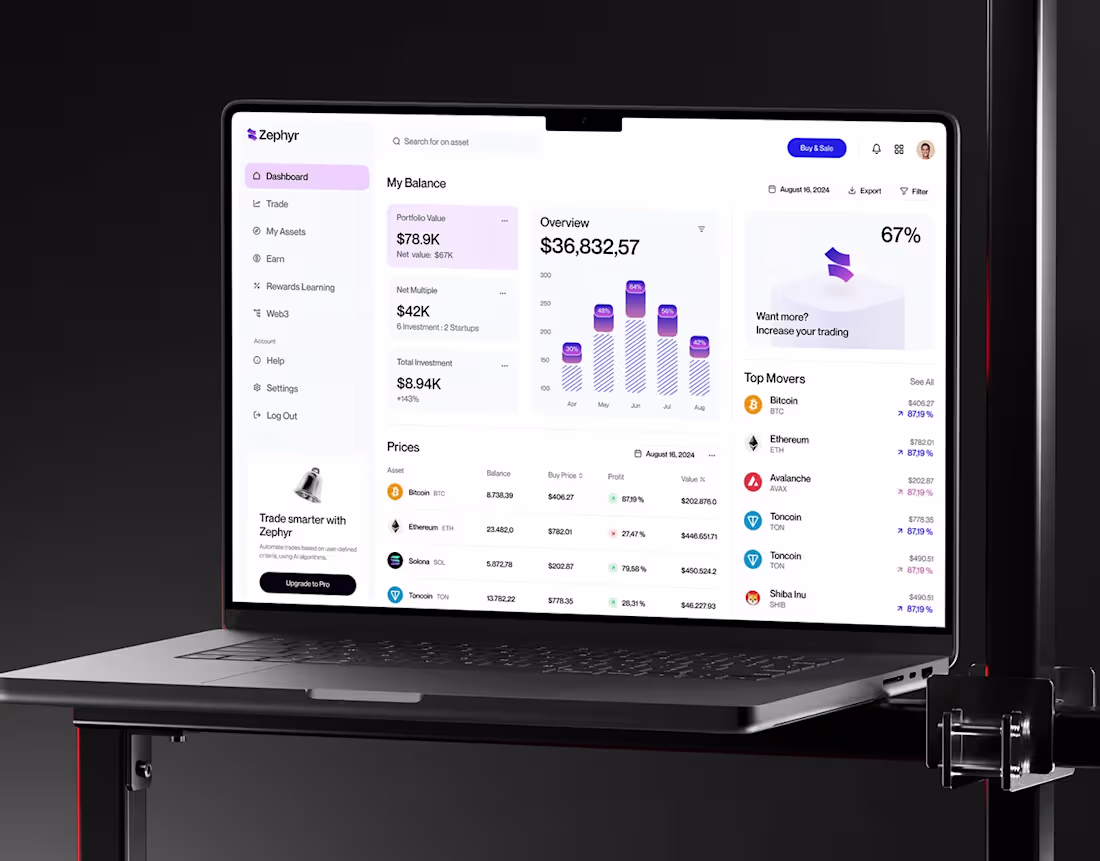
Zephyr | A B2B Web3 Payments Platform
0
3
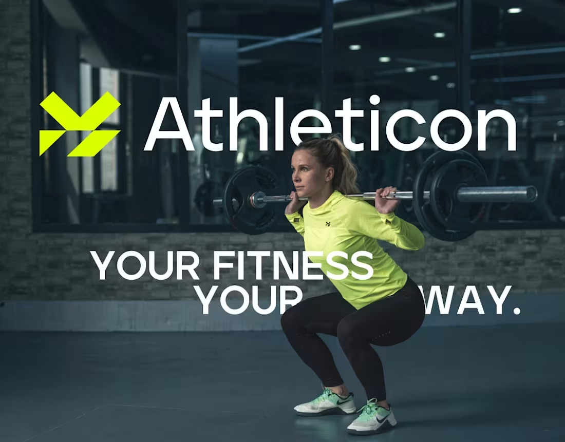
Athleticon | Fitness and Health Training App
0
6
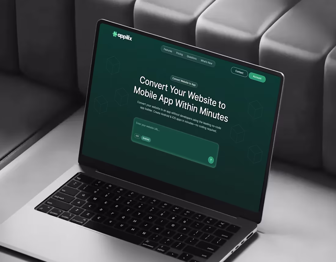
Appilix — Web-to-App Platform | UI/UX Case Study
0
1
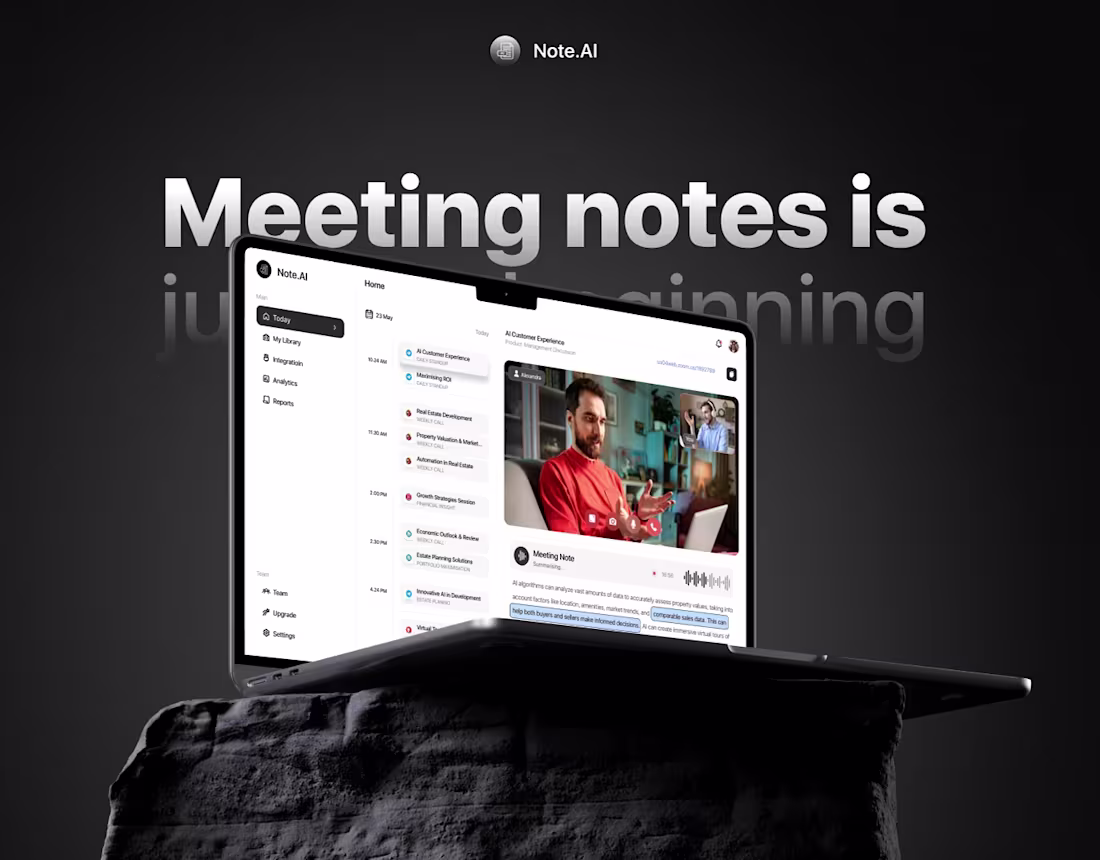
Note AI | An AI Based Meeting Note Taker
0
1
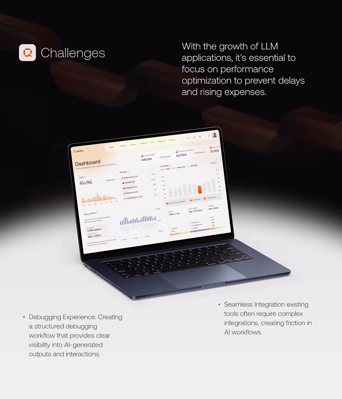
Quantix LLM Application | A UI/UX Case Study
0
0
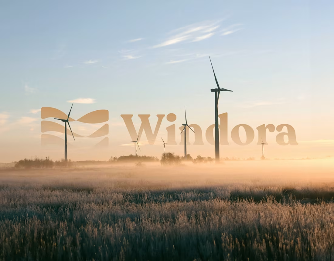
Windora | Renewable Energy Company
0
1
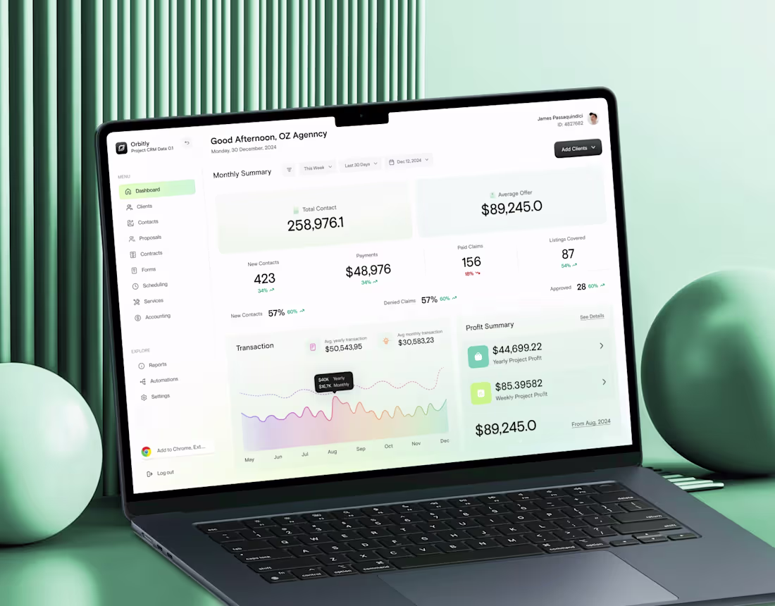
Orbitly | Modern CRM Powered by AI
0
2
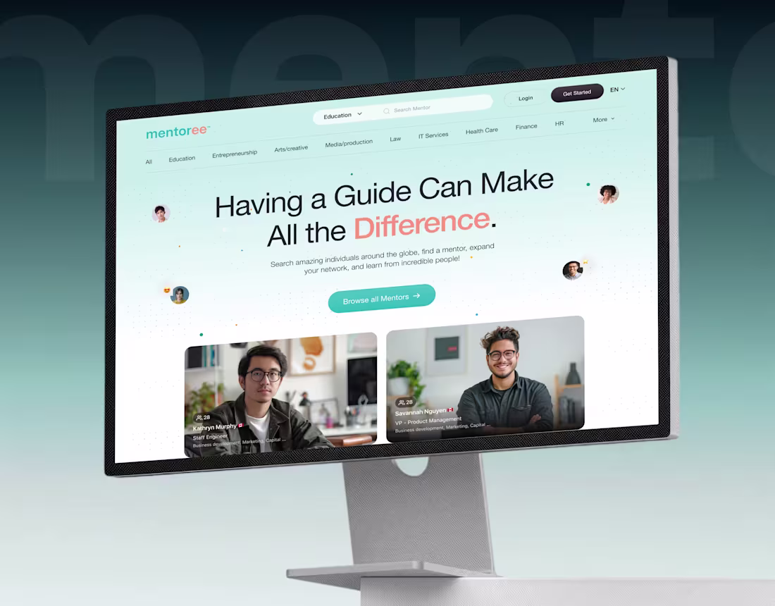
Mentoree : UI UX Case Study
0
2
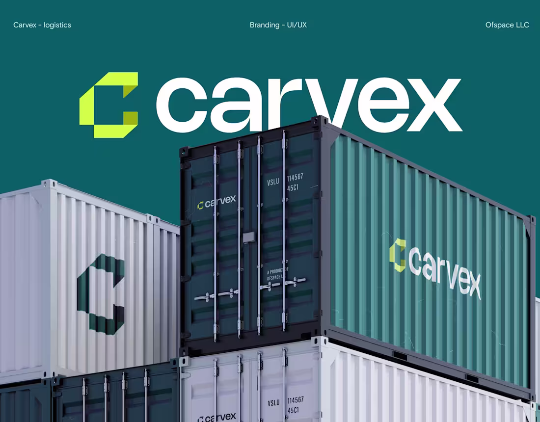
Carvex | Reimagined Logistics
0
5
AirWave - Branding, Web UI and UX Design
0
4

Curiosity AI Branding and UI
0
3
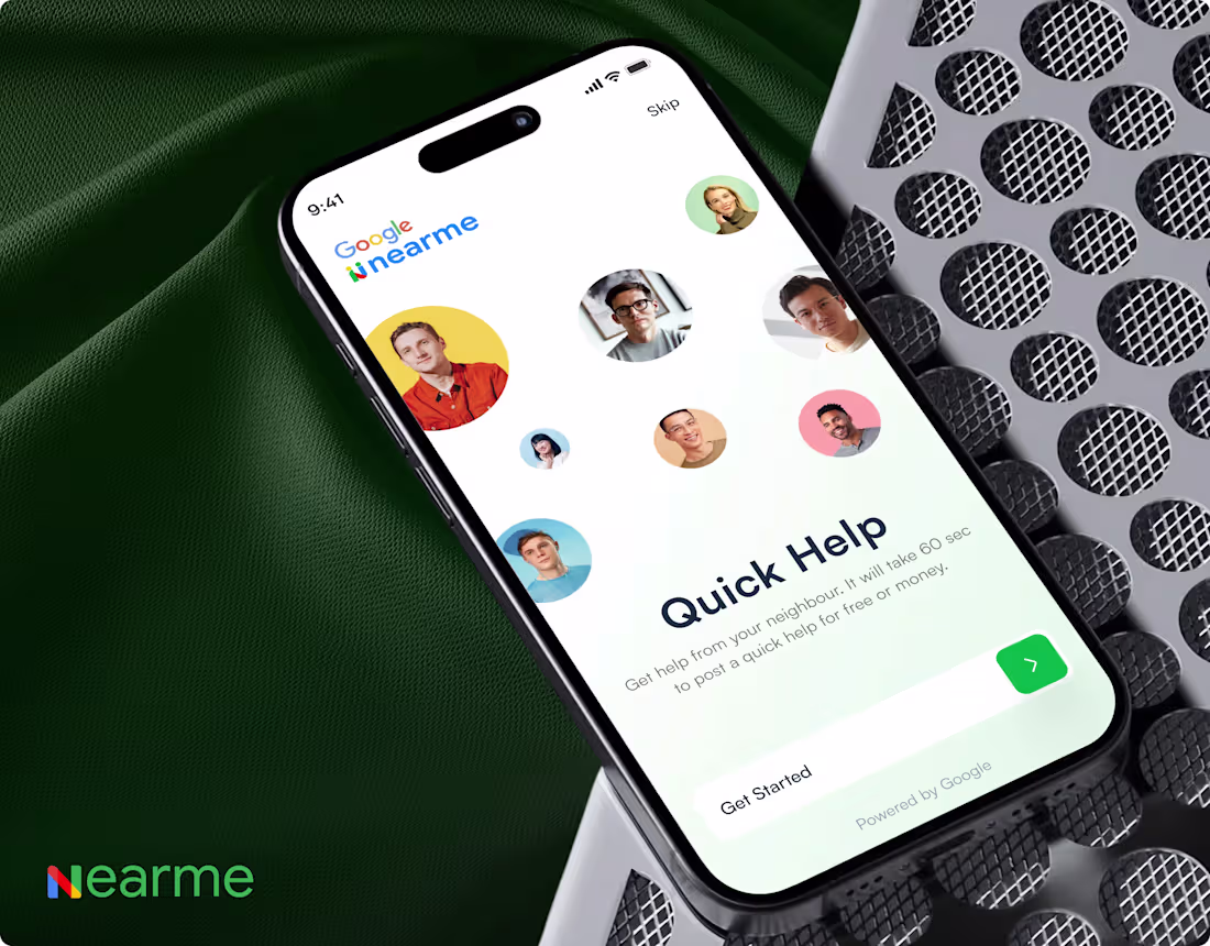
Google Near Me - UX/UI Case Study
0
1
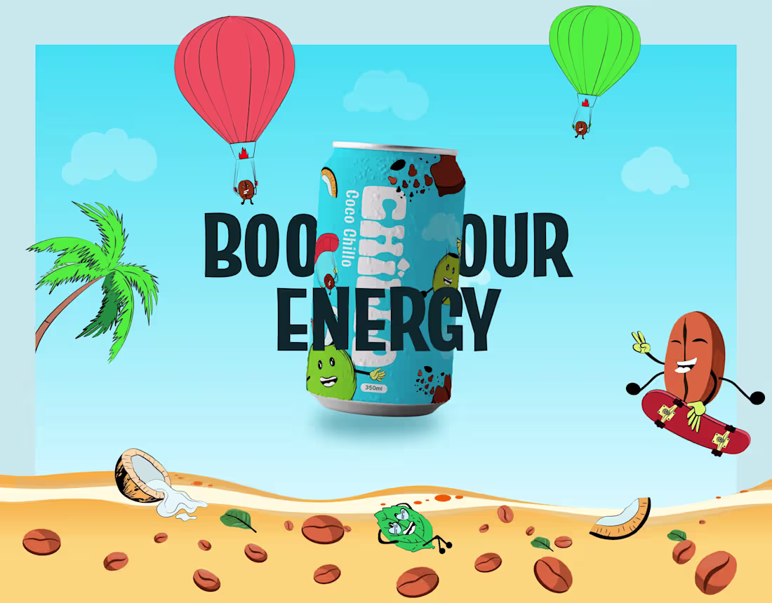
Chillo Coffee | Boost your Energy
0
0
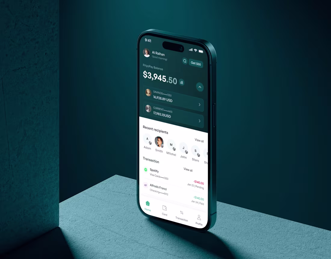
PriyoPay | Reimagined by Ofspace
0
1