Intuitive and Impactful Custom Air Monitoring Dashboard
Evan ONeil
Recording of the main dashboard functions
I designed an interactive air quality monitoring system that serves 8 Houston communities previously lacking real-time data. The process involved: 1) Building data pipelines from PurpleAir and Sensit networks 2) Processing 4 key pollutants (PM2.5, ozone, NO2, VOCs) 3) Developing a custom Mapbox visualization using Observable Framework and D3.js. The system updates hourly, maintains 48-hour historical data, and automatically flags dangerous pollution levels around industrial facilities. Technologies used: Node.js for data processing, Observable Framework for visualization, and Mapbox GL JS for mapping functionality.
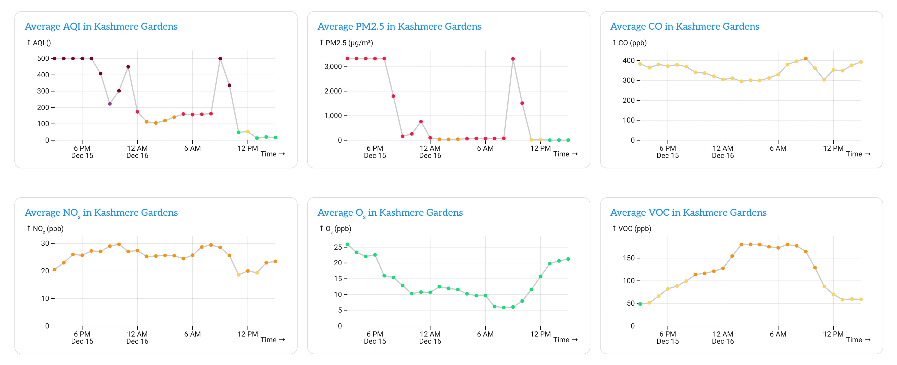
Real-time charts of air quality levels
View the dashboard here: https://airalliancehouston.org/air-monitoring
Like this project
Posted Dec 16, 2024
Interactive map-based dashboard powered by Observable Framework and Mapbox that transforms complex geospatial data into compelling visual insights.