The network for creativity
Join 1.25M professional creatives like you
Connect with clients, get discovered, and run your business 100% commission-free
Creatives on Contra have earned over $150M and we are just getting started
Back to feedPost

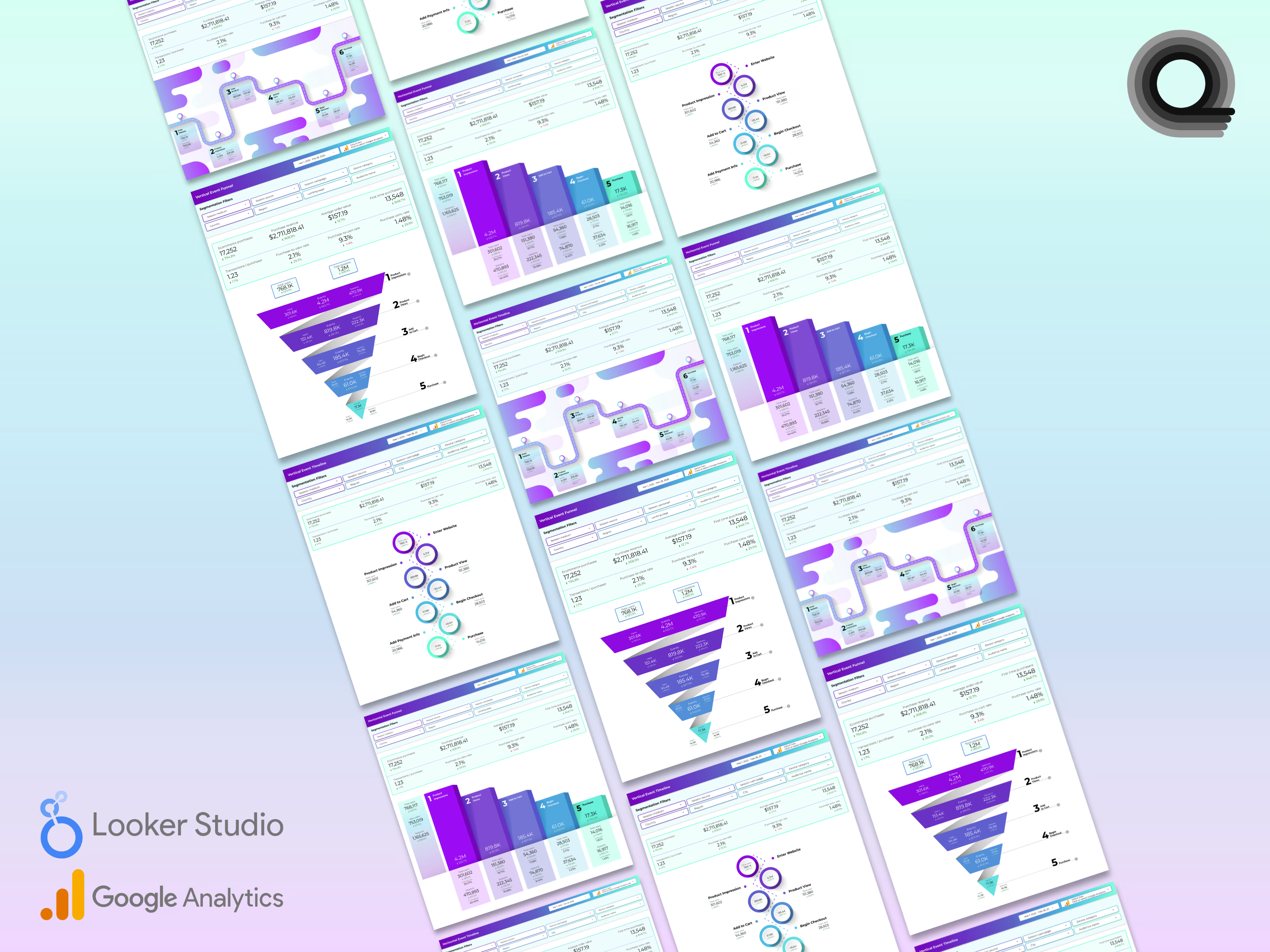
I posted another couple of new Looker Studio dashboards in my Contra shop today and thought I would share some related eye candy with ya'll.
This is a bundle of four funnel and timeline data visualizations / infographics that I created specifically for Google Analytics e-commerce events.
I was inspired to create this after having stumbled upon a slough of similar GA4 ecommerce-related dashboards that were woefully visually unappealing. Creating more beauty in the world around me is one of my prime movers.
https://contra.com/products/mYxjErTV-ga4-ecommerce-funnel-visualization-pack


The network for creativity
Join 1.25M professional creatives like you
Connect with clients, get discovered, and run your business 100% commission-free
Creatives on Contra have earned over $150M and we are just getting started











Related posts

Working on a SaaS dashboard concept in Figma. 🚀
The goal is to make complex business data easier to scan and understand through clear visual hierarchy, structured analytics cards, and organized navigation.
Still refining the details and exploring ways to make the experience more intuitive.
What matters more to you in a dashboard: clean visuals or faster access to insightful?
#Ui designs #Ux design #Saas design #Figma
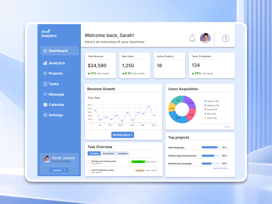

For a dashboard like this, I’d test whether the key action stays visible when the cards are filled with real, uneven data—not just placeholder numbers. What kind of business data are you designing the first view around?

Project Management Dashboard – A powerful and intuitive interface designed to enhance team collaboration, productivity, and workflow efficiency.


Santa Monica Tile & Stone E-Commerce Design, 2025.
Buying tile online is mostly guesswork, so I designed a concept store where every page answers one buyer question. Shoppable rooms show how it looks, a coverage calculator tells you how much you need, and free samples let you see it first. Deep green, warm gold, and an AI tile scan that turns inspiration photos into products. Open for e-commerce and web design projects.
Full case study on my Contra Profile

TOP!!


