

Creative Studio | Social, Video & Creator Content


Creative Studio | Social, Video & Creator Content



Video Growth Partner | YouTube, Reels & Ads That Work
Video Growth Partner | YouTube, Reels & Ads That Work




Framer Expert | Specialized in fast turnarounds | Design Day

Framer Expert | Specialized in fast turnarounds | Design Day



InDesign expert and Website Designer


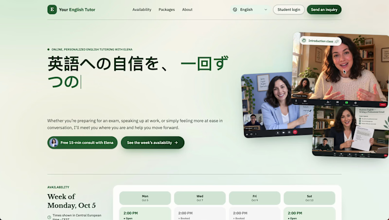
From booking chaos to a calendar you’re excited to open...?
Meet Elena! 👋
She’s an English tutor based in NYC and she loves to teach...
But managing her schedule? Not so much. 😳
She’s overwhelmed with booking inquiries coming through Instagram, email, and WhatsApp. Messages get buried, unmotivated students disappear, and she spends way too much time going back and forth just to schedule a lesson that she struggles to fill her teaching hours...
The solution? A booking website to take care of that messy middle! ✨
Students can now see Elena’s weekly availability and book individual lessons, or choose an intensive learning package to inspire students to commit to their progress! ✨
It could even suggest plans and has a Student Profile page for easy rescheduling and communication! 🤩🙏🏼
Now, Elena absolutely looks forward to seeing her calendar! 🩷
We helped her turn one-off bookings into a trusted base of regular, motivated students... from around the world! ✨
✅ Less back-and-forth
✅ Clear lesson planning
✅ More consistent bookings
✅ Committed students
And most importantly, more time for Elena to do what she actually loves — teaching! ✨
1
385

Social Media Strategist & Content Creator
Social Media Strategist & Content Creator

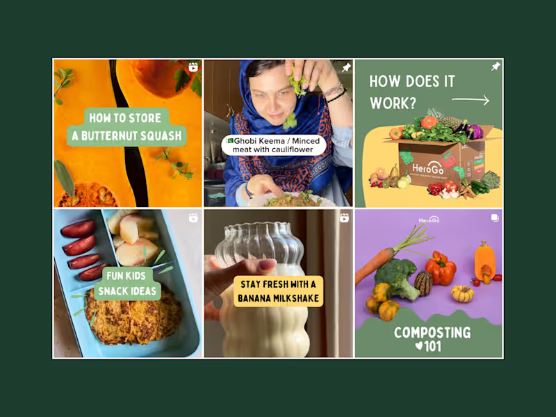

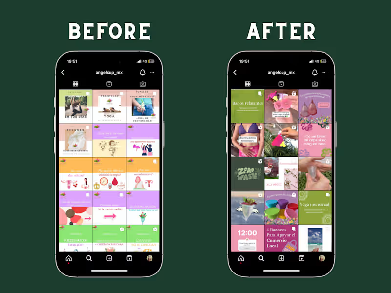

Webamigo is specialised in Canva, Webdesign, and Shopify
- $1k+
- Earned
- 1x
- Hired
- 5.0
- Rating
- 7
- Followers
Webamigo is specialised in Canva, Webdesign, and Shopify


Brand & Web Design for B2B and Professional Services

Some of the strongest Meta creatives I’ve designed are not the ones I’d call the most visually restrained.
Working closely with Nutrafine, I’ve created 200+ Meta ad creatives across several European markets. And one thing became very clear: performance design has to respond to the market, not just the brand.
When Nutrafine expanded into France, we adapted more than the language. We adjusted the offer framing, visual density, product-benefit hierarchy and overall creative direction to better reflect local shopping behaviour and aesthetic expectations.
Some of the creatives that converted especially well ended up being more text-heavy, bold and “poppy” than my natural design instinct would suggest. But that’s the point.
Good performance design is not about forcing your preferred aesthetic onto every market. It’s about knowing when to move beyond your default visual instinct in order to support attention, conversion and sales.
#PerformanceCreative #MetaAds #ArtDirection #BrandDesign #CreativeStrategy
1
1
181
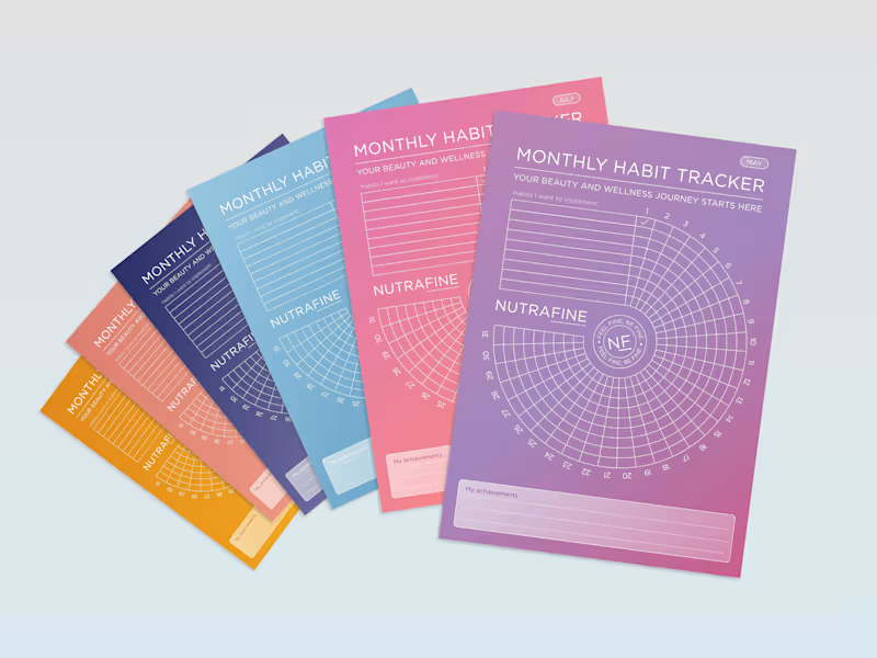
Can a habit tracker feel like a brand experience, not just a table?
For Nutrafine’s corporate gifting, each month is tied to one SKU, using the same colour as its packaging. It’s more colour than I would usually choose, but the depth of the palette, white linework and typography make the system hold together.
The bigger idea was to make the tracker itself feel less expected. Instead of a grid, we built a spiral, turning a practical tool into something more playful, memorable and distinctly Nutrafine.
#BrandDesign #CorporateGift #WellnessBranding #BrandExperience #CreativeDirection
25
50
3.4K

Squarespace Web Designer for Biz Owners
- $1k+
- Earned
- 1x
- Hired
- 5.0
- Rating
- 4
- Followers
Squarespace Web Designer for Biz Owners


