
Framer Pro Expert & Web Designer for Creative Entrepreneurs


Framer Pro Expert & Web Designer for Creative Entrepreneurs
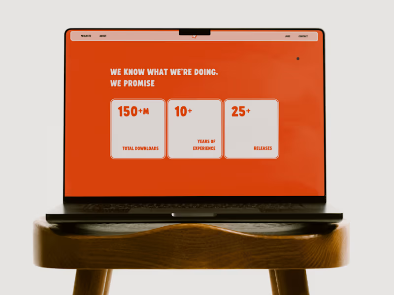
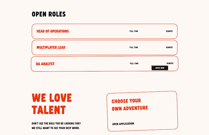
My favorite interaction from my recent work for Starfish Studios (https://starfishstudios.framer.website/). The perfect touch of playfulness for an industry-leading Minecraft development agency.
1
2
312
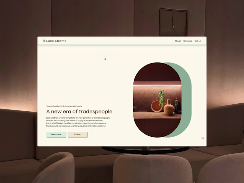
Local Electric (https://contra.com/products/4IzpFm6d-local-electric-framer-template) is a Free Framer template for the next generation of skilled tradespeople and professional service providers. I built Local Electric because all of the websites I've seen for electricians, plumbers, cleaners, landscapers, etc. look exactly the same. They're professional but they miss the mark when it comes to creating a brand that shows neighborly personality, builds trust, and makes folks want to work with you.
4
5
1.1K


Let's close the gap between visitors and conversion.

Actionable UX Audits for startups and scaling businesses
- 1x
- Hired
- 4
- Followers
Actionable UX Audits for startups and scaling businesses
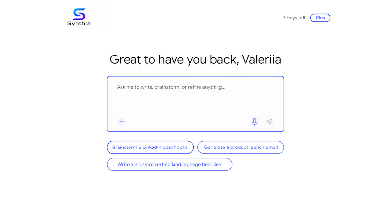
In a recent review of AI product, I noticed next: to help users getting over a blank state - there are pre-made prompts.
Unfortunately 🥲 they acted as a pure ‘conversation starters’ - in the end, user still needs to start typing 👩🏻💻 in order to accomplish a task. Such pattern just postpones the moment user gets an actual value 💫
To fix this, pre-made prompts are better to work as templates 🙌🏻 It would reduce friction and improve the overall user experience 😉
1
252
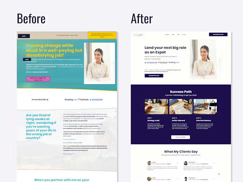
UX Review & Redesign Suggestion for a Career Coach 💼
☝🏻Photos replaced and some details blurred with the client's permission
In this redesign I focused on two main issues: credibility and clarity.
Trust signals existed but were invisible. Logos from recognizable companies (Atlassian, TomTom, Booking.com (http://Booking.com)) and client testimonials were buried below the fold thus invisible to most visitors. Moving them above the fold immediately signals legitimacy before a potential client decides whether to keep reading.
The target audience wasn't clear enough. The original headline spoke to a broad, emotionally frustrated audience without specifying who exactly the coach helps. The redesign suggestion narrowed the positioning so a potential client knows within the first scan: "this is for me."
Nothing new was added, I just reframed what was already there 👩🏻💻
0
249
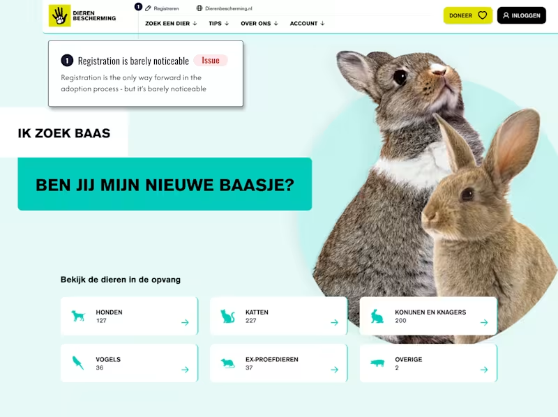
Registration wall nobody warns you about
Ik zoek baas by dierenbescherming.nl (http://dierenbescherming.nl) receives thousands of monthly visitors looking to adopt a pet 🐶🐱🦮 The page looks like a browsing experience: scroll through animals, find one you love, proceed.
But there's a catch nobody mentions upfront: you can't move forward in your adoption journey until registered.
Visitors only discover this after they've already chosen an animal they want. That's not the best moment for a surprise.
Here's the nuance though 👆 the registration requirement is right ✅ Adopting a pet is a serious commitment. Some people decide emotionally and later regret it, which is harmful to the animal. The screening process exists to protect against that.
The UX failure isn't the barrier. It's that the page hides it.
Framed honestly from the start - "we ask you to register because we care about the right match" - registration stops feeling like bureaucracy and starts feeling like trust 🧡
Sometimes the fix isn't removing friction. It's explaining it 💬
1
0
294
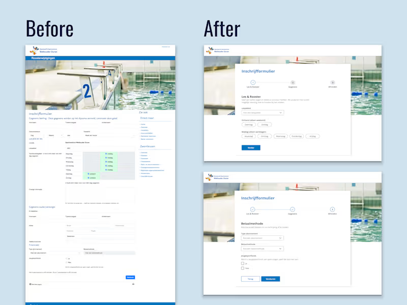
UX Redesign Suggestion — Swimming Lesson Registration Form
Zwembad & Sportcentrum Wethouder Duran, Diemen
A municipal swimming centre's registration form was technically functional but created unnecessary friction for parents signing up their children a task that should take minutes but felt overwhelming.
Core problems identified ⬇️
1. Single long-scroll form with no sense of progress or completion time
2. All time slots pre-selected by default, forcing parents to manually deselect irrelevant options
3. Poor scannability: inline labels, inconsistent field widths, and section headers in colour rather than hierarchy made it hard to read at a glance and easy to miss fields entirely
Redesign approach:
Restructured into 3 logical steps: lesson preference first, personal details second, payment last. This order follows the parent's natural decision flow: does this work for us → here's who we are → here's how we pay.
The day selection was rebuilt from a confusing pre-checked grid into clear pill buttons grouped by ochtend/middag to reduce cognitive load and eliminating the default-selection error pattern.
No new content was needed, only reframing what was already there.
Speculative redesign based on a publicly accessible form, created to demonstrate UX audit and form design methodology
0
218

Product Designer: people-copy-design-code-revenue
- 5.0
- Rating
- 2
- Followers
Product Designer: people-copy-design-code-revenue
View more →

Your best Framer designer.
Your best Framer designer.


View more →

Brand and Graphic Designer
Brand and Graphic Designer


Crafting intuitive UX for clear, beautiful digital products.
Crafting intuitive UX for clear, beautiful digital products.


Innovative UX Designer, Social Media Marketer
Innovative UX Designer, Social Media Marketer


View more →